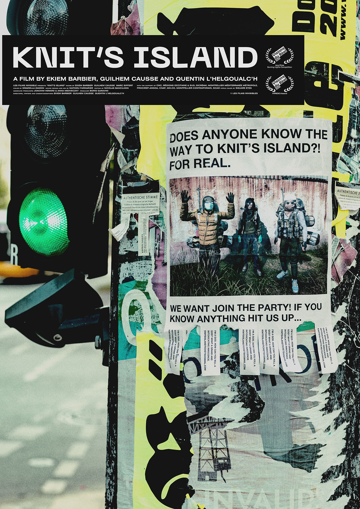
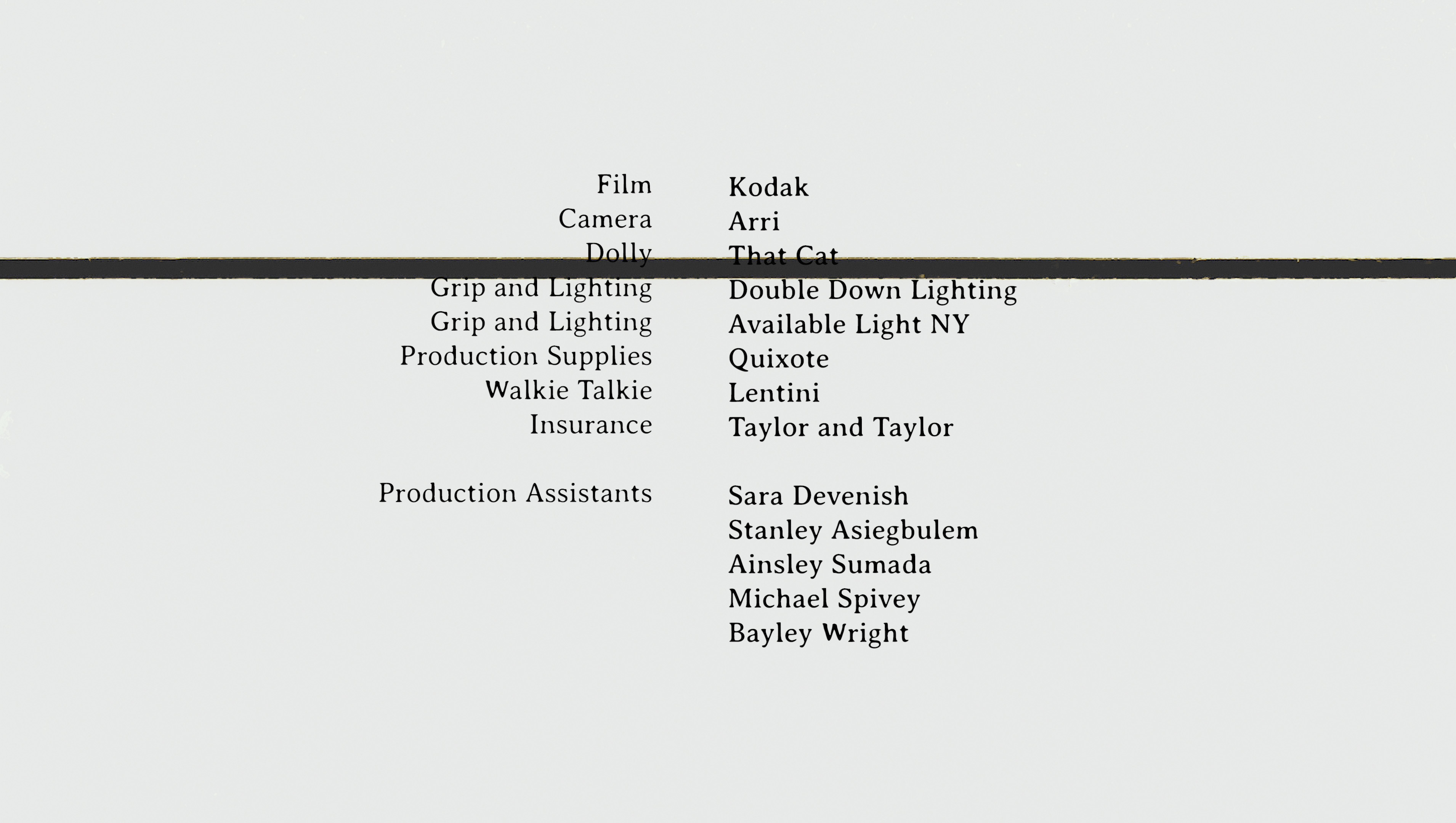
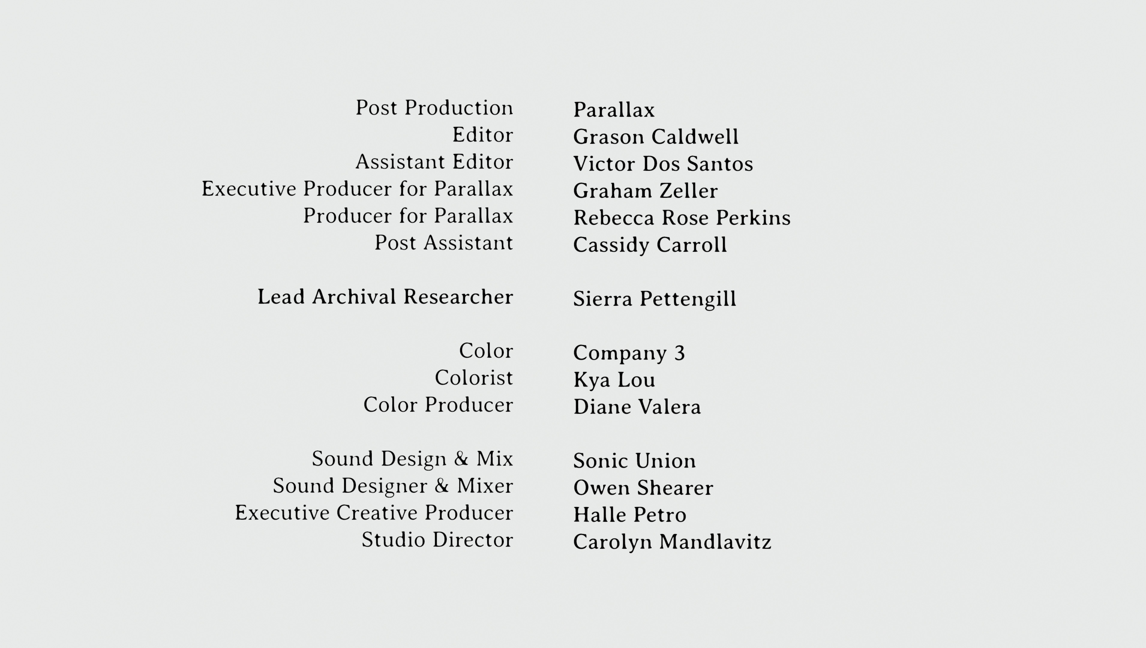
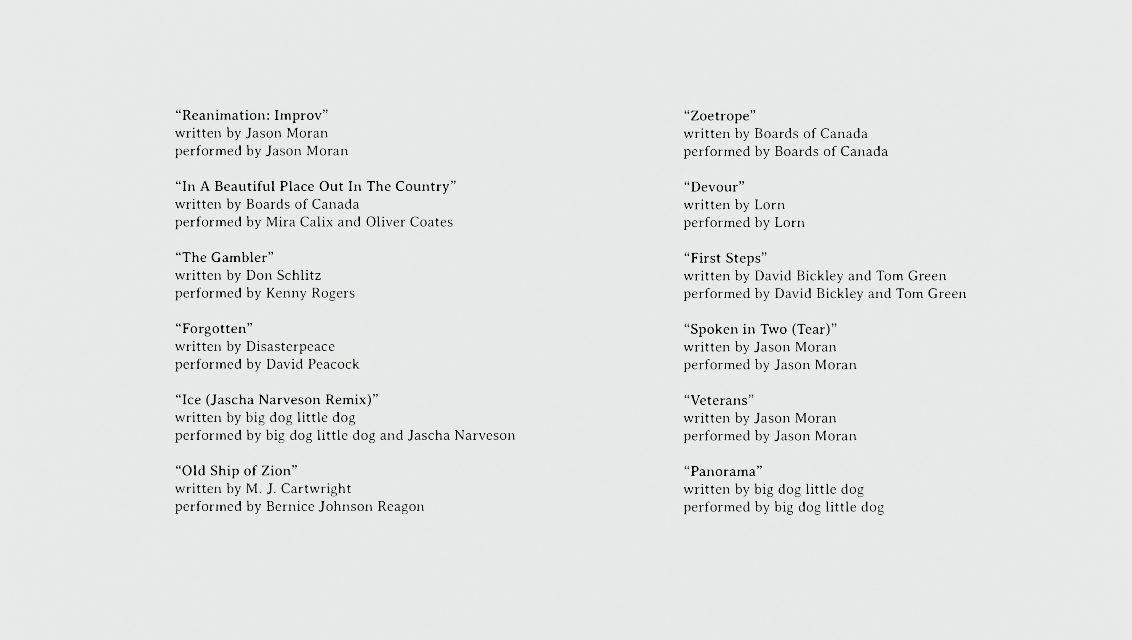
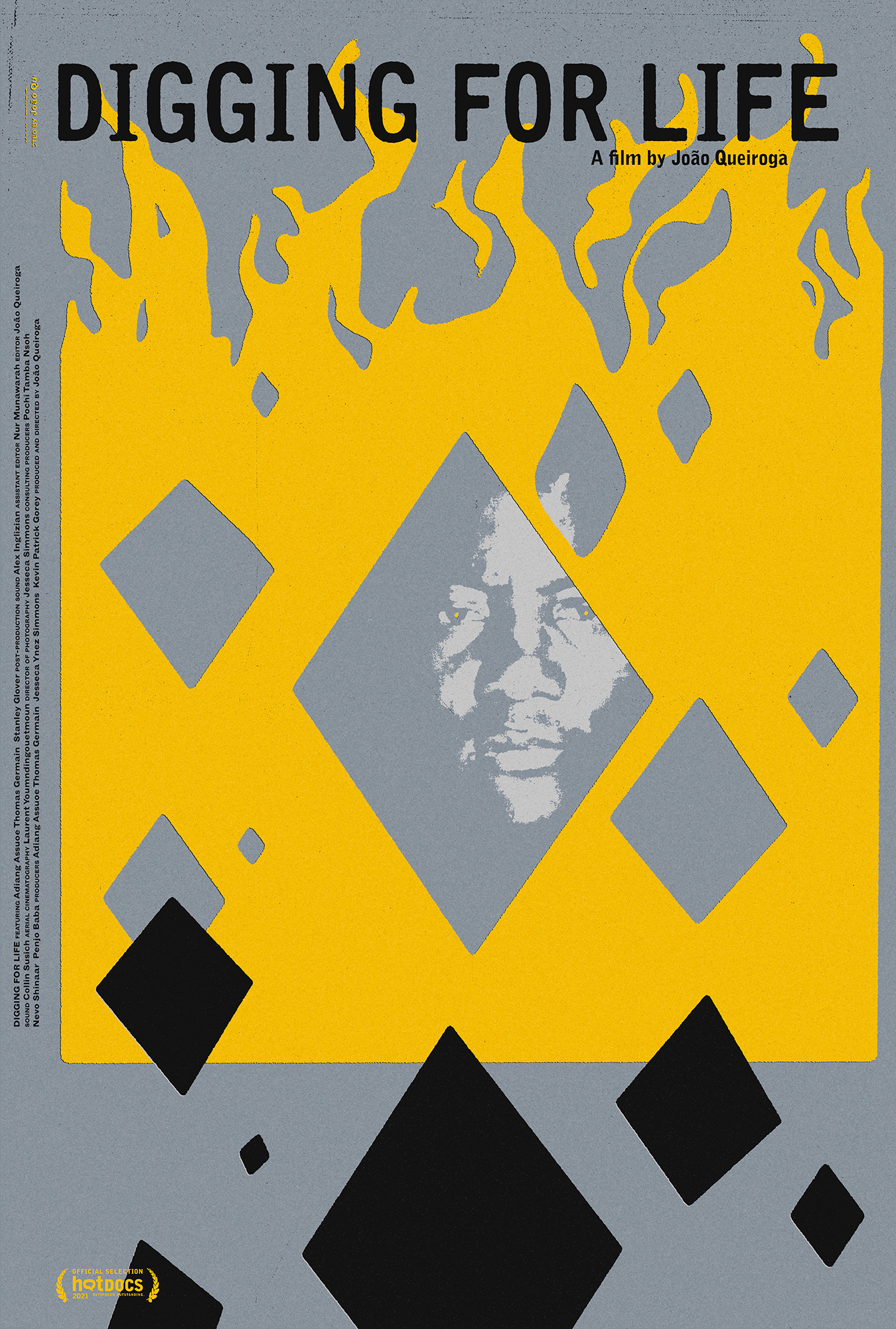
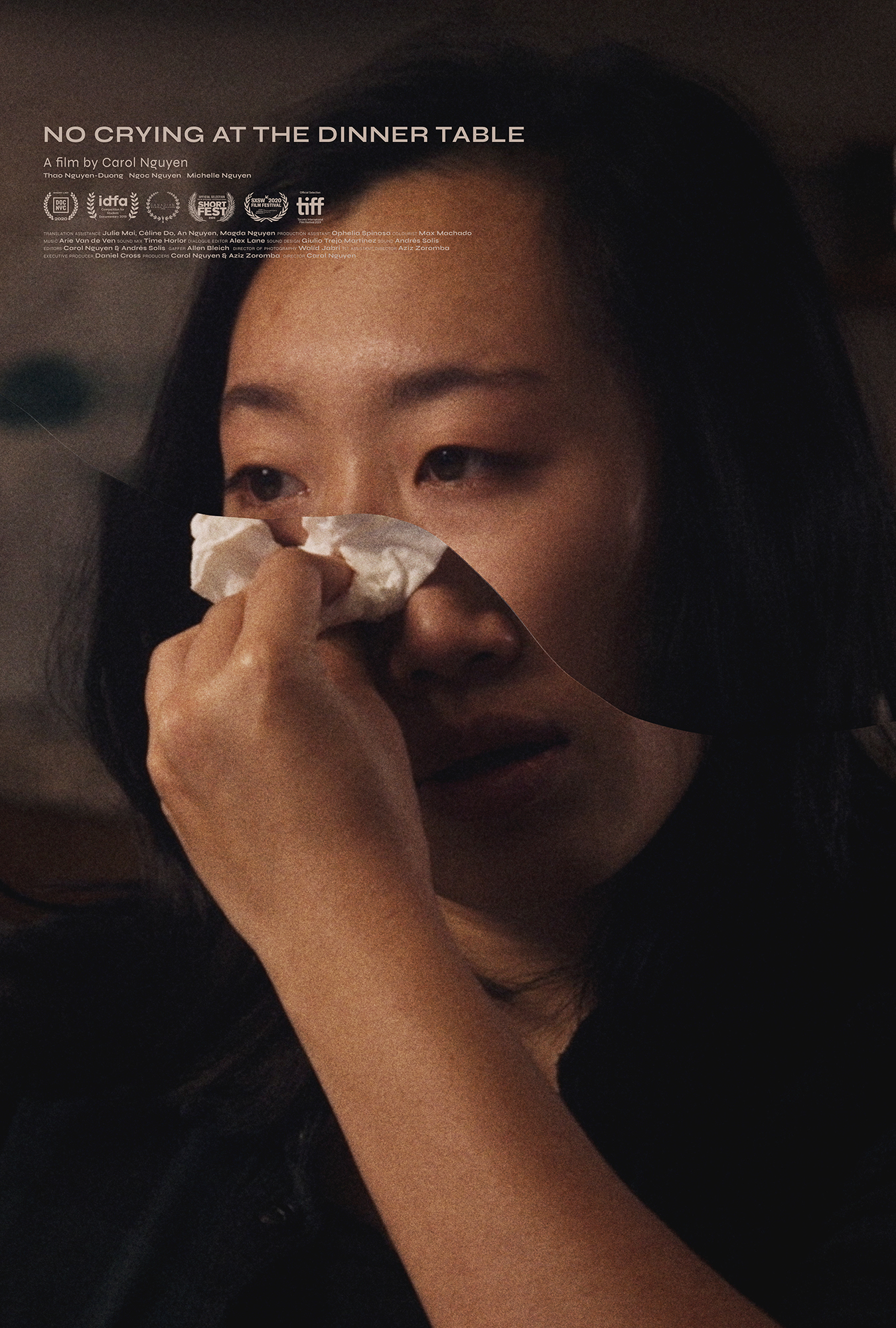
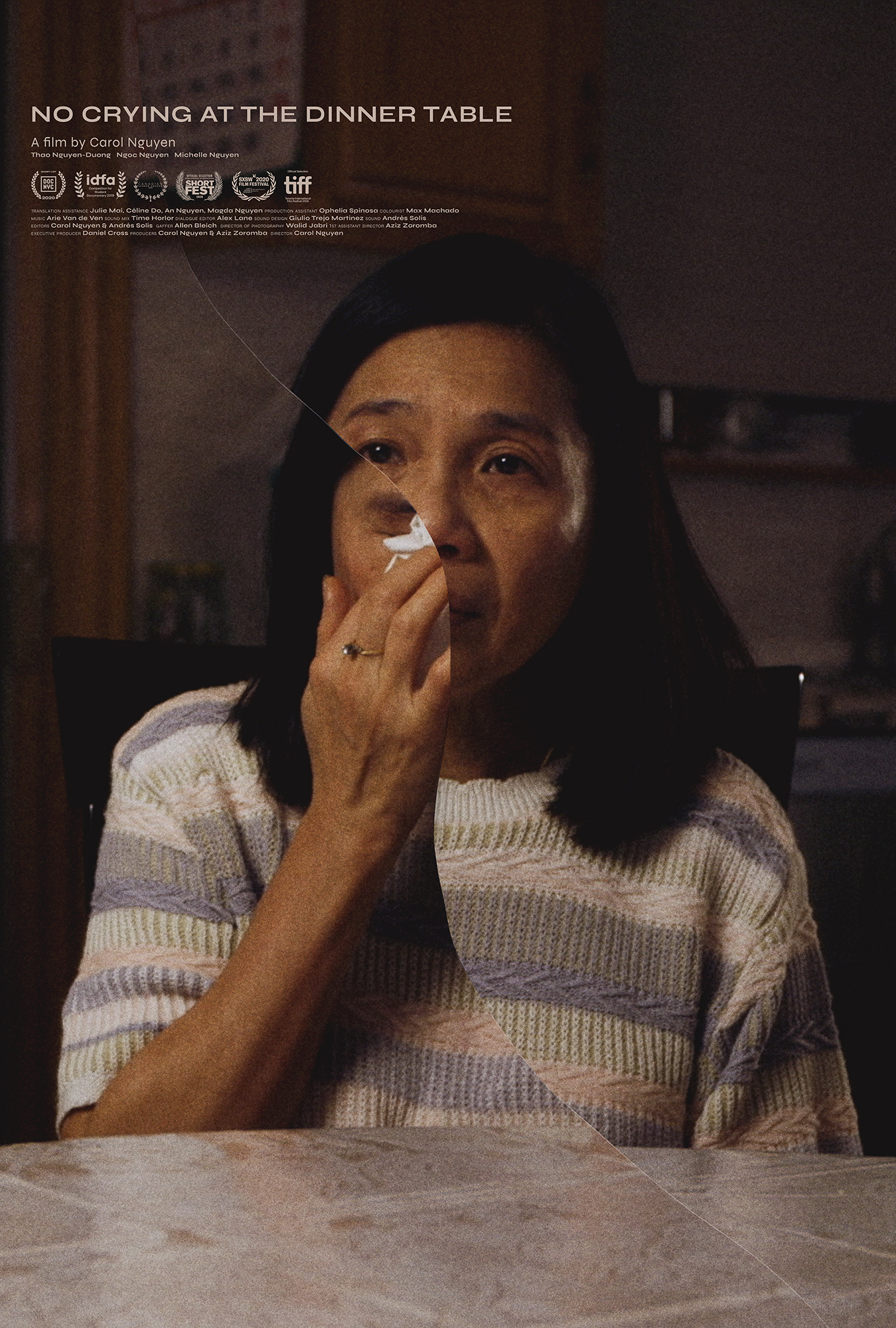
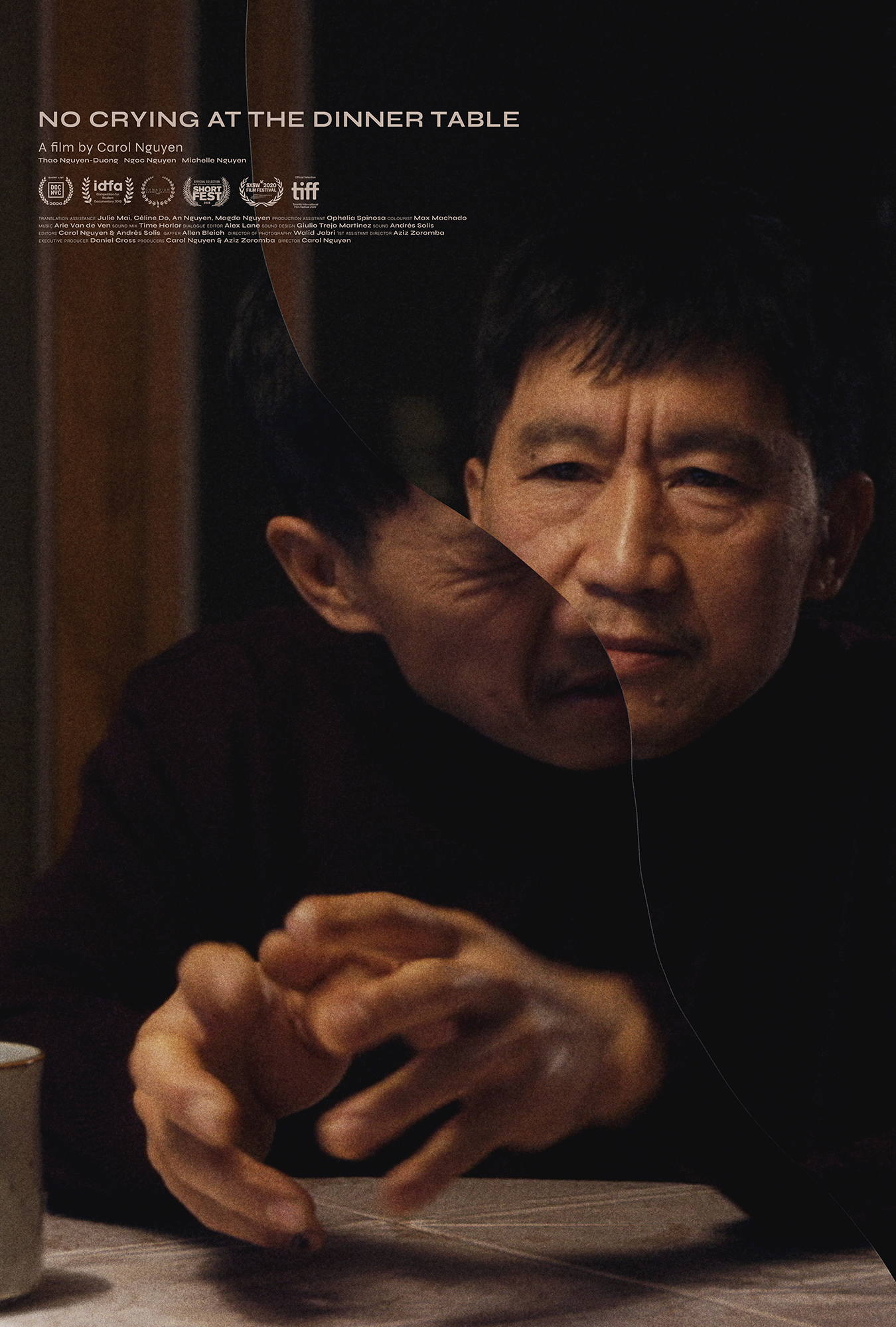
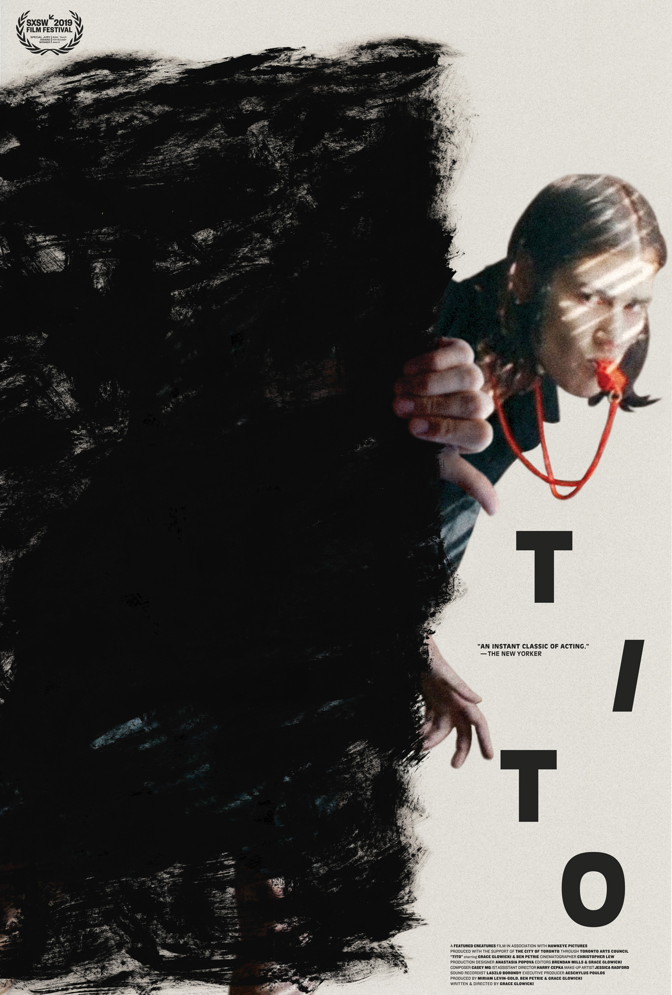
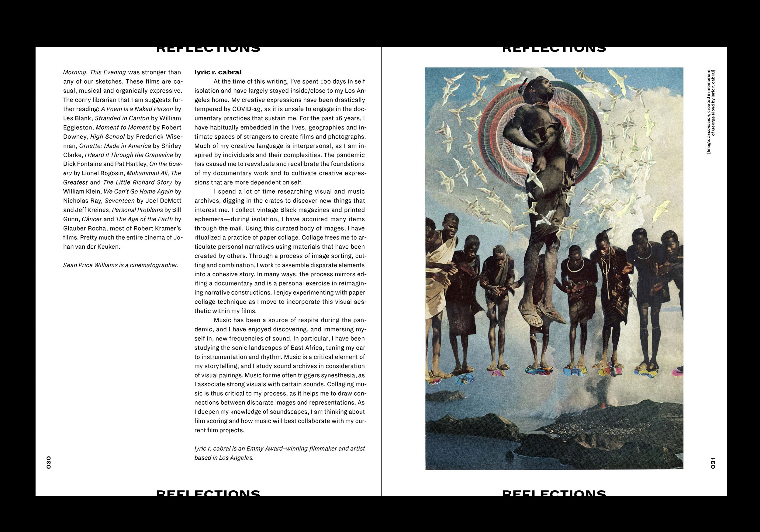
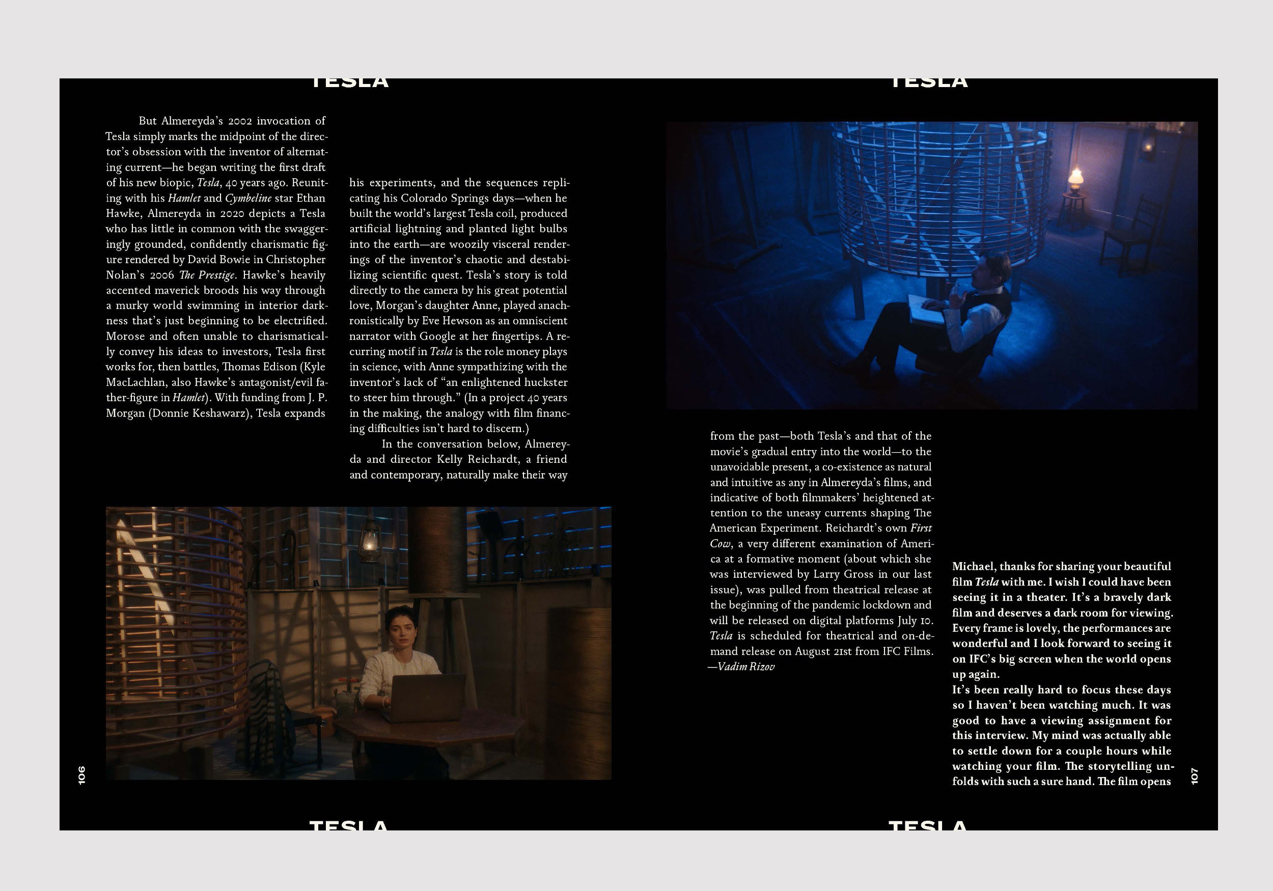
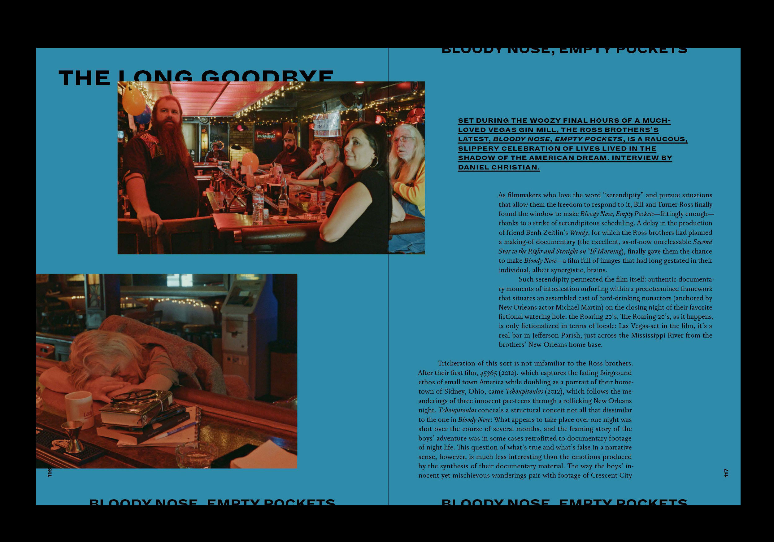
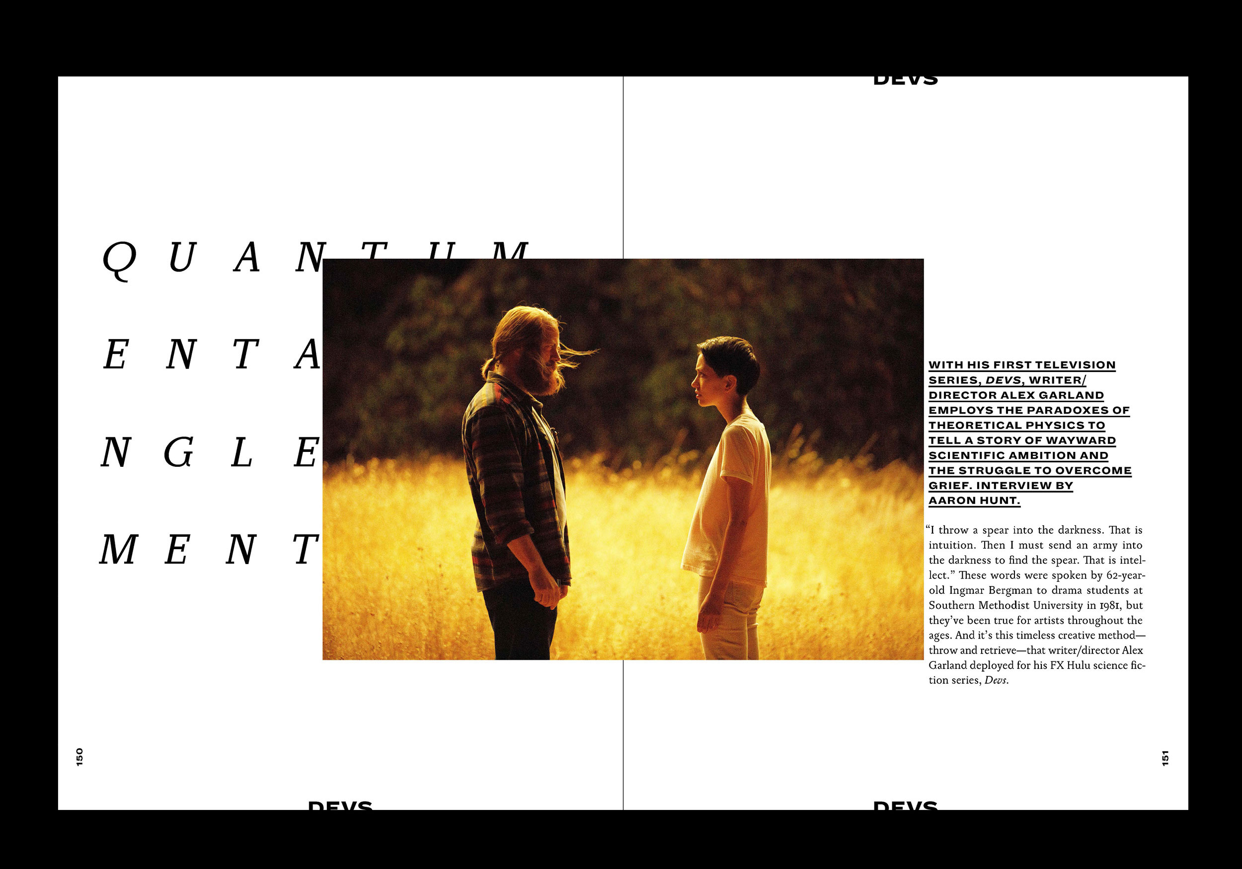
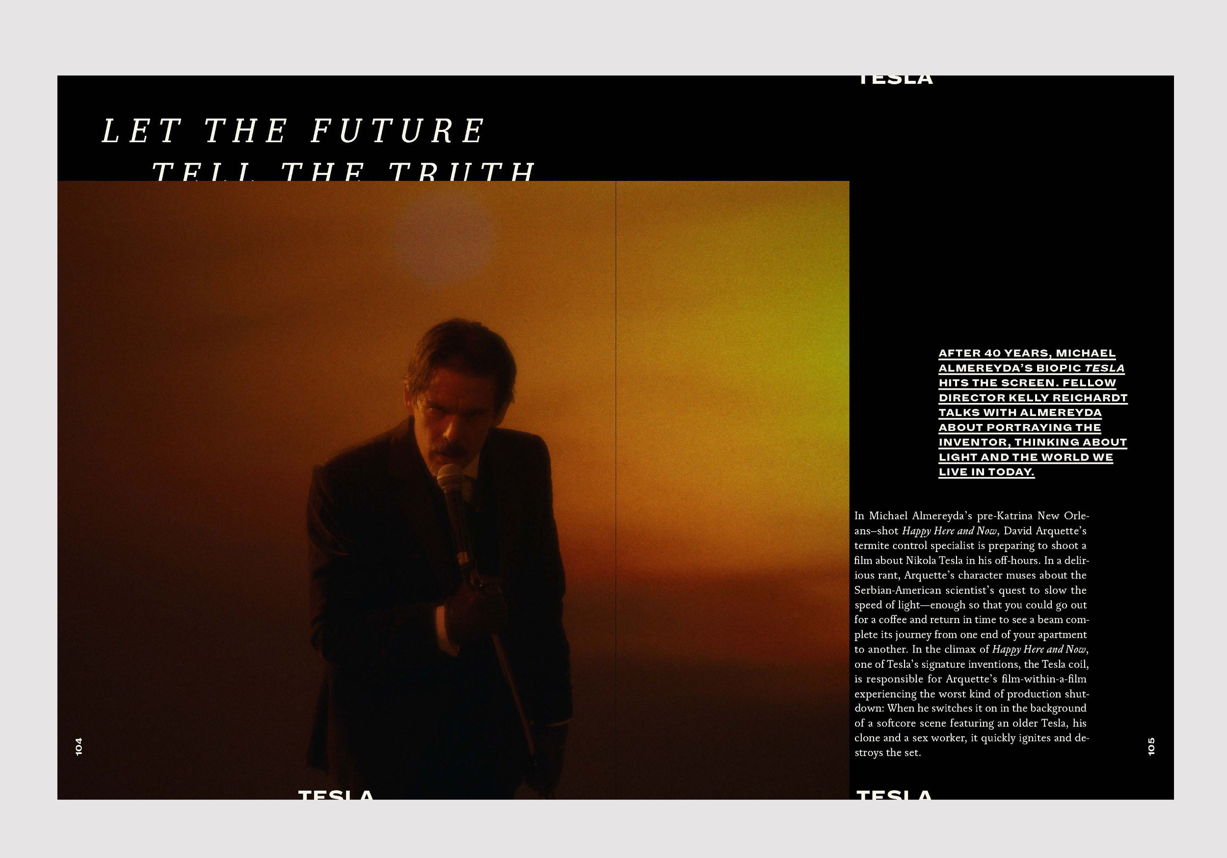
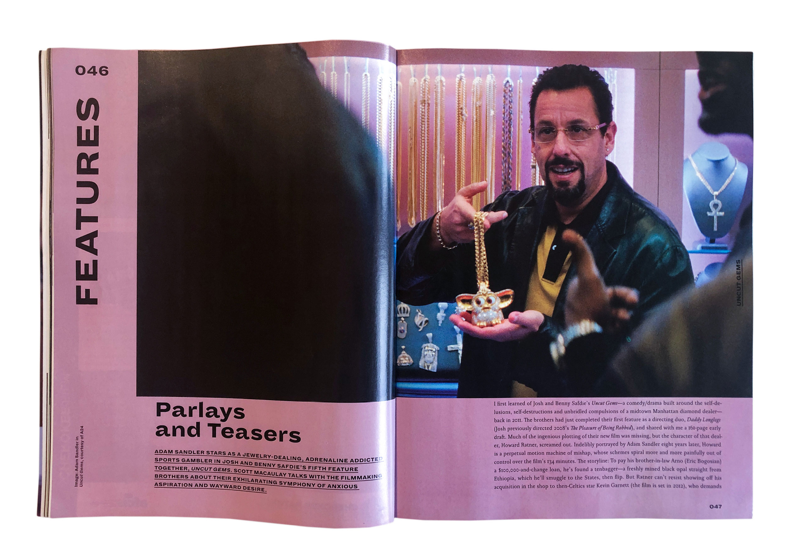
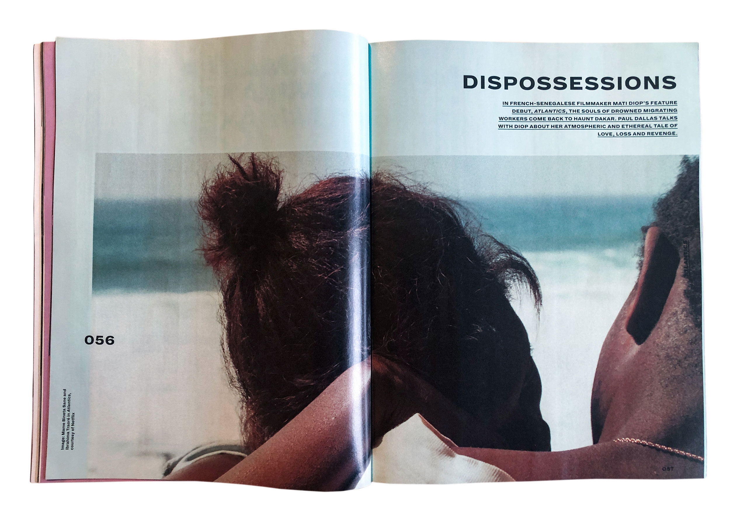
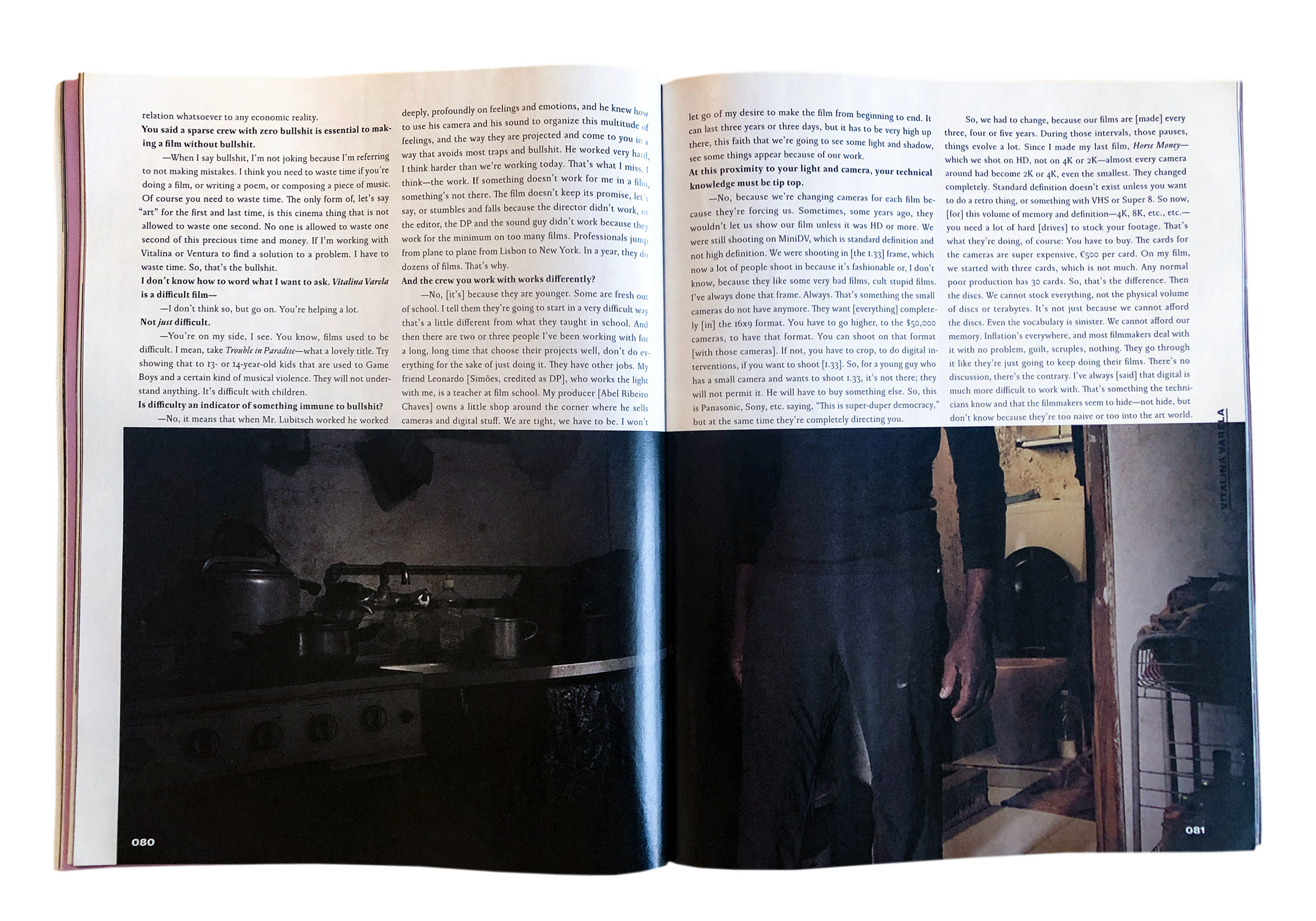
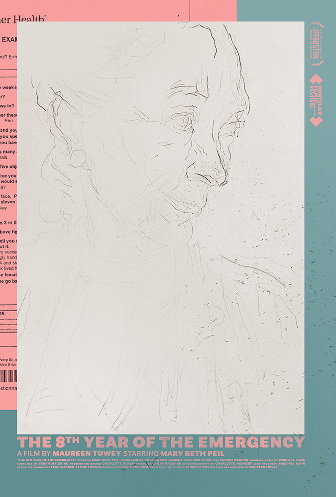
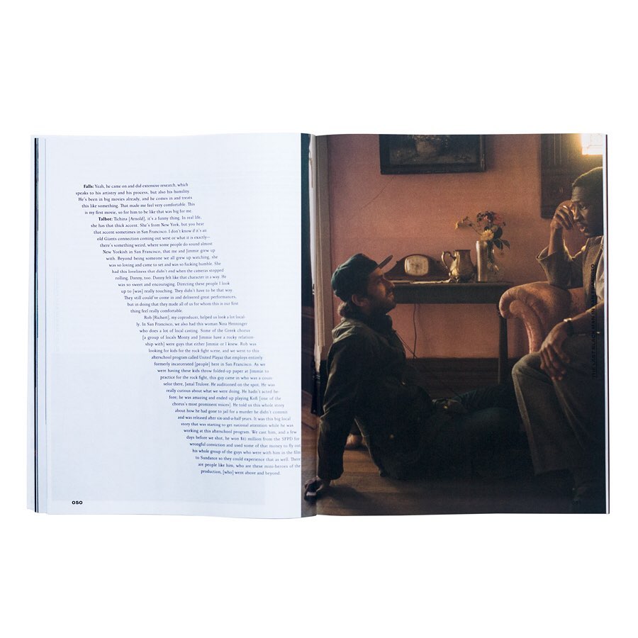
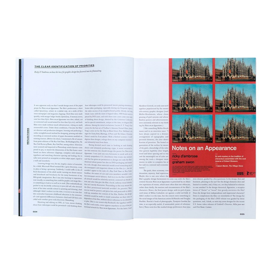
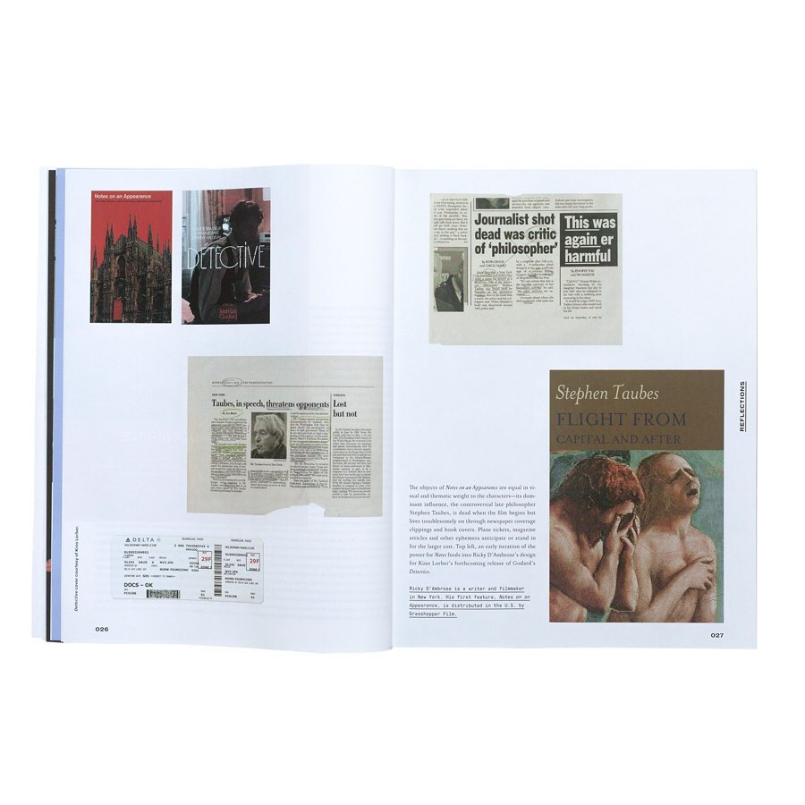
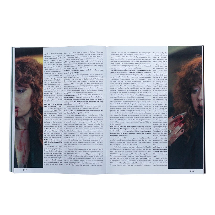
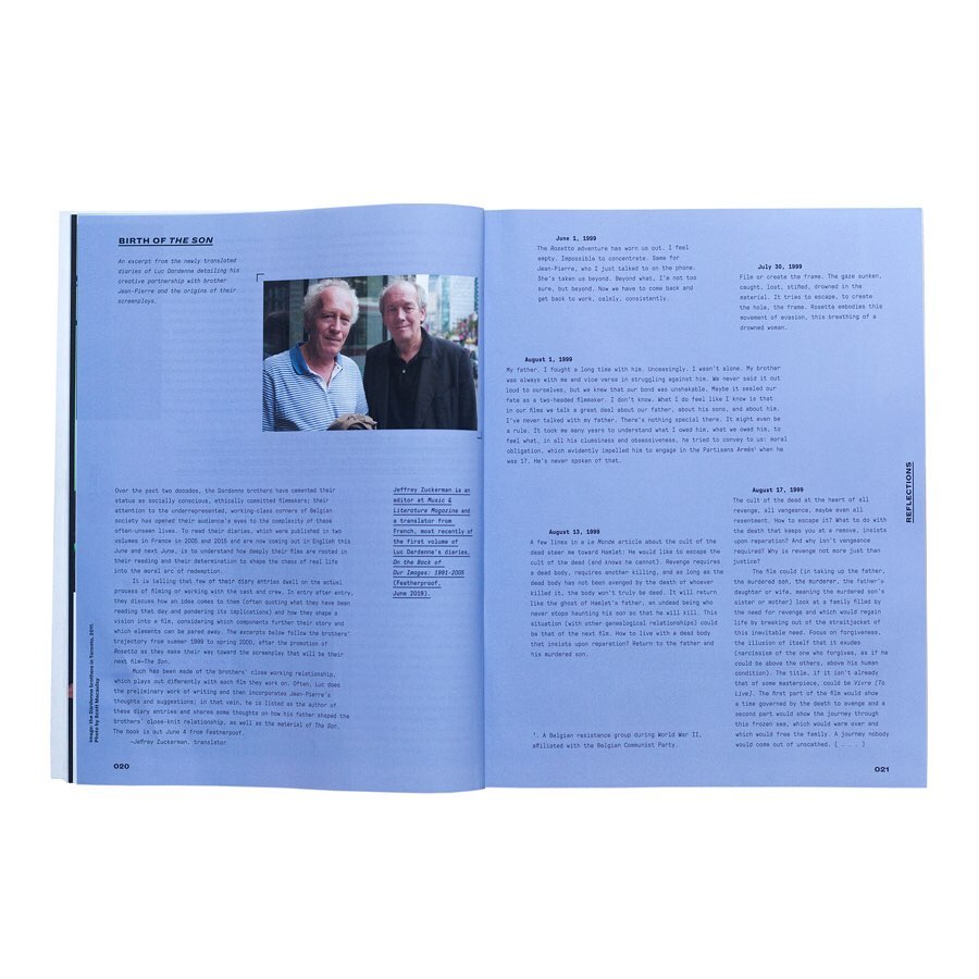
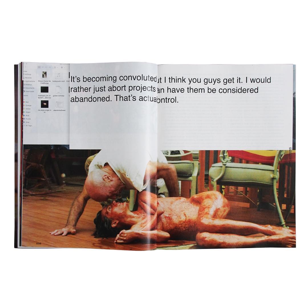
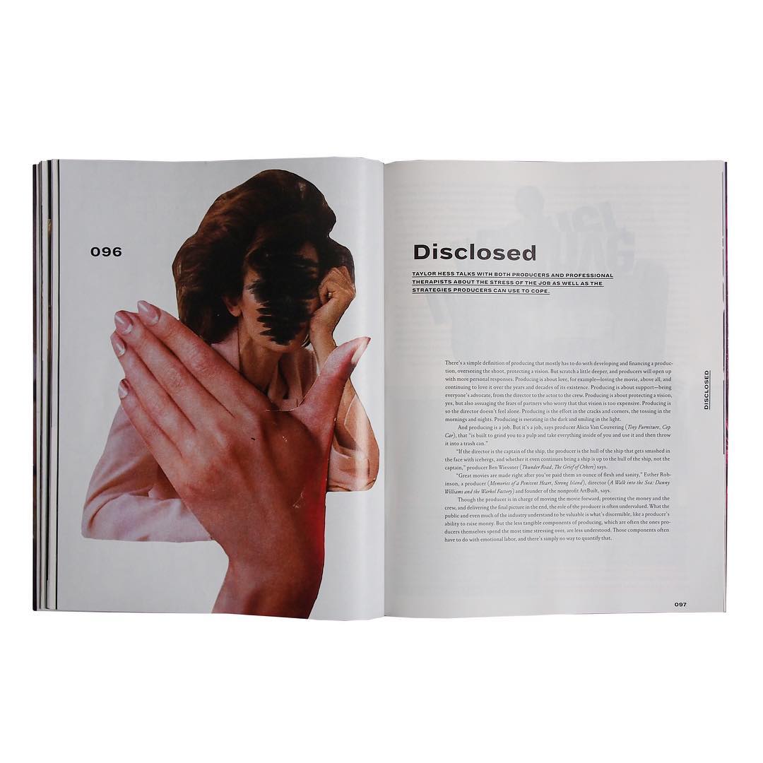
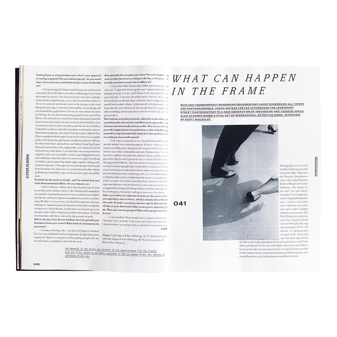
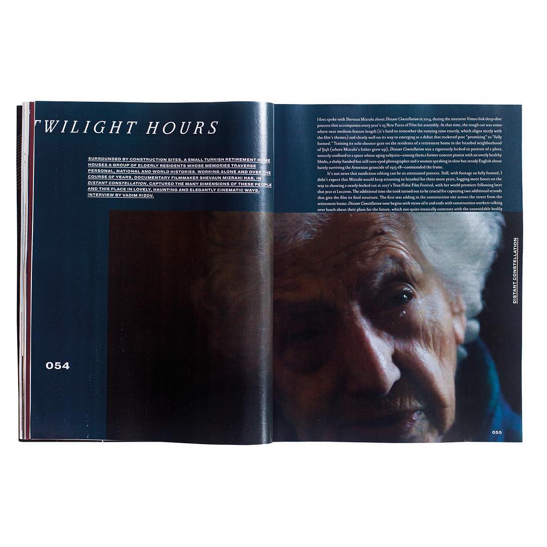
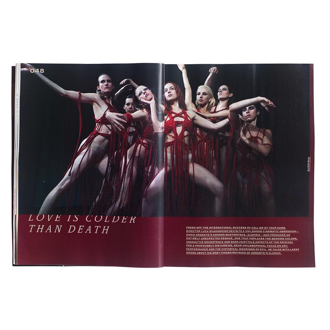
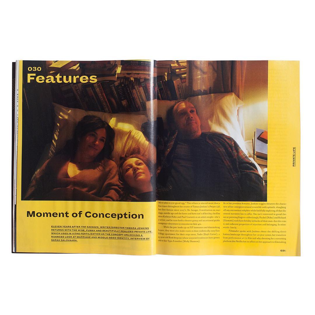
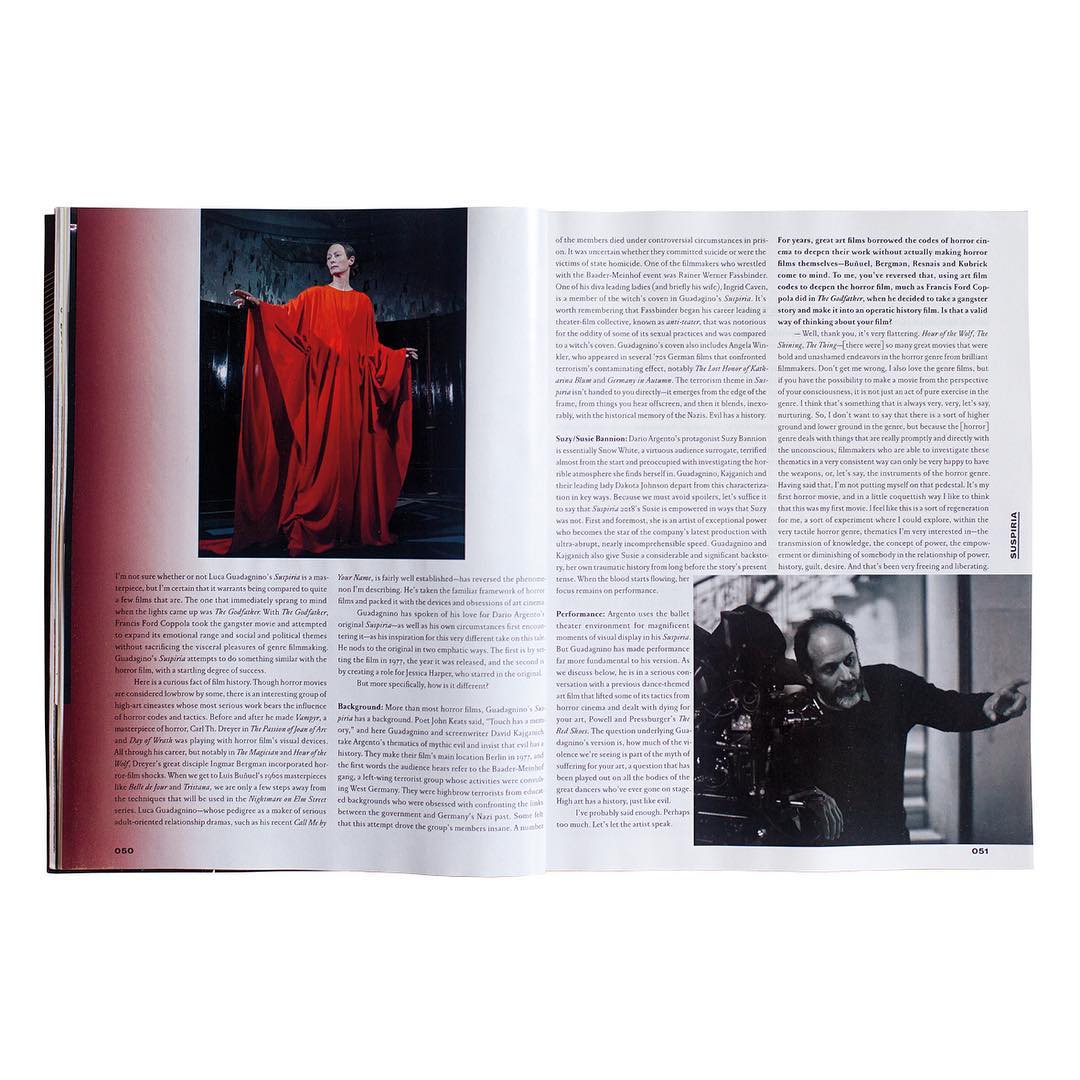
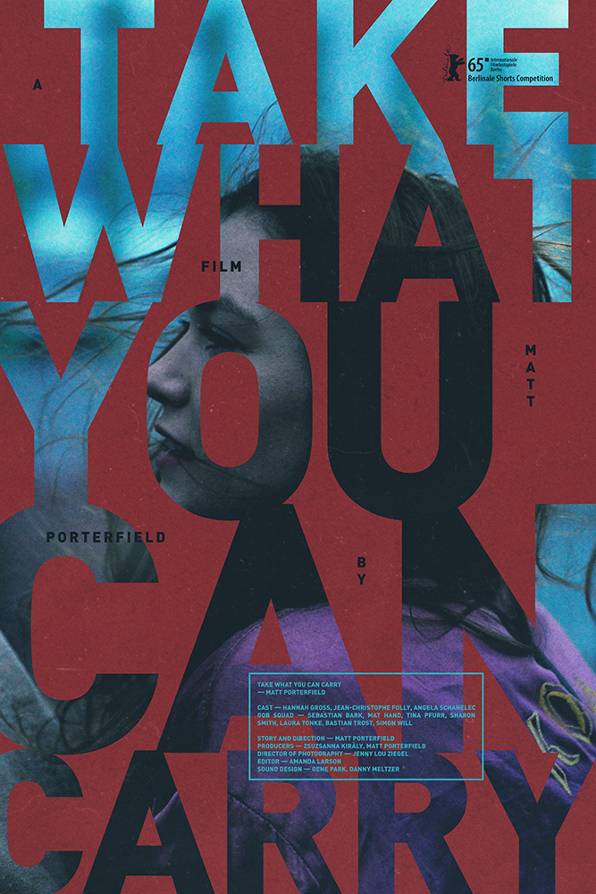
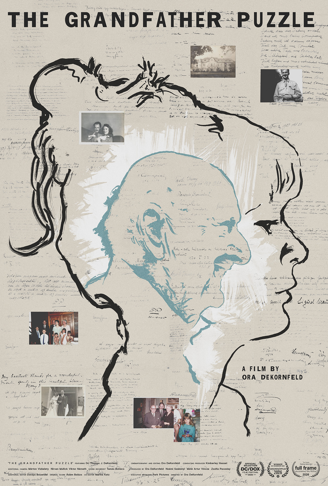
the grandfather puzzle_poster
_what
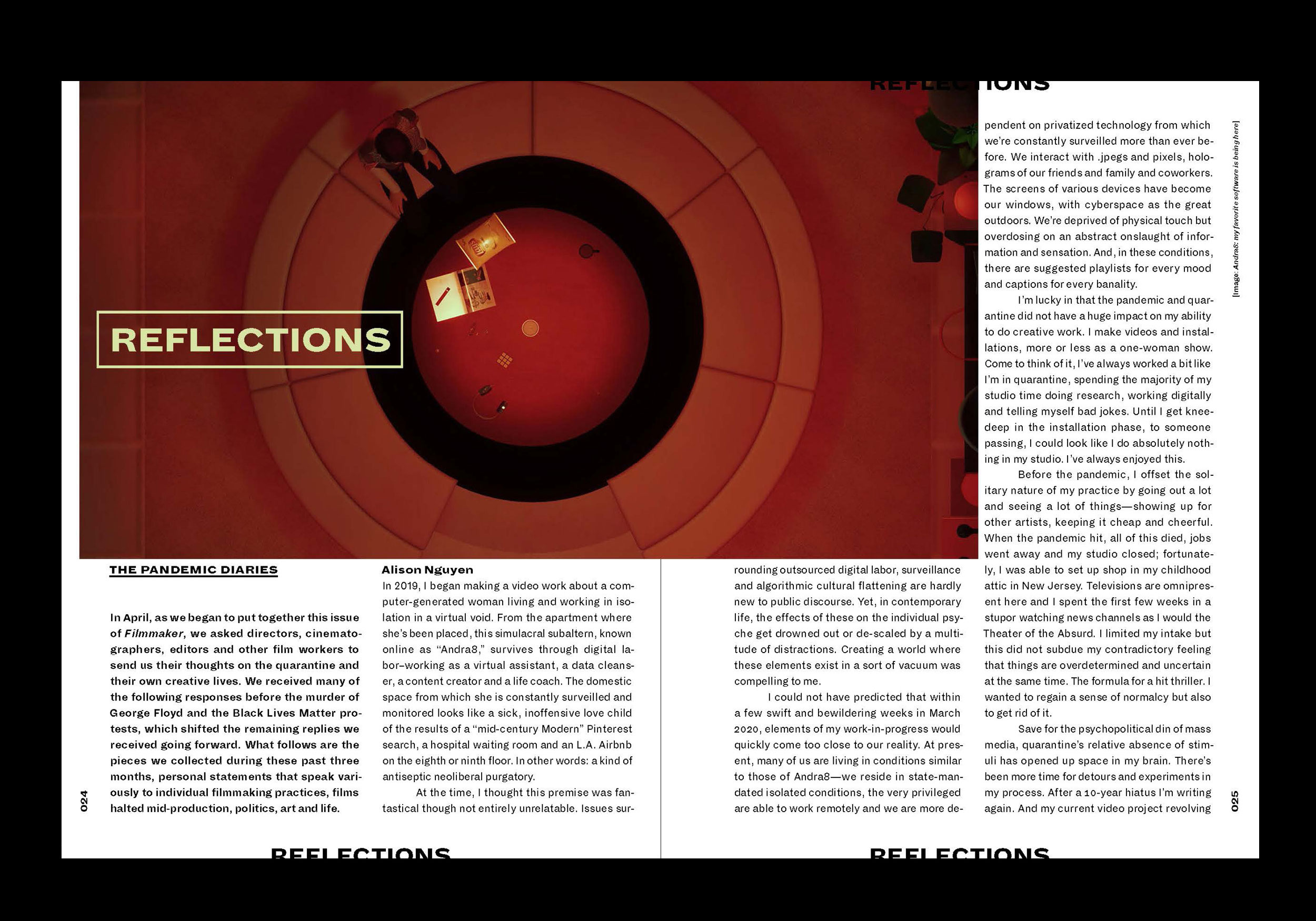
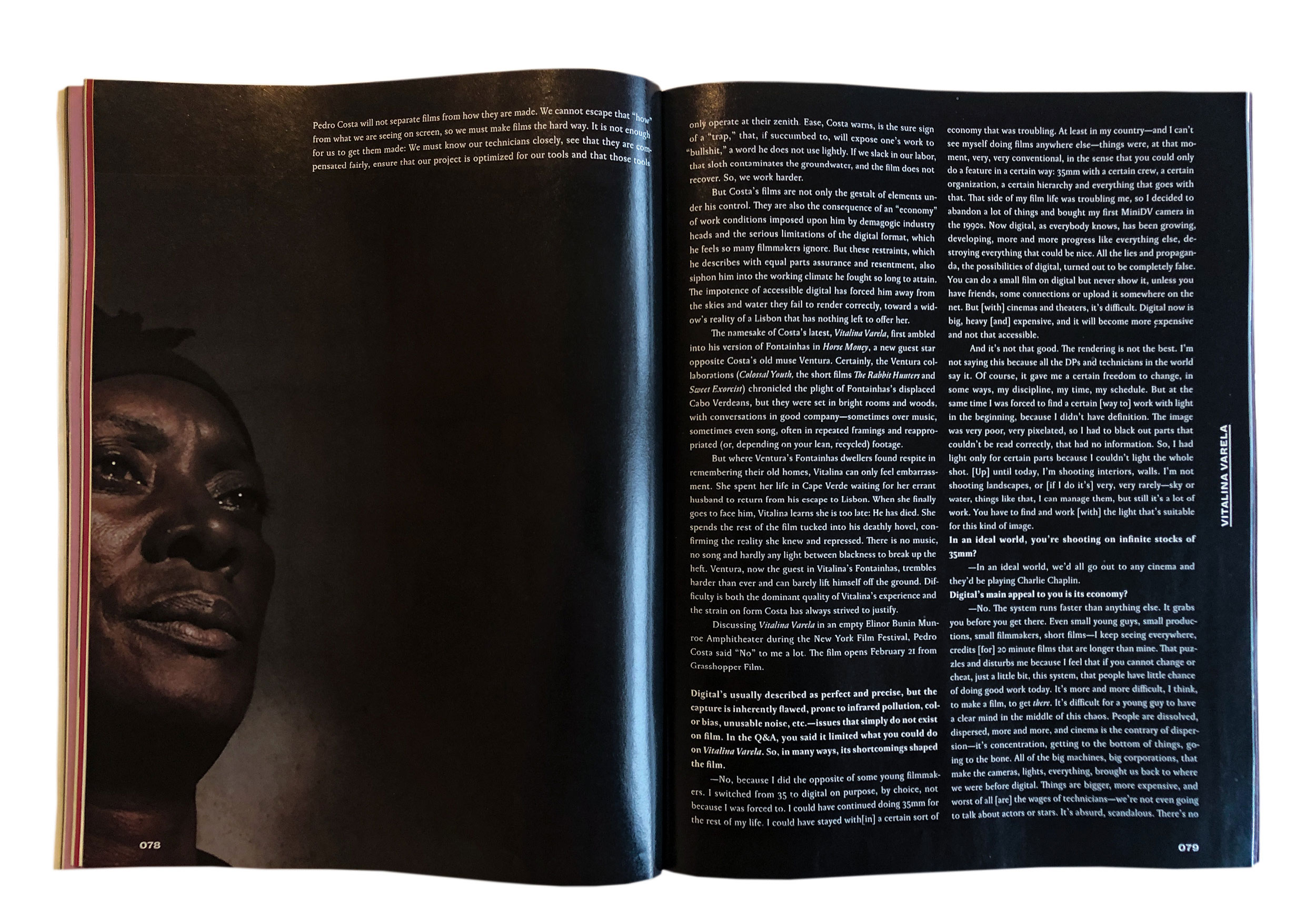
_how
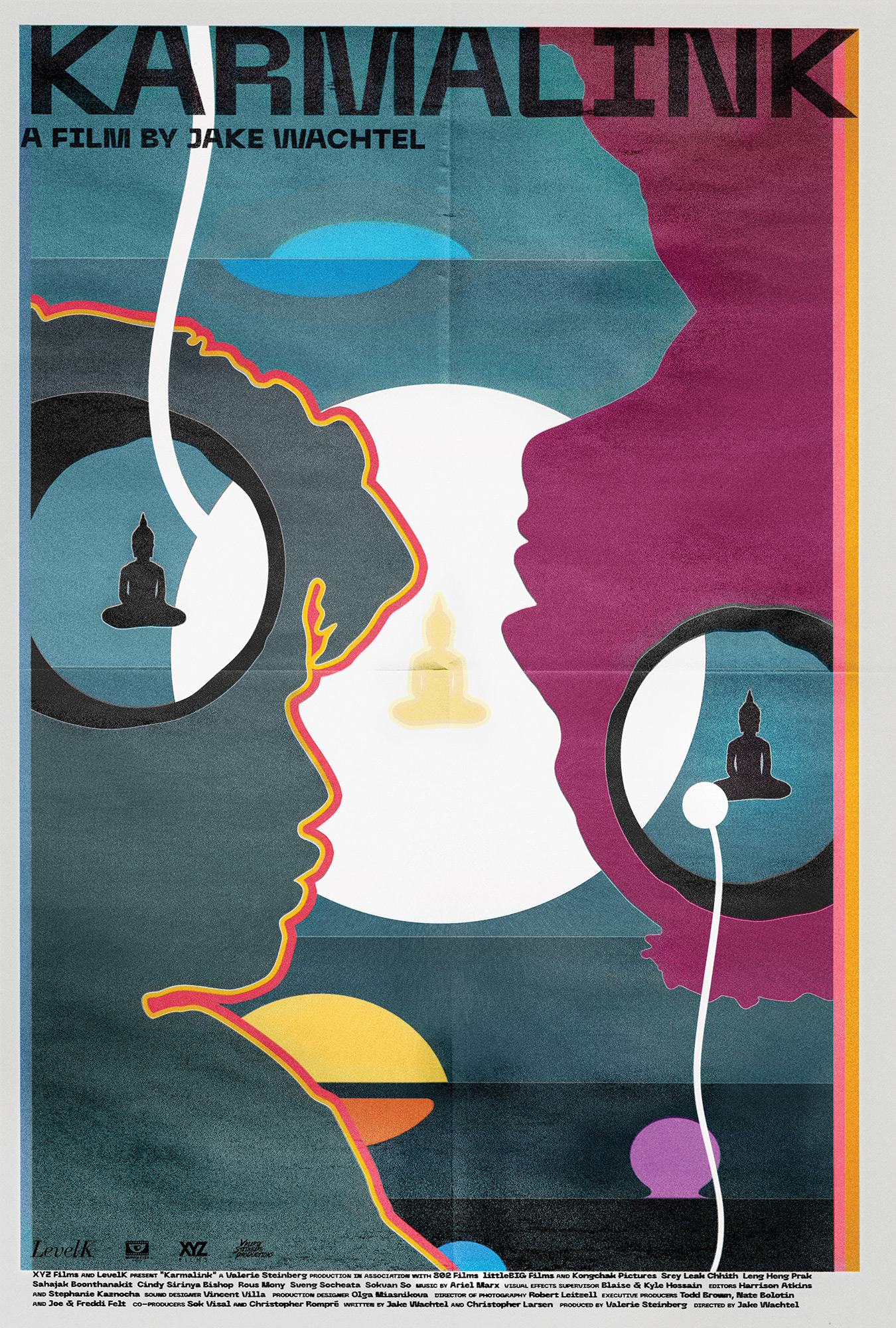
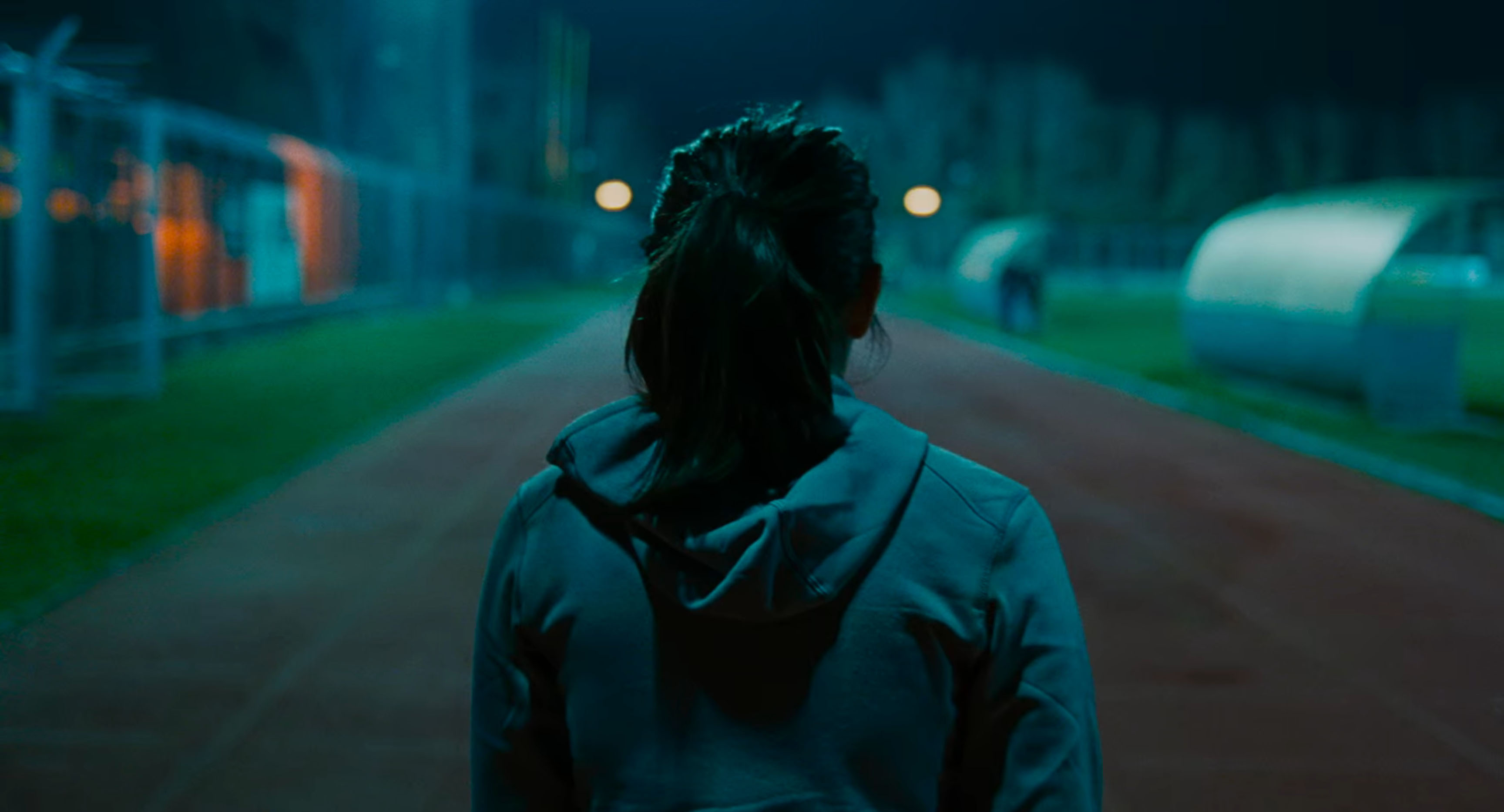
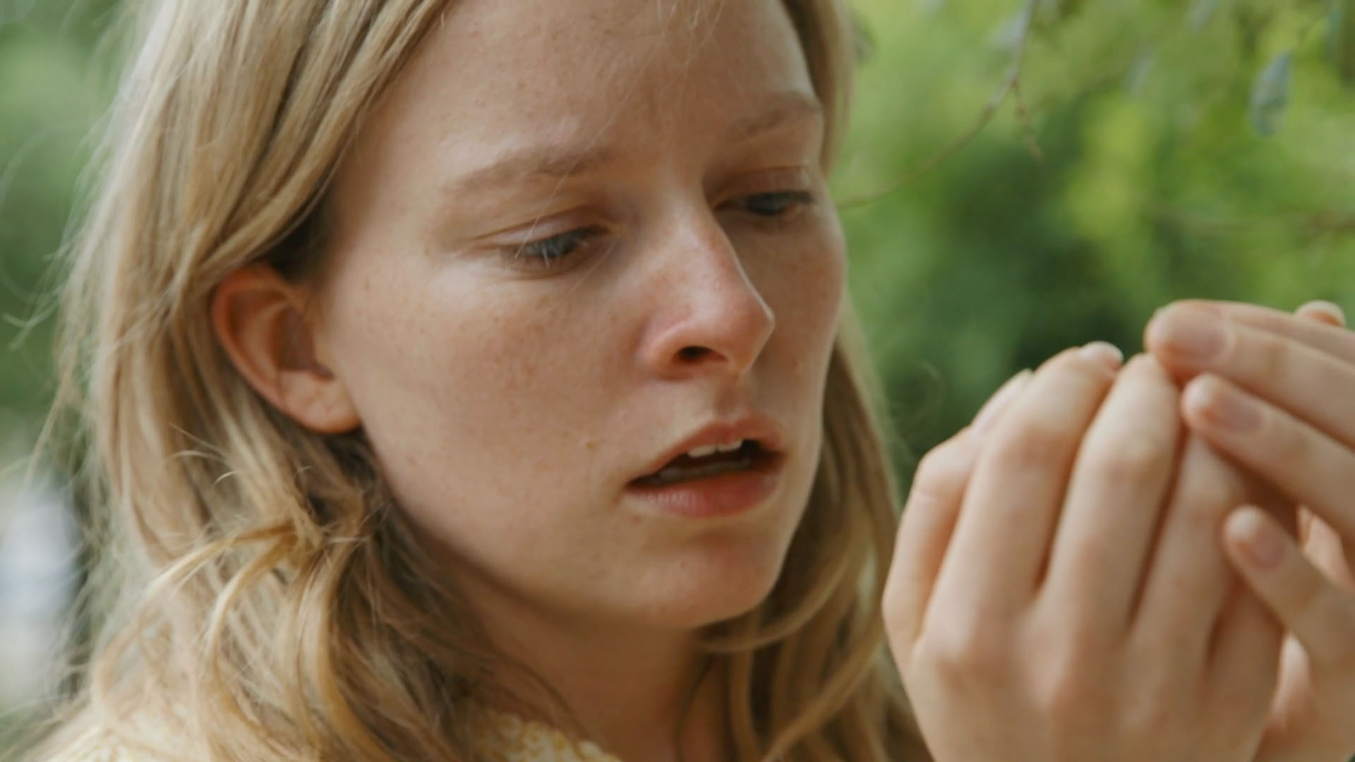
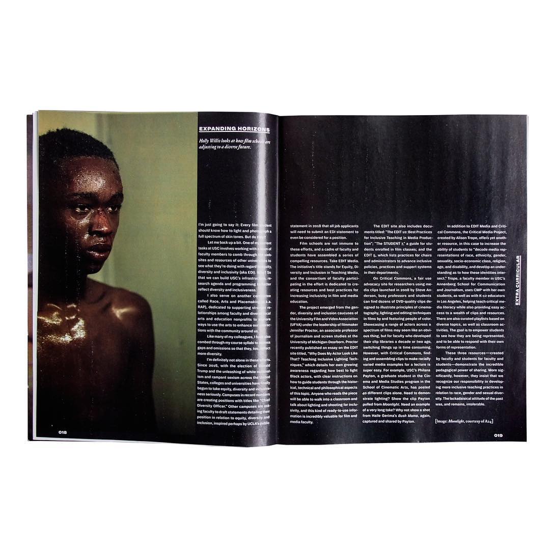
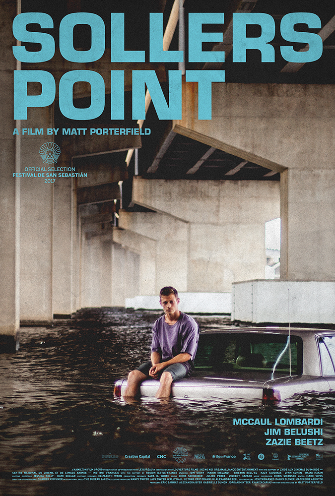
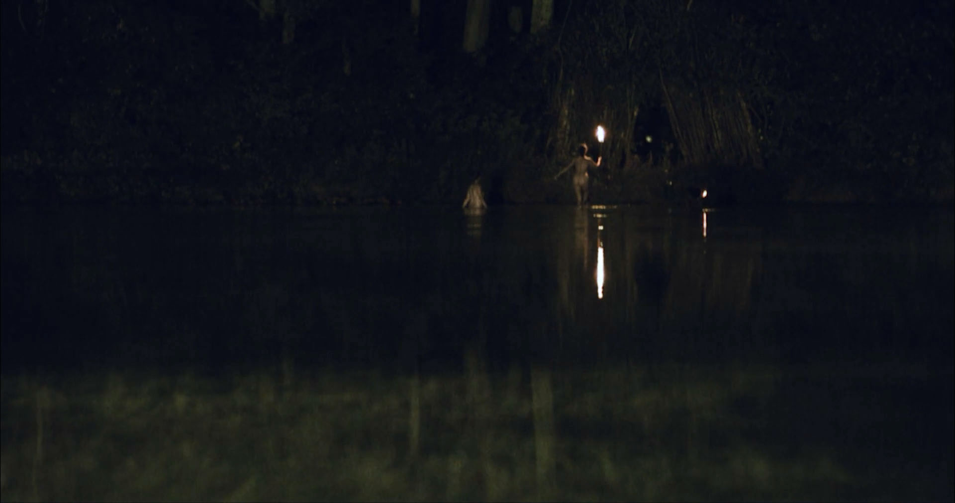
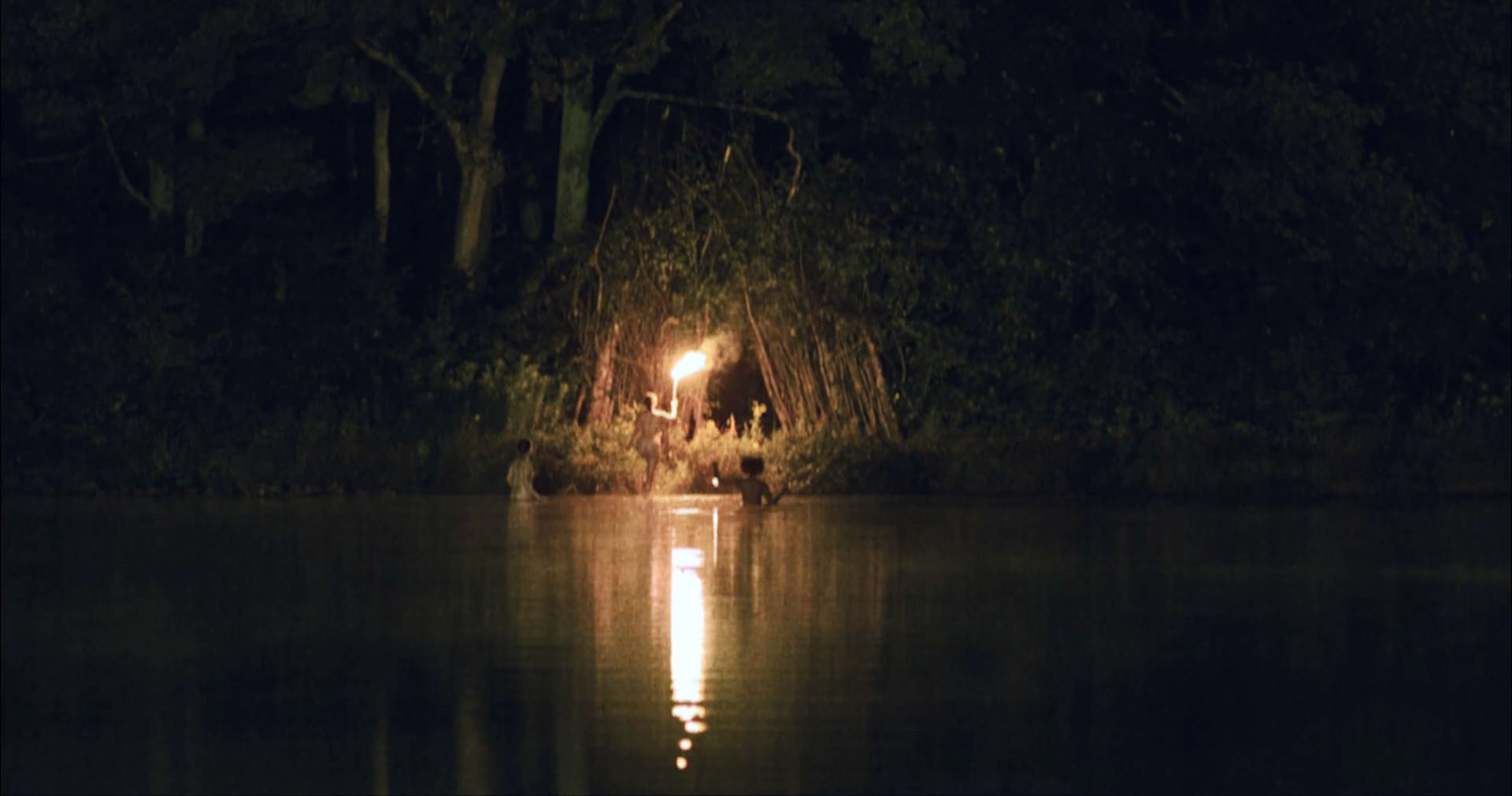
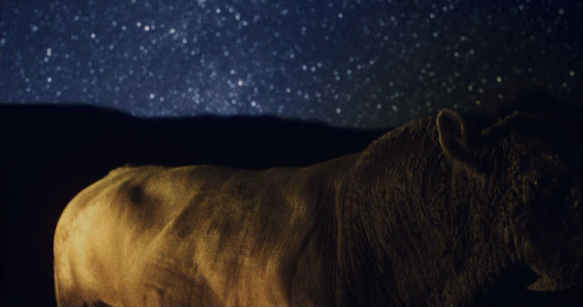
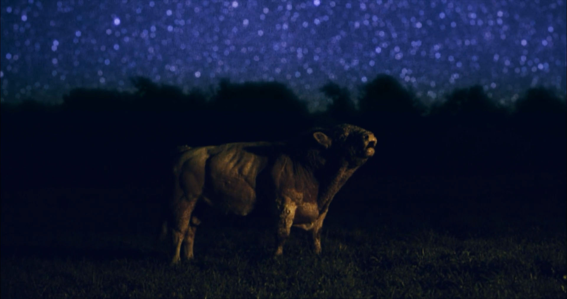
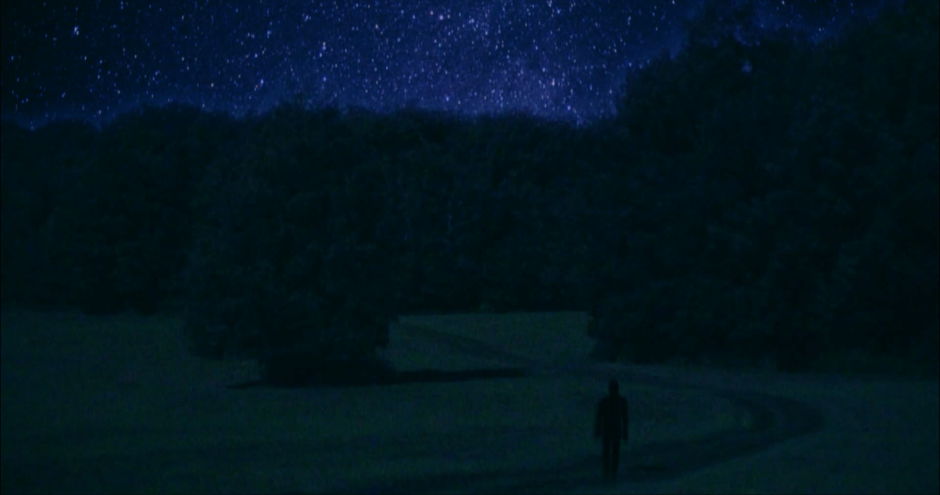
the film follows ora as she tries to solve the mystery of her 100 year old hungarian grandfather's life — a holocaust survivor, he never wants to do anything except jigsaw puzzles. seeking to bridge a silence that has defined their relationship, ora journeys to hungary to photograph locations from his past and transform them into puzzles we can solve together. arriving at her grandfather's childhood home—a castle now repurposed as a boarding school—ora is unprepared for how the locals receive her: "has the baroness come to reclaim the castle?" what began as a simple quest to connect with her grandfather transforms into a darkly comedic exploration of identity, belonging, and the stubborn untidiness of historical memory.
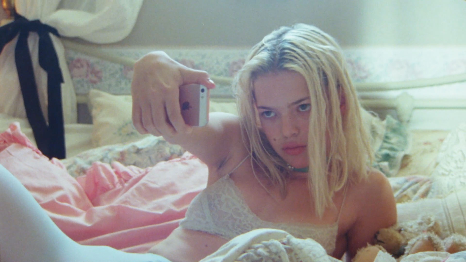
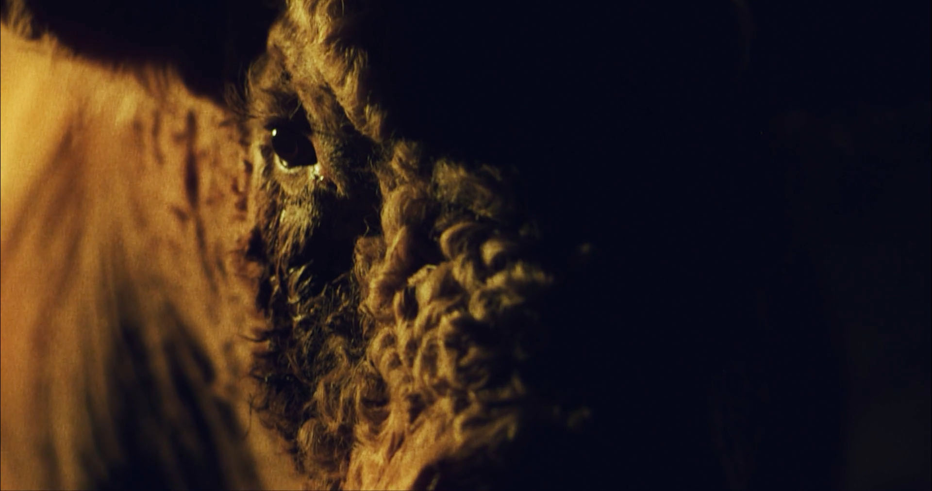
we took a shine to the film for various reasons and jumped on a call with ora. after some discussion we presented her with a range of directions the poster could take. ora chose the one you see here. it was inspired by the piece selfie 20230107 by patrick thomas and by the cover artwork of the rolling stones greatest hit compilation hot rocks 1964-1971. ora sent us a photograph of her own profile and with that and other bits and pieces from the film, caspar laid the poster out, hand painted it and scanned it all in for finishing in the berlin studio.