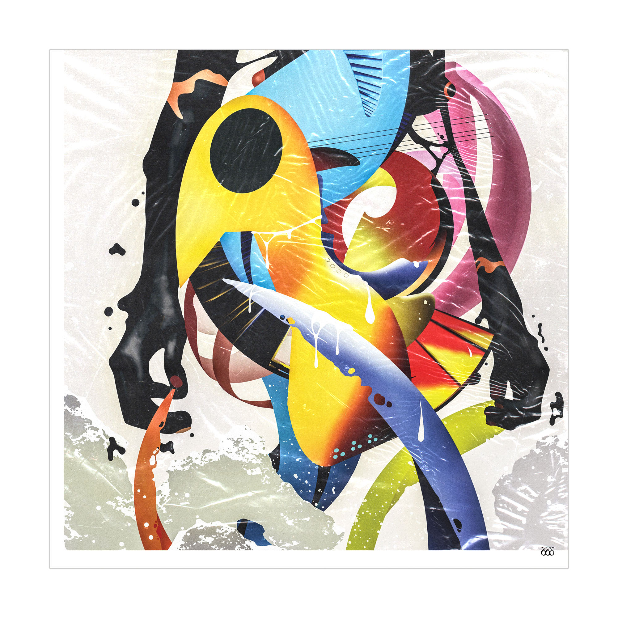
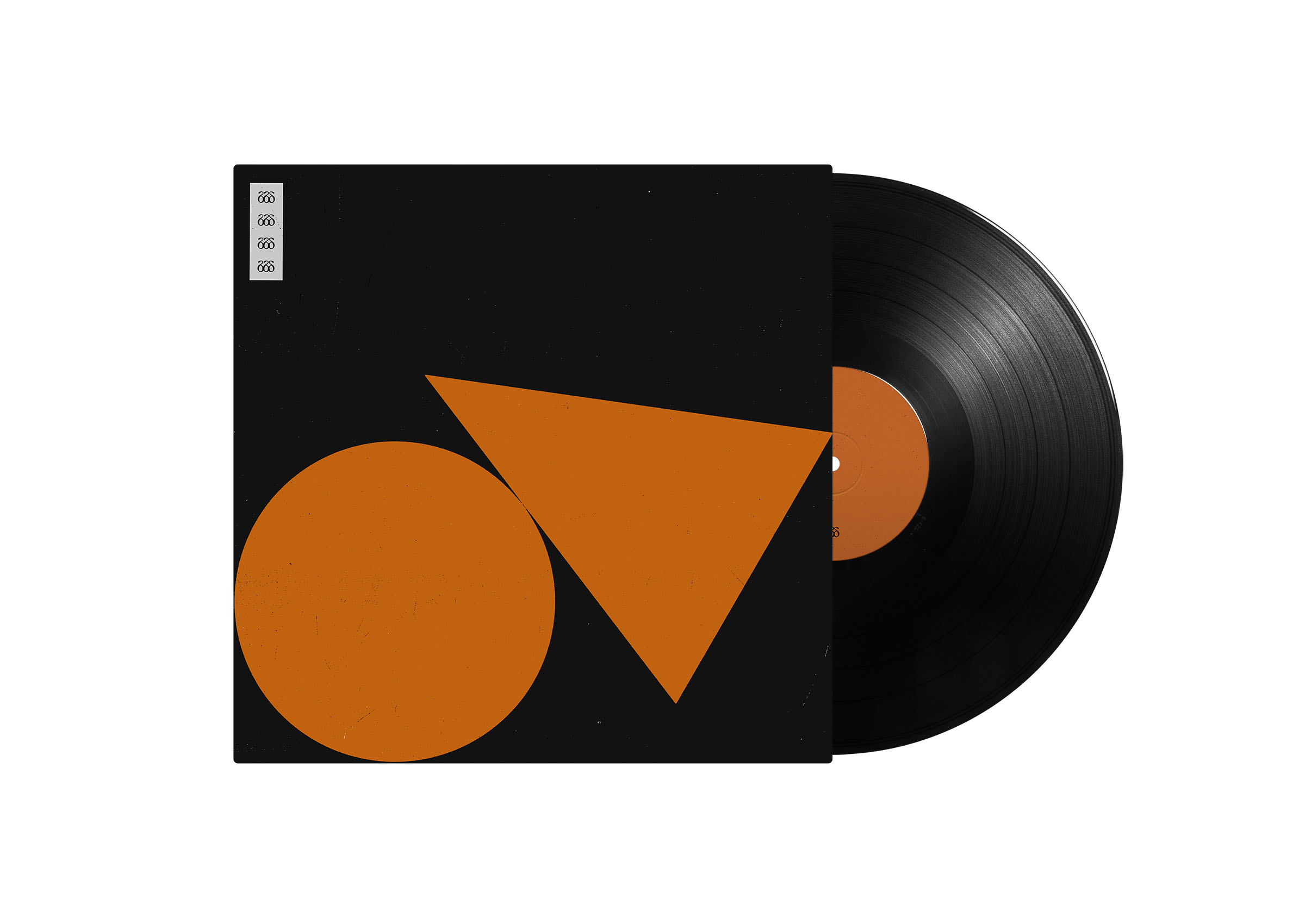
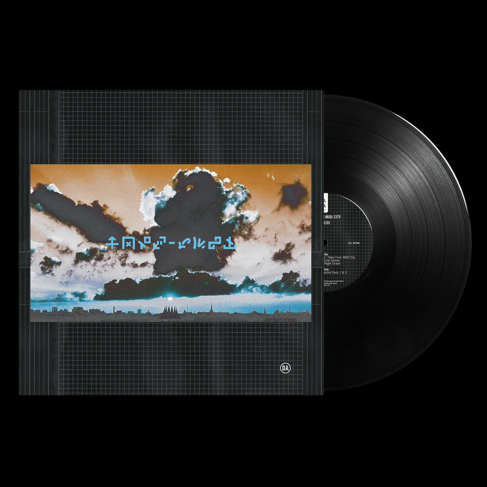
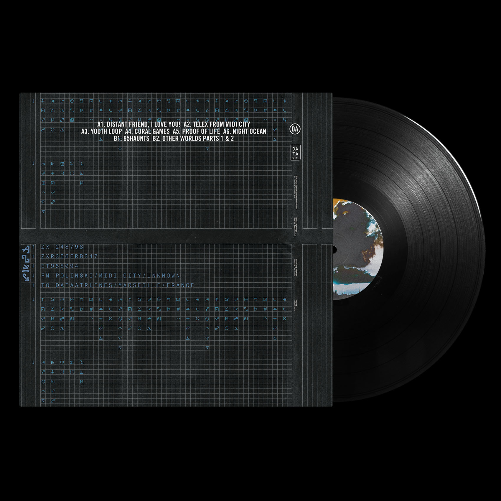
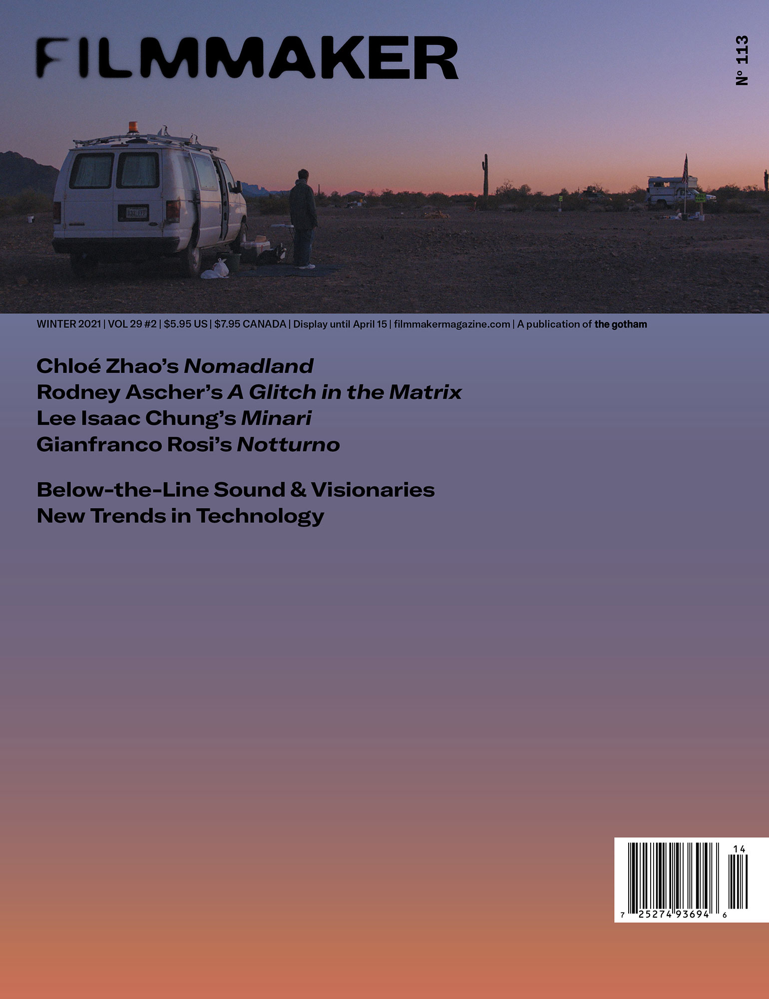
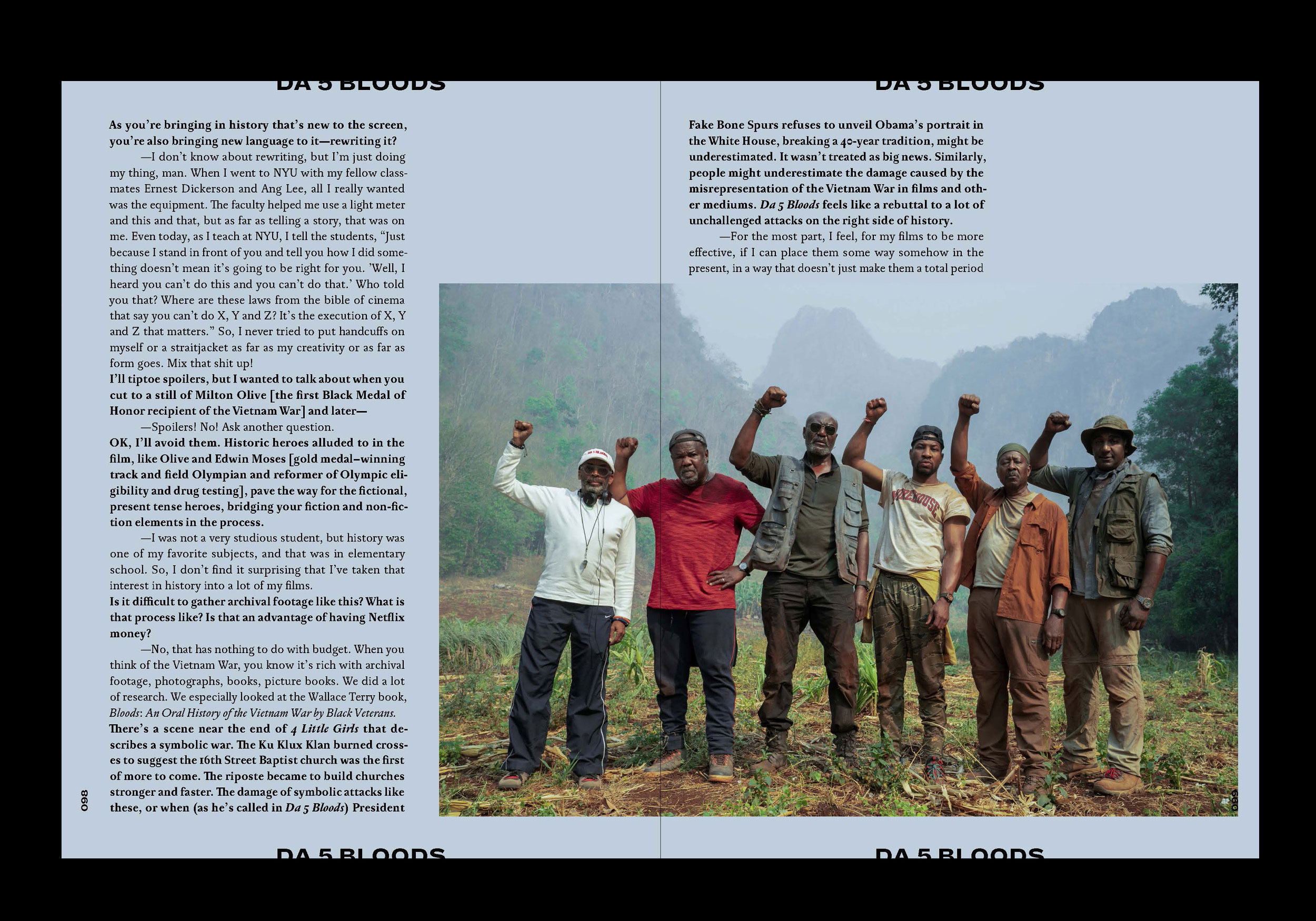
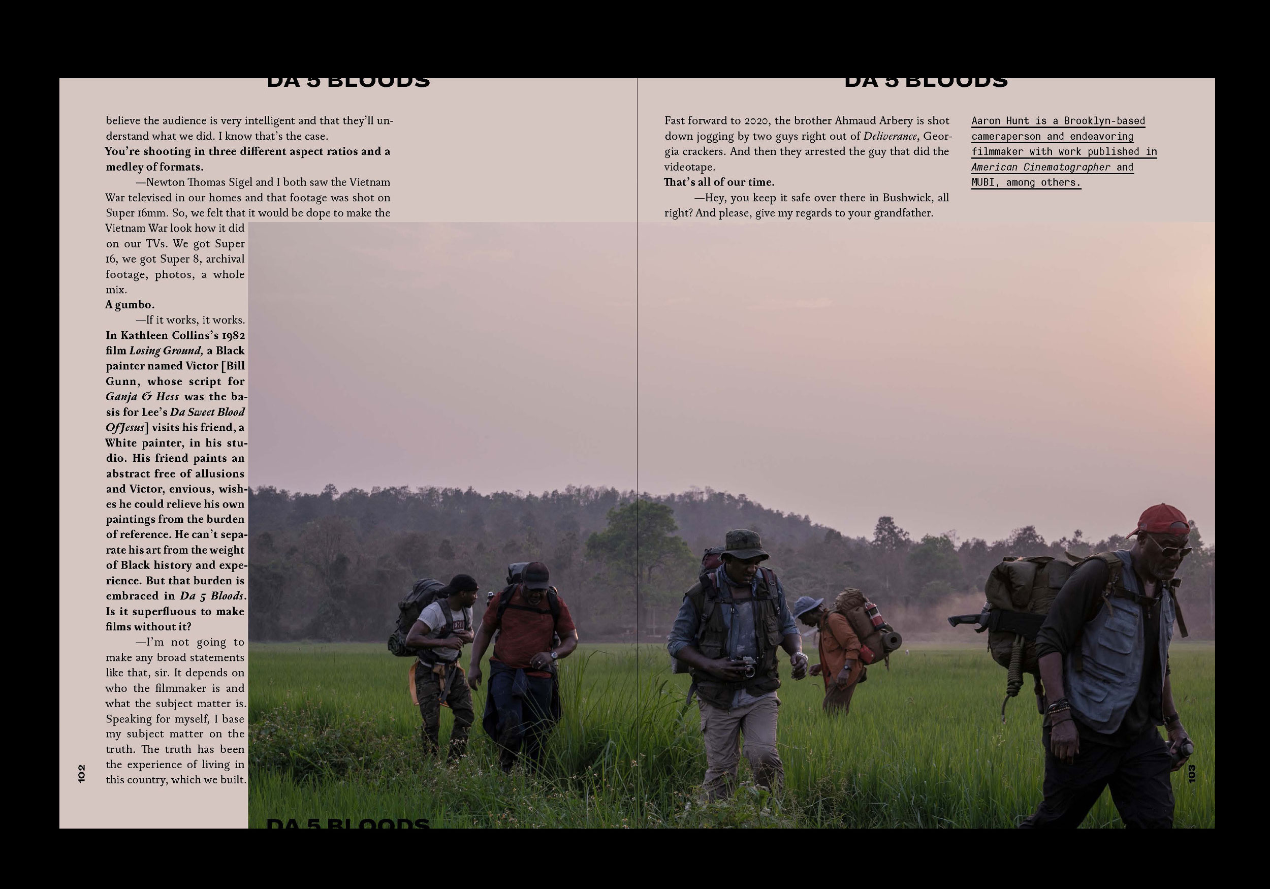
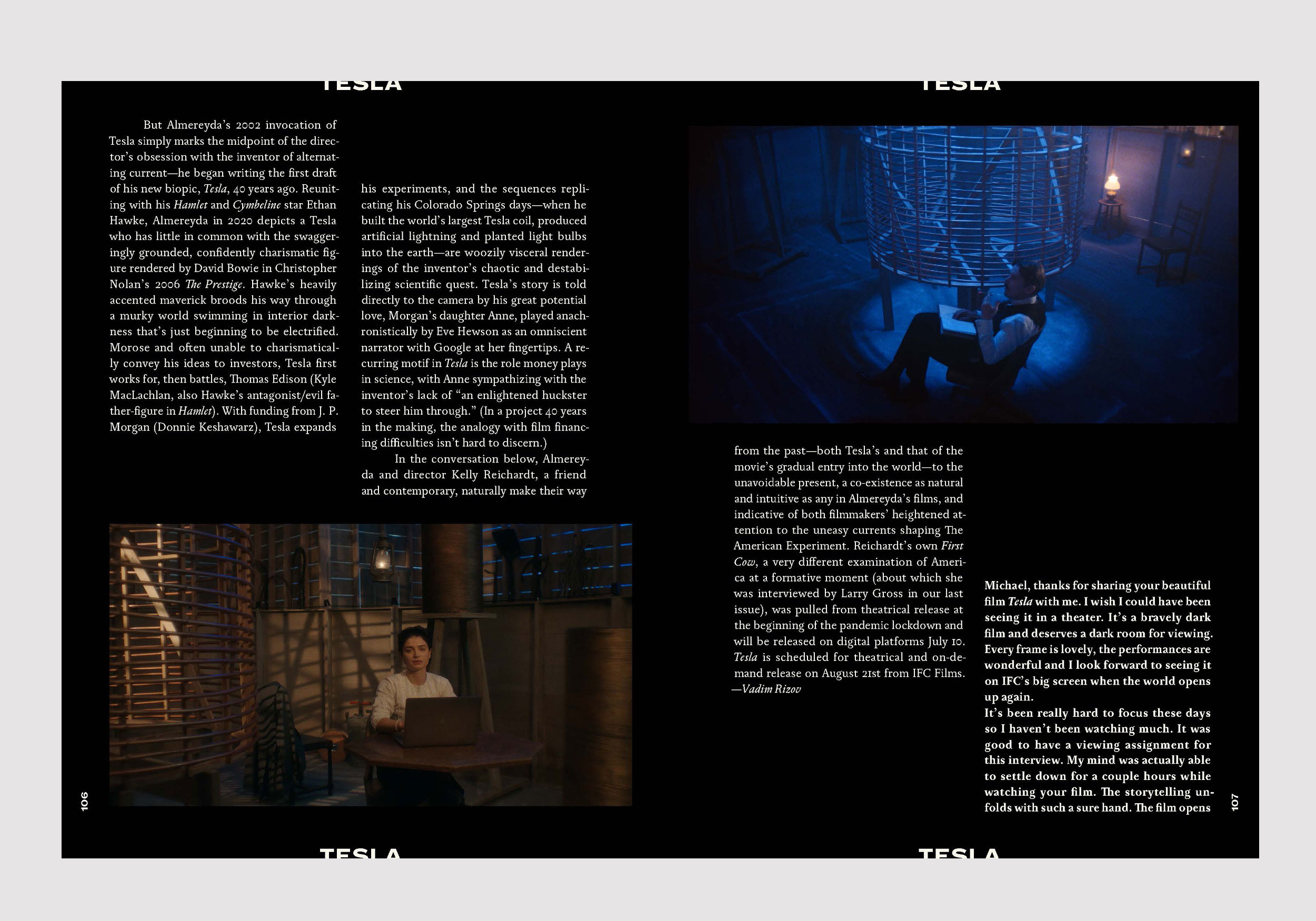
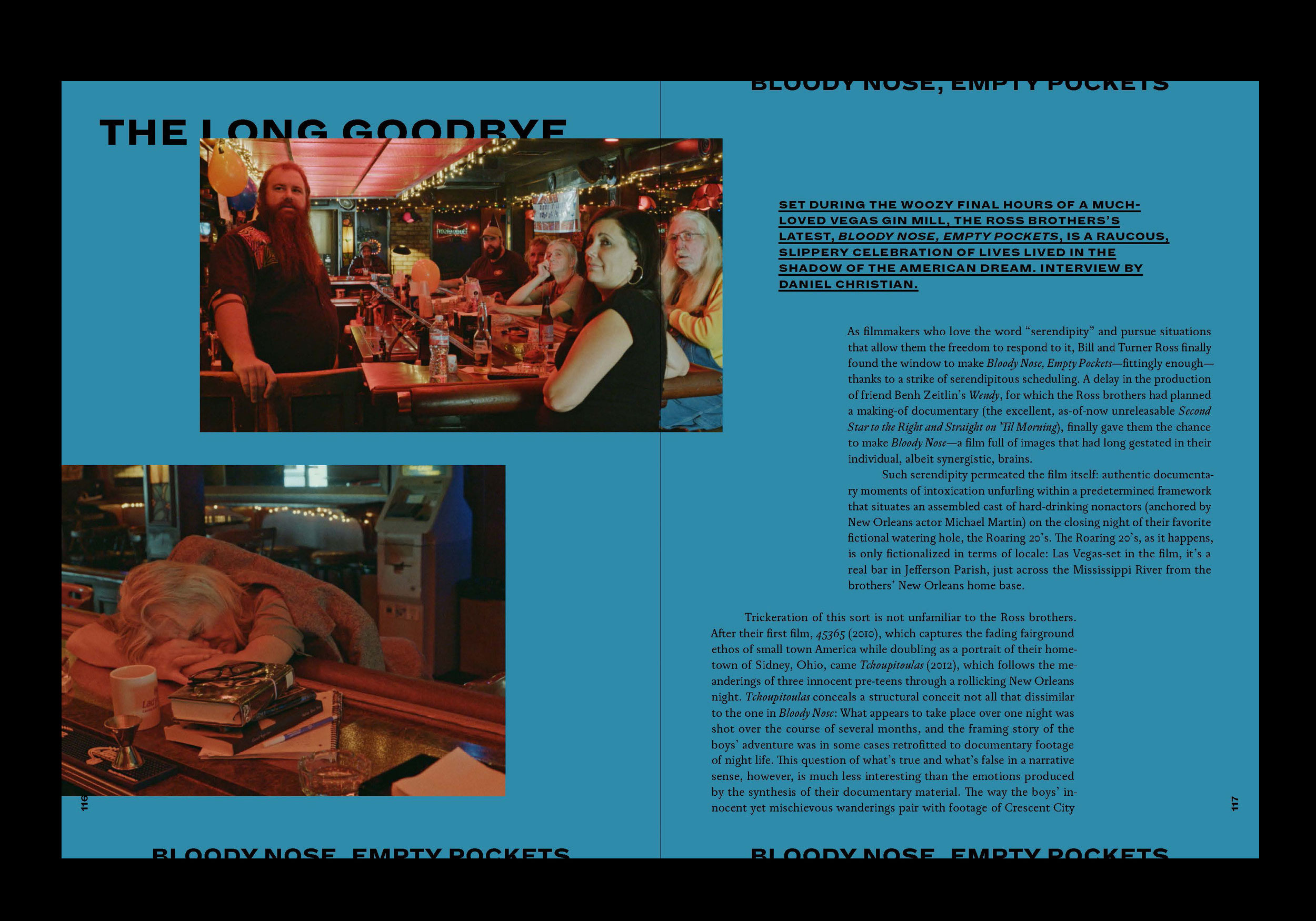
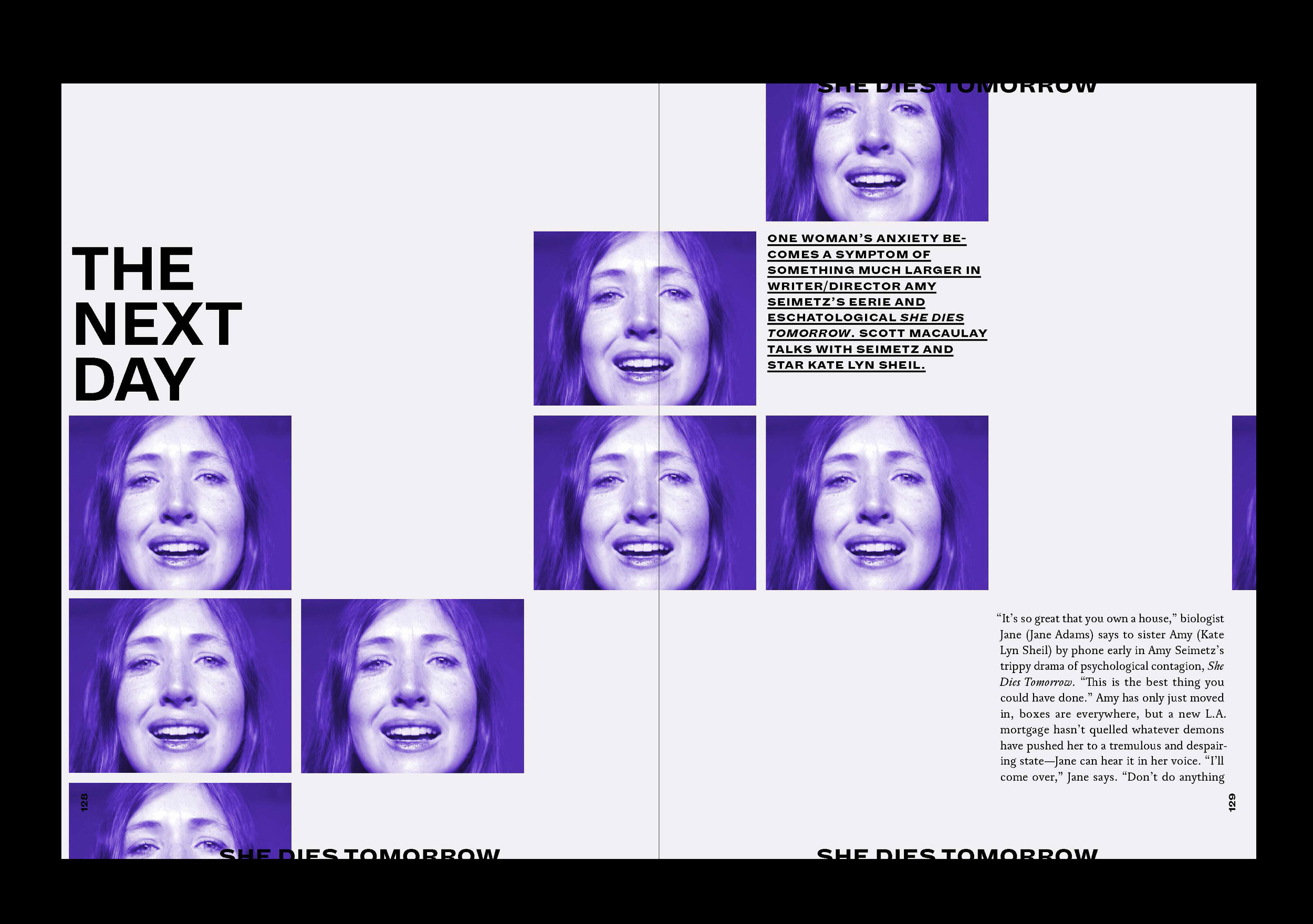
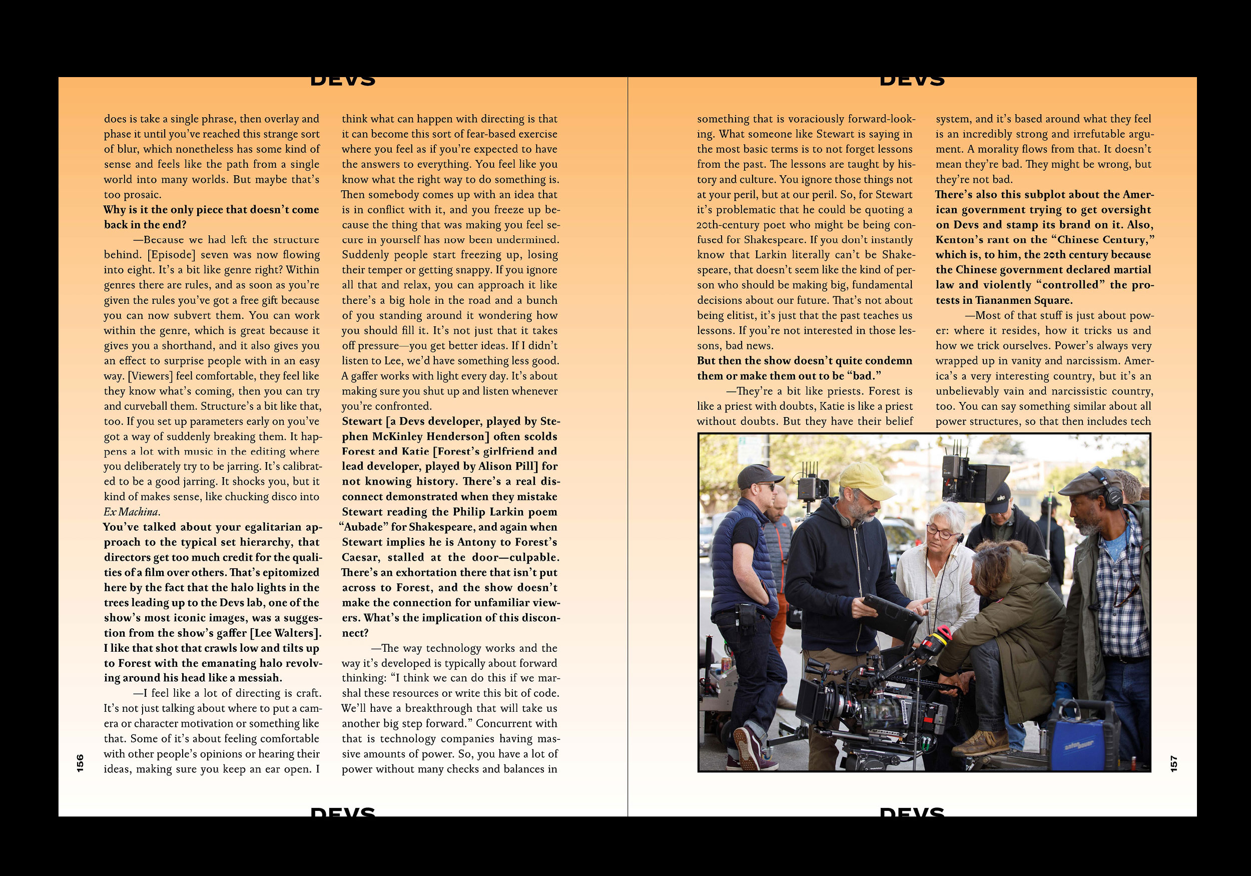
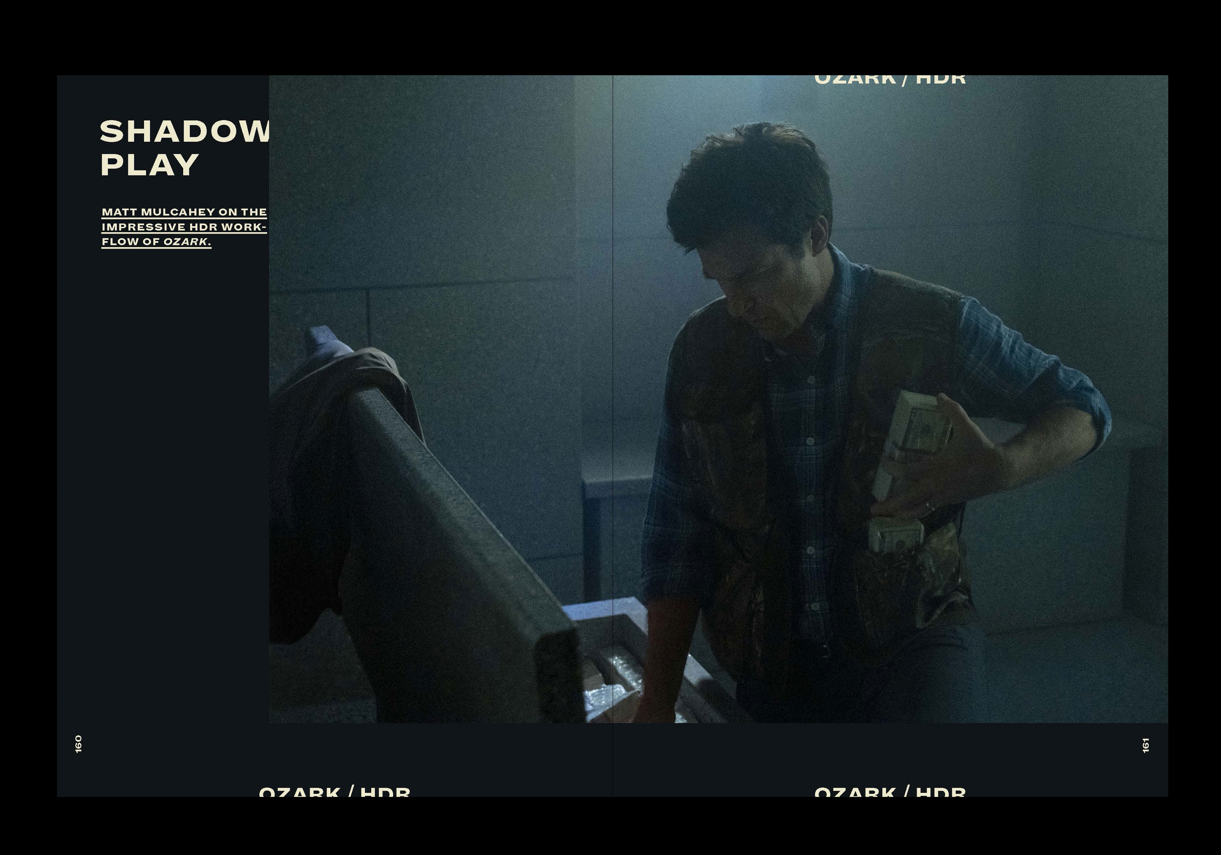
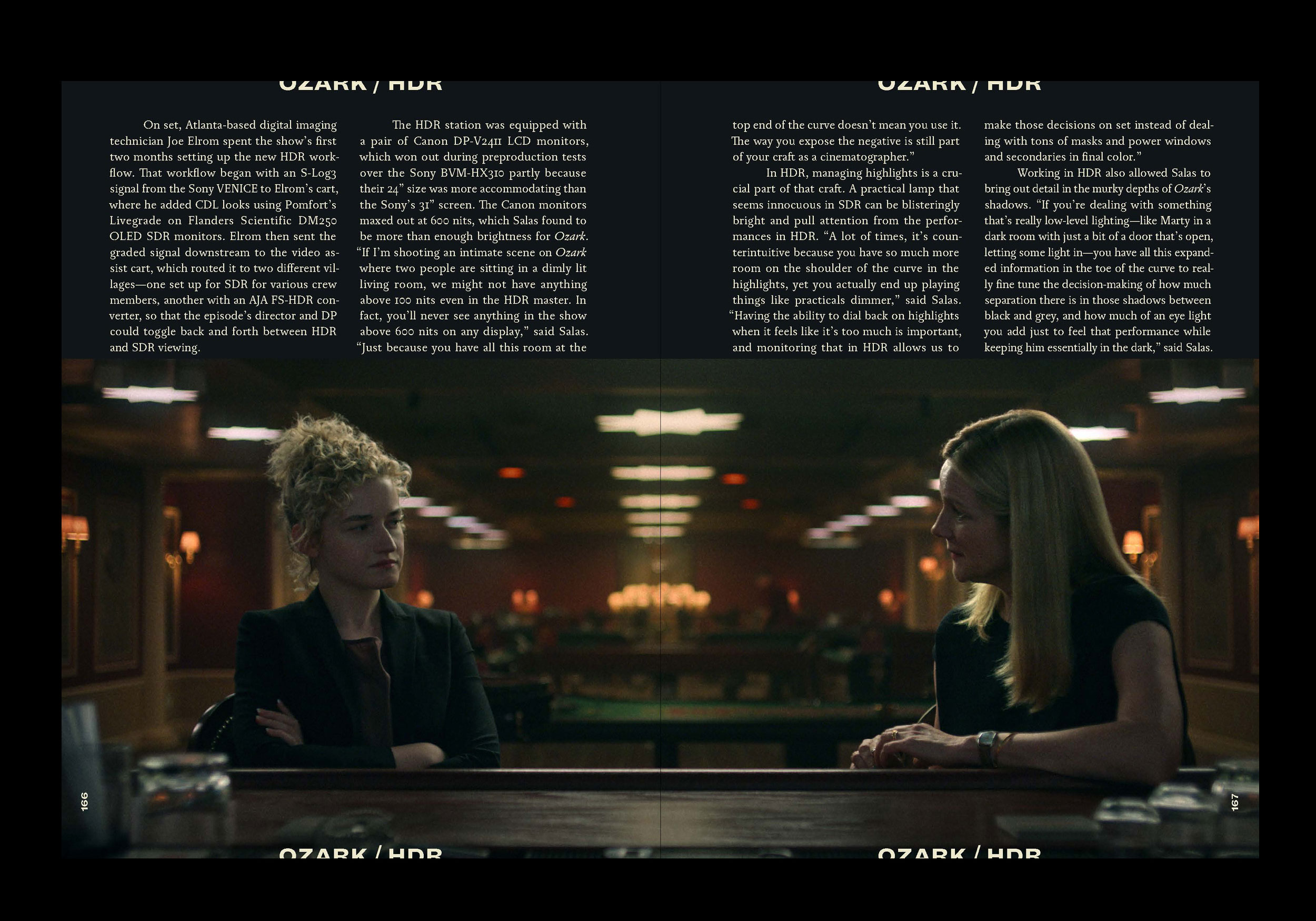
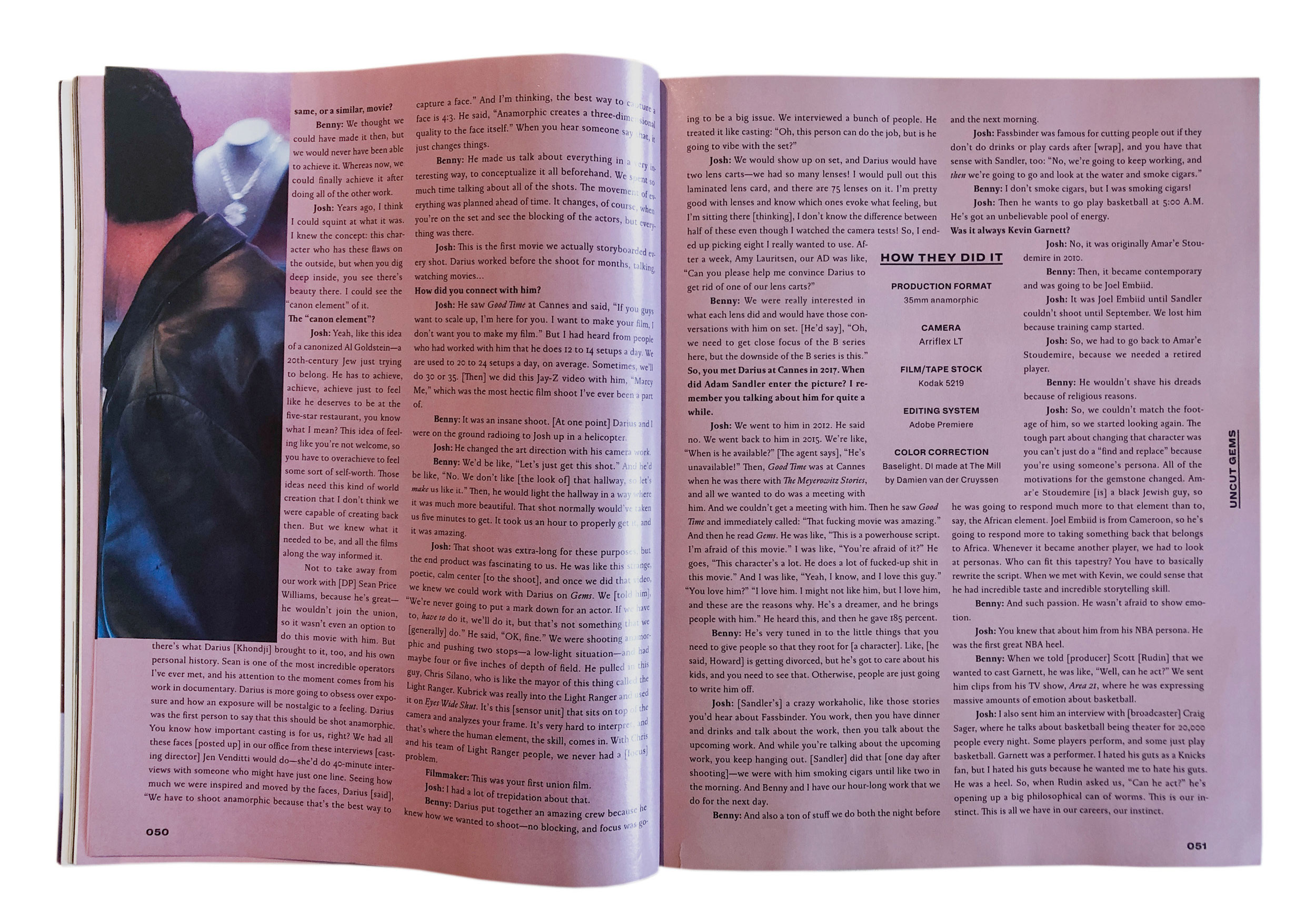
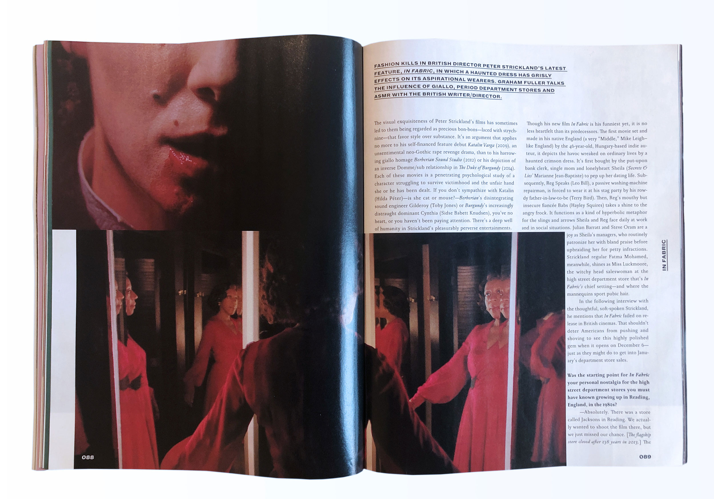
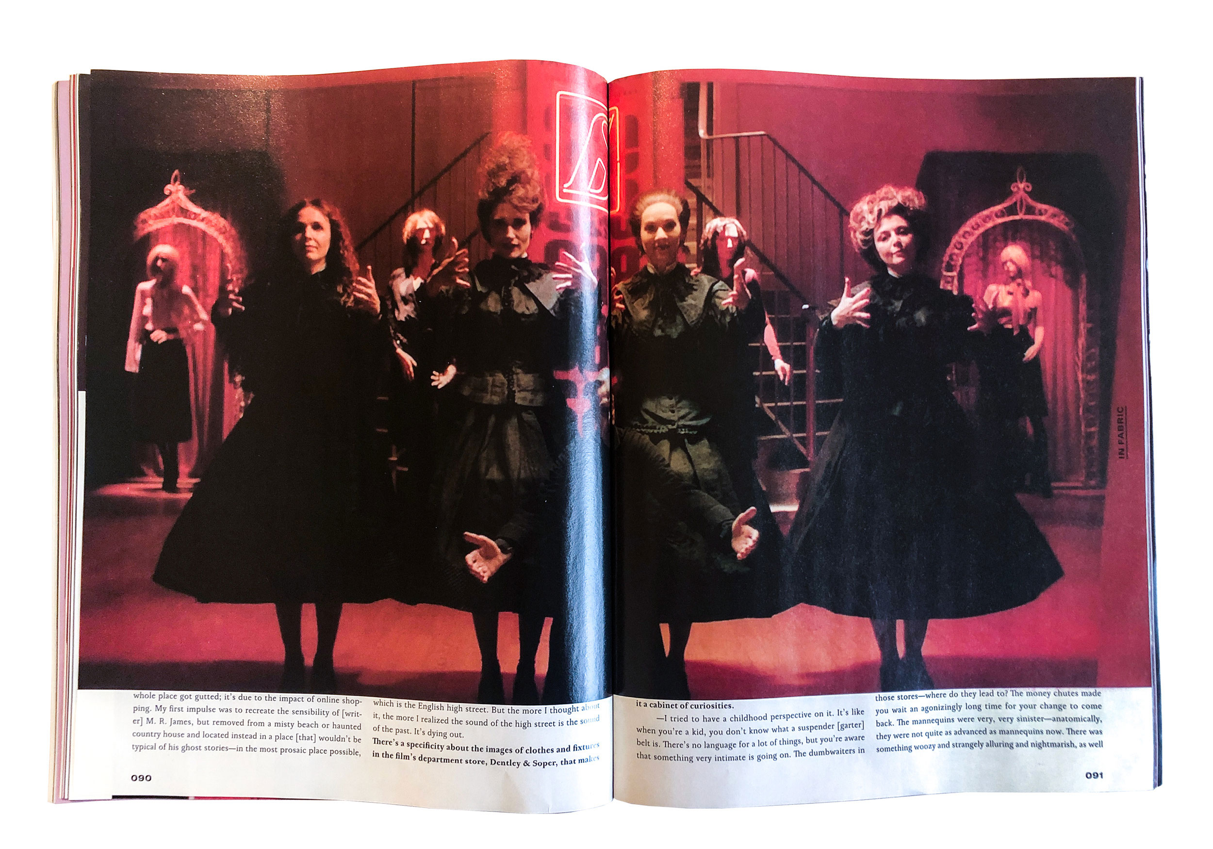
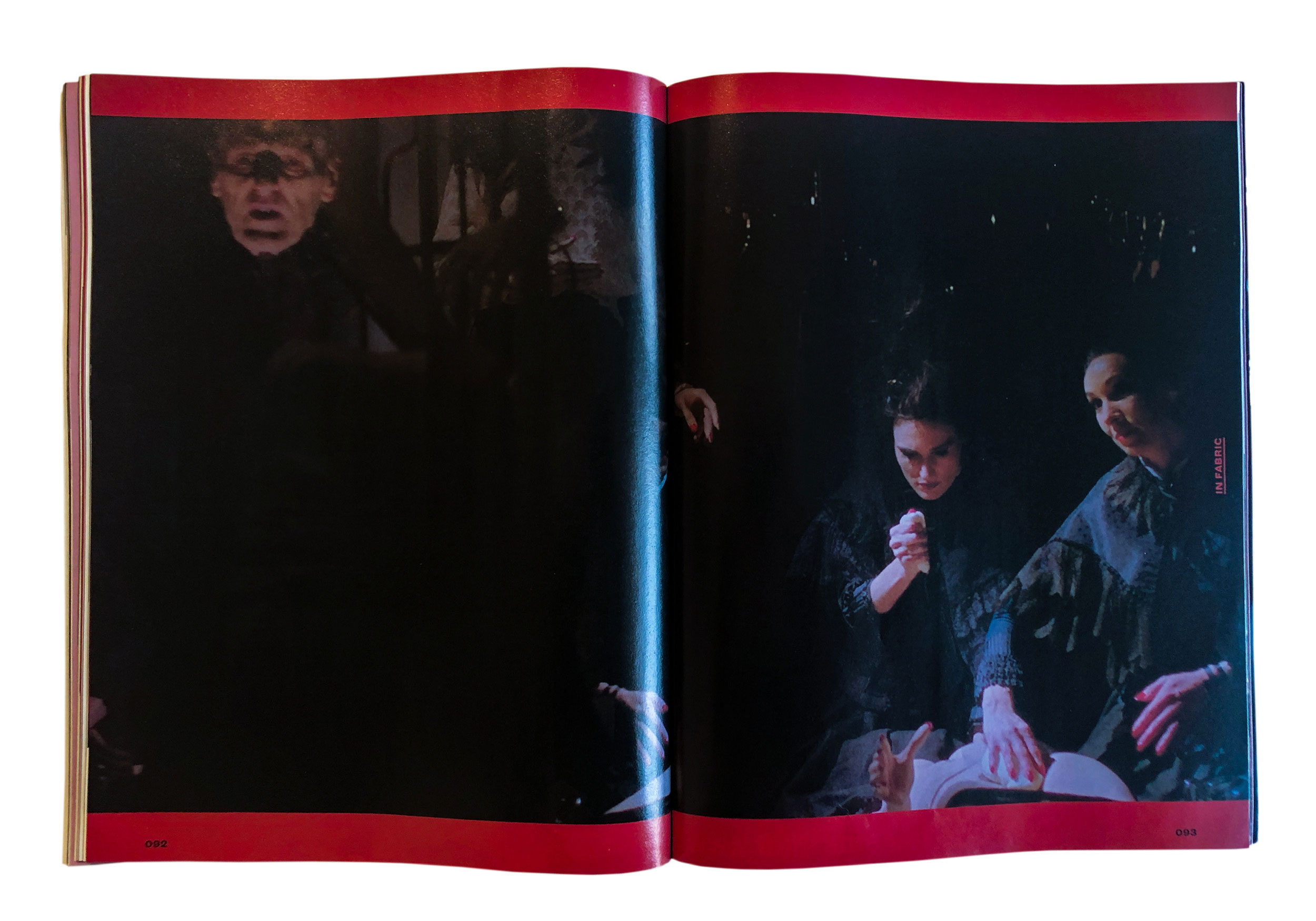
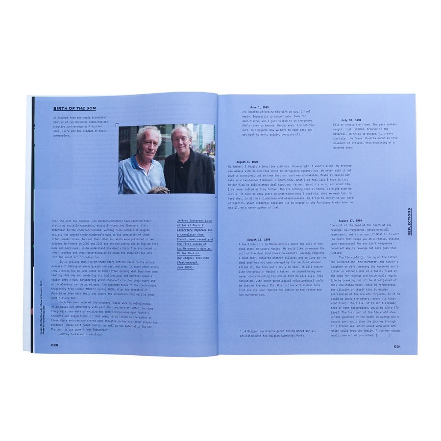
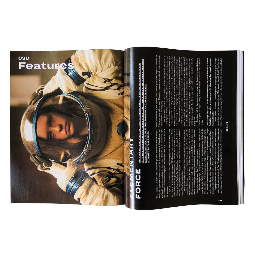
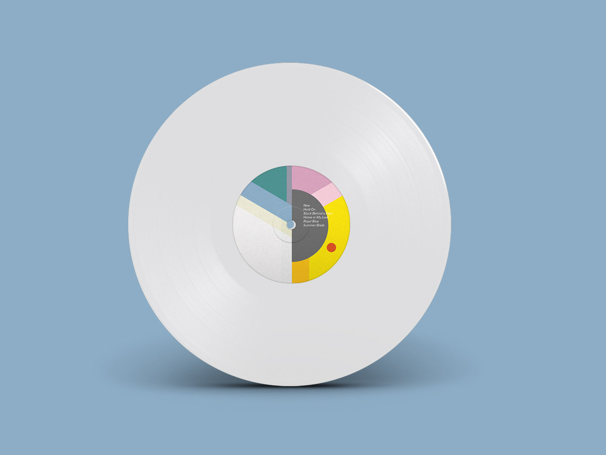
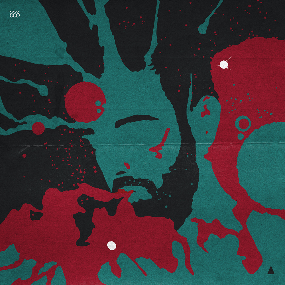
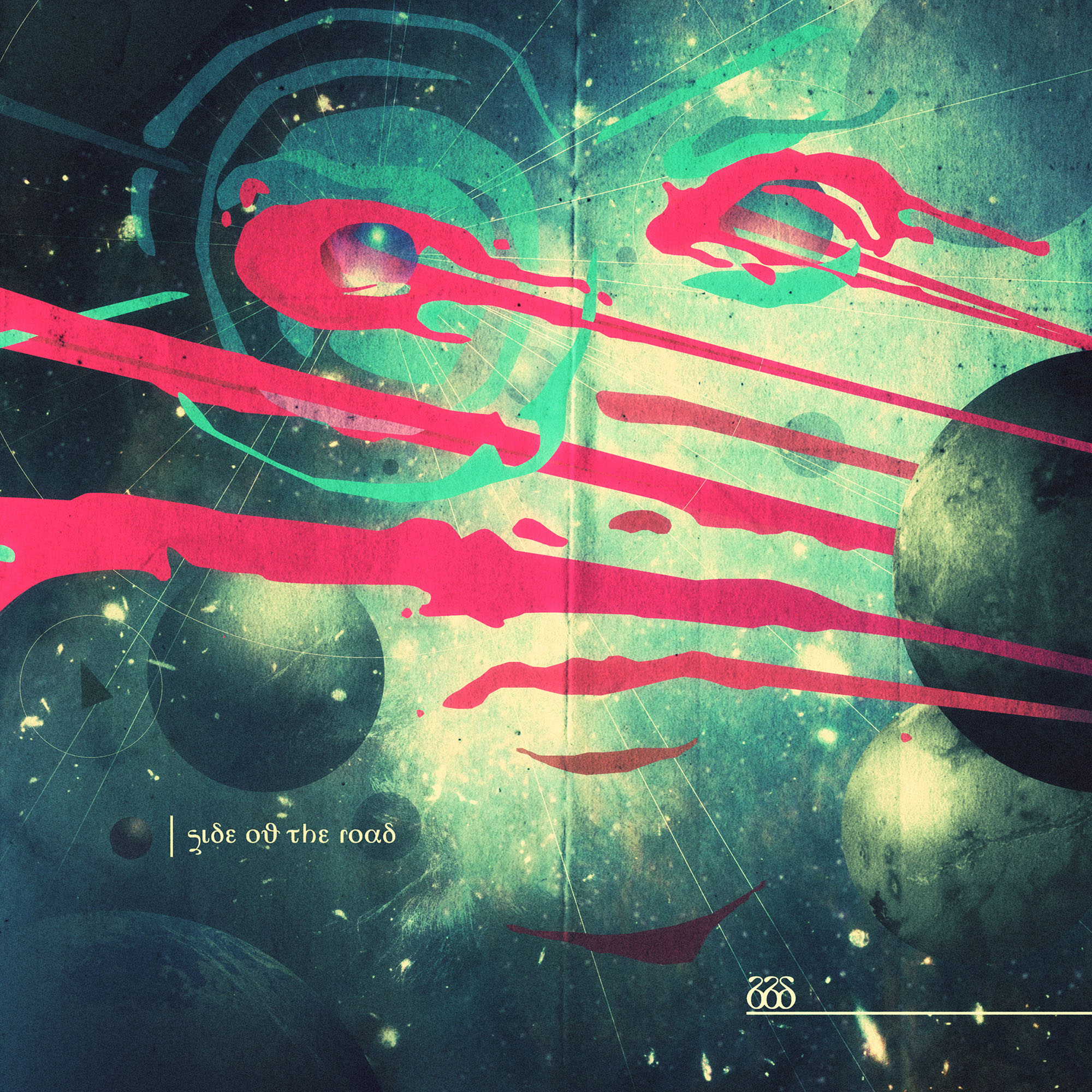
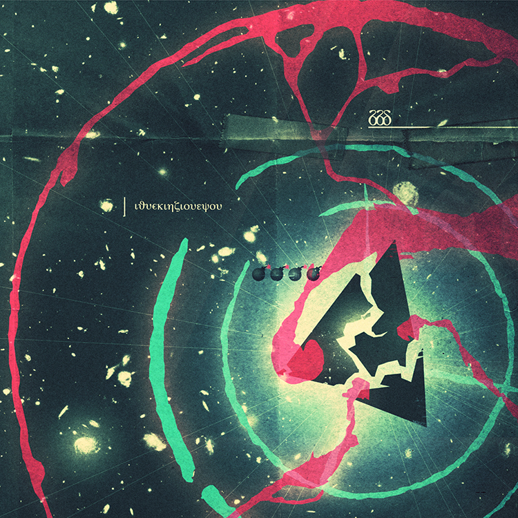
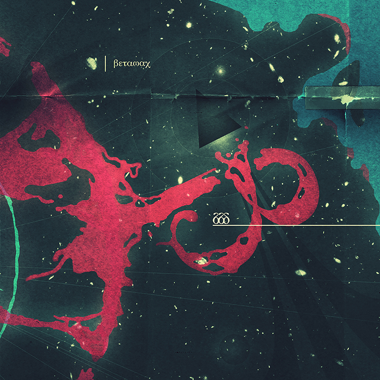
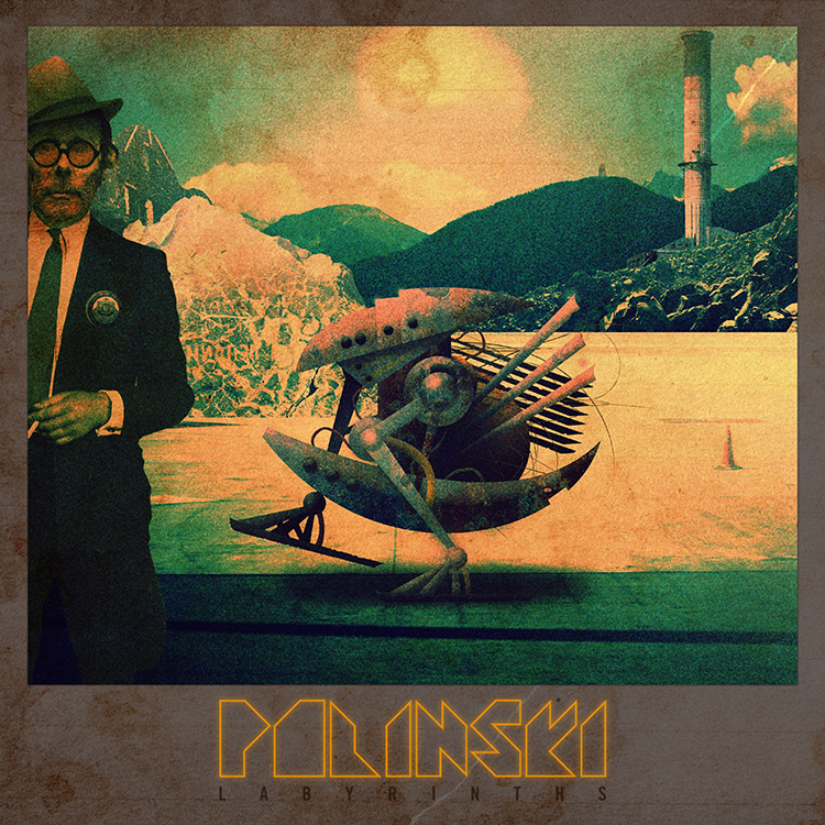
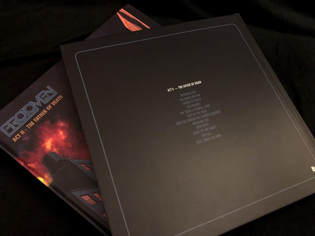
here's the album cover for the aforementioned new polinski LP, telex from MIDI city. paul wolinski, sole member of the band, asked that we might make the vinyl artwork for the record.
a
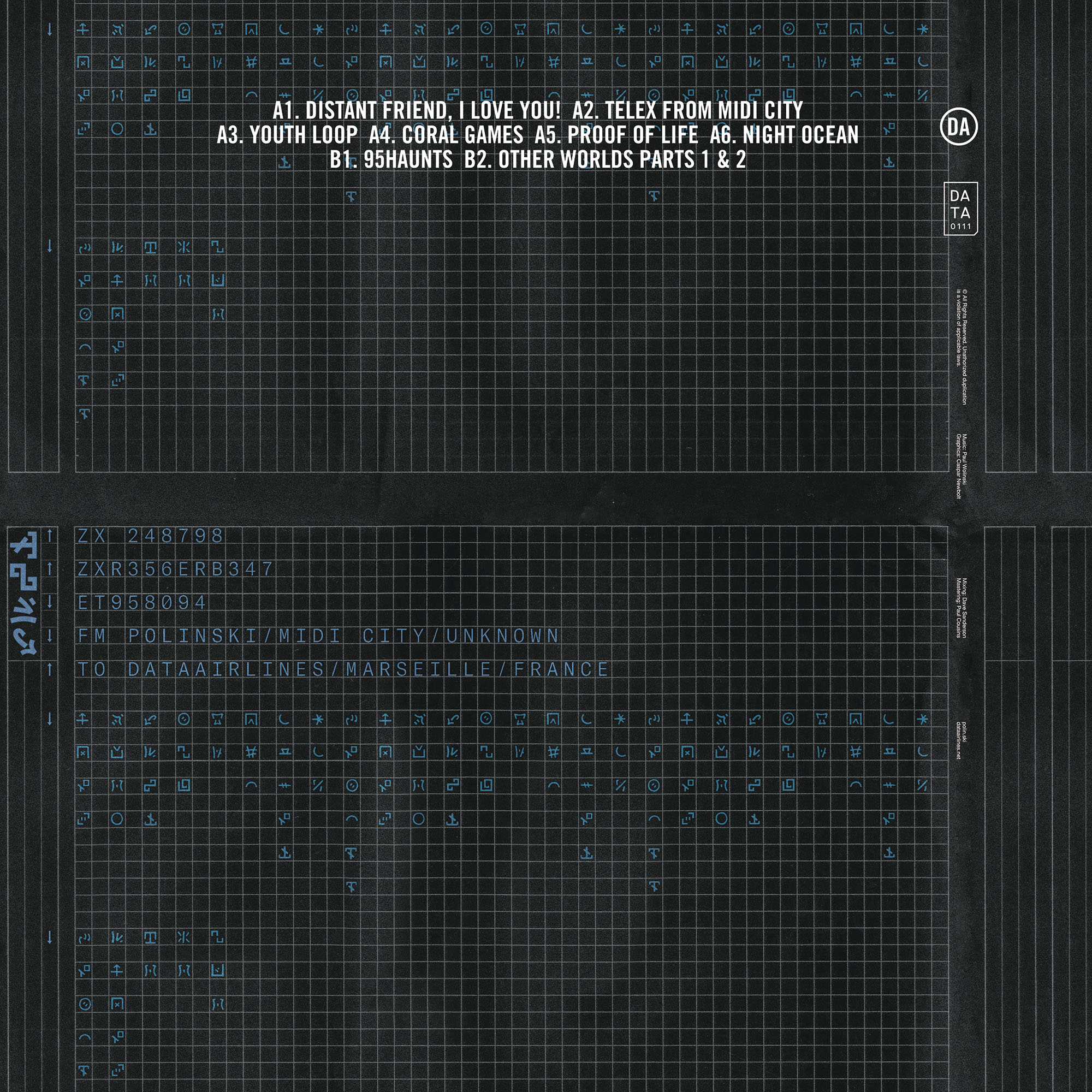
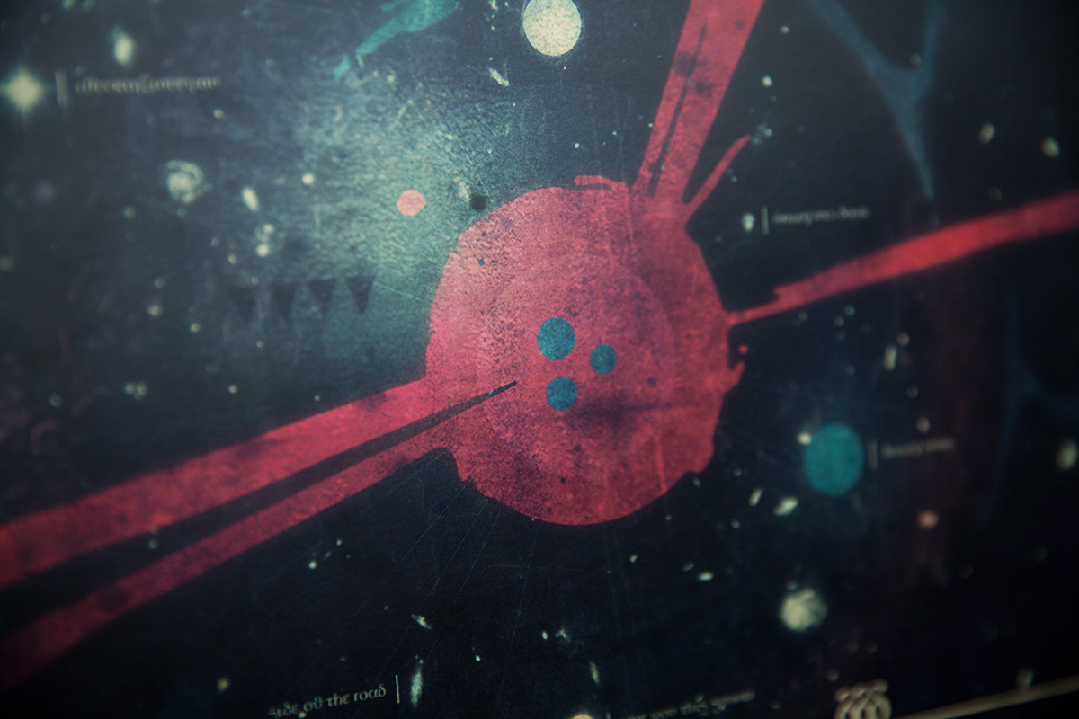
telex is a now antique device for sending text messages over phone networks. it was invented in germany in the 1920s and finally gave way to the fax machine in the 1980s. given the science-fiction nature of the album's title, paul and caspar agreed that the invention of a new alphabet would be the first place to start when making the record's artwork. paul's love of emojis and caspar's complete distaste for them seemed like an amusing place for this alphabet's generation to begin.
caspar asked paul to reimagine and transcribe every single word on the album's cover and liner notes into
apple color emoji format. caspar then took these emoji-based phrases and reimagined them into a visual style he felt more aesthetically comfortable with. he went through several stages of redrawing and simplifying them on paper with a pencil until they felt like a workable pictographic alphabet. he then imported them into a computer and proceeded to vectorize the different characters so that they could function at any size and in any context, be that in sentences or as single characters.
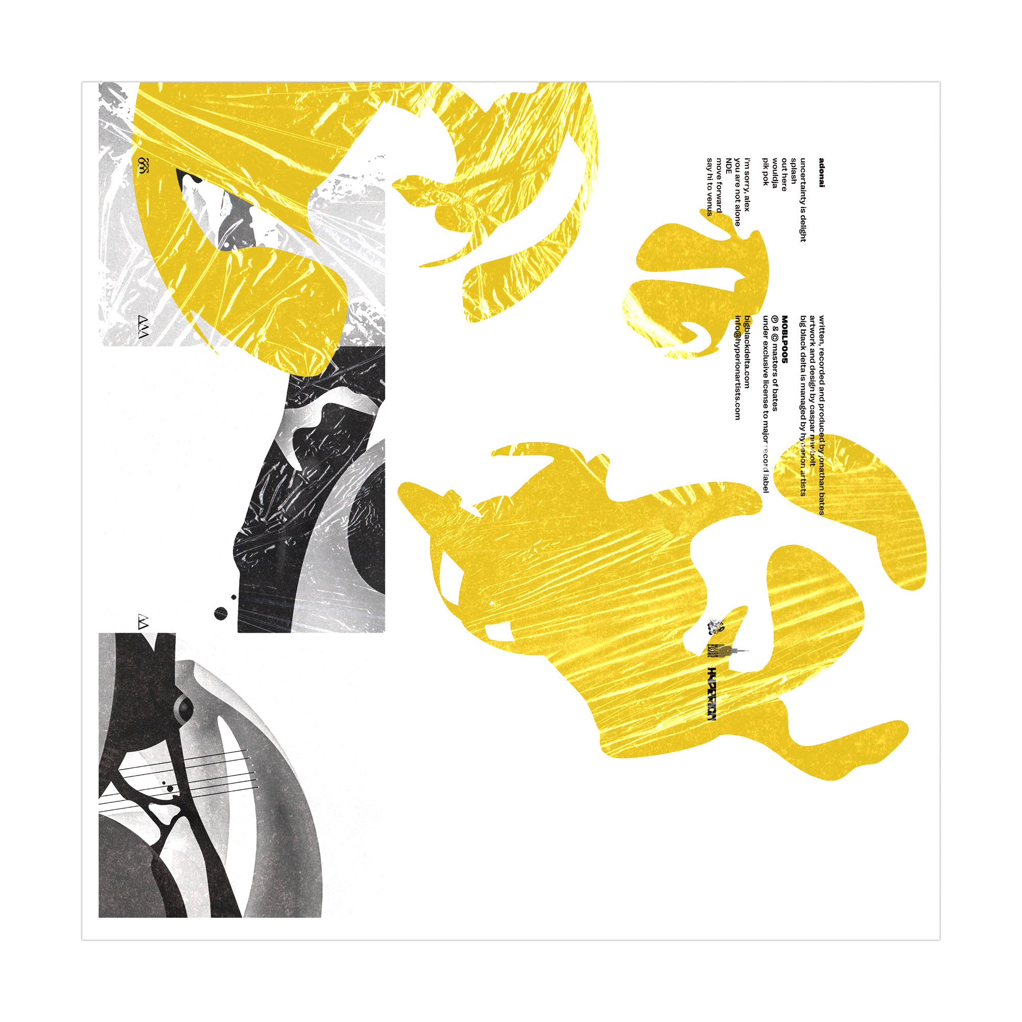
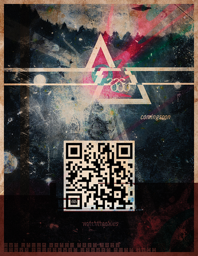
paul then generated a working typeface / font file from caspar's vectorized glyphs and used this for the various online and music video outputs he was preparing to promote the record. in the meantime caspar used the alphabet to prepare the final record cover artwork you see here.
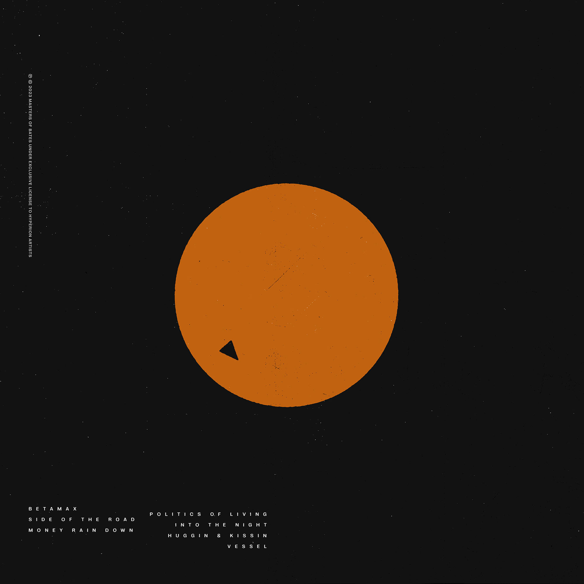
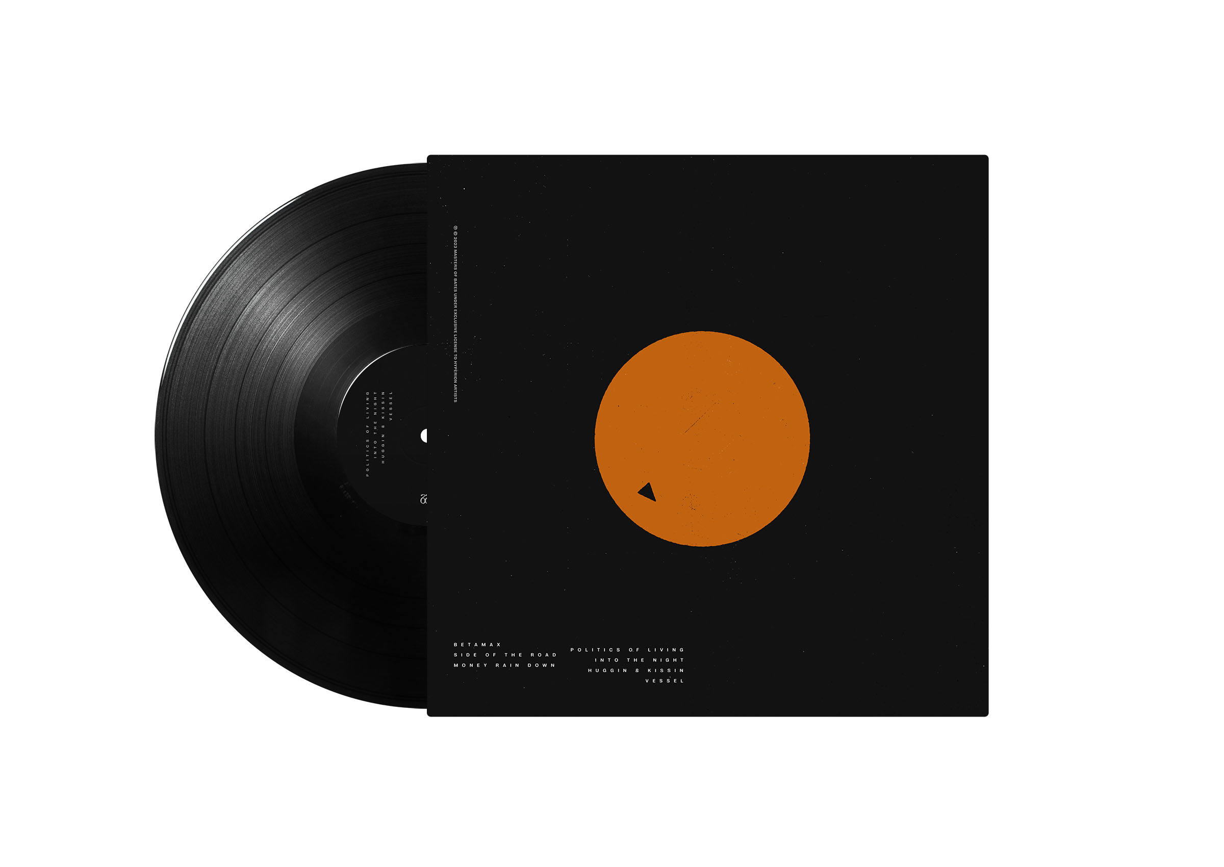
the front cover uses a photograph caspar took from an apartment balcony during the pandemic lockdown in berlin. the back cover is a telex message paul wrote detailing the album's tracklist and liner notes—using the new alphabet—from himself (in his MIDI city) to his record label,
data airlines.
the record was released on february 24th, 2023 by data airlines. you can see paul's usage of the MIDI city alphabet in the video for the album's first single,
distant friend, i love you!