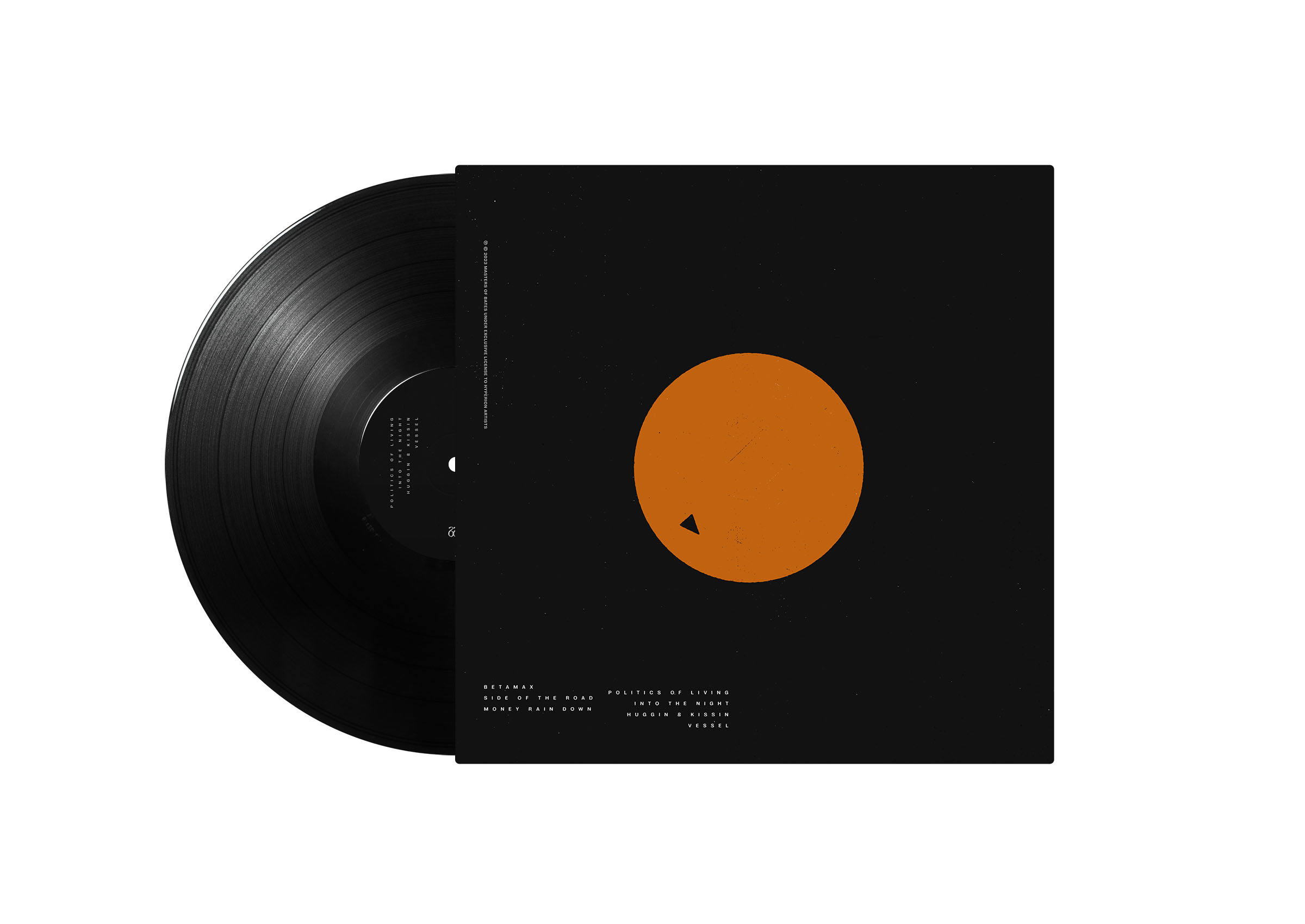
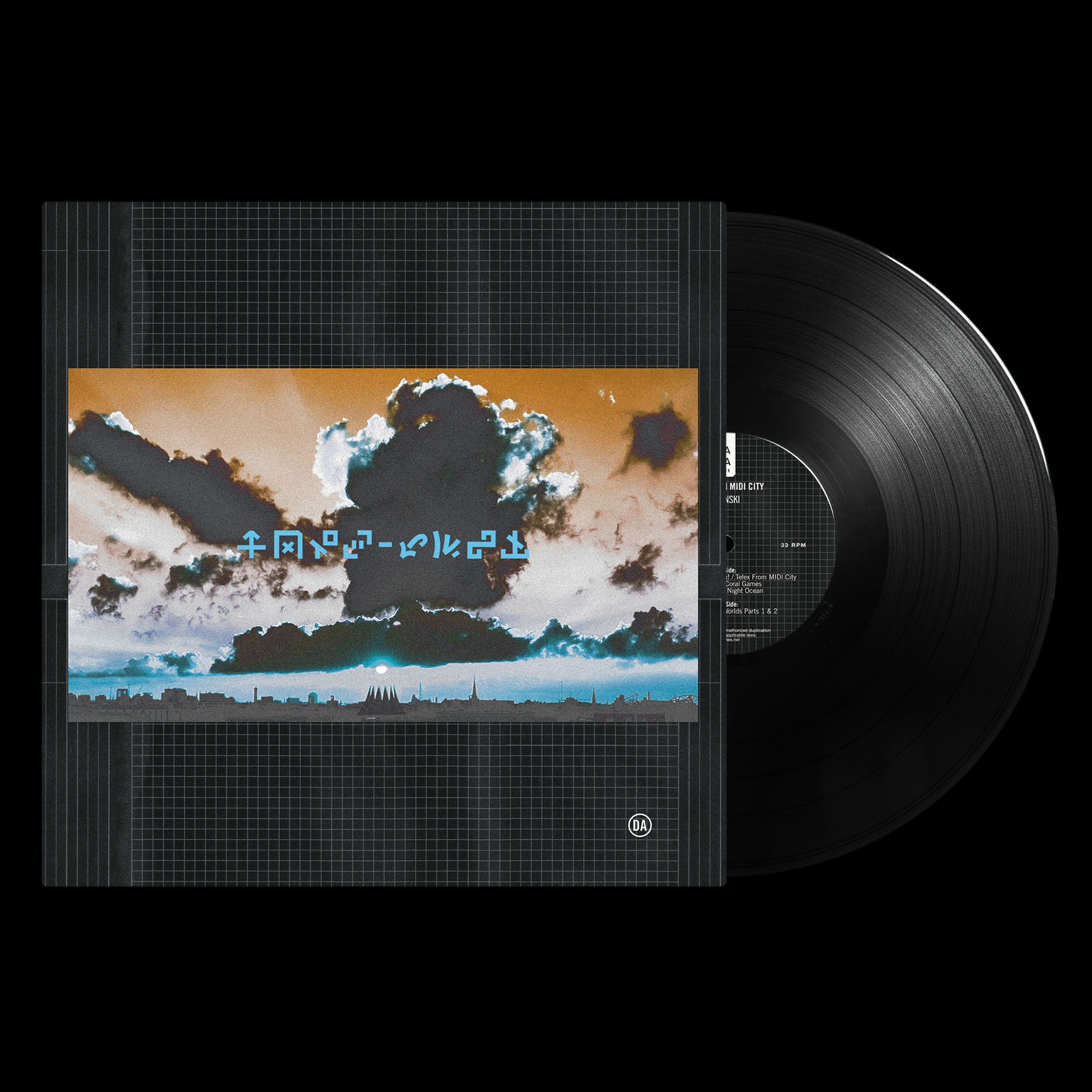
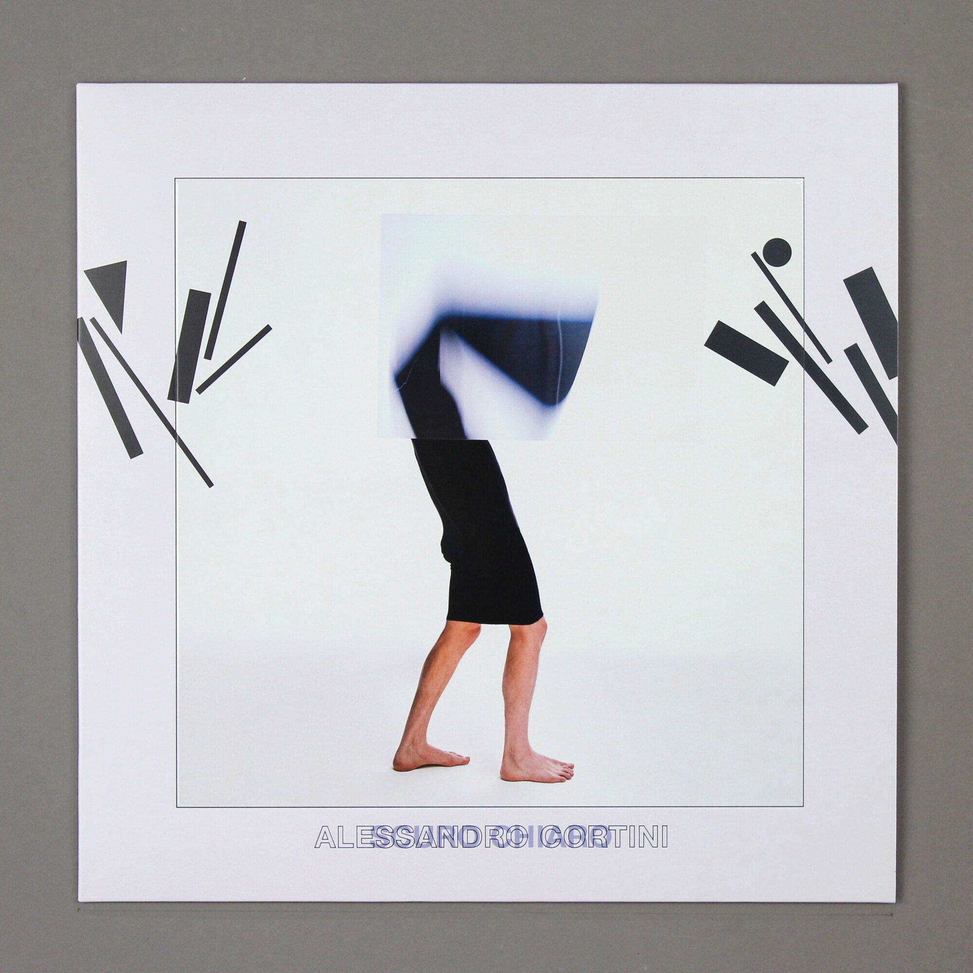
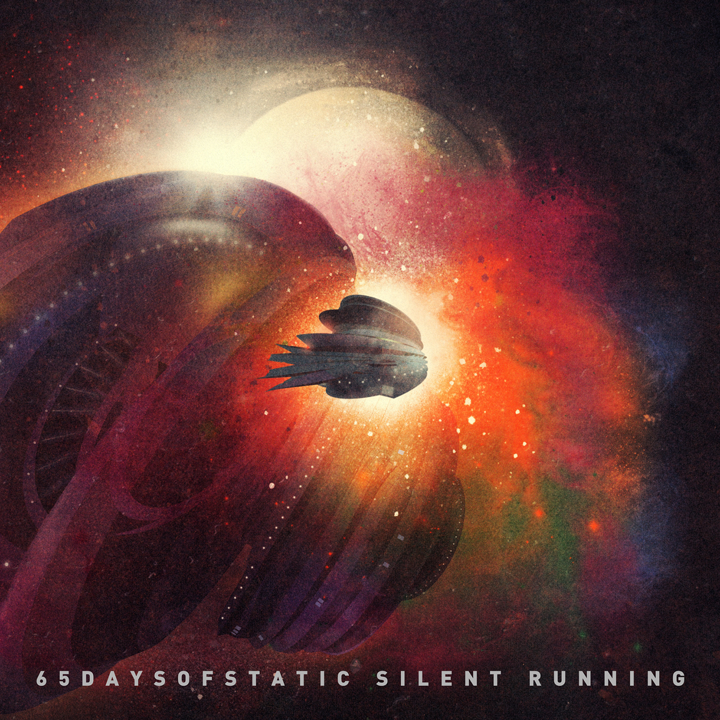
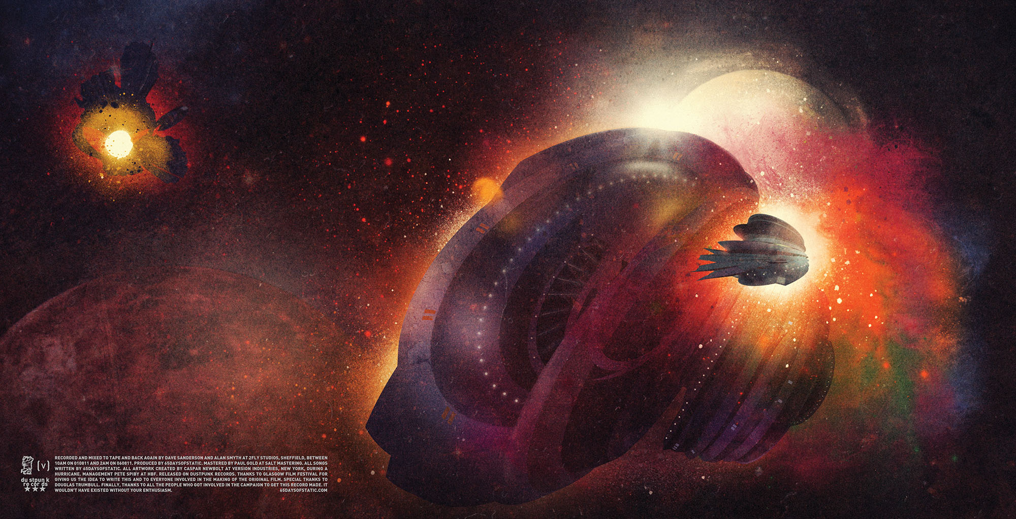
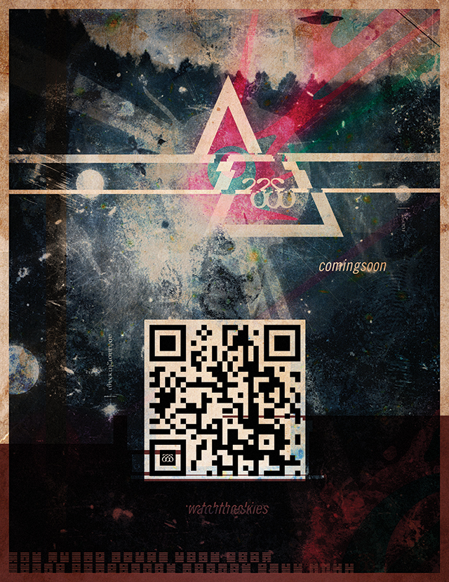
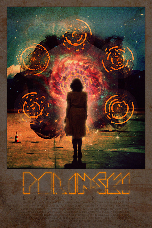
replicr, 2019 is the sixth studio album by 65daysofstatic. it marks a rather radical shift in approach for the band as—fresh off of making the algorithmically arranged no man's sky soundtrack—they had started to question the way they made and performed music. recognizing the post-mark-fisher-capitalist-realist-pop-cultural-fugue-state the world of music seemed to be in, the band wanted to somehow make a record that articulated the seeming futility of trying to make anything that was in any way new.
as drummer
rob jones put it in an interview: "this was supposed to be the future, but that future got cancelled. history is moving but it’s got nowhere to go. it’s piling up all around us. that’s what this record is about; this atemporality is an illusion, it’s the cultural logic of late capitalism, consuming everything faster and faster, each artefact a more diluted replica of the last. even the idea that ‘pop will eat itself’ is eating itself."
replicr, 2019 is an album made using customized algorithmic software and live coding techniques, and in almost every way marked a departure for the band not just in terms of how they made music, but also how they would perform it on on stage. it's a dark, unsettling and challenging record. it certainly has a soul, but it would be hard to say it was an optimistic one.
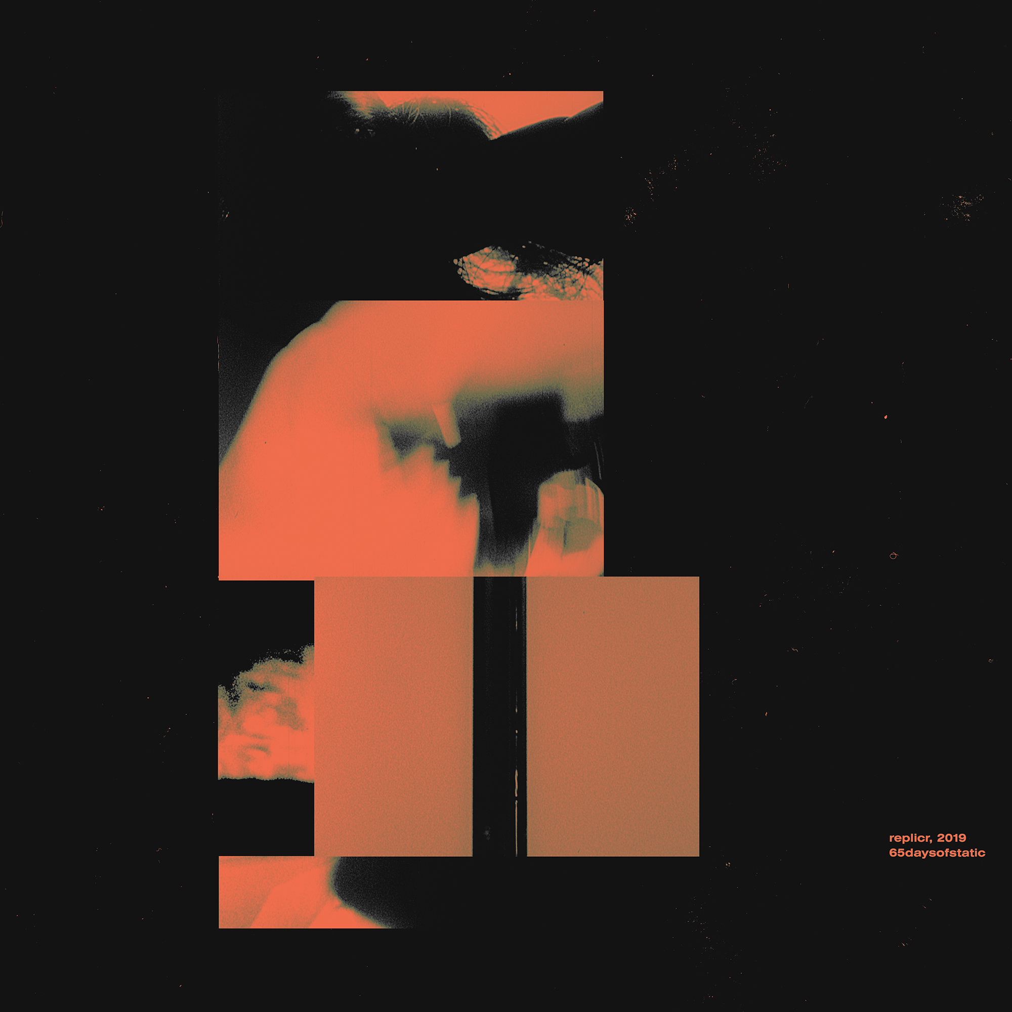
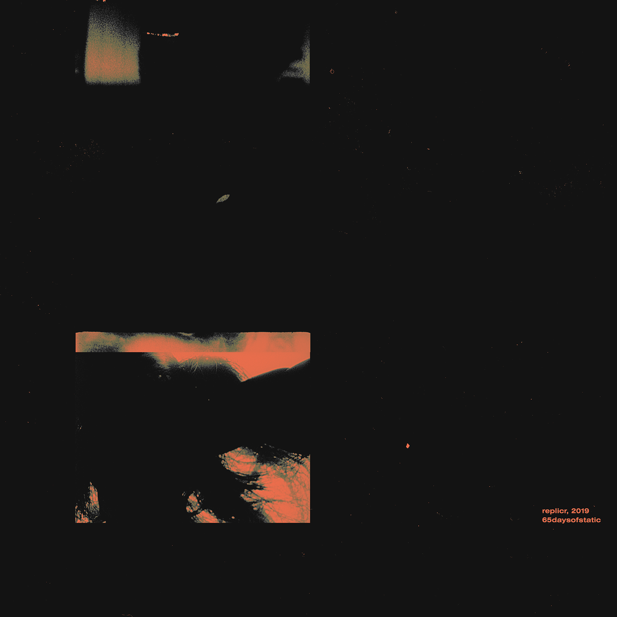
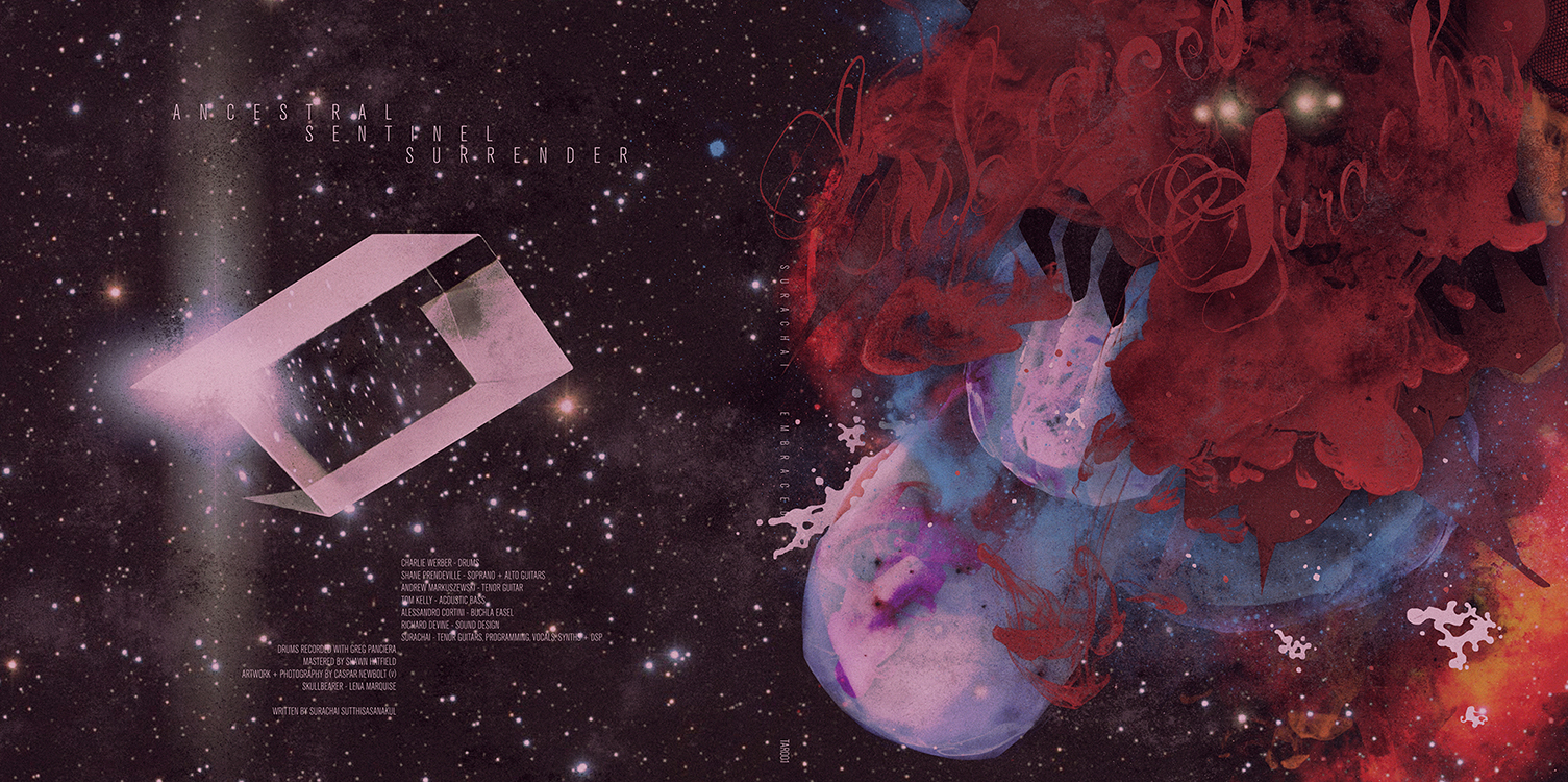
conversations about the artwork were long and hard and hit many dead ends. caspar would meet paul in berlin and they'd talk in circles—not without being aware of the innate irony of that—as they waited for an idea to fall into their laps. afterall, how do you make a record cover that says "everything is a copy of a copy of a copy, and that in some sense our best way out of this is to surrender to it", whilst also making a record cover that does in fact not look like anything else?
in the end the idea did just fall into our laps. back in new york and quite out of the blue caspar's studio mate showed him a copy of a relatively unknown, experimental, american, arthouse film. made in 1968 the film had won an award in the same student film festival as george lucas’s
THX 1138. this meant george lucas would have seen this film before making
american graffiti or
star wars. before even watching the film it had dawned on caspar that it might shed light on a solution to the replicr, 2019 artwork that he was still struggling with.
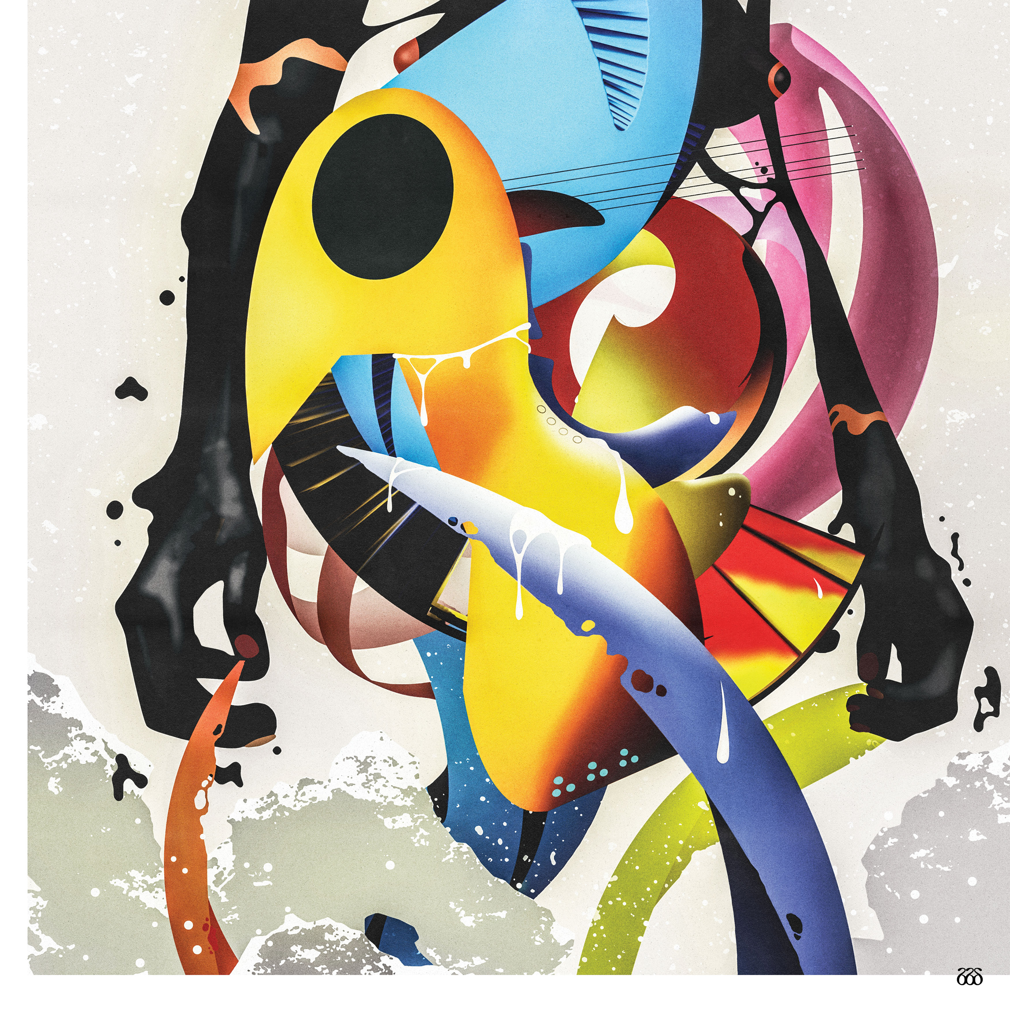
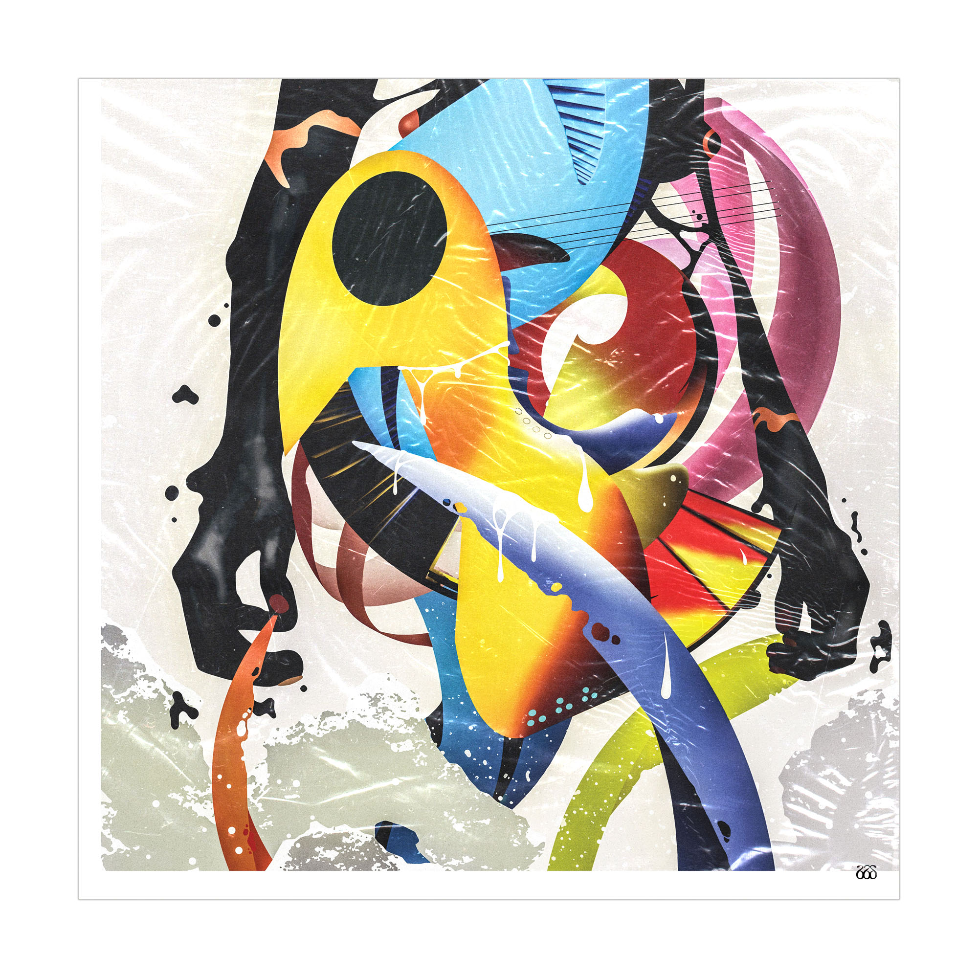
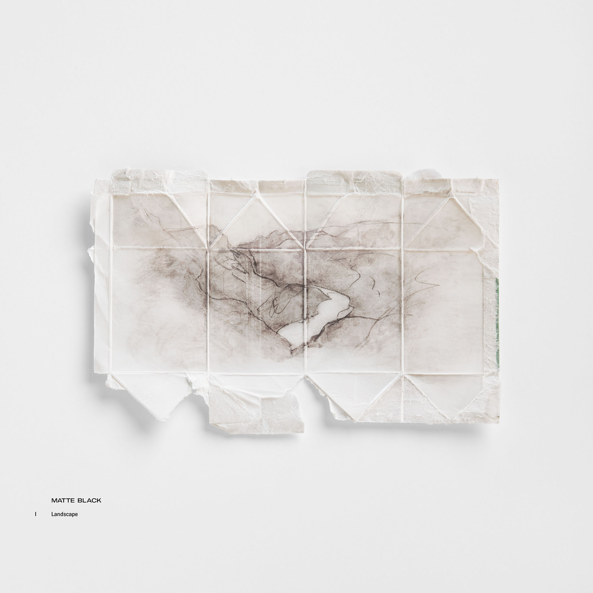
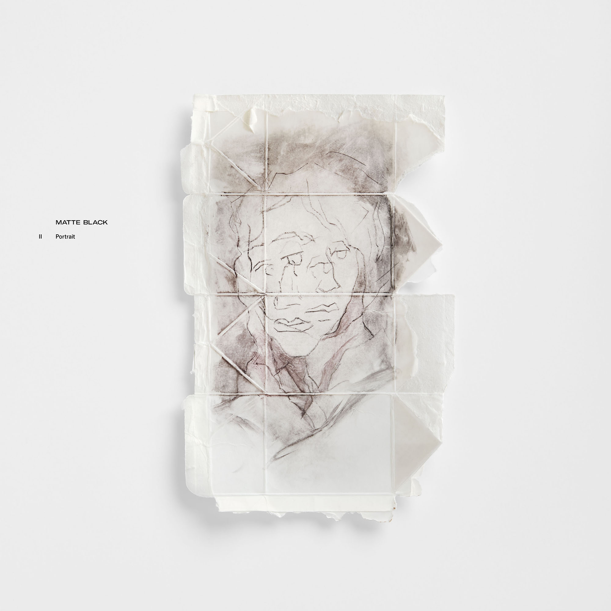
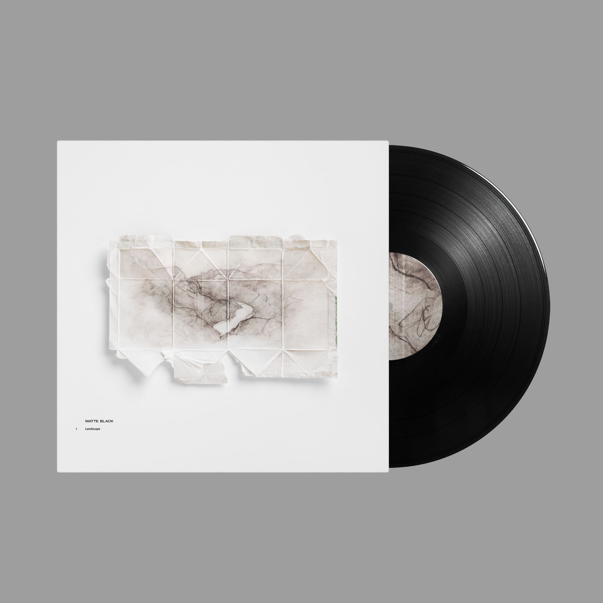
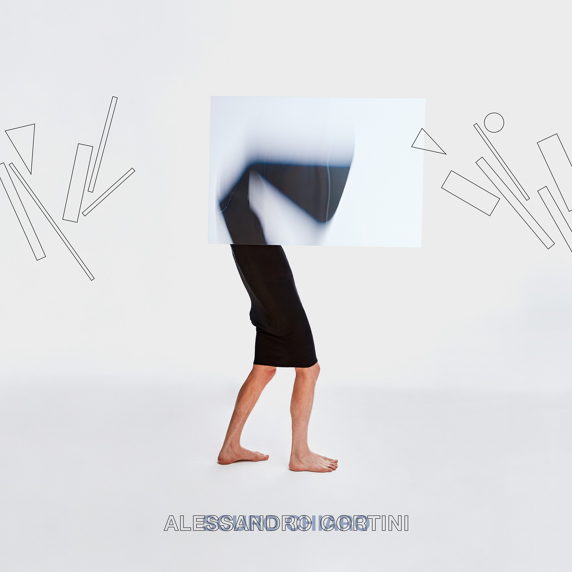
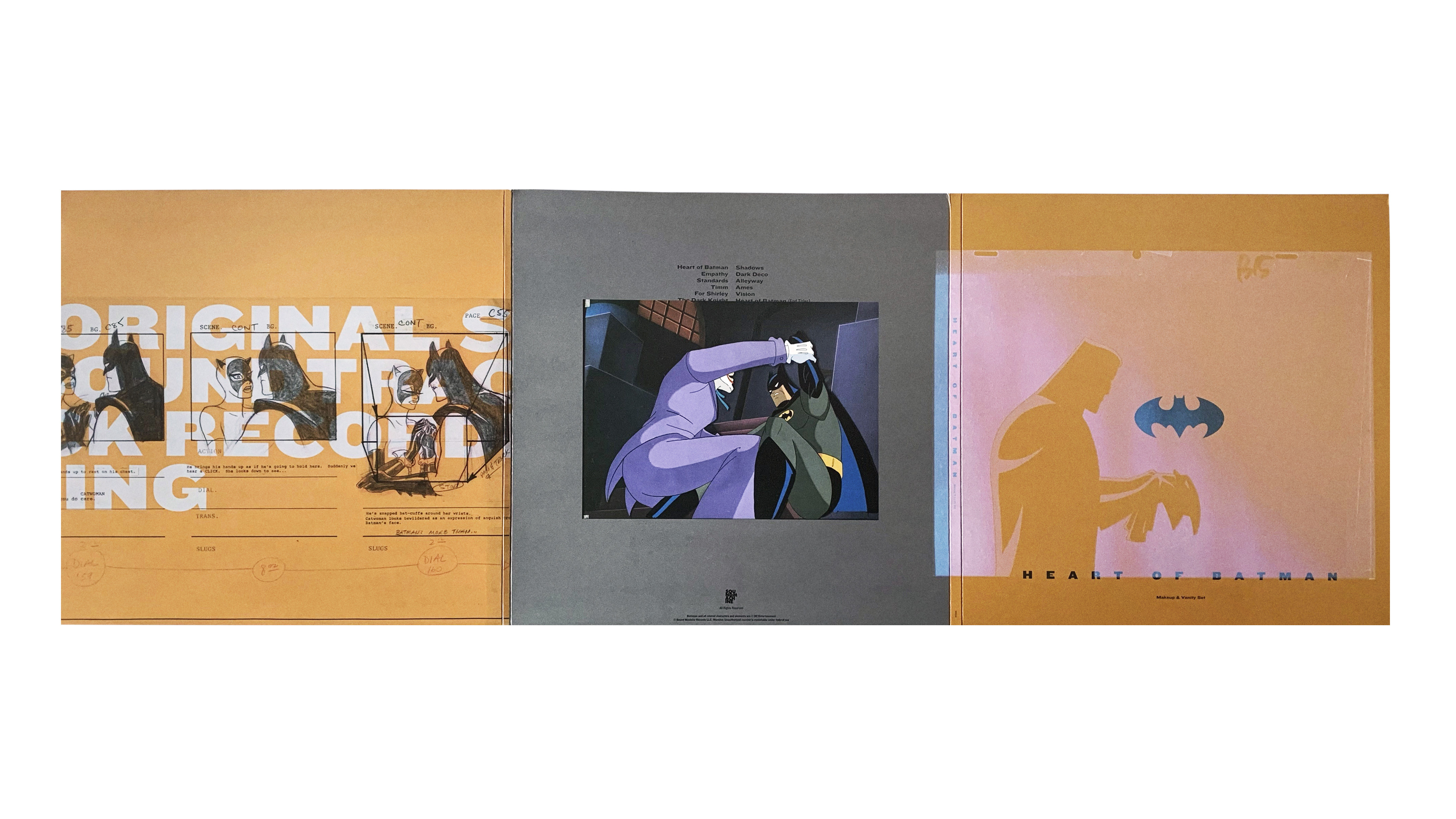
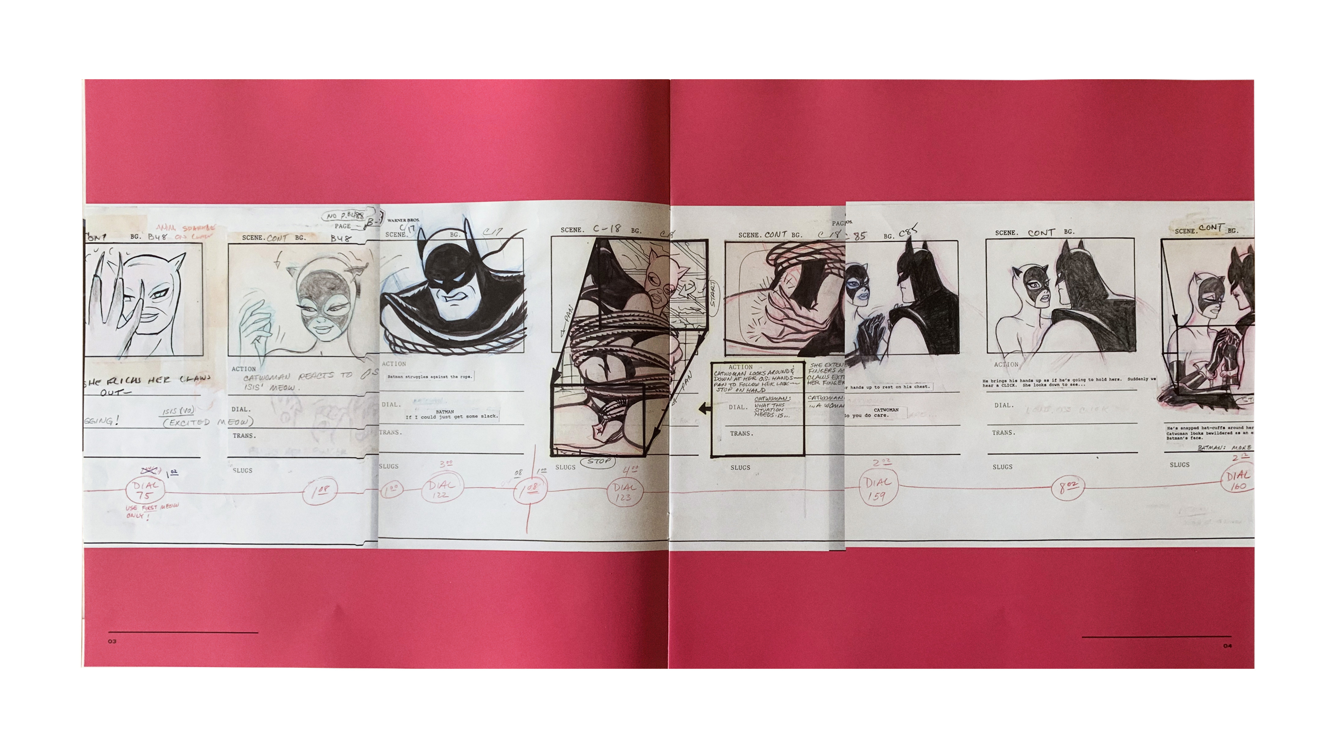
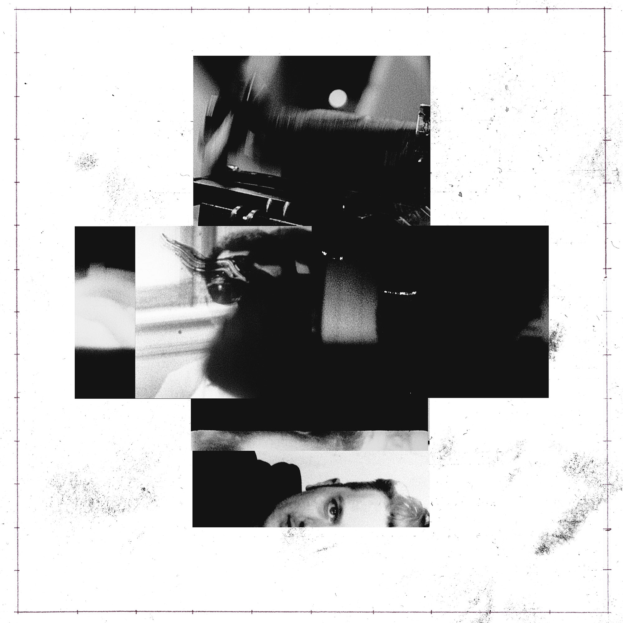
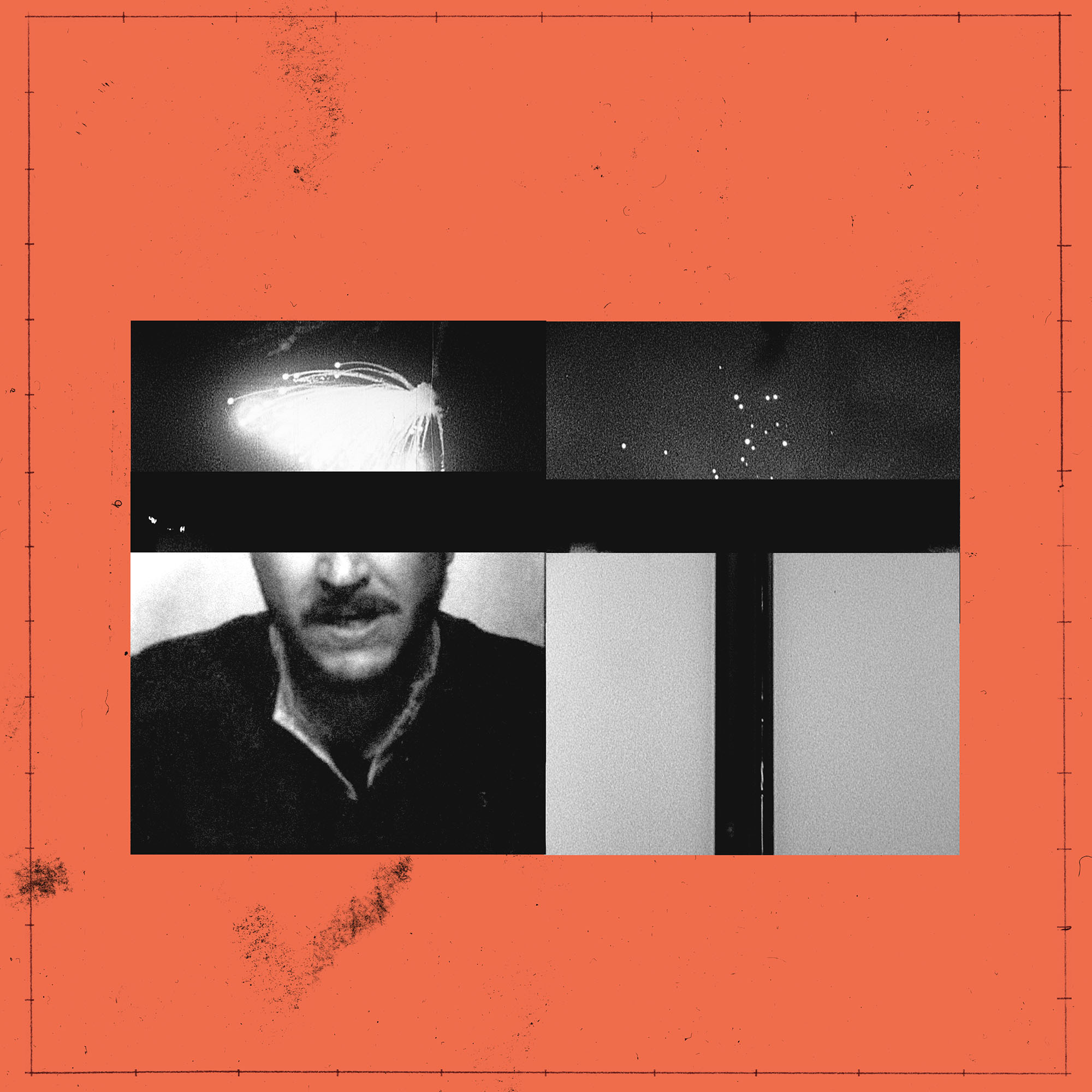
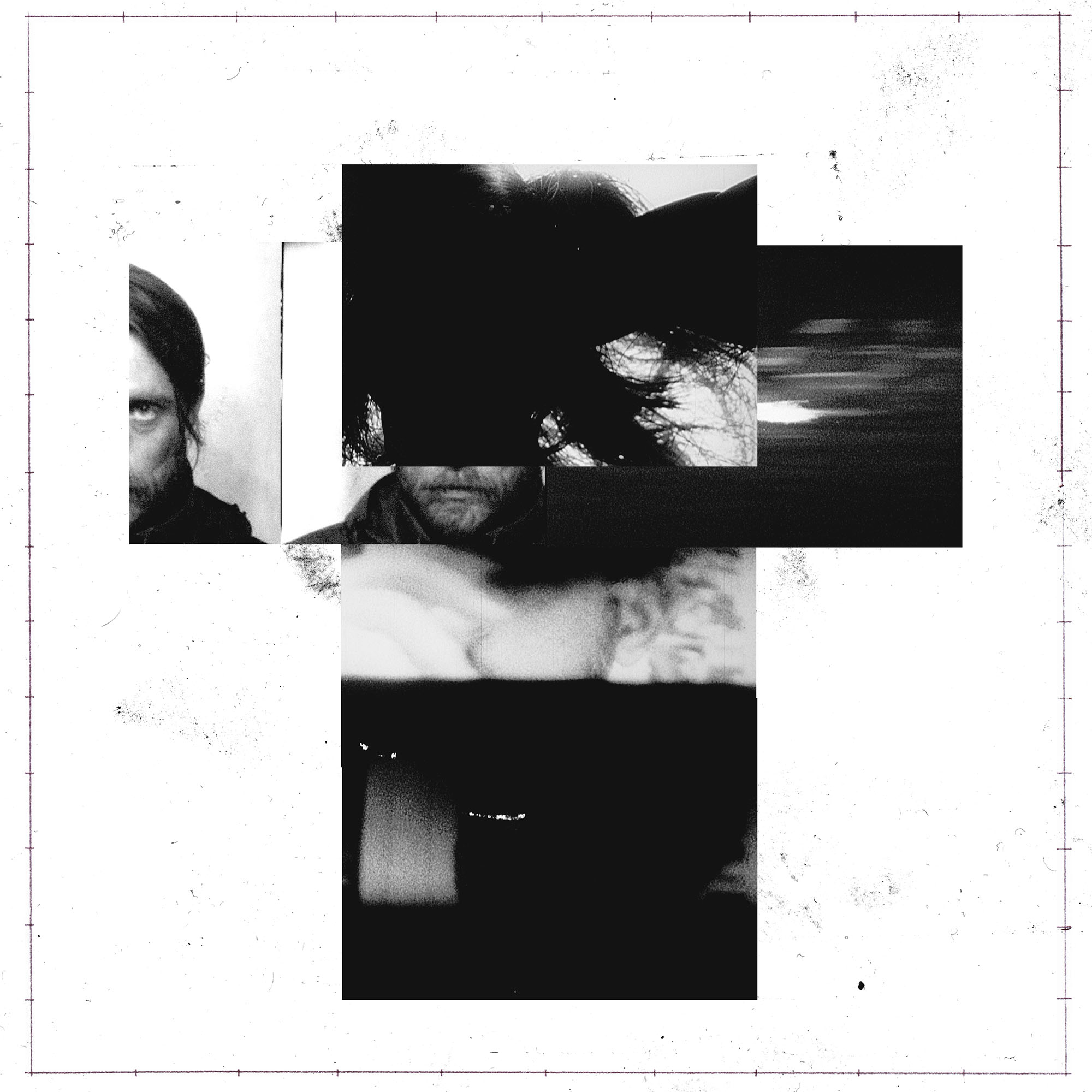
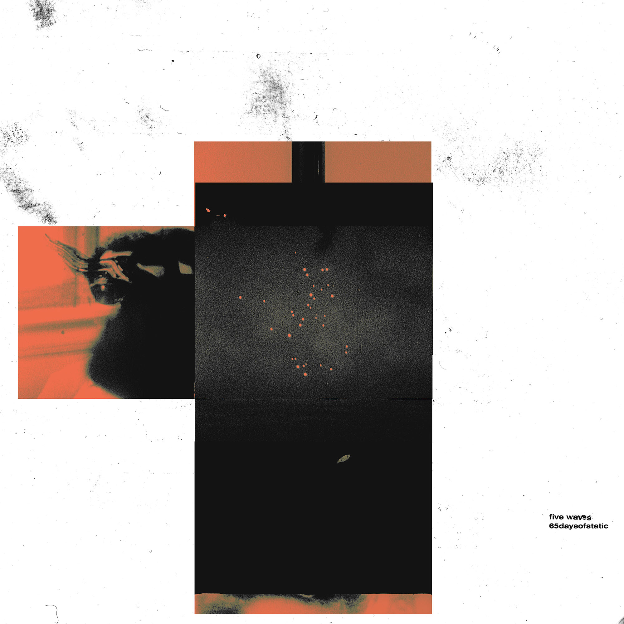
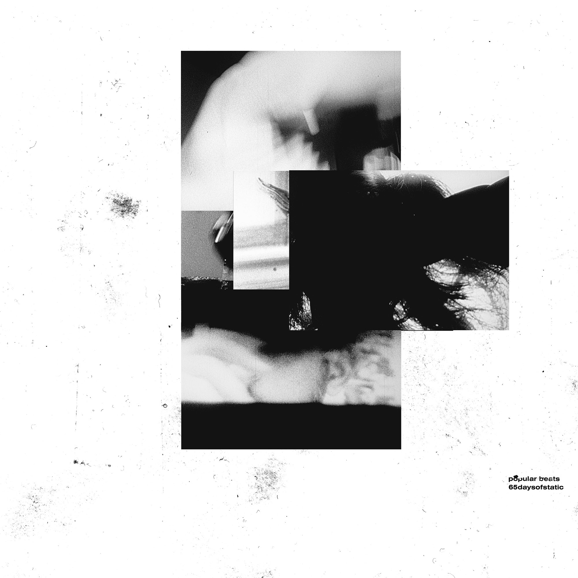
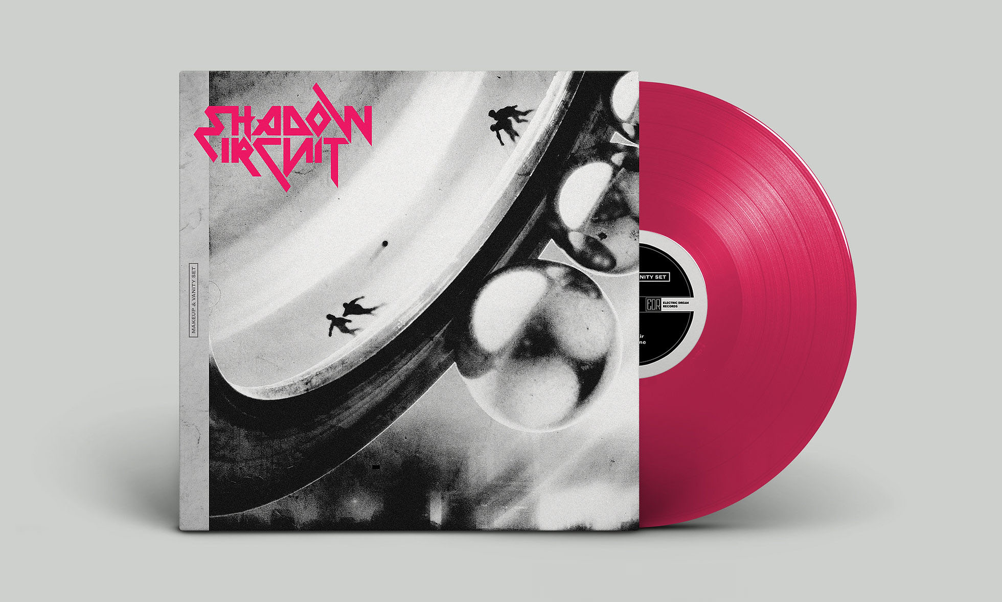
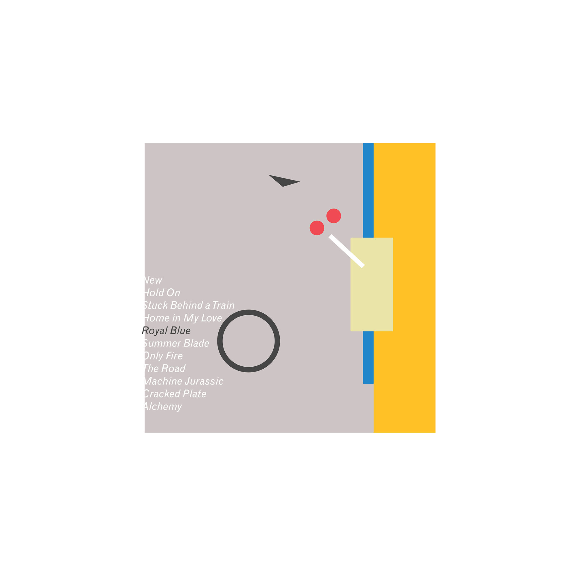
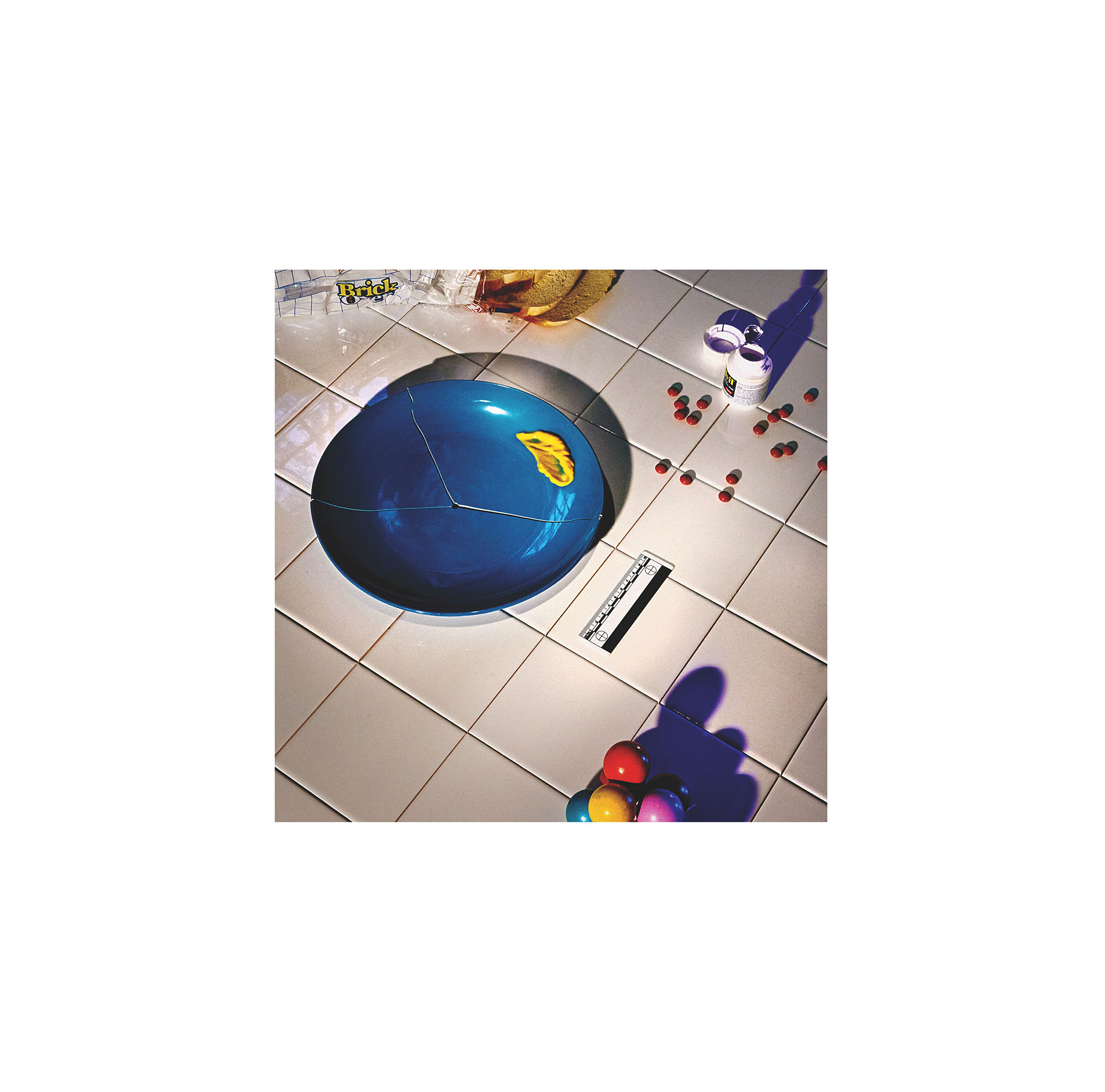
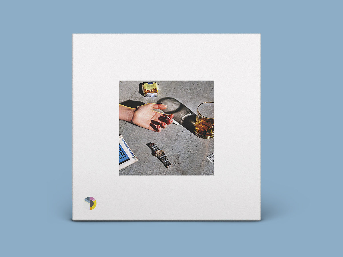
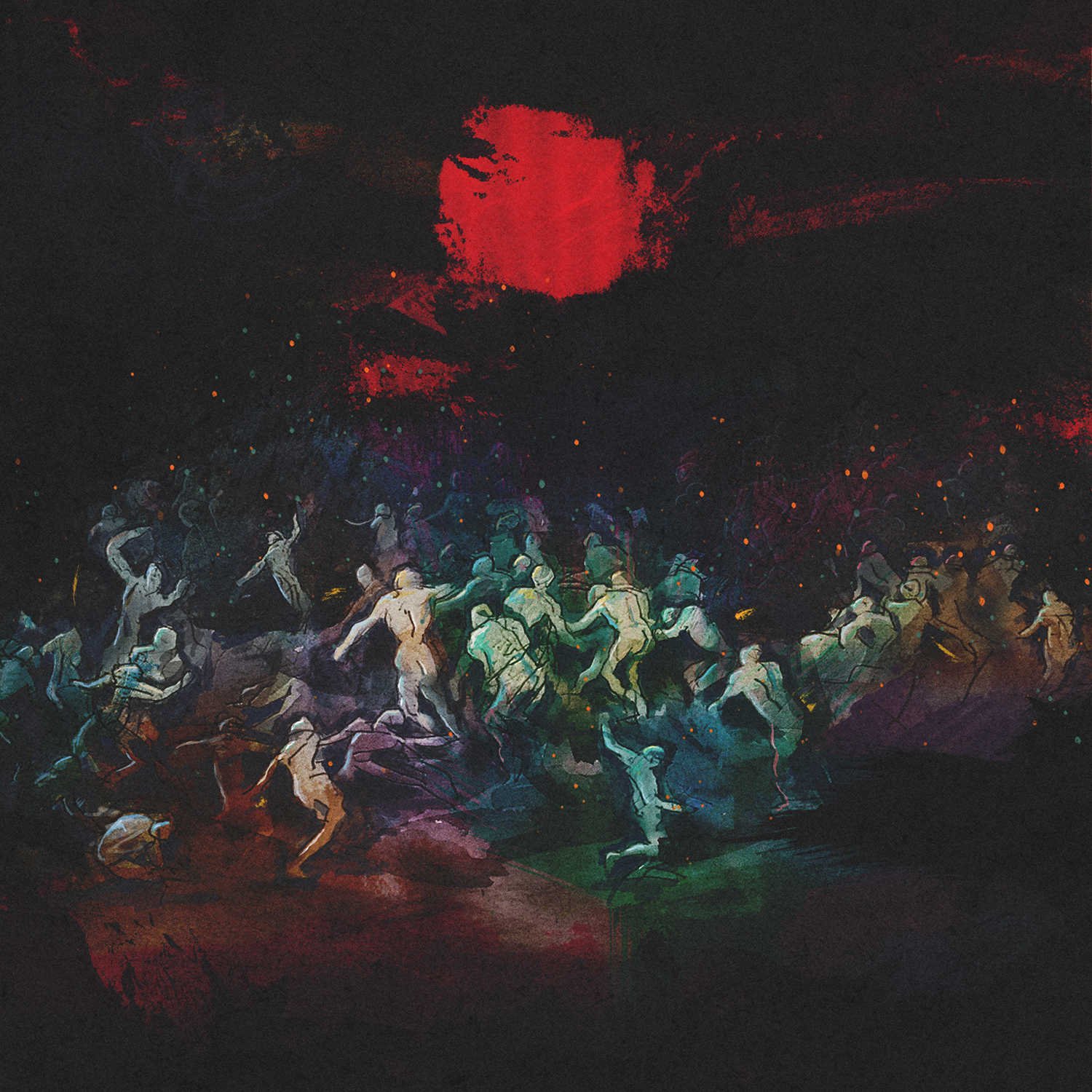
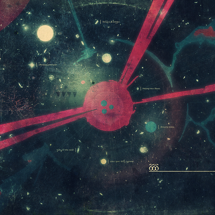
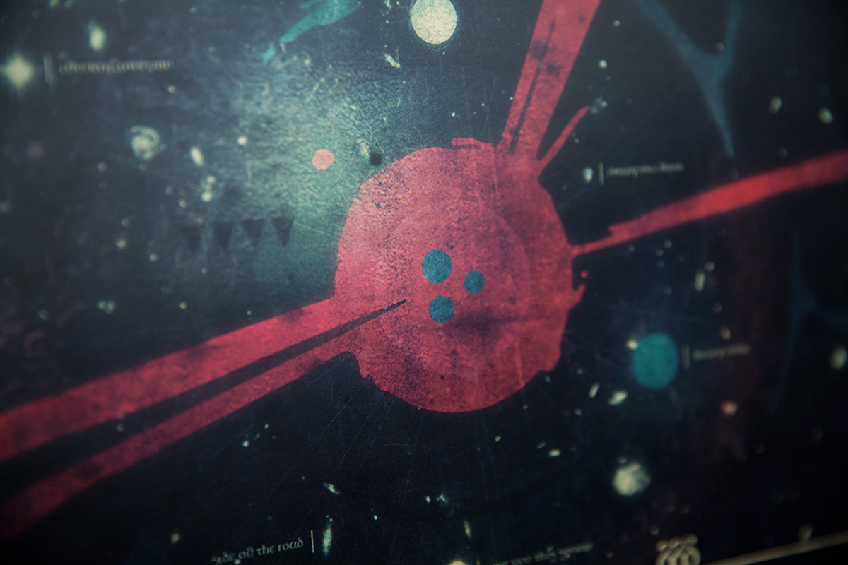
after watching the film caspar pulled a series of stills from it. each still was chosen for its abstract beauty, it's inherent movement and its oblique narrative implications. he then packaged this selection of stills with two reference images that suggested how these static film captures could be used to make a viable and interesting record cover. the first reference image was a 1967 sol lewitt piece called
eakins stamps, and the second was a
1963 czech poster for michelangelo antonioni's blow-up by milan grygar.
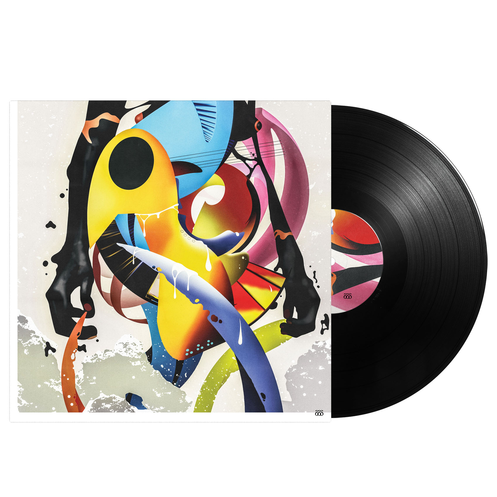
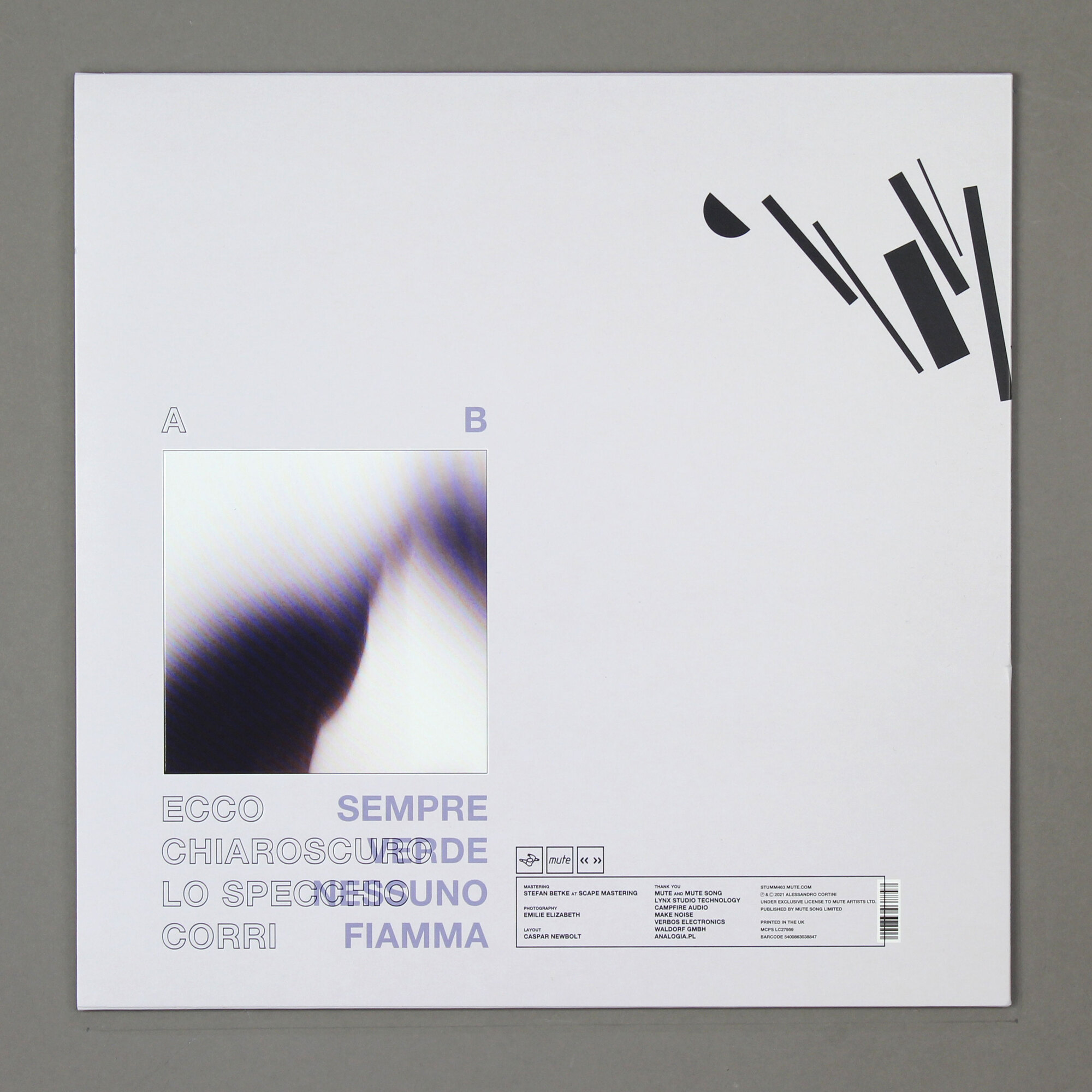
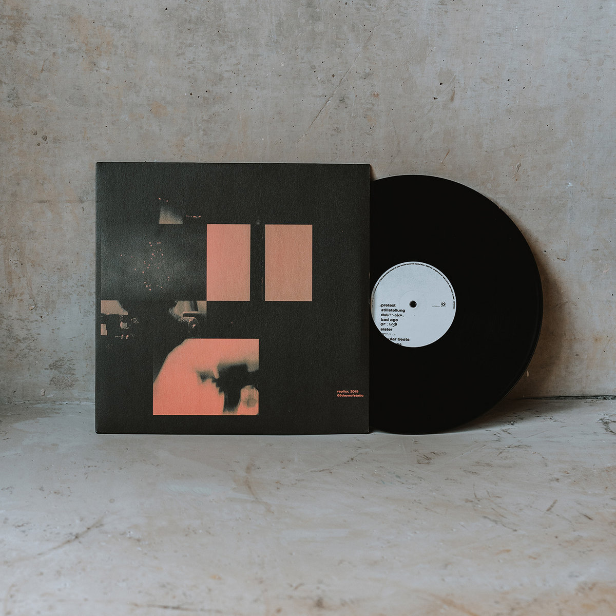
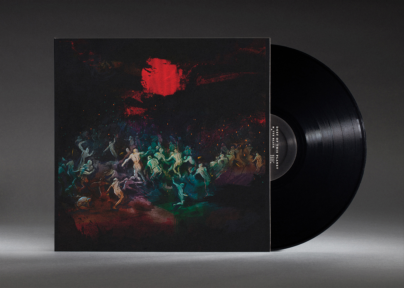
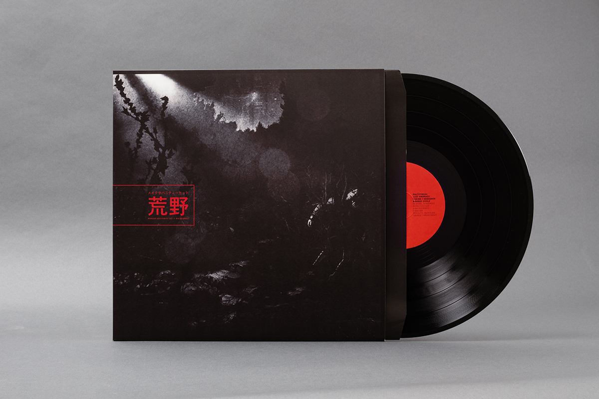
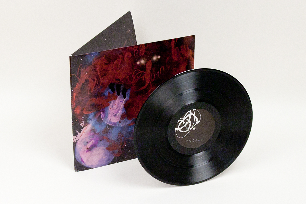
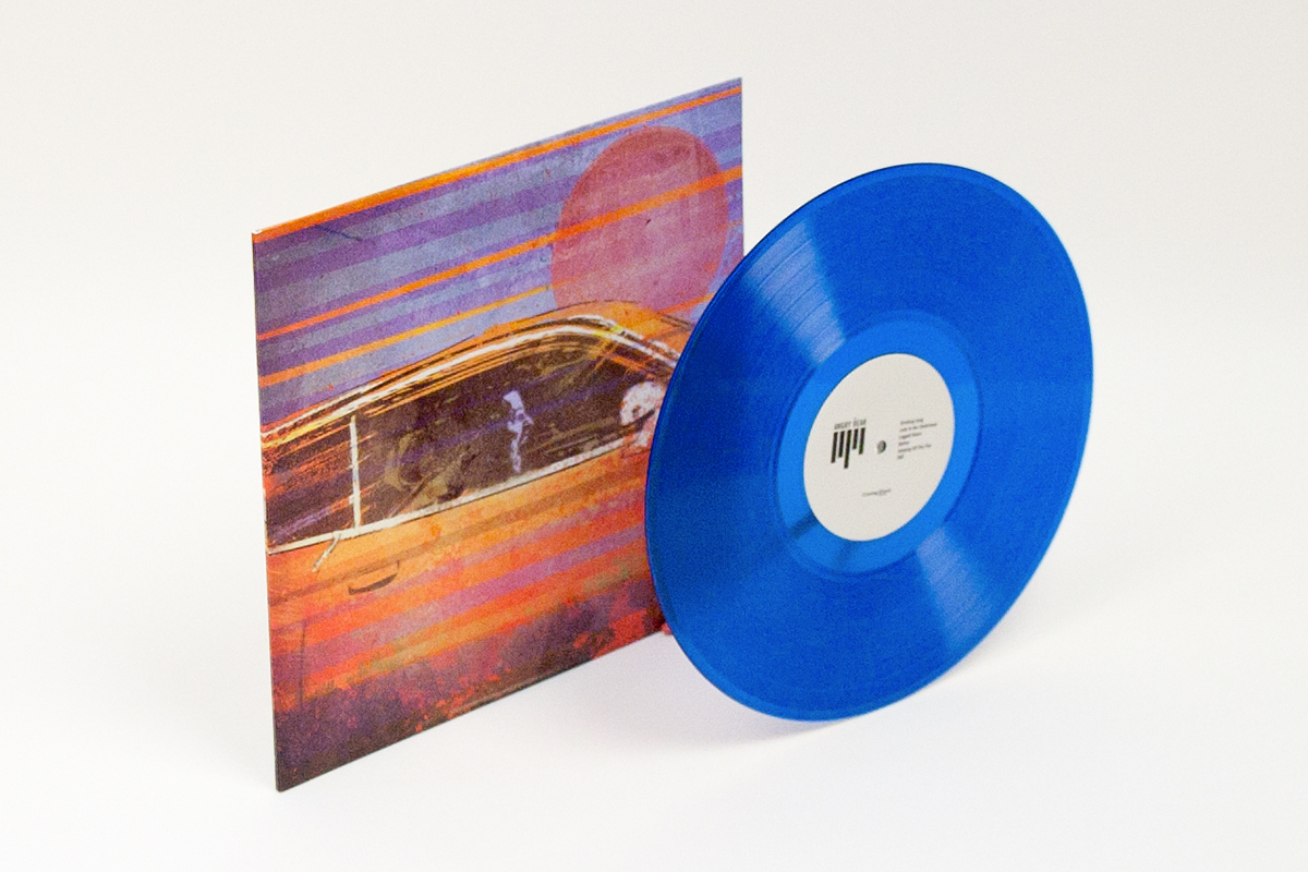
the band responded well to the package. there was finally a light at the end of the tunnel, and thus began the process of making the vinyl, cd and digital artwork. rather like
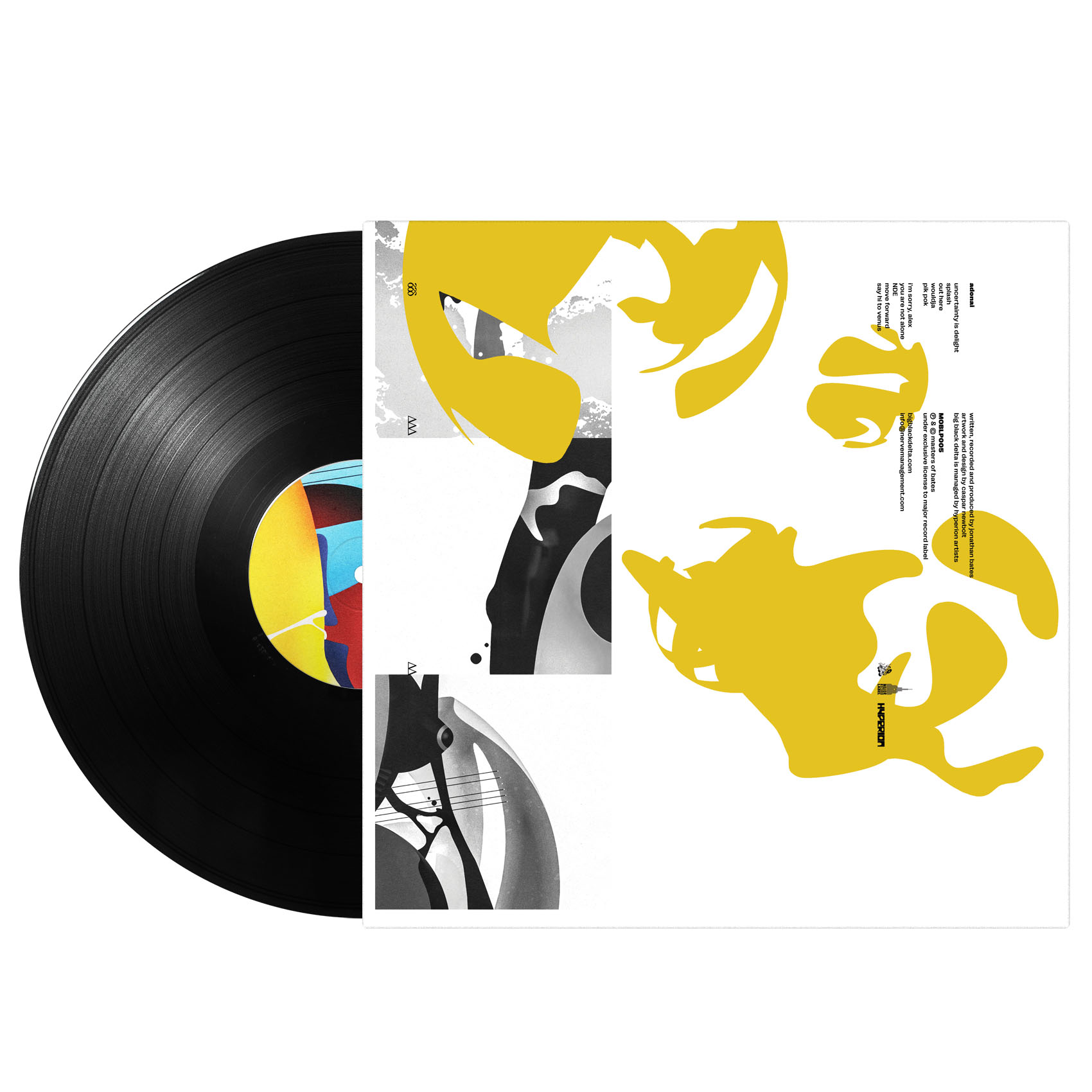
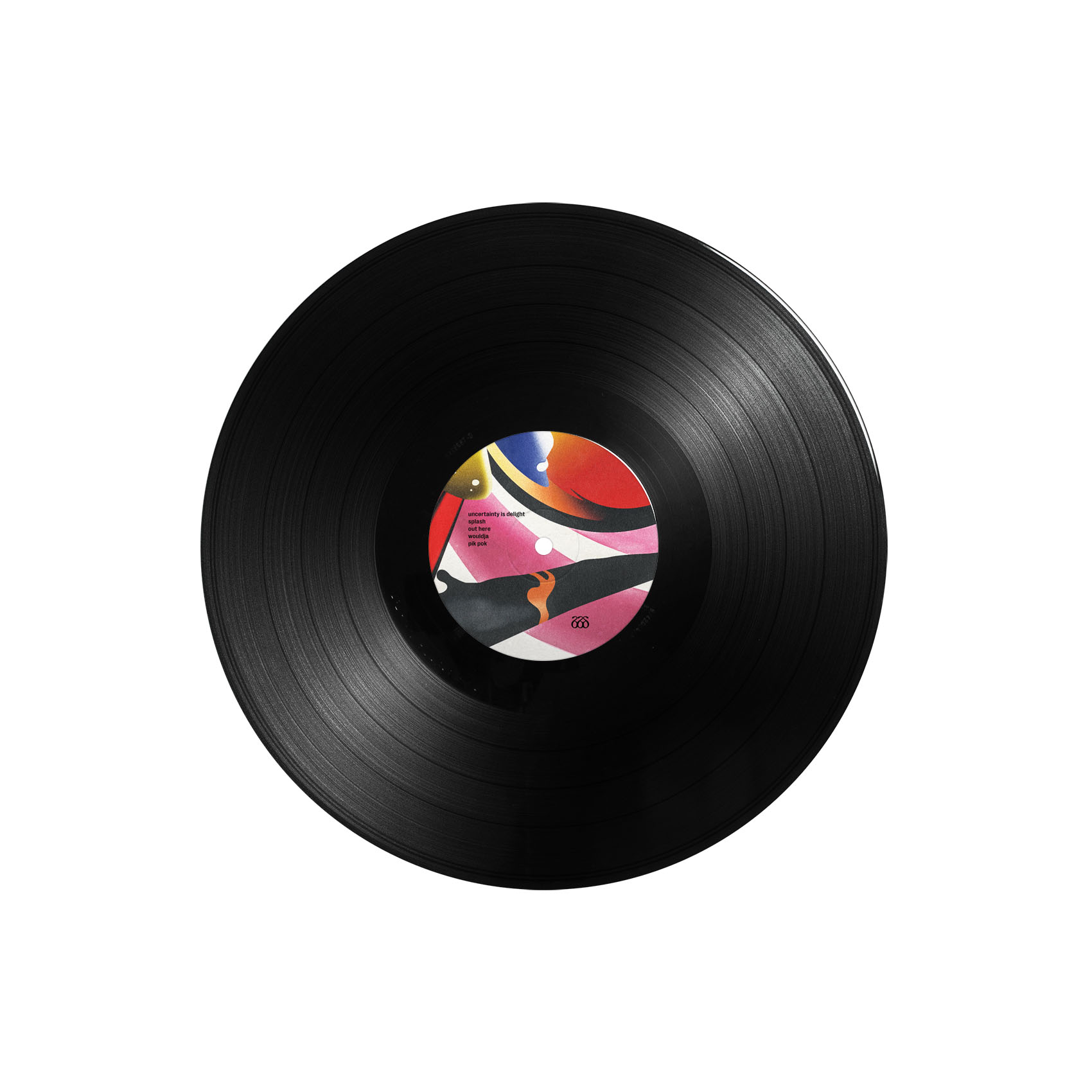
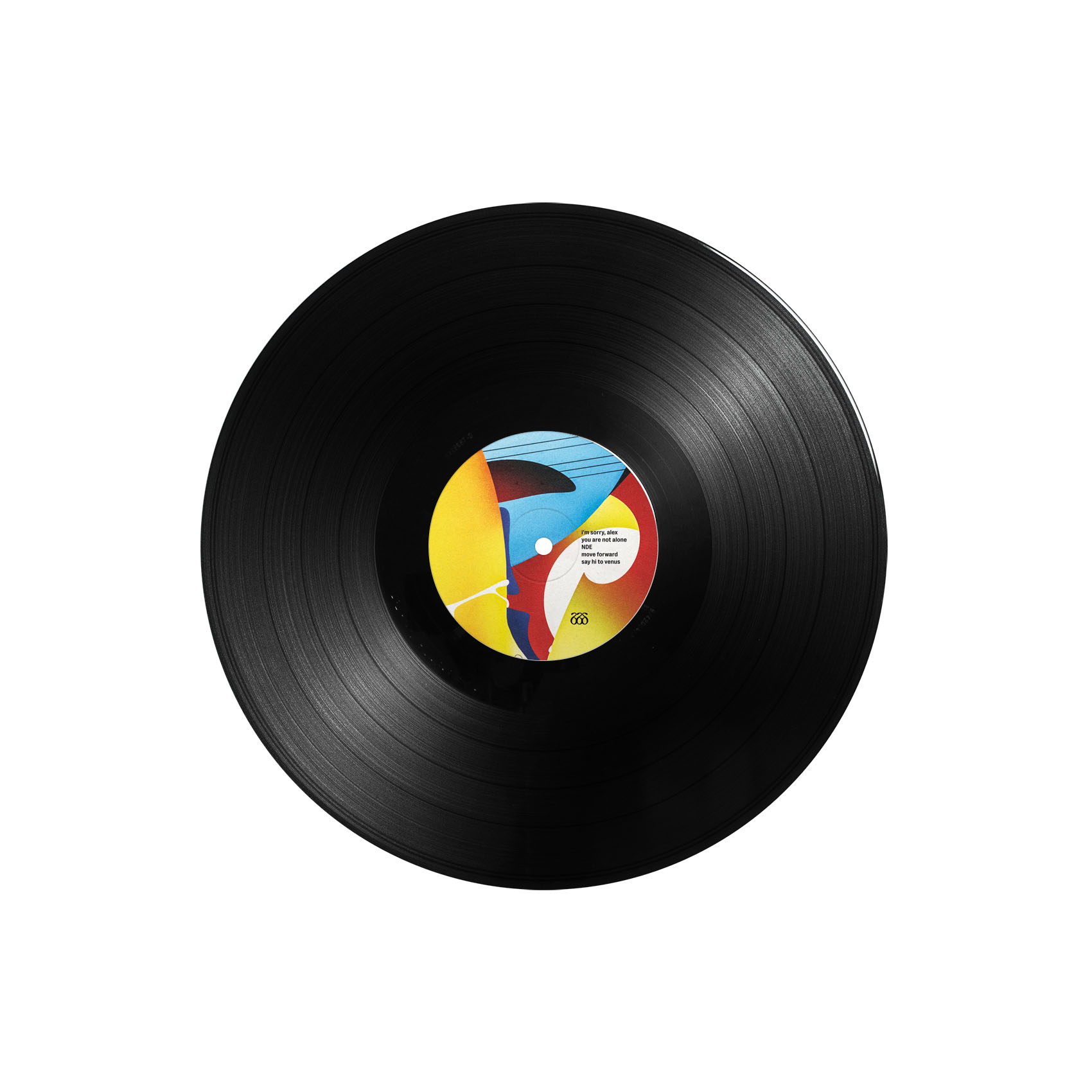
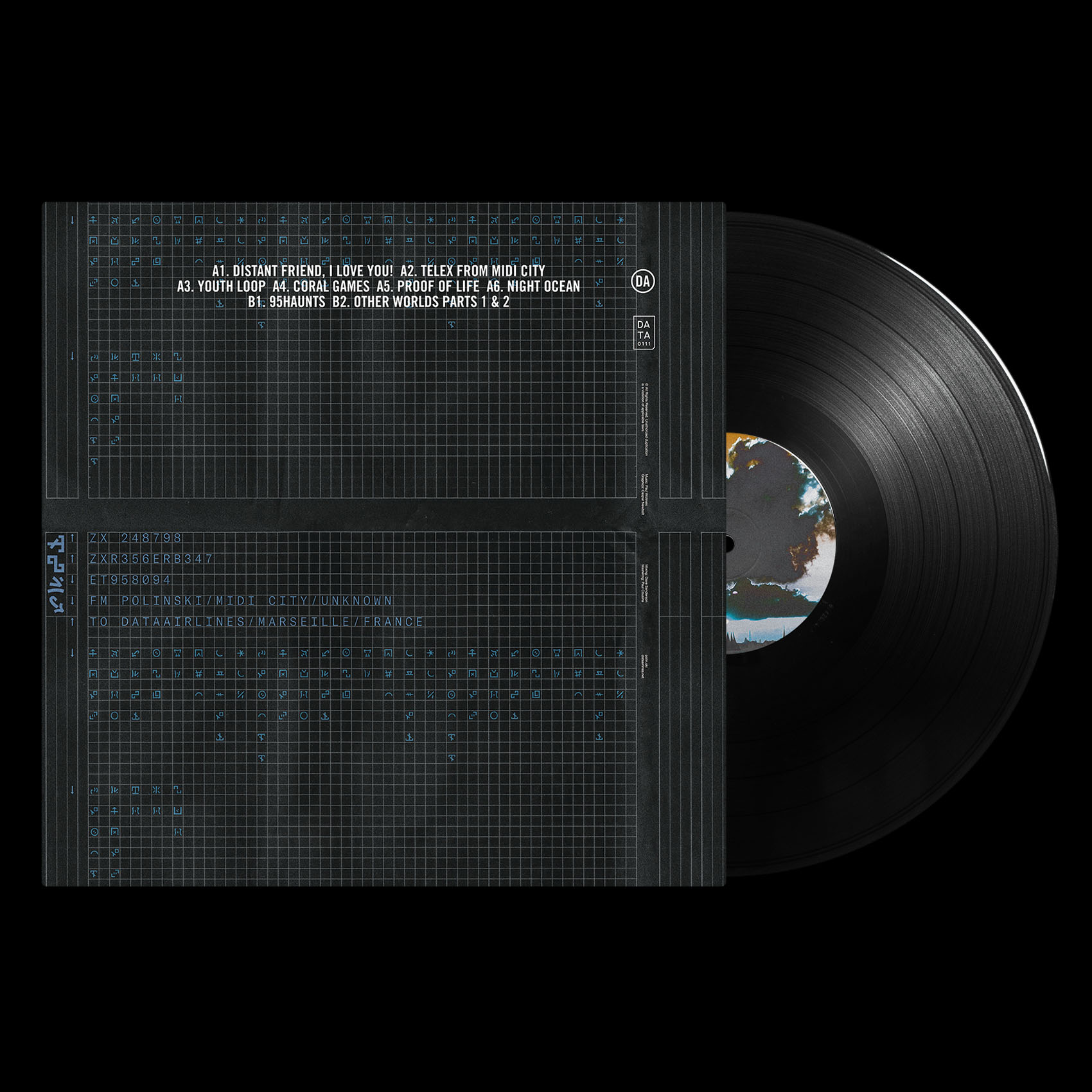
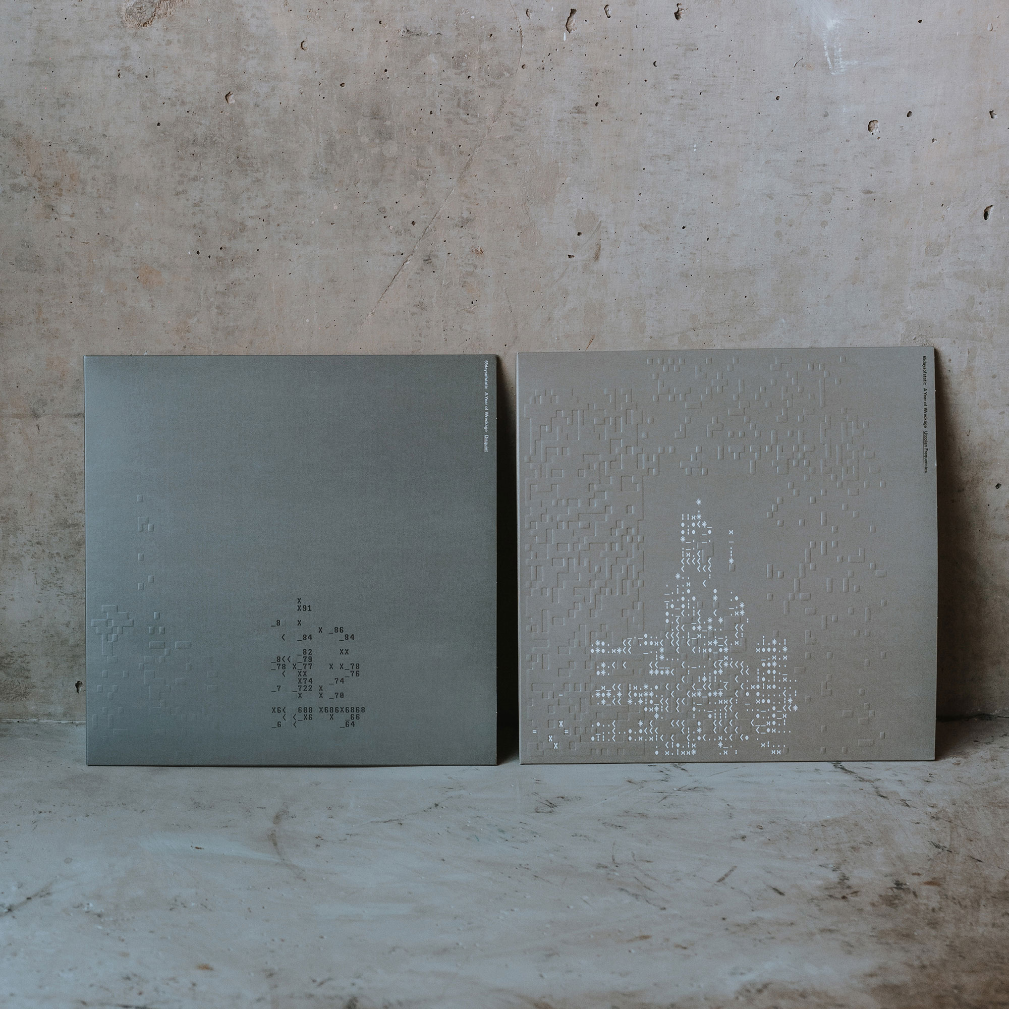
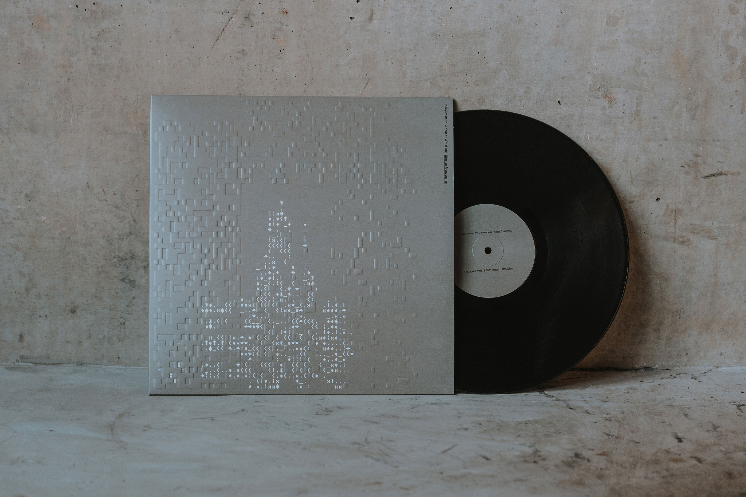
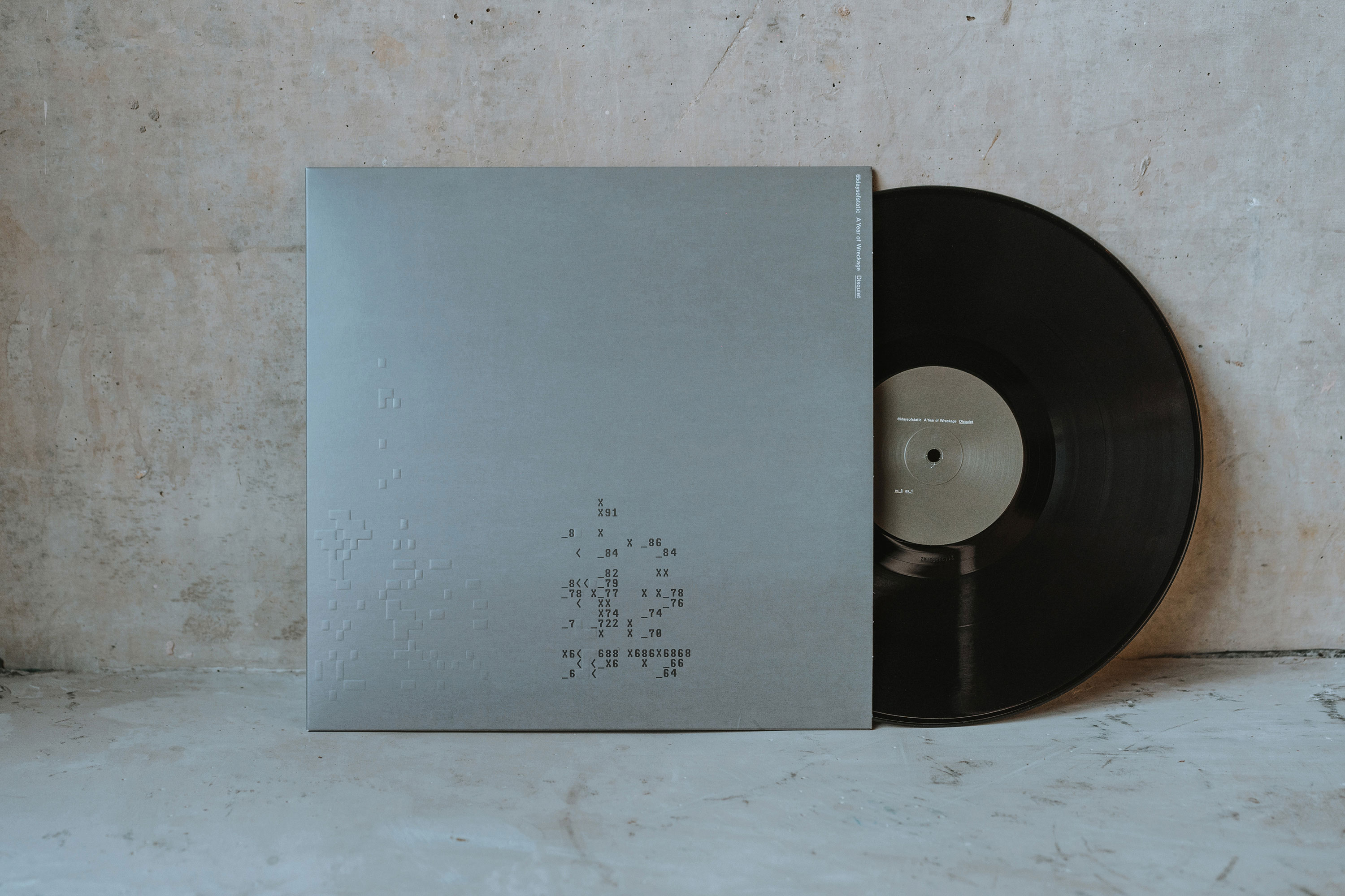
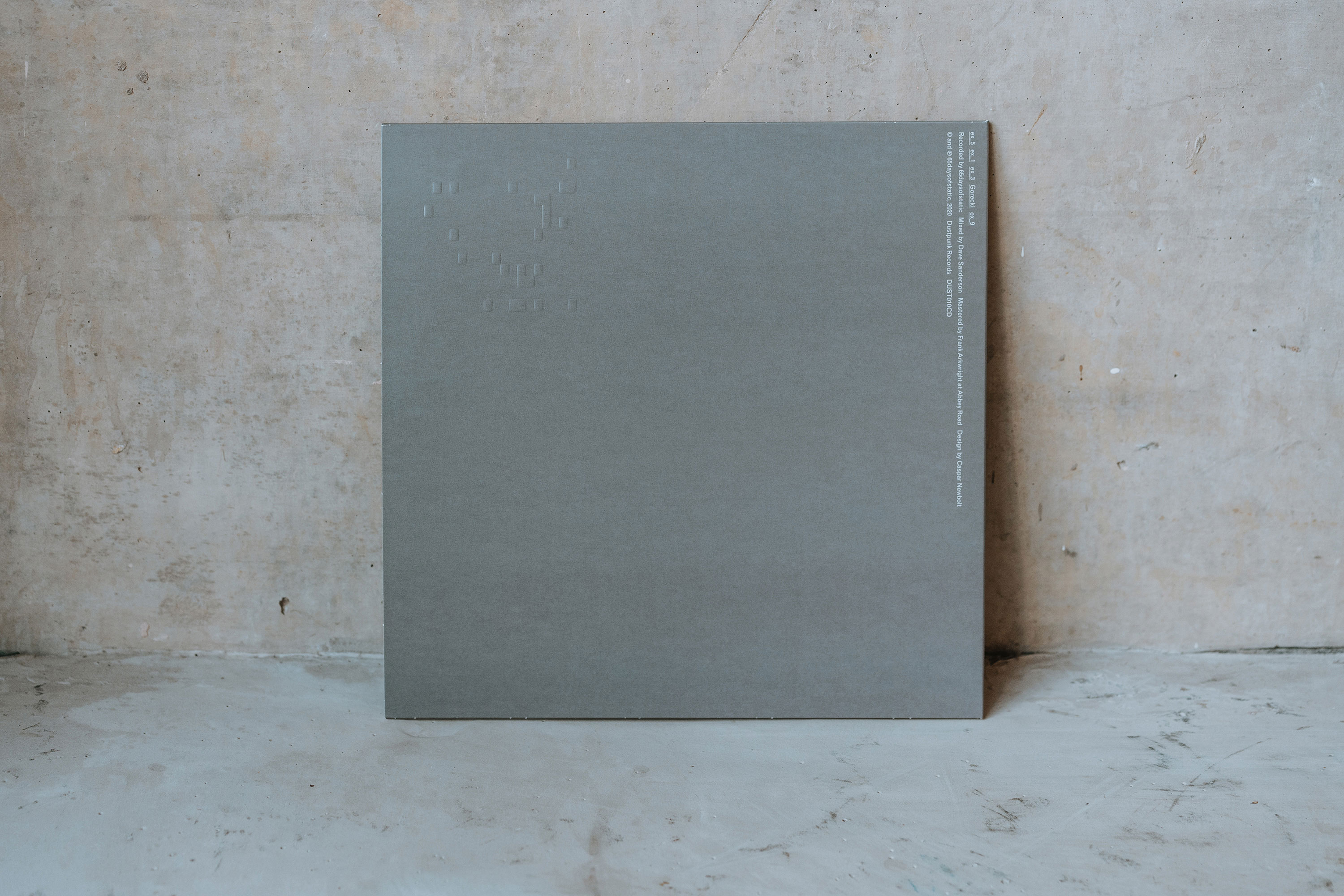
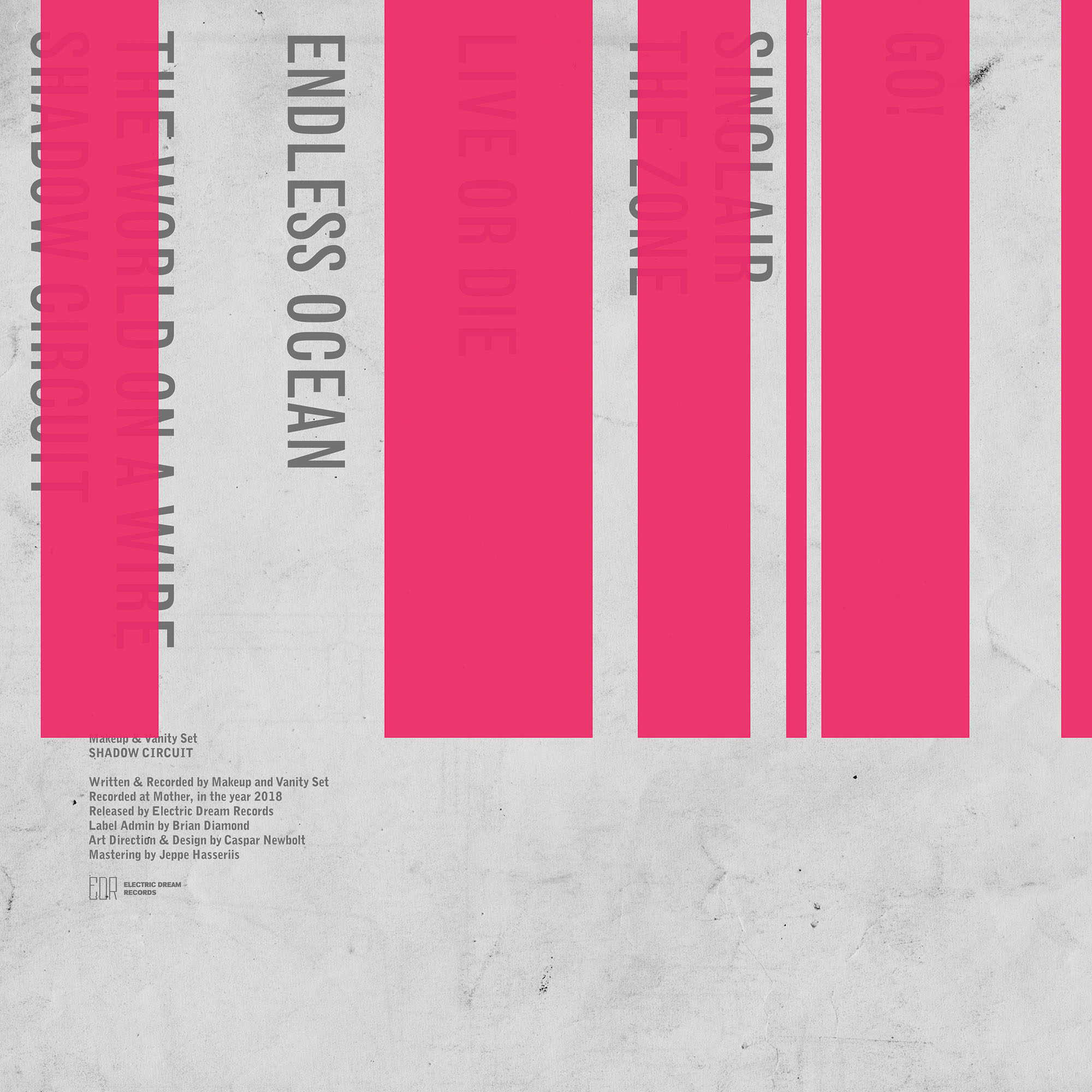
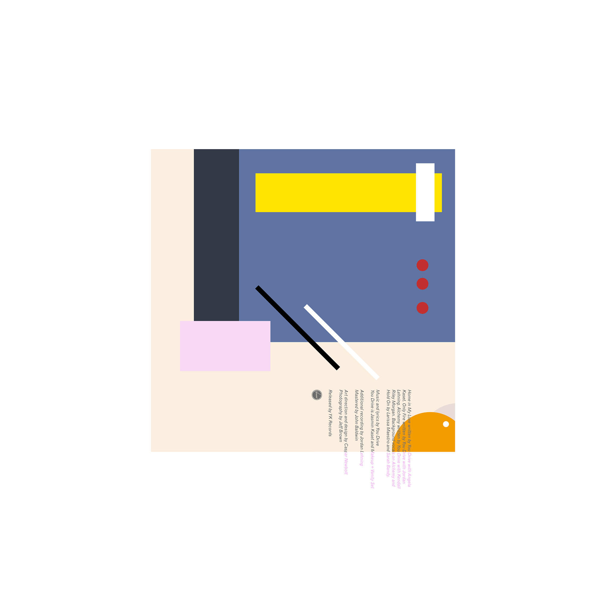
autechre's oversteps record, we all agreed that each of replicr, 2019's different musical formats should have different artwork. this of course echoed rob's point that everything we were making was a diluted copy of the previous thing; our pop that ate itself had to regurgitate itself to satisfy the format wars.
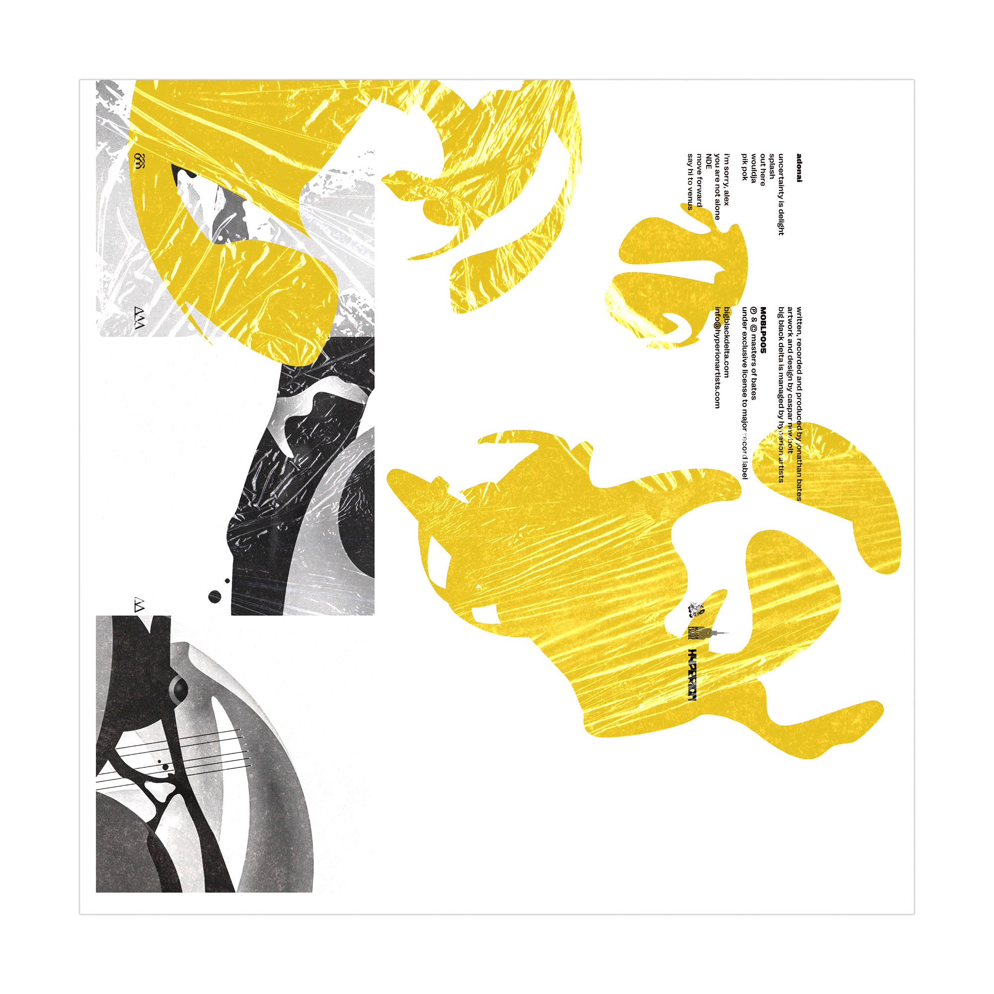
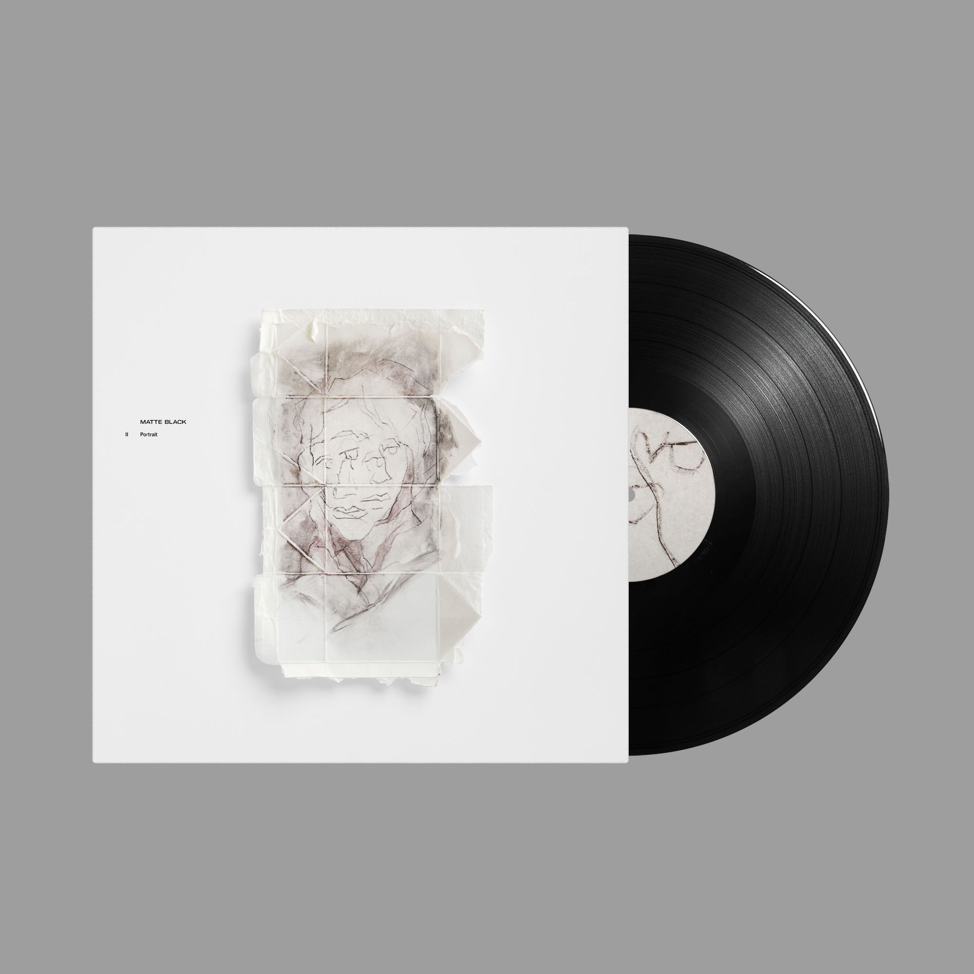
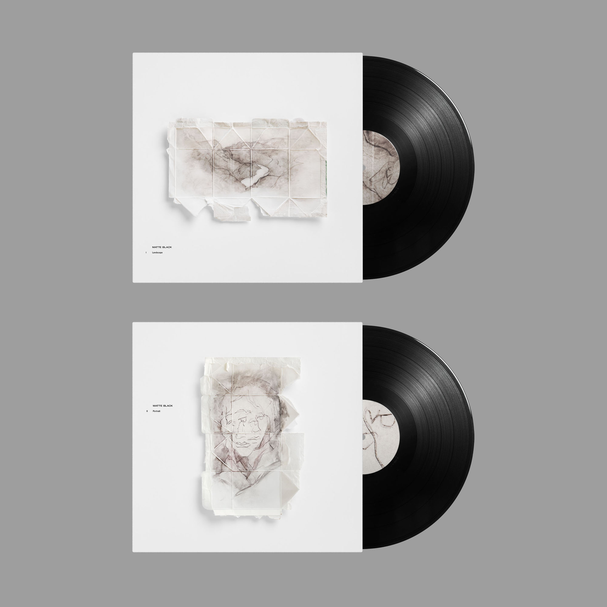
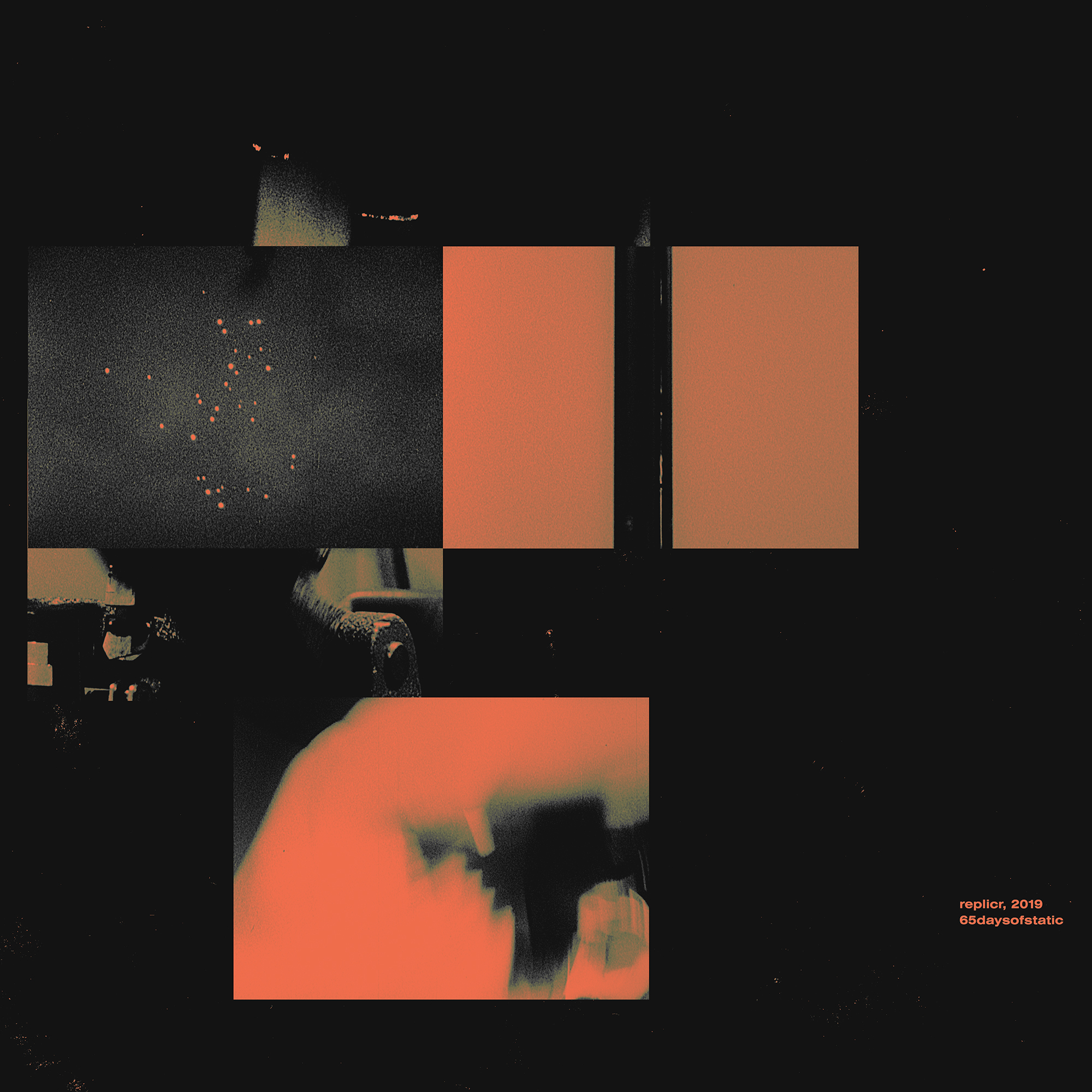
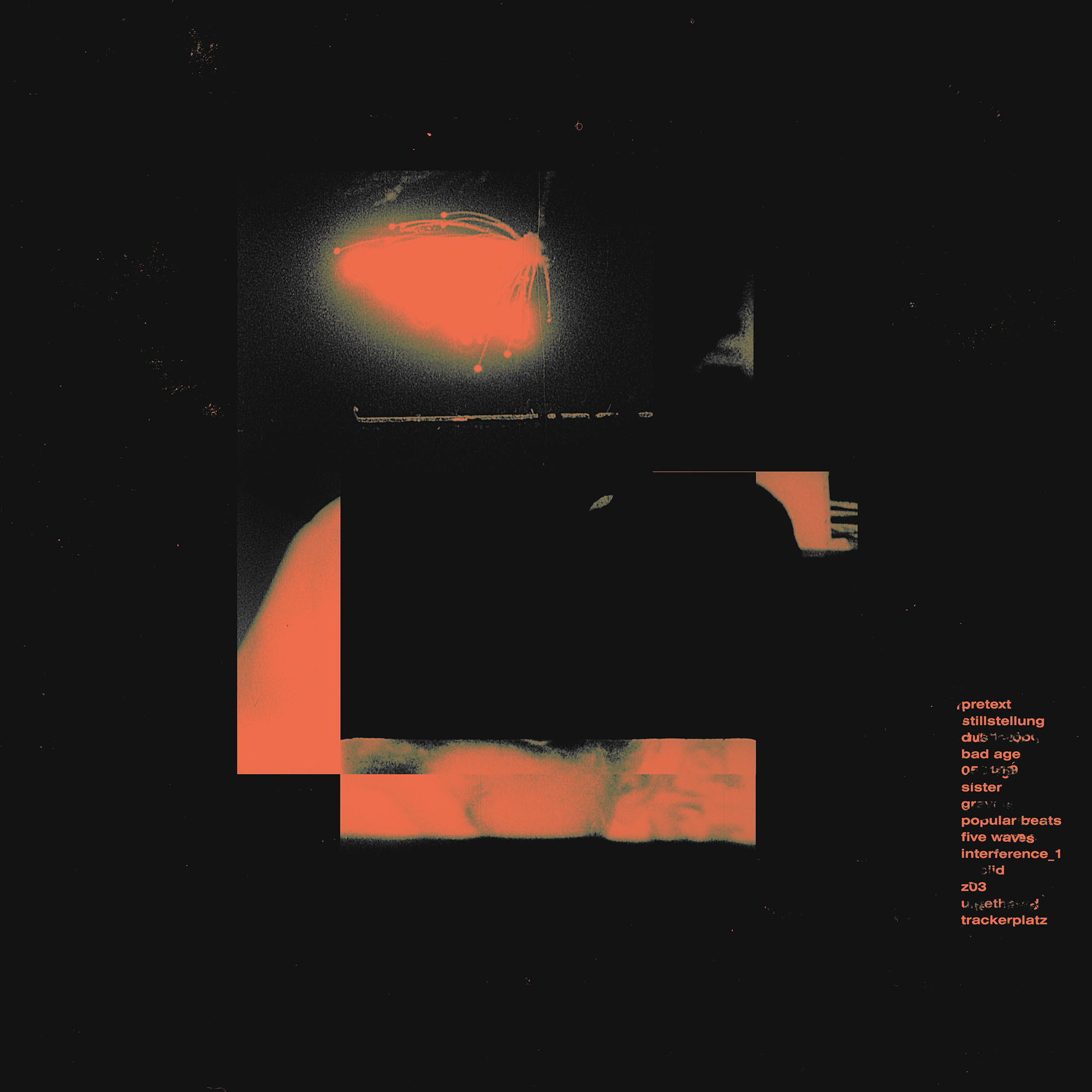
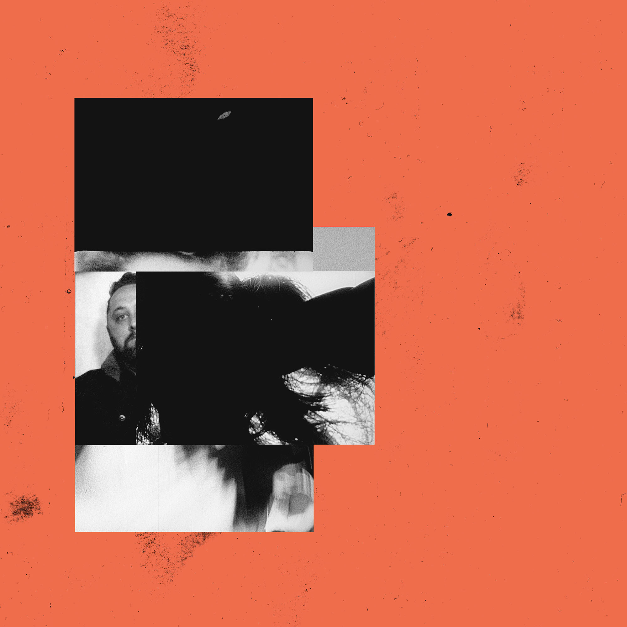
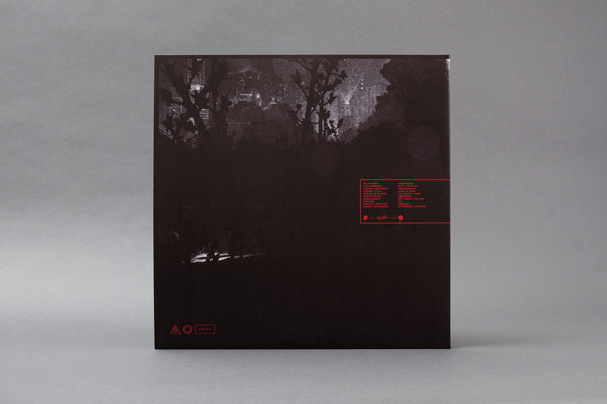
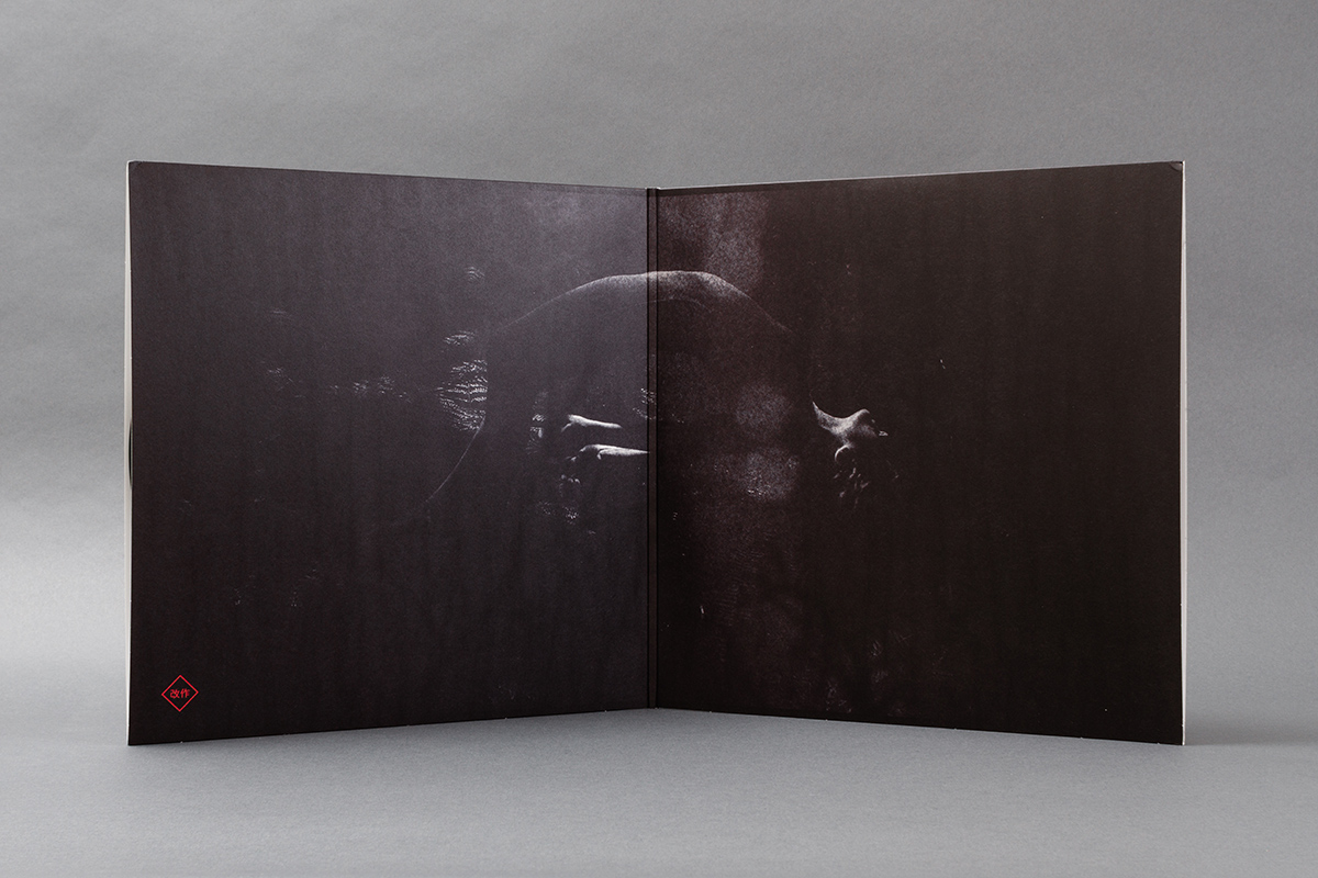
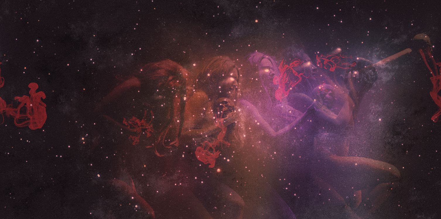
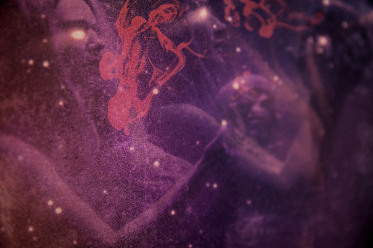
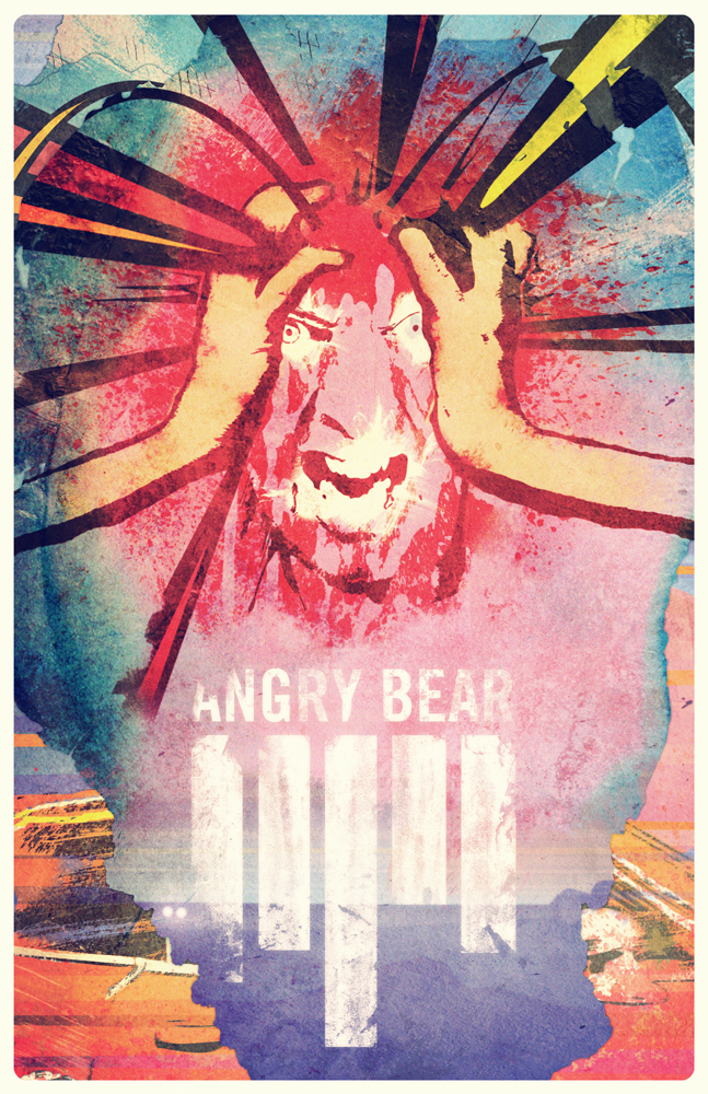
caspar then made a large series of hand-made collages using the 1968 film's stills. the idea was that each collage would be made on a fixed, pencil drawn grid, using the same limited selection of stills each time. in the process caspar tinted half of everything he was producing with an unusual red colour. it was a colour that he and the band agreed carried an ineffable, ominous quality that echoed a similar quality found in the music.
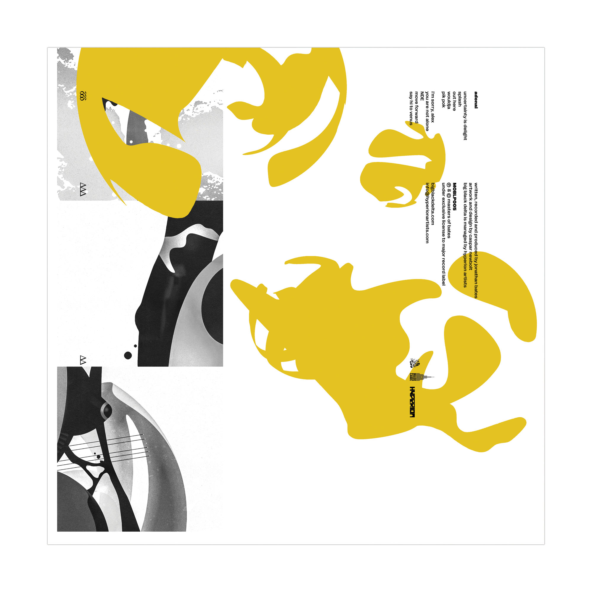
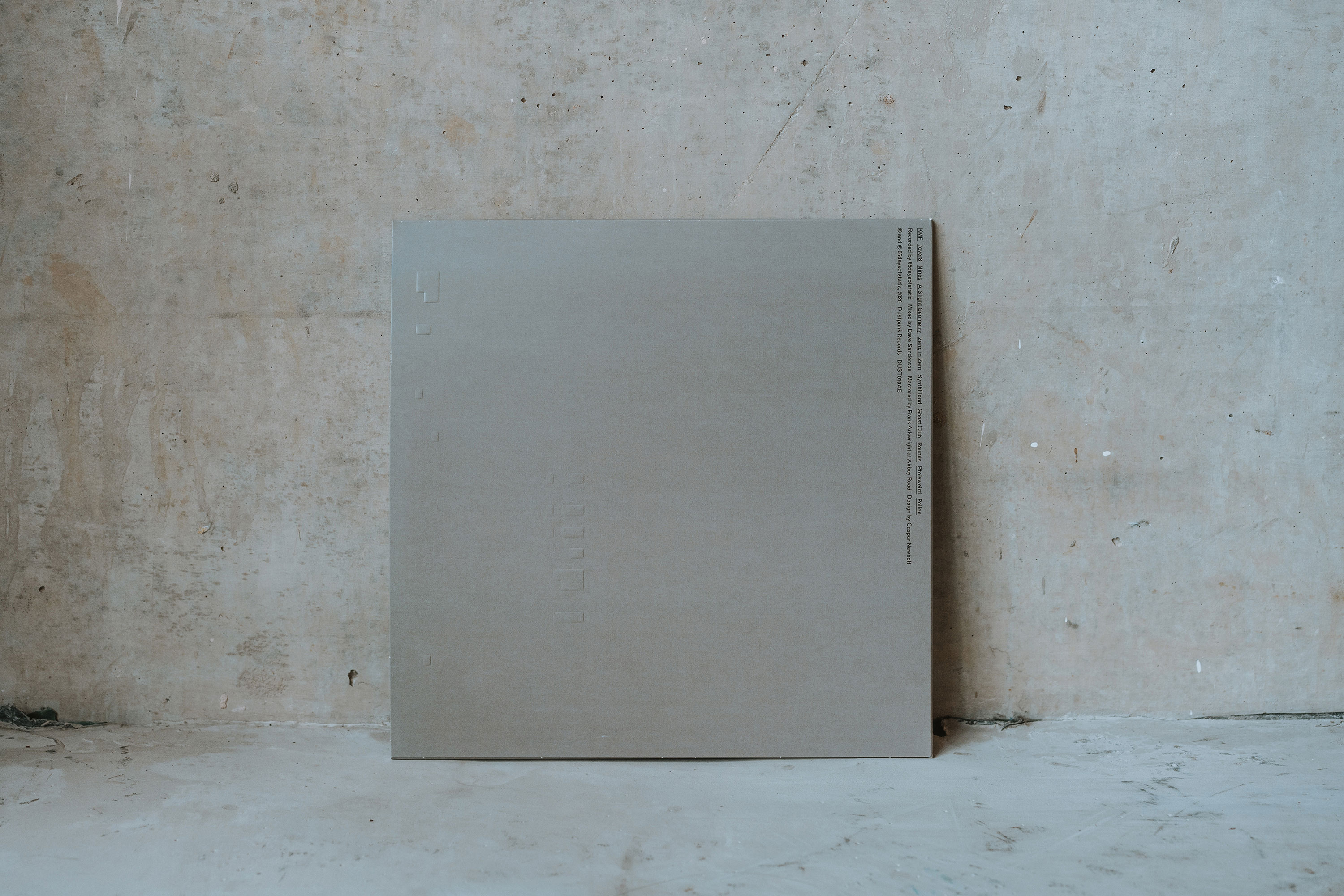
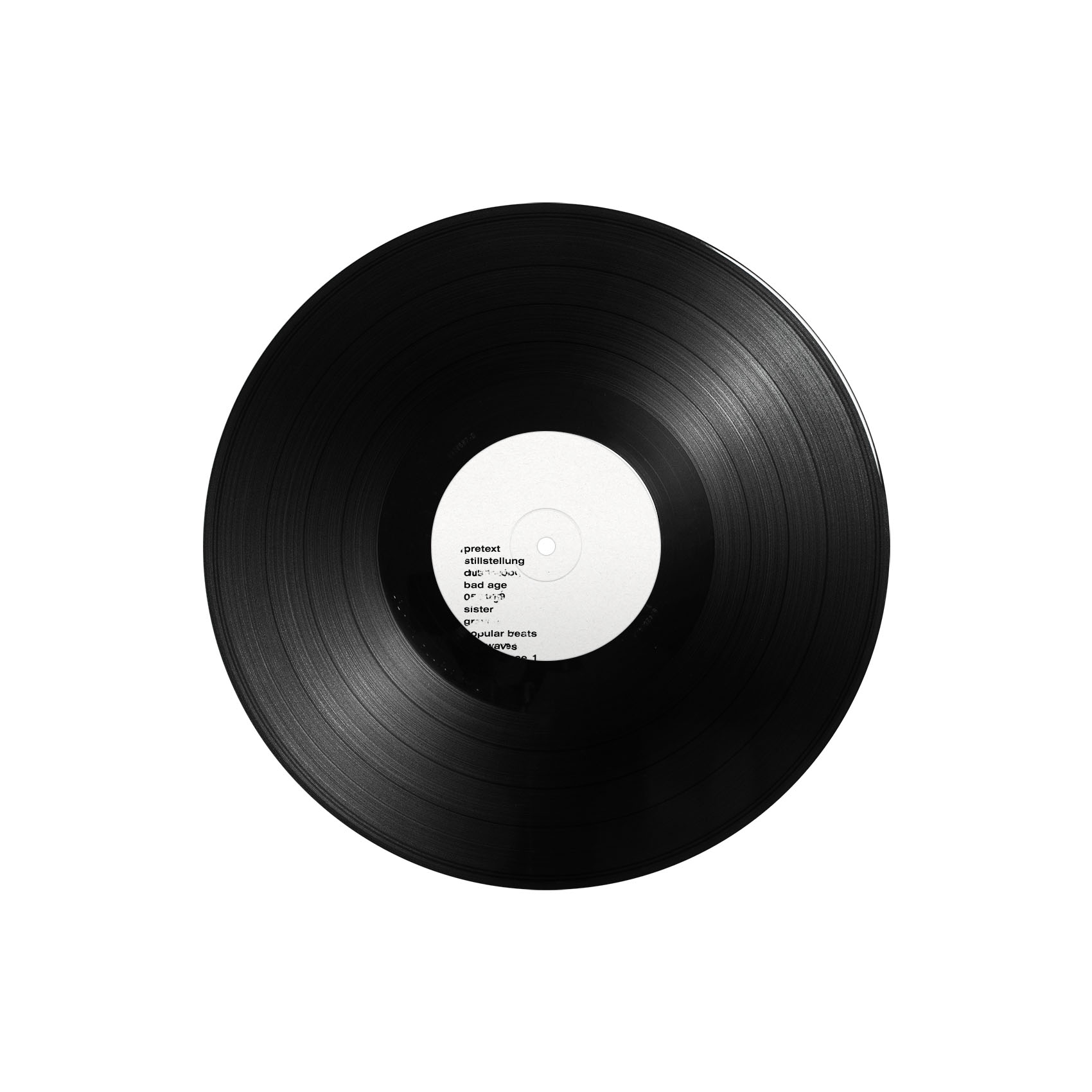
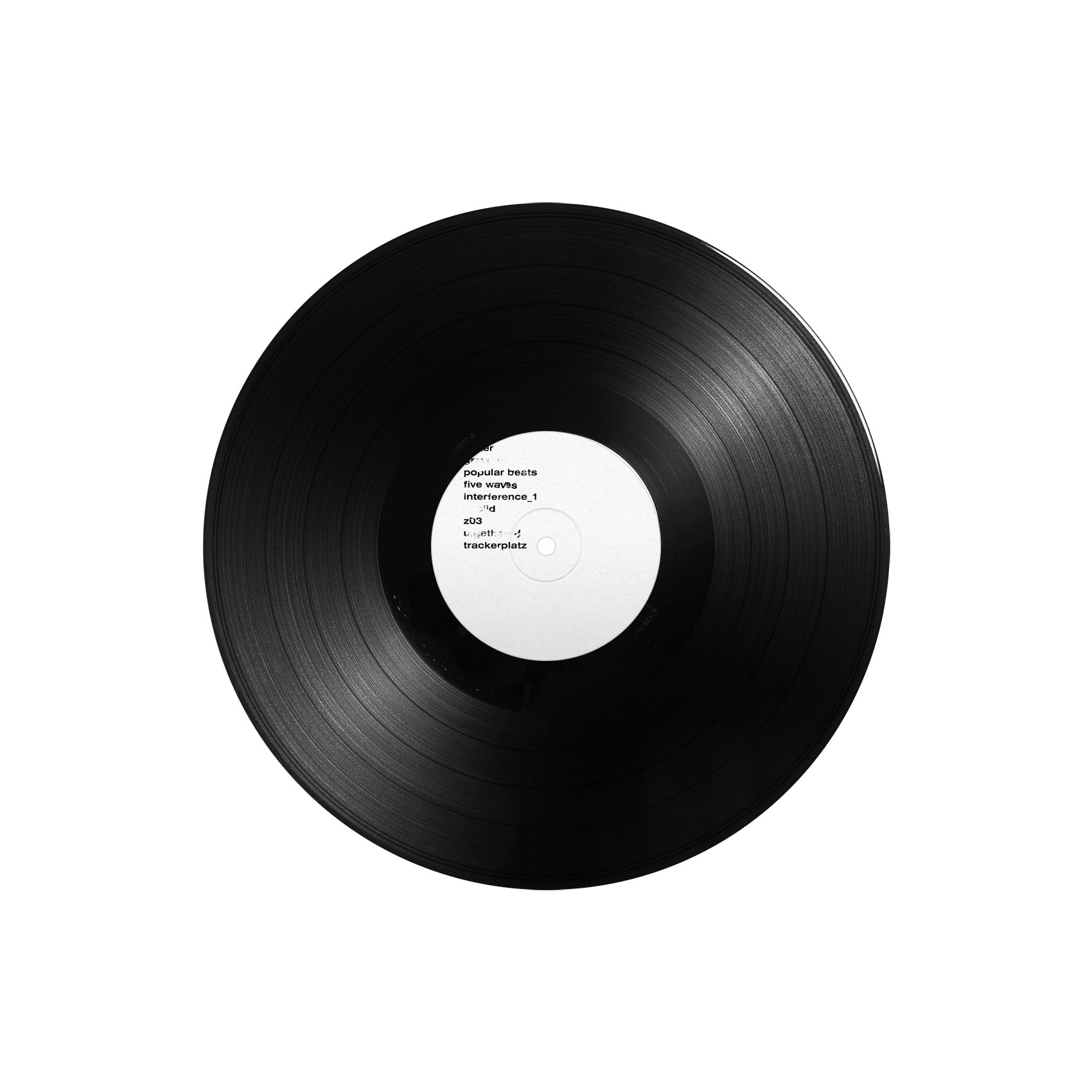
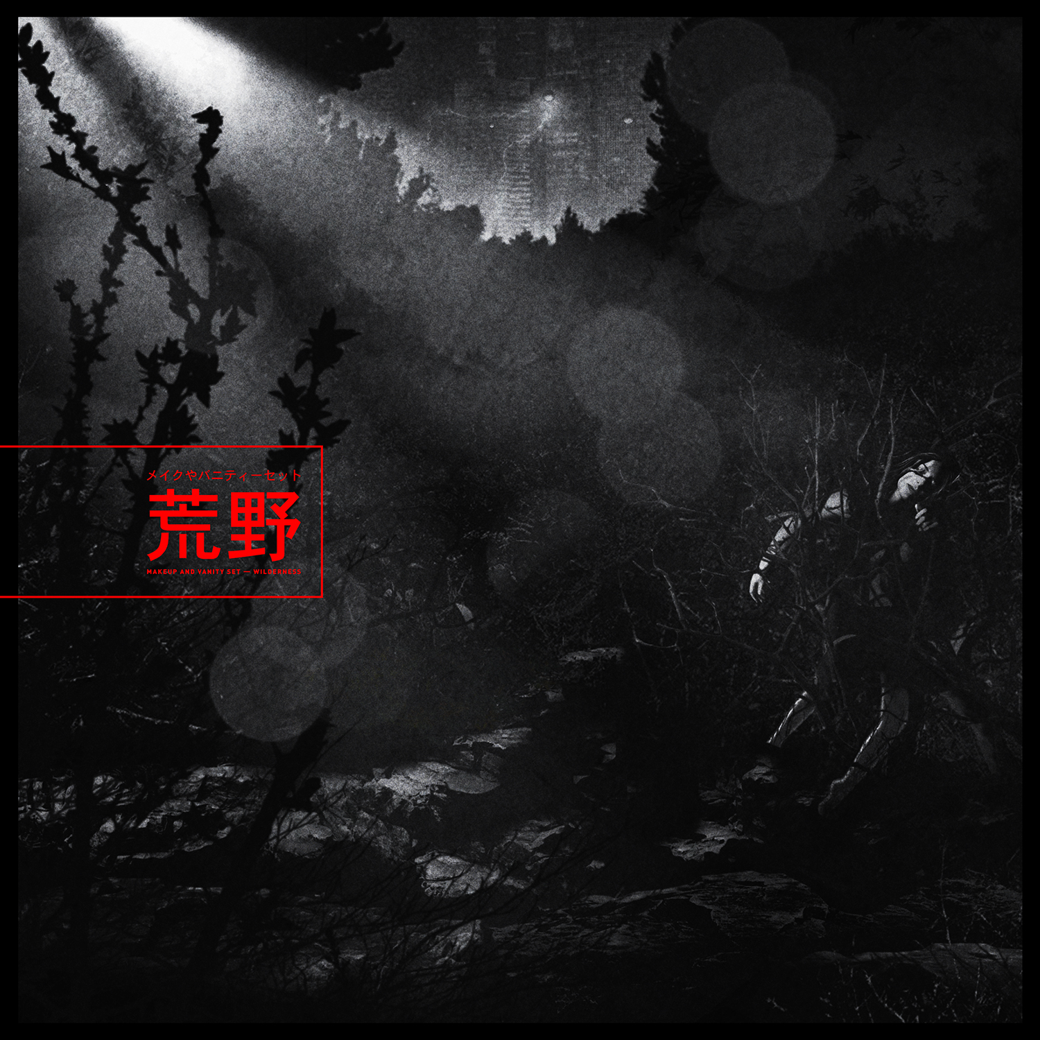
then came the typography for the album name, tracklist and liner notes. caspar printed all the relevant text out onto paper and then layered several pieces of sellotape over some of the words, sentences or paragraphs. some of the tape he ripped off—thus removing pieces of the words—and the rest he left as is. scanning the results of these experiments back into the computer produced the typographic effect you see here in the artwork.
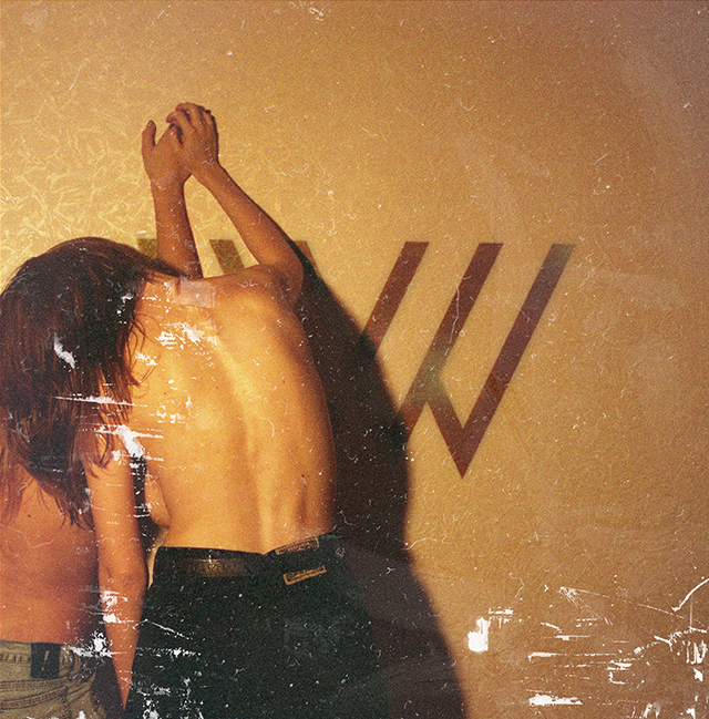
last of all came the question of whether to put a picture of the band into the album artwork. they'd never done this before so it was an interesting proposition. the band weren't all living in the same country at this point and so they'd already come up with the idea of doing a band photoshoot using passport photo machines in different countries. it was itself a great idea for a band photoshoot, but it also served the replicr, 2019 project's ethos admirably well. caspar therefore took these photobooth images and folded them into the collages he was making. remarkably, the band didn't hate the results.