(v)
(v_i)
(version_industries)

music
record sleeve
_what
record sleeve for the nashville-based band, the protomen.
_how
the protomen sent us their new song, "the fight," and we got to work. the band are always clear on the imagery they want to accompany their music, and john delucca and caspar do their best to realize that vision.

this time around the band needed a new logo as well as a revised visual aesthetic. john drew the cityscape you see here, and caspar drew the logo typeface and the rest of the layout. the aesthetic references are we're sure very obvious to some, but above all we hope you find it all a fitting visual accompaniment to the song.

you can listen to "the fight " here.
_link
protomen.com
_tags
poster
_what
poster for the feature film, futra days.
_how
director ryan david reached out to us in the hope that we'd create the poster and titles for his new feature film, futra days. the film is a deep psychological, psychedelic trip that takes a rather dickensian approach to the larger existential questions. the poster you see here was one of several ideas we pitched. long-standing collaborator john delucca brought his typical brilliance to the fore and took care of the lion's share of the work here.
_link
imdb.com/title/tt6209774
_tags
cover vinyl mockup
_what
record sleeve for the nashville-based band, makeup and vanity set.
_how
'breaking news' is the 4th record in a series of imaginary soundtrack albums by matthew pusti, AKA makeup and vanity set. it is the first record in a start of a new trilogy, but a part of a larger series under the name 'charles park'. the narrative of this record is based more around a criticism of the american news media. based on a short plot synopsis from matt, long-standing collaborator john delucca and i set to work on creating a cover that we felt set the tone of the movie inside matt's head. the result of that work you can see here.
_link
makeupandvanityset.com
_tags
poster
title sequence 1
title sequence 2
title sequence 3
title sequence 4
title sequence 5
title sequence 6
title sequence 7
title sequence 8
title sequence 9
title sequence 10
title sequence 11
title sequence 12
title sequence 13
title sequence 14
_what
writing, directing, title design and poster design for the short film, light up the night.
_how
executive producer john la valle approached us with idea of making a film of a section of the protomen's second record, act II: the father of death. the band chose light up the night as the song, and we approached collaborator matt sundin to co-direct the project with us.

development of the project took some years. the end result, shot in new york city and starring james ransone, you can see here. a testament to the band and everyone else involved, the film pays homage to many of the things that inspired us to do the work we do today.

we collaborated once again with john delucca on the film's title sequence and its poster design.
_link
protomen.com
_tags
cover
1
2
3
4
_what
record sleeve for the sheffield-based band, 65daysofstatic.
_how
our friends and long-standing collaborators 65daysofstatic were hired to write the score to the forthcoming game, no man's sky. 65 in turn asked us to put together the artwork for the soundtrack itself. after listening to the music for months we had a long chat with the band and came up with a loose aesthetic trajectory. two or three different approaches were fully explored before we settled upon what you see here.

the landscape paintings you see embedded into the various covers are by another of our long-term collaborators, john delucca.

the record is available here in various physical and digital formats.
_link
65daysofstatic.com
_tags
cover
back cover
inside spread
poster
_what
record sleeve for the nashville-based band, the protomen.
_how
the protomen, quite apart from their original music output, are a band that produces cover songs par excellence. this is not least because they choose songs that almost entirely echo the narrative they deliver in their ongoing series of rock operas.

the cover up is likely just the first in a series of exceptionally well recorded collections of cover songs from the band. needless to say it was our job to create artwork for the record that deliberately wove it into the protomen's overall narrative arc. this included nothing less than asking friends to voice characters in the various "movie scenes" dotted throughout the recording.

the idea here was to make a movie soundtrack to a film that was made and exists within the protomen's ongoing story. in doing so we asked john delucca that he might once again bless us with his exceptional drawning and painting talents. caspar and commander then sewed everything together to make a vinyl record release we're very proud of.

we hope you enjoy the work.
_link
protomen.com
_tags
charles park trilogy album cover
charles park trilogy poster
_what
record sleeve, poster + trailer for the nashville-based band, makeup and vanity set.
_how
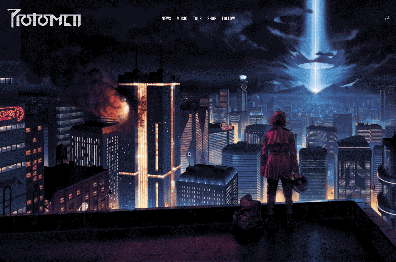
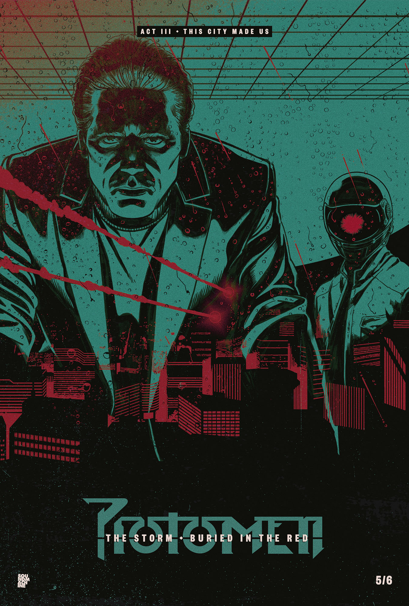
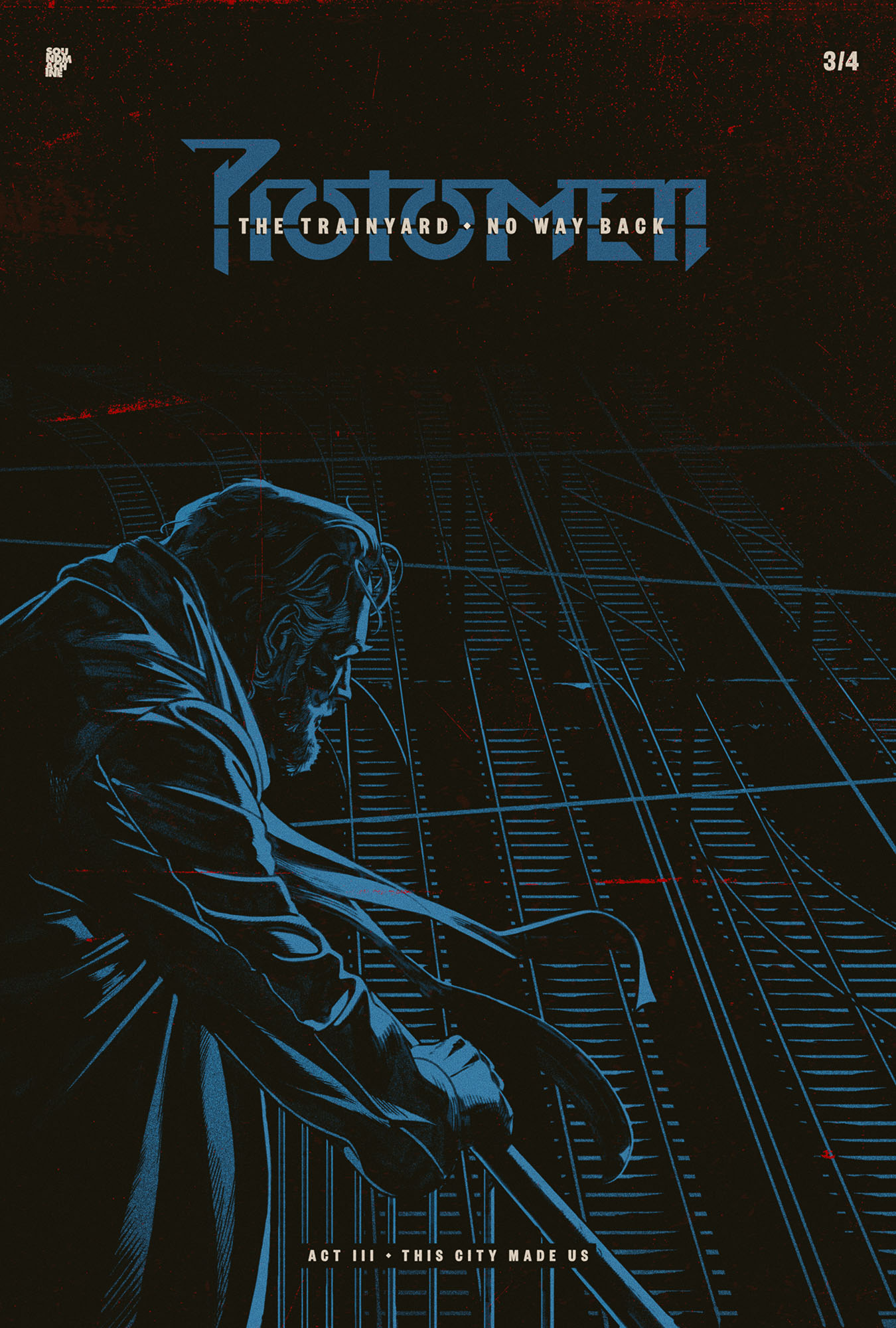
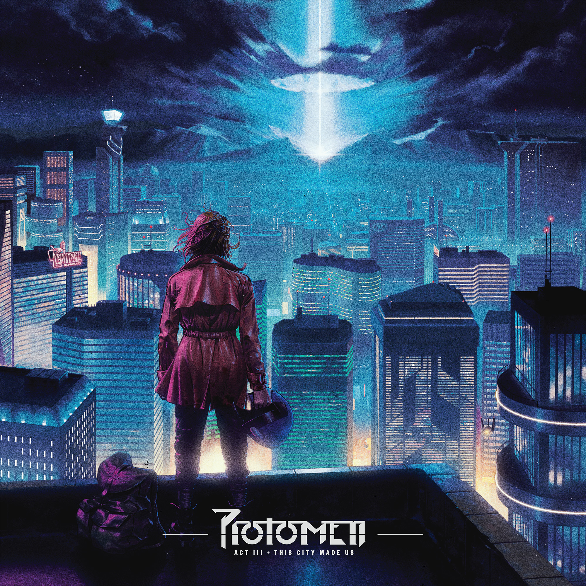
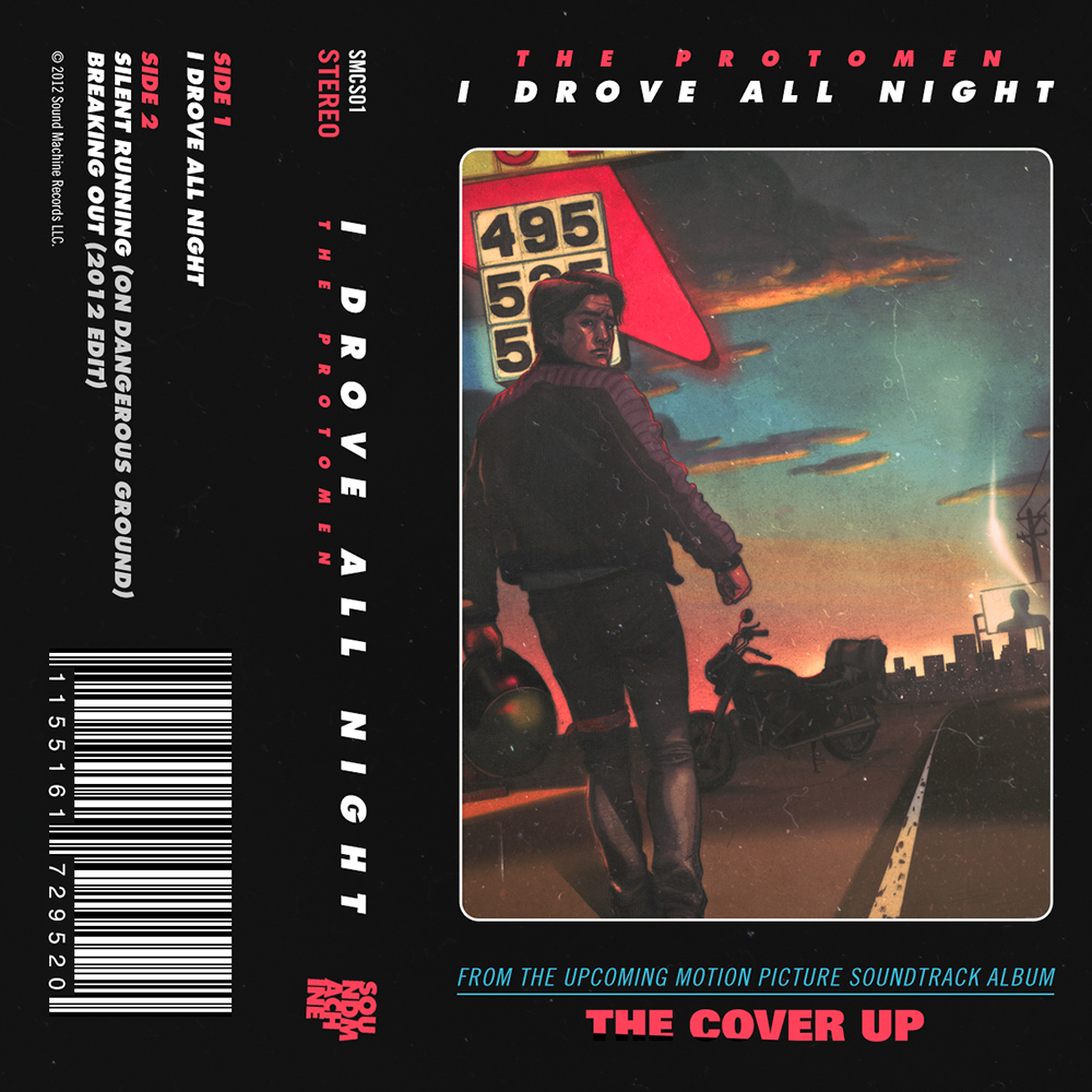
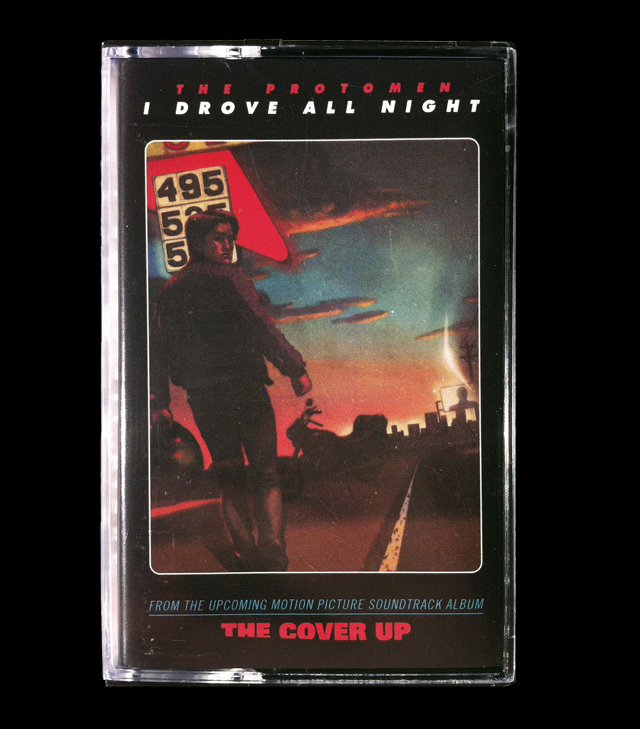
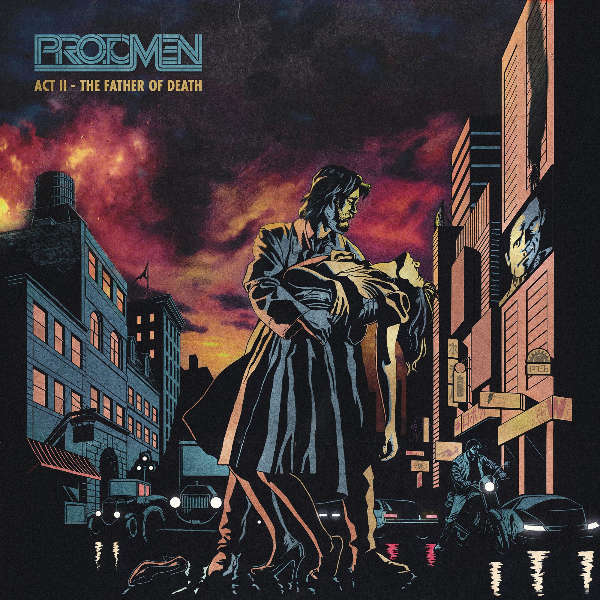
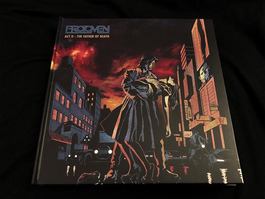
telefuture records approached makeup and vanity set with the idea of re-releasing their popular charles park records as a trilogy box set. the moment the project got a green light john delucca, joey ciccoline and ourselves were put to work in tying the overall package together visually.

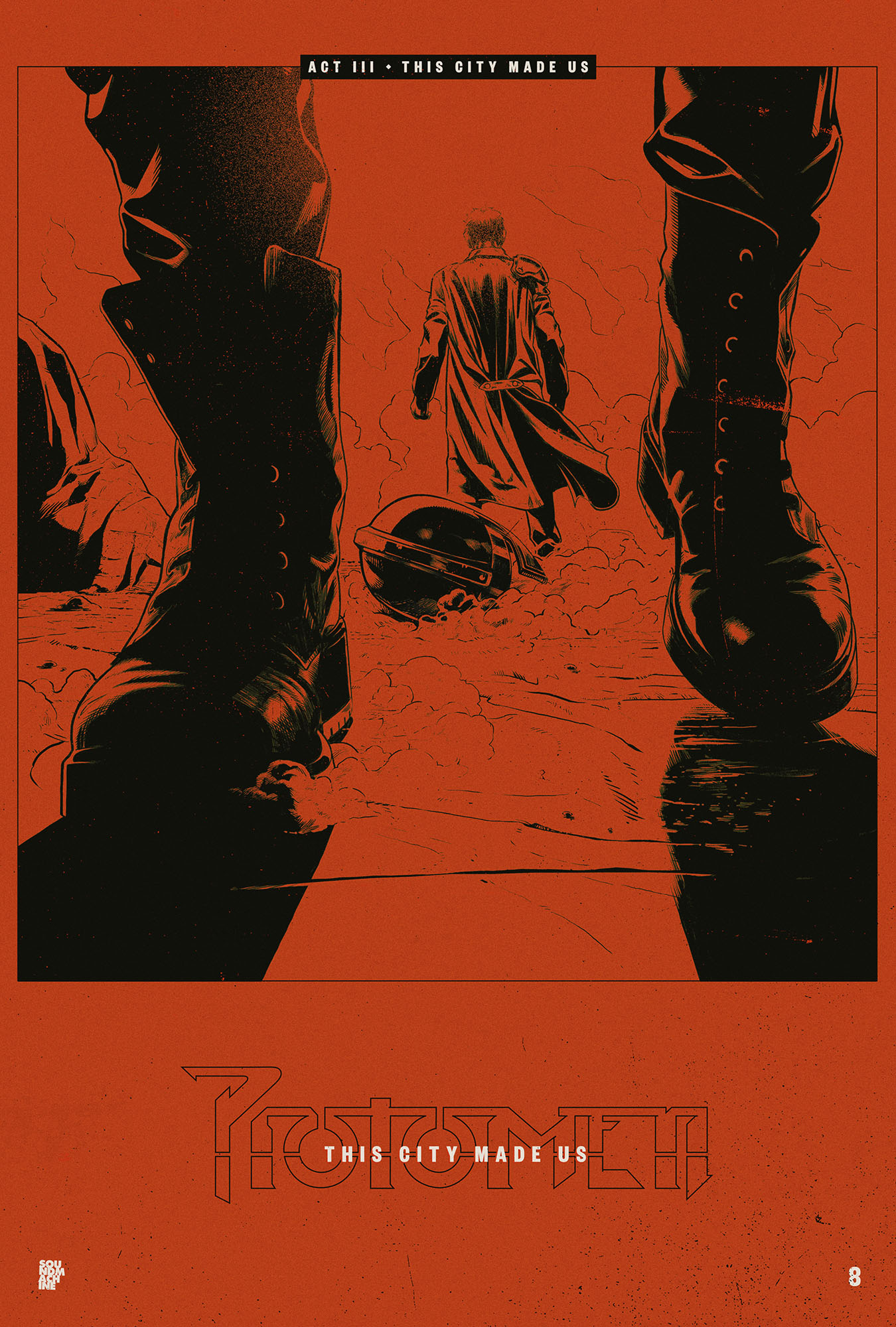
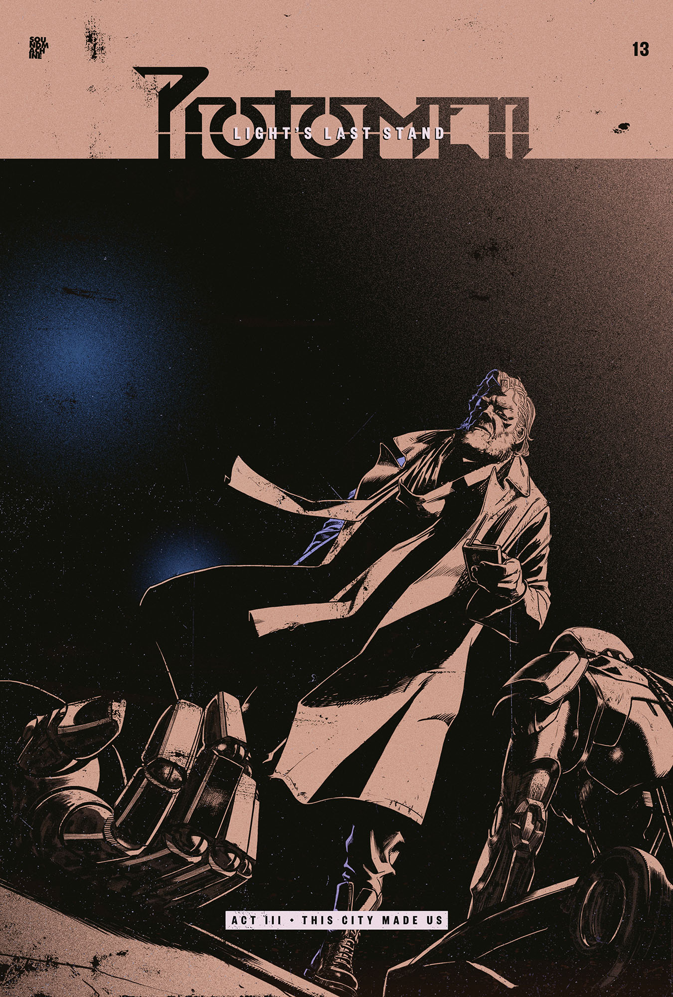
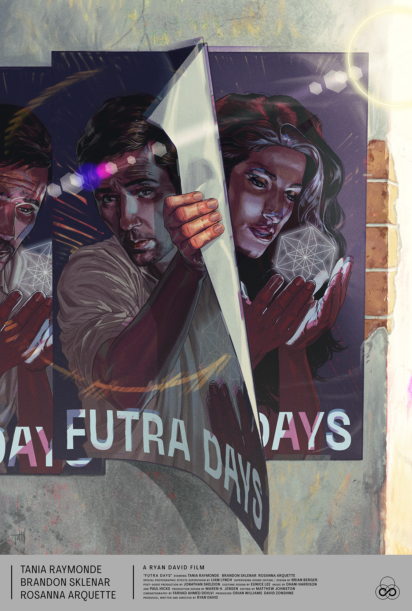
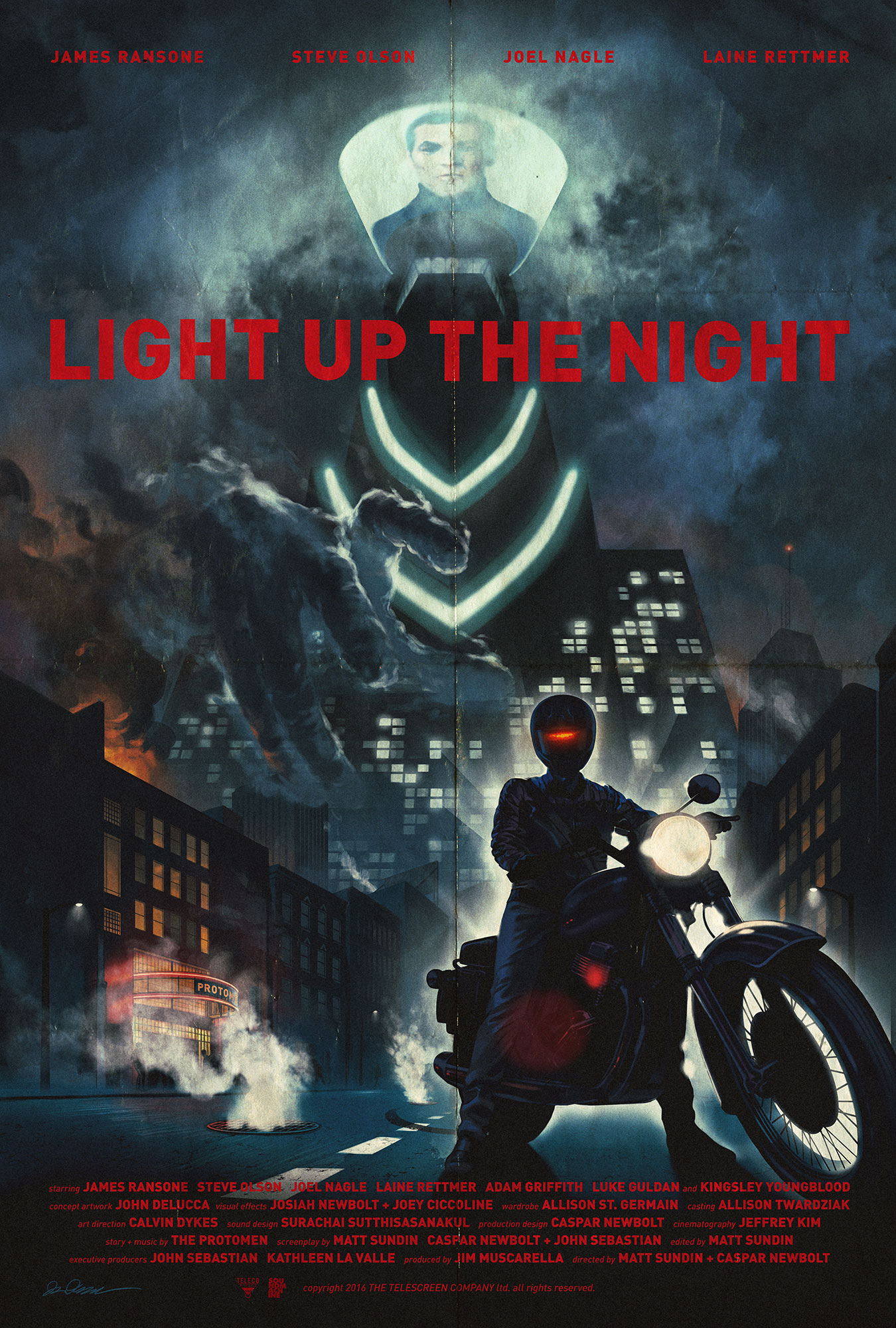
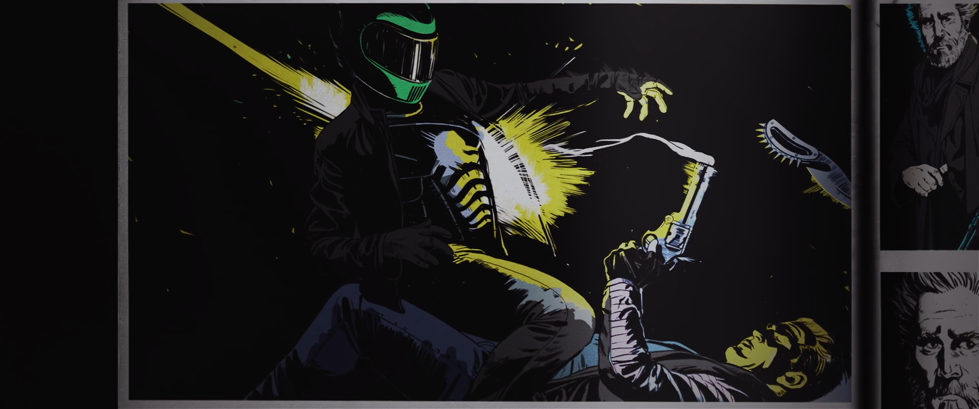
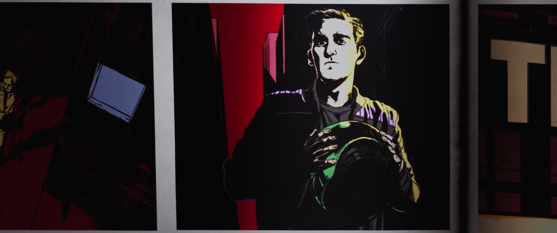
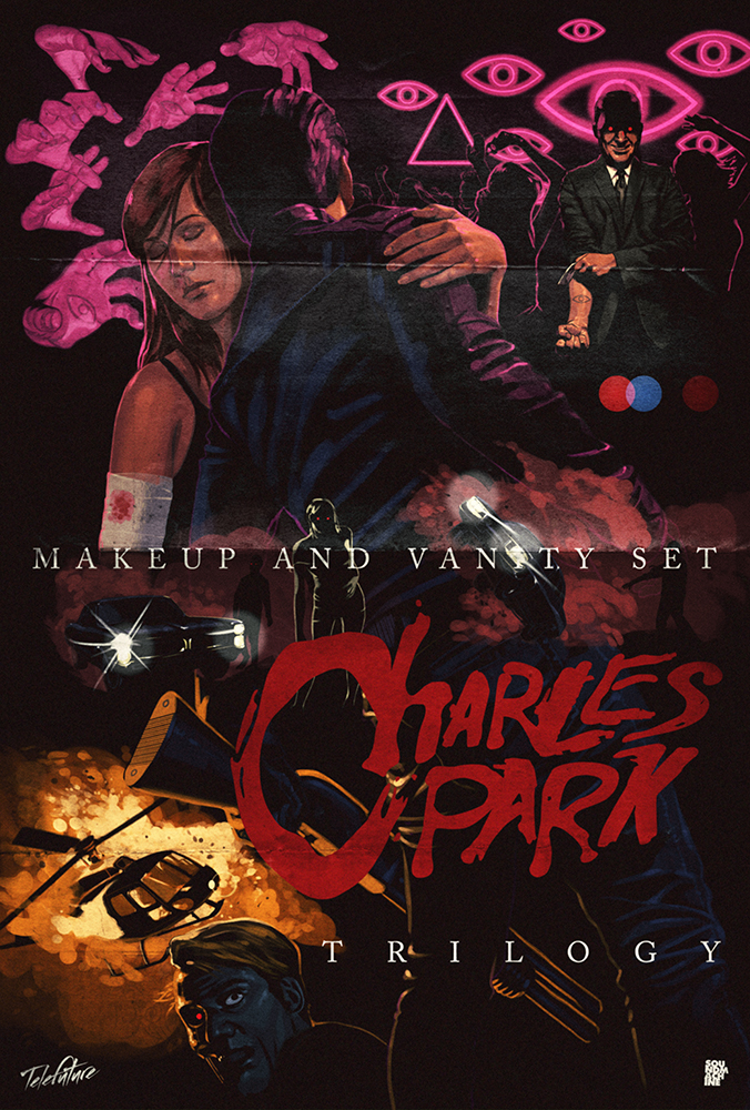
john was sent a few paragraphs detailing the narrative behind each album. he then started to create a poster that we could divide into three halves, to represent the three parts of the story.

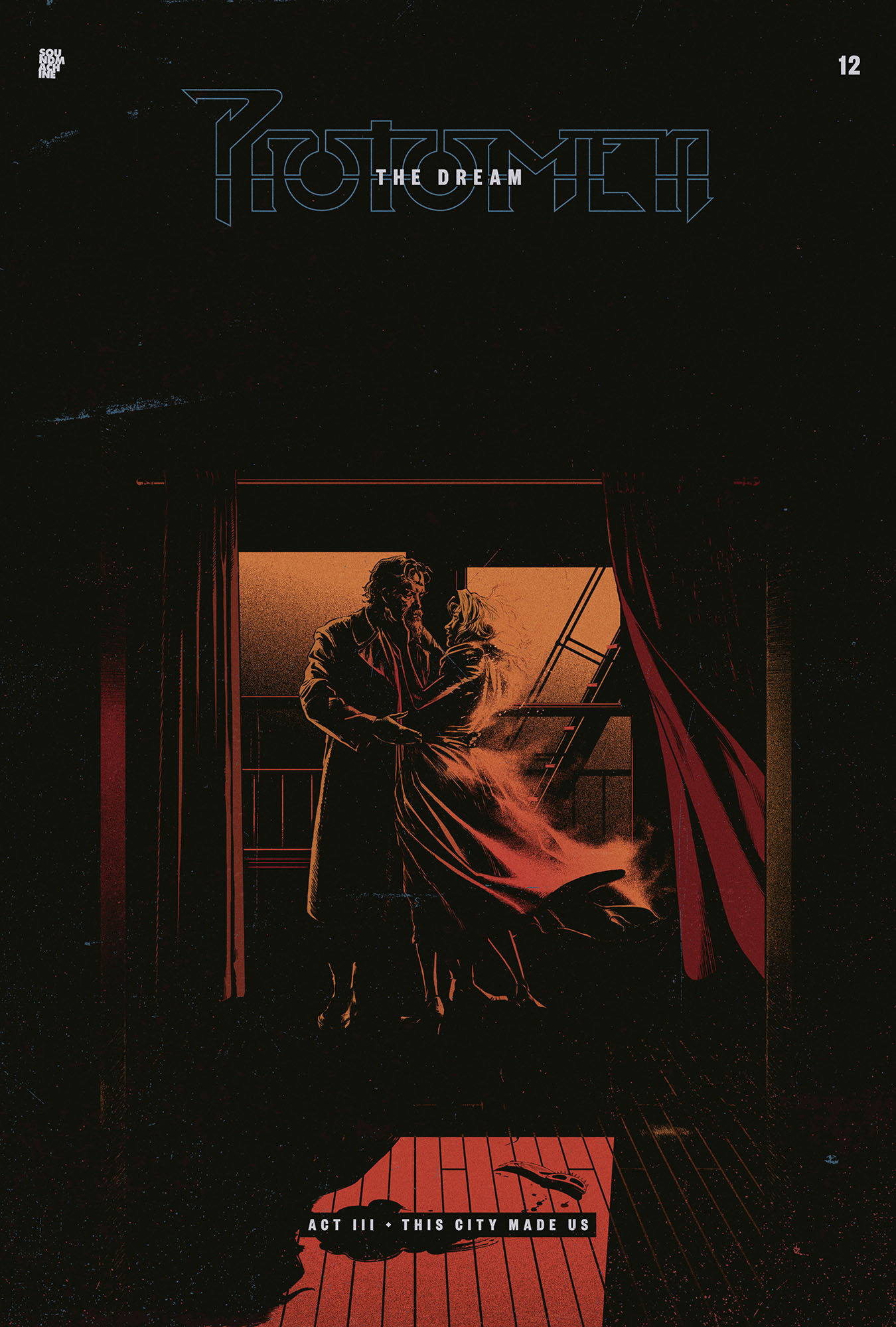
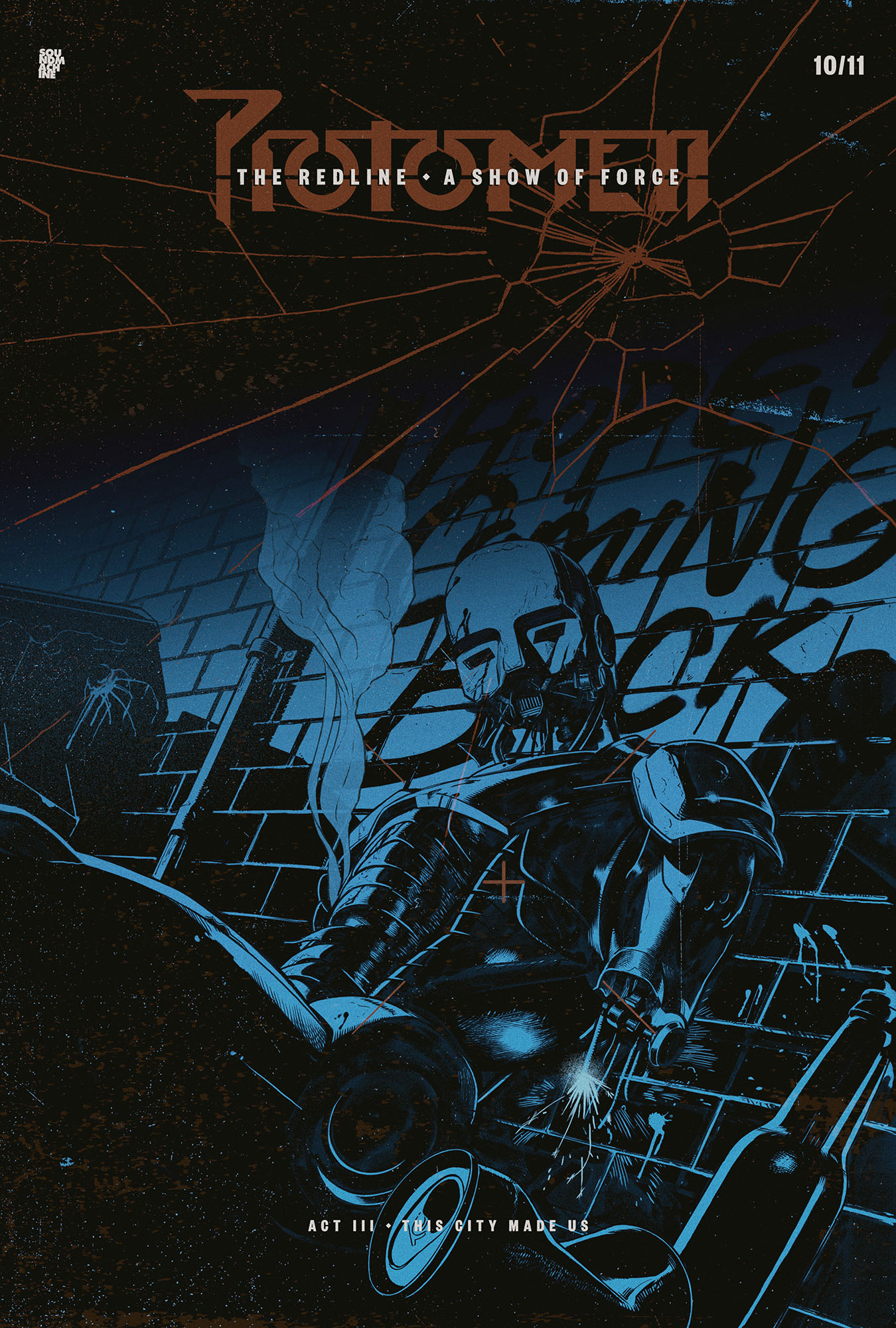
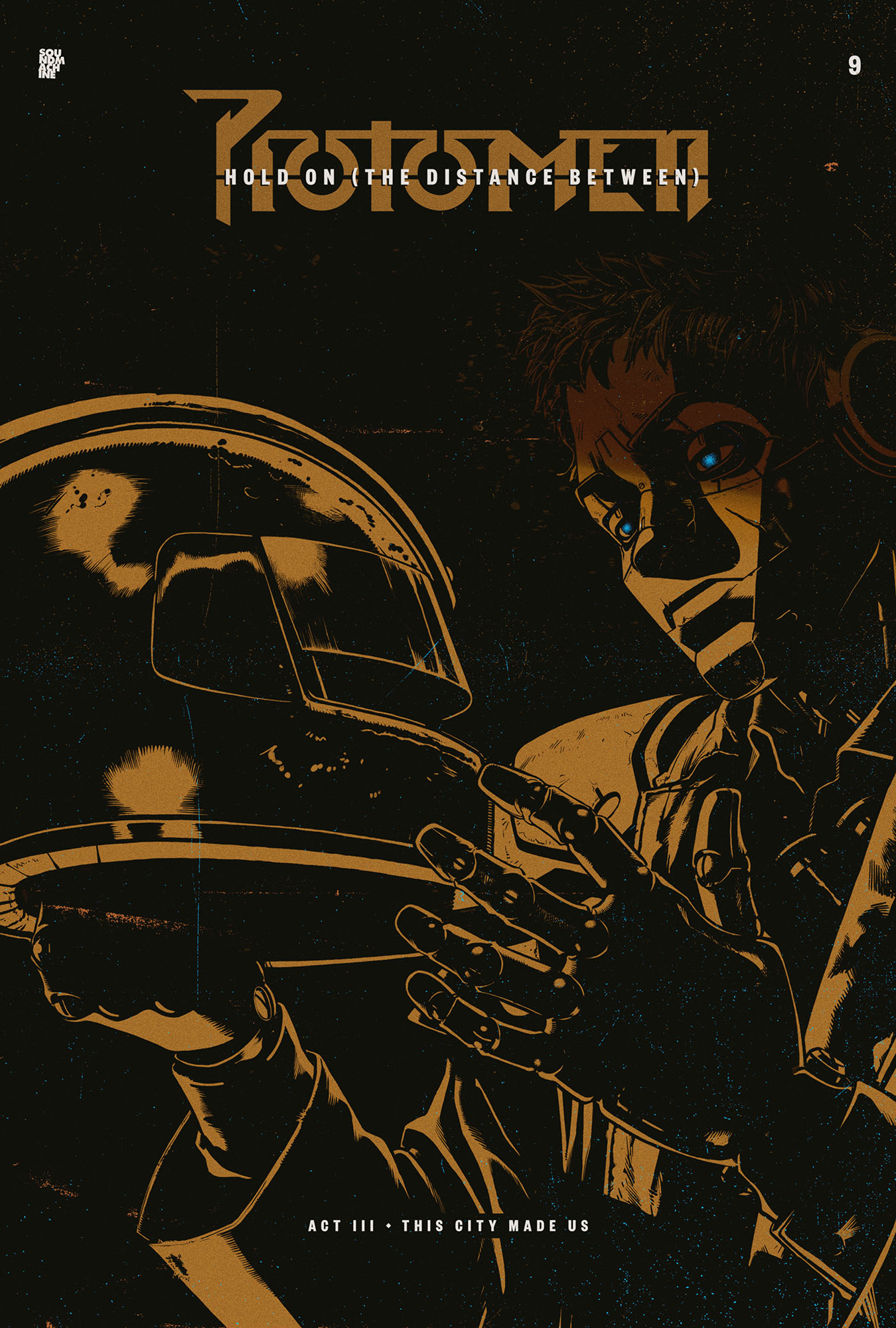
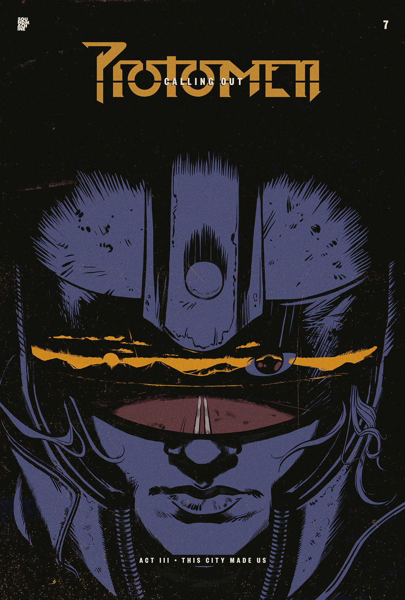
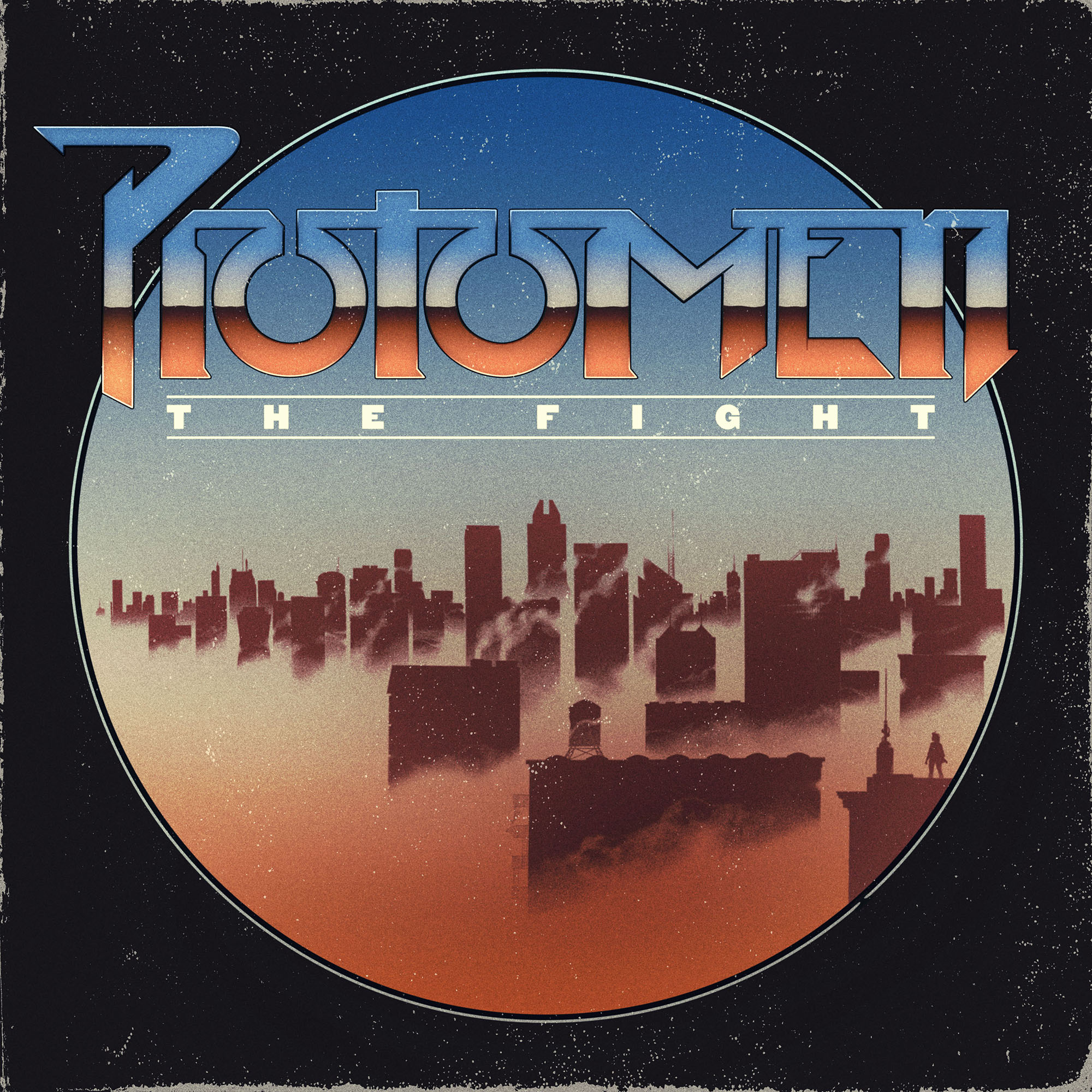
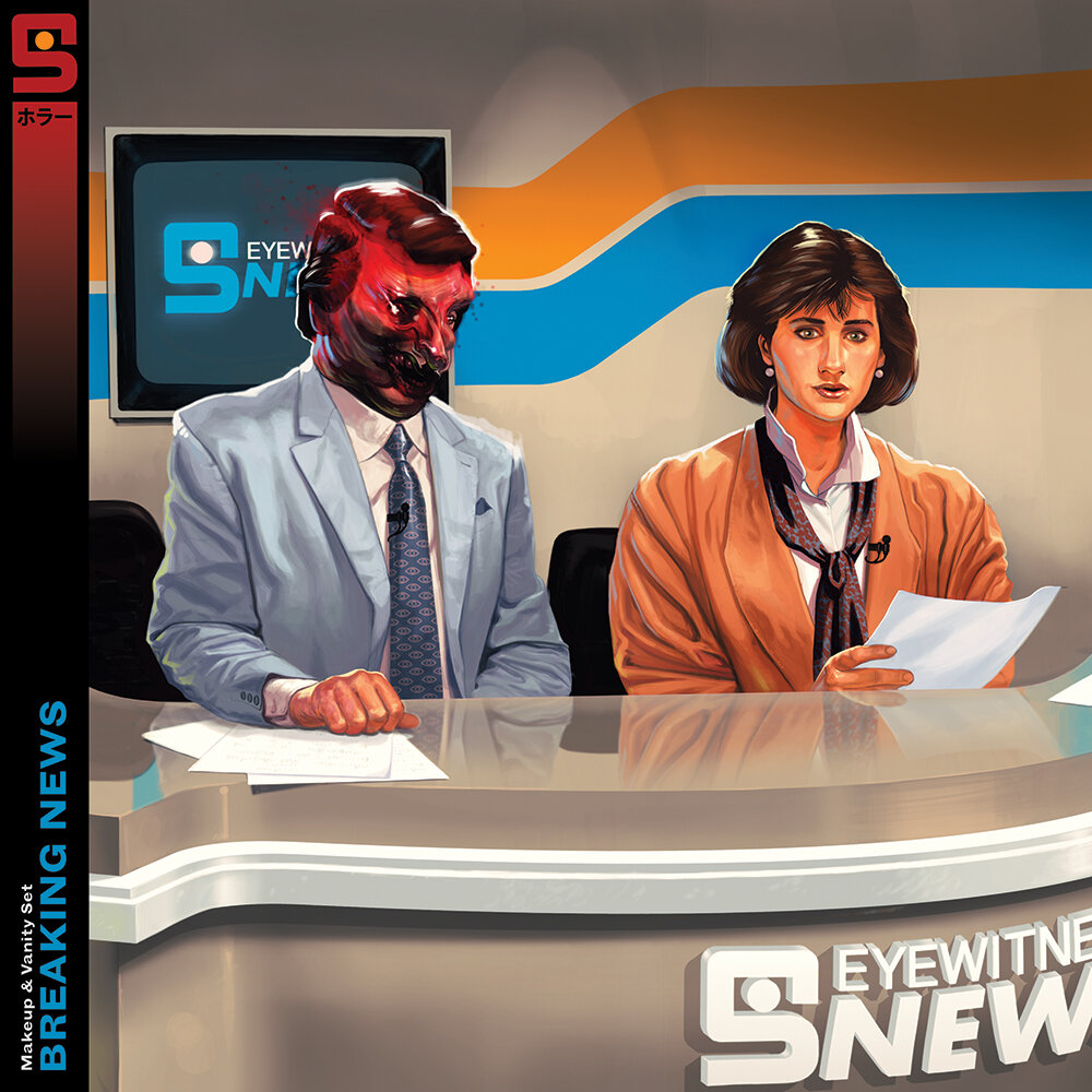
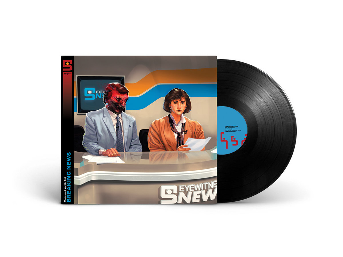
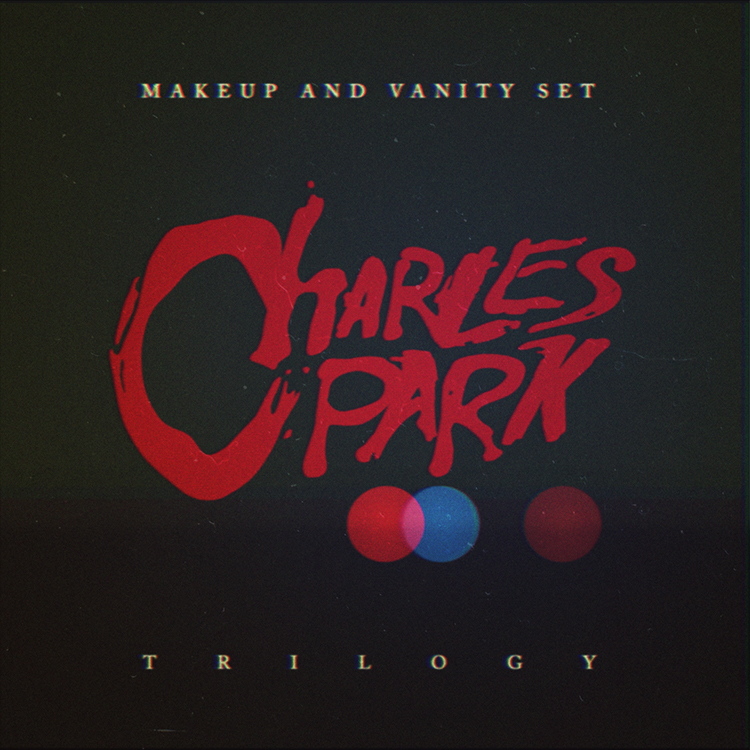
we were asked to create the logo, cover and overall packaging for the record. the logo we made is pretty self-explanatory, but the packaging was a subtler affair. utilizing the 
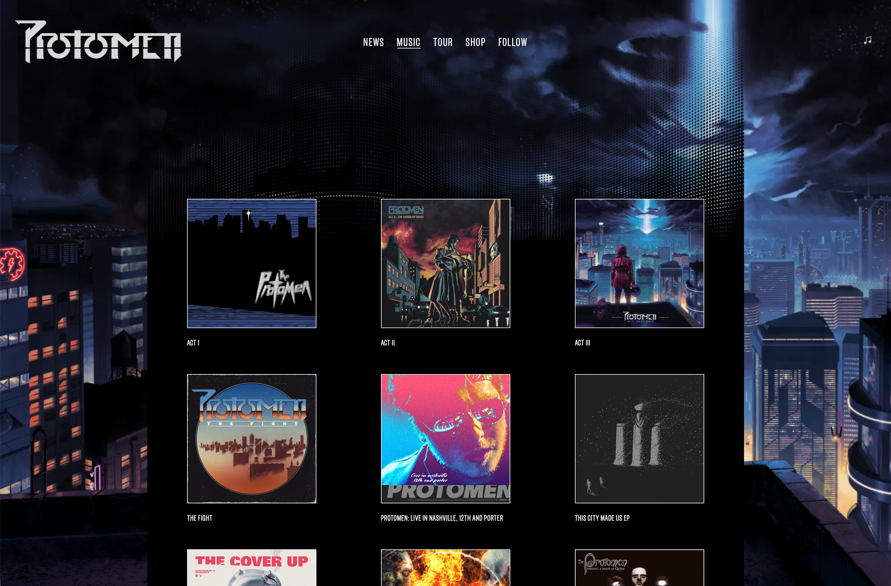
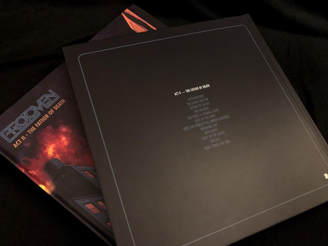
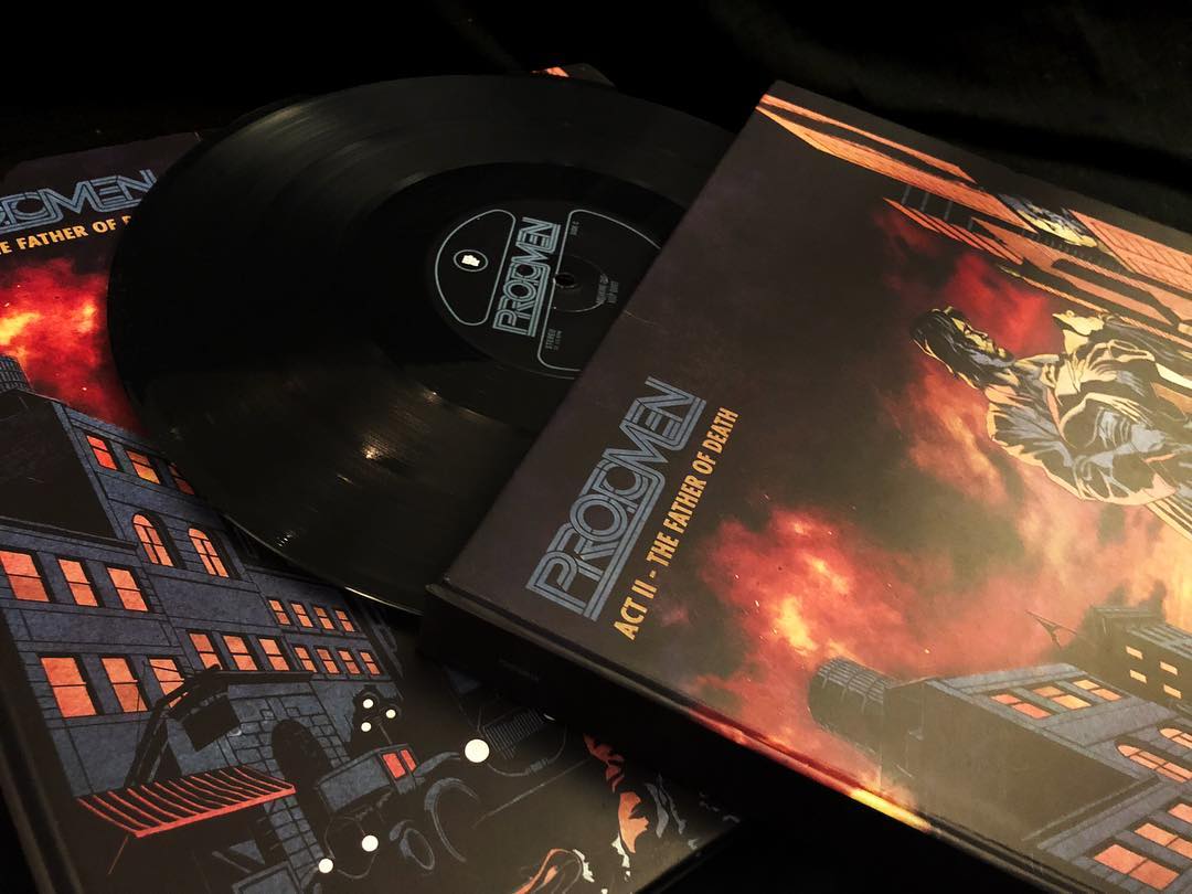
bokeh affect often seen in films when the camera is focussing on objects in the foreground, we realized we could represent each part of the trilogy with a different coloured circle. in this way the cover image could say a lot with very little, and each record within the packaging could be differentiated by its own red, blue or brown graphic.

joey was then sent the logo and proceeded to shoot the necessary footage to create the teaser trailer for the trilogy, this clip was the first promotional piece released to the general public. once released the limited edition box set sold out in 2 days, but you can still purchase the album digitally here.
_link
makeupandvanityset.com
_tags
cassette cover
cassette
inside spread
_what
artwork for the protomen's cassette single, i drove all night.
_how
the first single from the protomen's forthcoming covers record was the roy orbison song, i drove all night. the song was of course chosen because of how directly it tied in with and expanded upon the band's long-running, conceptual narrative. in the same fashion the artwork had a very clear path to follow. once again employing the talents of john delucca, we set about creating a design that both expanded on the protomen's story, but also paid homage again to many of their key influences. releasing it on cassette only was of course the final gesture that completed the project.

if you're interested you can read more about the development of the artwork on our blog. otherwise by all means grab a copy of the single here, whilst stocks last.
_tags
cover
vinyl cover
vinyl back cover
vinyl record
vinyl pop-up
vinyl pop-up detail
poster
_what
artwork for the protomen's second album, act 2 - the father of death
_how
everything about this record cover and poster had to be bigger and better. the moment we heard act II: the father of death we knew the protomen had taken giant leaps as a band. consequently we wanted to produce artwork that celebrated and supported this excellent new music through and through.

caspar had already created the band's new logo and once again we asked john delucca to bring his magic to the project. first he painted the fantastic streets of fire inspired cover, and then went on to create various other pieces for the album's illustrated "libretto" booklet. caspar then wove everything together for the 2009 compact disc release of the album, and the promo "movie poster" that went with it.

in 2018 it was time to release a deluxe, vinyl version of the album. for this the band wanted to make a book with a pop-up diorama of john's "how the world fell under darkness" illustration as the centrepiece. this time around caspar eschewed the rest of the CD artwork and replaced it with stills from the recently shot and released light up the night music video.
_link
protomen.com
_awards
making vinyl awards 2018 finalist in 4 categories
_tags