jonathan bates, better known for his part in the band
mellowdrone, recently got back in touch with us regarding a "new thing" he was working on. he was calling the project
big black delta and he asked that caspar might come on board as its art director.
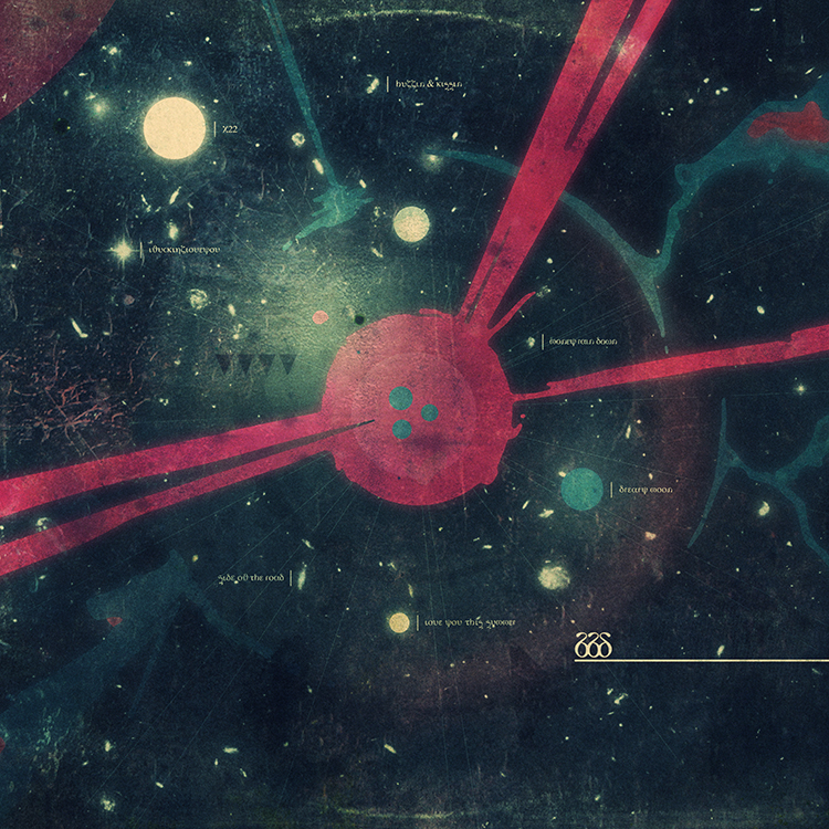
soon caspar found himself watching the
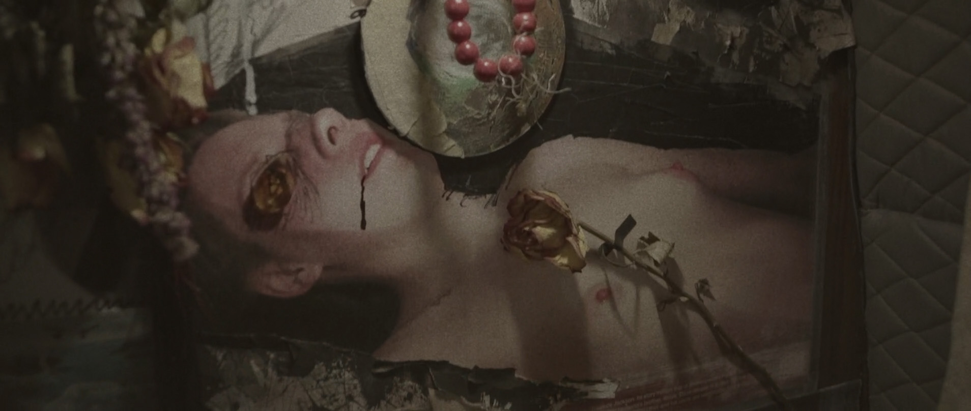
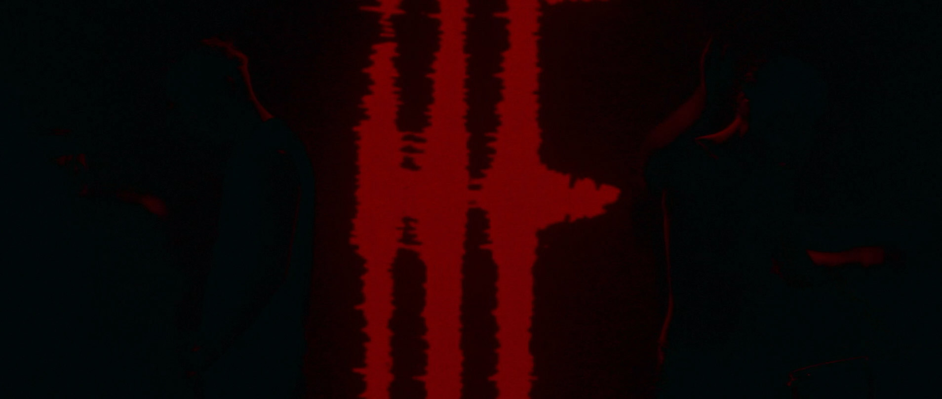
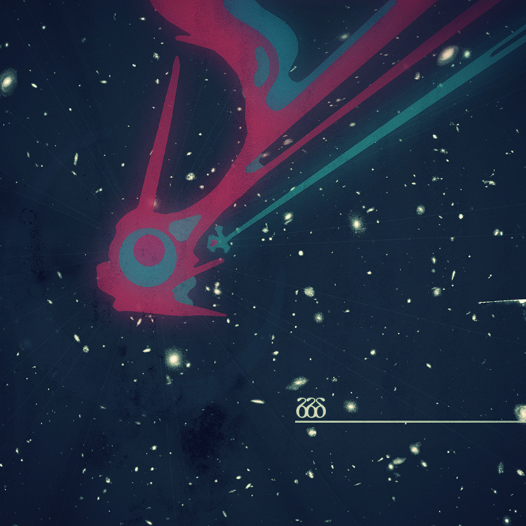
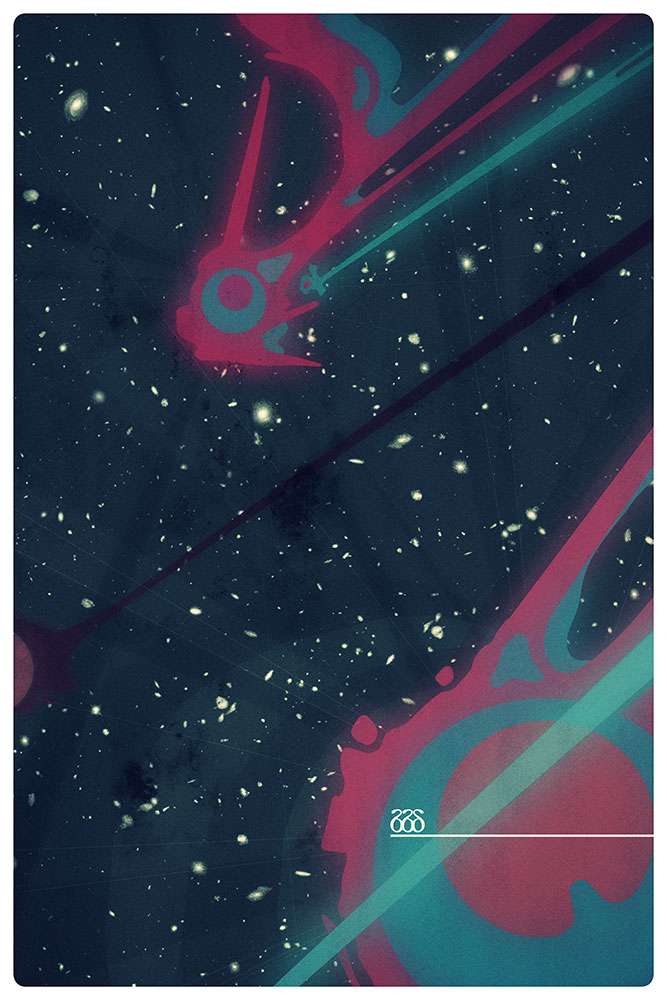
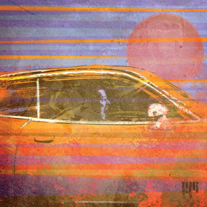
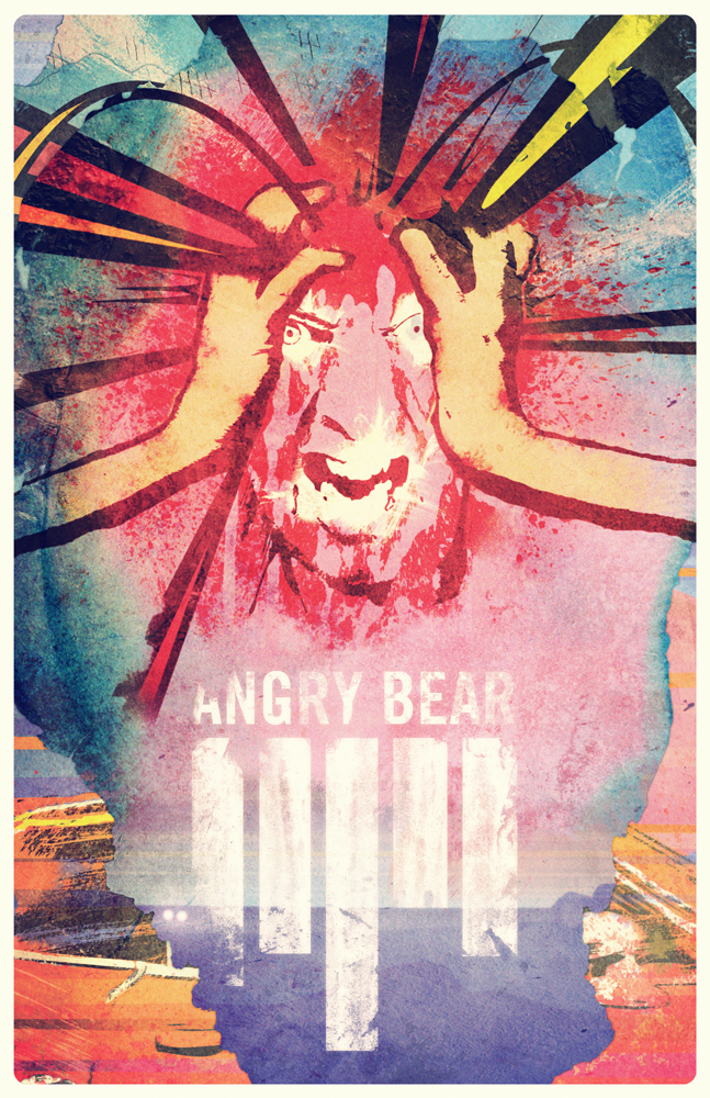
thundercats intro over and over and obsessing with jon over UFO footage. after this came a rapid exchange of music for artwork, much the way a choir does their psalms and responses. late one night caspar arrived at the EP cover you see here and sent it to jon. jon loved it and big black delta had finally been born.
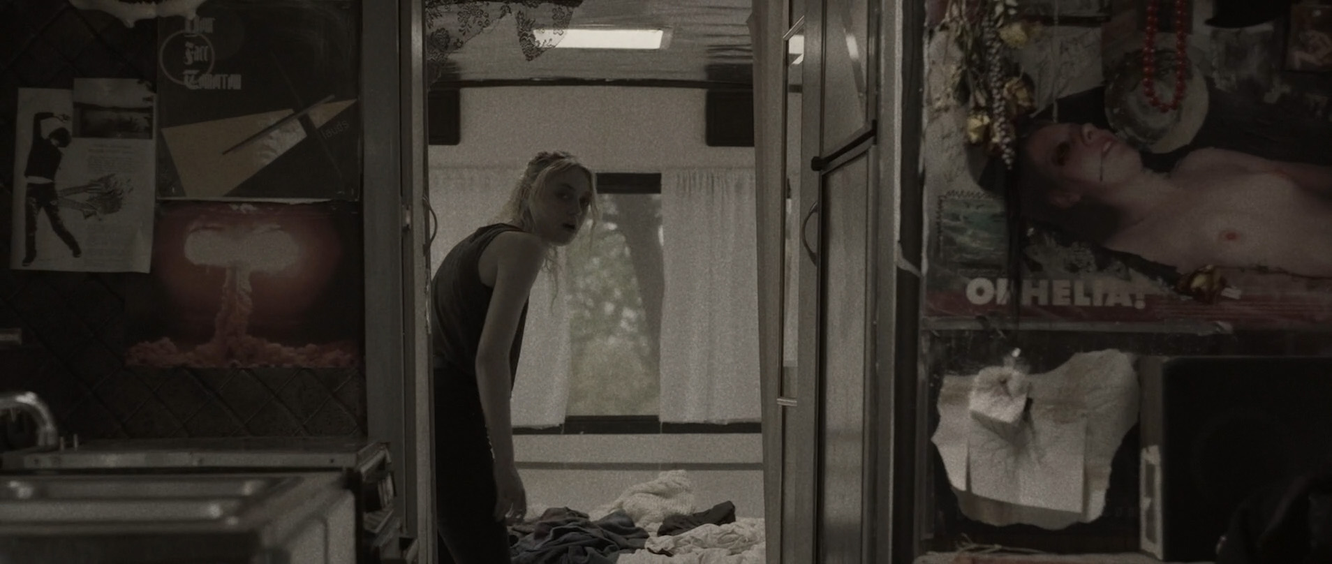
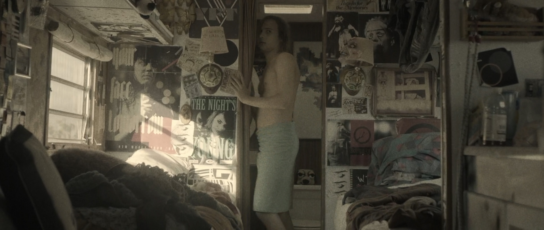
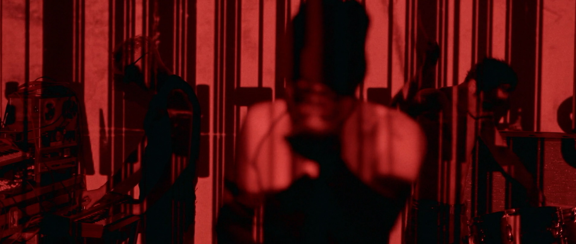
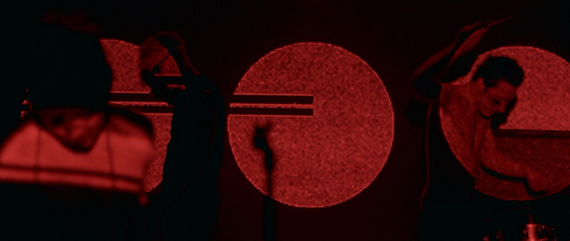
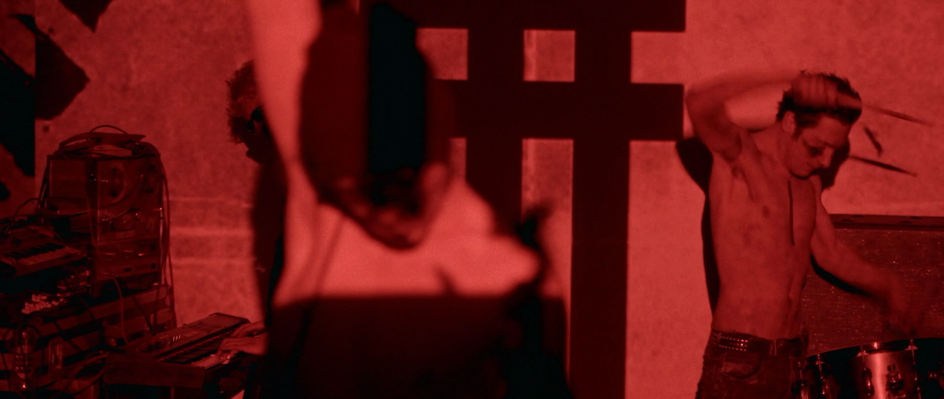
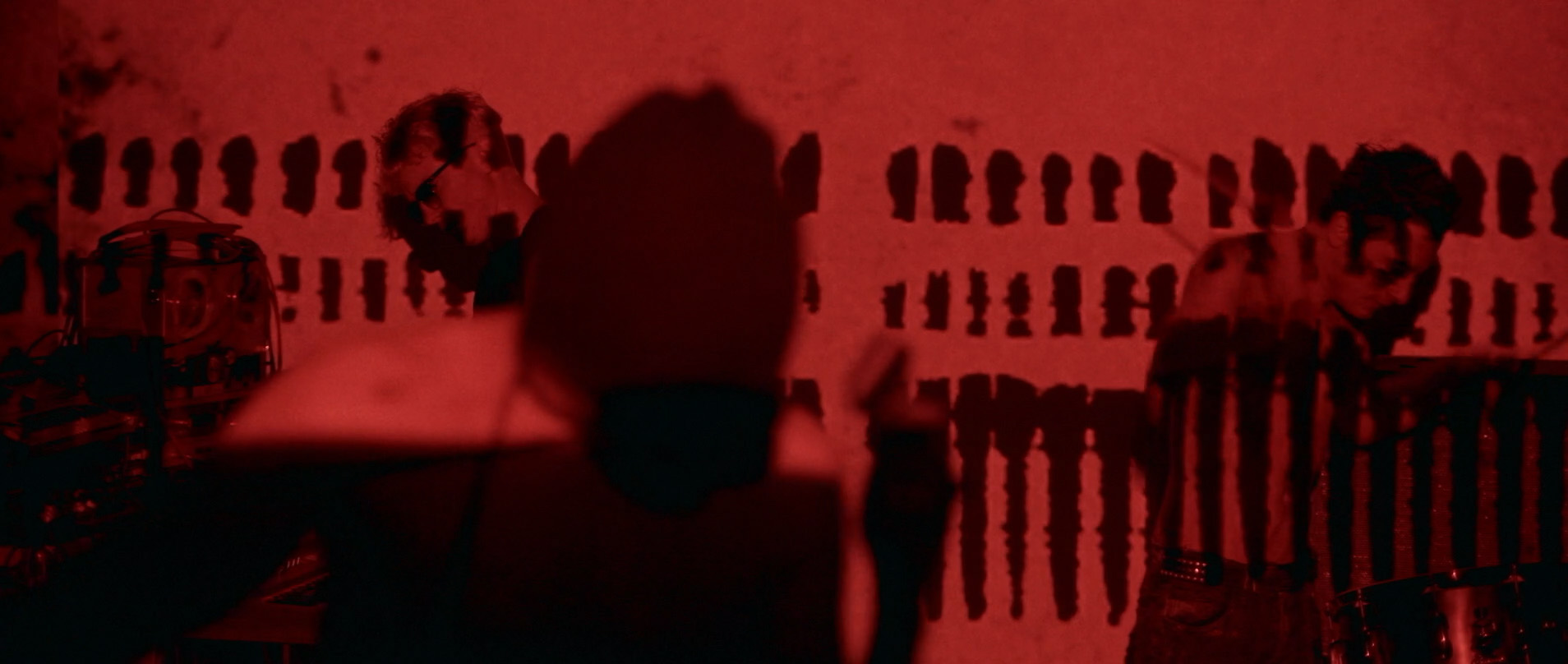
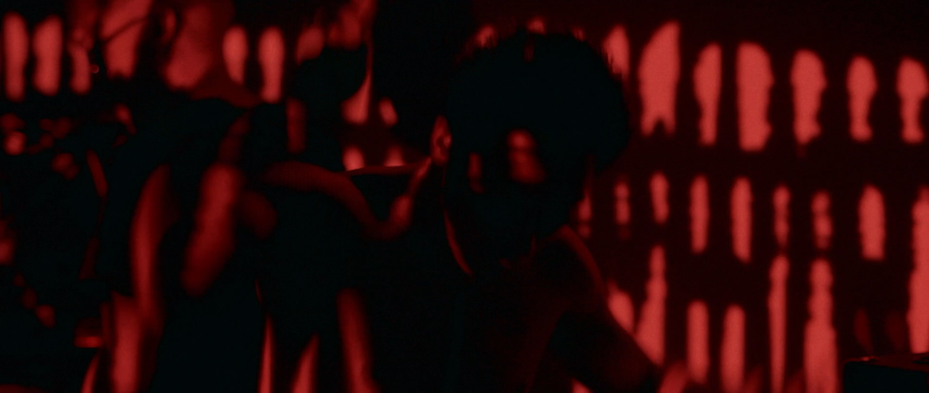
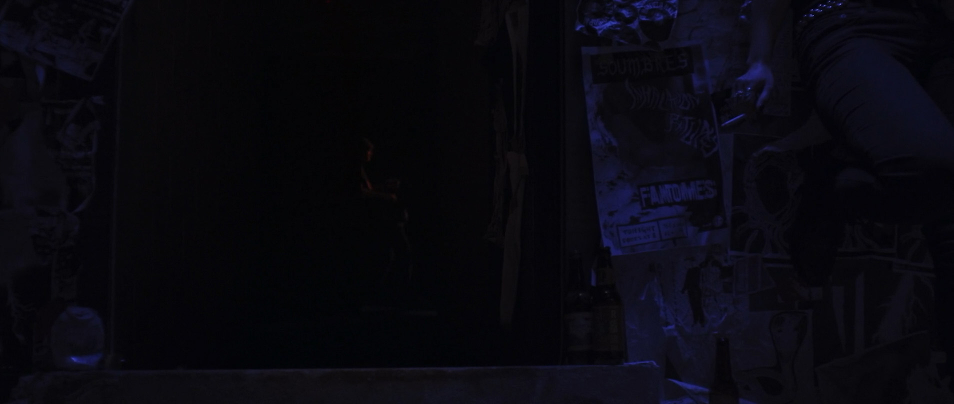
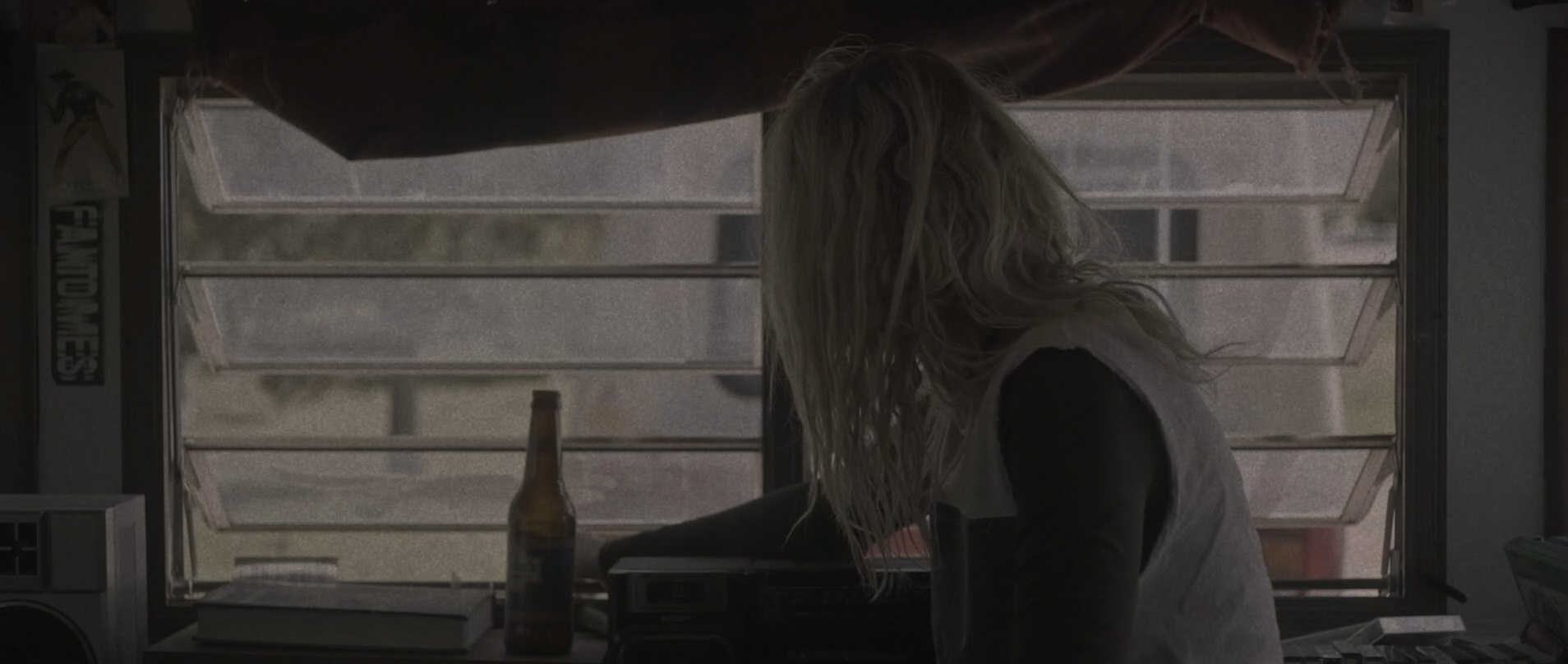
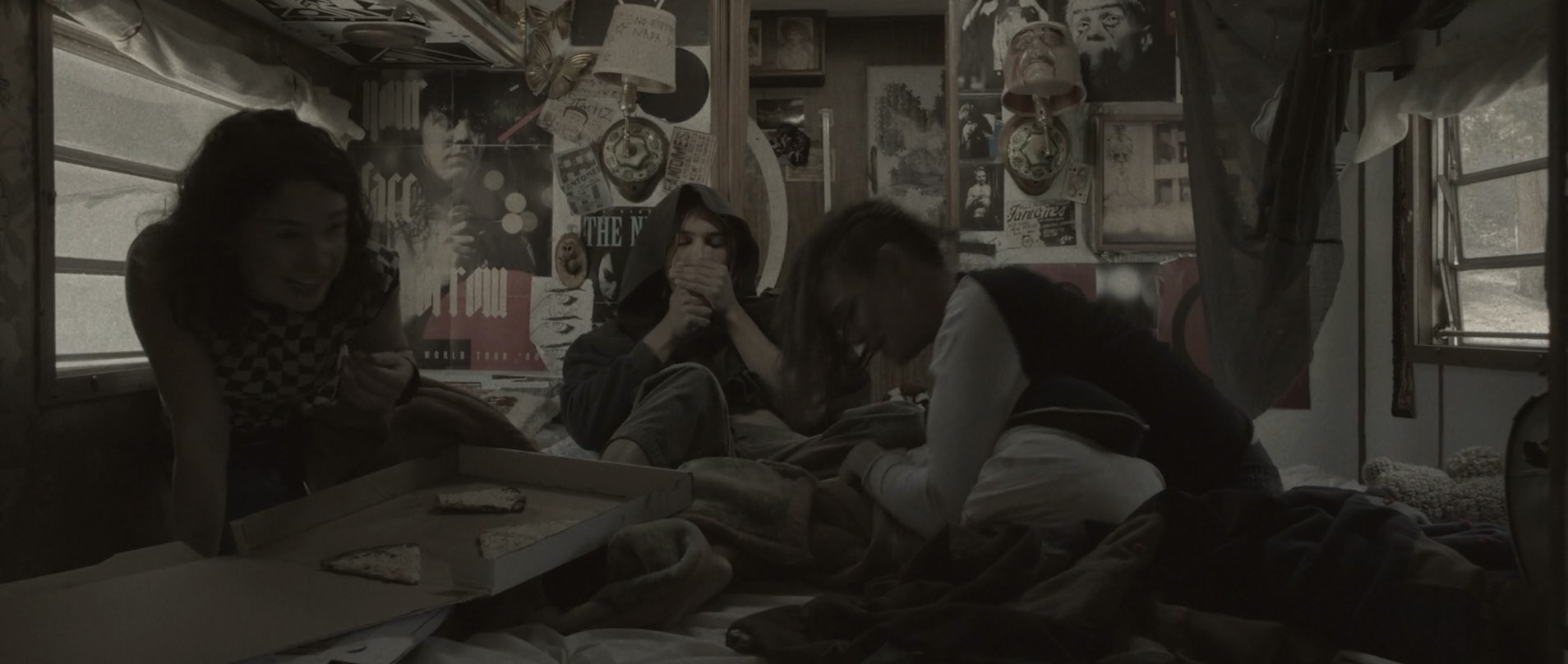
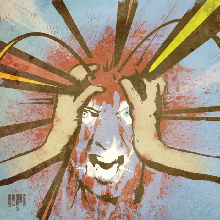
caspar then shot and edited a
short film to accompany the release of the song
IFUCKINGLOVEYOU. it was filmed over a couple of days around
independence day in los angeles. the timing seemed fitting UFO-wise, and the idea was simply to capture everything he and jon got up to in the short time they had together, be that searching the night sky for flashing lights, watching dan akroyd talking about UFOs on youtube or witnessing jon make strange noises on his studio floor.