(v)
(v_i)
(version_industries)

logo
white on black logo
_what
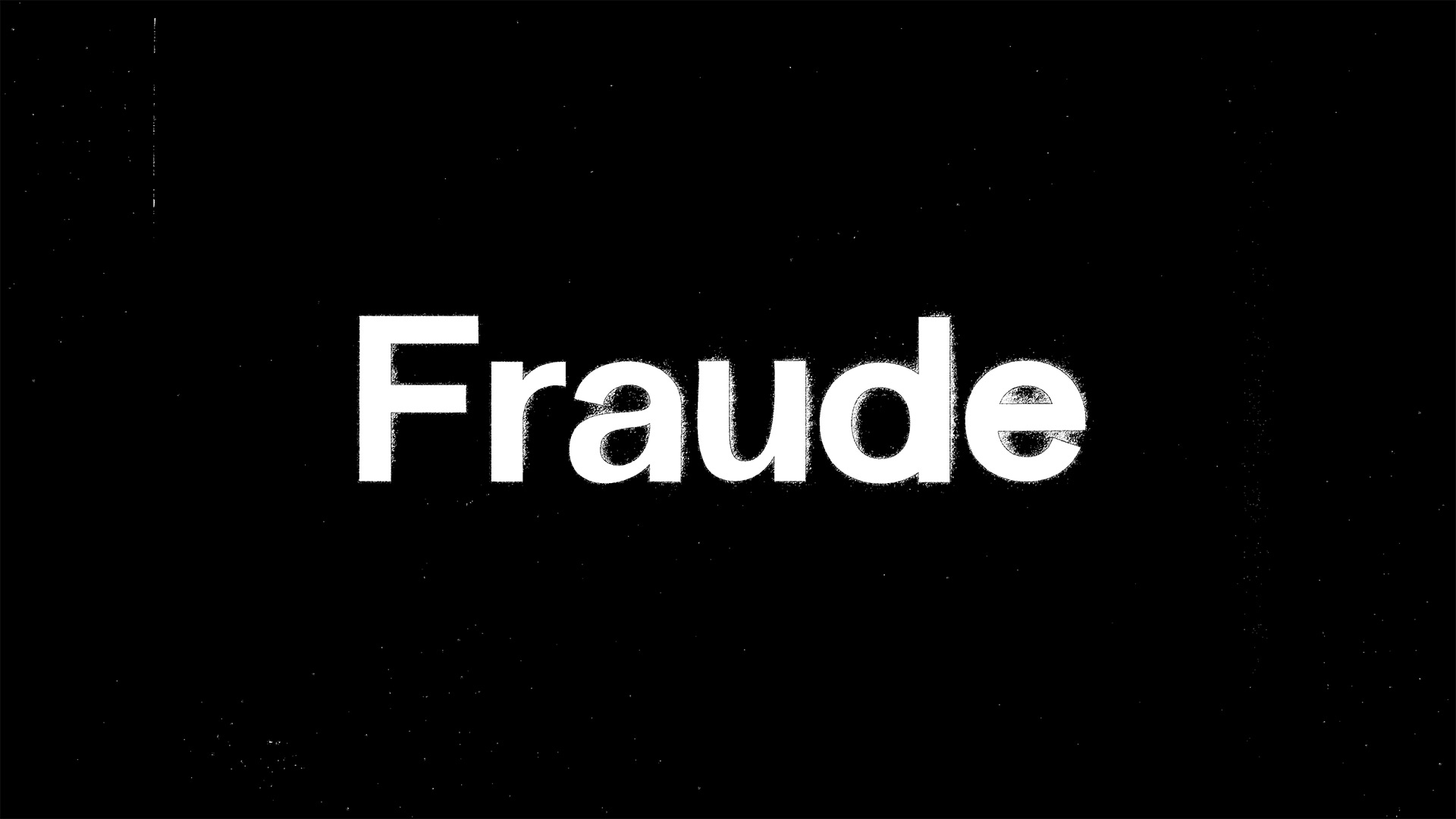
logo for the new york-based company, fraude films.
_how
wells watson jr. reached out to us and asked that we might create an animated logo for his new company, fraude films. after presenting various ways in which to visualize his company's name, we all settled upon the one you see here. created by giulia bertolino and caspar, the animation is a result of some digital type design, and plenty of printing and scanning. 
_link
fraudefilms.com
_tags
poster
title sequence 1
title sequence 2
title sequence 3
title sequence 4
title sequence 5
title sequence 6
title sequence 7
title sequence 8
title sequence 9
title sequence 10
title sequence 11
title sequence 12
title sequence 13
title sequence 14
_what
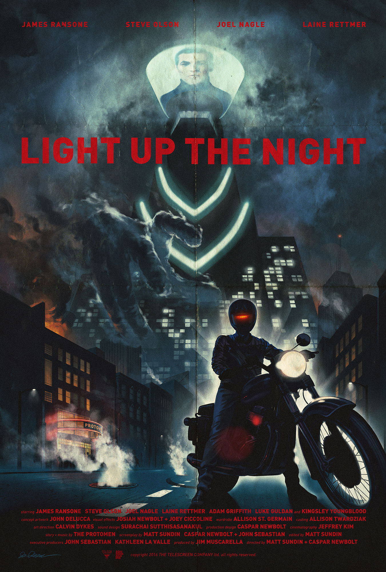
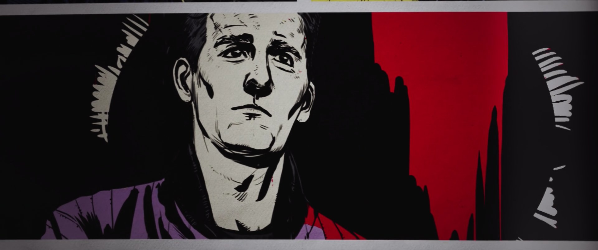
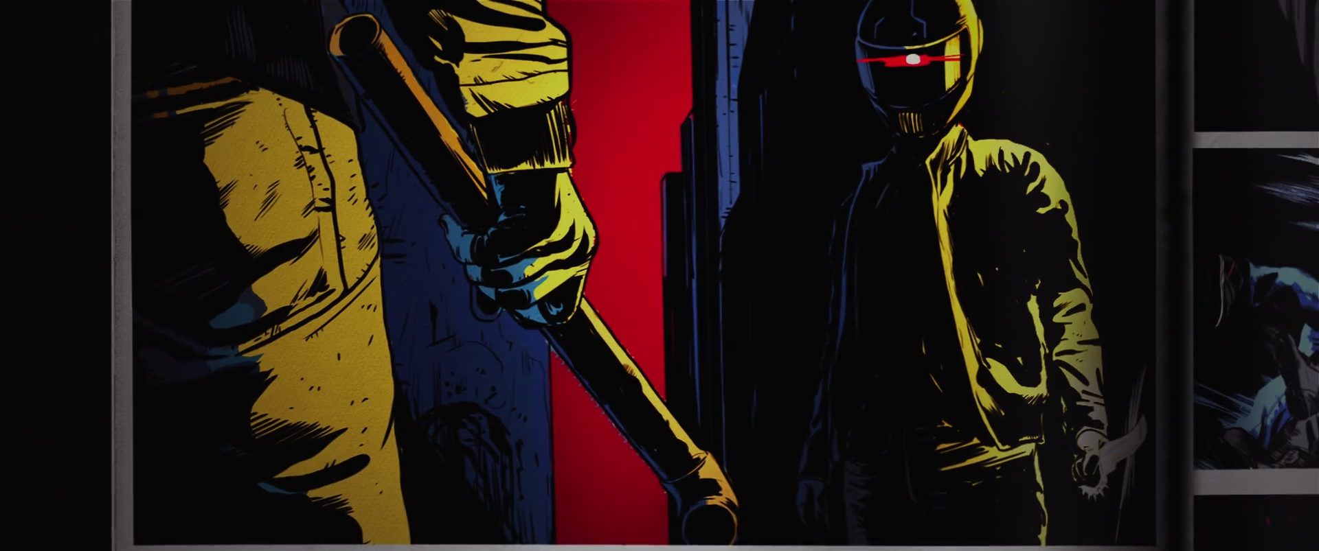
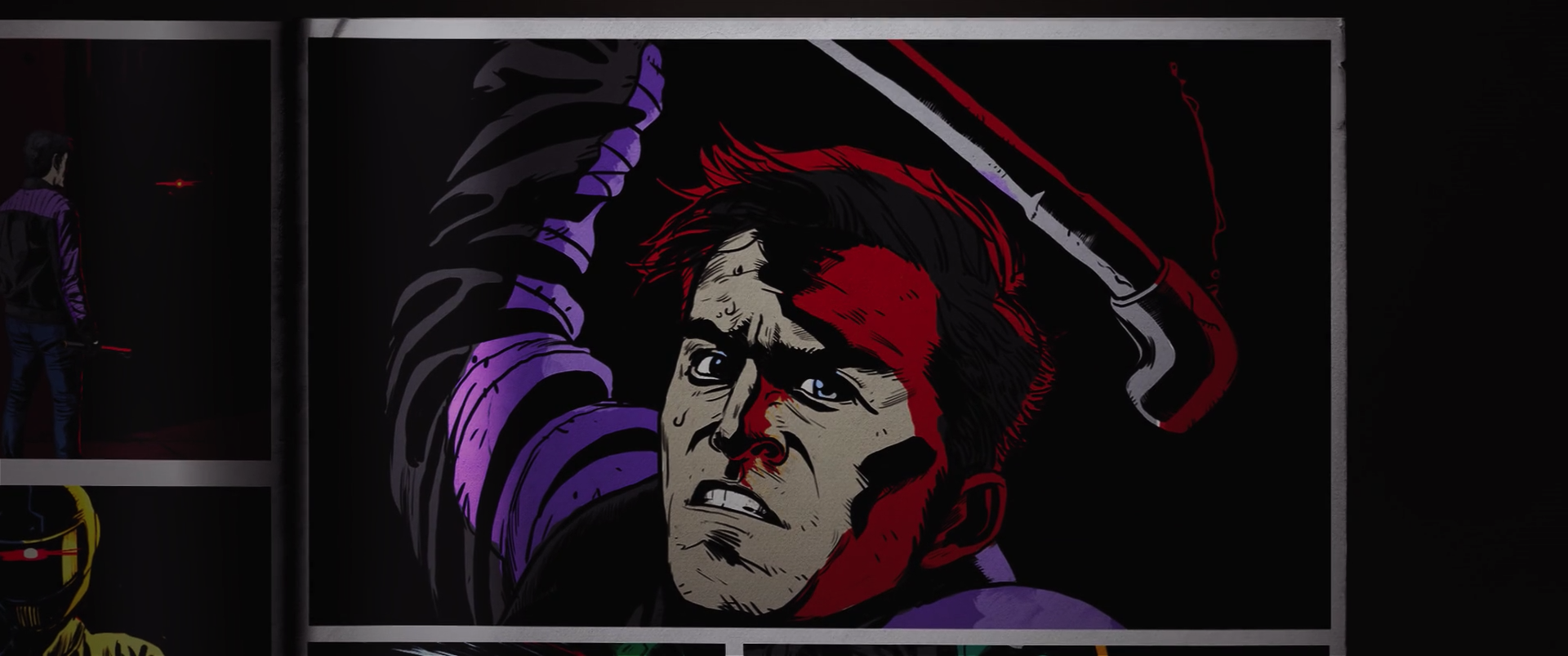
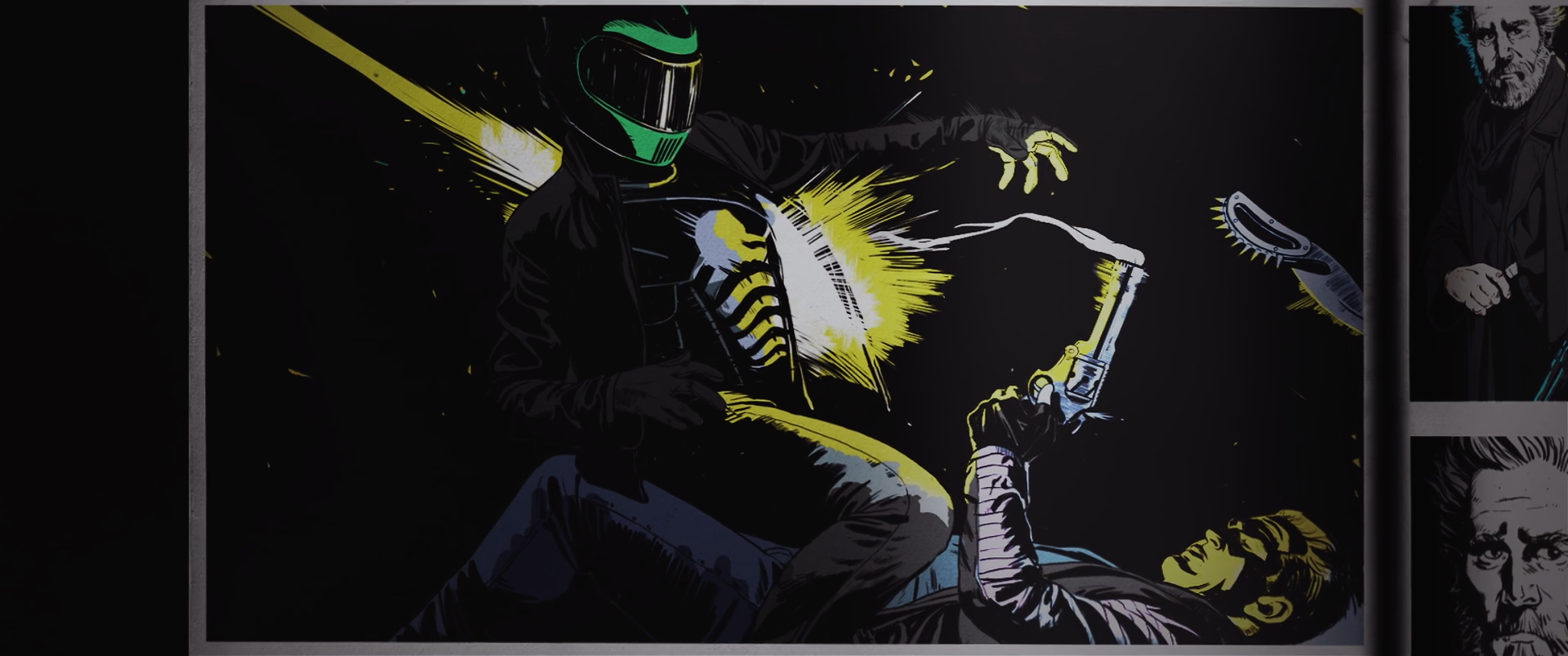
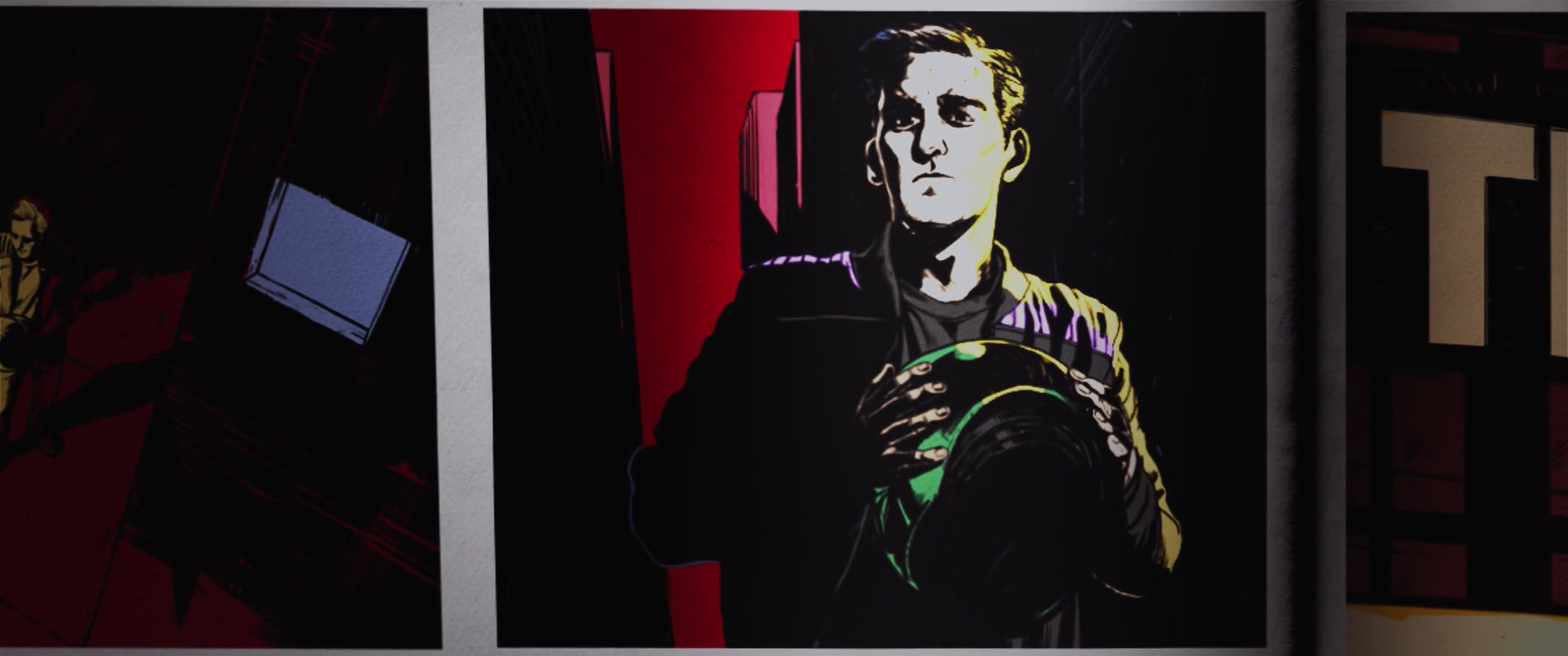
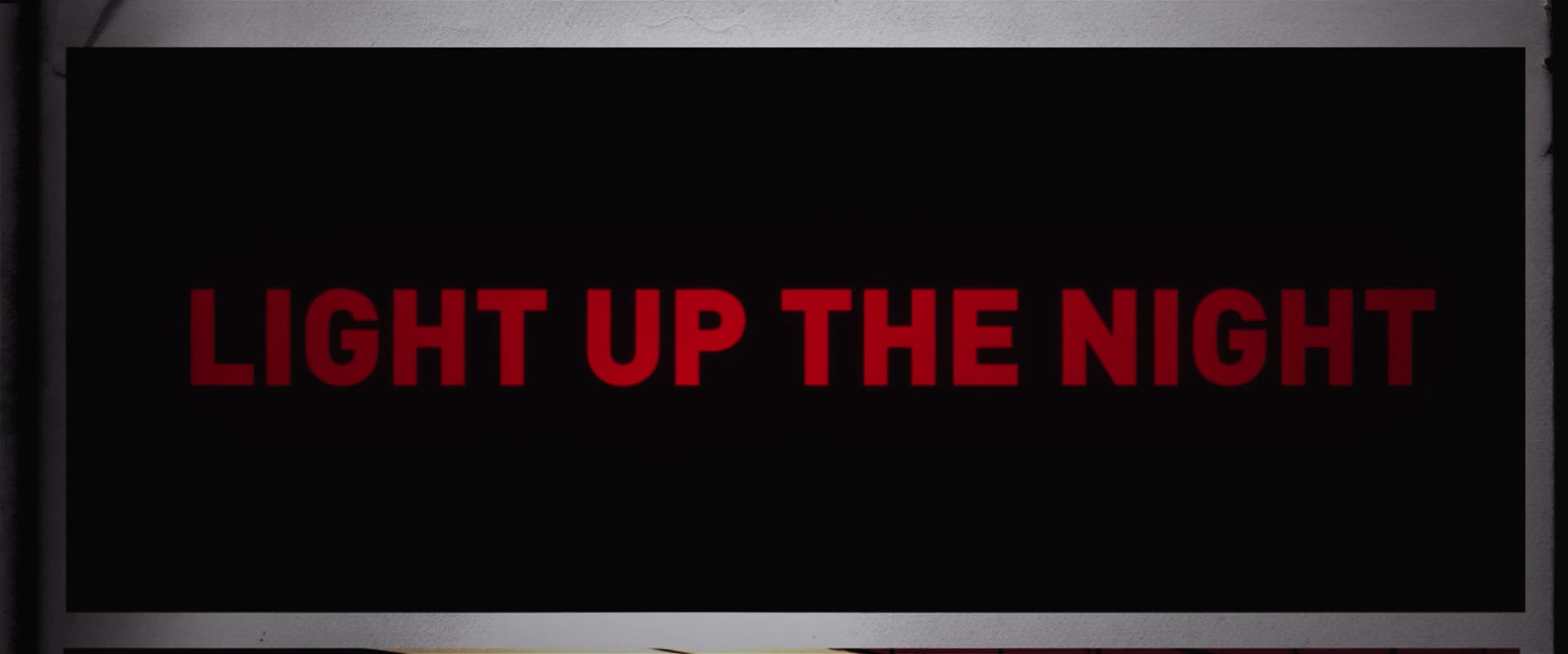
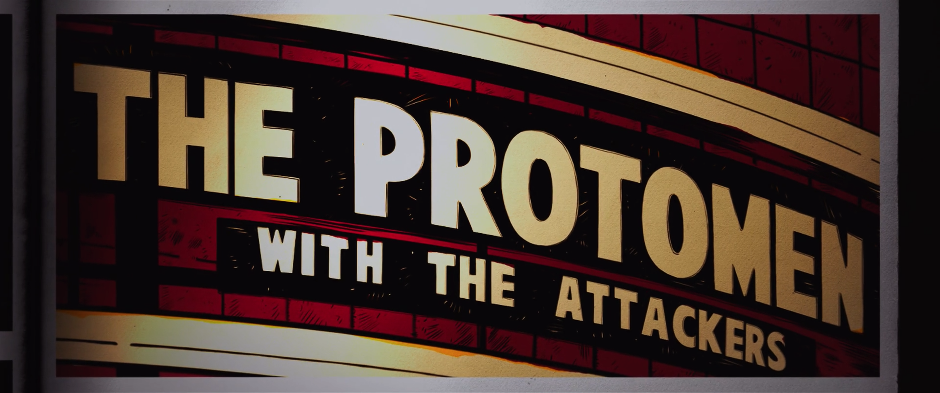
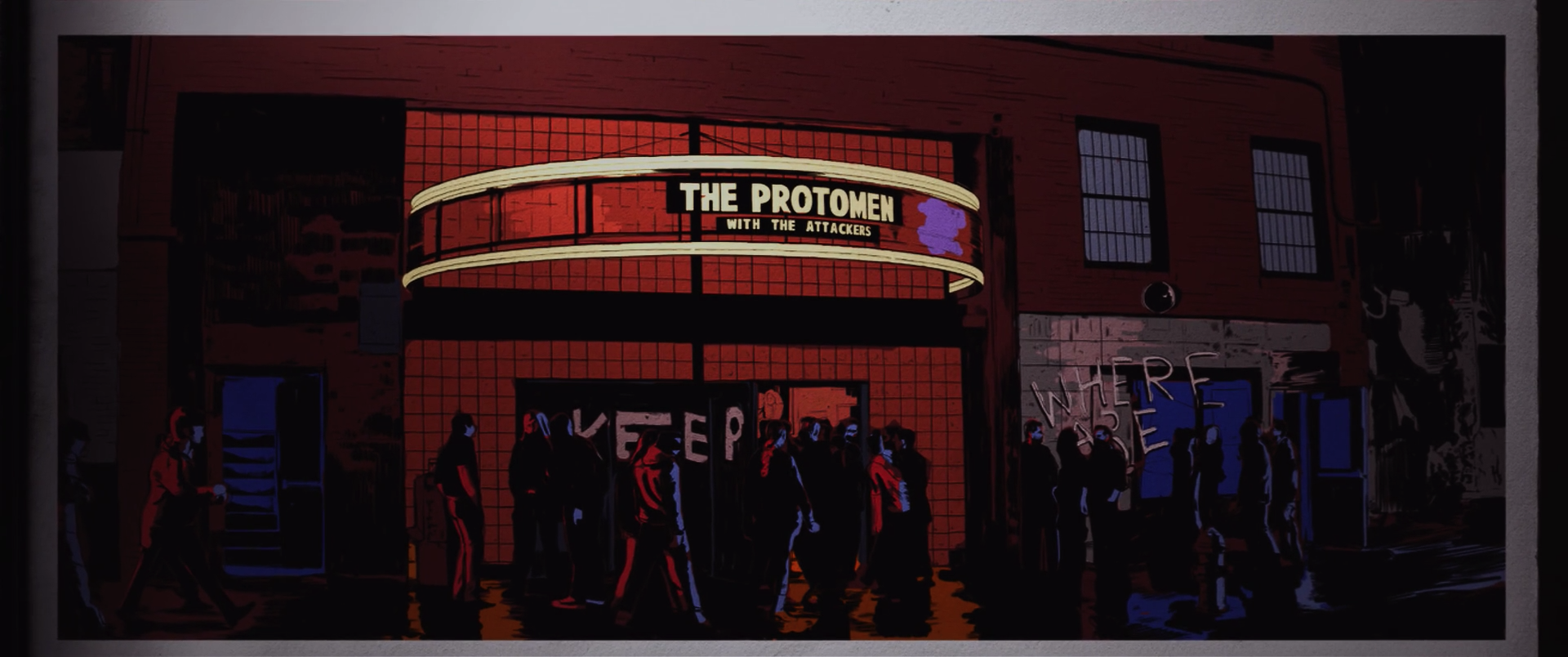
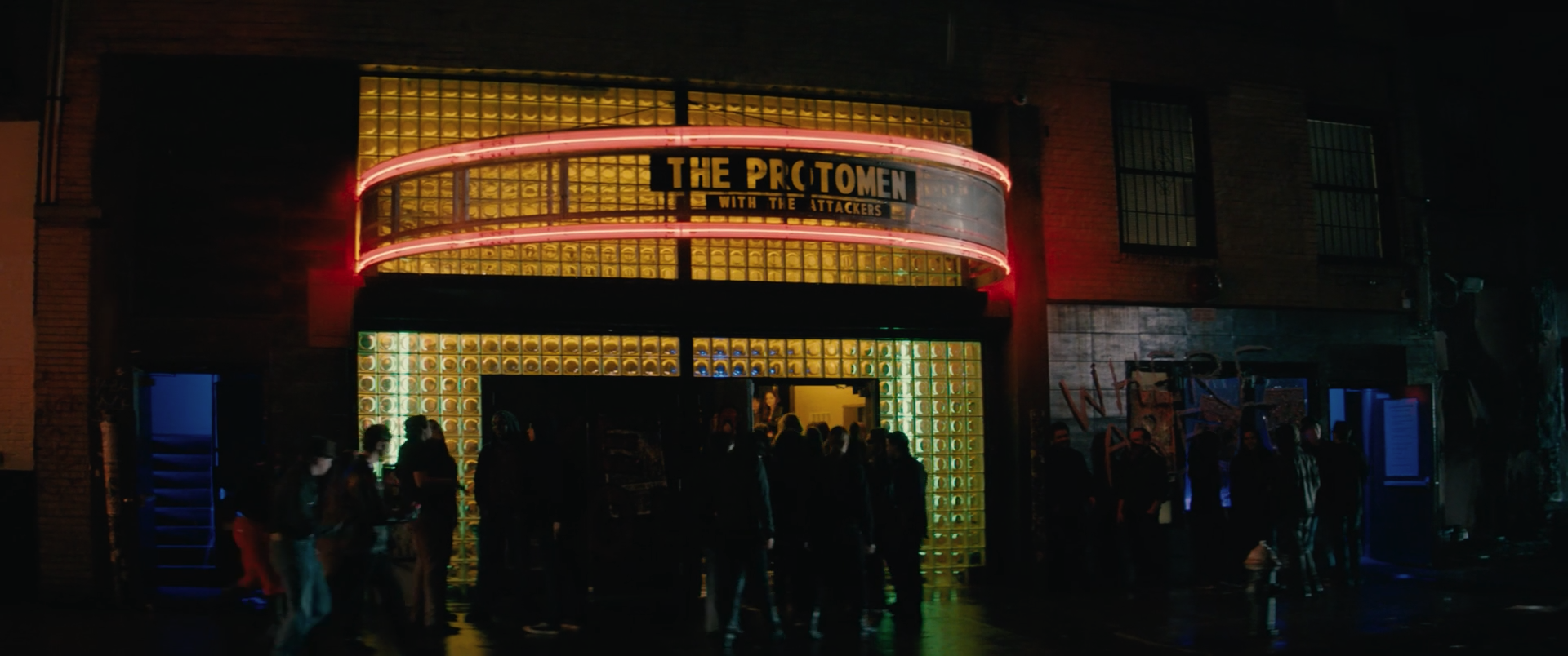
writing, directing, title design and poster design for the short film, light up the night.
_how
executive producer john la valle approached us with idea of making a film of a section of the protomen's second record, act II. the band chose light up the night as the song, and we approached collaborator matt sundin to co-direct the project with us. development of the project took some years and the end result you can see here. a testament to the band and everyone else involved, the film pays homage to many of the things that inspired us to do the work we do today, whilst delivering a particularly serendipitous socio-political commentary. 

we collaborated once again with john delucca on the poster design.
_link
protomen.com
_tags
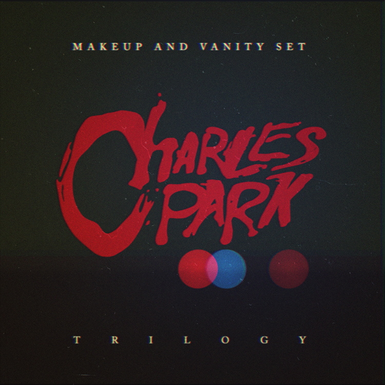
charles park trilogy album cover
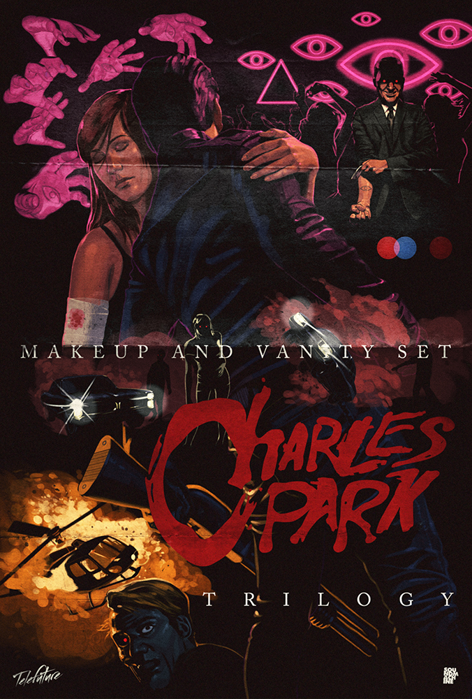
charles park trilogy poster
_what
record sleeve, poster + trailer for the nashville-based band, makeup and vanity set.
_how
telefuture records approached makeup and vanity set with the idea of re-releasing their popular charles park records as a trilogy box set. the moment the project got a green light john delucca, joey ciccoline and ourselves were put to work in tying the overall package together visually.

john was sent a few paragraphs detailing the narrative behind each album. he then started to create a poster that we could divide into three halves, to represent the three parts of the story.

we were asked to create the logo, cover and overall packaging for the record. the logo we made is pretty self-explanatory, but the packaging was a subtler affair. utilizing the bokeh affect often seen in films when the camera is focussing on objects in the foreground, we realized we could represent each part of the trilogy with a different coloured circle. in this way the cover image could say a lot with very little, and each record within the packaging could be differentiated by its own red, blue or brown graphic.

joey was then sent the logo and proceeded to shoot the necessary footage to create the teaser trailer for the trilogy, this clip was the first promotional piece released to the general public. once released the limited edition box set sold out in 2 days, but you can still purchase the album digitally here.
_link
makeupandvanityset.com
_tags