(v)
(v_i)
(version_industries)

film
1
2
3
4
5
6
7
8
9
13
16
_what
title sequence for the feature film, good one.
_how
writer and director india donaldson asked that we might make the titles for her debut feature film, good one. we'd previous worked on the titles for india's short film, if found

caspar and india quickly developed an idea for the titles based around a sense of caution that comes from certain colours, both in the human and the animal kingdom. beyond that it was an exercise in minimalism — how little can one affect the text whilst still allowing it to perform its function. 

the film had its world premiere at the sundance film festival and its european premiere at the cannes film festival. the film will be released by metrograph pictures
_link
imdb.com/title/tt30319516
_tags
2a
2b
1b
3
5
8
9
10
11
12
13
14
_what
title sequence for the feature film, family portrait.
_how
caspar met writer/director lucy kerr at FID marseille film festival before the premiere of rob rice's film, way out ahead of us. later it was sound designer nikolay antonov that recommended lucy and her producer megan pickrell ask us to create the poster and title sequence for family portrait.

the title sequence is conceptual in nature such that it prepares the audience for a film that is itself poetic and mercurial by nature. thankfully lucy was open to trying something more experimental than the kind of thing most directors would go for. 
_link
imdb.com/title/tt21257870
_tags
1c
1b
1
2
3
4
5
6
_what
title sequence for the short film, daron, daron colbert
_how
long-standing collaborators and friends rathaus films, asked us to take care of the titles for director kevin steen's new short film, daron, daron colbert. the hybrid narrative-documentary was shot in detroit and stars the eponymous daron colbert, someone the director met by happenstance when shooting another film in the streets of the city. 

once caspar completed tbe title design and animation, kevin and cinematographer shabier kirchner printed the footage back onto film and scanned it back into the computer. this is what gives the whole piece the beautiful analog glow and grain that it has now.
_link
vimeo.com/918953723
_tags
5
6
7
9
11
12
_what
title sequences for the feature film, the end we start from.
_how
after our work on aftersun, producer amy jackson asked that we might work on the titles for mahalia belo's debut feature film, the end we start from. the film stars jodie comer, katherine waterston and benedict cumberbatch and follows a woman and her child as they strive to survive as the world falls aapart around them. 

the film's title sequence concept centers around having the main title card at the end, such as suggested by the film's name. furthermore the title is revealed, over picture, by the movement of a figure whose very existence is significant to the film's beginning and ending.
_link
en.wikipedia.org/wiki/The_End_We_Start_From
_tags
titles 11
titles 10
titles 9
titles 8
titles 7
titles 6
titles 5
titles 4
titles 3
titles 2
titles 1
_what
title sequences for the feature film, sanctuary.
_how
editor lance edmands put us in touch with director zachary wigon and his producers. they were looking for someone to take care of the title design for their new film, sanctuary. the film was at that time on its way to the toronto film festival for its world premiere.

zach had some ideas about how he wanted the title sequence to be a part of the film's opening narrative sequence. after some discussion we settled on the treatment you see here, itself a visualisation of what it feels like when ideas or even simply words appear in your mind. the reason we did this will be obvious when you see the film.

the film has since been acquired and distributed by NEON you can watch the trailer here.
_link
imdb.com/title/tt15364972
_tags
main title
1
2
3
4
5
6
7
8
9
13
15
_what
title sequences for the feature film, aftersun.
_how
a few days before the 2022 cannes film festival producer adele romanski reached out and asked if we had the time to create the title sequence for a new film she had produced called 
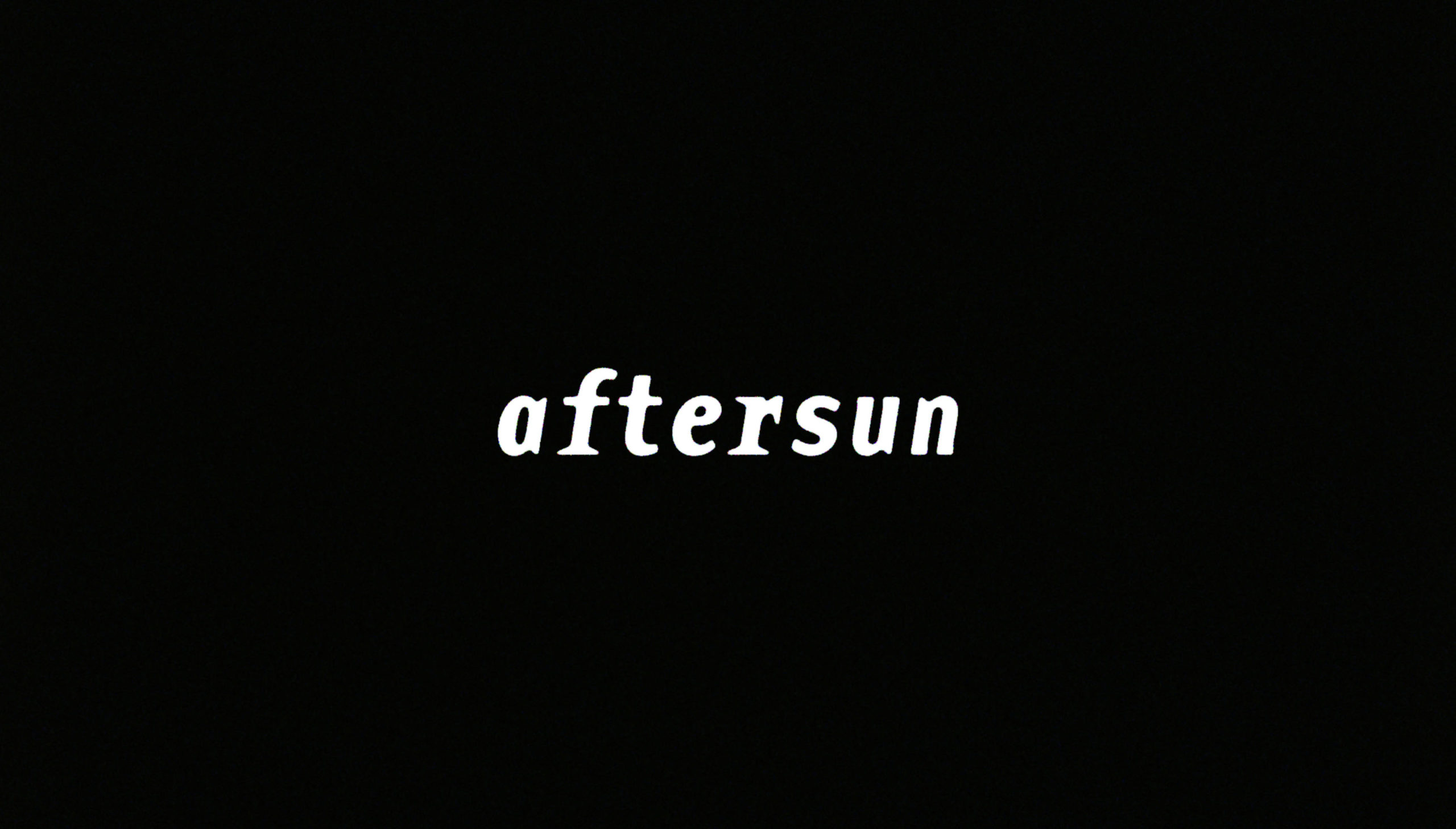
aftersun. we connected with the film on a numer of levels and immediately committed to the work.

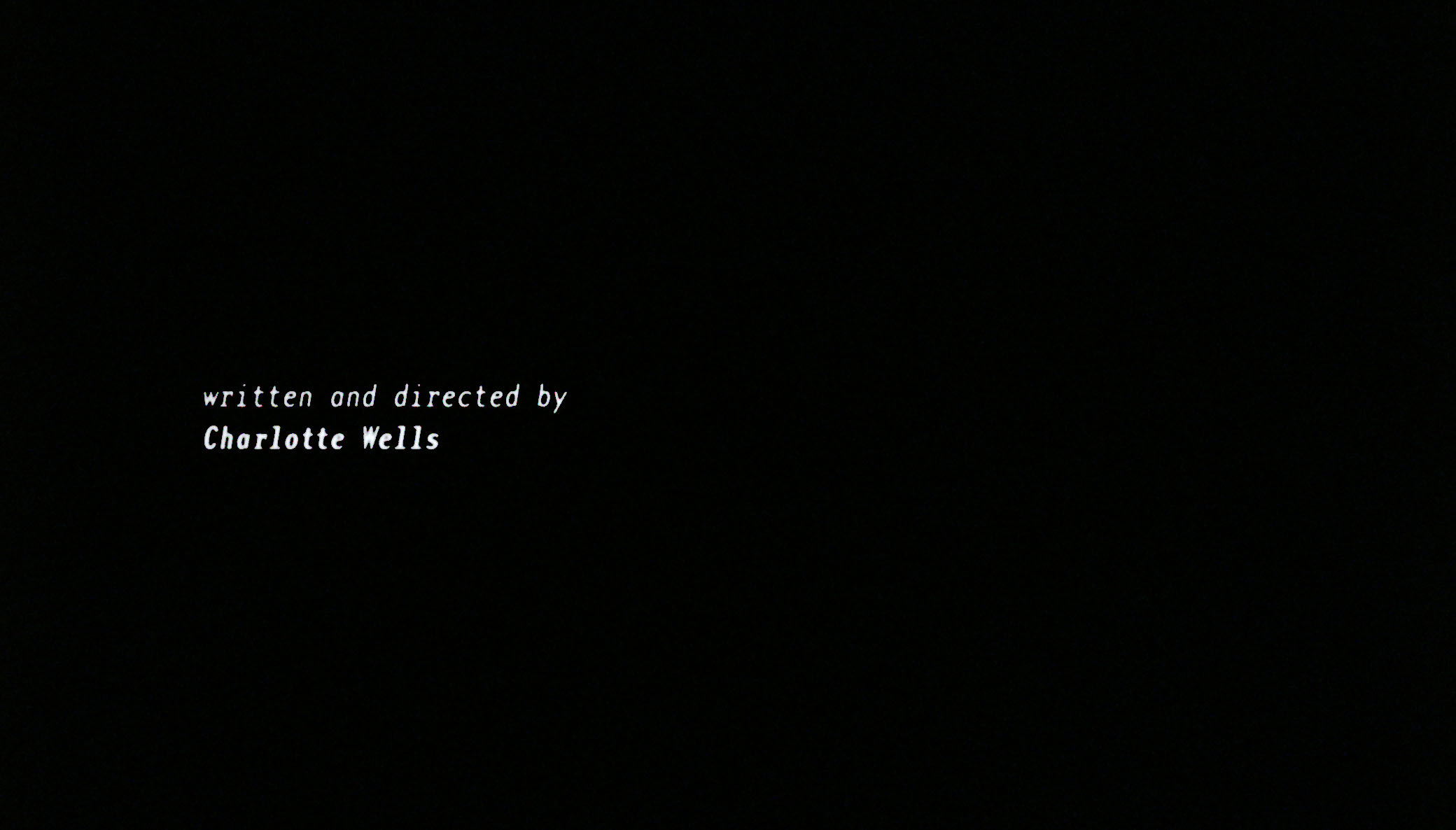
caspar sent the director, charlotte wells, some typeface ideas based on the film’s overall mood and his experiences of growing up in the 90s. they then began work on customizing and animating the chosen typeface in a fashion that charlotte and he felt appropriate to the tone of the film. all the while caspar’s brother josiah got to work on creating the end crawl.

you can read more about our involvement in the project here, and you can watch the titles themselves here.
_link
artofthetitle.com/title/aftersun
_tags
title card 3
title card 1
title card 2
title card 4
title card 5
title card 6
title card 7
title card 8
title card 9
_what
titles for the feature film, the inspection.
_how
long-standing collaborator elegance bratton reached out and asked that we assist him in creating titles for his debut feature film, the inspection, which was to be produced and distributed by A24 films. the film is a personal story based on elegance's own experiences as a young, gay man who, rejected by his own mother, entered the military as a way of getting off the streets of new york and finding some self respect. what transpires is a drama that illustrates the complexities of being a homosexual in the army and a parable of self discovery and definition.

we sent elegance a series of typographic ideas for the titles and elegance picked the styles you see here. the resulting mixing of typefaces used, to us, suggested the idea of being a sensitive man in a tough military environment. both typefaces are beautiful and imperfect in their own ways and together suggested in this way the film's overall narrative. elegance then asked that we colour the text gold to reflect his feelings about how he felt about the story. 
_link
a24films.com/films/inspection
_tags
3
_what
title sequences for the feature film, karmalink.
_how
producer and friend valerie steinberg asked that we make the poster and titles for her debut feature film production, karmalink. the film is an original and complex analog science fiction film set in cambodia. soon we were talking to director, jake wachtel and developing a visual language to accompany his fresh science fiction narrative. 

for the titles caspar developed an animated title card that uses both the khmer and english languages. from there the rest of the title design followed suit. 
_link
imdb.com/title/tt10396450
_tags
screenshot 1
screenshot 2
screenshot 3
screenshot 4
screenshot 5
screenshot 6
screenshot 7
screenshot 8
screenshot 9
screenshot 10
screenshot 11
screenshot 12
screenshot 13
screenshot 14
screenshot 15
screenshot 16
screenshot 17
screenshot 18
_what
title sequence and motion graphics for the tv series, the girlfriend experience.
_how
writer / director anja marquardt invited us to create titles and some motion graphics pieces for the 3rd season of the girlfriend experience. anja had written and was directing the entire season herself, and as fans of our work she was excited to see what we could bring to the table for her.

caspar teamed up once again with joey ciccoline and josiah newbolt and they immersed themselves fully into the fast-paced world of a television series production. the screenshots you see here give you a taste of the varying styles of animation work we produced for the 10 episode season.

we'd also like to draw your attention to the incredible soundtrack our friend and long-time collaborator matthew pusti (AKA makeup and vanity set) composed for this 3rd season. you can listen to that here.
_link
imdb.com/title/tt3846642
_tags
_what
title sequences for the feature film, waves.
_how
director trey edward schults had a few ideas about how the opening titles for his new feature film, waves, should look and feel. he was keen to capture a certain, particular, "florida feeling." florida was the US state in which the film had been shot and where trey is from. to that end we suggested that a neon flicker of orange on top of the beautiful opening shot of the girl on her bike would hint nicely at a florida tone, but also the darker, fiery film to come. after finding the right colour, placing and treatment of the titles, we offered trey some typeface options and he chose the one you see here.

for the closing titles trey had some unusual, abstract b-roll footage he'd shot in pre-production and we suggested we scroll black type through it so that at times the words literally got lost in the darker colours. this was one of those rare projects where everything we did both the director and A24 (the film's production company) loved straight off the bat.
_link
a24films.com/films/waves
_tags
card 6
1
2
4
5
7
8
9
10
13
14
15
16
_what
title sequence for the feature film, funny face.
_how
writer / director tim sutton and caspar worked together to make a simple set of titles that felt cartoon and comic book in nature. the key thing was to somehow echo the inane grin in the funny face character's mask. the result was a set of titles that look half like they're made with a DYMO label writer and half like an abstracted gummy smile. 

the film had its world premiere at the 2020 berlinale.
_link
imdb.com/title/tt11638942
_tags
16
1
2
3
4
5
6
7
8
9
10
11
12
13
17
18
19
20
21
22
23
24
25
_what
title sequence for the feature film, anne at 13,000 feet.
_how
writer / director kazik radwanski asked that we might work with him again on making the titles and poster for his new film, anne at 13,000 feet. for the titles work in particular it was an exercise in minimalism, in which caspar used the top of the screen to talk about the sky, and the bottom of the screen to talk about the ground. such was the nature of the film's narrative. 
_link
en.wikipedia.org/wiki/Anne_at_13,000_Ft.
_tags
16
1
3
7
8
9
10
11
12
13
14
15
17
18
19
20
21
22
23
28
30
31
32
_what
title sequence for the short film, the follower.
_how
producer valerie steinberg put us in touch with director stevie szerlip and producer sarah winshall. they'd just completed shooting a short film called the follower, with a story based on a 1966 joyce carol oates short story. the film's modern take on the narrative tells the tale of a teenage girl whose somewhat sexualized social media posts get her into a sticky situation with a stalker.

caspar and stevie experimented with a few approaches before settling on the one you see here. the idea that made the most sense was using repetitive animated type and photo sequences to speak both obliquely and directly about scrolling, following, stalking and the heat that can come from that.
_link
vimeo.com/293449456
_tags
poster
poster 2
_what
writing, directing, title design and poster design for a short film.
_how
two years ago caspar wrote and directed his first short film. the film is now available through the online short film festival, no budge. the film stars laine rettmer and is about loss and the fear of making a film.

the film's titles and poster were also designed by caspar.
_link
nobudge.com/videos/leaving-hope
_tags
still
_what
end title sequence for the feature film, the song of sway lake.
_how
we met director ari gold at a party on his rooftop. in discussions about his forthcoming new film he revealed he was looking for a title sequence. sharing a love for the filmed title sequences of saul bass, we agreed to stay and touch and discuss things further. a few weeks later producer alexandra byer, cinematographer shabier kirchner and i found ourselves upstate filming by a lake. not long after that were cutting the sequence you see here into the film. the piece combines almost every aspect of what we do as a company, from record cover design through to film direction.
_link
swaylake.com
_tags
poster
title sequence 1
title sequence 2
title sequence 3
title sequence 4
title sequence 5
title sequence 6
title sequence 7
title sequence 8
title sequence 9
title sequence 10
title sequence 11
title sequence 12
title sequence 13
title sequence 14
_what
writing, directing, title design and poster design for the short film, light up the night.
_how
executive producer john la valle approached us with idea of making a film of a section of the protomen's second record, act II. the band chose light up the night as the song, and we approached collaborator matt sundin to co-direct the project with us. development of the project took some years and the end result you can see here. a testament to the band and everyone else involved, the film pays homage to many of the things that inspired us to do the work we do today, whilst delivering a particularly serendipitous socio-political commentary. 

we collaborated once again with john delucca on the poster design.
_link
protomen.com
_tags
2
1
google maps sequence
cinema lightbox poster sequence
3
4
5
11
68
_what
title sequence for the feature film, dark night.
_how
tim sutton asked that we make some additional elements alongside the title sequence for his third feature film, dark night. to achieve this caspar was on set during the filming and was put to work making props and photographing cast members.

the first task was to screen-record a sequence where the film's protagonist plans a trip through town using google maps. into this sequence caspar then composited photographs he'd taken on set of two cast members on skateboards.

the second task was the printing and placing into a cinema lightbox on set of the film's actual poster. this meta sequence can be seen in the film's startling denouement. 
_link
imdb.com/title/tt5281134
_tags