(v)
(v_i)
(version_industries)

film
title card 3
title card 1
title card 2
title card 4
title card 5
title card 6
title card 7
title card 8
title card 9
_what
titles for the feature film, the inspection.
_how
long-standing collaborator elegance bratton reached out and asked that we assist him in creating titles for his debut feature film, the inspection, which was to be produced and distributed by A24 films. the film is a personal story based on elegance's own experiences as a young, gay man who, rejected by his own mother, entered the military as a way of getting off the streets of new york and finding some self respect. what transpires is a drama that illustrates the complexities of being a homosexual in the army and a parable of self discovery and definition.

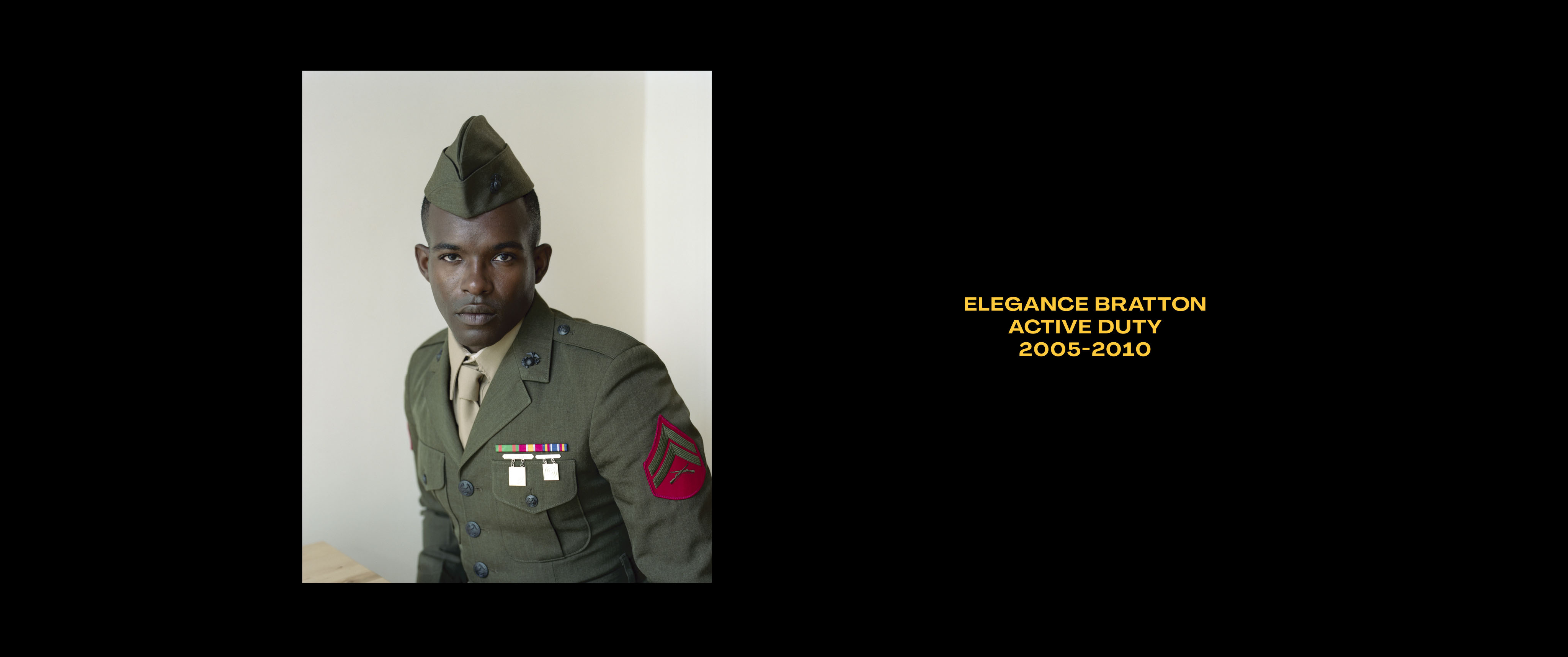
we sent elegance a series of typographic ideas for the titles and elegance picked the styles you see here. the resulting mixing of typefaces used, to us, suggested the idea of being a sensitive man in a tough military environment. both typefaces are beautiful and imperfect in their own ways and together suggested in this way the film's overall narrative. elegance then asked that we colour the text gold to reflect his feelings about how he felt about the story. 
_link
a24films.com/films/inspection
_tags