(v)
(v_i)
(version_industries)

poster
poster
_what
poster for the nashville-based band, the protomen
_how
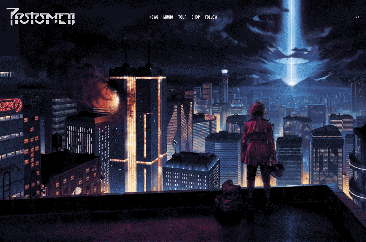
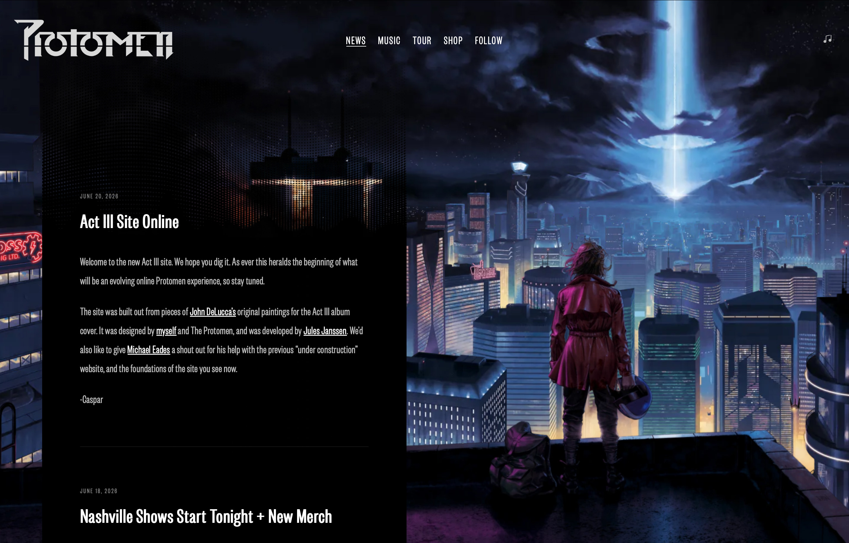
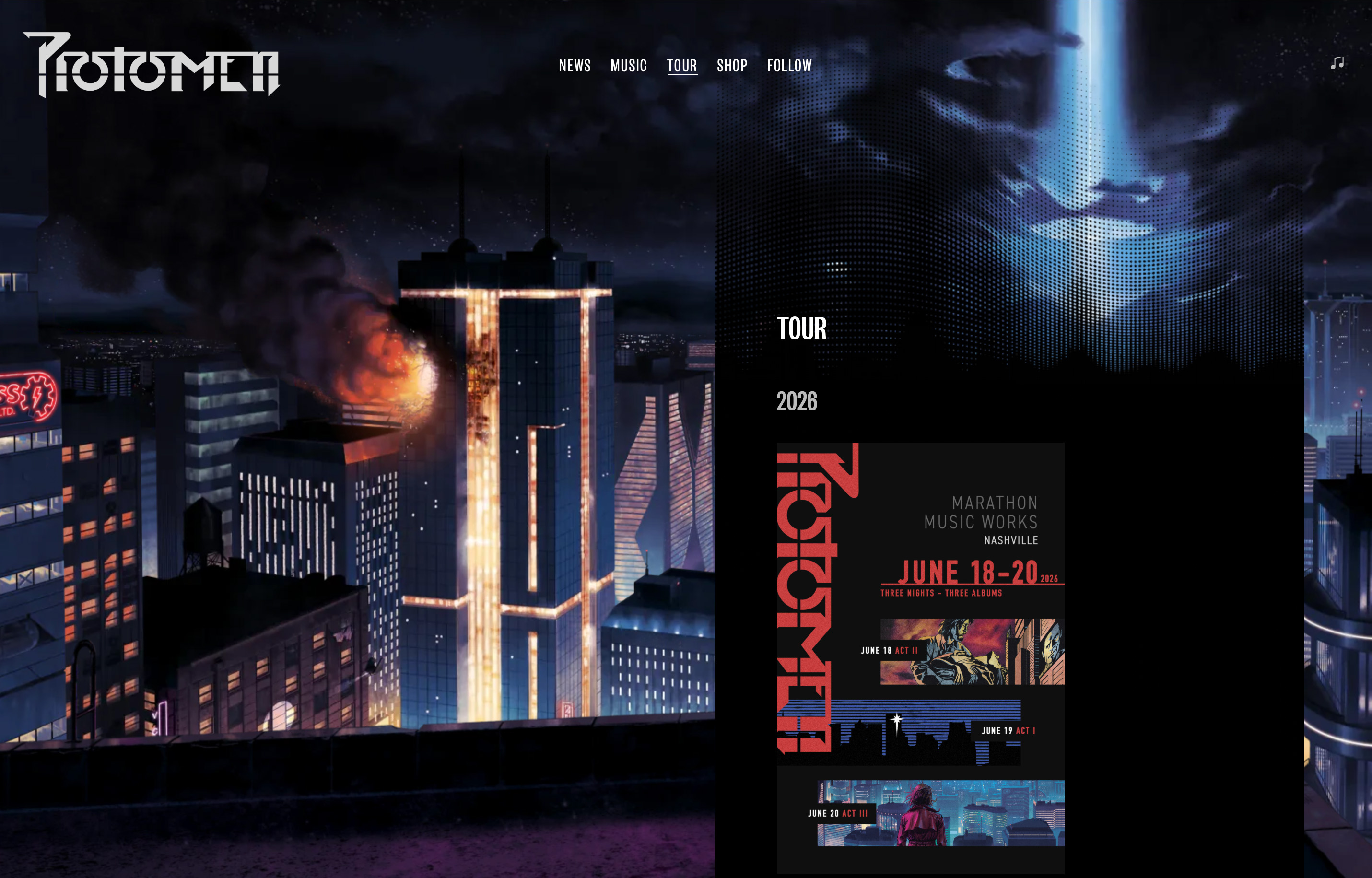
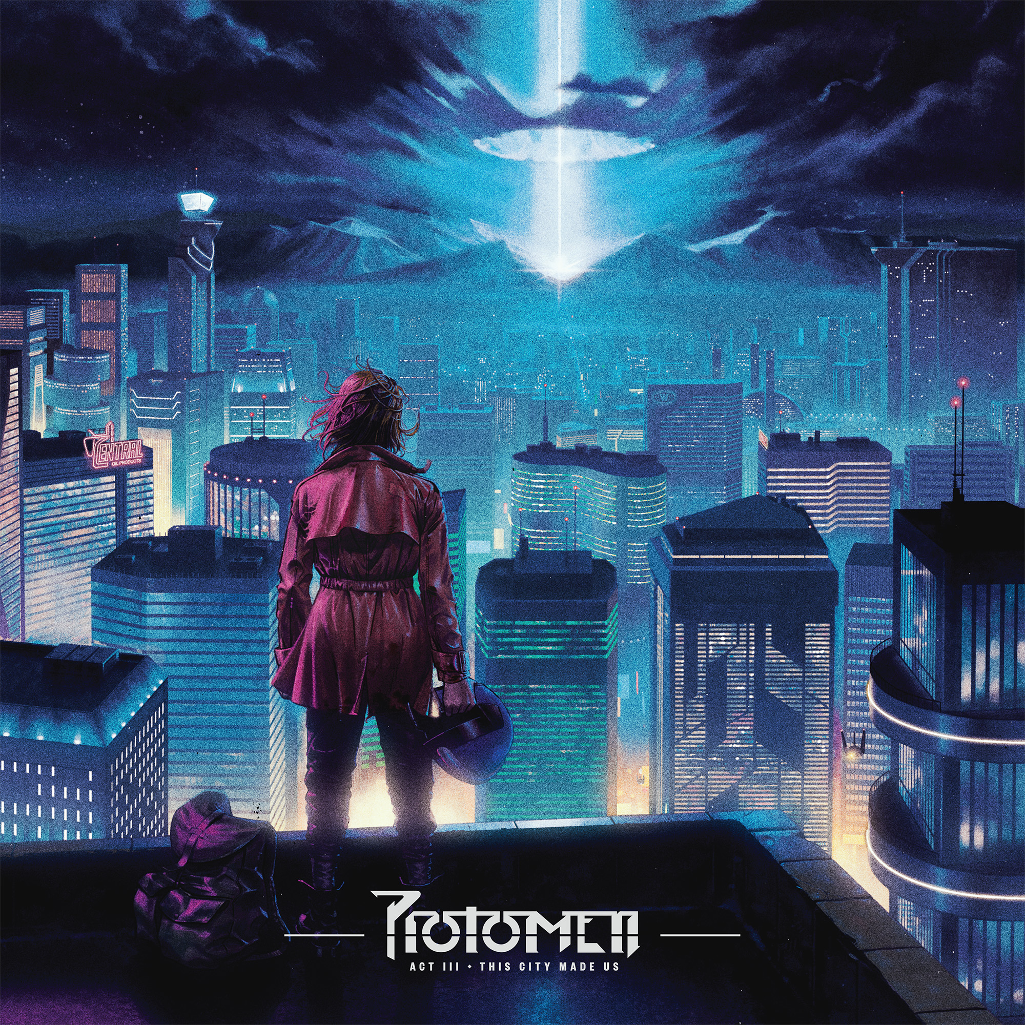
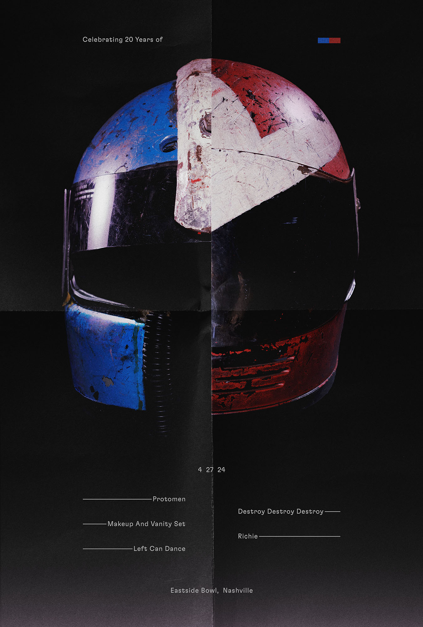
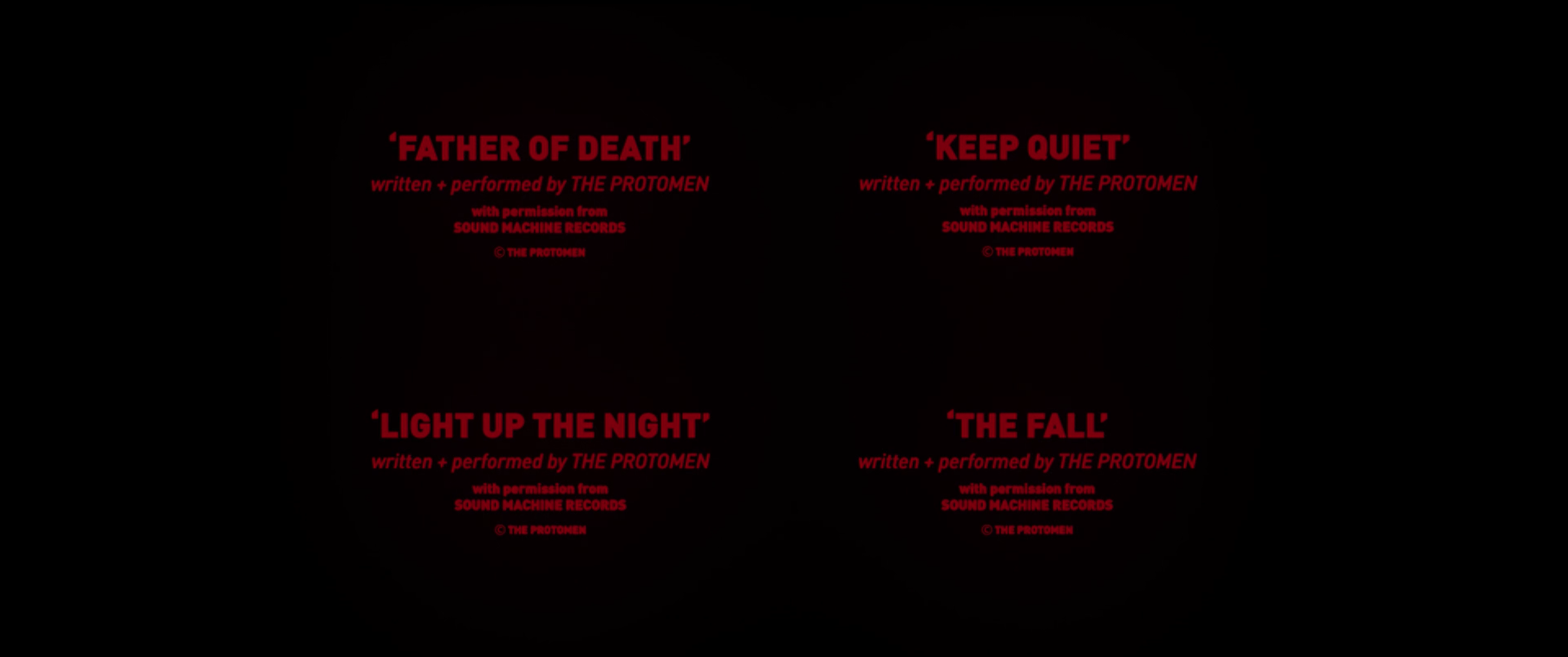
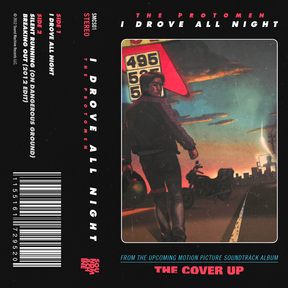
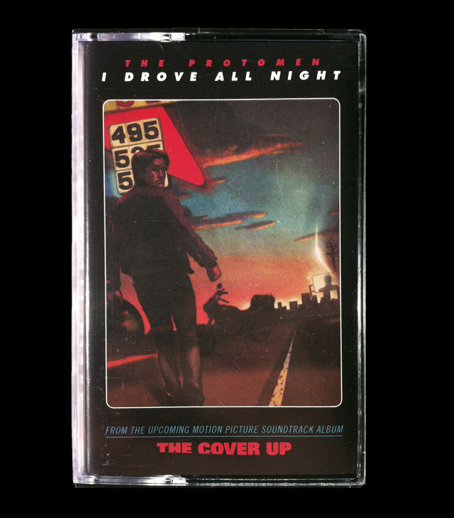
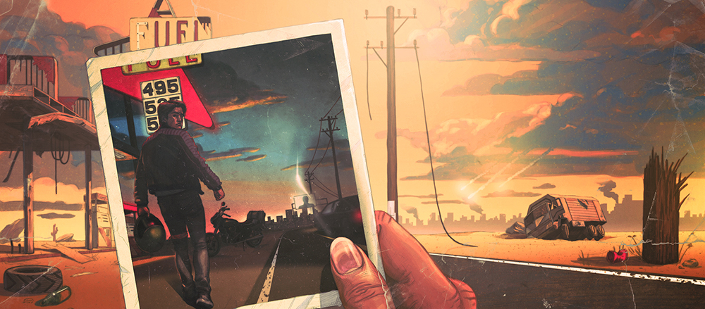
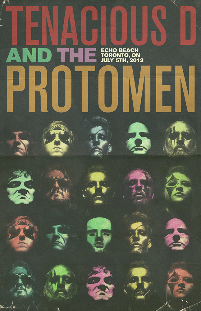
it's 2024. the protomen first took to the stage 20 years ago. to mark the occasion they are playing a show with the same bands (almost) that played with them at that first show. they asked us to make a poster to promote the occasion.

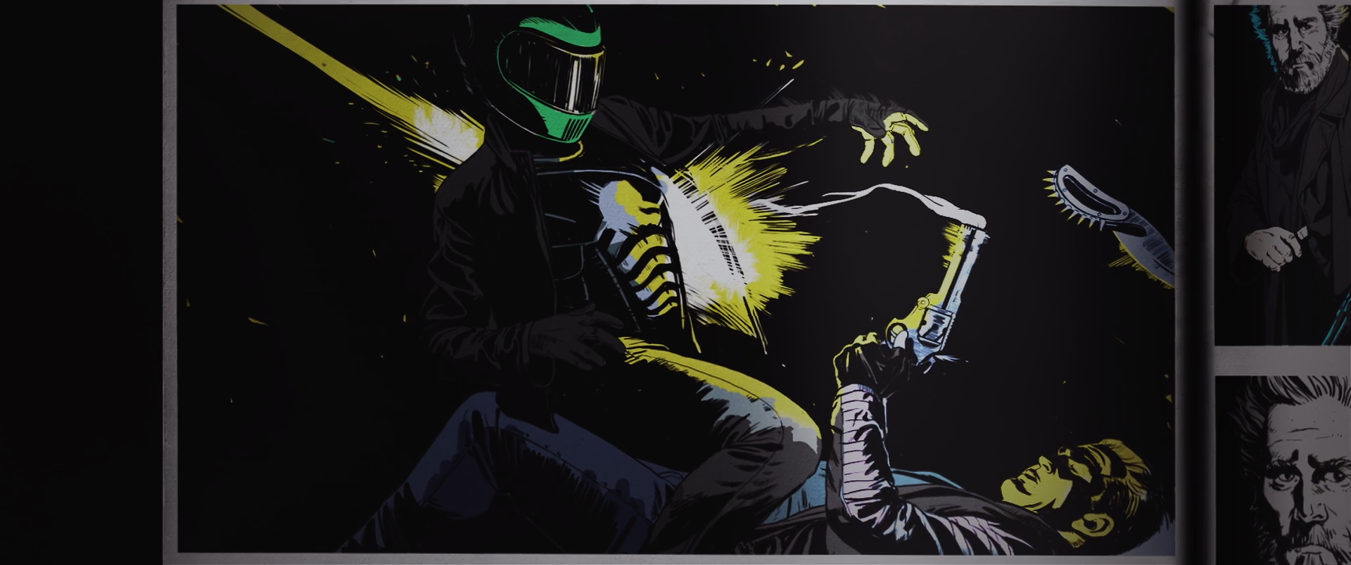
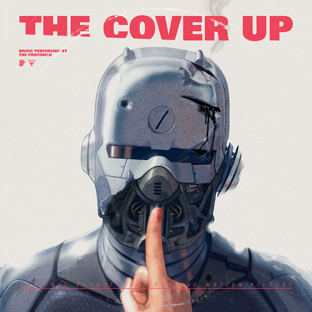
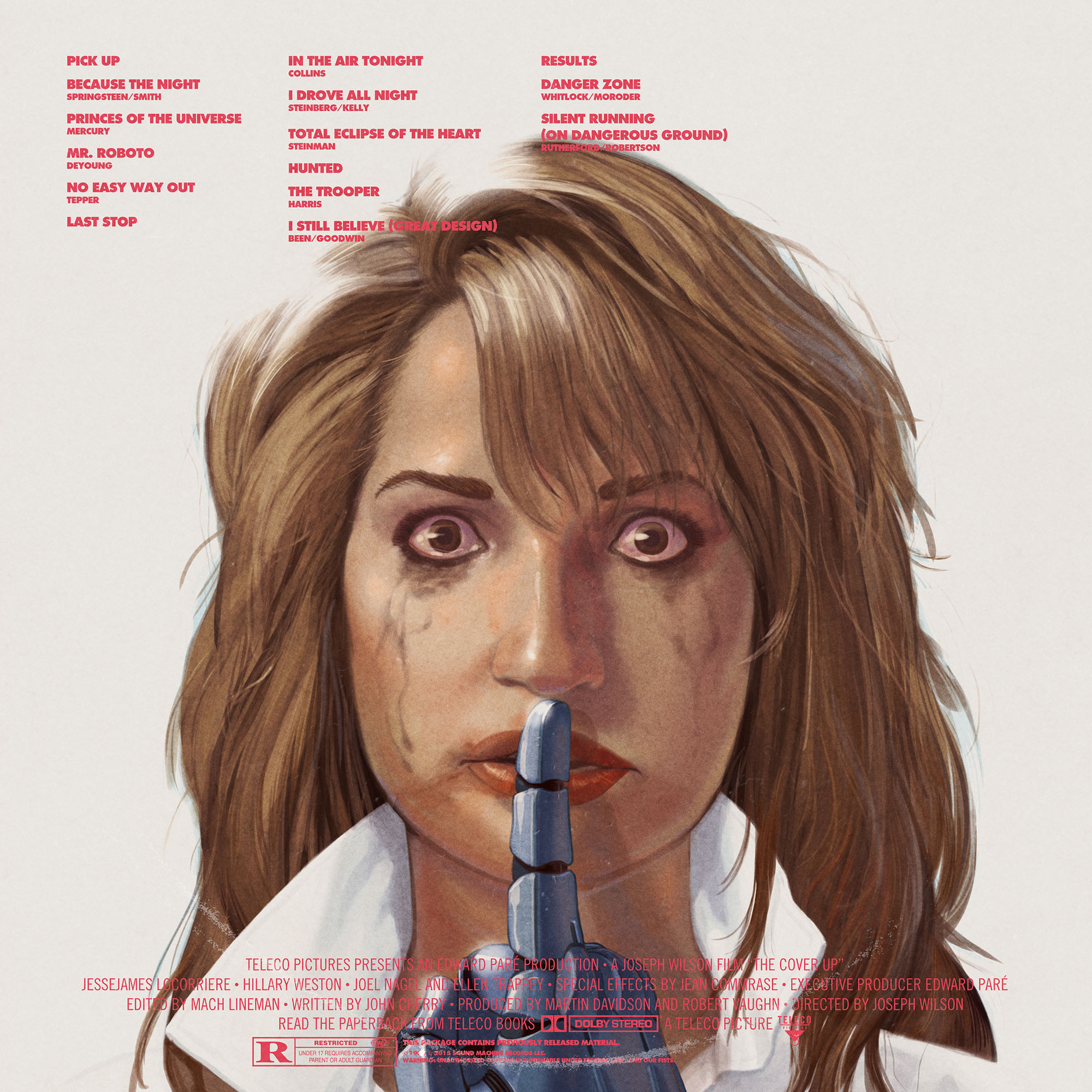
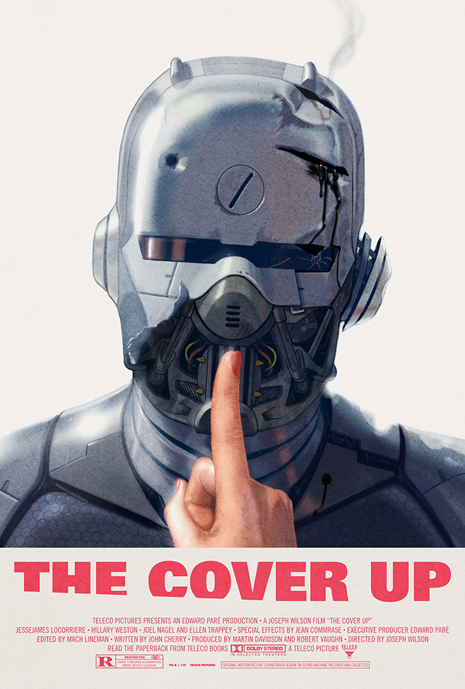
caspar had long been bothered with how badly daft punk had executed the cover artwork for their final album, 
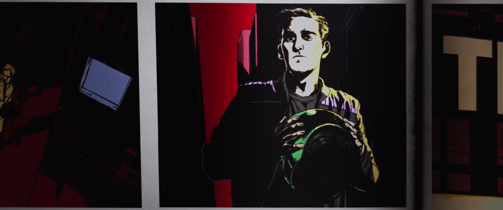
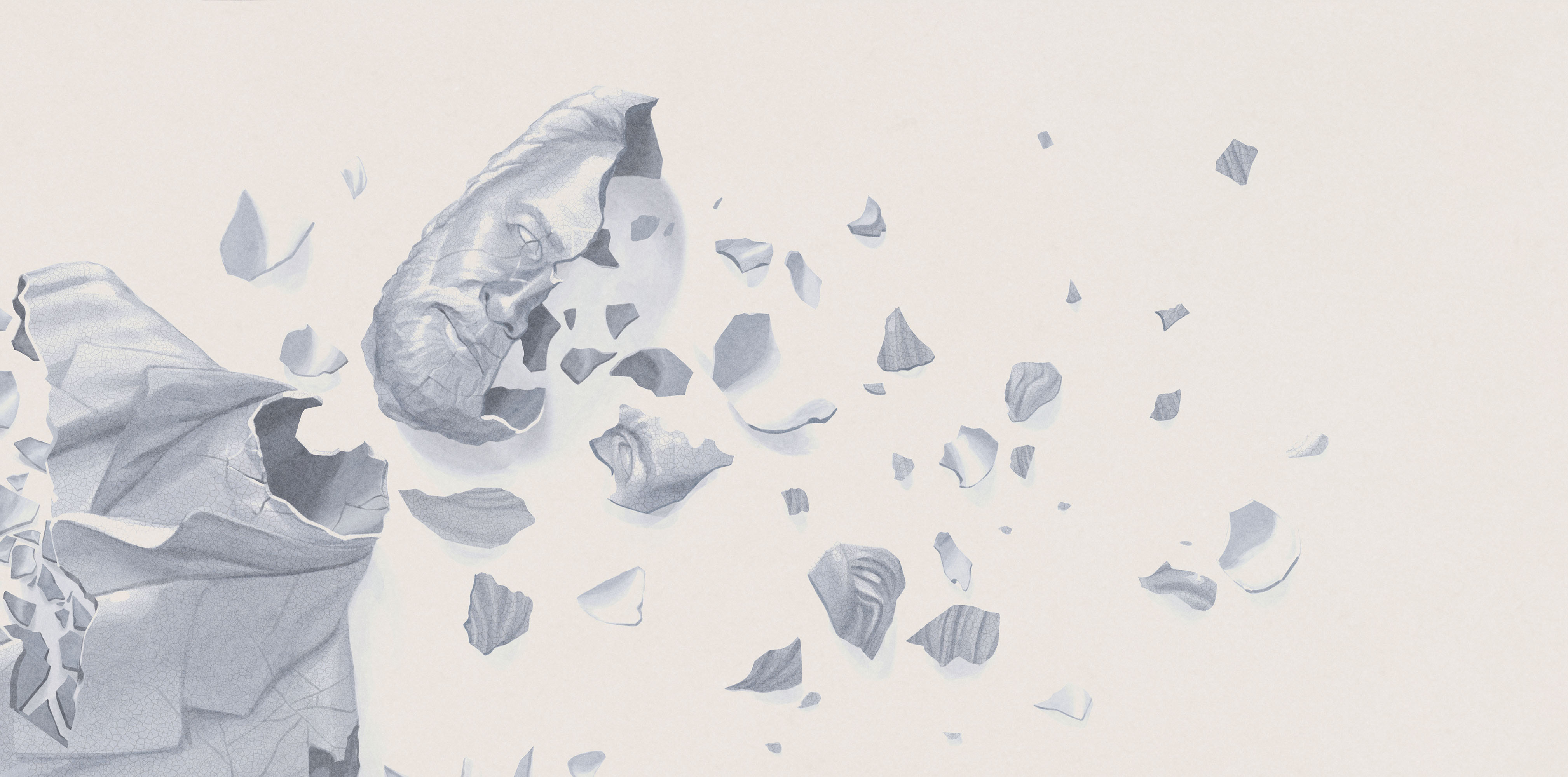
random access memories. despite having access to their own helmets to photograph, they made a poor computer rendering of them instead. now, since the protomen had often referred to themselves as "a southern, buck-toothed daft punk", it felt right to finally set the record straight. we shipped their smashed-up, 20 year old helmets to joey ciccoline and he set about photographing them in the appropriate manner.

if you have the means to make it to the show we do recommend it. the protomen are, despite the tongue-in-cheek daft punk reference here, one of the most unique and extraordinary live bands in existence today. 
_link
protomen.com
_tags
record sleeve
_what
record sleeve for the nashville-based band, the protomen.
_how
the protomen sent us their new song, "the fight," and we got to work. the band are always clear on the imagery they want to accompany their music, and john delucca and caspar do their best to realize that vision.

this time around the band needed a new logo as well as a revised visual aesthetic. john drew the cityscape you see here, and caspar drew the logo typeface and the rest of the layout. the aesthetic references are we're sure very obvious to some, but above all we hope you find it all a fitting visual accompaniment to the song.

you can listen to "the fight " here.
_link
protomen.com
_tags
tour poster
_what
tour poster for the nashville-based band, the protomen
_how
the protomen recently headed out west to road test some new material from their forthcoming LP. after some discussion john delucca set to work drawing and painting the image you see here. the image speaks for itself of course and, as ever, hints at elements of the band's ongoing conceptual narrative and as much as their reality.
_link
protomen
_tags
poster
title sequence 1
title sequence 2
title sequence 3
title sequence 4
title sequence 5
title sequence 6
title sequence 7
title sequence 8
title sequence 9
title sequence 10
title sequence 11
title sequence 12
title sequence 13
title sequence 14
_what
writing, directing, title design and poster design for the short film, light up the night.
_how
executive producer john la valle approached us with idea of making a film of a section of the protomen's second record, act II. the band chose light up the night as the song, and we approached collaborator matt sundin to co-direct the project with us. development of the project took some years and the end result you can see here. a testament to the band and everyone else involved, the film pays homage to many of the things that inspired us to do the work we do today, whilst delivering a particularly serendipitous socio-political commentary. 

we collaborated once again with john delucca on the poster design.
_link
protomen.com
_tags
cover
back cover
inside spread
poster
_what
record sleeve for the nashville-based band, the protomen.
_how
the protomen, quite apart from their original music output, are a band that produces cover songs par excellence. this is not least because they choose songs that almost entirely echo the narrative they deliver in their ongoing series of rock operas.

the cover up is likely just the first in a series of exceptionally well recorded collections of cover songs from the band. needless to say it was our job to create artwork for the record that deliberately wove it into the protomen's overall narrative arc. this included nothing less than asking friends to voice characters in the various "movie scenes" dotted throughout the recording.

the idea here was to make a movie soundtrack to a film that was made and exists within the protomen's ongoing story. in doing so we asked john delucca that he might once again bless us with his exceptional drawning and painting talents. caspar and commander then sewed everything together to make a vinyl record release we're very proud of.

we hope you enjoy the work.
_link
protomen.com
_tags
cassette cover
cassette
inside spread
_what
artwork for the protomen's cassette single, i drove all night.
_how
the first single from the protomen's forthcoming covers record was the roy orbison song, i drove all night. the song was of course chosen because of how directly it tied in with and expanded upon the band's long-running, conceptual narrative. in the same fashion the artwork had a very clear path to follow. once again employing the talents of john delucca, we set about creating a design that both expanded on the protomen's story, but also paid homage again to many of their key influences. releasing it on cassette only was of course the final gesture that completed the project.

if you're interested you can read more about the development of the artwork on our blog. otherwise by all means grab a copy of the single here, whilst stocks last.
_tags
cover
tenacious d show poster
_what
record sleeve for the nashville-based band, the protomen
_how
here's another one of the many fruits of our on-going collaborations with the protomen. the band played a tribute night in nashville, TN, back in late 2010 and the recordings came out so well they decided to release it. performing as 'queen' for the night, we decided to recreate the iconic 'queen II' record cover in a studio in brooklyn. the photography is by long-time (v) collaborator matt sundin, and the logo work is by M L hope. we handled the art direction, post-production + layout duties. 
_link
protomen.com
_tags
cover
vinyl cover
vinyl back cover
vinyl record
vinyl pop-up
vinyl pop-up detail
poster
_what
artwork for the protomen's second album, act 2 - the father of death
_how
everything about this record cover and poster had to be bigger and better. the moment we heard act II: the father of death we knew the protomen had taken giant leaps as a band. consequently we wanted to produce artwork that celebrated and supported this excellent new music through and through.

once again we asked john delucca to bring his magic to the project. first he painted the fantastic streets of fire inspired cover, and then went on to create various other pieces for the album's illustrated "libretto" booklet. caspar then wove everything together for the 2009 compact disc release of the album, and the promo "movie poster" that went with it.

in 2018 it was time to release a deluxe, vinyl version of the album. for this the band wanted to make a book with a pop-up diorama of john's "how the world fell under darkness" illustration as the centrepiece. this time around caspar eschewed the rest of the CD artwork and replaced it with stills from the recently shot and released light up the night music video.
_link
protomen.com
_awards
making vinyl awards 2018 finalist in 4 categories
_tags