(v)
(v_i)
(version_industries)

music
_what
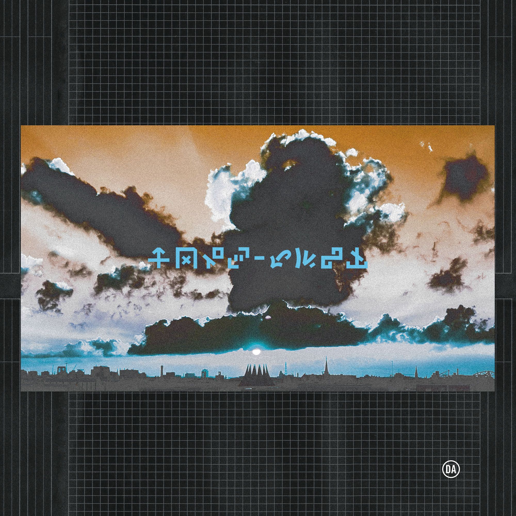
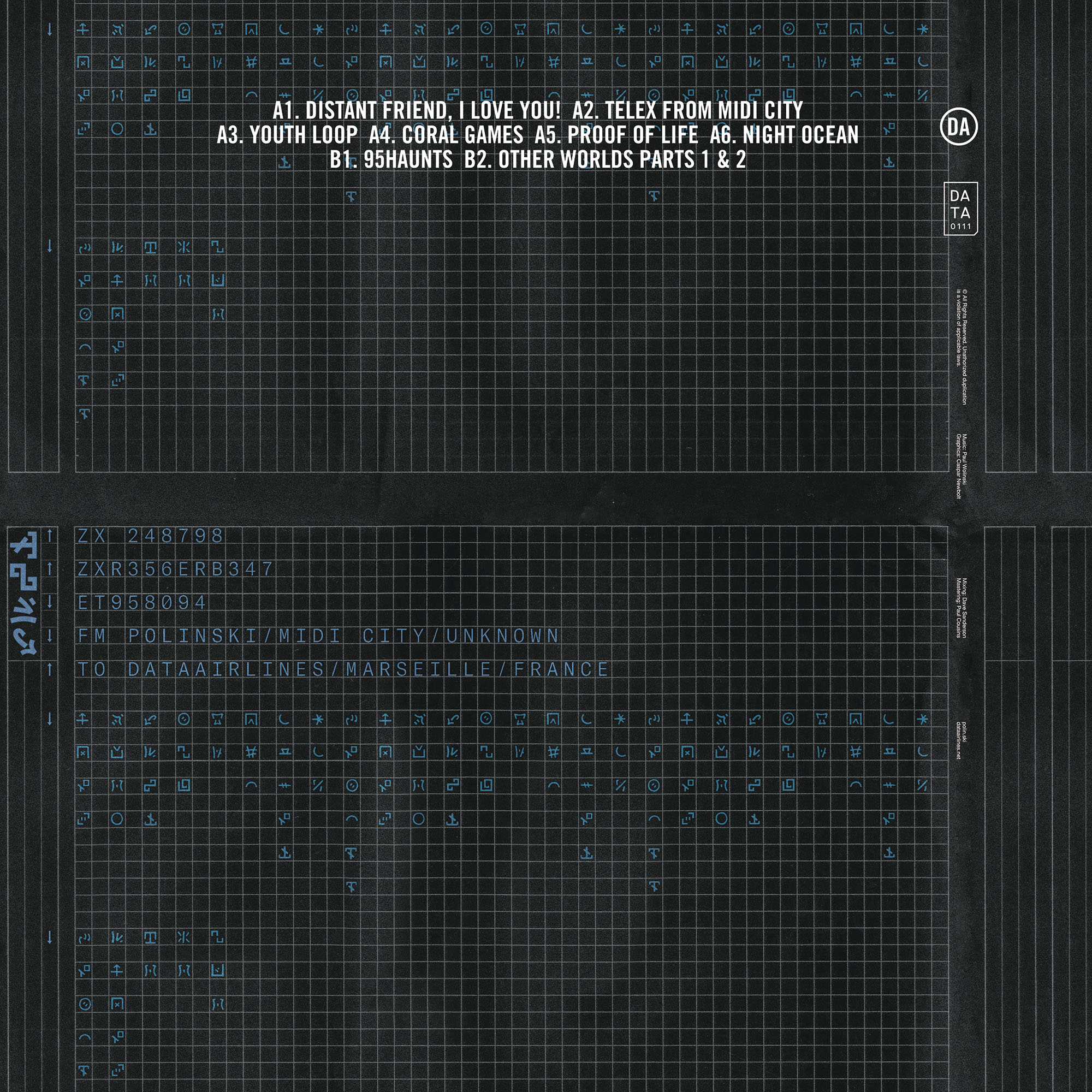
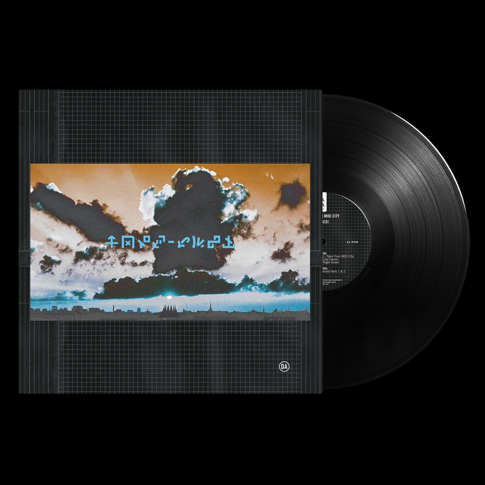
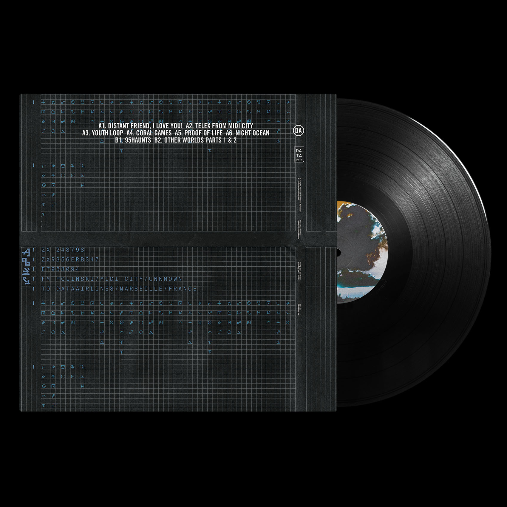
record sleeve for the berlin-based band, polinski.
_how
paul wolinski has returned as polinski, his 65daysofstatic side-project. distant friend, i love you! is the first single from his forthcoming sophomore LP, telex from MIDI city. the record will be released through dataairlines, home of makeup and vanity set amongst others.
we made the LP cover artwork for the new record first, and then made this single cover second. the latter photographed in the rainy streets of berlin not so many days ago.

you can watch the fantastic music video paul made for distant friend, i love you! here.
_link
polin.ski
_tags
_what
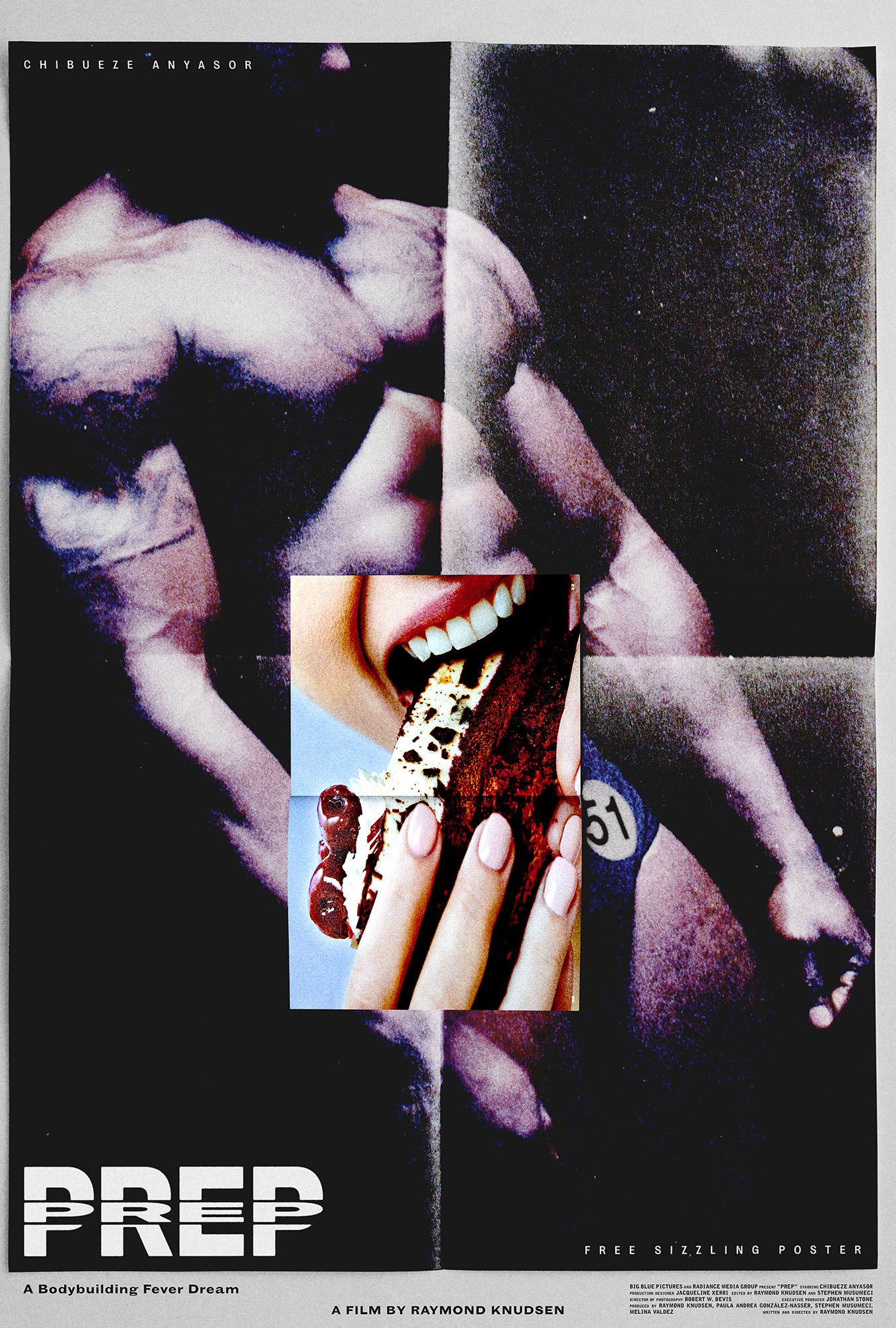
poster for the short film, prep.
_how
producer raymond knudsen returned and asked us to make a poster for his new film, prep. this time raymond was in the director's chair and his film is a frenetic, personal insight into the world of body building. we loved the film and presented a range of poster ideas for raymond to choose from. he selected the one you see here. the collaged juxtaposition was our attempt to tackle the particular psychosis suffered by the protagonist in the film.
_link
bigbluepictures.com/soon
_tags
record sleeve
_what
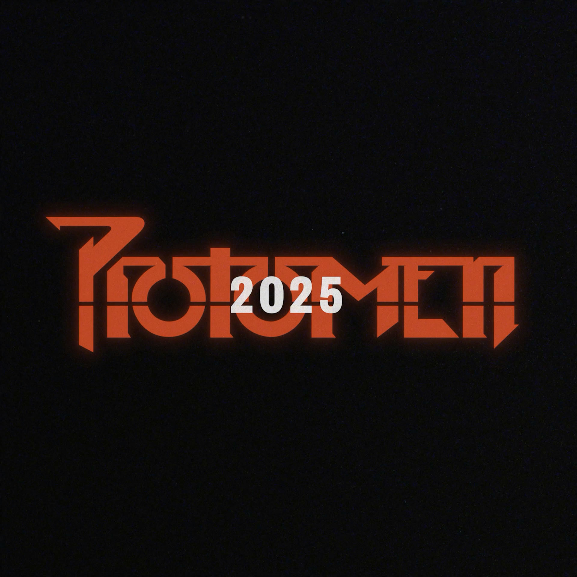
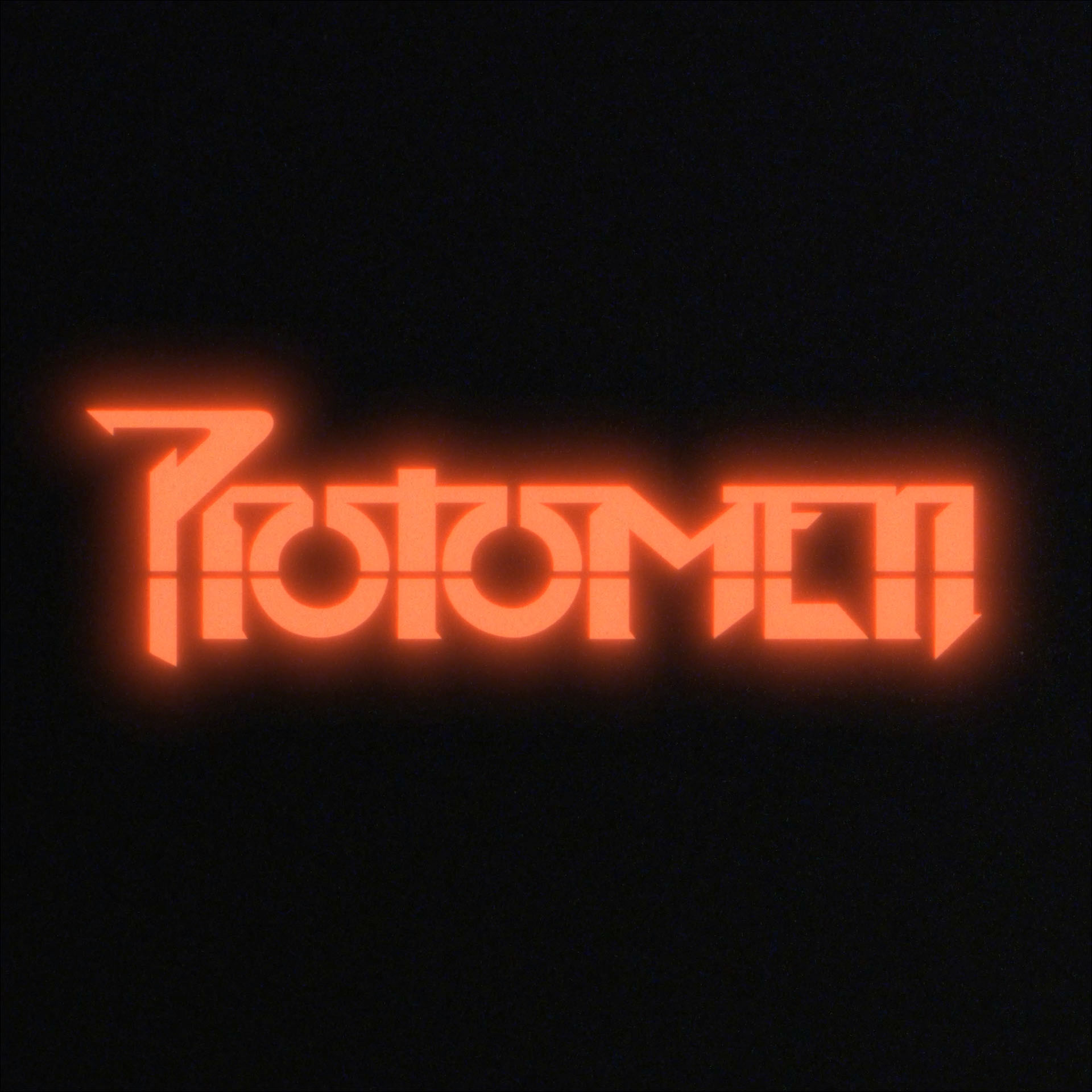
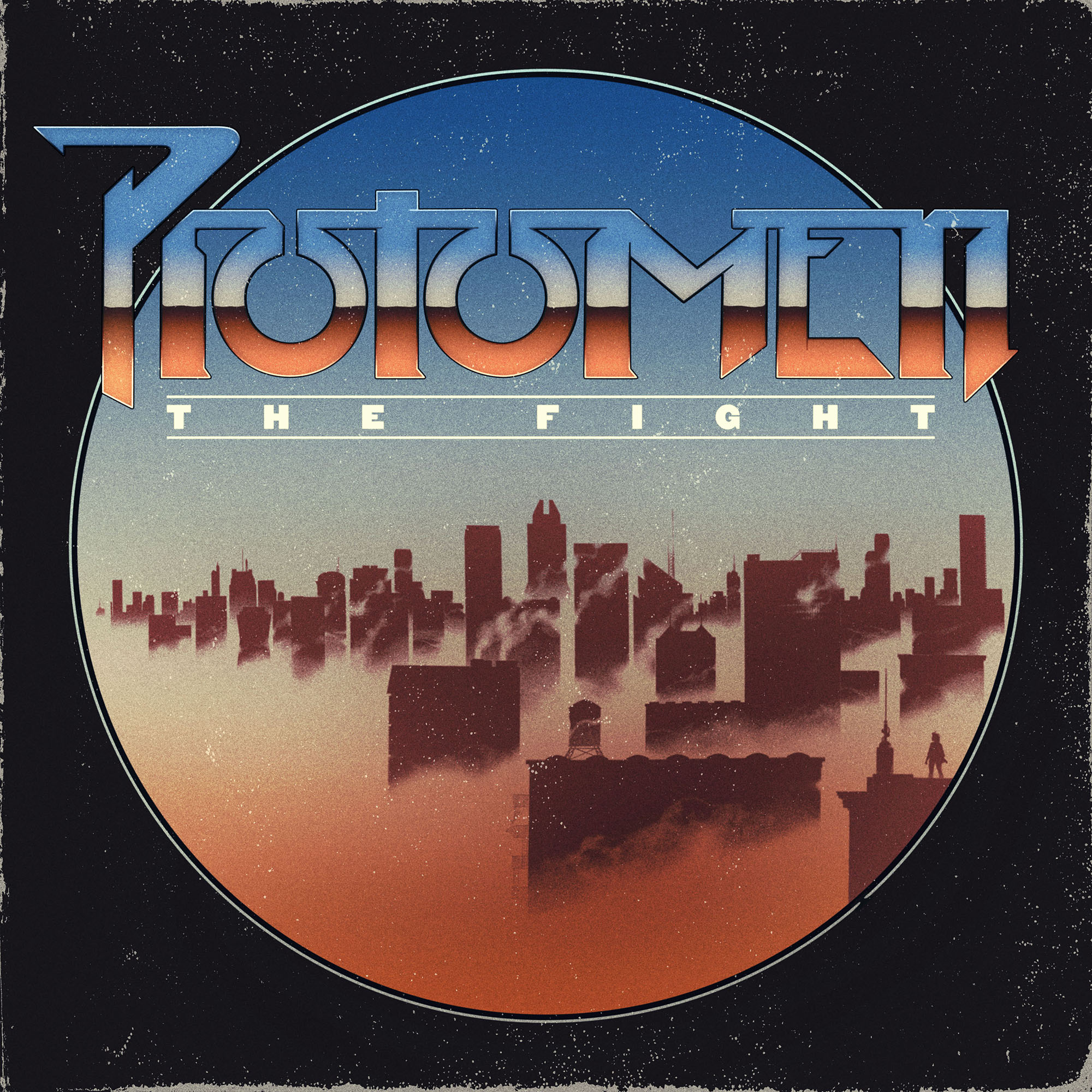
record sleeve for the nashville-based band, the protomen.
_how
the protomen sent us their new song, "the fight," and we got to work. the band are always clear on the imagery they want to accompany their music, and john delucca and caspar do their best to realize that vision.

this time around the band needed a new logo as well as a revised visual aesthetic. john drew the cityscape you see here, and caspar drew the logo typeface and the rest of the layout. the aesthetic references are we're sure very obvious to some, but above all we hope you find it all a fitting visual accompaniment to the song.

you can listen to "the fight " here.
_link
protomen.com
_tags
white on black logo
_what
logo for the new york-based company, fraude films.
_how
wells watson jr. reached out to us and asked that we might create an animated logo for his new company, fraude films. after presenting various ways in which to visualize his company's name, we all settled upon the one you see here. created by giulia bertolino and caspar, the animation is a result of some digital type design, and plenty of printing and scanning. 
_link
fraudefilms.com
_tags
cover
back cover
package mockup
_what
record sleeve for the nashville-based band, makeup and vanity set.
_how
"the future past. lights on a horizon. blood in your veins. old visions. low frequencies fading across night. the roar of the masses. the reflection of bulbs overhead, on printed plastic and steel. a fight to survive, all or nothing. shadow circuit."

this was the story matt pusti (AKA makeup and vanity set) had written and was thus scoring the soundtrack for when he created this album. what you see here is the logo design and record sleeve artwork we created to reflect this narrative.
_link
makeupandvanityset.bandcamp.com/album/shadow-circuit
_tags
charles park trilogy album cover
charles park trilogy poster
_what
record sleeve, poster + trailer for the nashville-based band, makeup and vanity set.
_how
telefuture records approached makeup and vanity set with the idea of re-releasing their popular charles park records as a trilogy box set. the moment the project got a green light john delucca, joey ciccoline and ourselves were put to work in tying the overall package together visually.

john was sent a few paragraphs detailing the narrative behind each album. he then started to create a poster that we could divide into three halves, to represent the three parts of the story.

we were asked to create the logo, cover and overall packaging for the record. the logo we made is pretty self-explanatory, but the packaging was a subtler affair. utilizing the bokeh affect often seen in films when the camera is focussing on objects in the foreground, we realized we could represent each part of the trilogy with a different coloured circle. in this way the cover image could say a lot with very little, and each record within the packaging could be differentiated by its own red, blue or brown graphic.

joey was then sent the logo and proceeded to shoot the necessary footage to create the teaser trailer for the trilogy, this clip was the first promotional piece released to the general public. once released the limited edition box set sold out in 2 days, but you can still purchase the album digitally here.
_link
makeupandvanityset.com
_tags
BBDLP1 cover
detail
poster
_what
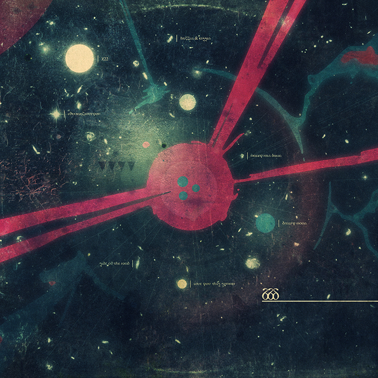
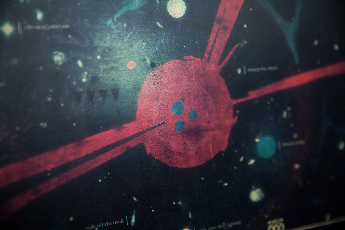
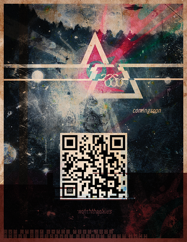
artwork for big black delta's debut LP, BBDLP1
_how
continuing the very fluid back and forth between us and jonathan bates, this the cover for the forthcoming BBDLP1 is our attempt at capturing the immensity that is this new record. whether you are listening to the lush love song that is 'capsize' or the vastness, heaving space trip that is 'BBD3', we wanted the cover to echo both the inner workings of jon's mind as well as the beautiful, dark recesses of the universe. no longer the man with his head exploding on the cover of mellowdrone's 'angry bear', we now step deeper inside that thinking and in doing so reach much further out into space as we get involved with his obsession with UFO folk-lore and his desire to be taken away from his planet by whatever means possible.
_link
bigblackdelta.com
_tags