(v)
(v_i)
(version_industries)

music
front cover
back cover
front cover vinyl mockup
back cover vinyl mockup
_what
record sleeve for the los angeles-based band, big black delta.
_how
it's been over a decade now since jonathan bates called us and asked caspar to do all the artwork for a new band he was starting called big black delta. working with jon has been one of the things that has kept caspar sane over the years. when jon sends us new music it's time to put the pencils down, get up from our chairs and dance. these acoustic versions of some of the best big black delta songs were no less effective. the opening lyrics of the new version of "betamax" coming as they are from an older, wiser and more weathered mr. bates, somehow carry more weight than ever before.

the artwork came easy. jon and his team approved the very first draft caspar put together. the idea was to reduce the big black delta imagery to the simplest forms, and let those forms succumb to gravity's pull; as we all do in the end. in this way we hoped the artwork would appear to be as reflective on the past, aging and the nature of all things, as these new songs are.

you can listen to the record's first single here, and you can preorder the vinyl edition here.
_link
bigblackdelta.com
_tags
landscape cover
portrait cover
landscape
portrait
landscape / portrait
_what
record sleeves for the new york-based band, matte black.
_how
old friends matte black have a new record coming out. in fact they have a double-album and its called, landscape / portrait. the first part, landscape, herald's a brand new sound for the band. the second part, portrait, weaves that new sound back into their original style of songwriting. 

we won't get into the details about the artwork just yet as the records are not out, but you can listen to two songs from them here and preorder digital copies of them here:

_link
matteblack.bandcamp.com
_tags
vinyl cover
front cover and record
front cover
back cover
digital cover
_what
record sleeve for the portugal-based musician, alessandro cortini.
_how
scuro chiaro is the 2nd album by alessandro cortini to be released on mute records. just as with his previous record, volume massimo, the photography you see here is by emilie elizabeth.

it was up to us to find a way to talk about the concept of "chiaro scuro" with emilie's photos and any other elements we saw fit. the result is a piece that talks not just about light and shadow, but also the nature, shape and form of sound. 
_link
mutebank.co.uk/collections/alessandro-cortini
_tags
cover
back cover
inside closed
inside open
back
booklet 1
booklet 2
booklet 3
booklet 4
booklet 5
booklet 6
booklet 7
booklet 8
booklet 9
_what
record sleeve for the nashville-based band, makeup and vanity set.
_how
matthew pusti of makeup and vanity set is scoring more and more films these days. this time around he was asked to score a documentary made about the making of the original batman: the animated series. to celebrate the release of the soundtrack on record store day, we teamed up once again with sound machine records to create something pretty special. the result is a visual expression of the aim of the documentary and a fresher take on the typical batman symbolism.
_link
makeupandvanityset.com/heart-of-batman
_awards
runner-up in the best record store day vinyl category for the making vinyl packaging awards.
_tags
utopian frequencies
disquiet
photo
photo
photo
photo
photo
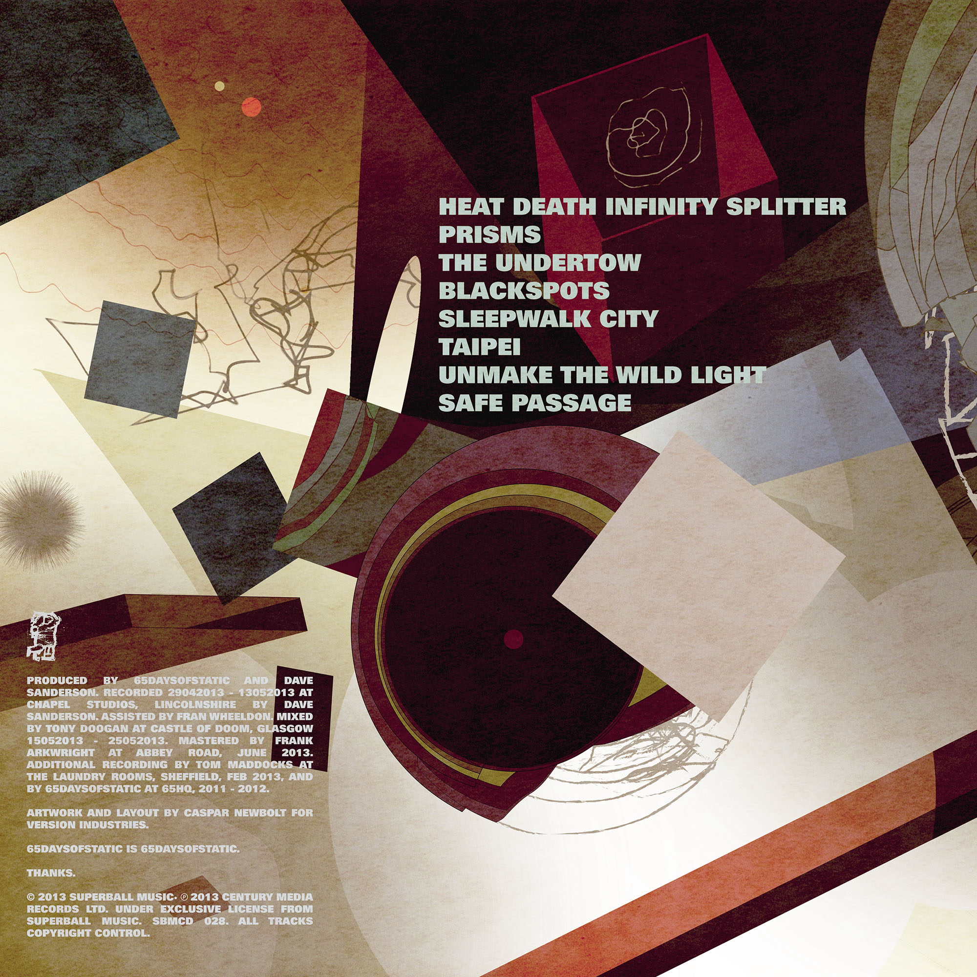
_what
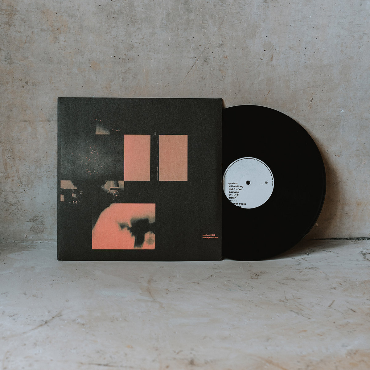
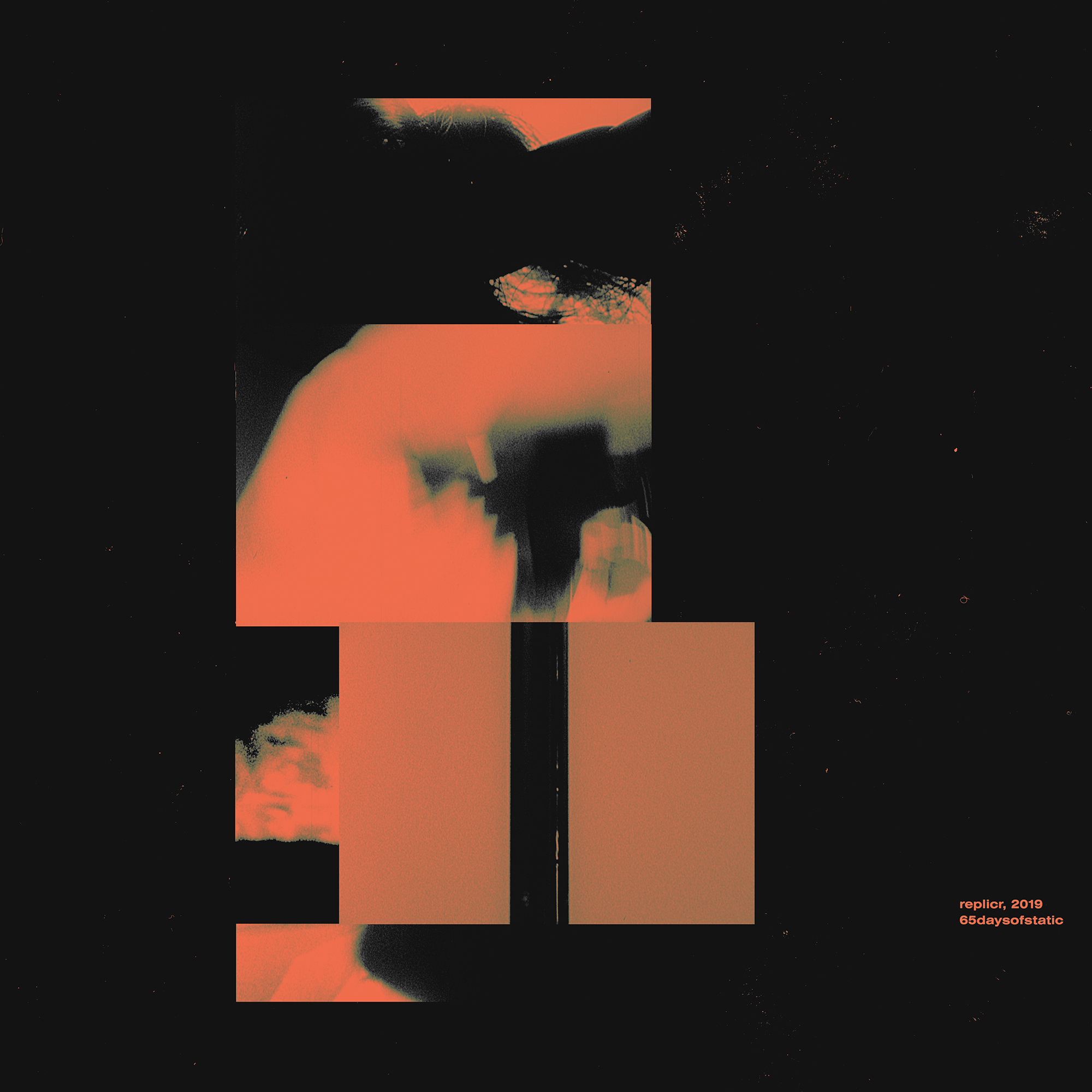
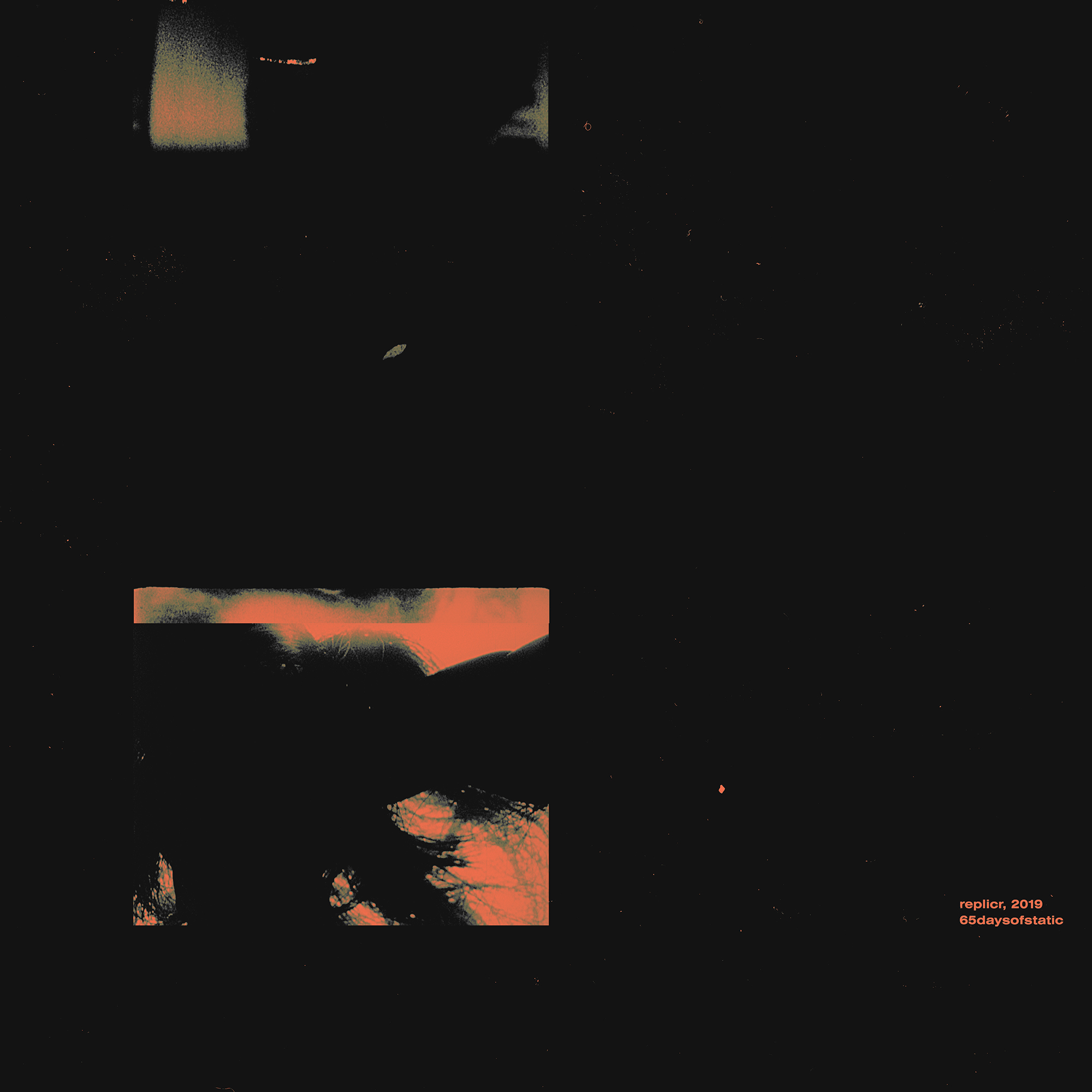
record sleeve for the sheffield-based band, 65daysofstatic.
_how
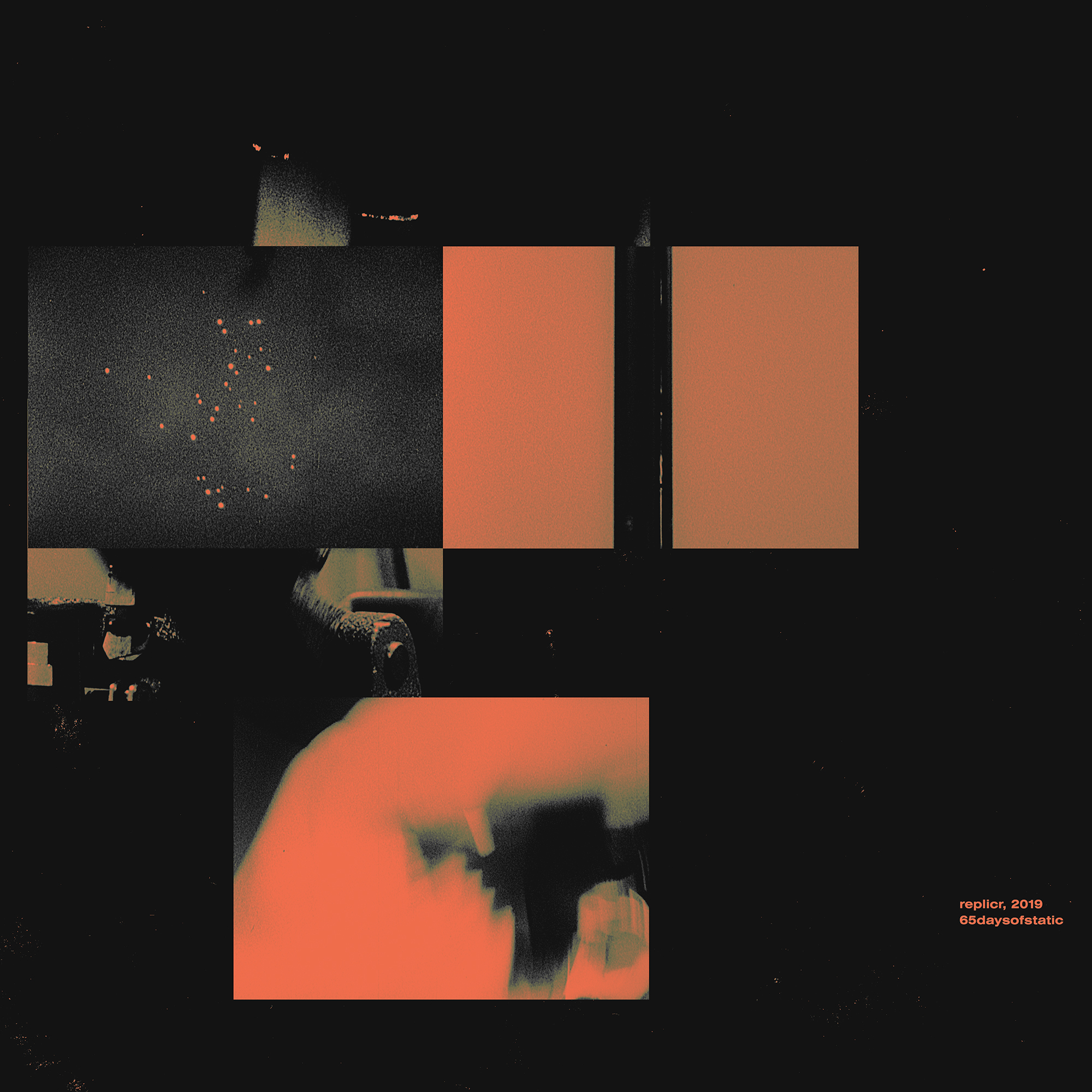
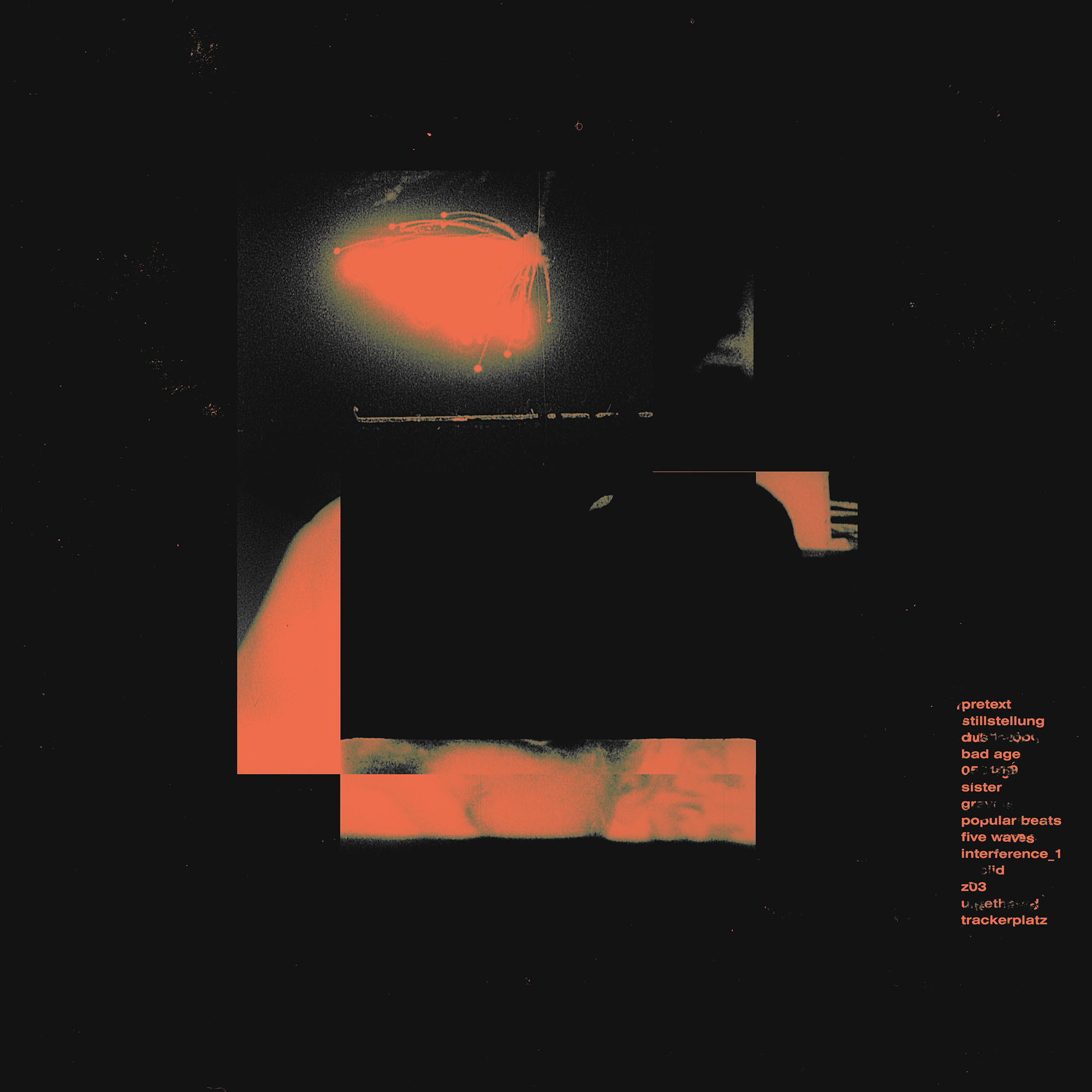
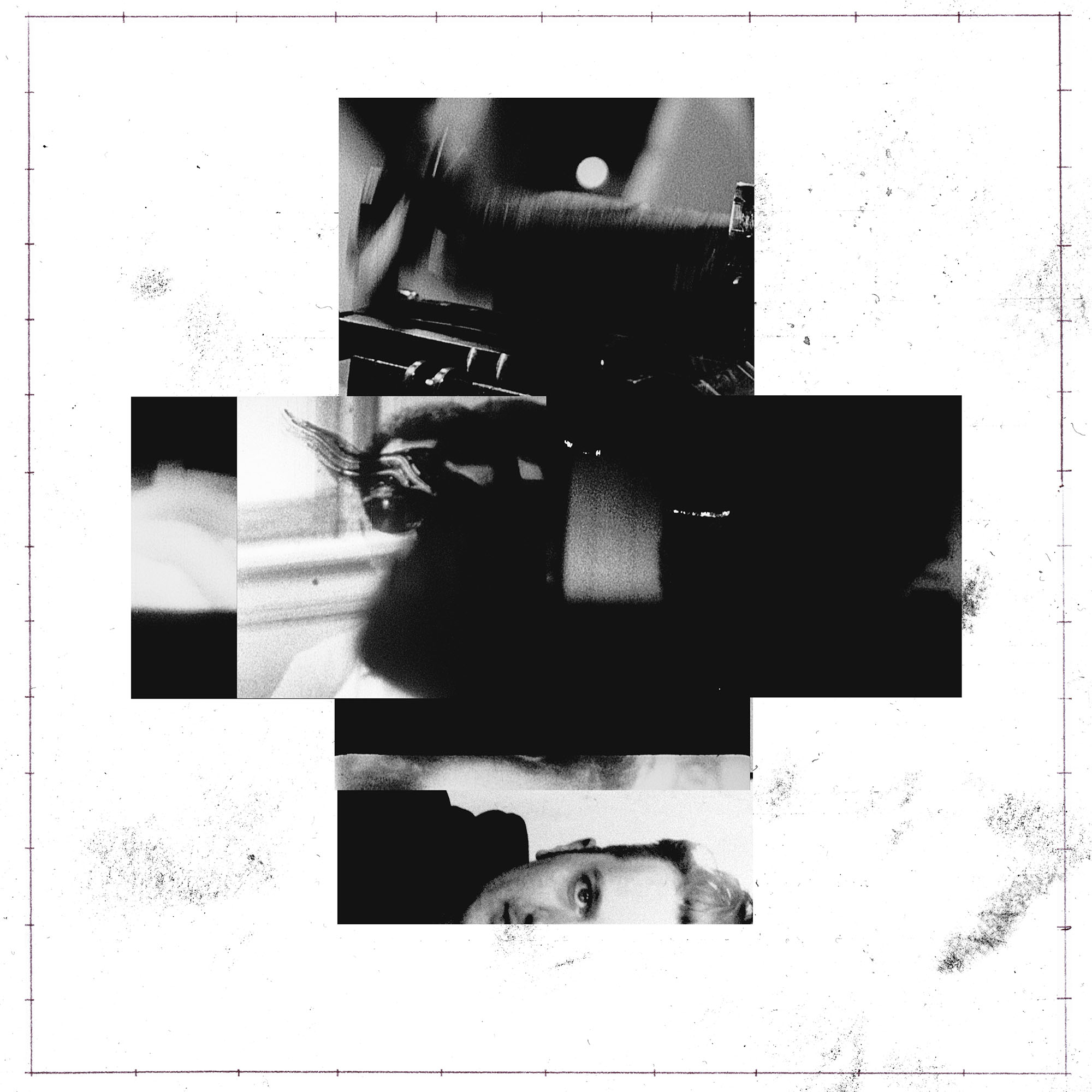
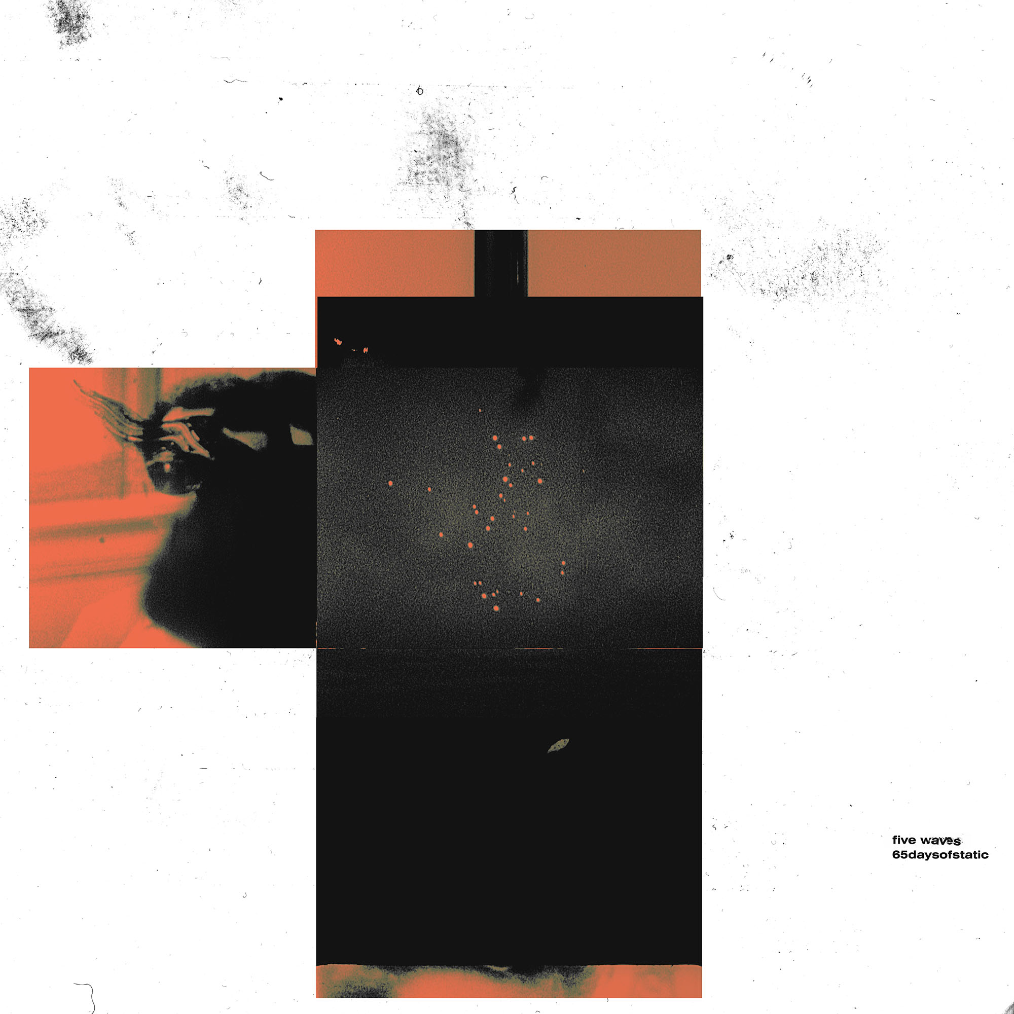
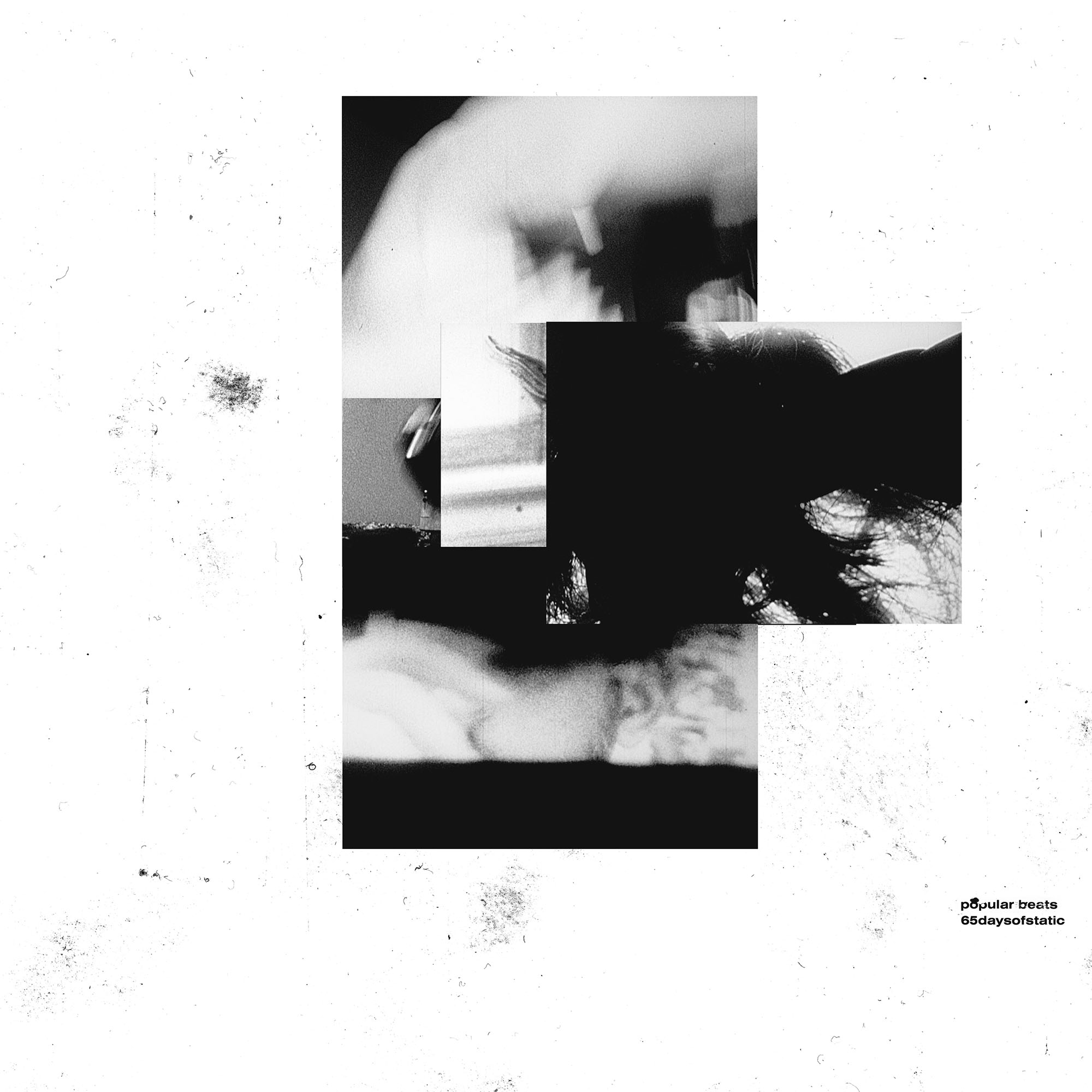
through 2020, the first year of the global pandemic, 65daysofstatic began work on an ongoing subscription project. fans made regular payments in order to receive a constant supply of music and other material throughout the year, published the moment it was produced. by the end of the year the band realized that in amongst the bits and pieces they'd worked on there were two records worth of material that were worth casting in stone. thus we began work on the two vinyl releases you see here.

the packaging is an attempt to turn the digital graphics 65 created on their computer screens during the year into an original lasting physical experience one could see and touch. in and of itself a reminder perhaps of one of the strangest years of our shared lives thus far.
_link
65daysofstatic.com
_tags
summoner
canary
lord only knows
_what
record sleeve for the los angeles-based band, big black delta.
_how
the record cover for big black delta's fourth LP was made in collaboration with the photographer and filmmaker matt sundin.

in the fall of 2019 matt, jonathan bates (singer and songwriter of big black delta) and caspar went to death valley together to take some time off. later when jon had finished his latest album he expressed an interest in using the images from that trip for the album's accompanying artwork. thus every image you see through the album's packaging and the digital singles that went with it, were images taken from this trip. in particular the cover image was taken by caspar, whilst every other image was taken by matt.
_link
bigblackdelta.bandcamp.com/album/4
_tags
cover vinyl mockup
_what
record sleeve for the nashville-based band, makeup and vanity set.
_how
'breaking news' is the 4th record in a series of imaginary soundtrack albums by matthew pusti, AKA makeup and vanity set. it is the first record in a start of a new trilogy, but a part of a larger series under the name 'charles park'. the narrative of this record is based more around a criticism of the american news media. based on a short plot synopsis from matt, long-standing collaborator john delucca and i set to work on creating a cover that we felt set the tone of the movie inside matt's head. the result of that work you can see here.
_link
makeupandvanityset.com
_tags
LP cover
vinyl
cd
cassette
CD cover
digital cover
_what
record sleeve for the berlin-based musician, alessandro cortini.
_how
old friend and long-standing collaborator, alessandro cortini, asked us to take care of the logo and design the layouts for his new album, volume massimo. photographer emilie elizabeth had already shot the beautiful cover photographs you see here when we joined the project. it was then our task to frame these images with a rich yet minimal design aesthetic that further harmonized with the album's overall tone. in the end we went with three different covers for the album - one for the vinyl, one for the CD and one for the digital / streaming edition.
_link
store.mute.com/browse/mute/products/alessandro-cortini-volume-massimo
_tags
_what
record sleeve for the cambridge-based musician, jasper byrne.
_how
jasper byrne and caspar go way back. they used to make computer games together as teenagers. night is jasper's latest record and is a beautiful, atmospheric and cinematic collection of synth-based songs. the album cover you see here makes prominant use of a photograph by the brilliant liam wong. as ever we hope the work gives you an idea of the music you're about to hear.
_link
spacerecordings.bandcamp.com/album/night
_tags
cover
_what
record sleeve for the nashville-based band, makeup and vanity set.
_how
continuing our long-standing devotion to offering makeup and vanity set the best packaging we can, we were very happy that he canned our initial attempts at making a cover for up and vanished's second season. it was in throwing out all of our original ideas that we stumbled across this idea for cover you see here now. the burnt photograph and the flower both represent elements of the podcast's true crime narrative and they collage together to further expand upon that same narrative.
_link
upandvanished.com
_tags
cover
back cover
package mockup
_what
record sleeve for the nashville-based band, makeup and vanity set.
_how
"the future past. lights on a horizon. blood in your veins. old visions. low frequencies fading across night. the roar of the masses. the reflection of bulbs overhead, on printed plastic and steel. a fight to survive, all or nothing. shadow circuit."

this was the story matt pusti (AKA makeup and vanity set) had written and was thus scoring the soundtrack for when he created this album. what you see here is the logo design and record sleeve artwork we created to reflect this narrative.
_link
makeupandvanityset.bandcamp.com/album/shadow-circuit
_tags
cover
_what
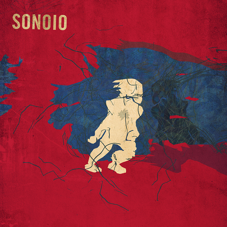
record sleeve for the berlin-based band, sonoio.
_how
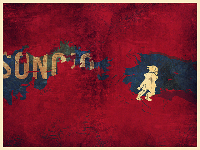
for this the third and final sonoio release, alessandro cortini asked us to produce artwork that offered a more cinematic visual than last time. after much discussion we landed on the idea of building a film set, lighting it and photographing it. we then reached out to long-time collaborator, the photographer matt sundin, and got to work sourcing all the necessary materials. the final cover offers both a commentary on the dual translations (italian and english) of the album's title, 'fine,' and a visual suggestion of the sonic and lyrical nature of the music. 

the record is available through dais records on vinyl, cd and all streaming services. if you have the means, we cannot recommend a physical copy of the record enough. it offers a rich accompaniment to what is already a really beautiful listening experience.
_link
sonoio.org
_tags
cover
back cover
_what
record sleeve for the nashville-based band, you drive.
_how
you drive is a new band formed by long-term collaborators of ours, makeup and vanity set, and the singer / song-writer jasmin kaset. a few months ago they approached us to create their debut album artwork. the plan for the record was to release it on vinyl. after listening to the record for some time we took a feeling for the overall tone and some lyrical fragments from the songs, and decided to make a series of still life photographs that we'd then insert into the jacket design in one form or another. working in collaboration with the photographer, jeff brown, we sourced various objects, built a series of sets in our studio and got to work arranging and lighting things. we then created abstract interpretations of the same photographs and used those as counterpoint pieces throughout the layouts. the resulting package we feel speaks to the music in both direct and indirect ways.
_link
you-drive.co
_tags
_what
record sleeve for the nashville-based band, the alphabet zero.
_how
andy walker found our work through his affiliations with makeup and vanity set. working in a similar sonic realm he was keen to create a heavily narrative driven image to accompany his new record. to this end he described to us a very particular set of moments he'd envisioned whilst composing the tracks, and we set about creating a single image that we felt best captured that.
_link
soundcloud.com/thealphabetzero
_tags
4 vinyl box set.
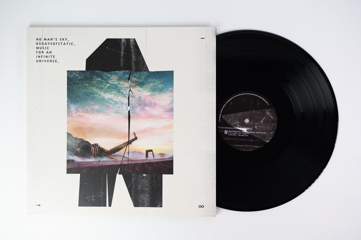
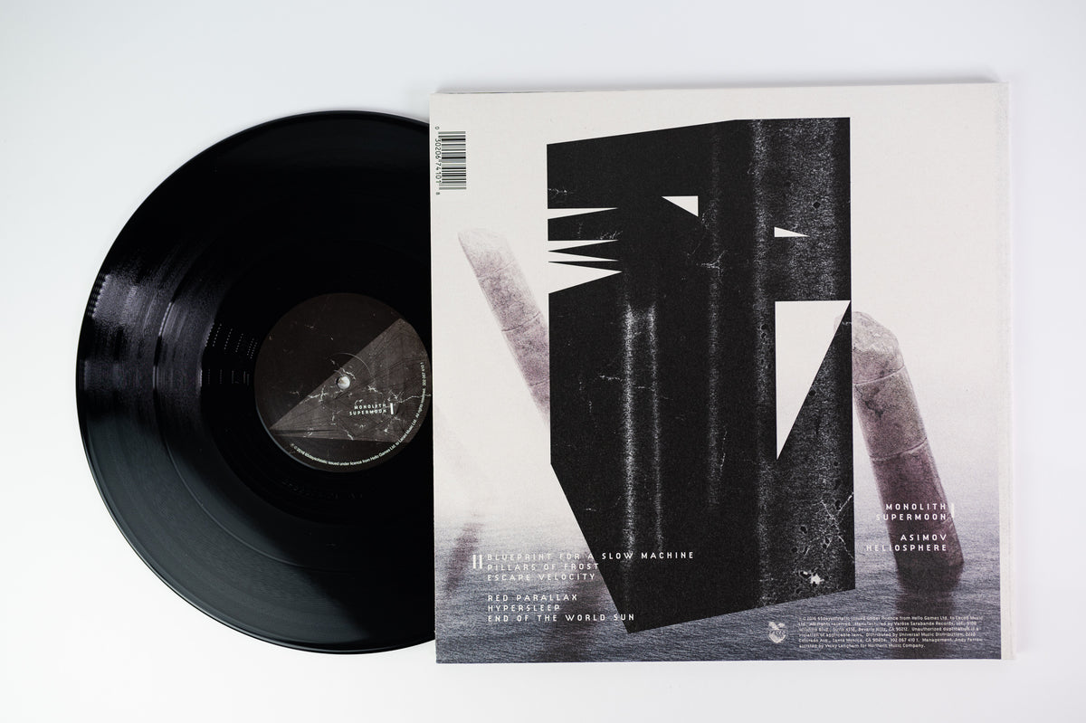
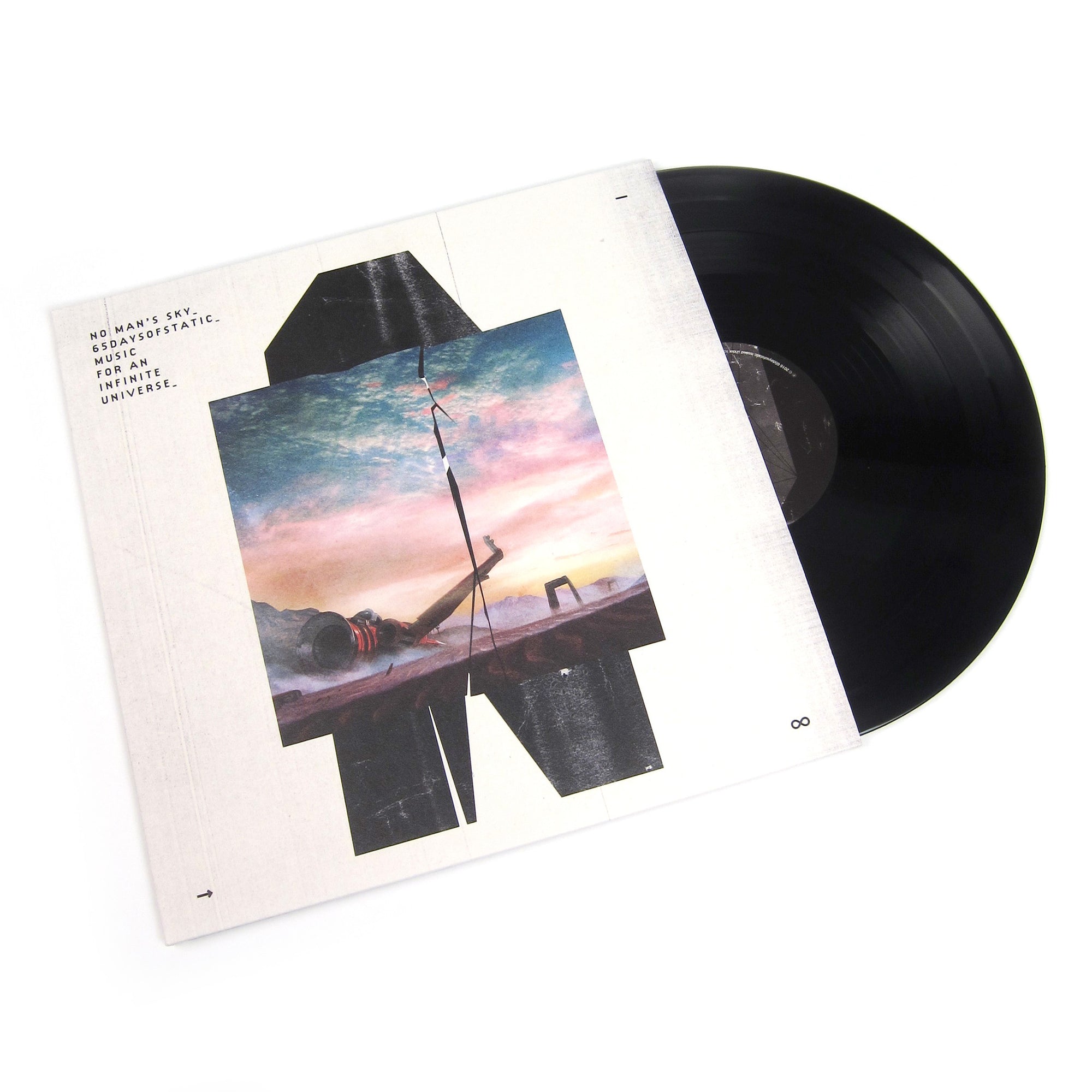
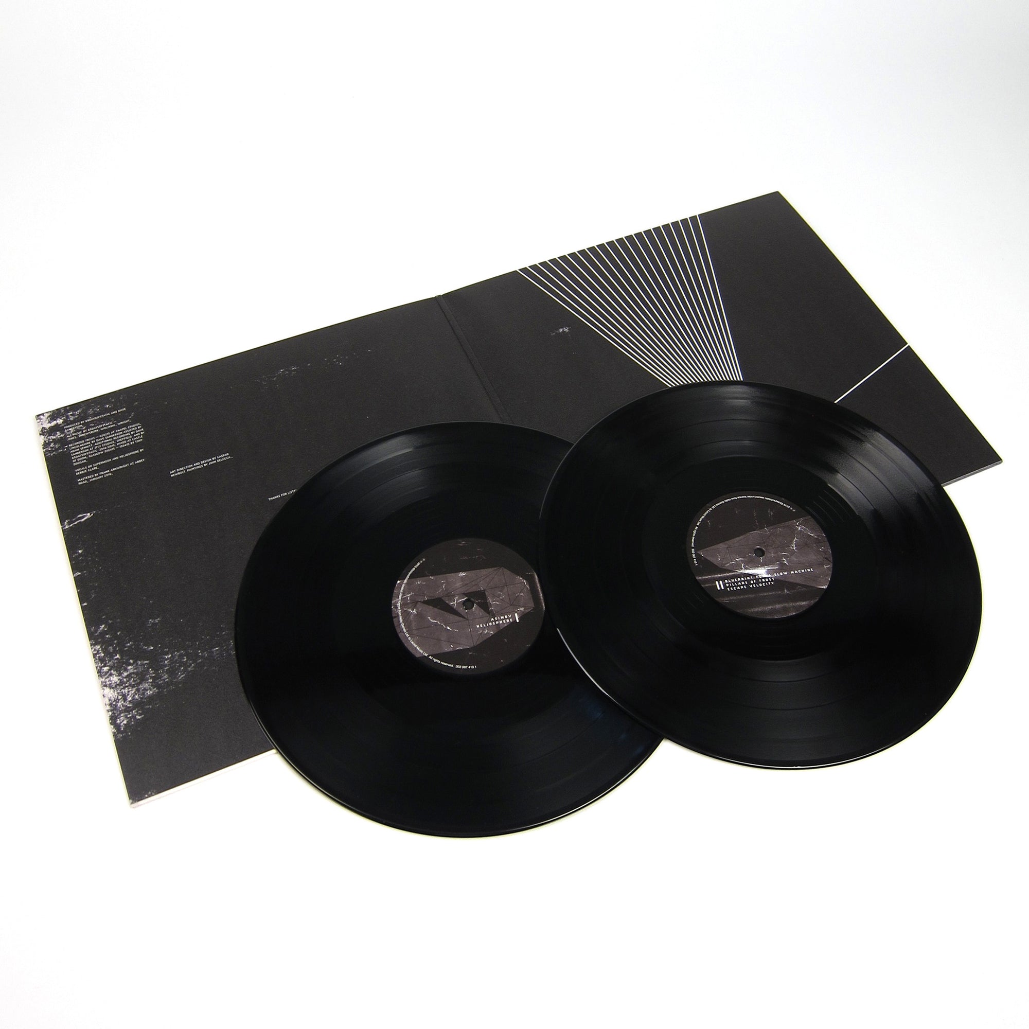
_what
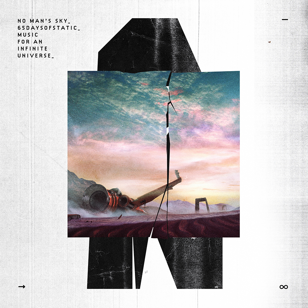
record sleeve for the sheffield-based band, 65daysofstatic.
_how
our friends and long-standing collaborators 65daysofstatic were hired to write the score to the forthcoming game, no man's sky. 65 in turn asked us to put together the artwork for the soundtrack itself. after listening to the music for months we had a long chat with the band and came up with a loose aesthetic trajectory. two or three different approaches were fully explored before we settled upon what you see here.

the landscape paintings you see embedded into the various covers are by another of our long-term collaborators, john delucca.

the record is available here in various physical and digital formats.
_link
65daysofstatic.com
_tags
_what
record sleeve for the nashville-based band, makeup and vanity set.
_how
makeup and vanity set was asked to score the forthcoming video game brigador. the game developers, telefuture and yk records to release two volumes of the soundtrack on vinyl and other formats. what you see here is the sleeve artwork we made in collaboration with jack monahan, the game's own 3D graphics artist.
_link
makeupandvanityset.com
_tags
_what
record sleeve for the los angeles-based band, big black delta.
_how
the cover for big black delta's 2nd LP, tragame tierra, was the 'last man standing' after trying a series of ideas that attempted to capture the subtler qualities of the new tracks. in the end we settled on a minimal aesthetic, colours that jon felt were closer to his sensibilities these days and a photograph jon liked of himself taken by jeff brown, and we developed things from there.
_link
bigblackdelta.com
_tags
cover
cover + vinyl
_what
artwork for matte black's second album, dust of this planet.
_how
matte black are old friends and with the release of their sophomore LP they asked that we handle artwork duties. the record's closing track 'time's arrow' immediately conjured an image in our heads of a mass of people running from something toward a great darkness. caspar asked his father, thomas newbolt, to draw such an image in pencil and watercolour. caspar then worked on it digitally until it reached the form it is in now.
_link
matteblackband.com
_tags
cover
cover + records
back cover
inside spread
detail
_what
record sleeve for the nashville-based band, makeup and vanity set.
_how
2 years in the making, wilderness is the new album from our good friends and longstanding collaborators, makeup and vanity set. the artwork stems from the narrative matthew pusti wrote for the record has he composed it. a combination of bespoke photography and extensive digital collage-work, it's perhaps our most involved record sleeve to date.

the record features the talents of many friends including big black delta, the protomen, witchoria and joey ciccoline. the short film accompanying the record's release and is featured in part in the album's video trailer above.
_link
makeupandvanityset.com
_tags
charles park trilogy album cover
charles park trilogy poster
_what
record sleeve, poster + trailer for the nashville-based band, makeup and vanity set.
_how
telefuture records approached makeup and vanity set with the idea of re-releasing their popular charles park records as a trilogy box set. the moment the project got a green light john delucca, joey ciccoline and ourselves were put to work in tying the overall package together visually.

john was sent a few paragraphs detailing the narrative behind each album. he then started to create a poster that we could divide into three halves, to represent the three parts of the story.

we were asked to create the logo, cover and overall packaging for the record. the logo we made is pretty self-explanatory, but the packaging was a subtler affair. utilizing the bokeh affect often seen in films when the camera is focussing on objects in the foreground, we realized we could represent each part of the trilogy with a different coloured circle. in this way the cover image could say a lot with very little, and each record within the packaging could be differentiated by its own red, blue or brown graphic.

joey was then sent the logo and proceeded to shoot the necessary footage to create the teaser trailer for the trilogy, this clip was the first promotional piece released to the general public. once released the limited edition box set sold out in 2 days, but you can still purchase the album digitally here.
_link
makeupandvanityset.com
_tags
cover
detail
wide
_what
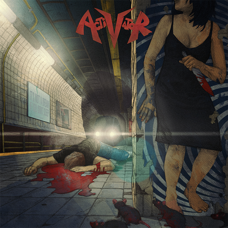
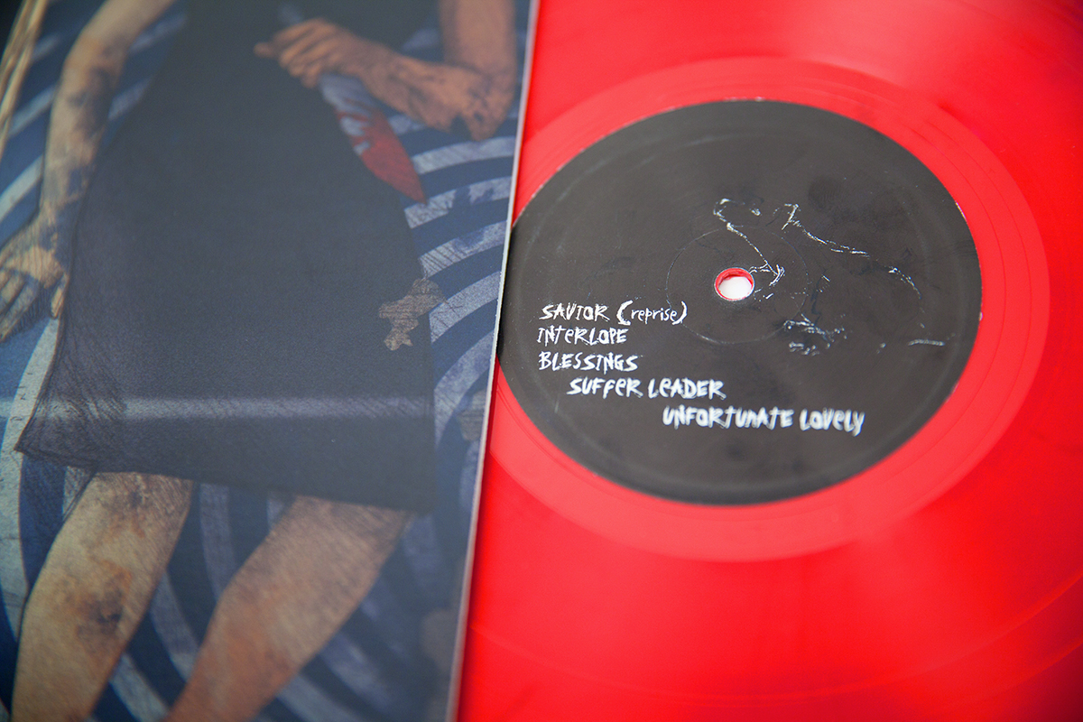
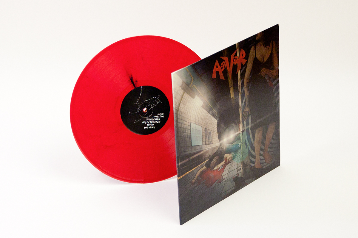
record sleeve for the new york-based band, activator.
_how
activator approached us to handle the sleeve artwork for their eponymous debut album. a dark, brutal, relationship-based thrash metal record, it played into our sensibilities nicely. sketching out basic layout on a scrap of paper, we photographed it and sent it to the incredible john delucca. 3 days later he sent back a final drawing and we began to colour it. the resulting image is a visual allegory commenting on whether it's really the relationship that's killing you, or whether it's actually something else.
_link
activatornyc.com
_tags
detail
wide
_what
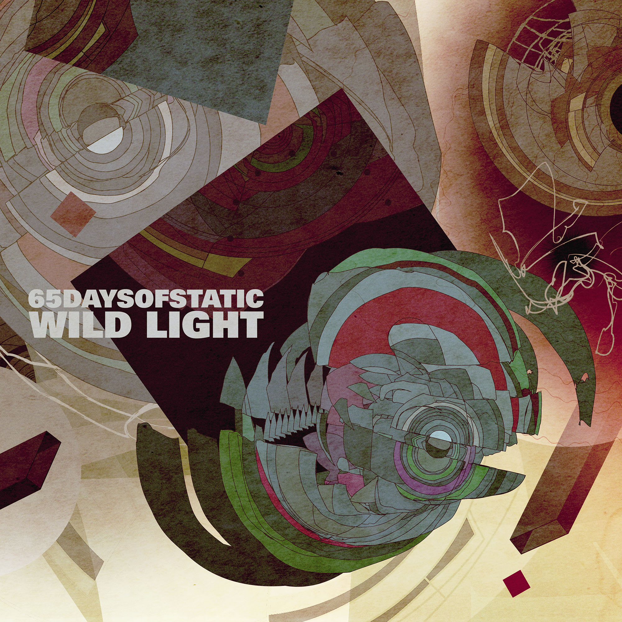
record sleeve for the sheffield-based band, 65daysofstatic.
_how
wild light is 65daysofstatic's sixth LP. presented with manifestos, poems, drawings, prints and transcripts of studio discussions about the concept of 'wild light', we set about producing a piece of work that we felt best encapsulated these ideas whilst also touching on how it felt to listen to the music itself. the result is something we're very proud of, and we hope is something that will change in meaning when you hear the music itself.
_link
65daysofstatic.com
_tags
cover
outside spread
inside spread
detail
wide
_what
artwork for surachai's LP, embraced.
_how
we were introduced to surachai by alessandro cortini of SONOIO. a fierce individual, surachai makes a form of black metal that he calls plagued metal. whatever you want to call it, his dark, aggressive and intricate songs take you to a very particular place.

for his latest LP he asked that we tackle the artwork. ordinarily, given the pre-established hallmarks of the black metal scene, this is something we might not have jumped at immediately. however given surachai's taste for esoteric artwork (formerly employing the likes of bridget driessen and sarah sitkin to handle the task), we knew he would be open to an entirely fresh interpretation of his music.

you can read more about the making of the artwork here.
_link
surachai.org
_tags
poster
VHS + poster
VHS
VHS 2
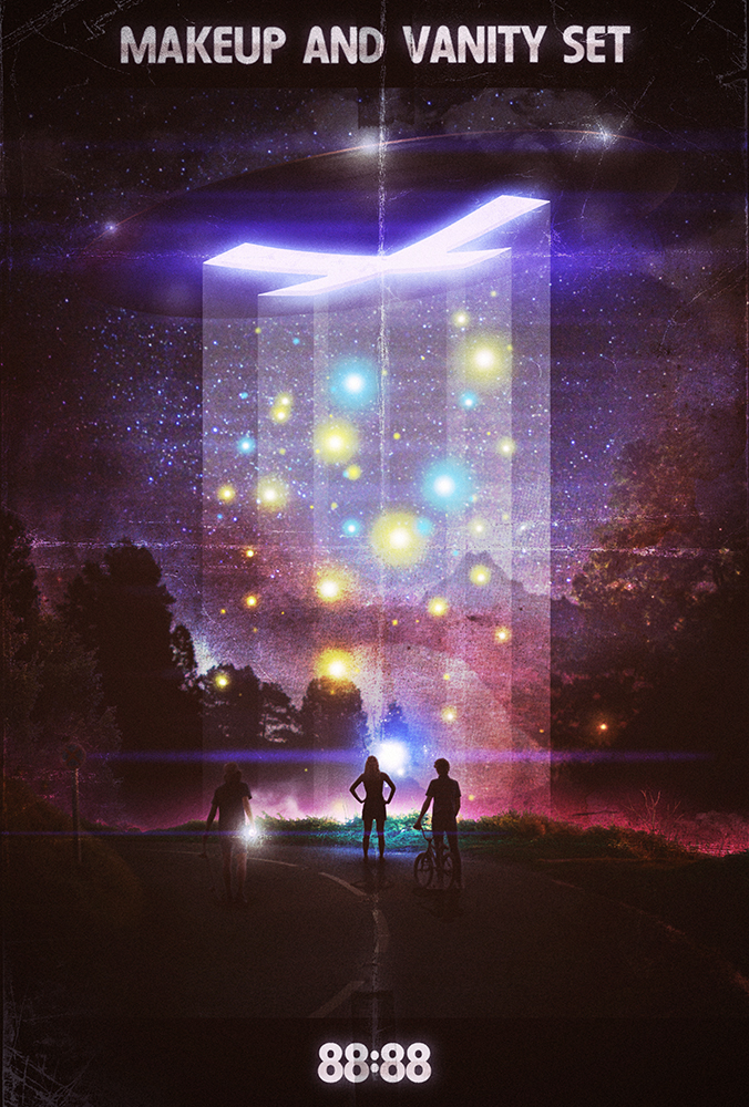
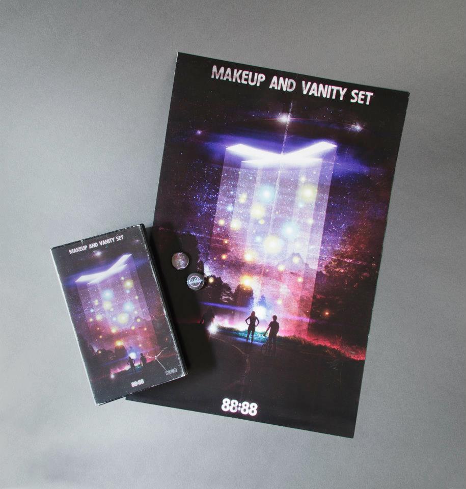
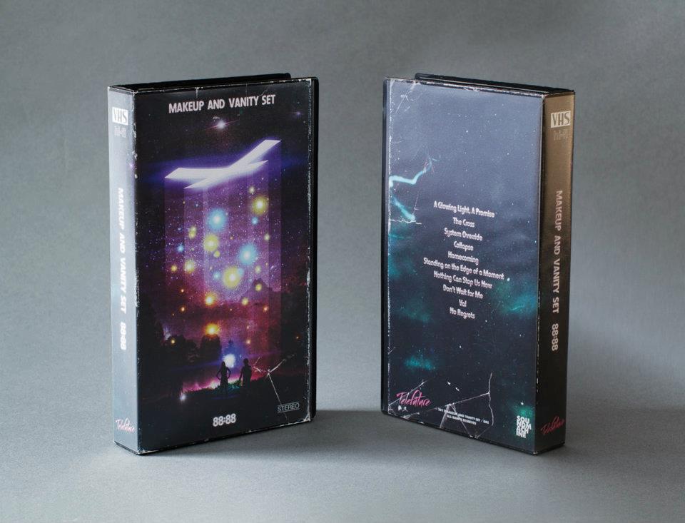
_what
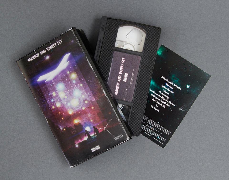
VHS tape and poster for makeup and vanity set's film soundtrack, 88:88.
_how
this was a project that started out with MAVS sending us demos and whispering things about it possibly being a film soundtrack. we were then contacted by the film's director, joey ciccoline. joey showed us the film and sent some ideas he'd had for possible directions for the artwork. included in his package was a poster for the 1985 kid's science fiction film, the explorers. this poster single handedly informed the initial designs we created for the film soundtrack. these designs were then scrapped when joey then expressed interest more in a design that told you less about the narrative, and gave you simply a sense of mystery. 

fortunately MAVS then had the idea to do a parallel release in the form of a limited edition VHS cassette and poster. this would then come out later than the official film artwork, and give the original pieces we created a place to live. a tangent universe if you will.

you can see photos of the VHS tape here.
_link
8888film.com
_tags
cover
tenacious d show poster
_what
record sleeve for the nashville-based band, the protomen
_how
here's another one of the many fruits of our on-going collaborations with the protomen. the band played a tribute night in nashville, TN, back in late 2010 and the recordings came out so well they decided to release it. performing as 'queen' for the night, we decided to recreate the iconic 'queen II' record cover in a studio in brooklyn. the photography is by long-time (v) collaborator matt sundin, and the logo work is by M L hope. we handled the art direction, post-production + layout duties. 
_link
protomen.com
_tags
BBDLP1 cover
detail
poster
_what
artwork for big black delta's debut LP, BBDLP1
_how
continuing the very fluid back and forth between us and jonathan bates, this the cover for the forthcoming BBDLP1 is our attempt at capturing the immensity that is this new record. whether you are listening to the lush love song that is 'capsize' or the vastness, heaving space trip that is 'BBD3', we wanted the cover to echo both the inner workings of jon's mind as well as the beautiful, dark recesses of the universe. no longer the man with his head exploding on the cover of mellowdrone's 'angry bear', we now step deeper inside that thinking and in doing so reach much further out into space as we get involved with his obsession with UFO folk-lore and his desire to be taken away from his planet by whatever means possible.
_link
bigblackdelta.com
_tags
album cover
stitches single cover
awaltzoflight cover
poster
_what
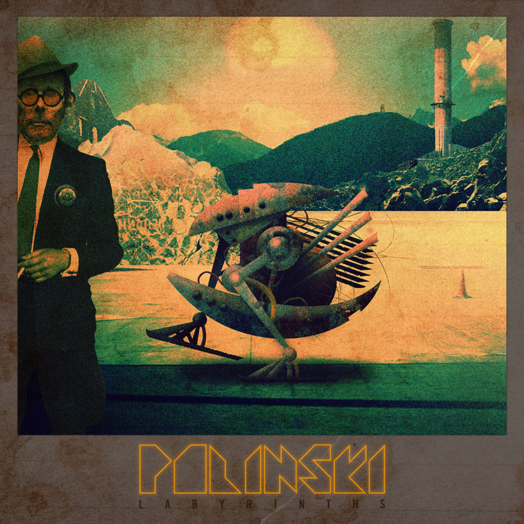
artwork and music video for polinski's debut album, labyrinths
_how
paul wolinski is one quarter of the experimental musical machine that is 65daysofstatic. polinski is his more purely electronic side-project.

the discussions for how to handle the artwork for the album started years before the record was even a twinkle in his eye. we'd talked at length for years about films, musics, books, games and designs that appeal to us for whatever reason. whether it be the books of jeff noon or the cassette loading games of sinclair ZX spectrum, there was an innate understanding of what this solo project would demand in terms of artwork the moment the demos started to come together.

the final artwork started with us coming up with a story that would capture paul's feelings about various things and how he wanted to translated those into a science fiction tale of some kind. the next step was padding that story out with various touchstone visual elements and then translating those into a series of panels that we could use for the album and any singles. the first image we put together turned out to be the album cover as it is now, and this went onto influence paul's approach to making the music. he then sent us more demos that inspired the creation of more panels, and so the back and forth went until we had enough to illustrate the story / world we had created.

the music video for the album's first single, stitches, was an attempt to bring back the feeling of using the sinclair ZX spectrum computer, whilst detailing some of the album's narrative elements. paul and caspar wrote the video's story, which expanded upon the lyrics jonathan bates from big black delta was singing on the song. john delucca then beautifully redrew and further illustrated the graphics caspar had made for the vinyl record's packaging in pixel art format, and josiah newbolt then animated those graphics.
_link
polinskimusic.net
_tags
print
album cover
_what
music video + print design for LA-based band, sonoio
_how
we'd been aware for a while that sonoio (alessandro cortini) intended to follow up his unique and well received experimental synth debut, with a 'sequel' record of some kind. furthermore alessandro was toying with the idea of a music video this time and asked that we might pitch a few ideas to him for a couple of different songs on the record. we came up with 3-4 ideas he chose the most 'live performance' based concept that we had and soon things were under way. the video was for the song enough, which to us was one of the songs that immediately jumped out on the record when hearing it for the first time. once more we recruited the talents of matt sundin (who helped us shoot the 65daysofstatic and war widow album covers) and soon after alessandro was flying to new york to shoot the video with us in brooklyn.

you can read more about making the artwork + video here.
_link
sonoio.org
_tags
front cover
back cover
detail
wide
_what
LP artwork for the LA-based band, war widow
_how
after accidentally hearing a clip from this band's new record, we sent some designs through that caused them to cancel the print job they already had running. sourcing photographers from as far as eastern europe, the resulting 12 inch vinyl artwork proved to be a very fast, very exciting collaboration between people in los angeles, new york and the ukraine. you can read more about the creation of the artwork here.

a huge thanks to photographers alex alekseenko and matt sundin, without whom this project would have never come about.
_link
warwidowmusic.com
_tags
album slash page
offer page
poster page
source code
data capture page
_what
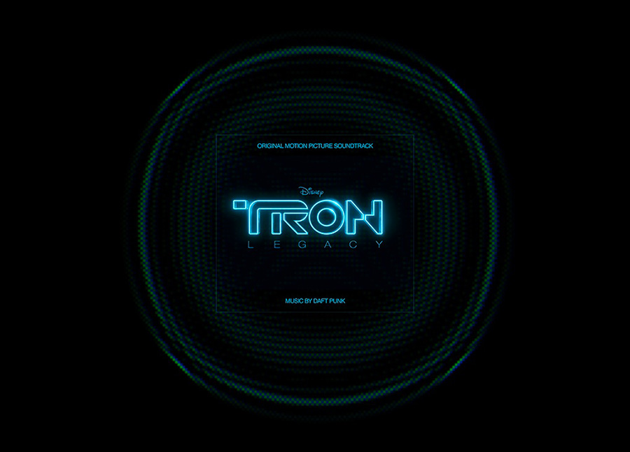
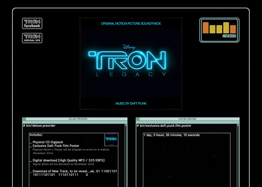
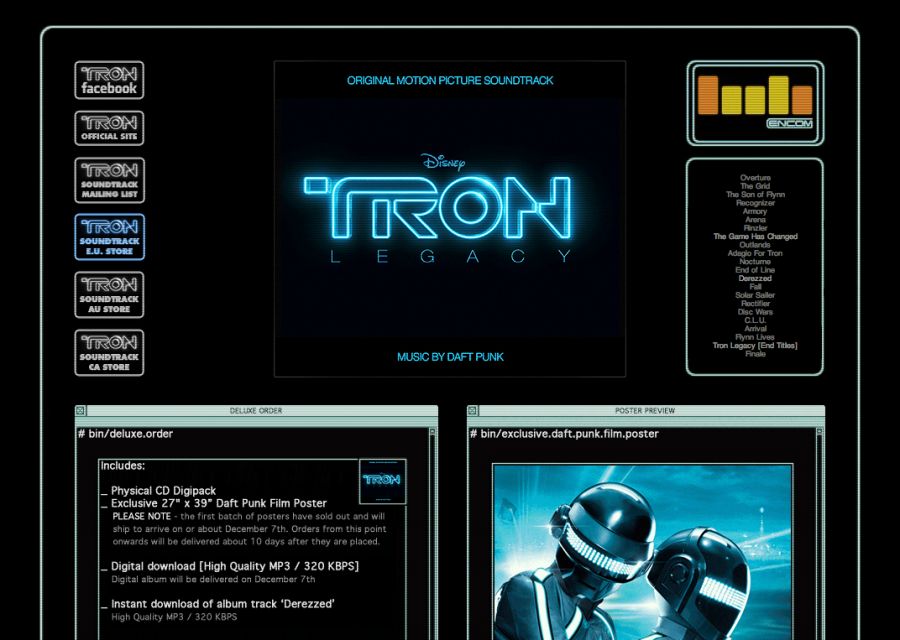
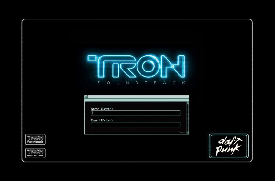
website for the tron legacy soundtrack by daft punk
_how
understanding that we were enormous fans of the original TRON film, and its forthcoming sequel, topspin asked us to create a site to gather emails for the new film's soundtrack release. 

given the soundtrack was created by daft punk it was safe to assume anything we made would be very popular with music geeks and film buffs alike. as such, we took full advantage of some of the latest web technologies (with help from mr. doob) and produced a site that works on iphones, ipads as well as regular machines. the end result is a streamlined data collection / e-commerce site with a series of film-related easter-eggs for fans to discover.
_features
  • html5 / javascript UI
  • keyboard input based triggers
  • ascii art source code
  • topspin E4M integration
_link
versionindustries.com/archive/tron
_tags
EP cover
poster
_what
EP artwork + music video for the LA-based band, big black delta
_how
jonathan bates, better known for his part in the fantastic band mellowdrone, recently got back in touch with us regarding a 'new thing' he was working on. as luck would have it, it was some seriously rich and rewarding new music. the kind which fills the mind with images pretty fast. well, the next thing you know we're watching the thundercats intro in total awe, debating wallpapering our apartment walls with TRON screenshots, and obsessing over UFOs. how one thing lead to another is neither here nor there, but it turns out we were all down with this new thing ... and it was taking us places.

what then ensued was the constant, rapid exchange of music for artwork, much the way a choir does their psalms and responses. there's no question in our minds now that big black delta was the only name you could use to sum up the music, what inspired it and everything we'd ultimately made together from that point forward. cut then to just a few days ago. cut right to the moment when we slung the cover you see above onto the proverbial coffee table. cut to us all looking at each other like we knew it was time. yep, ufologists were about to get some melody in their google.

additionally we shot and edited a short film to accompany the release of the song IFUCKINGLOVEYOU. it was shot over a couple of days around independence day in los angeles. the idea was simply to capture everything we got up to in the short time we had, be that searching the night sky for flashing lights, watching dan akroyd talking about UFOs on youtube or jonathan bates making strange noises on his studio floor. we hope the end result, if nothing else, makes you feel like all these things are related. not forcibly, but maybe with a little serendipity.
_link
bigblackdelta.com
_tags
cover
poster
_what
artwork for the protomen's second album, act 2 - the father of death
_how
everything about this record cover + poster had to be bigger and better. the moment we heard act 2 we knew the protomen had taken things far beyond anyone's imagining, and that we were under a huge amount of pressure now to produce artwork that echoed that through & through. we were aware of john delucca's work after collaborating with him on a previous poster for the band, and hired him once again to produce the fantastic 'streets of fire' inspired drawing you see above. we then took care of the sleeve + poster layouts and also put together the 24 page booklet that would detail the story behind the music on the album.
_link
protomen.com
_awards
making vinyl awards 2018 finalist in 4 categories
_tags