(v)
(v_i)
(version_industries)

music
_what
record sleeve for the berlin-based band, polinski.
_how
paul wolinski has returned as polinski, his 65daysofstatic side-project. distant friend, i love you! is the first single from his forthcoming sophomore LP, telex from MIDI city. the record will be released through dataairlines, home of makeup and vanity set amongst others.

we made the LP cover artwork for the new record first, and then made this single cover second. the latter photographed in the rainy streets of berlin not so many days ago.

you can watch the fantastic music video paul made for distant friend, i love you! here.
_link
polin.ski
_tags
_what
record sleeve for the sheffield-based band, 65daysofstatic.
_how
this is one of a series of covers 65daysofstatic designed themselves as a part of their ongoing wreckage systems project. this particular EP cover they asked if we could apply our own treatment to. we printed out the artwork they'd made and got to work on it with a sponge, some water and a metal surface. 
_link
65daysofstatic.bandcamp.com/album/available-data
_tags
_what
record sleeve for the sheffield-based band, 65daysofstatic.
_how
65daysofstatic wrote and released this song in support of palestine and its recent conflicts with israel. the song was released on bandcamp on a "pay what you want" basis with all proceeds going to medical aid for palestine. for the first 24 hours of the song's release the band matched all sales with money from their own pockets. the band raised 4000 GBP in the end.

the song's artwork was created using a photograph caspar took in berlin during the 2020 pandemic lockdown.
_link
65daysofstatic.bandcamp.com/track/asymmetry
_tags
poster
_what
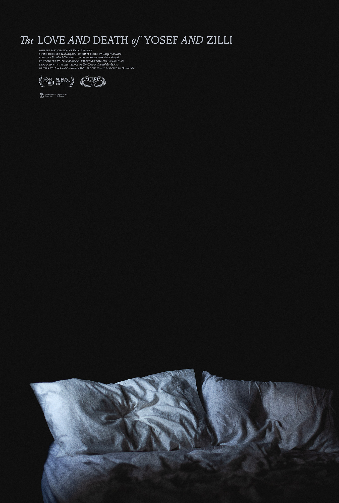
film poster for the documentary, the love and death of yosef and zilli.
_how
director dean gold got in touch with us after seeing our poster work for the canadian films firecrackers, the great darkened days and anne at 13,000 feet. he sent us a copy of this his latest documentary and it floored us. it's an unflinchingly personal film and knowing we were to try and make a poster for it was particularly humbling. we've seen few films like it.

we presented a series of concepts for the poster. dean immediately went for the idea you see here as he felt it captured the feeling of his film best. caspar took the photograph used for the poster in his bedroom in new york city.
_link
yosefandzillimovie.com
_tags
poster
_what
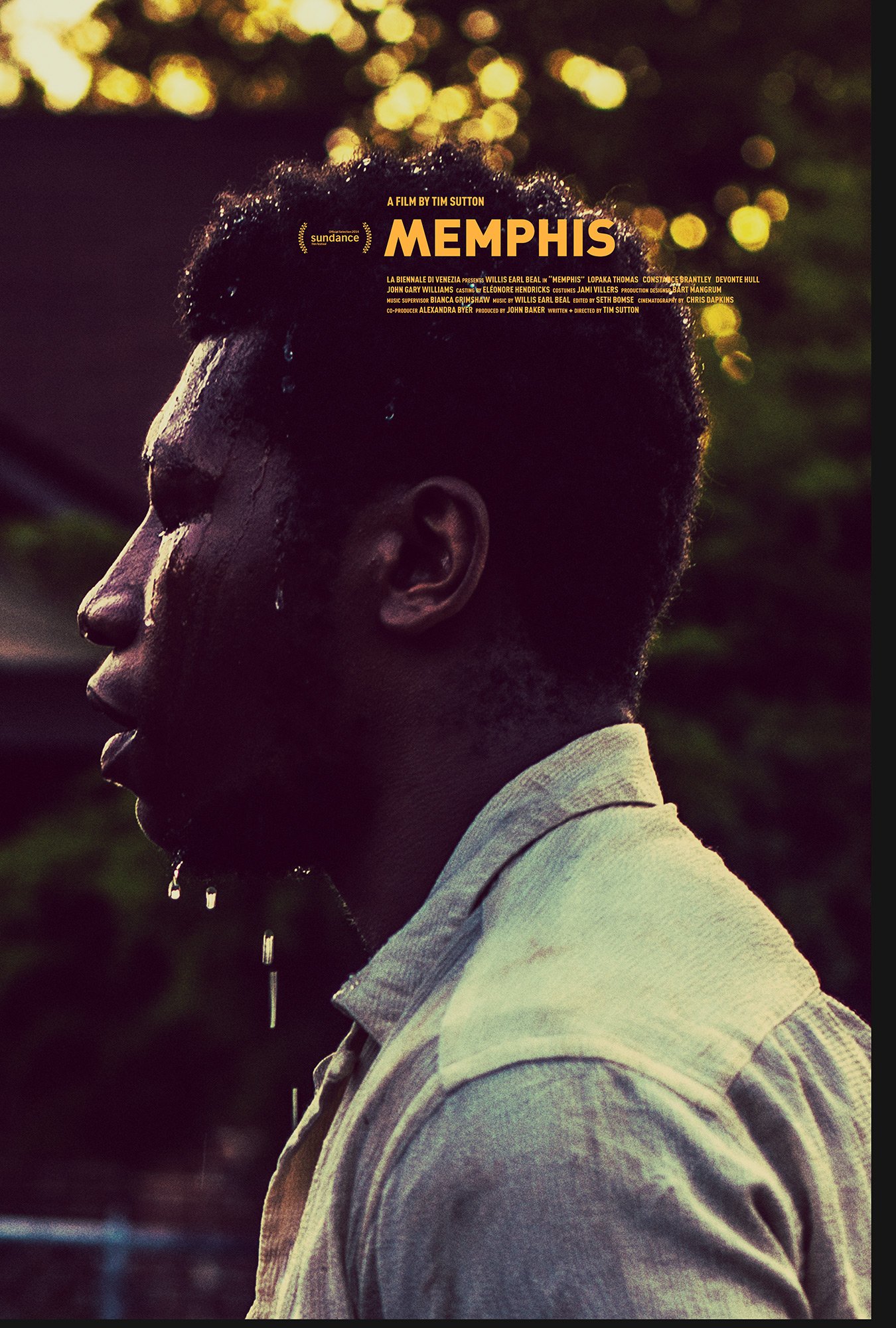
posters for the feature film, memphis.
_how
based on our previous work on PAVILION, the film's director tim sutton invited us to the set of his new feature MEMPHIS. once again he asked us handle the films posters, title sequence and online promotion. the poster you see here was created using a photograph that caspar took on set. the image is of the film's start, willis earl beal.

you can purchase a physical copy of this poster here.
_link
memphis-film.com
_tags
cover
outside spread
inside spread
detail
wide
_what
artwork for surachai's LP, embraced.
_how
we were introduced to surachai by alessandro cortini of SONOIO. a fierce individual, surachai makes a form of black metal that he calls plagued metal. whatever you want to call it, his dark, aggressive and intricate songs take you to a very particular place.

for his latest LP he asked that we tackle the artwork. ordinarily, given the pre-established hallmarks of the black metal scene, this is something we might not have jumped at immediately. however given surachai's taste for esoteric artwork (formerly employing the likes of bridget driessen and sarah sitkin to handle the task), we knew he would be open to an entirely fresh interpretation of his music.

you can read more about the making of the artwork here.
_link
surachai.org
_tags
album cover
stitches single cover
awaltzoflight cover
poster
_what
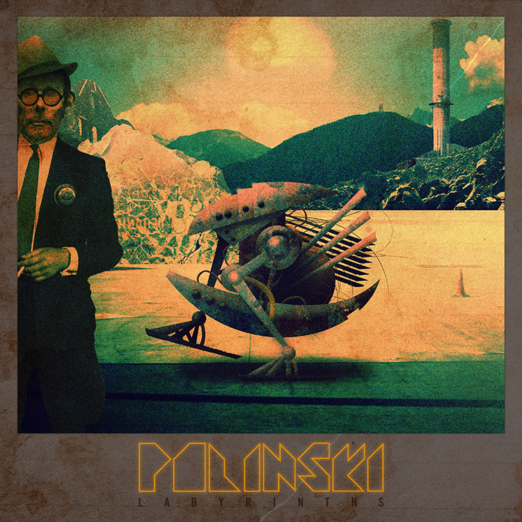
artwork and music video for polinski's debut album, labyrinths
_how
paul wolinski is one quarter of the experimental musical machine that is 65daysofstatic. polinski is his more purely electronic side-project.

the discussions for how to handle the artwork for the album started years before the record was even a twinkle in his eye. we'd talked at length for years about films, musics, books, games and designs that appeal to us for whatever reason. whether it be the books of jeff noon or the cassette loading games of sinclair ZX spectrum, there was an innate understanding of what this solo project would demand in terms of artwork the moment the demos started to come together.

the final artwork started with us coming up with a story that would capture paul's feelings about various things and how he wanted to translated those into a science fiction tale of some kind. the next step was padding that story out with various touchstone visual elements and then translating those into a series of panels that we could use for the album and any singles. the first image we put together turned out to be the album cover as it is now, and this went onto influence paul's approach to making the music. he then sent us more demos that inspired the creation of more panels, and so the back and forth went until we had enough to illustrate the story / world we had created.

the music video for the album's first single, stitches, was an attempt to bring back the feeling of using the sinclair ZX spectrum computer, whilst detailing some of the album's narrative elements. paul and caspar wrote the video's story, which expanded upon the lyrics jonathan bates from big black delta was singing on the song. john delucca then beautifully redrew and further illustrated the graphics caspar had made for the vinyl record's packaging in pixel art format, and josiah newbolt then animated those graphics.
_link
polinskimusic.net
_tags
EP cover
_what
artwork for makeup and vanity set's EP, never let go.
_how
working with makeup and vanity set continues to be a very exciting, fluid and rewarding process. this time around, in terms of a brief, we were given the recordings themselves, informed that the release would be out on cassette only and asked that we try to echo a visual from the VHS era of home entertainment. old enough to have lived through a great portion of the VHS and cassette eras, we understood how this record would sound when fans heard it and very much where it was coming from in terms of cinematic narrative. the decision to in some way make it photographic and involve some sort of backlit misty scene came very quickly, and was undeniably influenced by our shared love for shows from that era like twin peaks and the x-files. so it was then a matter of building that out with a combination of photographic elements and a series of photoshop brushes and textures. finally, the typography came about as a result of wanting something elegant and not too cliche, but that would also feel a little like film credits.

you can read more about the making of the artwork here.
_link
makeupandvanityset.com
_tags
front cover
back cover
detail
wide
_what
LP artwork for the LA-based band, war widow
_how
after accidentally hearing a clip from this band's new record, we sent some designs through that caused them to cancel the print job they already had running. sourcing photographers from as far as eastern europe, the resulting 12 inch vinyl artwork proved to be a very fast, very exciting collaboration between people in los angeles, new york and the ukraine. you can read more about the creation of the artwork here.

a huge thanks to photographers alex alekseenko and matt sundin, without whom this project would have never come about.
_link
warwidowmusic.com
_tags