invincible_film poster

_what
_how
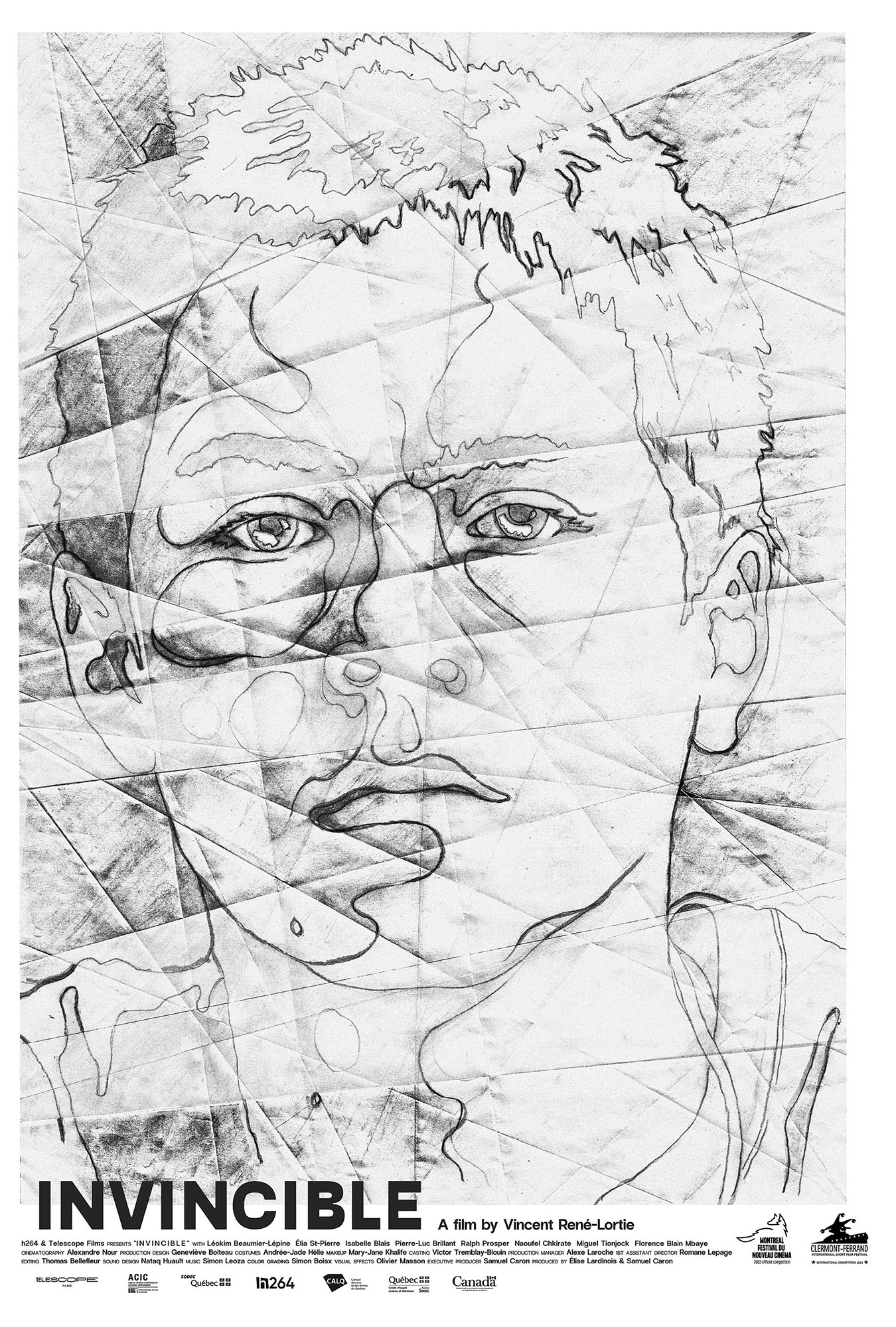
caspar had the following to say about making this poster:
"for this poster i wanted to do a drawing of (the lead character) marc’s face in pencil. i wanted the drawing to feel a little like a map with various roads going off in different directions. this itself was done to echo marc’s desire to escape his confines throughout the film.
i then folded this drawing up in angular ways to leave marks like cuts or cracks across his face. taking some ink I then painted over some of the pencil drawn lines, but only where i could still see them after the folds were made. afterwards i unfolded the resulting half pencil / half ink image, and scanned the whole thing back into the computer to make a poster with it.
the idea here was that because of marc’s screw-ups and fuck-ups we never quite get to see the entirely brilliant person he clearly could have been. hence certain folds in the paper preventing the ink from completing the final painting of marc, leaving just a fractured image of him instead."
