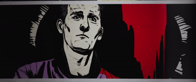
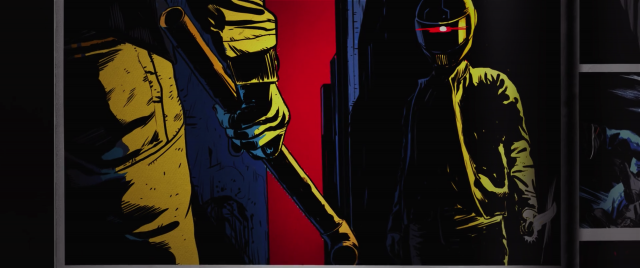
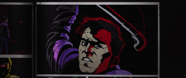
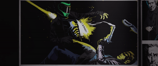
(v)
(v_i)
(version_industries)

manifold_102913

mavs_manifold_750

a while back i came head to head with the work of one of my design heroes, eike k?nig. i’d been asked to redesign the logo for the german band booka shade, after many years of eike having been their go-to design guy. it was frankly a terrifying prospect. whilst i was quite sure eike would probably never see the work i did, i would be immediately compared to him by both the band and their large fan base. settling down to create the logo i realized of course that you just do the best thing you can, and make sure that at the very least it’s nothing like the other guy’s work.

when matthew pusti of makeup and vanity set asked me to do the cover for the soundtrack EP to anthony scott burns‘ forthcoming sci-fi short, manifold, i sighed a similar breath of despair. why? because ash thorp had done the film’s poster and of course once again i would have to be compared to someone of considerable status in the graphics world. suffice to say here’s the poster ash had made –

Screen Shot 2013-09-04 at 11.23.06 AM

turning away from it, going for several walks listening to the soundtrack and spinning the film’s ideas around in my head, i realized of course that ash had the visual concept wrapped up. particularly in terms of subtly explaining what the film was about, but not so much as to spoil the film. every idea i wrote down or got momentarily excited about felt too similar to what he was saying with his treatment.

what he didn’t have however, that of course applied in particular to the job i had to do, were the tracks on the EP that had remained unreleased up until now. these were tracks that had been written for, but not actually used in the film. in particular the track ‘yearling,’ which featured original foley work, vied for my attention every time i put the record on.

mulling over these differences i decided to take a different route, one that i’d been flirting with for a while but never really had the chance to test out – a route i like to call the ‘polish’ route. now i must stress this is a route i still haven’t fully explored, but the work i was to do on manifold?certainly gave me the impetus to do so. it is afterall a firmer step in that direction, and excitingly so.

after watching the film several times i began to feel a tingling, almost aching pain in my face. furthermore i began to think about how much value we put in the face and what it means in terms of not just our identity, but our chances in life. how being beautiful can both be a blessing and a curse, and how in many regards you can either be born with a ticket on a certain kind of ride, or a ticket on an entirely different ride. all of this based on your face and how it develops as an image to others.

i then started thinking about how technology is really quite an organic extension of the human form and mindset, and that it wouldn’t be too long before these things merge imperceptibly. in fact i’d written an essay for the IFP on this subject just a few weeks before, so to say the idea was on my mind a little was an understatement. the sense of menace one feels as we start to worry about the increasing amount that technology governs our lives, is really just a greater understanding of our own constant need for distraction from ourselves.

this is when i started to realize what i had to do for?manifold, and furthermore i knew exactly where i was going to start. skipping through the film to a very particular shot, i cut it out and began work. i had to make an image that encapsulated, for me at least, that sense of terror beneath the ever prettier face of technology, and at the same time capture that actual physical ache i felt in my own face after watching the film. as i worked i began to realize that i was also edging closer to this aforementioned ‘polish’ route.

now, by ‘polish’ route i of course mean making a film poster that uses little or none of the imagery from the film and instead offers a more emotional, impressionistic interpretation of its narrative. the eastern-european film posters that have been created in support of US films (with particular reference to poland), are a powerful lesson in creating an image that, to paraphrase jim steinman, you’ll never know the meaning of, but you’ll know how it feels. much in the same way a piece of music moves you in a fashion you cannot put into words, eastern-european posters often remove all trace of the film’s visual, its recognizable characters and its story, and delve headfirst into making an entirely original image. an image that still conveys the film’s ideas, but often in a darker and less conventional style. consequently it’s this approach that has come to feel so incredibly liberating to designers working in US and UK markets. to quote??on the subject??”there?s something captivating about those things that feel inseparable from a haze of abandon, existing to give hope to the creatively forlorn.”

11

left: philip gips, US. right: wieslaw walkuski, poland.

when i presented the final cover to matthew pusti, he said it was perfect. i know he would have let me take it even further into the horrifying abstract had i wanted to, but then we both agreed that it was as important to keep things familiar this time around. after all it wasn’t our film and we could just as easily go to poland next time.

you can buy the full manifold soundtrack here, and you can watch a trailer for the film here.

_category
blog, grafiks, news, , , , , , , , , , , , , ,

kaleidoscope pr_101413

Screen-Shot-2013-10-14-at-4.12.26-PM

back in 2008 we created a rather simple and elegant flash website for the art and fashion-based PR firm, kaleidoscope consulting. aware now that their site was useless on a range of new platforms but still very much in love with the look and feel of it, they asked us to recreate the site using HTML5 and javascript. in response we proffered that we might add another dimension to the site, and began to scheme this new black + white edition you see before you.?the result is a site that’s fully iphone and ipad compliant, and features not just a kaleidoscope that can be populated with images from your webcam, but also now hand drawn sketches too.

once again we reached out to mr. doob (who’d previously worked with us on the intro to daft punk’s?tronsoundtrack.com) and asked that this time we might integrate elements of his harmony drawing engine into the site. happily he gave us carte blanche and soon we had a new kaleidoscope engine on our hands – one that caters to both the photogenic and sketchy among us.?for this newly ‘harmonized’ white side of the site, our in-house sound designer and composer gavin singleton (aka accelra) created a new piece of music that felt more suited its hand-drawn, softer tone.

lastly we rebuilt the original site’s entire ‘key’ navigated client section around a wordpress backend so that the client could now more easily and swiftly keep this information updated, along with any other site copy.

we trust you’ll enjoy navigating the site as much as we enjoyed the challenge of putting it together.

_category
audio, blog, code, grafiks, news, , , , , , , , , , , ,

wild light_100313

65_wildlight_cover_750

creative review?asked?to include 65daysofstatic’s wild light album cover in their monthly round-up of great album covers. in doing so they interviewed us about what went into the making of the sleeve –

could you tell me more about the inspiration for this design, how it relates to the music and how you came up with the idea?

65daysofstatic have always had a strong socio-politcal mindset whether that has directly influenced their music or not. therefore it came as no surprise to me that whilst in the studio they’d read and discussed a wide array of contemporary and historical political and artistic literature. for this reason when they approached me to create the artwork for the album i was given a good deal more than just their definition of the term ‘wild light’.

leading with ezra pound’s imagist poem ‘in a station of the metro’ they lead me down a path of minimalist, suprematist and futurist thinking including snippets of conversations they’d had over instant messenger, photographs of sculptures, scans of paintings and lengthy 20th century manifestos. my favourites of which were a book called ‘the vagrant light of stars’ which depicted a memorial to albert einstein being launched into deep space traveling on a beam of light, and a supremacist, communist, modern art children’s book called ‘about 2 squares.’

i’d had the demos for the songs for a while and around the time I received the above documents from the band i’d been given a near final version of the album. what struck me immediately was that whilst minimal in its conception, cinematically speaking the sounds on the record created some incredibly beautiful, richly coloured and vibrant images in my head. tracks like ‘heat death infinity splitter’ and ‘the undertow’ took my mind from a sense of something vast moving through the chaotic depths of outer space, right down to microscopic organisms and cells living in our oceans and under our skin.

bearing all of this in mind I made the cover you see now. appropriately adopting where possible various lines in supremacist, futurist and imagist visual thinking, i created a wide-format piece that i felt resonated with the music as much as with those old explorations of artistic expression. if those were one band of hapless, anti-establishment types trying to evolve our way of thinking about and perceiving the world, here was another band with their designer in tow – trying his best at the impossible task of visualizing music for those who’ve seen everything before.

i understand you’re a fan of 65daysofstatic – how important is it, do you think, that the designer creating cover art engages with or enjoys the music?

in 2006 i wrote to 65 and asked if my business partner giles and I could make their website. i’d seen them live in 2005 in london and knew that – like many of the bands I’ve asked to work with over the years – i’d make my best work if their music was the soundtrack to it. little did I know we’d become such good friends and that I’d be sitting here today having finished not just my third album cover for them, but also the best record cover I think I’ve made to date.

from my perspective being a fan of the music is essential. i give talks to independent filmmakers here in New york on the same subject. I implore them to not pay money to anyone that isn’t already immediately and very clearly a fan of the film they have made. money cannot and will not ever be enough motivation to make a truly beautiful and appropriate design or piece of artwork. despite having worked over 10 years in this role, i continue produce some of my worst work when I am not a fan of the film or music i’m working to support.

the graphic designer david carson pointed out that it’s a gross misconception that you should not judge a book by its cover. everything about how a band presents itself is a reflection of the amount they have cared for and thought about the the music they have made. a record cover is a huge responsibility, particularly so when you’re handed a record like ‘wild light.’ something this good demands to be heard and it’s my job to make sure someone clicks on that cover on the net or picks up that record in the store, even if just out of curiosity. It’s debatable to this day whether an image can represent a sound, but I work based on the belief that you can at least try to achieve such a thing.

an excerpt from this interview can be found on the creative review website here, along with some write-ups of some other great covers. we hope the above interview gives people some further insight into what it’s like working with a band like 65daysofstatic, who’s intense worth-ethic continues to push us to new levels.

_category
blog, news, , , , , , , , , , , ,

record cover + poster exhibition_091213

blog_versionindustriescovers013


we’ve created an exhibition of our ongoing record cover and poster work over at squarespace. the format of their site and the nature of their templates was immediately conducive to such a concept. immediately following the posting we received a very flattering review over at one of our favourite blogs

“i’m a huge fan of the work of?(version) industries. from their work in?film?to?web?to?video?to?design, they do a grand job every time. they recently launched this?record covers + posters collection?and it’s amazing to see all of their print work at once. i never even realized the big black delta covers were?sewn?together?in that way or that this?makeup and vanity set poster?even existed.”

we hope you enjoy the show.

_category
blog, grafiks, news, , , , , ,

activator_090313

activator album cover

the new york thrash metal band activator are releasing their debut album in two weeks. i’ve known the guitarist jared drace for some time now. his apartment is like a museum version of my formative years. packed full of vintage horror film posters, action figures, comic books, guitars and a vast alphabetized collection of records, i spent the first half hour i was there just staring at the walls. i shared my first boarding-school dormitory with an english metal guitarist who had a redwood washburn N-series N2, with humbucker pickups and a floyd-rose tremolo. this guy had me listening to extreme, van halen,?steve vai and joe satriani. my first record cover was a pencil crayon copy of satriani’s the extremist sleeve. i’ve never told jared this, but i didn’t really have to. suffice to say i lept at the chance of creating the sleeve for his band activator’s debut LP.

almost a year ago i was in london sitting in my brother’s apartment scratching a rat’s nest of unwashed hair on my head, staring at a crude biro drawing of the image you see above. just days before i’d downloaded a mastered version of the record and it was once again upon me to try and make an image that might get people more immediately into the headspace the band were in with these new songs.

the album is a fast-paced and brutal affair with lyrics that delve fiercely into the bleaker side of personal relationships. it opens with the sound of rats screeching as they run through city streets and as a new york resident myself i was immediately transported to a place i’d seen many a rat in my days – waiting for a train as we all have on those sweltering summer nights. closing my eyes and turning up the music, i then tried to think of a way to step over the still fresh vomit of ?’tough love’ clich?s i’d seen on record sleeves of this kind in the past. for one, the failed love stories on this album had such a battering of a soundtrack that i knew i had to find a way of turning the gun on the protagonist somehow. badly sketching out a train platform, i drew in the dead body of a guy, blood streaming from his corpse. next up was of course the question of who killed him and why. if you were to sympathize with the lyrics on this record you’d certainly at least joke that a girl must have killed him. you know, metaphorically speaking … and that’s when it hit me.

i scribbled in the rest of the drawing details, took a photo of the sketch and emailed it immediately to john delucca. if there’s anyone on this planet who can not only whip up an incredible pencil rendering of a scene but also style it to a level that fits my particular idiosyncrasies, it’s john.

3 days later i had a finished pencil drawing in my hands. not one change was necessary – he had nailed it. immediately i set to work on colouring it in, adding textures, type and any other specific little details that i felt would really bring the concept home. i was already smiling – listening to the music as the image slowly came to life, i knew we’d nailed it.

so what was the big idea? well, take a closer look at the image above and you’ll see that the girl hiding around the corner holding the bloody knife is merely coincidental. she’s in fact just a picture of a girl on a poster. she didn’t kill the guy. she’s not really there.

the truth in fact being that something else killed him and the question of what or why that could be is open to the listener’s imagination. one interpretation might be that it’s a more supernatural, as-yet-unseen danger stemming from the bands own obsession with horror films and comic books. another could be that the girl in the poster is?a simply a metaphorical commentary on all the album’s ‘this relationship is killing me’ lyrical content. either way the visual allegory is there and we hope it provokes more than just a passing interest in all activator have to offer. the fact is you won’t find classic thrash this rad with ease, so why not let yourself be seduced.

activator is out on september 17th and you can pre-order it digitally, on CD or on vinyl here.

_category
blog, grafiks, news, , , , , , , , , , , , , , , , , , ,

protomen 10 year anniversary_042513

protomen 10 year poster

our dear friends?the protomen are 10 years old this year – the same age as us in fact. above is the poster we created for their anniversary show in nashville this weekend. hidden in it are various artifacts dating back to when they recorded their first song, due vendetta. hard copies are of course available at the show, and likely afterwards too.

here’s to another 10 years as magnificent as the last.

cheers,

_category
grafiks, news, , , , , , , , , ,

caspar vs. monocle magazine_022813

monocle march 2013 cover

caspar was recently interviewed for monocle magazine. here’s an excerpt from the piece –

describe your work with bands.
i am responsible for visually creating their sound. i get images in my head from listening to their music and create everything from sleeves, posters and videos to documentaries. i only work with bands i like.

is art more influential in the music business now?
record labels have faded. bands work with us on artwork and we in turn can become a catalyst for them working with each other. it’s a creative nucleus. we all talk online but it’s as though we’re meeting up in a bar. it’s unusual that so many bands are grouped around us, linked by interest in our design ethic rather than necessarily sharing a musical theme. i’m treated like a band member – i’ve even gone on tour.

we’d like to thank belinda bamber for conducting such a wonderful interview, and of course?joshua simpson?for taking the great photographs.

you can read the rest of the interview here. the magazine itself is in stores now.

_category
blog, news, , , , , , ,

not fade away (part 2)_012913

not fade away website

our website for david chase’s rock ‘n’ roll, coming-of-age feature?not fade away, is now live. as hinted at in our previous post?the site represents our first public foray into hollywood studio design work.?paramount pictures came to us upon the recommendation of jon reiss, and requested that we create an award-winning website for them for a forthcoming feature film. they then provided us with some examples of the kinds of websites they felt were truly successful on a number of levels – their choices were excellent and we were excited by their expectations. in fact it was in every way one of the more exciting moments in our now-10 year life as a company, as we’d dreamed about such an opportunity since the moment we saw hi-res! flaunting their talents in a similar fashion 10 years earlier.

as is our usual way, we conceived of three differing, strong and complex approaches that we felt would capture at the very least the tonal nature of the film, as best we could determine from their words about the film alone. they were excited by our suggestions and not long after this we were given a chance to see the film at press screening in new york.

of all our ideas, paramount wanted to move forward with our suggestion of a a series of location-aware, fully soundtracked, living photographs that would be tailored to each of the site’s sections. to achieve this we first pitched the relatively new technique of creating PNG animations as a more compatible and controllable form of GIF animation ? in essence, canvas-based video. it was a technique that we’d first noticed being used by jon skinner on the website for?sublime text, and later, the apple website, and one that we knew we could adapt in order to bring the site comfortably to the iphone and ipad.

on top of this, because we could not use music from the film, we had approval on the creation of supporting soundscapes, custom radio recordings and also a full musical score in support of each animation. our trick, of course, being that each soundscape would be different depending on where you were looking at the site within the USA, and the weather outside at that time. each radio news report would be native to your location, should you have been alive in the 60s, and all the songs you heard on the radio would be imitations tracks of bands?from the so-called british invasion of the US. in essence, we were striving to conjure up a disarmingly fragile series of moments in an otherwise rather raucous film, and these looping visual tangents would allow us to illustrate the various tonal elements of the film without having to seriously spoil any of it.

not fade away website, filmmaker page

after making notes during the screening of the scenes we felt would be most suited to this idea, we were sent a quicktime reel of the scenes to produce compositions from.

we then started in earnest to create the soundscapes, radio recordings and music. gavin singleton, who runs our studio in london, headed up the audio production. he created a series of soundscape beds for each scene, and also cut up and mixed the other elements together as they were passed over to him. zach barocas, who manages our studio here in new york and who’s had previous work as a voiceover artist, recorded hundreds of custom, historical radio news and weather reports. adam shaw and pete newton, two trusted commercial composers from england, set about recording a series of rock ‘n’ roll songs in differing styles. giles and i then set about vetting the various elements, offering feedback where possible, in order to harmonize the audio with the visuals we were developing.?it was perhaps the most exciting, unified team effort we’d invested our time in to date – a real showcase of all our various talents.

towards the end of production we found out it was in fact possible to use the music from the film, as long as we used only 30 second clips of it. this meant we had to replace our custom sound work with a player featuring short loops much like itunes does in its track previews.

the site is an unusual and beautiful site in many respects, and we are proud of it.?we hope you enjoy the experience we’ve created. if you’re interested in taking a look at the site with the original sound engine still present (including locale-based news reports, custom rock songs and louder soundscapes), you can do so by clicking here. we’re calling it our director’s cut. we’re thankful to have been commissioned to build such an engine even if it was never used, and one day hope to be able to re-develop it for another project in some capacity.

_category
audio, blog, code, grafiks, news, , , , , , , , , , , , , ,

i drove all night_012313

i drove all night outside cover

the above layout is a part of the latest in our ongoing collaborations with the protomen – it’s the inlay of the cassette single for their cover of roy orbison’s i drove all night. it’s been public knowledge for a while that the band have been working on a covers LP, and this marks the first release from that project. never a band to back down from going all the way in terms of developing a narrative around their releases, this covers record is going to be a very unique thing indeed. striving to be both the greatest covers record you’ve ever heard, it may also turn out to be the greatest soundtrack to a film you’ve never seen. either way we are yet again being pushed by the protomen to pull out the stops on creating the most immersive artwork experience we can in support of it.

the i drove all night cassette single, whilst just a teaser of what’s to come, provided a good warm-up to working on the larger release. you see for?the protomen?the process of selecting songs to cover?is a little more in depth than with most bands we’ve worked with.?i drove all night?was chosen not just because it’s a tough old jam that harks back sweatily to another time, but also because lyrically it echoes very strongly elements of the protomen’s own story. expanding upon this, what you see when you open the cassette up and turn over the inlay is this –

i drove all night inside spread

calling once again on the mighty talents of john delucca, we went back and forth on various different angles and layouts until we had in essence captured what we felt told the story best. once john had drawn in all the details we were after, he brushed in the colour and we took over with various aspects of post-production and layout work. all of this in order to bring it in line with the band’s reference-fueled vision for the overall package.

the cherry on top was of course including the name and logo for the film for which this covers album would be the soundtrack. aptly named?the cover up, we wanted with just a logo to give fans a little taste of what’s to come – what the story of the covers LP might be about and what sort of tone it might have.

i drove all night cassette

only 1000 copies were printed of the cassette ?- you can grab a copy of it here whilst stocks last.

_category
blog, grafiks, news, , , , , , , ,

what about dick, how’s your news, pauly shore + joe rogan_011113

what about dick

since our initial work in the burgeoning direct-to-fan film sales world, we’ve been asked to produced platforms for a variety of different outfits. sometimes they want the whole rig from us as what about dick? and how’s your news? did, and sometimes they simply want to license the technology and design the look and feel of the platform themselves, as both pauly shore and joe rogan have. either way we’re extremely thankful to be asked to help in these developments, and flattered to be able to sit down in the fine company of those great talents interested in taking this new direction.

_category
blog, news, , , , , , , , ,