creative review?asked?to include 65daysofstatic’s wild light album cover in their monthly round-up of great album covers. in doing so they interviewed us about what went into the making of the sleeve –
could you tell me more about the inspiration for this design, how it relates to the music and how you came up with the idea?
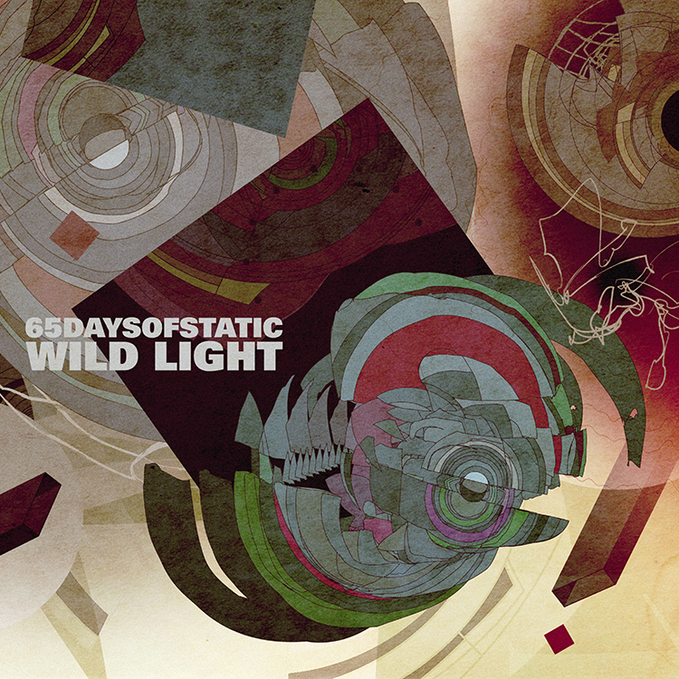
65daysofstatic have always had a strong socio-politcal mindset whether that has directly influenced their music or not. therefore it came as no surprise to me that whilst in the studio they’d read and discussed a wide array of contemporary and historical political and artistic literature. for this reason when they approached me to create the artwork for the album i was given a good deal more than just their definition of the term ‘wild light’.
leading with ezra pound’s imagist poem ‘in a station of the metro’ they lead me down a path of minimalist, suprematist and futurist thinking including snippets of conversations they’d had over instant messenger, photographs of sculptures, scans of paintings and lengthy 20th century manifestos. my favourites of which were a book called ‘the vagrant light of stars’ which depicted a memorial to albert einstein being launched into deep space traveling on a beam of light, and a supremacist, communist, modern art children’s book called ‘about 2 squares.’
i’d had the demos for the songs for a while and around the time I received the above documents from the band i’d been given a near final version of the album. what struck me immediately was that whilst minimal in its conception, cinematically speaking the sounds on the record created some incredibly beautiful, richly coloured and vibrant images in my head. tracks like ‘heat death infinity splitter’ and ‘the undertow’ took my mind from a sense of something vast moving through the chaotic depths of outer space, right down to microscopic organisms and cells living in our oceans and under our skin.
bearing all of this in mind I made the cover you see now. appropriately adopting where possible various lines in supremacist, futurist and imagist visual thinking, i created a wide-format piece that i felt resonated with the music as much as with those old explorations of artistic expression. if those were one band of hapless, anti-establishment types trying to evolve our way of thinking about and perceiving the world, here was another band with their designer in tow – trying his best at the impossible task of visualizing music for those who’ve seen everything before.
i understand you’re a fan of 65daysofstatic – how important is it, do you think, that the designer creating cover art engages with or enjoys the music?
in 2006 i wrote to 65 and asked if my business partner giles and I could make their website. i’d seen them live in 2005 in london and knew that – like many of the bands I’ve asked to work with over the years – i’d make my best work if their music was the soundtrack to it. little did I know we’d become such good friends and that I’d be sitting here today having finished not just my third album cover for them, but also the best record cover I think I’ve made to date.
from my perspective being a fan of the music is essential. i give talks to independent filmmakers here in New york on the same subject. I implore them to not pay money to anyone that isn’t already immediately and very clearly a fan of the film they have made. money cannot and will not ever be enough motivation to make a truly beautiful and appropriate design or piece of artwork. despite having worked over 10 years in this role, i continue produce some of my worst work when I am not a fan of the film or music i’m working to support.
the graphic designer david carson pointed out that it’s a gross misconception that you should not judge a book by its cover. everything about how a band presents itself is a reflection of the amount they have cared for and thought about the the music they have made. a record cover is a huge responsibility, particularly so when you’re handed a record like ‘wild light.’ something this good demands to be heard and it’s my job to make sure someone clicks on that cover on the net or picks up that record in the store, even if just out of curiosity. It’s debatable to this day whether an image can represent a sound, but I work based on the belief that you can at least try to achieve such a thing.
an excerpt from this interview can be found on the creative review website here, along with some write-ups of some other great covers. we hope the above interview gives people some further insight into what it’s like working with a band like 65daysofstatic, who’s intense worth-ethic continues to push us to new levels.