(v)
(v_i)
(version_industries)

MUBI, movie poster of the week + top 10 posters_042426
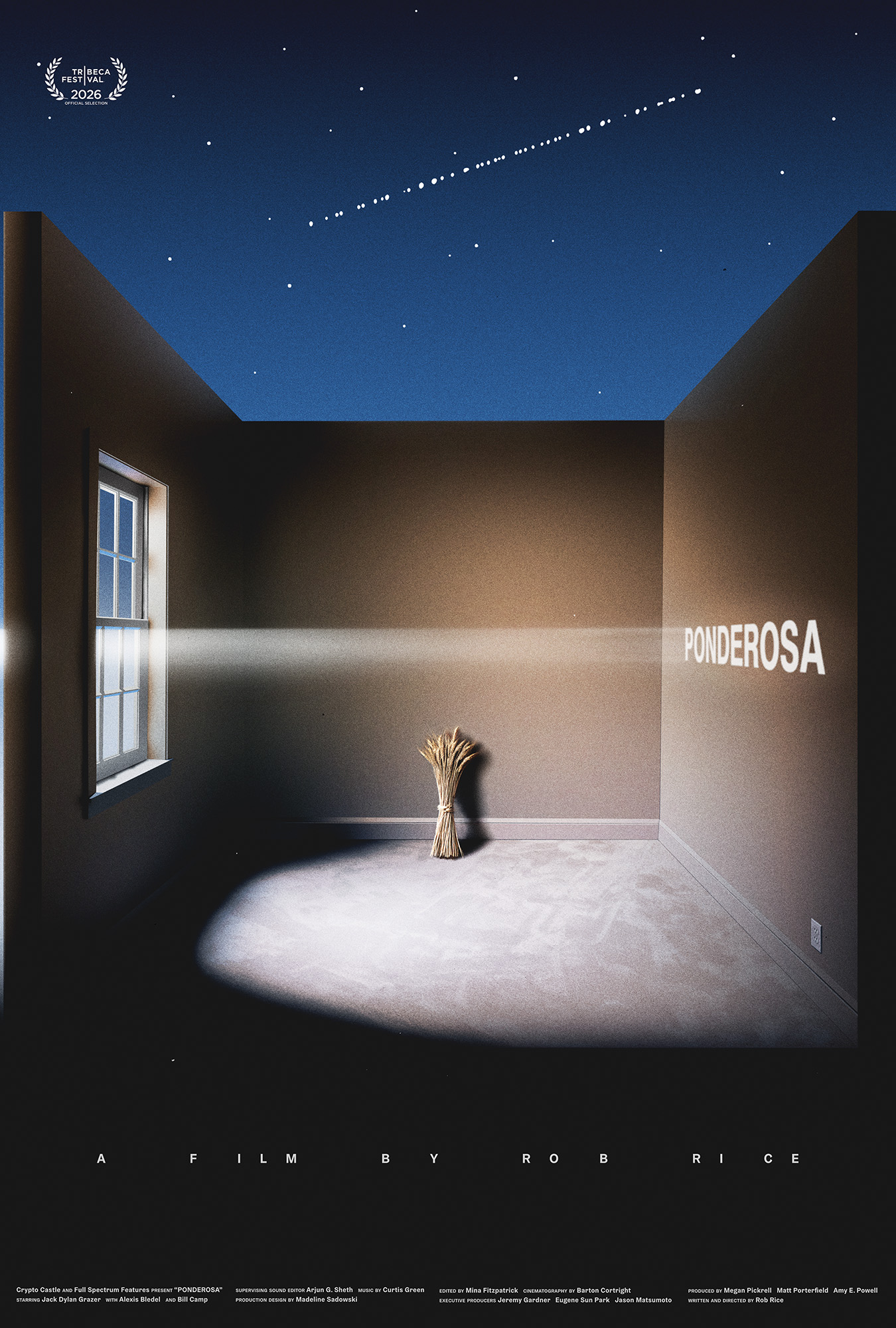

our poster for rob rice’s feature feature film, ponderosa, was selected as MUBI’s movie poster of the week today. to accompany the selection caspar was asked by adrian curry to pick his top 10 favourite movie posters (and 10 runners-up) and comment on them. you can read four excerpts from the piece here:

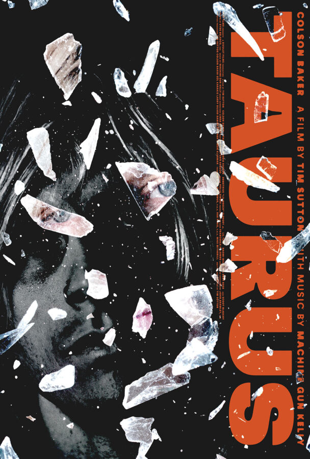
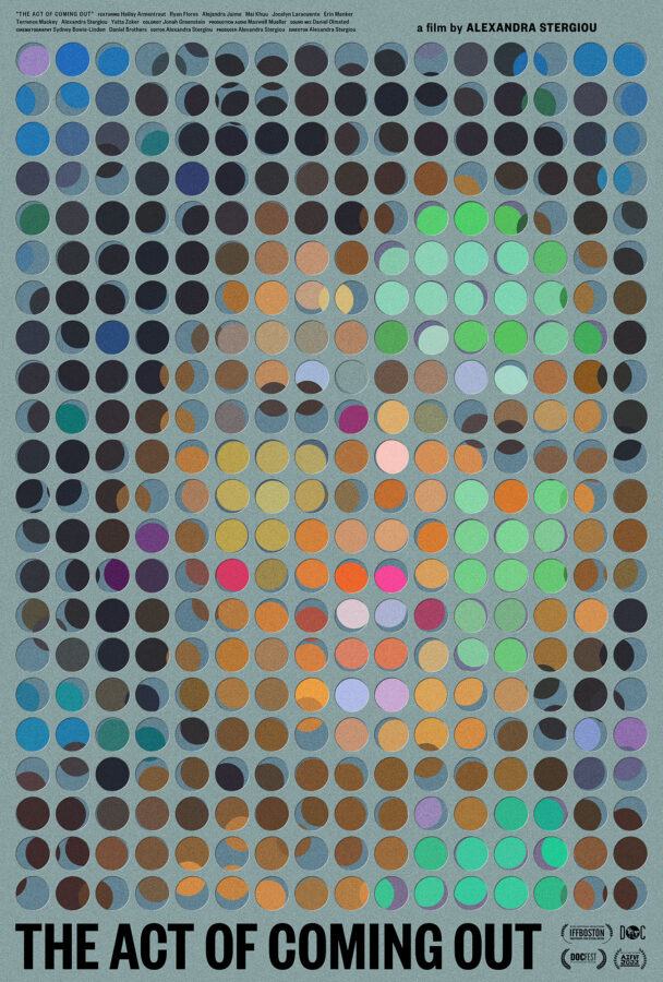
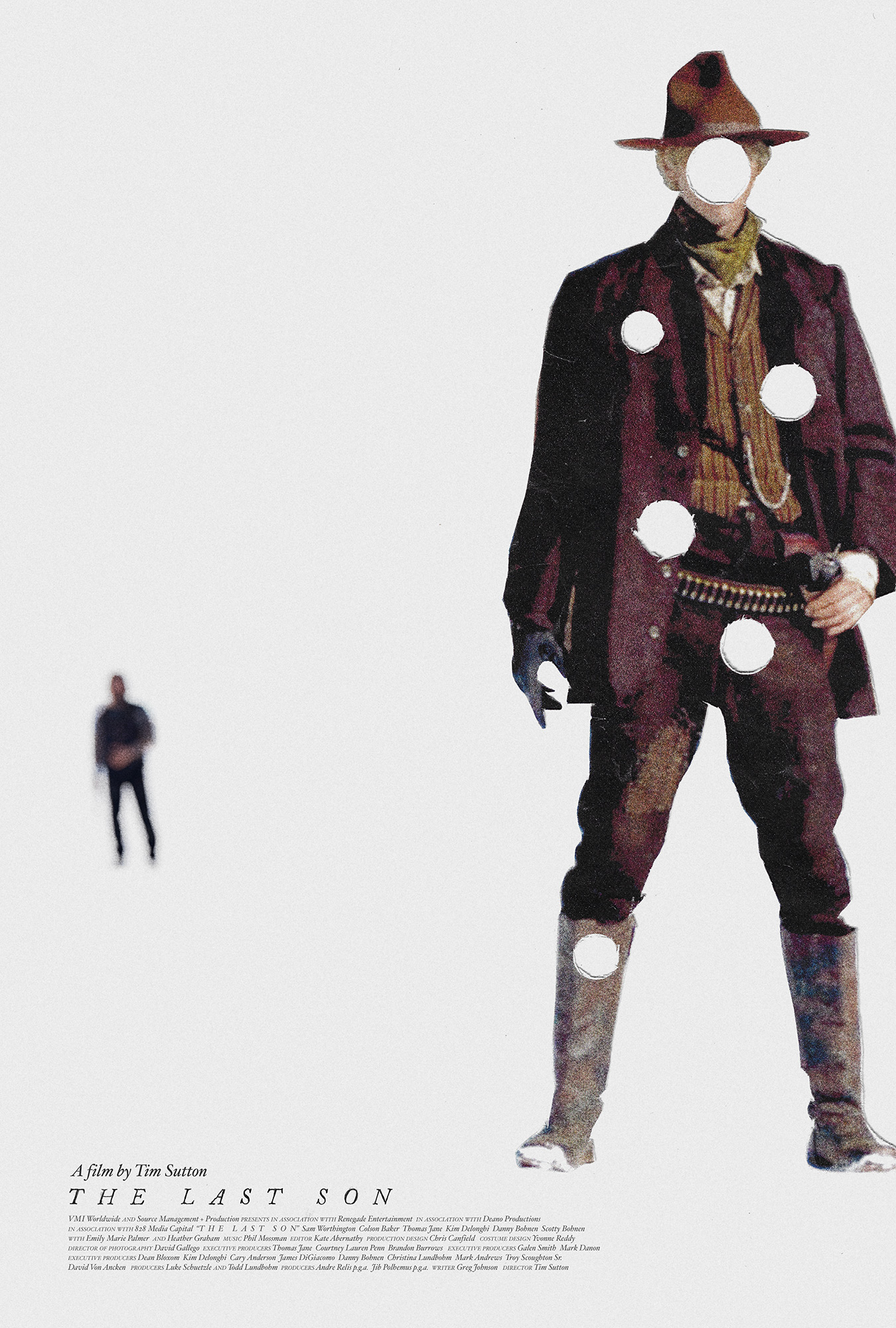
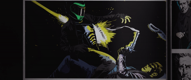
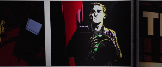
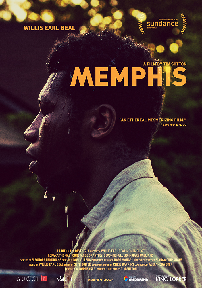
ADRIAN CURRY: Ever since I interviewed designer Caspar Newbolt about his poster for The Act of Coming Out (Alexandra Stergiou, 2022) and he spoke so eloquently about the art of making posters, I’ve been wanting to ask him about his favorite movie posters and the designers who inspired him. With the opportunity to spotlight his newest poster, for the indie film Ponderosa (2026), this seemed the perfect time. Premiering at the upcoming Tribeca Film Festival on June 6, and billed as an experimental comic horror movie, Ponderosa is directed by Rob Rice and concerns a young man named Zeke who, “when the buffet where his mom works closes down, is forced to entertain the wild advances of a rich regular who is weirdly and vehemently obsessed with becoming his father.” Newbolt designed the poster for Rice’s first feature, Way Out Ahead of Us (2022) and his design for Ponderosa is as oblique, intriguing, and flat out beautiful as all of his best work. 

You can see where Newbolt is coming from, and what he values most in graphic design, by looking at his favorite posters and reading what he thinks about them.

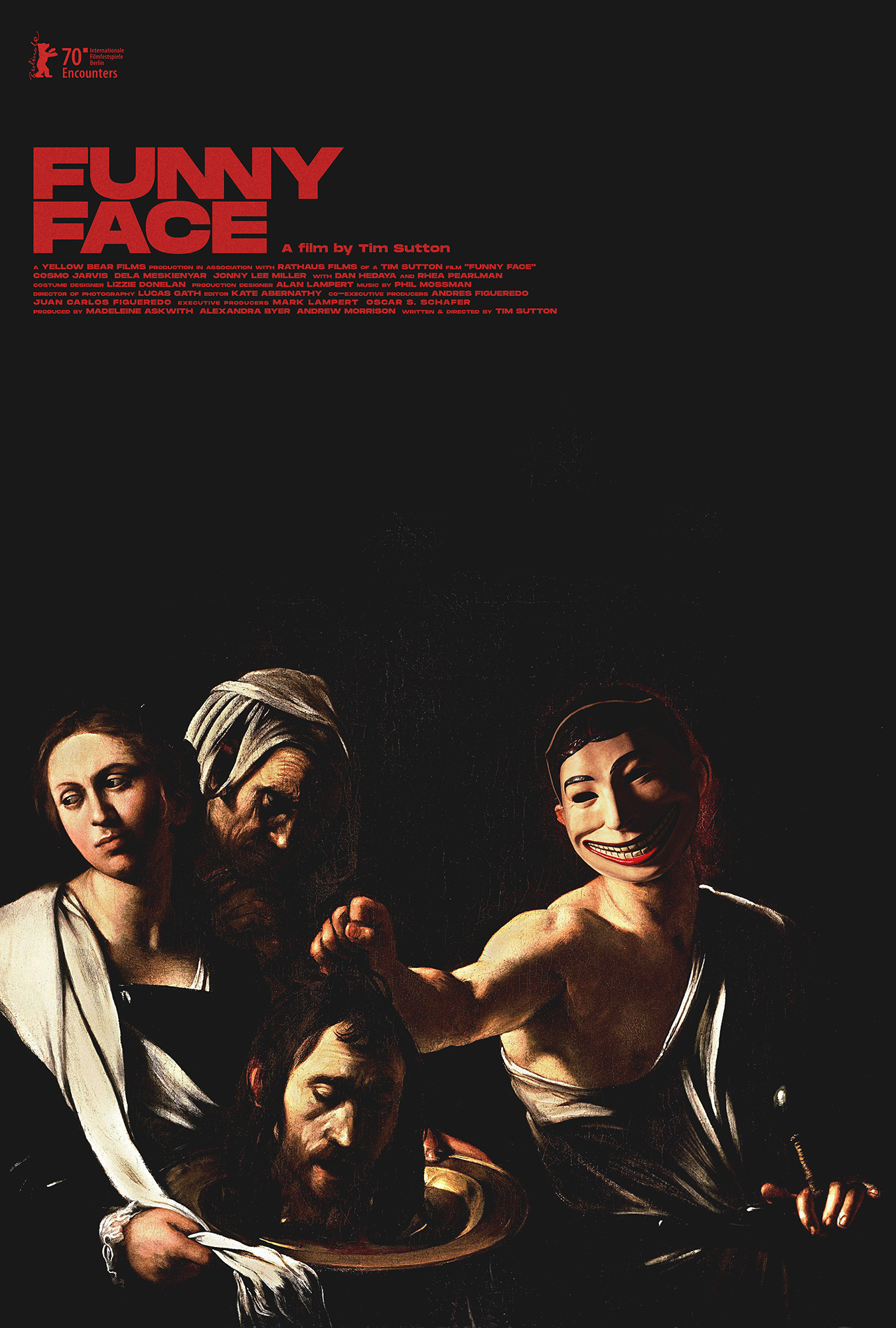
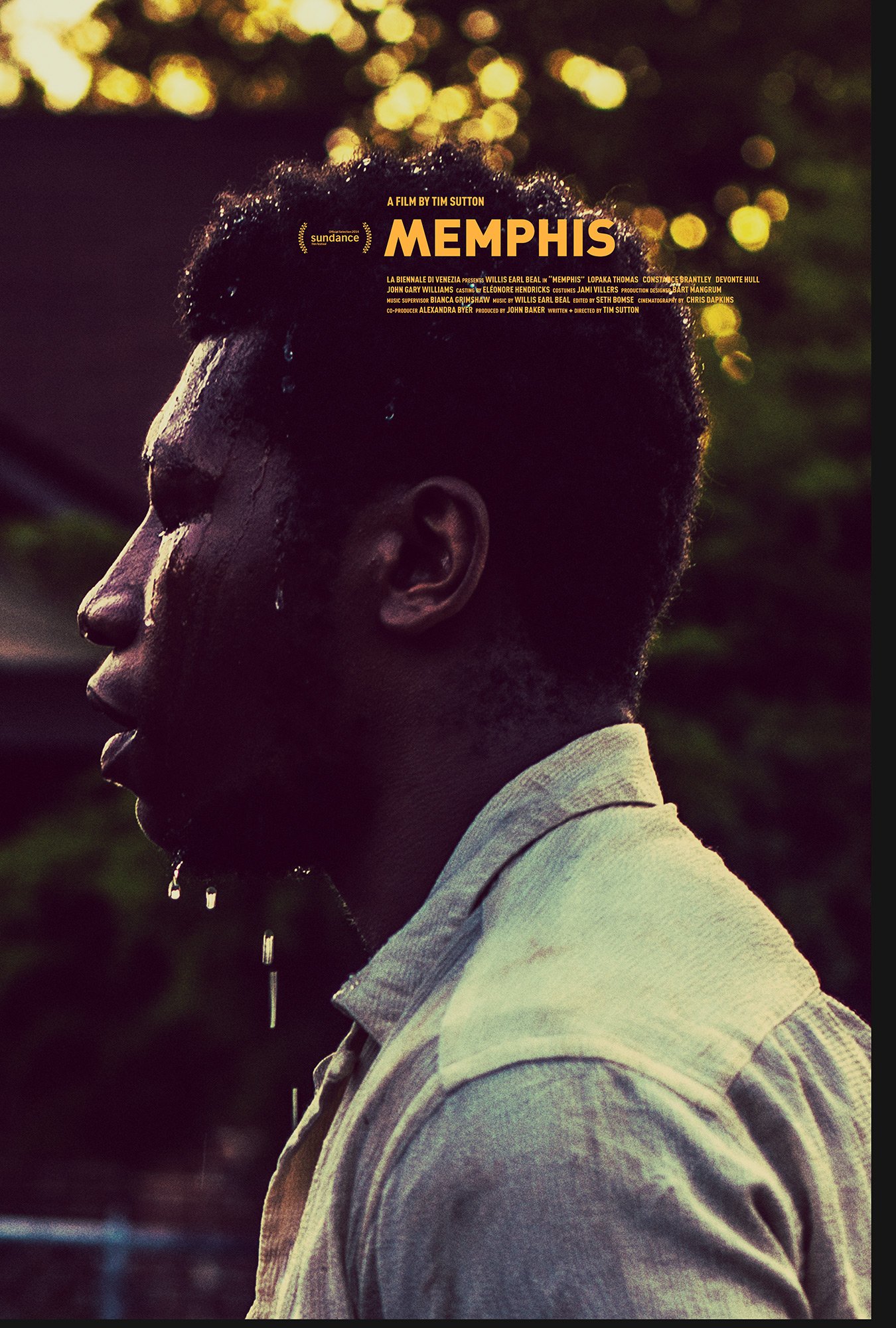
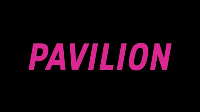
CASPAR: Creatively speaking, I always say “yes” to doing something I’ve never done before and then go home in a panic and quickly figure out how to do that thing. I never went to art school or design school, so this is a good way for me to catch up on some of the schooling I never had. Tim asked me if I could make a poster and titles for his debut feature Pavilion (2012) and I said, “Of course!” This wouldn’t be the last time Tim saw in me something that I did not.

I try very hard to not look at film posters when I work and to do everything in my power to draw from other sources for ideas. I do this because I believe that a really good film poster should be more than just promotional artwork for a film, and in so doing it should not think like other film posters. A great poster should be a piece of artwork that you want on the wall because it—like the film it was based upon—has the poetic capacity to speak to you about your own life. After all, film posters, like all visual marketing pieces, get put up around town without anyone’s permission. Thus, as the Polish poster-maker Leszek Żebrowski suggested when he said to me, “I like making posters because it means I don’t have to get into art galleries any more—the streets are my art gallery now,” it rests upon the shoulders of any poster-maker to make sure our streets are as beautiful as we can make them.

To that end, the following 20 film posters are the exceptions to my own rule. These are the posters that, despite my searching for ideas elsewhere, continue to hugely influence my practice. Each of them has haunted me in different ways for years as I continue to try to make something beautiful and thought-provoking for those of us on the street, going about our daily grinds.

3. 1975 Polish poster by Mieczysław Wasilewski for Pat Garrett and Billy the Kid(Sam Peckinpah, USA, 1973).

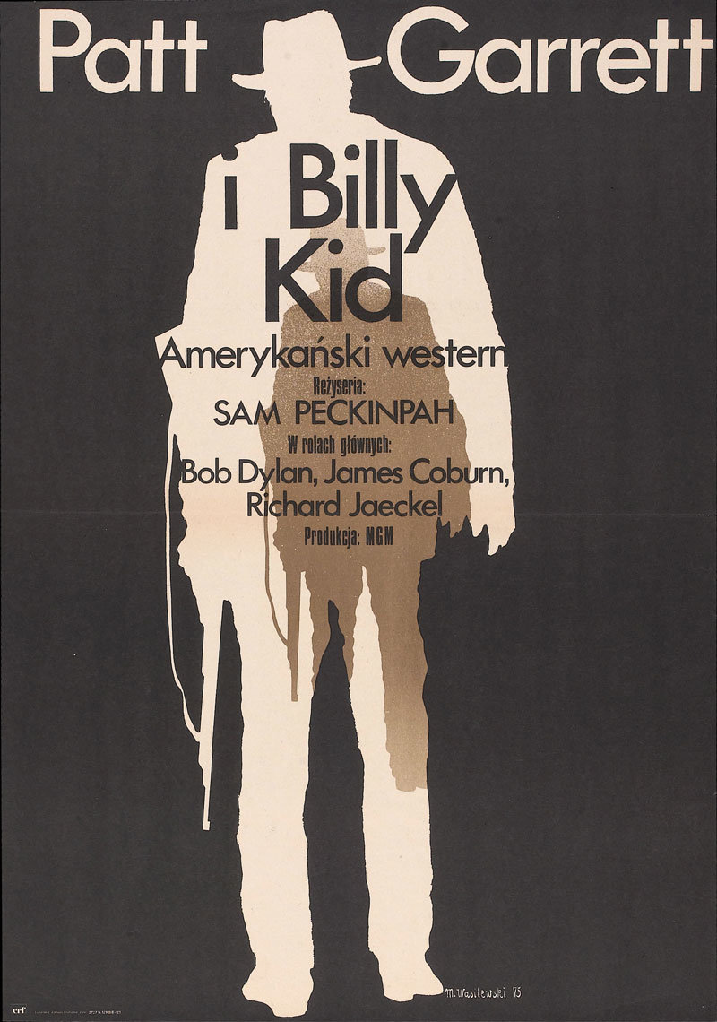
I have a theory about Vasilis Marmatakis’s excellent poster for Yorgos Lanthimos’s The Lobster (2015) and I guess now is the time to publish that theory, given that this Pat Garrett and Billy the Kid poster so substantiates it.

The theory is this: The Lobster poster isn’t just a great poster for the film The Lobster, it’s a great poster for every film. It’s, in fact, a universal film poster. Simply put, you could scratch out the title The Lobster from the poster and write almost any other film name there instead, and the poster would work beautifully. Often filmmakers I’m working with send me the film posters they like or that they hope might inspire our work together. The Lobster poster is regularly included. This is a fact that further supports this theory.

The poster above by Mieczysław Wasilewski proves itself time and again to also be one of these universal film posters. Simply adjust the cut-out figures to that of your film’s protagonists and you could have a poster for a film about someone retreating inside themselves, a poster for a film about someone coming of age, a poster for a film about someone going back in time, a poster for a film about succession, a poster for a film about unrequited love, a poster for a film about swapping bodies with someone else… Honestly, you name it…

Saul Bass was by his own admission someone who tirelessly searched for such universal devices, and to powerful effect. They’re certainly not the be-all and end-all in this kind of work, but if you stumble upon a new one you could have a piece of work that speaks to people more deeply than you originally intended.

8. US one-sheet by Saul Bass for Exodus (Otto Preminger, USA, 1960).

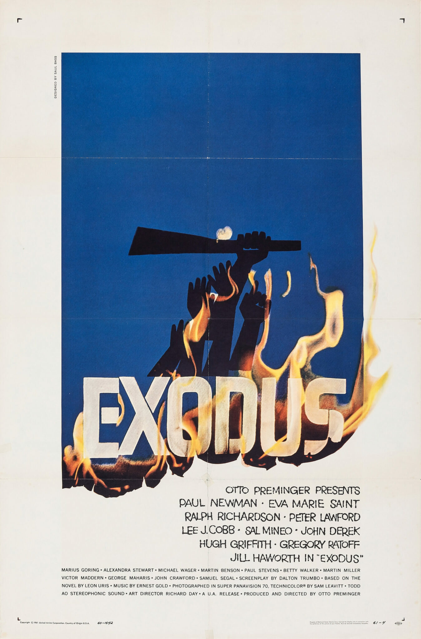
A thing I think about a lot in my practice—thanks in a large part to my years working on Filmmaker Magazine—is how to make print work that looks like it’s physically moving, or has just moved, without using ugly motion blurs or similar effects. Given the inherently static and flat nature of print design this might seem like a fool’s errand. However I’ve come to learn that it is possible and that Saul Bass’s poster for Exodus offers one such solution (see also: Hans Hillmann’s poster for Muriel, which I’ll get to later).

In the case of Exodus, the paper is burning away to reveal the credit block beneath, and you understand from the shape of the blue paper at the top, where the paper would have originally sat, unburnt at the bottom. So whether you use fire or a paper tear or fold that paper up, you’ve created an obvious sense of something moving, or something that has just moved. Thus it’s the combination of what was there before and what was revealed, all the while based on an invisible sense of a grid, that can give a design this kinetic quality. Saul does this here with panache, of course.

you can read the rest of the piece here. a huge thank you again to adrian curry and to everyone at MUBI for the continued support.

_category
blog, grafiks, news, , , , , , , , , , , , , , , , , , , , , , , , , , , , ,

taurus and the act of coming out posters acquired by the art library of the state museum in berlin_043023


this year marks the 20th anniversary of the founding of version industries. we never imagined we’d last this long. to mark the occasion it feels fitting that the posters we made for tim sutton’s feature film taurus and alexandra stergiou’s short film the act of coming out have just been acquired by the kunstbibliothek (art library) of the staatliche museen zu berlin (state museum in berlin), germany. we will post a link to their digital record of the acquisitions the moment they appear.

there’s a chance also that one or other of the posters will be featured in their forthcoming großes kino: movie posters from twelve decades show. the show opens november 3rd of this year in berlin. here is what they say about it:

Großes Kino – we’re talking about cinema with a capital C, about motion pictures that leave you feeling overwhelmed or in awe. A good movie poster, too, is designed to be remembered: it captures the film’s mood, alludes to storylines, evokes feelings. The drama and narrative of a long film are condensed into a single image. The exhibition “Großes Kino” presents around 100 original movie posters from the 1900s through to the 2020s from the Kunstbibliothek’s collection of graphic design.

The twist is that the selection is not made by the inhouse curatorial team alone, but in collaboration with thirty people connected with the film industry – including actors, directors, cineasts, historians and designers. In the exhibition, an audio guide with the guest curators’ commentaries will inform visitors about the background to their poster selections. Thematic sections provide additional perspectives on the medium of the movie poster, such as its birth at the turn of the 20th century, Berlin as a city of cinema, and current graphic design trends for films. The exhibition will be accompanied by an education and outreach programme as well as a symposium that examines the topic from a critical perspective.

either way a huge thank you to christina thompson and christina dembny at kunstbibliothek for finding and acquiring these posters. we are greatly honoured to have our work in such a museum’s permanent collection; a collection that includes the work of one of our heroes, hans hillmann.

_category
blog, grafiks, news, , , , , , , , , , , , , , , , , , , ,

the film stage, the best movie posters of 2021_123121


the film stage just selected caspar’s poster for tim sutton’s feature film, funny face, as their 8th best poster of 2021. jared mobarek, writing for film stage, had the following to say about the poster:

“Caspar Newbolt and (version_industries) traverse an inspired path to give frequent collaborator Tim Sutton’s film Funny Face a printed counterpart. The subject is a revenge-seeking man who serendipitously discovers a plastic mask, donned more as a talisman of confidence than means of anonymity. Was its appearance fate? Has this surreal shield served others before him? Newbolt looks to amplify that potential by delving back through history to discover another artistic work with empowered figures perfectly suited to become this character’s progenitors. His selection of Caravaggio’s Salome with the Head of John the Baptist proves a magnificent partner both thematically and tonally. You want to laugh, but it’s all too sinister to risk the ensuing wrath. For all you know, that face might just find you next… already affixed to another’s head.”

thank you jared and everyone at the film stage for this vote of confidence.

_category
grafiks, news, , , , , , , , , ,

creative review, the best film posters of the year_121321


creative review magazine have included caspar’s poster for tim sutton’s feature film, the last son, in their round up of the best film posters of 2021. daniel benneworth-gray, writing for the magazine, had the following to say about the poster:

“With a wry nod to its star’s name – Machine Gunned Kelly? – Caspar Newbolt avoids the usual grizzled-faces-and-dusty-vistas approach for Tim Sutton’s modern western, opting for something more abstract. As with many on this list, a more conventional poster was also used, but strong visual identities like this are essential for standing out among streaming services’ endless carousels of content.”

a huge thank you to creative review and to mr. benneworth-gray. you can see the poster in question below.

_category
grafiks, news, , , , , , , ,

the last son poster acquired by the academy of motion picture arts and sciences_112521


our poster for tim sutton’s sixth feature film, the last son, has been acquired by the margaret herrick library of the academy of motion picture arts and sciences. two copies of the poster now exist in their collection in los angeles, california. you can view their digital record of the acquisition here.

_category
grafiks, news, , , , , , , , , , , ,

print shop_090521


after 10 years of working to make the best and most original film posters we can for everyone, we wanted to celebrate by opening a print shop at shop.versionindustries.com to provide physical copies of those posters to anyone anywhere.

our mission is simply to make sure those that want these posters can have them and for the cheapest price possible. during the 2020 global pandemic we worked out a way to print posters “on demand” and deliver them worldwide whilst keeping our overheads very low. as you can see, we’re talking around $25 at most for a full-size 27×40 inch US one-sheet or A0 poster on good paper, plus shipping. what small profit margin there may be will hopefully cover the overheads of running an online store of this kind.

we trust that this offers us a way to make sure the films we have worked on can be remembered beyond the festival and theater releases, on the walls of those who really loved them. the funny thing is this is so often not the case; film posters only get printed a handful of times and then they’re just the result of google image searches and that’s that. this goes against the entire point of making posters of course.

thank you in advance for your continued love and support for independent cinema, and for the work that we do to celebrate the films and filmmakers we’re lucky enough to work with.

_category
blog, grafiks, news, , , , , , , , , , , , , , , , , , , , , , , , , , , , , , , , , ,

film title sequence + motion graphics work_062117

memphis titles

it’s been a while since we updated this blog thing. it occurred to us that we really need to make a record of our gradual move into the world of film title sequences. unfortunately the way this website is constructed means that it’s hard to highlight this kind of work, and so we hope this article gives you an inkling of what we’ve done and hope yet to do in this field.

over the last few years we’ve been asked to do an increasing amount of motion graphics work for films, and whilst the work is often relatively rudimentary in terms of graphic design, the projects have certainly been respectable. in this regard it’s worth noting what kind of films we’ve worked on and observing the more subtle compliment a thing as simple as a typeface choice or type placement can offer a film. which isn’t to say we wouldn’t rather do something more explosive graphically, but more often than not a film doesn’t need that. not at all.

anyway, after a while in this business you realize that you need to just let the work speak for itself, rather than doing a whole lot of talking about your process or whatever. so here are a series of title cards and stills from various film productions, where you can see our motion graphic design work at play.


light up the night
co-directed by matt sundin and caspar newbolt. featuring drawings by john delucca and animation by josiah newbolt.

light up the night titles


entertainment
directed by rick alverson.

entertainment titles


dark night
directed by tim sutton. featuring in-film poster design and ‘google maps sequence’ compositing.

dark night titles
dark night titles
dark night titles
dark night titles
dark night titles
dark night titles
dark night titles
dark night titles


take what you can carry
directed by matthew porterfield.

take what you can carry titles


live cargo
directed by logan sandler.

live cargo titles
live cargo titles
live cargo titles
live cargo titles
live cargo titles
live cargo titles
live cargo titles
live cargo titles
live cargo titles


memphis
directed by tim sutton.

memphis titles
memphis titles
memphis titles
memphis titles
memphis titles
memphis titles
memphis titles
memphis titles


the convention
directed by jessica dimmock.

the convention titles


pavilion
directed by tim sutton.

pavilion titles
pavilion titles
pavilion titles
pavilion titles


muito romântico
directed by distruktur.


stay tuned for more work from us for jonas carpignano’s a ciambra, matthew porterfield’s sollers point and ari gold’s the song of sway lake.

cheers.

_category
grafiks, news, , , , , , , , , , , , , , , , , , , , , , , , , , ,

memphis amongst best film posters of 2014_121614

B46e9sNCYAAXhlq.jpg-large

MUBI and slate have put together a list of their best film posters of 2014. we’re honoured to say that our poster for memphis came in 7th place, and must again thank adrian curry who put the list together for the recognition. it goes without saying that such an accolade would have been impossible without the belief and support of tim sutton and the rest of the film’s crew. it’s not often that a relationship of this kind allows such a level of artistic freedom, and furthermore that this is one particular collaboration that’s only just getting started.

cheers.

_category
blog, grafiks, news, , , , , ,

memphis awarded movie poster of the day_082914

memphis_poster_layered_v2_resized

our poster for tim sutton’s memphis was kindly selected as movie poster of the day by adrian curry on his blog of the same name. adrian writes for film comment, MUBI and is the design director for zeitgeist films. we’re thrilled to have made the cut. thank you, adrian.

_category
blog, grafiks, news, , , , , , , , ,

memphis_011414

Screen Shot 2014-01-14 at 11.51.03 AM

tim sutton’s new feature film MEMPHIS is having it’s US premiere at the sundance film festival this week. the film stars the incendiary singer willis earl beal and chases, in the form of a filmic essay, the ever-fleeting soul of the creative process. as some of you know we have had the great honour of working on this film and you can read more about that in an interview we did with black book magazine here.

since putting together the posters for the film, we’ve created a small teaser site to celebrate the sundance acceptance. additionally the film has since been written up in dazed & confused magazine. to say that it’s a thrill to see the film (not to mention one of our photographs) in that legendary periodical would be an understatement.

here’s wishing the whole memphis film team all the success at sundance and beyond. it’s not often enough that films as experimental and searching as this get this sort of recognition.

1009716_1413214968917902_98139597_o

thanks to indiewire you can view a brand new trailer for the film below. do please immerse yourself for a moment. to paraphrase one of my favourite songs – nothing quite like the feel of something new.


lastly, if you have the means – see willis earl beal perform live. he’s touring europe in february and i can honestly say that there are very few out there of his caliber. lyrically, musically and performance-wise, he will most assuredly smash you to pieces.

_category
blog, grafiks, news, , , , , , , , , , ,