print shop_090521
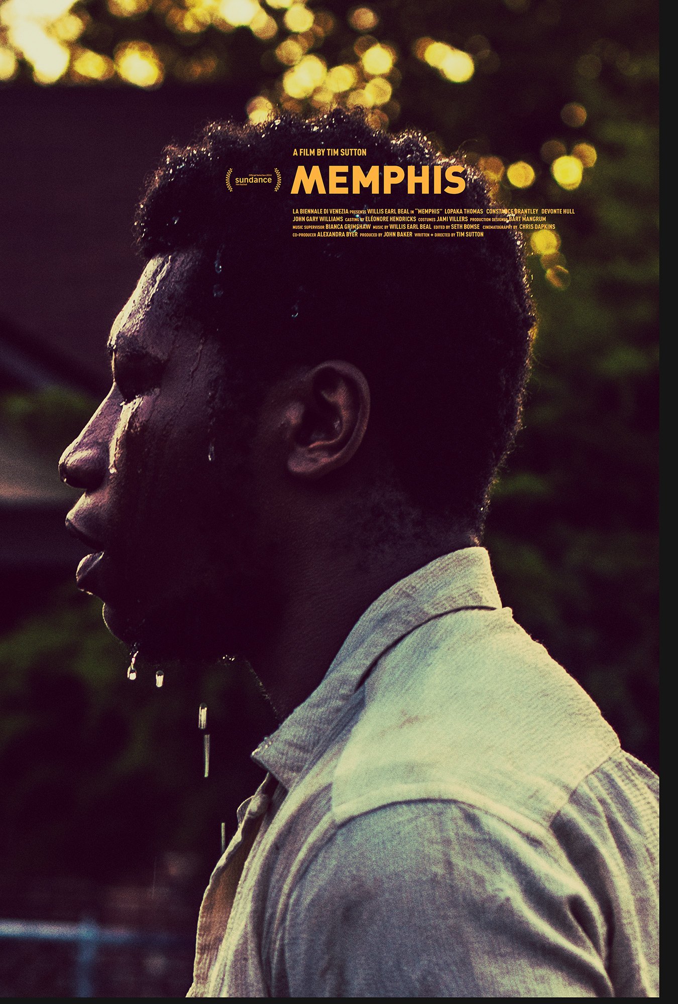
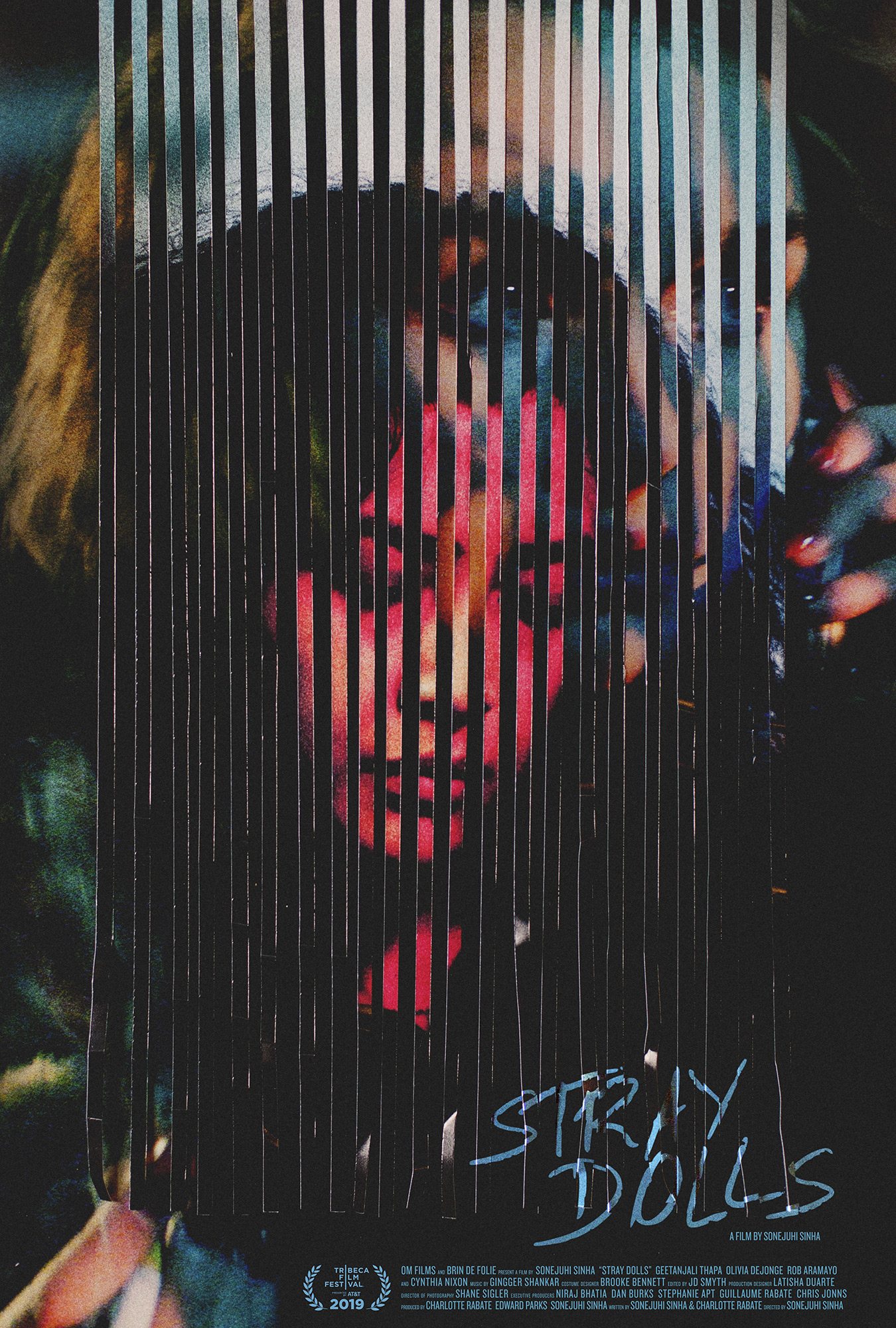
after 10 years of working to make the best and most original film posters we can for everyone, we wanted to celebrate by opening a print shop at shop.versionindustries.com to provide physical copies of those posters to anyone anywhere.
our mission is simply to make sure those that want these posters can have them and for the cheapest price possible. during the 2020 global pandemic we worked out a way to print posters “on demand” and deliver them worldwide whilst keeping our overheads very low. as you can see, we’re talking around $25 at most for a full-size 27×40 inch US one-sheet or A0 poster on good paper, plus shipping. what small profit margin there may be will hopefully cover the overheads of running an online store of this kind.
we trust that this offers us a way to make sure the films we have worked on can be remembered beyond the festival and theater releases, on the walls of those who really loved them. the funny thing is this is so often not the case; film posters only get printed a handful of times and then they’re just the result of google image searches and that’s that. this goes against the entire point of making posters of course.
thank you in advance for your continued love and support for independent cinema, and for the work that we do to celebrate the films and filmmakers we’re lucky enough to work with.