posteritatiand the film stage have kindly included our joyland and falcon lake posters in their best movie posters of 2023 lists. the film stage went as far as to consider our poster for saim sadiq’s joyland their number 1 poster of the year.
here’s what jared mobarek at the film stage had to say about the joyland poster:
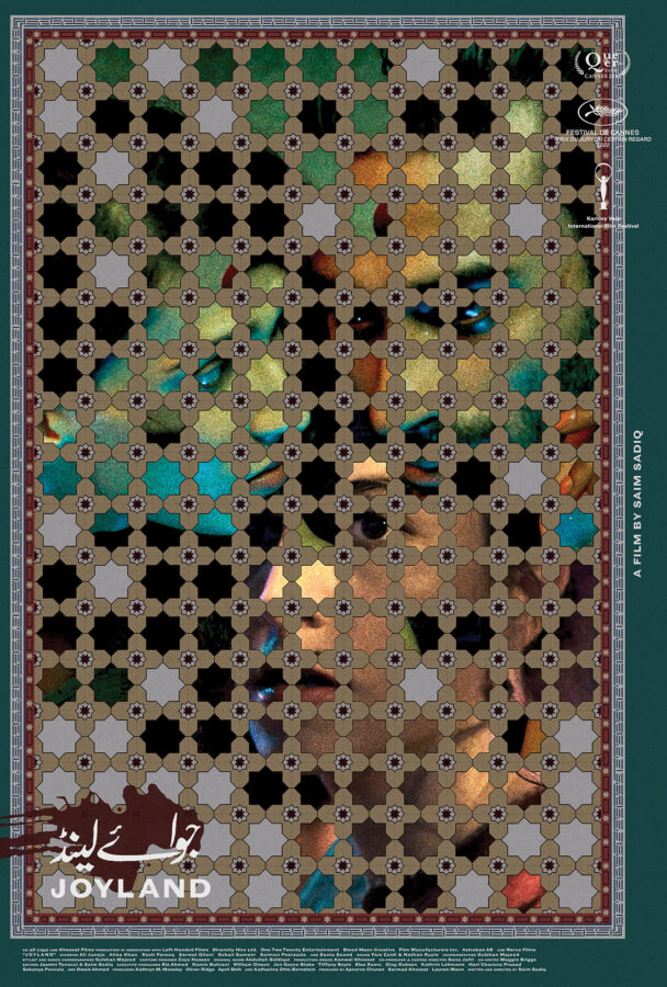
There’s so much to talk about with (version_industries) and Caspar Newbolt’s Joyland. The ornately hand-drawn floor tiles (their website always generously explains their process) doubling as a window upon the main characters. The whole’s off-center nature pushing everything into the top-left corner to provide room for text on the outside without sterilizing the composition via more symmetry. The way the three actors feel as though they exist in one scene despite a handful of lotus flowers overlapping their images to prove each has been meticulously layered atop the others. The grain, subdued colors, and blood-smeared title. It’s truly a work of art all its own and a testament to the field’s ability to sell itself as much as the product being sold.
a huge thank you to both institutions for their continued support of our work.
this year marks the 20th anniversary of the founding of version industries. we never imagined we’d last this long. to mark the occasion it feels fitting that the posters we made for tim sutton’s feature film taurus and alexandra stergiou’s short film the act of coming out have just been acquired by the kunstbibliothek (art library) of the staatliche museen zu berlin (state museum in berlin), germany. we will post a link to their digital record of the acquisitions the moment they appear.
there’s a chance also that one or other of the posters will be featured in their forthcoming großes kino: movie posters from twelve decades show. the show opens november 3rd of this year in berlin. here is what they say about it:
Großes Kino – we’re talking about cinema with a capital C, about motion pictures that leave you feeling overwhelmed or in awe. A good movie poster, too, is designed to be remembered: it captures the film’s mood, alludes to storylines, evokes feelings. The drama and narrative of a long film are condensed into a single image. The exhibition “Großes Kino” presents around 100 original movie posters from the 1900s through to the 2020s from the Kunstbibliothek’s collection of graphic design.
The twist is that the selection is not made by the inhouse curatorial team alone, but in collaboration with thirty people connected with the film industry – including actors, directors, cineasts, historians and designers. In the exhibition, an audio guide with the guest curators’ commentaries will inform visitors about the background to their poster selections. Thematic sections provide additional perspectives on the medium of the movie poster, such as its birth at the turn of the 20th century, Berlin as a city of cinema, and current graphic design trends for films. The exhibition will be accompanied by an education and outreach programme as well as a symposium that examines the topic from a critical perspective.
either way a huge thank you to christina thompson and christina dembny at kunstbibliothek for finding and acquiring these posters. we are greatly honoured to have our work in such a museum’s permanent collection; a collection that includes the work of one of our heroes, hans hillmann.
after 10 years of working to make the best and most original film posters we can for everyone, we wanted to celebrate by opening a print shop at shop.versionindustries.com to provide physical copies of those posters to anyone anywhere.
our mission is simply to make sure those that want these posters can have them and for the cheapest price possible. during the 2020 global pandemic we worked out a way to print posters “on demand” and deliver them worldwide whilst keeping our overheads very low. as you can see, we’re talking around $25 at most for a full-size 27×40 inch US one-sheet or A0 poster on good paper, plus shipping. what small profit margin there may be will hopefully cover the overheads of running an online store of this kind.
we trust that this offers us a way to make sure the films we have worked on can be remembered beyond the festival and theater releases, on the walls of those who really loved them. the funny thing is this is so often not the case; film posters only get printed a handful of times and then they’re just the result of google image searches and that’s that. this goes against the entire point of making posters of course.
thank you in advance for your continued love and support for independent cinema, and for the work that we do to celebrate the films and filmmakers we’re lucky enough to work with.
we’ve created an exhibition of our ongoing record cover and poster work over at squarespace. the format of their site and the nature of their templates was immediately conducive to such a concept. immediately following the posting we received a very flattering review over at one of our favourite blogs –
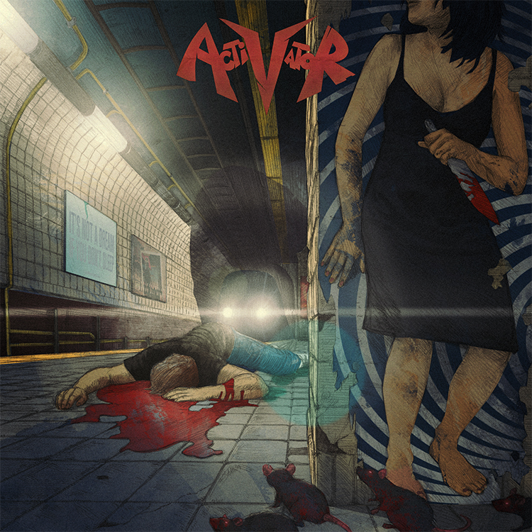
the new york thrash metal band activator are releasing their debut album in two weeks. i’ve known the guitarist jared drace for some time now. his apartment is like a museum version of my formative years. packed full of vintage horror film posters, action figures, comic books, guitars and a vast alphabetized collection of records, i spent the first half hour i was there just staring at the walls. i shared my first boarding-school dormitory with an english metal guitarist who had a redwood washburnN-series N2, with humbucker pickups and a floyd-rose tremolo. this guy had me listening to extreme, van halen,?steve vai and joe satriani. my first record cover was a pencil crayon copy of satriani’s the extremist sleeve. i’ve never told jared this, but i didn’t really have to. suffice to say i lept at the chance of creating the sleeve for his band activator’s debut LP.
almost a year ago i was in london sitting in my brother’s apartment scratching a rat’s nest of unwashed hair on my head, staring at a crude biro drawing of the image you see above. just days before i’d downloaded a mastered version of the record and it was once again upon me to try and make an image that might get people more immediately into the headspace the band were in with these new songs.
the album is a fast-paced and brutal affair with lyrics that delve fiercely into the bleaker side of personal relationships. it opens with the sound of rats screeching as they run through city streets and as a new york resident myself i was immediately transported to a place i’d seen many a rat in my days – waiting for a train as we all have on those sweltering summer nights. closing my eyes and turning up the music, i then tried to think of a way to step over the still fresh vomit of ?’tough love’ clich?s i’d seen on record sleeves of this kind in the past. for one, the failed love stories on this album had such a battering of a soundtrack that i knew i had to find a way of turning the gun on the protagonist somehow. badly sketching out a train platform, i drew in the dead body of a guy, blood streaming from his corpse. next up was of course the question of who killed him and why. if you were to sympathize with the lyrics on this record you’d certainly at least joke that a girl must have killed him. you know, metaphorically speaking … and that’s when it hit me.
i scribbled in the rest of the drawing details, took a photo of the sketch and emailed it immediately to john delucca. if there’s anyone on this planet who can not only whip up an incredible pencil rendering of a scene but also style it to a level that fits my particular idiosyncrasies, it’s john.
3 days later i had a finished pencil drawing in my hands. not one change was necessary – he had nailed it. immediately i set to work on colouring it in, adding textures, type and any other specific little details that i felt would really bring the concept home. i was already smiling – listening to the music as the image slowly came to life, i knew we’d nailed it.
so what was the big idea? well, take a closer look at the image above and you’ll see that the girl hiding around the corner holding the bloody knife is merely coincidental. she’s in fact just a picture of a girl on a poster. she didn’t kill the guy. she’s not really there.
the truth in fact being that something else killed him and the question of what or why that could be is open to the listener’s imagination. one interpretation might be that it’s a more supernatural, as-yet-unseen danger stemming from the bands own obsession with horror films and comic books. another could be that the girl in the poster is?a simply a metaphorical commentary on all the album’s ‘this relationship is killing me’ lyrical content. either way the visual allegory is there and we hope it provokes more than just a passing interest in all activator have to offer. the fact is you won’t find classic thrash this rad with ease, so why not let yourself be seduced.
activator is out on september 17th and you can pre-order it digitally, on CD or on vinyl here.
working with makeup and vanity set continues to be a very exciting, fluid and rewarding process. we will never take for granted the fact that we get to work so directly with such an exciting, cinematically driven collective of musicians down there in nashville, tennessee. MAVS and the protomen continue to challenge and inspire, and this project was no different.
that said, when MAVS first approached us for this project we had a lot going on and so he was forced to go elsewhere. however when that didn’t pan out as planned, he offered us another shot at it. by this point we’d had a chance to listen to the record a great deal and lament on the fact that the job was no longer ours. this of course meant that the moment we got given the reins again everything came together very quickly. the work was done in 2-3 days and proved to be a rather cathartic and emotional experience for all involved. both MAVS and i had been through intense personal experiences around this time and listening to the record now whilst looking at the cover, it clearly expresses both of our desires to keep searching for an answer no matter how dark things got.
beyond the obvious emotional understanding, we’d been informed that it was to be a cassette only release and that MAVS was keen to echo a visual from the VHS era of home entertainment. old enough to have lived through a great portion of the VHS and cassette era, we understood how this record would sound when fans heard it and very much where it was coming from in terms of cinematic narrative. the decision to in some way make it photographic and involve some sort of backlit misty scene came very quickly, and was undeniably influenced by our shared love for shows from that era like?twin peaks and the x-files. so it was then a matter of building that out with a combination of photographic elements and a series of photoshop brushes and textures. finally, the typography came about as a result of wanting something elegant and not too clich?, but that would also feel a little like film credits.
it goes without saying but we can’t express just how fantastic the music is on this record. it’s powerfully cinematic and takes you back into a world made mysterious by not just the technologies used to create and record it, but also by the melodies and the concepts behind them.
stream the record here and by all means buy a copy of if you dig it. it’s only $6 on mp3, or $15 if you want the cassette version.
a couple months back alessandro cortini pushed the button on the sequel to his experimental synth project sonoio. he’d finished a rough version of the album and was keen to get some ideas for the artwork rolling. the first record’s aesthetic had been based around the colour blue, and we’d known for a while that this record was likely to be coloured, and called, red. in fact there was already a version of the album cover from the original design sessions that had been cast in red and he’d been using for his demo mp3s. however once we’d heard the record and fallen under its spell (it is even better than the original), we knew a new cover was needed. something that felt more involved, continued the abstract character based narrative of the first cover and took it into a new realm of introspection, if you will.
we’d also already developed the blue cover in a number of directions for the remix album that came soon after it, and so realized there was space there to keep telling the story in a fashion we felt true to the new material. it took a while to stumble across something that still felt immediately connected to the first cover, whilst offering a fresh angle on things. the resulting piece is of course deliberately open to interpretation, but features our white and black characters again, now in different circumstances and states of repair. we also started to pad out the design with more intricate textures and new colours, as the new album felt like a development and growth musically in such a way that the artwork had to follow suit.
then there’s this music video for enough, as seen at the top of this post.
for a long time my close friend and collaborator, the director / photographer?matt sundin, and i have been talking about making videos, and eventually films, together. in fact it was this desire that made the 65daysofstaticwe were exploding anyway album cover turn out the way it did. so the moment alessandro proposed a video, i gave him a call and said ‘this is our chance’.
alessandro was considering making 2-3 of the new songs into videos and wanted our ideas for each. ultimately he felt that the ‘live performance’ pitch that we included was the one that felt truest to where he was with this project right now. so matt called his crew together and asked that i start to write down a list of ideas for shots for the video. so i took an evening, put the song on repeat and worked on shot ideas that i felt would embellish the music visually and give the production a quality that had some level of character. you know, above and beyond what you usually get with these things.
we then booked a studio in green point, brooklyn and alessandro flew out from LA. the next day we hit the ground running.
matt and his gaffer / assistant craig ward had pulled together some fantastic elements, including a wild array of lighting options and a carpenter to build a small but unusually surfaced stage for alessandro to perform on. we then painted everything else in the room black and setup our dolly / tracking rig. so far everything was going well, heck there were even 2 cats wandering around the studio which proved more than enough to keep alessandro entertained between takes.
the only sad moment was when the two vintage television sets that alessandro had used for his live performances in LA arrived via post all cracked and broken inside their box. we tried our best to make them work, but it wasn’t happening.
pushing on we proceeded to do take after take of alessandro performing the song from every angle we could, taking care to include shots with him not on the stage too for some fun and games later in the editing room. it was a pretty intense process but the footage was clearly looking solid from the outset. plus the more the song got played over the studio speakers the more everyone involved started to dance a bit too, and dancing never hurt anyone.
the shoot ended pretty late into the night and the studio owner offered to keep our stage setup for some cabaret / performance art style shoot he had going on later, involving strippers and wild animals. i could have mis-remembered that though. we then headed back to matt’s apartment for the wrap-party and alessandro headed back to LA the next day.
a week or two later the intense process of editing began. matt went through the footage and started pulling together the best stuff from the vast array of material we had. soon after that he was putting together a great rough cut of things and sent this to me so that i could cut together the teaser clip that went live a couple weeks ago. he then did another cut and passed it over to me again. we agreed that what there was already felt good and exciting, but tended to get a little tiring after a while, as it all had a very similar tone. so we consciously divided the song up into 4-5 parts and attempted to address each section with a different mindset, in terms of editing. i was then left to re-imagine the intro to the video and the electronic breakdown after the verses and choruses – the part with all the ‘oh oh ohs’. sending this back to matt lead us to more talks, further edits and the delivery of the first rough cut to alessandro.
alessandro was very excited by what we gave him and made a series of notes regarding various tonal changes he was after and what he felt, due to the nature of where his head was at with the song, needed adjusting in terms of shots used for certain lyrics. in this way several cuts were sent back and forth between new york and los angeles and then just last sunday we got a thumbs up from alessandro. matt then sat down and worked his magic on the footage, grading it to give it the warm, grainy, contrasty feel you see in the final cut. it was that final lick of varnish that properly started to give us the shivers. the thing was done, we were flat out of time and there was nothing we could do but send it off.
none of us could be happier with the response to the video. you just never know if you’re going insane in that editing suite. many days in the dark with breaks at strange hours for food or beer, and then back into the darkness. hearing the song a thousand times over to the point where it’s just noises and everything in your head is tied to its ebb and flow. it gets a bit bewildering. so much so that at one point we did an edit of the video laced with eerie footage of cats that we’d shot at matt’s girlfriend’s apartment nearby. inspired as we were by the cats that had been on set throughout the shoot, and often leapt onto the stage right into the shot. of course the ‘cat cut’ really didn’t work but we felt we had to try everything just to be sure, haha. ?so yeah, thanks and thanks again.
the sonoio project is going from strength to strength at this point and we’re very fortunate and grateful to be a part of it.
if you’ve ever heard their cover of cheap trick’s song he’s a whore, you’ll know that both big black delta and war widow are bands to keep an eye on. both new, both from LA and both with singers called jon. now whilst we’ve been working with big black delta for some time now, war widow are pretty new to us. both bands share the same record label – coming home records – who have handled not just releases from a large amount of nine inch nails alumni, but of course also the magnificent mellowdrone. it was through coming home records that we got wind of some of the new tracks by war widow. the label’s boss erik andrews posted a couple of tracks on soundcloud one morning and i joined the others on twitter who follow the label’s feed, and gave them a listen over a hot cup of coffee.
tear it up (above) is the track that immediately grabbed me. the first thing that struck me was the dirgey feel of it. then when the dark + seedy lyrics filled my ears i started getting a range of very particular images dancing around in my brain. so i immediately looked to see if any artwork had been announced for this release. sure enough they had a record cover on their website. it was of a cat snarling. rich colours. very vibrant. it was tough, but it didn’t seem to mesh with the music i was hearing. so i quickly fired off an email to erik and asked if the artwork had been printed yet. he said it hadn’t. i then started ripping through various photographs i had lying around on hard drives and bookmarked on various sites, trying to find things that seemed to fit the music. i then put together a few designs using the bands logo and some of these images, and fired it off as quick as i could to erik. he amazingly passed them right onto the band and just moments later i got news that they were into trying a new cover and wanted to know what else we had up our sleeves.
i then emailed two people. first my friend?matt sundin, who took the photographs for the 65daysofstatic album cover,?we were exploding anyway. i briefed him quickly on the sorta images i was after and asked him if he had anything lying around. i then reached out across oceans into distant lands i’d never set foot in and contacted a ukrainian photographer who’s flickr account i’d been obsessed with for some time now. i felt his photos were utterly perfect for this and had in fact used some of them in the initial comps i sent to the band. this guy’s name is alex alekseenko, and you can see more of his work here.
knowing both would need some time i then told the band i’d need a day or so to pull things together and if they could hold off the printing presses for a moment, it’d be worth their while. they were cool with this.
the next morning i was elated to find an email from alex in my inbox. turns out he was 100% down with us using one of his photos for a record cover, particularly for a rock band. he himself was a collector of many records and was very excited at the prospect of having some of his work used in such a fashion. similarly matt also got back to me with a few shots of his own that he felt stepped into the murky conceptual arena i was after with this.
the images then started to speak for themselves. certain images coupled very well with others and those that didn’t lead me to ask if they could delve deeper – send me anything. i wanted them to send me the stuff they might even be scared to send through, because of the content of them. needless to say but we were all excited and definitely beginning to get that feeling again. that feeling that made you remember why you do this damn thing for a living.
pretty soon it was done. round 2 was off to the band and we were checking our emails regularly for anything back from them.
the band got back to us after a few days. they’d made a decision. they wanted the image you see above for the cover, and the image you see below for the backcover. we then started about ‘finishing up’ the design, which of course involved making it feel like you’d find the record in the damp corner of someone’s basement in the middle of nowhere.
if you’re into hearing the record, needless to say we highly recommend it. it will be out on 12 inch vinyl and was produced by none other than jonathan bates of big black delta. you can grab another song from the record from the band’s site here, or from the label’s site here.
we hope you enjoy it and that the artwork in some way helps you get deeper into the music.
we were recently asked to write an article about the artwork we created for 65daysofstatic’s new album, we were exploding anyway. the article has been included as part of a ‘takeover’ over on drowned in sound this week.
it’s not often we get to talk openly and at length about some of the inspiring relationships we’ve built with some of our collaborators. furthermore to be given this chance and to have everything we said posted up, unedited, was something we’re very grateful for.
we hope you enjoy the article. you can read it here.
it’s not every day that one of your favourite bands on the planet calls you & asks you to design their record sleeve. such was the case a few weeks ago when tony dematteo, the guitarist of mellowdrone, rang our number one evening and asked us if we were interested in putting together the artwork for their second LP.
needless to say we jumped at the chance and the results speak for themselves. few collaborations are more exciting & productive than those between parties with a massive amount of mutual respect and a great deal in common.
so yeah, that image above is a teaser of the full artwork which will be available in it’s final form at mellowdrone shows come june. stay tuned for updates on the subject here too, when it’s appropriate to do so.