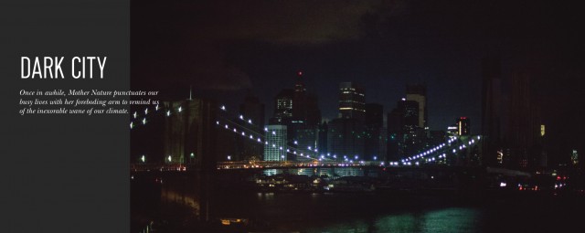
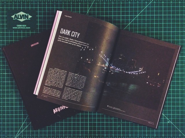
after a brief hiatus, singapore’s underscore magazine has relaunched with its ‘arrival’ issue. included amongst its pages are two essays of note; one by 65daysofstatic guitarist joe shrewsbury — a piece which in fact opens the magazine; the other i wrote to accompany some photographs i took of a post-hurricane sandy manhattan 2 years ago.
here’s an excerpt from the latter:
as i walked around captivated by the things i saw, i stopped occasionally to send messages to the internet using my phone. observations, sensations and imagery as i best i could translate into words, shivering slightly with excitement in this unkempt, eerily unfamiliar, home city of mine.
“brooklyn reaches out its sparkling arm of a bridge tonight, cars dripping down it. the inky towers of manhattan stare quietly back.”
“a family quietly opens a hydrant with all their tupperware waiting thirstily in the trunk of a car.”
“the occasional cab down a street reveals people on benches, talking together in the dark. shivering cigarette tips like fireflies.”
“expensive apartment blocks dead monoliths bathed in moonlight. candlelit windows flicker here and there, like everyone’s watching TV in sepia.”
and so on.
you can read the rest of the essay here, and you can see the original set of photographs i took here.
of course nothing compares to owning an original copy of underscore. the latest issues is hardbound with canvas and sports a handwritten cover. if you have the means, do grab yourself a copy.
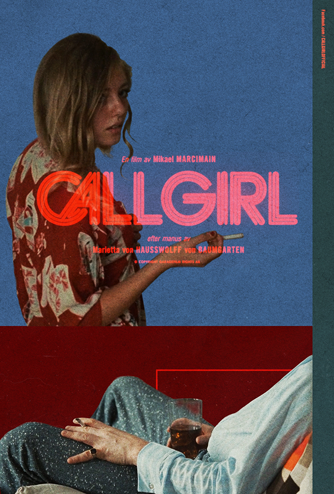
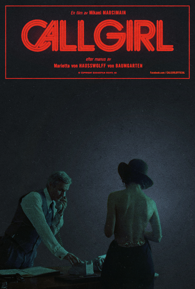
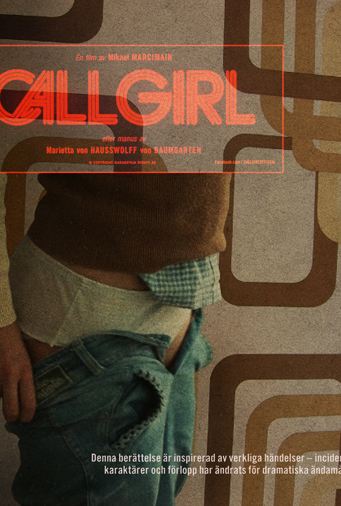
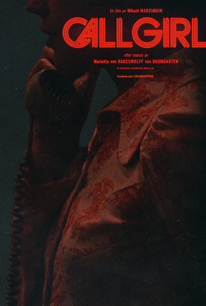
in the last days of 2013 whilst on a longish trip back to england, i sat down with my brother to watch a film called call girl. we didn’t know anything about it – in fact i’d picked it up because i liked the typography used for the film’s logo. it was close to midnight, we filled our whiskey glasses and slung the disc into the playstation. i said one word during the entire viewing. in fact i said that one word twice. the word was ‘fuck.’
call girl came out in 2012. it’s basically unheard of here in the US, and even harder to get a physical copy of. heck it was tough enough to find a pressing of the soundtrack that anyone would ship to england, let alone new york. whether this is to do with the controversy that surrounds the film, or simply because for some reason it failed to pickup a good distribution deal, is unclear.
call girl documents a political catastrophe in the 1970s that is still such a sore matter for those involved in sweden, that the film had to be heavily edited after it’s festival screenings in order for it to make the public domain. without going into the story, i’ll add that it’s one of the most beautifully written, shot, edited, scored, acted and packaged films i’ve seen in a long time. after watching it i immediately picked up a copy for a friend in england, and have since screened my copy for as many friends as i can in new york.
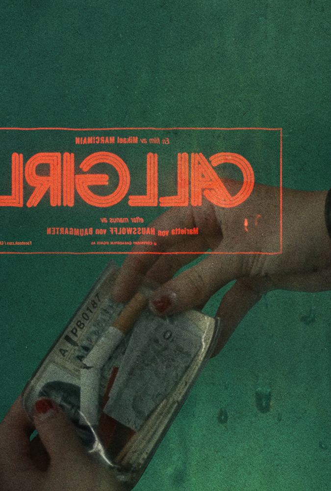
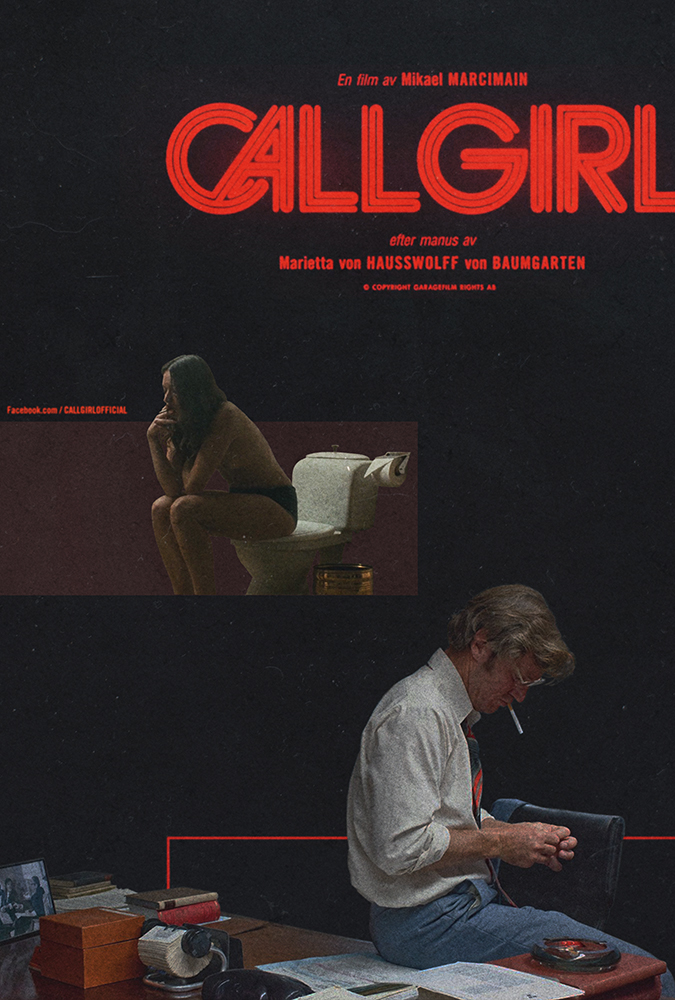
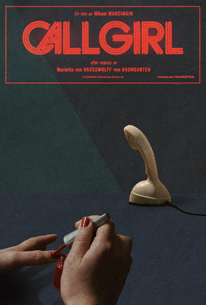
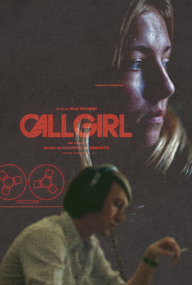
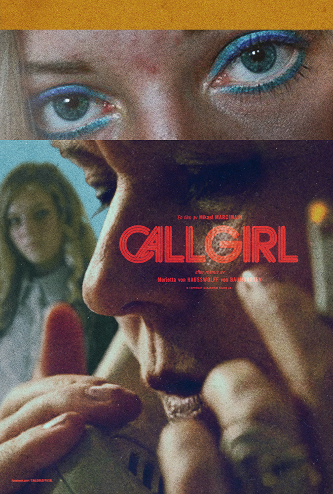
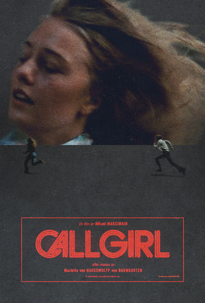
soon after returning from england i began to steal an hour here or there amongst my regular projects, to piece together notes, take screen snapshots and cut together various layouts. a day or so ago a much larger film related project landed – one that would truly require every second i had left in each day – and i had to save the files, export them and put this particular aside to rest.
there’s no real need to go into why the posters turned out the way they did, but they certainly follow my long-running ethos that the artwork supporting a film or record should in every capacity echo the tone, message and overall aesthetic value of that work. i hope you enjoy each of the 10 editions i’ve put together in different ways, and ultimately take the time to see the film (and buy the soundtrack) as soon as you can.
my gratitude to daniel carlsten who’s typographic work on the film drew me to it. my congratulations to mikael marcimain for such masterful directing, to hoyte van hoytema (let the right one in) for a level of cinematography the likes of which i wish every film could be blessed with, and lastly to mattias bärjed for an incendiary soundtrack. one i am still trying to get on vinyl.
the new york thrash metal band activator are releasing their debut album in two weeks. i’ve known the guitarist jared drace for some time now. his apartment is like a museum version of my formative years. packed full of vintage horror film posters, action figures, comic books, guitars and a vast alphabetized collection of records, i spent the first half hour i was there just staring at the walls. i shared my first boarding-school dormitory with an english metal guitarist who had a redwood washburnN-series N2, with humbucker pickups and a floyd-rose tremolo. this guy had me listening to extreme, van halen,?steve vai and joe satriani. my first record cover was a pencil crayon copy of satriani’s the extremist sleeve. i’ve never told jared this, but i didn’t really have to. suffice to say i lept at the chance of creating the sleeve for his band activator’s debut LP.
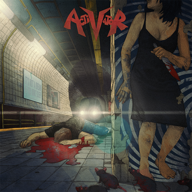
almost a year ago i was in london sitting in my brother’s apartment scratching a rat’s nest of unwashed hair on my head, staring at a crude biro drawing of the image you see above. just days before i’d downloaded a mastered version of the record and it was once again upon me to try and make an image that might get people more immediately into the headspace the band were in with these new songs.
the album is a fast-paced and brutal affair with lyrics that delve fiercely into the bleaker side of personal relationships. it opens with the sound of rats screeching as they run through city streets and as a new york resident myself i was immediately transported to a place i’d seen many a rat in my days – waiting for a train as we all have on those sweltering summer nights. closing my eyes and turning up the music, i then tried to think of a way to step over the still fresh vomit of ?’tough love’ clich?s i’d seen on record sleeves of this kind in the past. for one, the failed love stories on this album had such a battering of a soundtrack that i knew i had to find a way of turning the gun on the protagonist somehow. badly sketching out a train platform, i drew in the dead body of a guy, blood streaming from his corpse. next up was of course the question of who killed him and why. if you were to sympathize with the lyrics on this record you’d certainly at least joke that a girl must have killed him. you know, metaphorically speaking … and that’s when it hit me.
i scribbled in the rest of the drawing details, took a photo of the sketch and emailed it immediately to john delucca. if there’s anyone on this planet who can not only whip up an incredible pencil rendering of a scene but also style it to a level that fits my particular idiosyncrasies, it’s john.
3 days later i had a finished pencil drawing in my hands. not one change was necessary – he had nailed it. immediately i set to work on colouring it in, adding textures, type and any other specific little details that i felt would really bring the concept home. i was already smiling – listening to the music as the image slowly came to life, i knew we’d nailed it.
so what was the big idea? well, take a closer look at the image above and you’ll see that the girl hiding around the corner holding the bloody knife is merely coincidental. she’s in fact just a picture of a girl on a poster. she didn’t kill the guy. she’s not really there.
the truth in fact being that something else killed him and the question of what or why that could be is open to the listener’s imagination. one interpretation might be that it’s a more supernatural, as-yet-unseen danger stemming from the bands own obsession with horror films and comic books. another could be that the girl in the poster is?a simply a metaphorical commentary on all the album’s ‘this relationship is killing me’ lyrical content. either way the visual allegory is there and we hope it provokes more than just a passing interest in all activator have to offer. the fact is you won’t find classic thrash this rad with ease, so why not let yourself be seduced.
activator is out on september 17th and you can pre-order it digitally, on CD or on vinyl here.
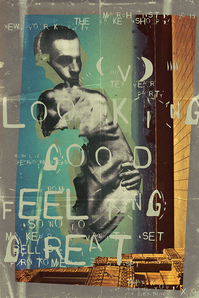
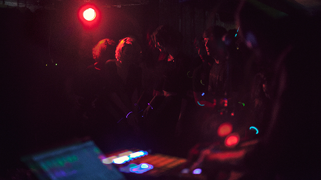
2013 marks the 10 year anniversary of the founding of our company, version industries. to celebrate the occasion we threw a party at the cake shop in manhattan, new york. it was a magical affair to say the least, with friends and collaborators flying in from europe and all over the US to be a part of it.
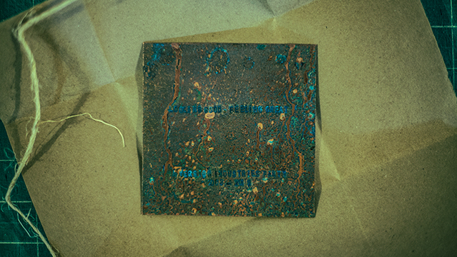
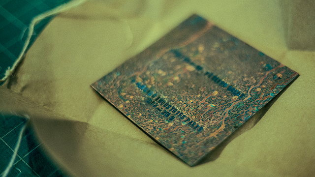
we created a poster and an engraved, acid-burned copper plate to commemorate the occasion. these we gave out to those in attendance. the plate itself of course inspired by the late joy division’s record sleeve for their song,?love will tear us apart.?each plate’s lettering was hammered in by giles and myself personally.?both the concept and the treatment just seemed apt somehow.
the following are some photographs from the night, which consisted of food, drinks, live music, dancing, glowsticks and all manner of other madness. none of which would of course be possible without incredible performances from?SONOIO, makeup and vanity set and BELLS?, and of course the?help of andy boder and all the other fantastic people working at the cake shop.
thank you a million times over to everyone who’s ever asked us to work for them in any capacity. we are only still here because of you and you’ve quite frankly given us a reason to live. not to mention a chance to see some of those ridiculous dreams we had as children realized.
the feeling you get watching panos cosmatos’ science-fiction film?beyond the black rainbow?is akin to what alex delarge must have felt when subjected to the ludovico technique in anthony burgess’ ferocious novel,?a clockwork orange. even if just to cleanse your palette you should subject yourself to its wiles at the nearest opportunity. it is of course not an easy watch. it will test your patience. however it will also leave an indelible mark on your brain. it’s coercive, narcotic audio-visual dictum will remind you that off the side and not so far away, there are those slaving away on the unforgiving, relentless and duty-bound task of making things that change the way you look at the world. things that take great pleasure in revisiting and cherishing the smallest details about the cultural carcasses we leave in our wake.
after seeing the film?here in new york, i found myself back in that familiar late night haze of coffee, loud music, sore back and twitching eyes, carving out the pieces you see above and below. whether you’re a fan of the results or not, we hope you are so moved at least to see the film and perhaps understand why we were so compelled to publicly display our affection for it.
in july of 2011 i was staying in los angeles with some friends, needing some time out from everything. the one thing i had on my plate during my stay out there in the breezy dry heat, was a pitch document for a job we’d been put forward for by some collaborators of ours.
the job was to revamp the carbon war room?website. the carbon war room is a non-profit organization set up by richard branson?for the facilitation and realization of investment in sustainable low-emissions industries and technologies. in other words, an enterprise setup to help investors and entrepreneurs realize the financial benefits of ?going green? on a vast scale in today?s market.
version industries’ MO from the outset has been to fight to work for clients that we believe have something worthwhile to say or offer the world. this job was consequently very attractive to us as we knew we’d be able to put a good deal of work into helping, even in some immeasurably?small capacity, to change the state of the world today.
the trick of course was that we were pitching against 6 other companies for the job, a good deal of whom already worked in the environmental sector or?were already working for the carbon war room in some capacity. furthermore we’d never done a website of this kind before. this is something that always lets us down initially with new clients, as if we actually have never done any website before. by which we mean that we try with every job to do something entirely different every time. so the odds were against us, plus i was sort of on holiday and back in the new york studio everyone had 100 other pressing issues to attend to.
i talked it through with giles over the phone and we came up with a plan. he produced the words to describe our approach to this, and i sat down and started drawing some pictures, so to speak. the understanding we had of how best to handle this project (and as it turned out, this would be our advantage over everyone else competing) was that we needed to make this site engaging (they were getting horrid bounce-rates), less business-like (the current site felt like it was for some london law-firm, with ‘small print’ everywhere) and more enjoyable on the various new computing platforms out there (i.e. let’s make it big, fun, easy to scroll and hit buttons with your fingers on an ipad). for a company trying to offer a fresh approach to tackling the world’s major environmental concerns, their problems seemed clear to us in terms of design.
the key element we were shooting for in our pitch was something that later became known as the engagement component. this was very simple a colorful, quick, javascript driven tool that determined what type of person you the user were. it would then direct you to the part of the site that was relevant to you, explaining what the site had to offer to you, in your own terms.
the other elements we were suggesting in our pitch were conveyed by a series of quick mock-ups of our vision for the site using large format photography, a very spacious design and bold use of typography.
we packaged the whole thing up and sent it off. i went back into the sun with a sense that overall we possibly could have done better, but not sure how. it was just that feeling you have when you’re in someone else’s house in another part of the world, and you don’t quite have the same focus as you do when you’re in your own studio.
a week or so later were informed we were in the next round and that we’d caught their attention. a few weeks later, after some further interviews we were told we’d been selected to do the job. it was the first of a few radical changes for our company around this time, and was deeply affecting our general outlook. after almost 10 years of being around we were now getting the work we felt we were always made for. this meant of course that in return we had to thank them for doing so. we had to thank them in the only way we knew how – by doing the best job we could.
it was a vast task, encompassing initially a large main website completely integrated with their already blooming business forums on linkedin, and a smaller subsidiary site for one of the their latest active operations,?renewable jet fuels. there were many meetings with a great deal of back and forth over the various approaches we should take. a lot of new ideas were developed in this time that went beyond our initial pitch. the filter we provided, as they were so fond of saying in meetings, was to give their content a rock ‘n’ roll feel. not to be taken literally of course, but it simply meant we needed to make this attractive to people like us as well as people like them. this included providing infographics throughout the site with a certain wide-eyed, humorous and na?ve aesthetic –
and making the home page of renewablejetfuels.org look a little like the interior of an airplane –
one of the final elements to fall into place was their ubiquitous sonar.?they wanted us to translate their company logo and how it represented a map of the carbon war room’s various facilities into an interactive site navigation tool. this is the kind of thing we rarely get to do, and is always a pleasure. it involved sitting around, arguing the difference between ‘what would be cool’ and ‘what would annoy the hell out of people’ and finding some middle ground therein. you can see the results of this if you click on the company logo when you first hit the site.
it’s not often you get paid to make a difference. often you just have to do that kind of thing for free. embrace it when you get the chance. we’d like to extend a huge amount of thanks to mark grundy, david schwartz, peter boyd and the rest of the carbon war room team who made this project such a great pleasure to work on. there is of course more work yet to do, but right now seemed like an appropriate time to raise a glass to the experience.
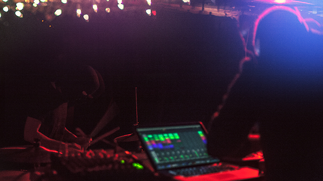
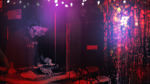
a couple months back alessandro cortini pushed the button on the sequel to his experimental synth project sonoio. he’d finished a rough version of the album and was keen to get some ideas for the artwork rolling. the first record’s aesthetic had been based around the colour blue, and we’d known for a while that this record was likely to be coloured, and called, red. in fact there was already a version of the album cover from the original design sessions that had been cast in red and he’d been using for his demo mp3s. however once we’d heard the record and fallen under its spell (it is even better than the original), we knew a new cover was needed. something that felt more involved, continued the abstract character based narrative of the first cover and took it into a new realm of introspection, if you will.
we’d also already developed the blue cover in a number of directions for the remix album that came soon after it, and so realized there was space there to keep telling the story in a fashion we felt true to the new material. it took a while to stumble across something that still felt immediately connected to the first cover, whilst offering a fresh angle on things. the resulting piece is of course deliberately open to interpretation, but features our white and black characters again, now in different circumstances and states of repair. we also started to pad out the design with more intricate textures and new colours, as the new album felt like a development and growth musically in such a way that the artwork had to follow suit.
then there’s this music video for enough, as seen at the top of this post.
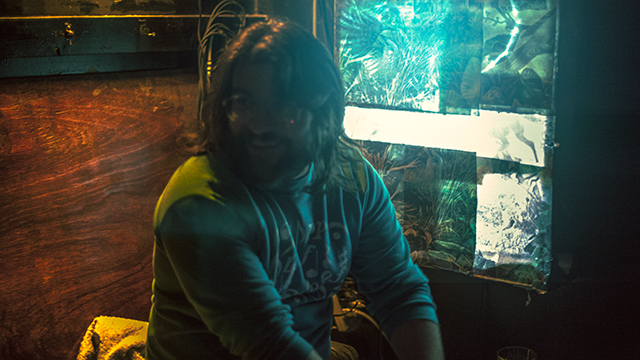
for a long time my close friend and collaborator, the director / photographer?matt sundin, and i have been talking about making videos, and eventually films, together. in fact it was this desire that made the 65daysofstaticwe were exploding anyway album cover turn out the way it did. so the moment alessandro proposed a video, i gave him a call and said ‘this is our chance’.
alessandro was considering making 2-3 of the new songs into videos and wanted our ideas for each. ultimately he felt that the ‘live performance’ pitch that we included was the one that felt truest to where he was with this project right now. so matt called his crew together and asked that i start to write down a list of ideas for shots for the video. so i took an evening, put the song on repeat and worked on shot ideas that i felt would embellish the music visually and give the production a quality that had some level of character. you know, above and beyond what you usually get with these things.
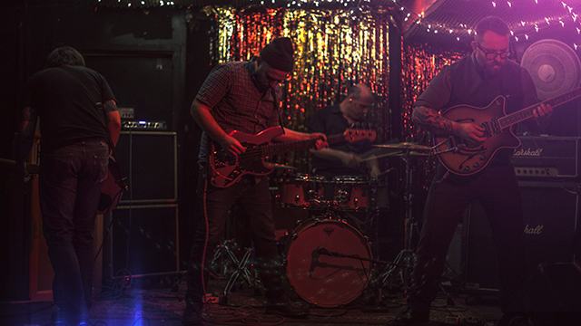
we then booked a studio in green point, brooklyn and alessandro flew out from LA. the next day we hit the ground running.
matt and his gaffer / assistant craig ward had pulled together some fantastic elements, including a wild array of lighting options and a carpenter to build a small but unusually surfaced stage for alessandro to perform on. we then painted everything else in the room black and setup our dolly / tracking rig. so far everything was going well, heck there were even 2 cats wandering around the studio which proved more than enough to keep alessandro entertained between takes.
the only sad moment was when the two vintage television sets that alessandro had used for his live performances in LA arrived via post all cracked and broken inside their box. we tried our best to make them work, but it wasn’t happening.
pushing on we proceeded to do take after take of alessandro performing the song from every angle we could, taking care to include shots with him not on the stage too for some fun and games later in the editing room. it was a pretty intense process but the footage was clearly looking solid from the outset. plus the more the song got played over the studio speakers the more everyone involved started to dance a bit too, and dancing never hurt anyone.
the shoot ended pretty late into the night and the studio owner offered to keep our stage setup for some cabaret / performance art style shoot he had going on later, involving strippers and wild animals. i could have mis-remembered that though. we then headed back to matt’s apartment for the wrap-party and alessandro headed back to LA the next day.
a week or two later the intense process of editing began. matt went through the footage and started pulling together the best stuff from the vast array of material we had. soon after that he was putting together a great rough cut of things and sent this to me so that i could cut together the teaser clip that went live a couple weeks ago. he then did another cut and passed it over to me again. we agreed that what there was already felt good and exciting, but tended to get a little tiring after a while, as it all had a very similar tone. so we consciously divided the song up into 4-5 parts and attempted to address each section with a different mindset, in terms of editing. i was then left to re-imagine the intro to the video and the electronic breakdown after the verses and choruses – the part with all the ‘oh oh ohs’. sending this back to matt lead us to more talks, further edits and the delivery of the first rough cut to alessandro.
alessandro was very excited by what we gave him and made a series of notes regarding various tonal changes he was after and what he felt, due to the nature of where his head was at with the song, needed adjusting in terms of shots used for certain lyrics. in this way several cuts were sent back and forth between new york and los angeles and then just last sunday we got a thumbs up from alessandro. matt then sat down and worked his magic on the footage, grading it to give it the warm, grainy, contrasty feel you see in the final cut. it was that final lick of varnish that properly started to give us the shivers. the thing was done, we were flat out of time and there was nothing we could do but send it off.
none of us could be happier with the response to the video. you just never know if you’re going insane in that editing suite. many days in the dark with breaks at strange hours for food or beer, and then back into the darkness. hearing the song a thousand times over to the point where it’s just noises and everything in your head is tied to its ebb and flow. it gets a bit bewildering. so much so that at one point we did an edit of the video laced with eerie footage of cats that we’d shot at matt’s girlfriend’s apartment nearby. inspired as we were by the cats that had been on set throughout the shoot, and often leapt onto the stage right into the shot. of course the ‘cat cut’ really didn’t work but we felt we had to try everything just to be sure, haha. ?so yeah, thanks and thanks again.
the sonoio project is going from strength to strength at this point and we’re very fortunate and grateful to be a part of it.
the new york real estate blog curbed just named our charles street townhouse site, “the gold standard by which all future websites will be judged.” you can read the full review here.