the carbon war room_041612
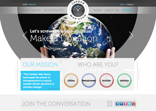
in july of 2011 i was staying in los angeles with some friends, needing some time out from everything. the one thing i had on my plate during my stay out there in the breezy dry heat, was a pitch document for a job we’d been put forward for by some collaborators of ours.
the job was to revamp the carbon war room?website. the carbon war room is a non-profit organization set up by richard branson?for the facilitation and realization of investment in sustainable low-emissions industries and technologies. in other words, an enterprise setup to help investors and entrepreneurs realize the financial benefits of ?going green? on a vast scale in today?s market.
version industries’ MO from the outset has been to fight to work for clients that we believe have something worthwhile to say or offer the world. this job was consequently very attractive to us as we knew we’d be able to put a good deal of work into helping, even in some immeasurably?small capacity, to change the state of the world today.
the trick of course was that we were pitching against 6 other companies for the job, a good deal of whom already worked in the environmental sector or?were already working for the carbon war room in some capacity. furthermore we’d never done a website of this kind before. this is something that always lets us down initially with new clients, as if we actually have never done any website before. by which we mean that we try with every job to do something entirely different every time. so the odds were against us, plus i was sort of on holiday and back in the new york studio everyone had 100 other pressing issues to attend to.
i talked it through with giles over the phone and we came up with a plan. he produced the words to describe our approach to this, and i sat down and started drawing some pictures, so to speak. the understanding we had of how best to handle this project (and as it turned out, this would be our advantage over everyone else competing) was that we needed to make this site engaging (they were getting horrid bounce-rates), less business-like (the current site felt like it was for some london law-firm, with ‘small print’ everywhere) and more enjoyable on the various new computing platforms out there (i.e. let’s make it big, fun, easy to scroll and hit buttons with your fingers on an ipad). for a company trying to offer a fresh approach to tackling the world’s major environmental concerns, their problems seemed clear to us in terms of design.
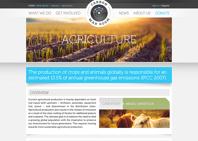
the key element we were shooting for in our pitch was something that later became known as the engagement component. this was very simple a colorful, quick, javascript driven tool that determined what type of person you the user were. it would then direct you to the part of the site that was relevant to you, explaining what the site had to offer to you, in your own terms.
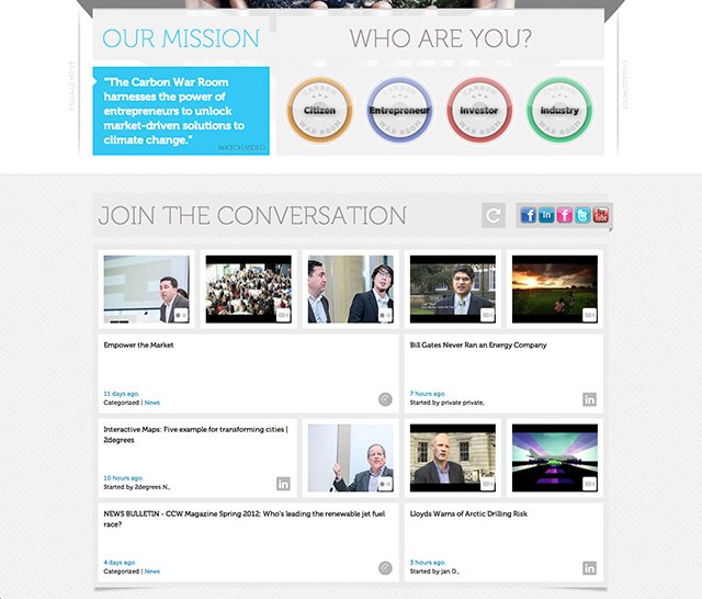
the other elements we were suggesting in our pitch were conveyed by a series of quick mock-ups of our vision for the site using large format photography, a very spacious design and bold use of typography.
we packaged the whole thing up and sent it off. i went back into the sun with a sense that overall we possibly could have done better, but not sure how. it was just that feeling you have when you’re in someone else’s house in another part of the world, and you don’t quite have the same focus as you do when you’re in your own studio.
a week or so later were informed we were in the next round and that we’d caught their attention. a few weeks later, after some further interviews we were told we’d been selected to do the job. it was the first of a few radical changes for our company around this time, and was deeply affecting our general outlook. after almost 10 years of being around we were now getting the work we felt we were always made for. this meant of course that in return we had to thank them for doing so. we had to thank them in the only way we knew how – by doing the best job we could.
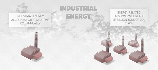
it was a vast task, encompassing initially a large main website completely integrated with their already blooming business forums on linkedin, and a smaller subsidiary site for one of the their latest active operations,?renewable jet fuels. there were many meetings with a great deal of back and forth over the various approaches we should take. a lot of new ideas were developed in this time that went beyond our initial pitch. the filter we provided, as they were so fond of saying in meetings, was to give their content a rock ‘n’ roll feel. not to be taken literally of course, but it simply meant we needed to make this attractive to people like us as well as people like them. this included providing infographics throughout the site with a certain wide-eyed, humorous and na?ve aesthetic –
and making the home page of renewablejetfuels.org look a little like the interior of an airplane –

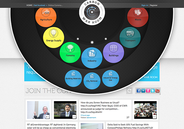
one of the final elements to fall into place was their ubiquitous sonar.?they wanted us to translate their company logo and how it represented a map of the carbon war room’s various facilities into an interactive site navigation tool. this is the kind of thing we rarely get to do, and is always a pleasure. it involved sitting around, arguing the difference between ‘what would be cool’ and ‘what would annoy the hell out of people’ and finding some middle ground therein. you can see the results of this if you click on the company logo when you first hit the site.
it’s not often you get paid to make a difference. often you just have to do that kind of thing for free. embrace it when you get the chance. we’d like to extend a huge amount of thanks to mark grundy, david schwartz, peter boyd and the rest of the carbon war room team who made this project such a great pleasure to work on. there is of course more work yet to do, but right now seemed like an appropriate time to raise a glass to the experience.
cheers,