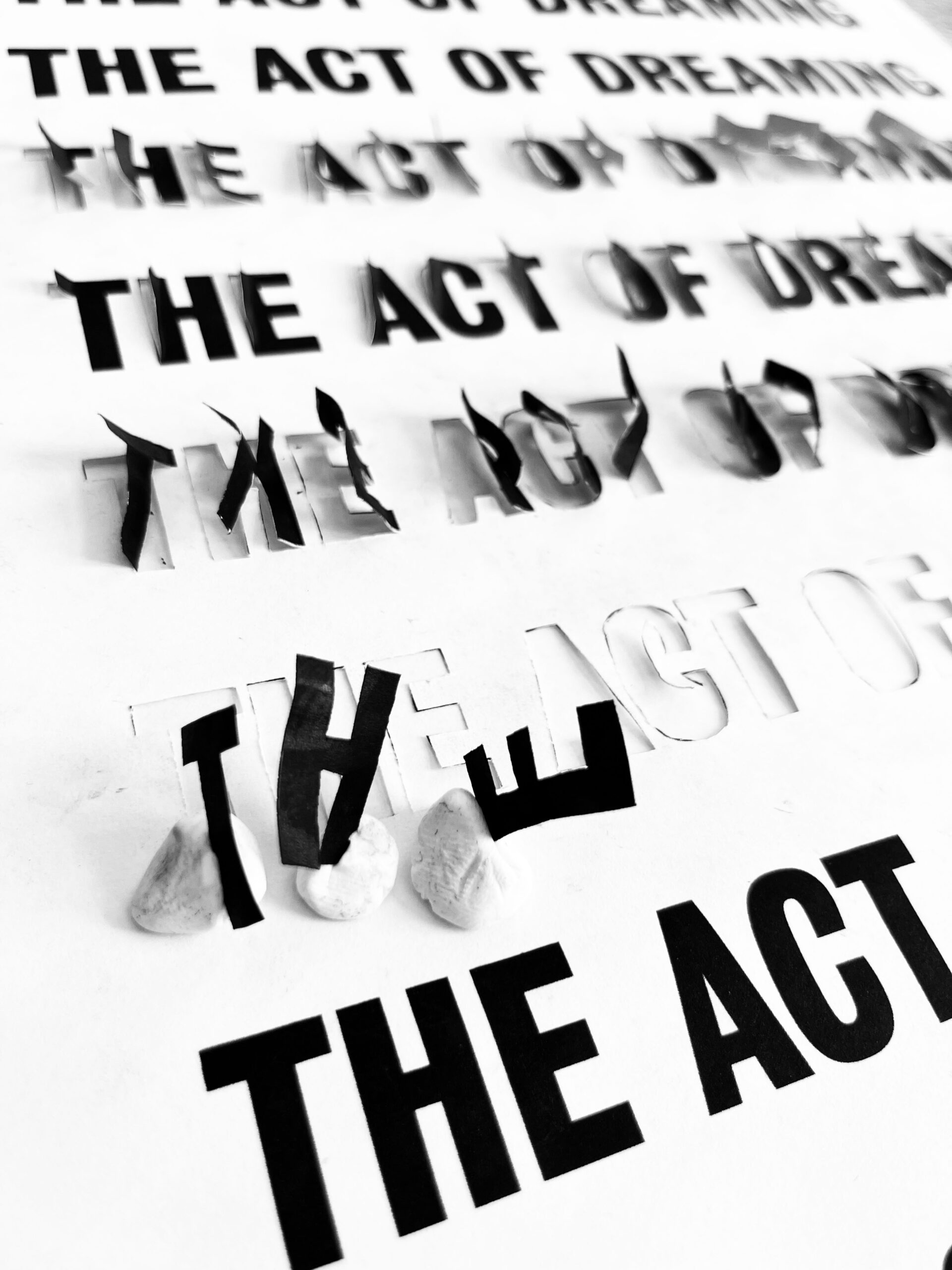
the act of dreaming, making of_112025
_category
blog, grafiks_tags
caspar newbolt, colllage, design, documentary, film, graphic design, john maggio, neha shastry, poster, print, print design, the act of dreaming, type, typography
comments (0)
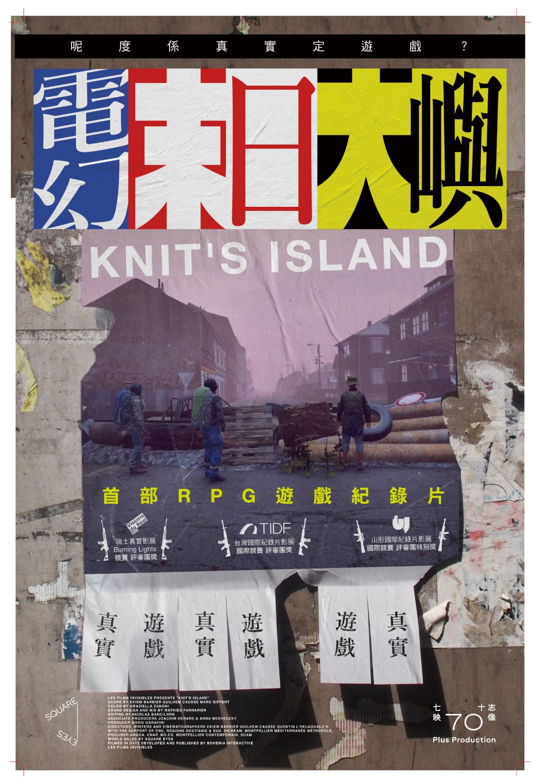
this beautiful poster by lau yan hin was made for the hong kong release of knit’s island (renamed electric doomsday in cantonese). knit’s island is an excellent french documentary that we also made a poster for back in 2023. i am posting lau’s poster here for posterity’s sake, because it is both an homage to our original work and i believe an improvement upon our work.
the idea behind our original poster was to make real “missing cat” flyers for knit’s island and plaster them around the city of berlin. our intention was not just to promote the film, but also to return later to photograph each flyer after people had ripped-off and kept the contact details from the bottom of it.
the reasoning for this is as follows: this film was made during the COVID lockdown. it’s effectively a series of interviews conducted by three french filmmakers with individuals and groups of human beings all over the world, as they play an expansive, online, multiplayer game called dayZ. the catch is that these people were interviewed from inside the game. the filmmakers themselves—also playing the game and using screen capture software to record their work—are seen chasing after players, often during deadly combat scenarios, in an attempt to draw them into a conversation. for the duration of the film we see only the in-game graphics, as each human—wearing an avatar of their own creation—describes how they’re spending more time playing the game than in reality, thanks in no small way to the pandemic. you can hear mini-fridges being opened, beers being drunk and babies crying in the background of their audio feeds. some of those interviewed had even gone as far as starting their own religions, repurposing in-game churches and all. suffice to say watching the film offers an uneasy, surreal and in some sense enlightening experience, wherein we the audience certainly begin to question the nature of our own reality.
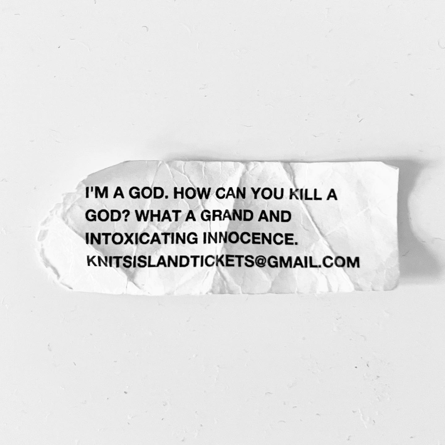
this is where the “missing cat” flyers come in. since our poster had to exist in reality and not in the game, we knew we had to flip the film’s entire concept around, and pretend that people from the game—our french filmmakers—had come out of the game in order to post a flyer in real life. furthermore this flyer had to show a picture of the filmmakers as they looked in the game, and it had to ask people in “reality” where knit’s island was. knit’s island being not just the name of the film, but a mysterious location whose name the filmmaker’s made up to capture the new reality the film provokes in our minds when viewing.
incredibly our idea worked. various people ripped off and took the contact details home. we then took photographs of those “used” flyers and made them into a series of posters. the best of which you can see below.
all that said, there are always posters we’ve done that i start to feel over time could have been better, and actually long to go back and change one day. this is certainly one of those posters, not because of the concept or the photography, but more because i feel the title treatment and layout was never quite what i wanted it to be.
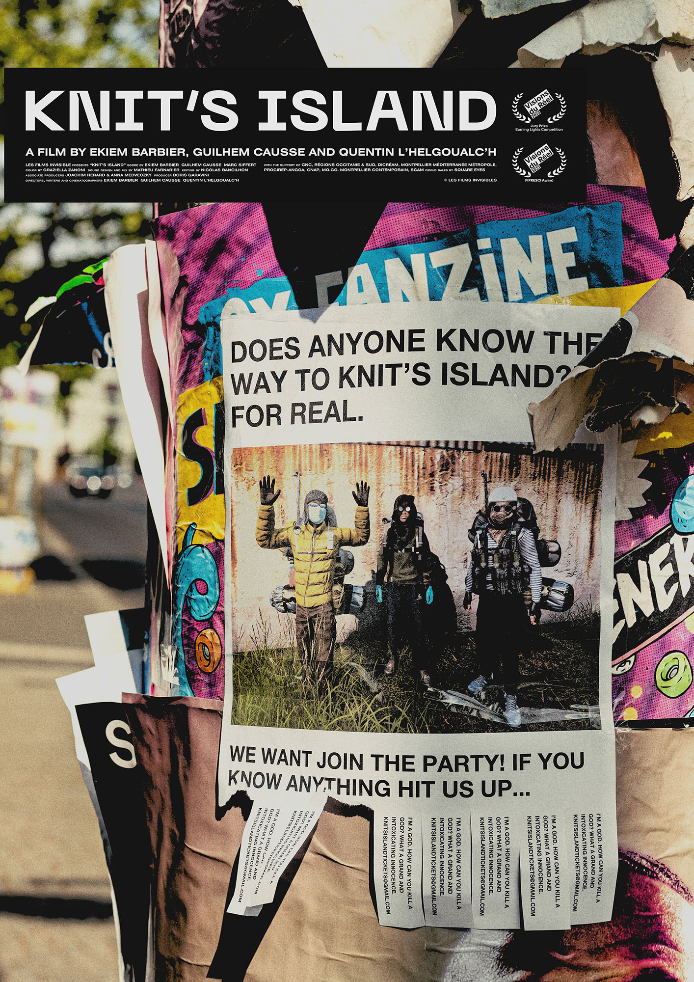
either way knit’s island is a particularly unusual and fantastic film and it was truly an honour to make a poster for it. i hope the folks in hong kong enjoyed watching the film also, and i want to extent a huge thank again you to lau yan hin for delivering such an inspiring response to our original work.
caspar
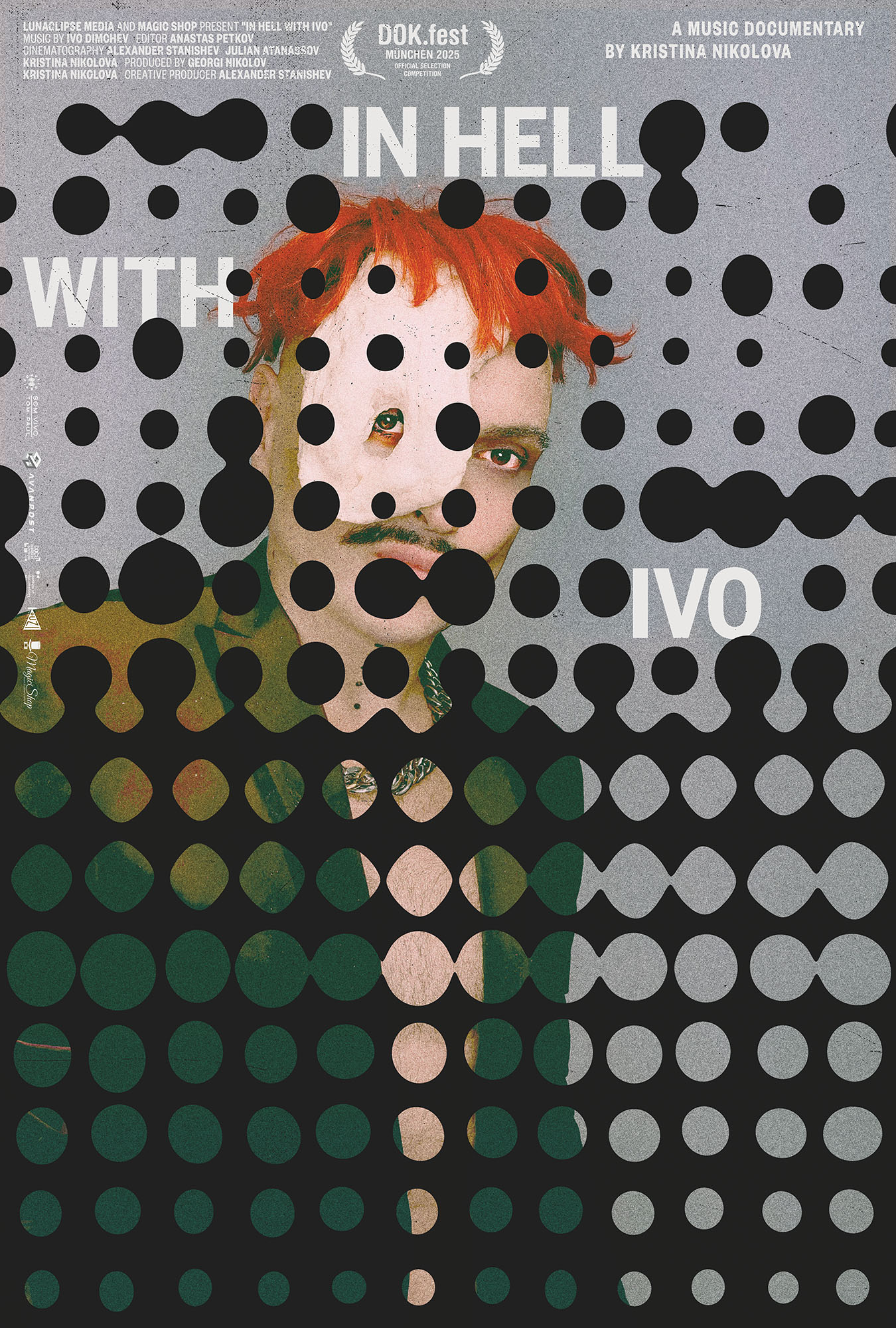
our poster for kristina nikolova’s music documentary, in hell with ivo, was selected as MUBI’s movie poster of the day today. a massive thank you once again to adrian curry for his continued interest in and support of our work.
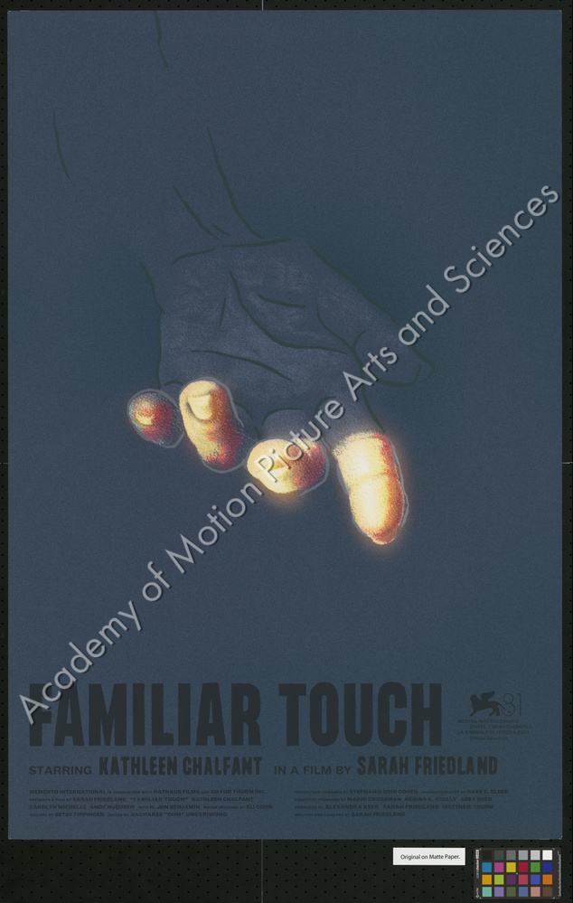
our poster for sarah friedland’s award winning debut feature film, familiar touch, has been acquired by the margaret herrick library of the academy of motion picture arts and sciences. two copies of the poster now exist in their collection in los angeles, california. you can view their digital record of the acquisition here.
this is the second of our posters that has been acquired by the academy. we’re incredibly grateful to gordon spates and everyone else at the margaret herrick library for their interest in and support of our work.
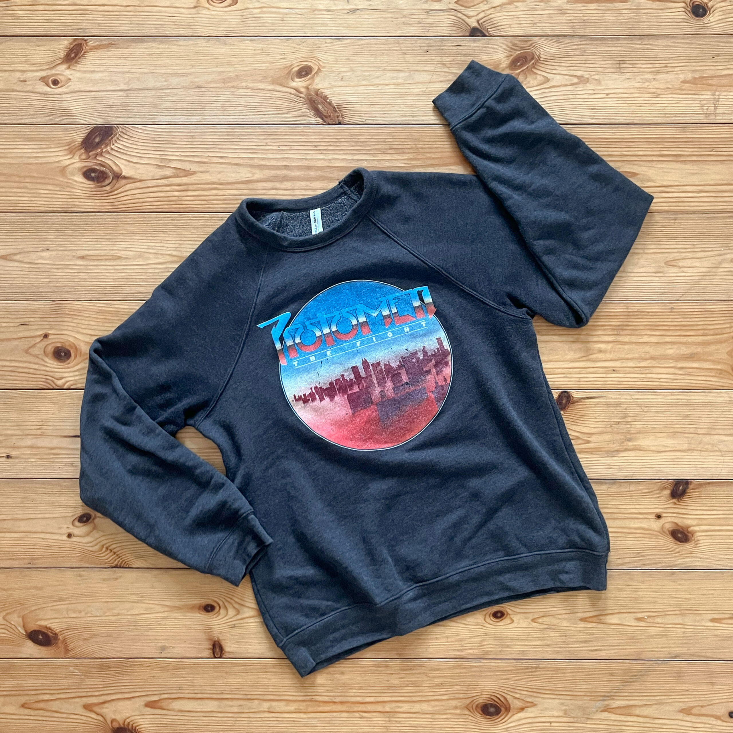
anyone who has been to a protomen show will know that the line for the band’s merch booth is often as long as the line for the show itself. over the years we’ve enjoyed experimenting with different ways to convert the band’s complex record sleeve artwork into a set of simpler graphic treatments more suited for clothing.
every so often we put our human heads together with their robot heads and make something particularly great. case in point: the original, 2009, charcoal, “act II: the father of death” t-shirt—whilst almost in absolute pieces—caspar still wears. other shirts of note include the original “keep quiet” and “breaking out” shirts.
the new “the fight” sweatshirt you see above, however, is our favourite piece of protomen merch to date. the image on the shirt being in part the work of the undeniable john delucca. we picked one up at the protomen’s 20th anniversary show in nashville back in april, and even the folks here in berlin keep asking how to get one. the clincher being that aside from the graphics on the front, it’s remarkably soft and comfortable. the band found a sweatshirt fabric for this one that kinda defies belief.
to that end we wanted to post a photograph of it here to raise further awareness of its tacit excellence. should you want to get one at any point, you can do so here.
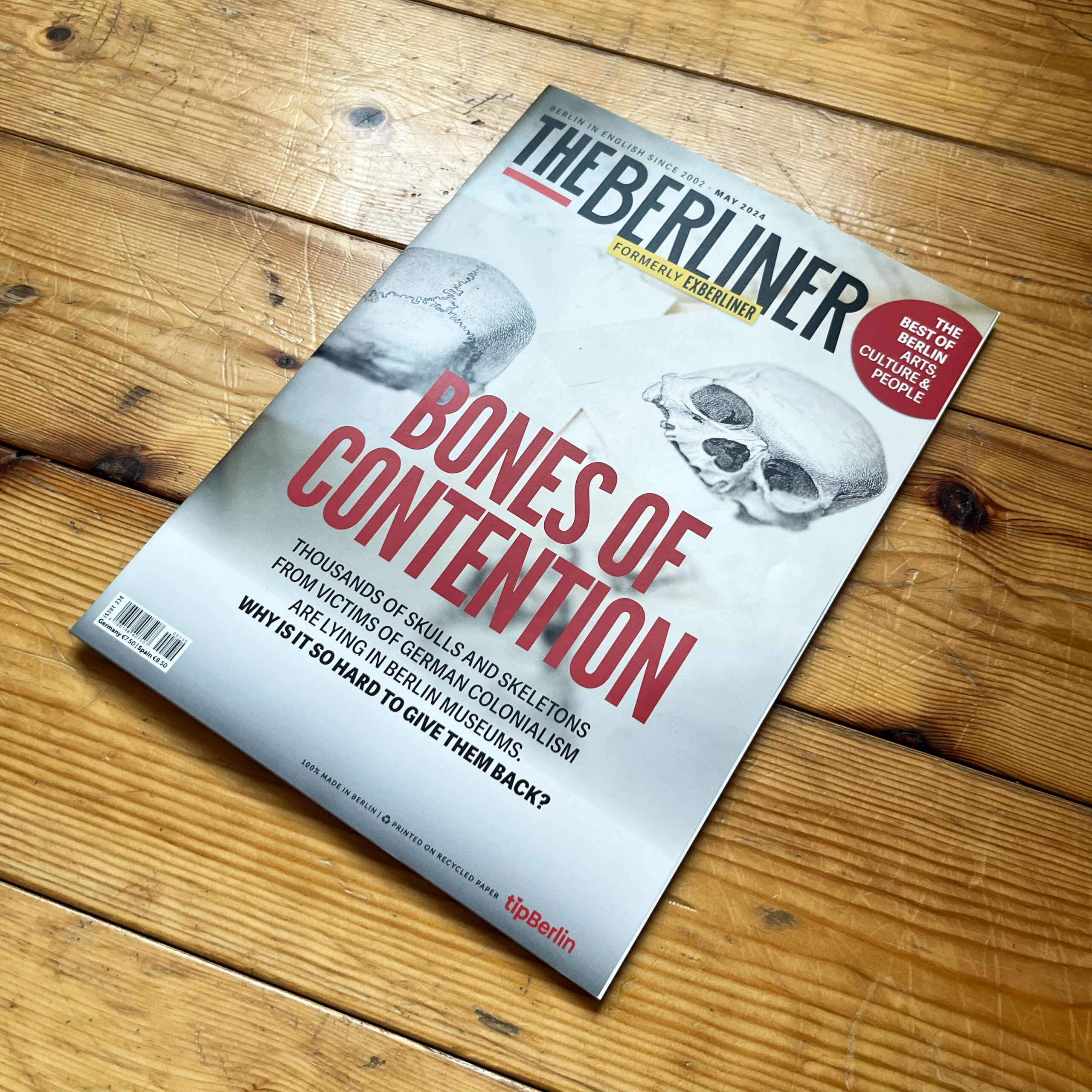
caspar was recently interviewed by florence scott-anderton, the film editor of the berliner magazine. the interview can be found in the latest issue of the magazine, which will be on newsstands in berlin for the next month.
here are a few excerpts from the interview:
Tell us a bit about yourself; what’s your relationship to cinema?
I was born in London to two English artists, and grew up in a household where making beautiful things was the most important thing. I always wanted to make films, largely because my father took them so seriously. However, we had very little money, so while I was always writing film scripts, my only real outlet for making images of any kind was with computers handed down to me by friends or family. The moment I could get one of those computers on the internet, I did. It was then I discovered I had a knack for website design and decided to start a company.
How does Version Industries fit in the film landscape?
I co-founded the graphic design company Version Industries in 2003 in London. I moved to New York City in 2005 and opened a studio there. Whilst most of the paid work came from real estate brokers and the like, I was always offering our services to filmmakers and musicians whenever I could. Ten years or so later, we were making film posters and film title sequences for filmmakers such as Chloe Zhao, Tim Sutton, Jane Schoenbrun, Trey Edward Shults, Jonas Carpignano, Adam Pendleton, Cathy Yan and so on. In 2017 we also won a pitch to re-design Filmmaker Magazine. I then continued to co-design every issue from cover to cover until 2021. During this time, certain filmmakers realized it was to their advantage to have me on set as a photographer, and it was there that I learned how to make films properly myself. In 2016, after co-directing several music videos and short films with a friend, I finally wrote and directed my own short film. The 25-minute, black-and-white short, Leaving Hope, was shot by Shabier Kirchner (Small Axe, Past Lives) and produced by Rathaus Films. It came out in 2019. That same year I moved back to Europe.
What made you choose to relocate to Berlin?
I had been staying with friends here since 2016, and in doing so it became clear that Berlin is still affordable enough that a significant proportion of the artistic community can and do still live here. I realized that if I was going to stay in New York I’d have to work on more commercial projects or find a different job in order to be able to afford my rent, and that was out of the question.
What do you find unique about Berlin when it comes to cinema?
Thanks to festivals like the Berlinale and Unknown Pleasures and the city’s central position in Europe, Berlin remains an important hub for art filmmakers. Combine this with the German government’s interest in funding film projects — a concept that doesn’t exist where I come from — it makes for a fertile cinematic landscape.
Congratulations on being recently included in the big film poster retrospective exhibition here in Berlin. Looking at the archive, would you say that Berlin has a specific influence on the art of film poster design?
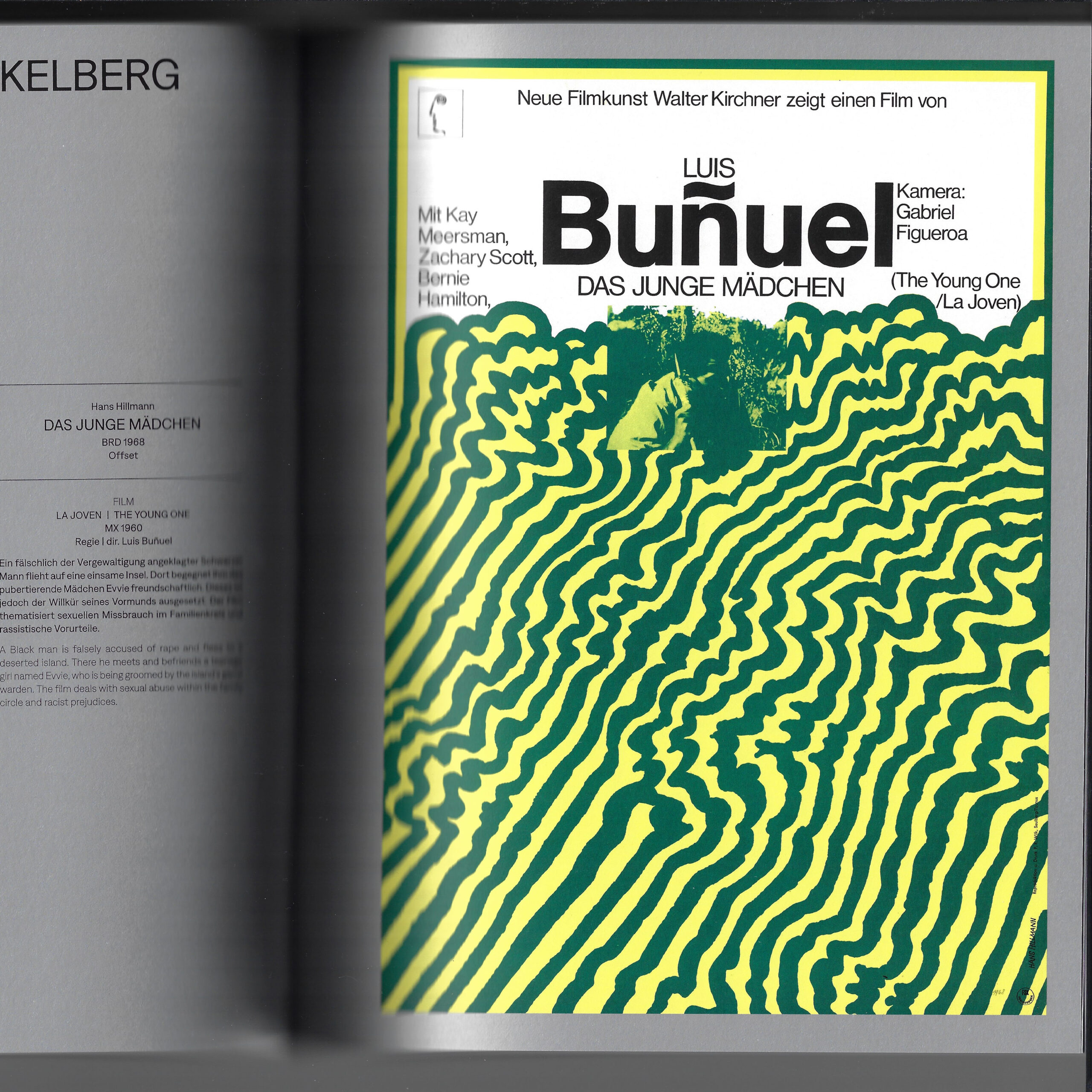
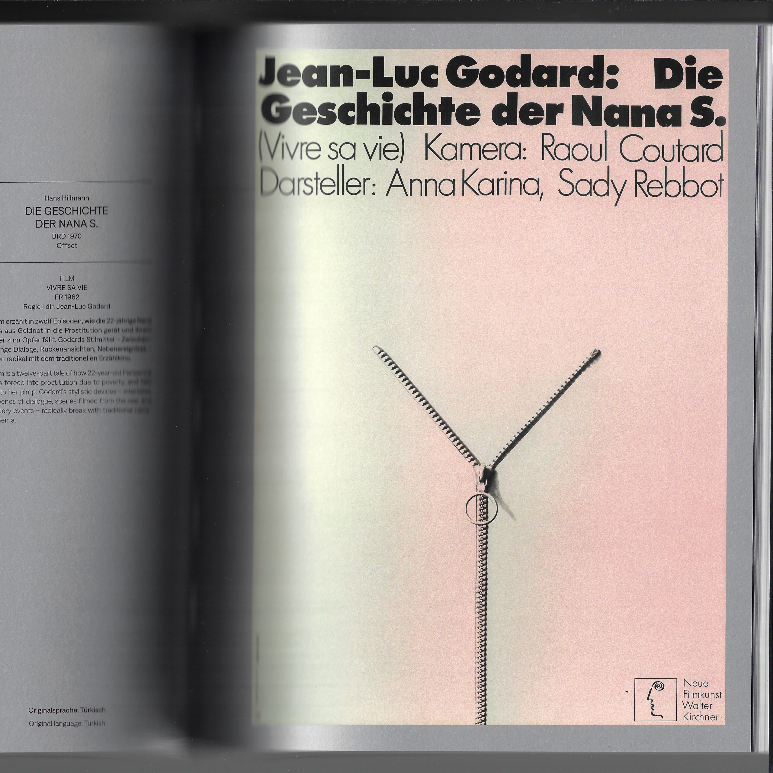
Thank you. My involvement notwithstanding, there really hasn’t been an exhibition of film posters of that stature before, and to that extent Berlin will, I’m sure, be seen as having a great influence on the making of film posters. I don’t think the city itself has had a particularly great influence on how film posters look aesthetically, but Germany as a country certainly has. Beyond the striking graphic qualities of German art movements such as Die Brücke and Der Blaue Reiter or the work coming out of the Bauhaus, the film poster-maker Hans Hillmann is arguably the greatest there has been to date. I look at his work regularly, and I say that as someone who rarely looks at film posters during their working process.
a huge thank you to florence for pitching the interview and for the questions. thank you also to the magazine itself for including caspar and our work in it. we’re very happy to have been included within the pages of such a berlin journalistic institution.
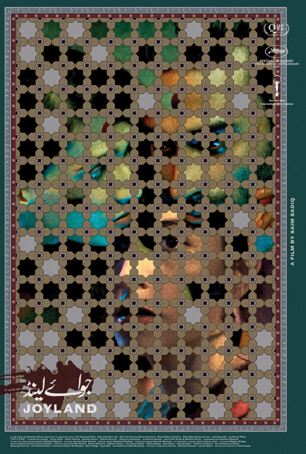
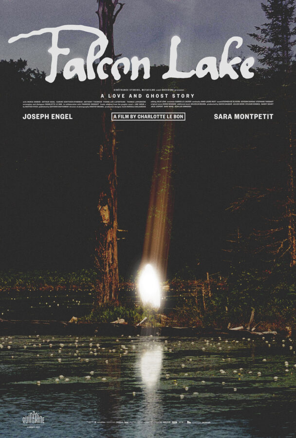
posteritati and the film stage have kindly included our joyland and falcon lake posters in their best movie posters of 2023 lists. the film stage went as far as to consider our poster for saim sadiq’s joyland their number 1 poster of the year.
here’s what jared mobarek at the film stage had to say about the joyland poster:
There’s so much to talk about with (version_industries) and Caspar Newbolt’s Joyland. The ornately hand-drawn floor tiles (their website always generously explains their process) doubling as a window upon the main characters. The whole’s off-center nature pushing everything into the top-left corner to provide room for text on the outside without sterilizing the composition via more symmetry. The way the three actors feel as though they exist in one scene despite a handful of lotus flowers overlapping their images to prove each has been meticulously layered atop the others. The grain, subdued colors, and blood-smeared title. It’s truly a work of art all its own and a testament to the field’s ability to sell itself as much as the product being sold.
a huge thank you to both institutions for their continued support of our work.
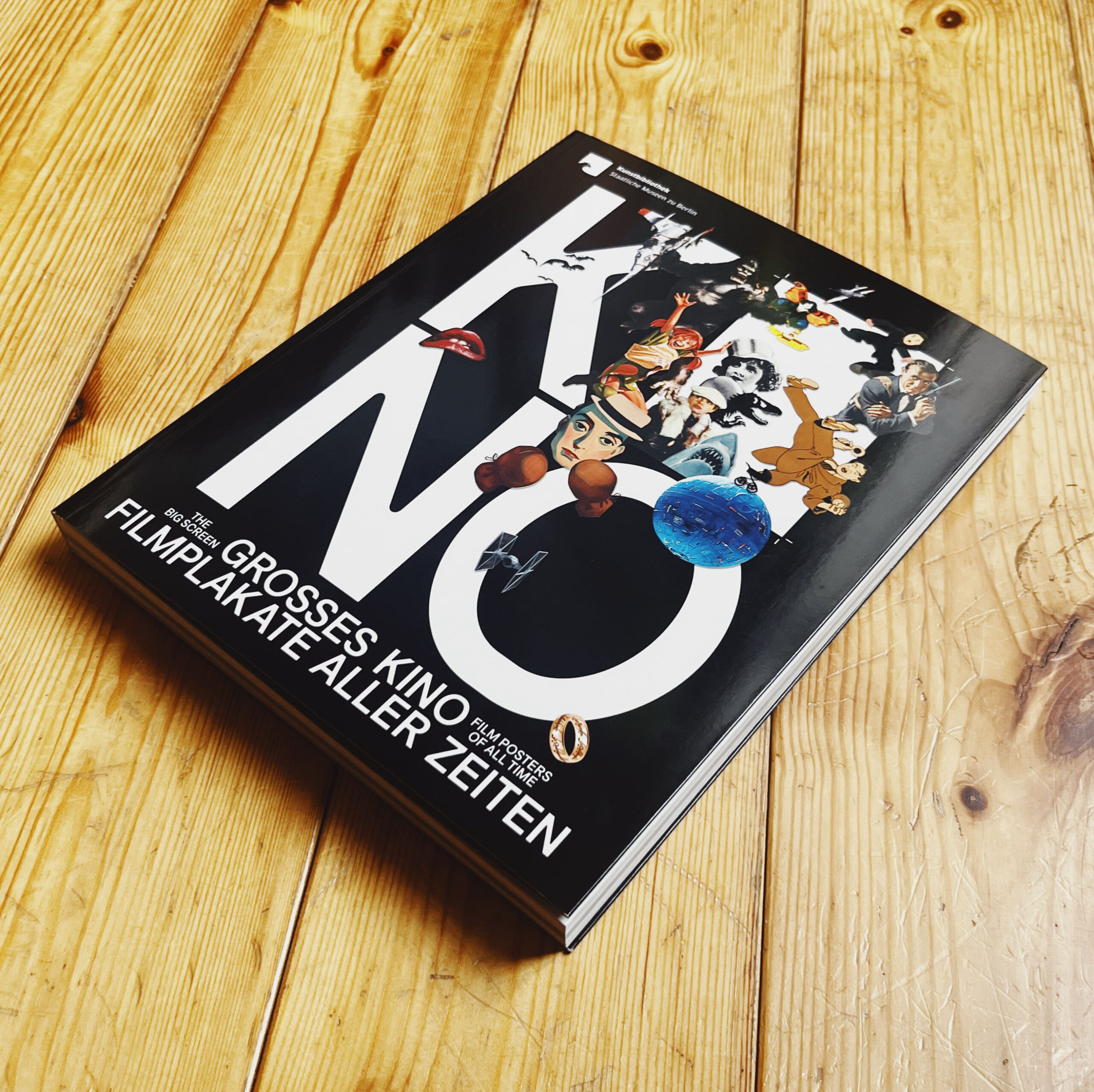
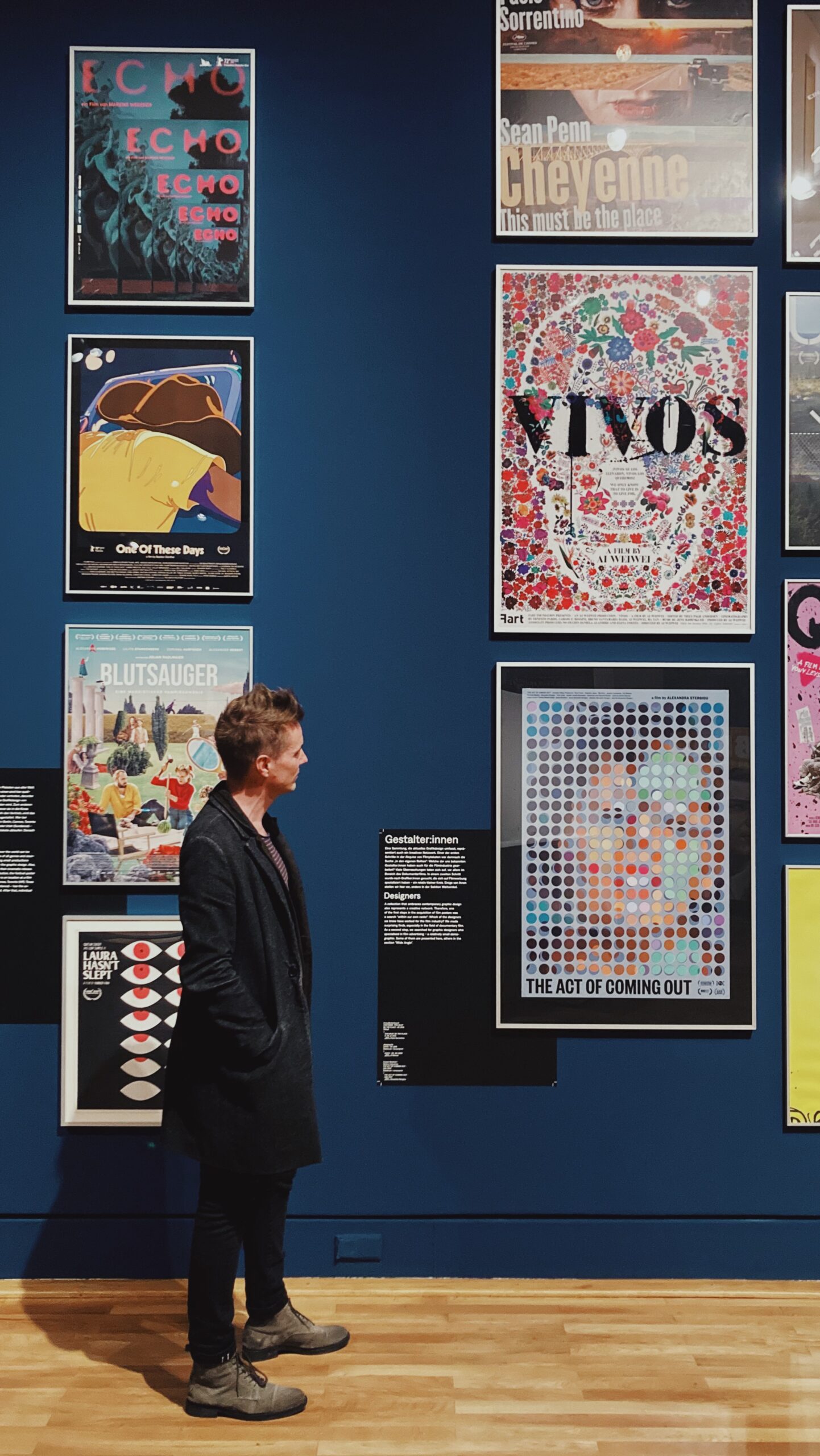
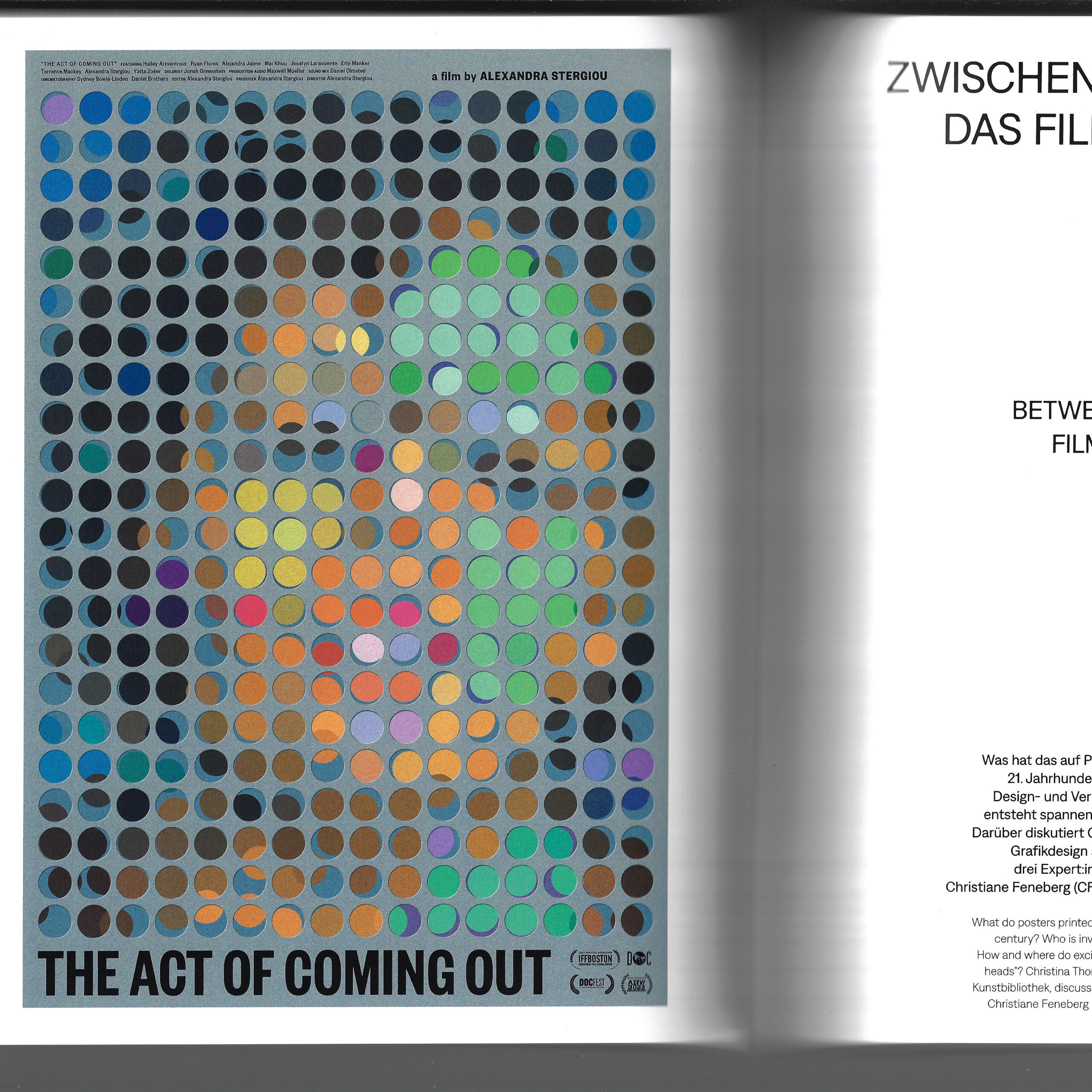
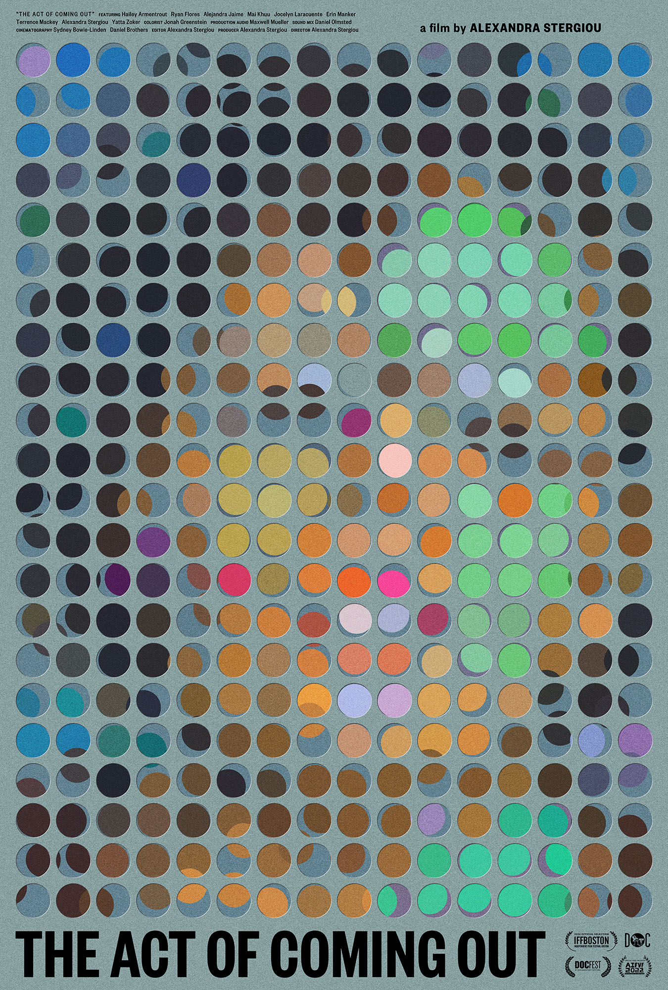
the staatliche museen zu berlin (state museum in berlin) wrote and printed a 280 page catalog for their großes kino exhibition. the catalog was beautifully designed by sandstein verlag and it details every aspect of the exhibition. included within its pages is a full page colour reproduction of the poster we made for alexandra stergiou’s short film the act of coming out, and an interview with german graphic designer christiane feneberg, MUBI germany’s director of distribution lysann windisch, and caspar.
the interview, titled “between paper and pixel: film posters today”, was conducted live on zoom by christina thompson, and then later edited for clarity. here are a few excerpts:
CT: In your professions – as designers and distributor – you are dealing with advertising and communicating films on a daily basis. In this, the film poster is only one aspect of many. How important would you say it is in what you do?
CF: The word “poster” is perhaps a little restrictive. 50 years ago, the printed poster may have been the main piece of publicity for a film, but nowadays, the scope is much broader. Contemporary designers create artwork that gets used for many different purposes, from mega prints to small website banners. So what we do is more like a corporate design for the movie than just a poster. Today, everyone is used to getting information visually – images are what attracts us, what makes us stop and think. That means: designers have the most powerful tools to communicate films. I mainly work with distributors in Germany, both creating fresh artwork and adapting existing designs. Hence, I look at the topic more from the marketing side, less from the art side.
LW: At MUBI, we also never talk about the “poster” but about the “key artwork” for a film. The key art is a central element of a campaign: it defines the look by being customised to each communication channel, whether this is a small digital banner or a large scale out of home promotion. As to the ratio, I’d say at least 50% of our communication output is centred around the film’s artwork. The rest of the campaign is built on moving images such as the trailer.
CN: I agree, but things look different from my perspective. I spend much of my time making physical posters for films. Generally, I am approached by film directors who have a powerful emotional attachment to their work. They are less interested in website advertising or such like. What they want is something beautiful to go on their wall, a poetic image that emotionally captures the piece of cinema they have spent years of their life making. For them, the film poster is like an album cover – you know, in the music industry album covers rarely ever change. I will make a film poster for them, but only the poster, as most of the best images cannot just be reformatted to fit any shaped hole.
CT: So the perfect film poster for you is one that remains unaltered?
CN: In a way, yes. The film poster, in its traditional format, has a great power. It is faster than a trailer, faster than reading a review. It captures the film in a glance, and it grabs your attention, whether someone is scrolling on their phone or walking down the street. If you make this glimpse unique and interesting enough, they’ll stop and wonder: why does it look like that? – and perhaps consider seeing the film.
CT: So is the film poster indeed one of the most restrictive fields of graphic design?
CN: Many of my contemporaries in the field are traumatised and underpaid. They are constantly coerced into making their work worse. They spend endless hours diluting the work with pointless revisions, and are left with pieces they’d never willingly put in their portfolio. As a result, they lose trust in themselves and struggle to get the jobs they want– they have effectively become someone else’s photoshop hands. I have fought hard to reverse this situation: I present several ideas to a client as text and reference image only and after some discussion ask them to choose just one. I then make the poster and what I come up with is effectively what we must work with. This way, I am free to produce what I believe to be the greatest possible poster. As a result, I hold myself to a much higher standard than they would or could, and I can really experiment. Plus: I sidestep the suffering.
CF: Occasionally, I have been tortured, too. Having worked with distributors for many years, I understand their needs well. But sometimes it just doesn’t go smoothly.
CN: I have been fired several times by distributors. For me the quality of the work comes first, and the money second. I’m of course not rich, but I can’t sleep at night if I’ve done bad work. They quickly forget that they couldn’t do it without us and it’s only when that understanding is established and respected, really beautiful things can happen. Then there’s a conversation rather than a bullet point list from them of changes to be made, like bullet holes in the work.
CT: Lysann, how does this look from a marketing point of view?
LW: I am speaking from a luxurious position, as MUBI has a whole creative team inhouse to create campaigns. All designers are employed. I hope that our gifted creative director, Pablo Mantin, is not suffering like Caspar and other designers. As a global platform, we work across territories, building international campaigns for our films – quite unlike the situation dealt with by most distributors in Germany or other countries. Ours is a complex process that needs a lot of listening and understanding, because online design and distribution have different needs and expectations. And some filmmakers also have a strong opinion on how a film should be communicated.
CT: The film poster has a long history of being scalded for tastelessness and bad design. Today, too, you often hear it described as generic, unimaginative, formulaic. How much truth is in that?
CN: I’d say for every beautiful poster (whatever we believe that to be) there are around 50 terrible ones, made globally by people trying to very safely market certain kinds of films, be it comedies, horror or action films. We all know the poster types: movie-star heads, guns, 3D shattered typefaces, a backdrop of explosions etcetera. The companies producing them usually have a lot more money to put up their posters all over the world, while the interesting ones don’t tend to have much reach. So the public get the impression that film posters are generally bad – whereas in fact, it is just power by numbers.
CF: It is all about daring to do things differently. Yet the main enemy of design courage is money: if you produce or buy a film, you have to get your investment back – so you play it safe. The assumption is that if a thing has worked once, it can be used as a formula. In briefings, I often get such references. At the end of the day, however, going to the movies is still a special experience. So I remain hopeful that distributors will dare new paths and change the recipe a bit more often.
LW: Yes. Working internationally, I have learned that, to a certain extent, you have to trust people to understand what you want to communicate. Perhaps German distributors don’t do that enough.
CN: I brought a quote which I think sums up a lot of what we were discussing. The Russian filmmaker Andrei Tarkovsky said in 1984: “Cinema is an unhappy art, because it depends on money. Not only because a film is very expensive, but it is also then marketed like cigarettes. A film is good if it sells well. But if cinema is art, then such an approach is absurd. It would mean that art is only good if it sells well.” With film being such an incredibly expensive art form, it seems understandable that marketing wants to attract everybody – it just cannot afford risks. And that’s where, design-wise, things start to suffer.
CF: Then again, maybe not every not every film poster can be art, or has to be art. It is also simply publicity. People decide for themselves if they want see an arthouse film or a cineplex movie. Is every chain-produced Marvel production a piece of art? Or is it a commercial project? Personally, I consciously chose being a graphic designer, not an independent artist. I believe it is OK that both exists. Big blockbusters don’t have to be ashamed of their commercial artwork, but it’s also very nice and refreshing to have individual, even arty, independent film posters.
CT: To sum up, let’s briefly consider digitalisation. Would you say the printed film poster is dying out?
LW: I wouldn’t say that. We still produce many analogue and haptic things, such as the printed version of our film magazine, the Notebook. This experiments creatively with different designs, adding another layer to campaigns. And for me, thinking about the printed version of a poster is just as important as thinking about a digital version. Nevertheless, we need formats to be adaptable to different communication channels, standardised versions don’t really work.
CN: I regard this hyper-adaptability with some caution. Watching a film on the big screen, you see many more details than you would on your phone, for example. In the same way, a poster tells you so much more than a small display, and it creates different emotions. There’s a value to understanding the different formats and how they work. I am sure that one day, there will be digital screens everywhere. That will also herald animated film posters – which is a whole other dimension. But then I think fondly of vinyl records. Why are they still here? Because people like holding the artwork, they like tactile, haptic things. It’s the same with paper posters.
we’d once again like to thank christina thompson and christina dembny at kunstbibliothek for creating such an extraordinary, in-depth and thought provoking exhibition and catalog. if you have the means, do see the show before it closes march 3rd, 2024. in the meantime you can purchase a copy of the exhibition catalog here.
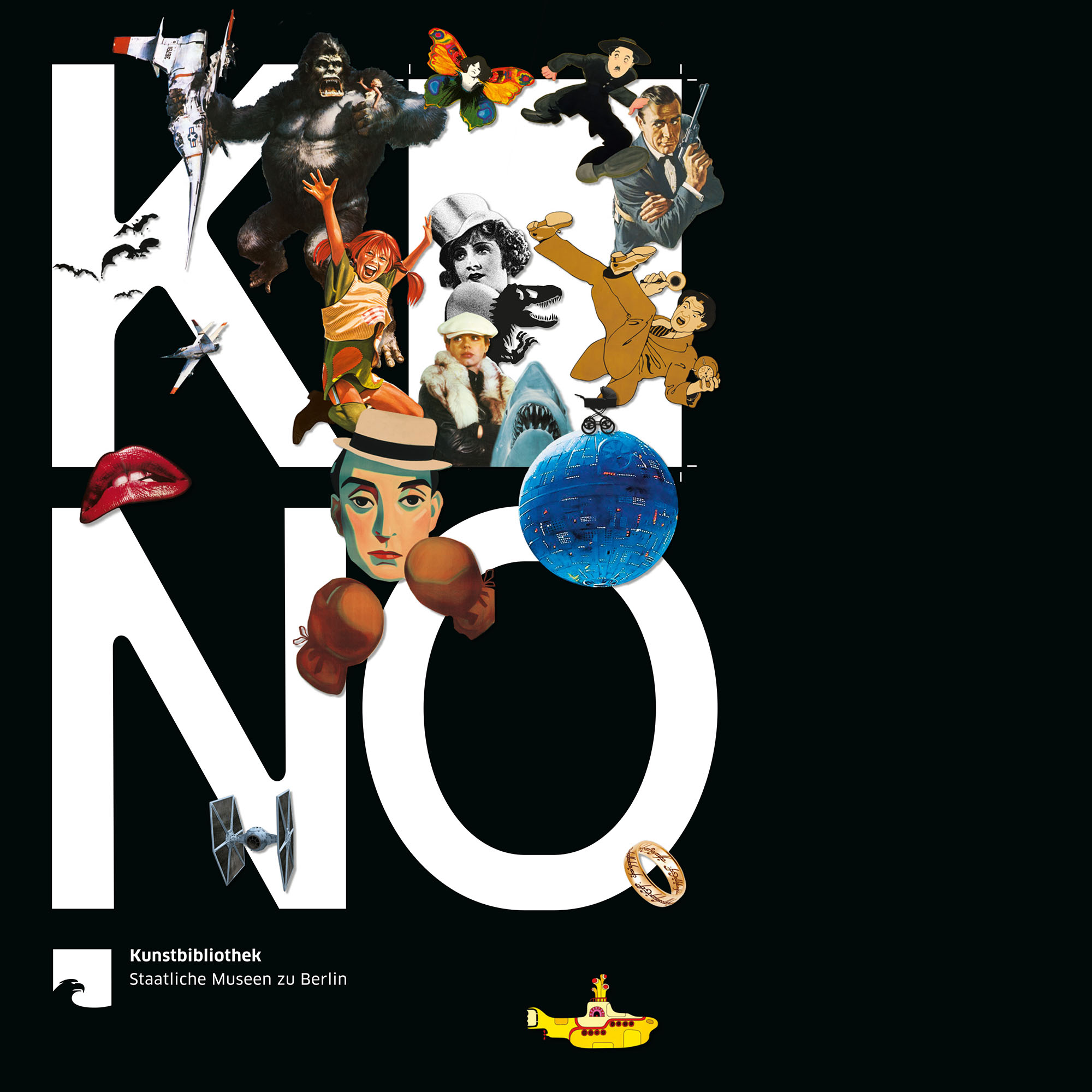
the art library of the staatliche museen zu berlin (state museum in berlin) have just informed us that their forthcoming großes kino (the big screen) show will now also include the poster we made for mareike wegener’s film, echo. we are delighted.
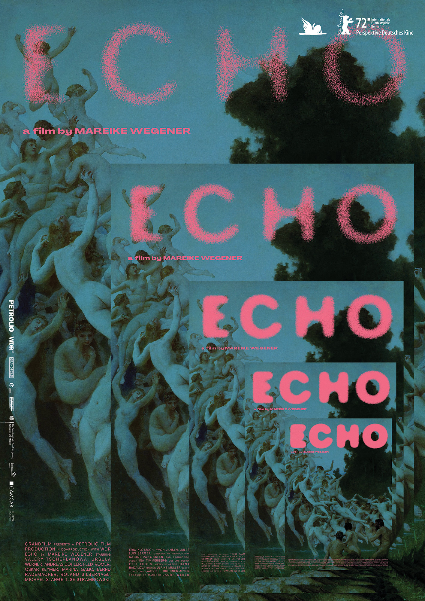
the echo poster will join the act of coming out poster alongside 298 other posters dating back to the year 1900 in a celebration of 120 years of film poster making.
here are some further details, translated into english, about the show:
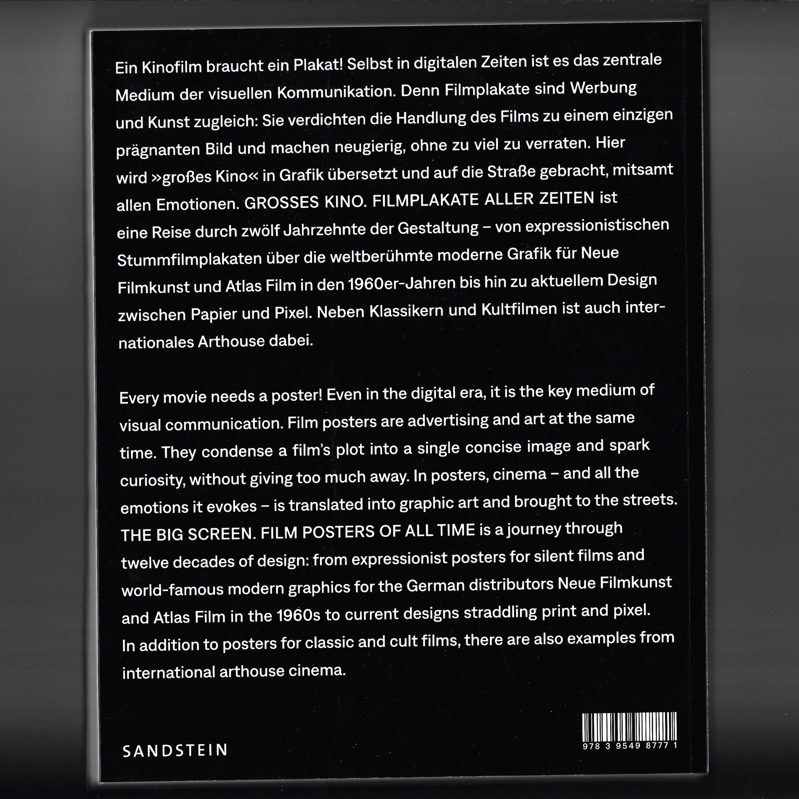
THE BIG SCREEN — FILM POSTERS OF ALL TIME
Film posters are both advertising and art: they condense a film’s plot into a single concise image and spark curiosity. They translate cinema – and all the emotions it evokes – into graphic design. The exhibition presents 300 original posters from twelve decades – classics, cult films, and arthouse cinema.
PROS AND CELEBS: 26 posters were chosen by film industry experts – hear their voices in the exhibition.
OPENING CREDITS: Graphics meet moving images.
PAULA POPCORN: Follow our mascot to family stations and listen, play, and draw!
CURIOUS? For details about our catalogue, symposium, and events programme, go to smb.museum/kb
An exhibition of the Kunstbibliothek, Staatliche Museen zu Berlin
3.11.2023 – 3.3.2024
Tue–Sun 10am–6pm
Tickets 10 € / 5 €, ‹ 18 frei / free smb.museum/ticketsKulturforum Matthäikirchplatz
10785 Berlin
Tel. +49 30 266 42 4242 service@smb.museum
the show will run through until march of 2024, which means it will be open during the 2024 berlinale. a huge thank you again to christina thompson and christina dembny at kunstbibliothek for finding and acquiring these posters.
see you at the show.