großes kino exhibition catalog, colour reproduction / interview_111123
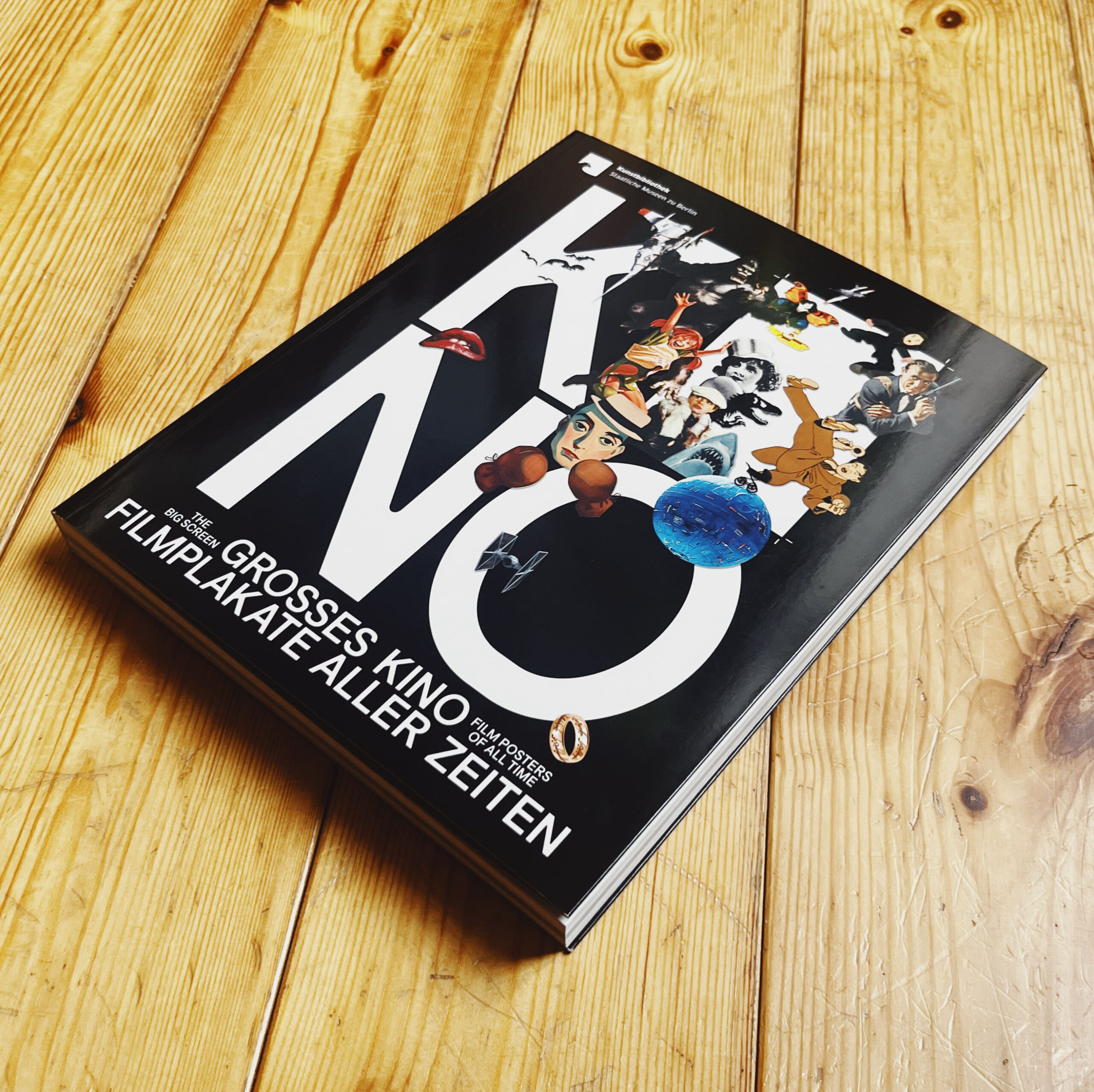
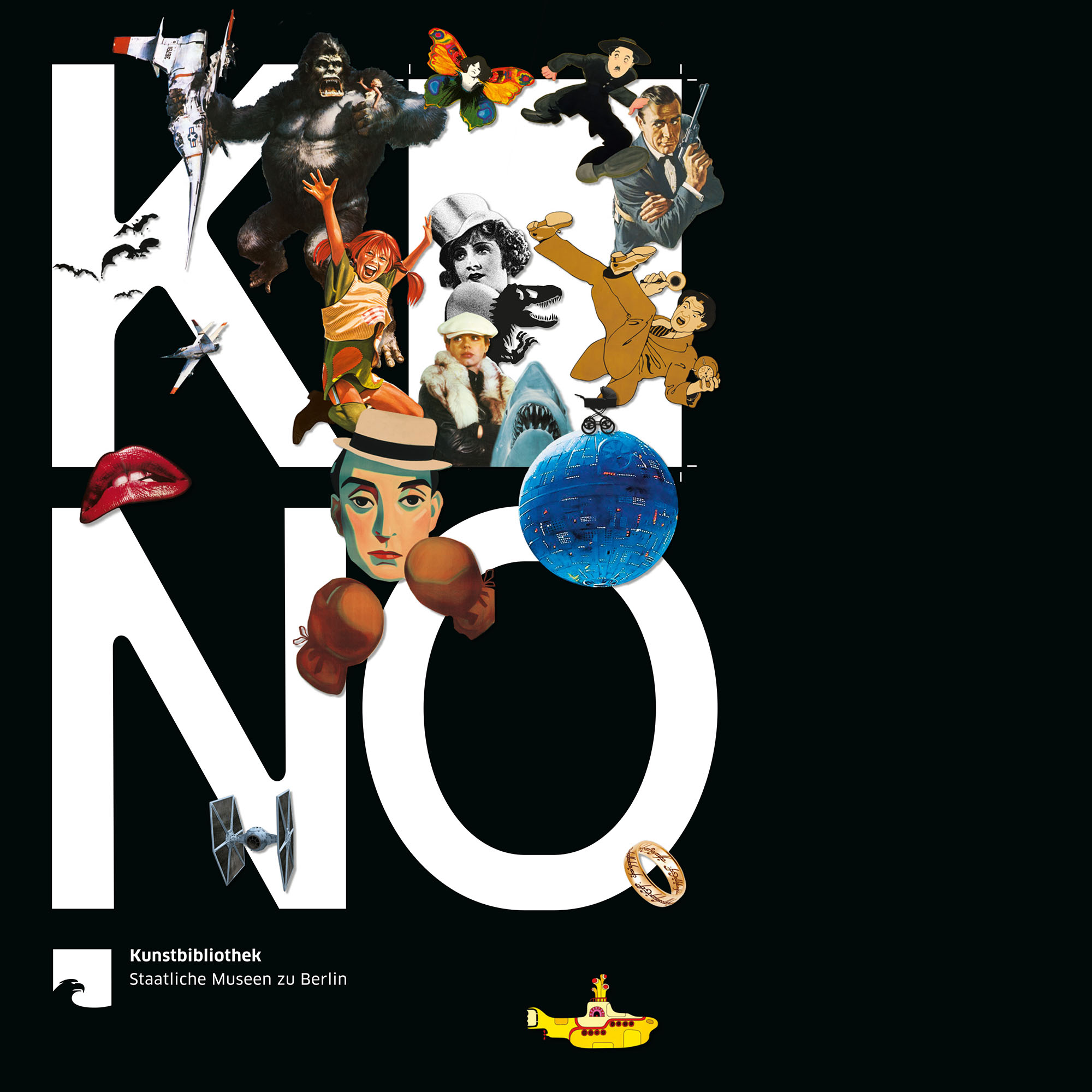
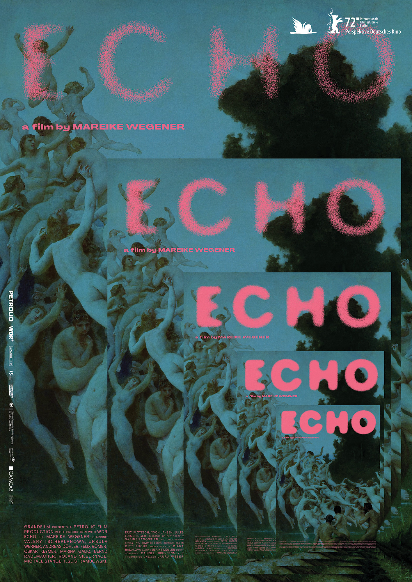
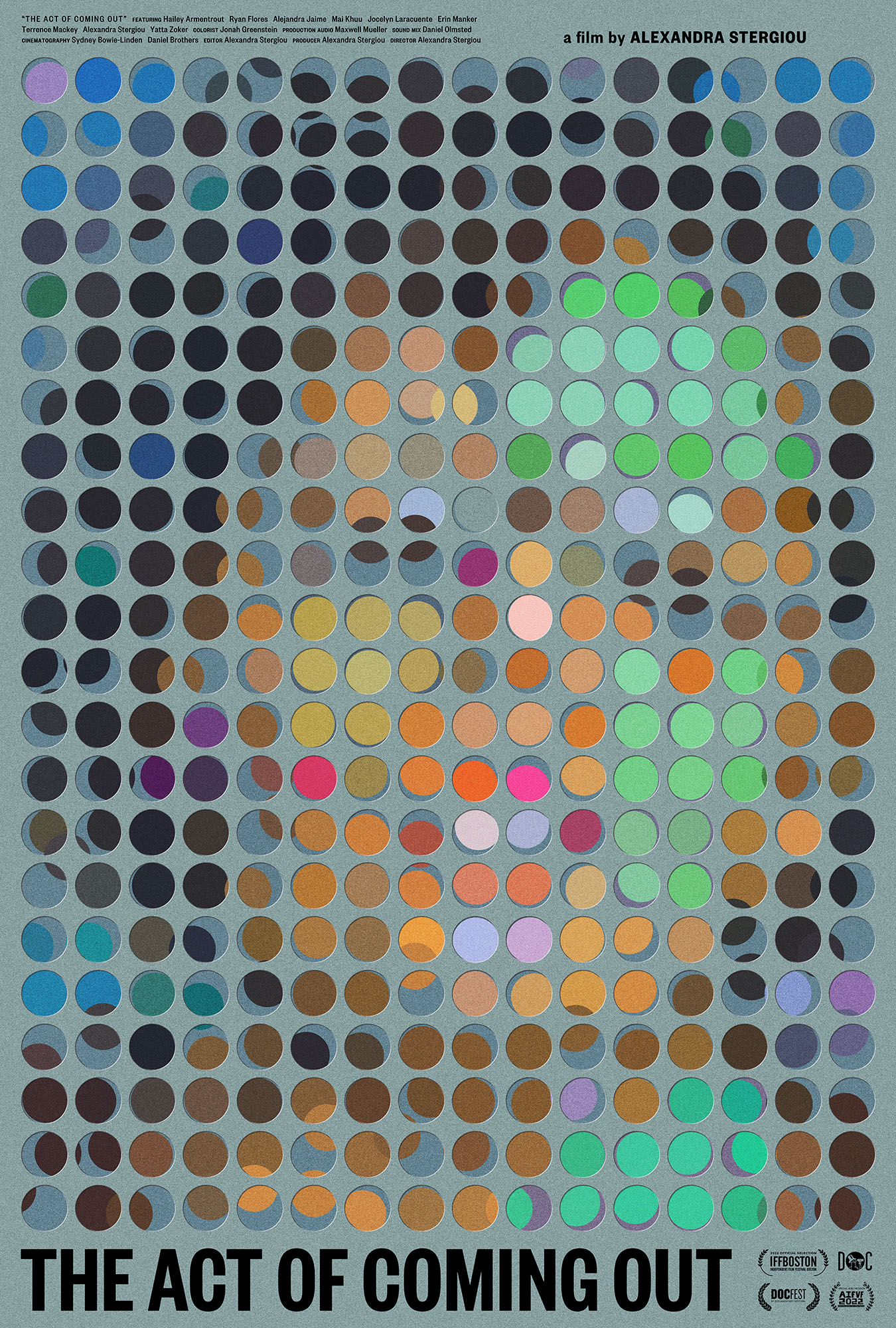
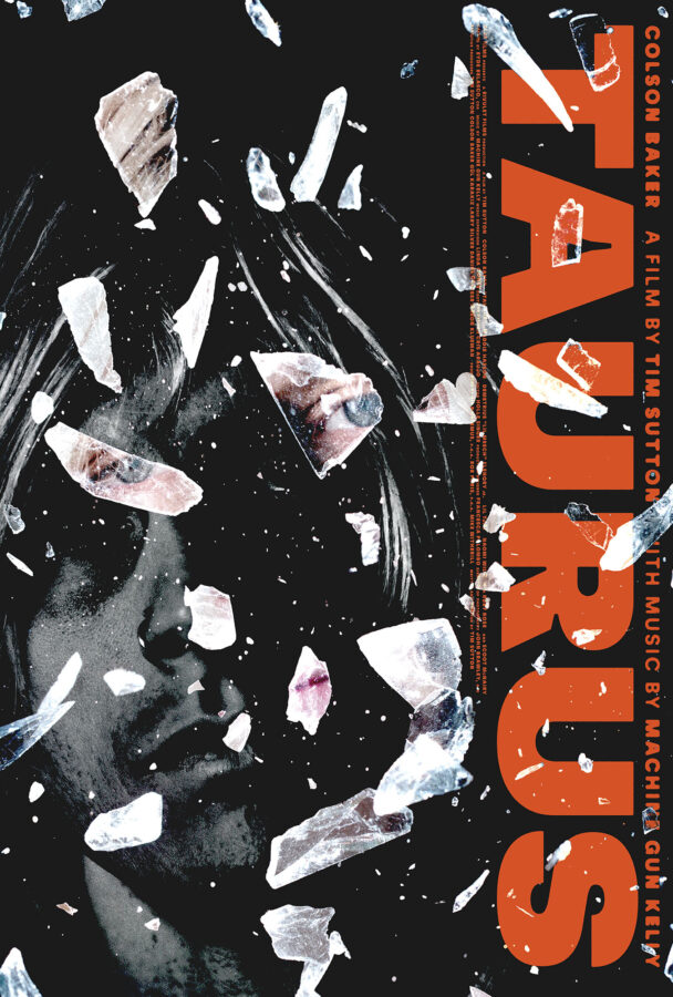
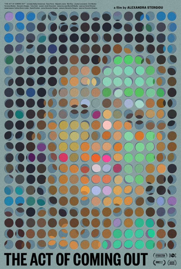
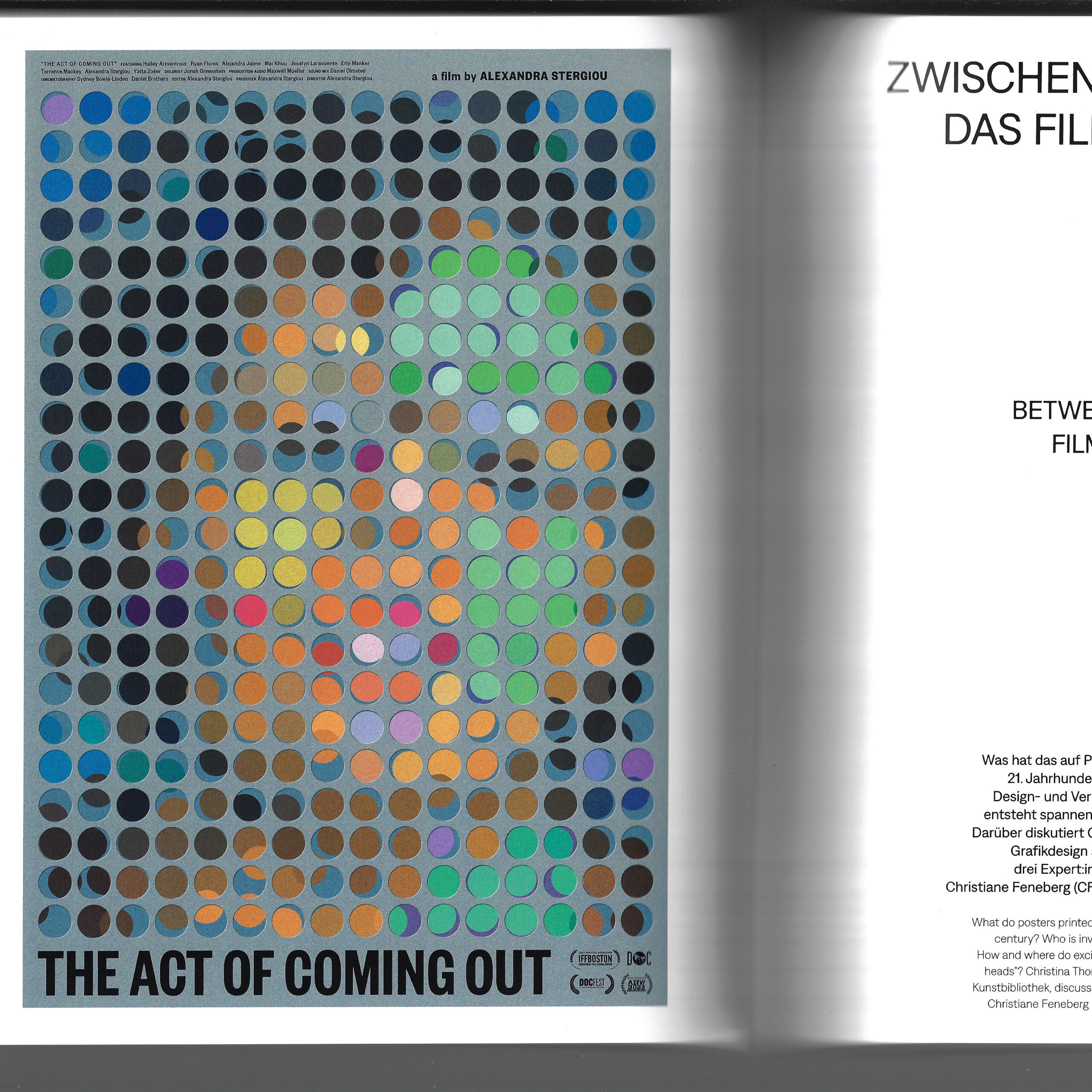
the staatliche museen zu berlin (state museum in berlin) wrote and printed a 280 page catalog for their großes kino exhibition. the catalog was beautifully designed by sandstein verlag and it details every aspect of the exhibition. included within its pages is a full page colour reproduction of the poster we made for alexandra stergiou’s short film the act of coming out, and an interview with german graphic designer christiane feneberg, MUBI germany’s director of distribution lysann windisch, and caspar.
the interview, titled “between paper and pixel: film posters today”, was conducted live on zoom by christina thompson, and then later edited for clarity. here are a few excerpts:
CT: In your professions – as designers and distributor – you are dealing with advertising and communicating films on a daily basis. In this, the film poster is only one aspect of many. How important would you say it is in what you do?
CF: The word “poster” is perhaps a little restrictive. 50 years ago, the printed poster may have been the main piece of publicity for a film, but nowadays, the scope is much broader. Contemporary designers create artwork that gets used for many different purposes, from mega prints to small website banners. So what we do is more like a corporate design for the movie than just a poster. Today, everyone is used to getting information visually – images are what attracts us, what makes us stop and think. That means: designers have the most powerful tools to communicate films. I mainly work with distributors in Germany, both creating fresh artwork and adapting existing designs. Hence, I look at the topic more from the marketing side, less from the art side.
LW: At MUBI, we also never talk about the “poster” but about the “key artwork” for a film. The key art is a central element of a campaign: it defines the look by being customised to each communication channel, whether this is a small digital banner or a large scale out of home promotion. As to the ratio, I’d say at least 50% of our communication output is centred around the film’s artwork. The rest of the campaign is built on moving images such as the trailer.
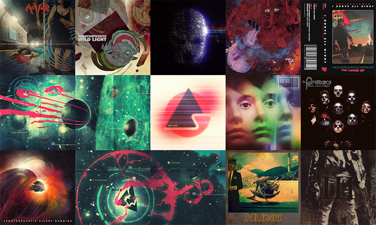
CN: I agree, but things look different from my perspective. I spend much of my time making physical posters for films. Generally, I am approached by film directors who have a powerful emotional attachment to their work. They are less interested in website advertising or such like. What they want is something beautiful to go on their wall, a poetic image that emotionally captures the piece of cinema they have spent years of their life making. For them, the film poster is like an album cover – you know, in the music industry album covers rarely ever change. I will make a film poster for them, but only the poster, as most of the best images cannot just be reformatted to fit any shaped hole.
CT: So the perfect film poster for you is one that remains unaltered?
CN: In a way, yes. The film poster, in its traditional format, has a great power. It is faster than a trailer, faster than reading a review. It captures the film in a glance, and it grabs your attention, whether someone is scrolling on their phone or walking down the street. If you make this glimpse unique and interesting enough, they’ll stop and wonder: why does it look like that? – and perhaps consider seeing the film.
CT: So is the film poster indeed one of the most restrictive fields of graphic design?
CN: Many of my contemporaries in the field are traumatised and underpaid. They are constantly coerced into making their work worse. They spend endless hours diluting the work with pointless revisions, and are left with pieces they’d never willingly put in their portfolio. As a result, they lose trust in themselves and struggle to get the jobs they want– they have effectively become someone else’s photoshop hands. I have fought hard to reverse this situation: I present several ideas to a client as text and reference image only and after some discussion ask them to choose just one. I then make the poster and what I come up with is effectively what we must work with. This way, I am free to produce what I believe to be the greatest possible poster. As a result, I hold myself to a much higher standard than they would or could, and I can really experiment. Plus: I sidestep the suffering.
CF: Occasionally, I have been tortured, too. Having worked with distributors for many years, I understand their needs well. But sometimes it just doesn’t go smoothly.
CN: I have been fired several times by distributors. For me the quality of the work comes first, and the money second. I’m of course not rich, but I can’t sleep at night if I’ve done bad work. They quickly forget that they couldn’t do it without us and it’s only when that understanding is established and respected, really beautiful things can happen. Then there’s a conversation rather than a bullet point list from them of changes to be made, like bullet holes in the work.
CT: Lysann, how does this look from a marketing point of view?
LW: I am speaking from a luxurious position, as MUBI has a whole creative team inhouse to create campaigns. All designers are employed. I hope that our gifted creative director, Pablo Mantin, is not suffering like Caspar and other designers. As a global platform, we work across territories, building international campaigns for our films – quite unlike the situation dealt with by most distributors in Germany or other countries. Ours is a complex process that needs a lot of listening and understanding, because online design and distribution have different needs and expectations. And some filmmakers also have a strong opinion on how a film should be communicated.
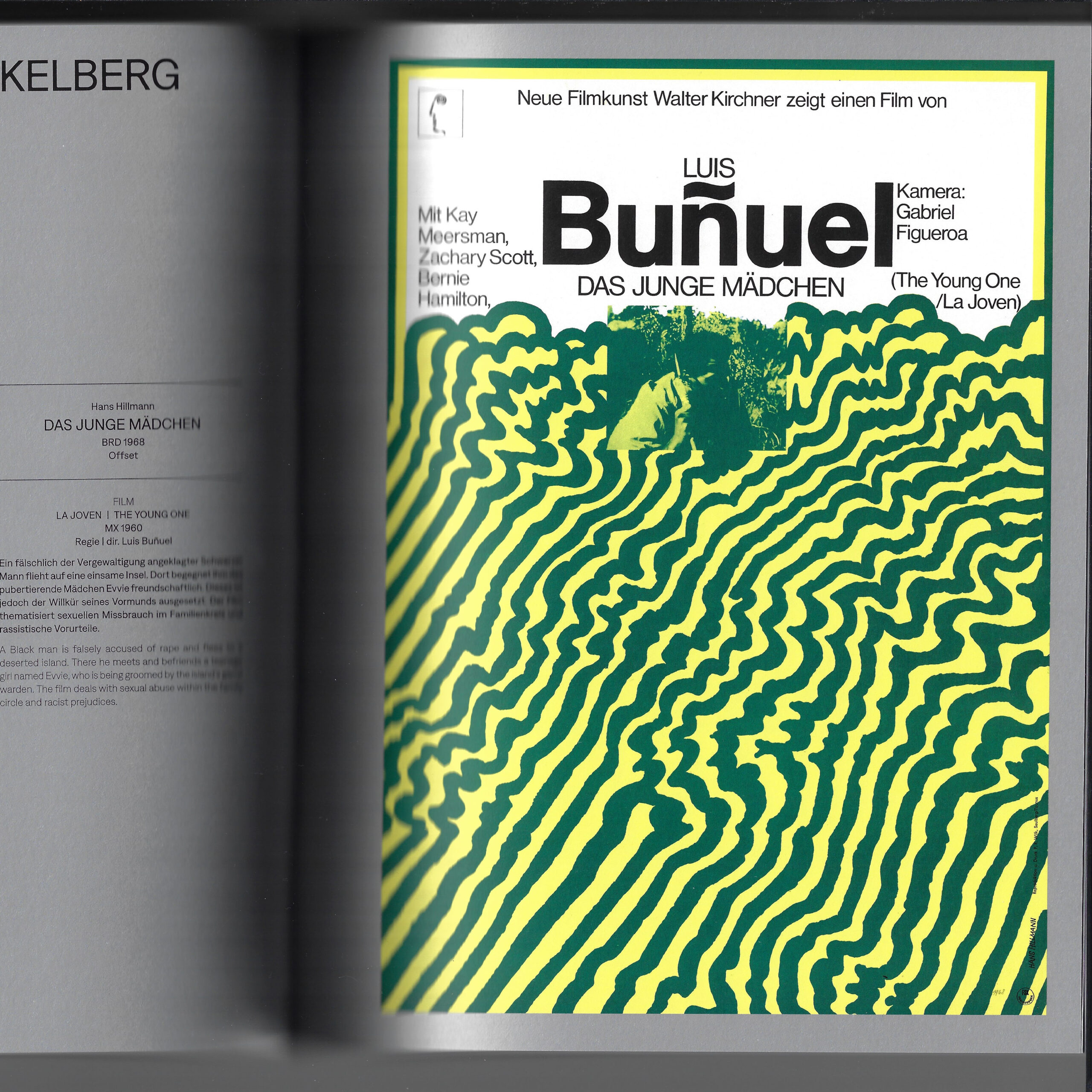
CT: The film poster has a long history of being scalded for tastelessness and bad design. Today, too, you often hear it described as generic, unimaginative, formulaic. How much truth is in that?
CN: I’d say for every beautiful poster (whatever we believe that to be) there are around 50 terrible ones, made globally by people trying to very safely market certain kinds of films, be it comedies, horror or action films. We all know the poster types: movie-star heads, guns, 3D shattered typefaces, a backdrop of explosions etcetera. The companies producing them usually have a lot more money to put up their posters all over the world, while the interesting ones don’t tend to have much reach. So the public get the impression that film posters are generally bad – whereas in fact, it is just power by numbers.
CF: It is all about daring to do things differently. Yet the main enemy of design courage is money: if you produce or buy a film, you have to get your investment back – so you play it safe. The assumption is that if a thing has worked once, it can be used as a formula. In briefings, I often get such references. At the end of the day, however, going to the movies is still a special experience. So I remain hopeful that distributors will dare new paths and change the recipe a bit more often.
LW: Yes. Working internationally, I have learned that, to a certain extent, you have to trust people to understand what you want to communicate. Perhaps German distributors don’t do that enough.
CN: I brought a quote which I think sums up a lot of what we were discussing. The Russian filmmaker Andrei Tarkovsky said in 1984: “Cinema is an unhappy art, because it depends on money. Not only because a film is very expensive, but it is also then marketed like cigarettes. A film is good if it sells well. But if cinema is art, then such an approach is absurd. It would mean that art is only good if it sells well.” With film being such an incredibly expensive art form, it seems understandable that marketing wants to attract everybody – it just cannot afford risks. And that’s where, design-wise, things start to suffer.
CF: Then again, maybe not every not every film poster can be art, or has to be art. It is also simply publicity. People decide for themselves if they want see an arthouse film or a cineplex movie. Is every chain-produced Marvel production a piece of art? Or is it a commercial project? Personally, I consciously chose being a graphic designer, not an independent artist. I believe it is OK that both exists. Big blockbusters don’t have to be ashamed of their commercial artwork, but it’s also very nice and refreshing to have individual, even arty, independent film posters.
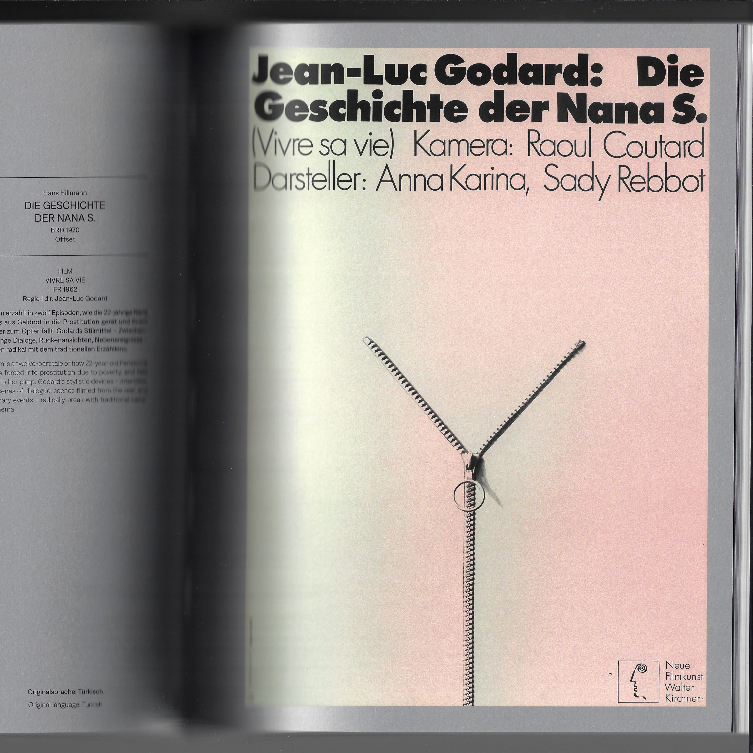
CT: To sum up, let’s briefly consider digitalisation. Would you say the printed film poster is dying out?
LW: I wouldn’t say that. We still produce many analogue and haptic things, such as the printed version of our film magazine, the Notebook. This experiments creatively with different designs, adding another layer to campaigns. And for me, thinking about the printed version of a poster is just as important as thinking about a digital version. Nevertheless, we need formats to be adaptable to different communication channels, standardised versions don’t really work.
CN: I regard this hyper-adaptability with some caution. Watching a film on the big screen, you see many more details than you would on your phone, for example. In the same way, a poster tells you so much more than a small display, and it creates different emotions. There’s a value to understanding the different formats and how they work. I am sure that one day, there will be digital screens everywhere. That will also herald animated film posters – which is a whole other dimension. But then I think fondly of vinyl records. Why are they still here? Because people like holding the artwork, they like tactile, haptic things. It’s the same with paper posters.
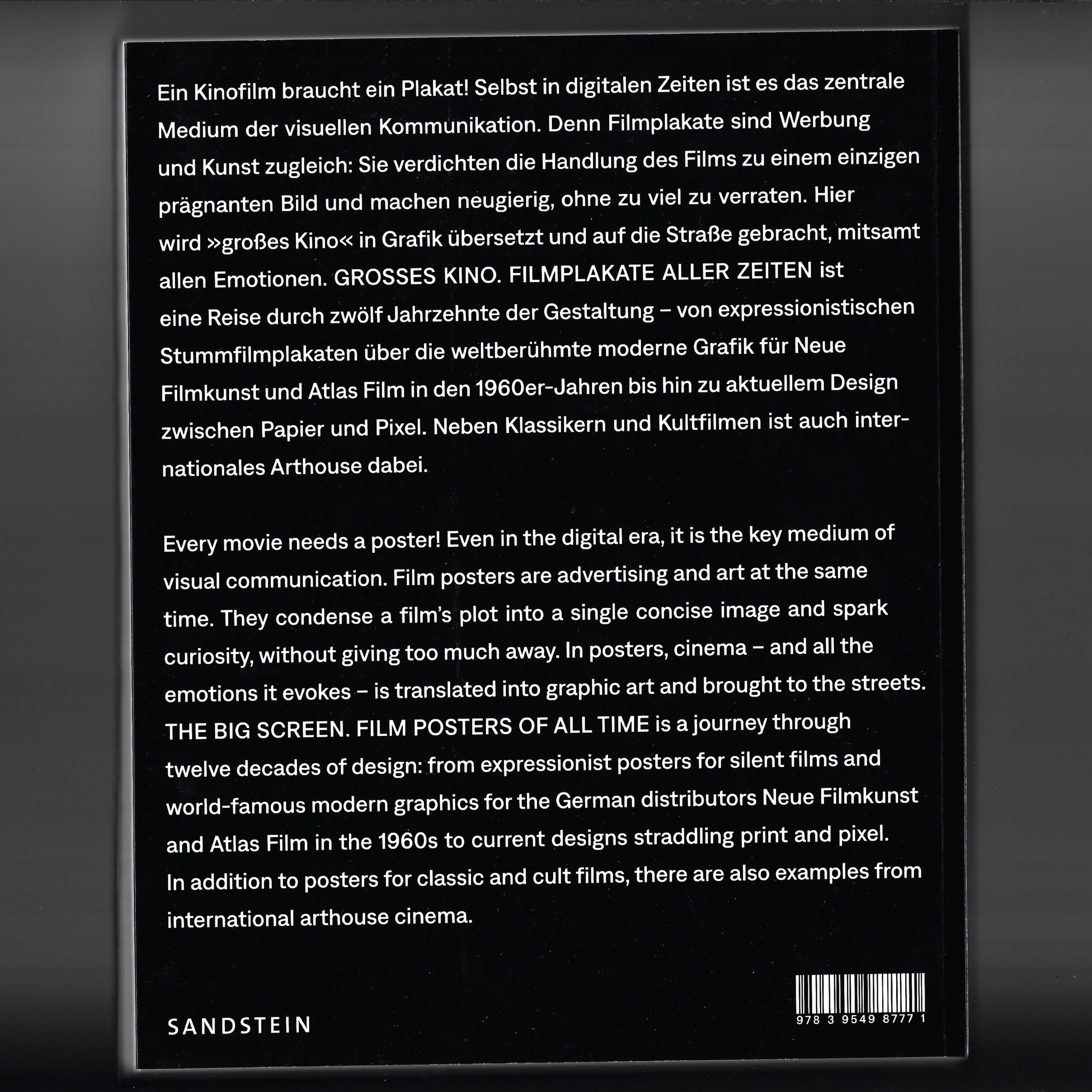
we’d once again like to thank christina thompson and christina dembny at kunstbibliothek for creating such an extraordinary, in-depth and thought provoking exhibition and catalog. if you have the means, do see the show before it closes march 3rd, 2024. in the meantime you can purchase a copy of the exhibition catalog here.
