knit’s island hong kong poster_100625
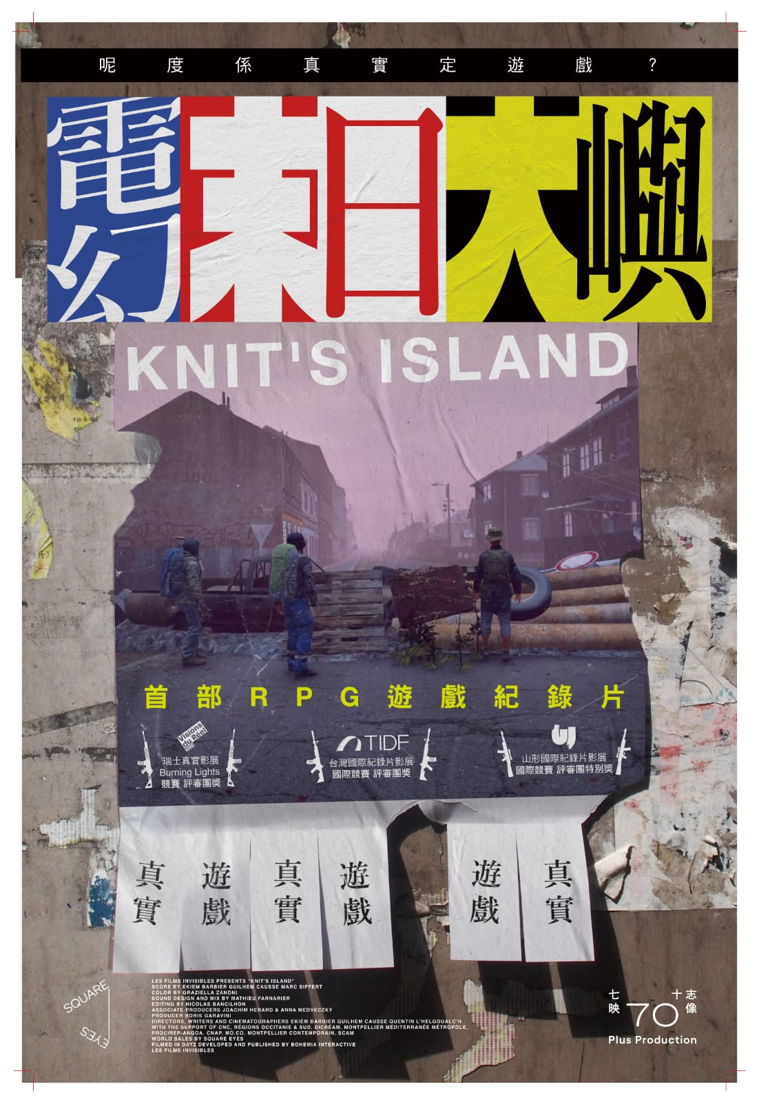
this beautiful poster by lau yan hin was made for the hong kong release of knit’s island (renamed electric doomsday in cantonese). knit’s island is an excellent french documentary that we also made a poster for back in 2023. i am posting lau’s poster here for posterity’s sake, because it is both an homage to our original work and i believe an improvement upon our work.
the idea behind our original poster was to make real “missing cat” flyers for knit’s island and plaster them around the city of berlin. our intention was not just to promote the film, but also to return later to photograph each flyer after people had ripped-off and kept the contact details from the bottom of it.

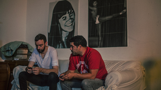
the reasoning for this is as follows: this film was made during the COVID lockdown. it’s effectively a series of interviews conducted by three french filmmakers with individuals and groups of human beings all over the world, as they play an expansive, online, multiplayer game called dayZ. the catch is that these people were interviewed from inside the game. the filmmakers themselves—also playing the game and using screen capture software to record their work—are seen chasing after players, often during deadly combat scenarios, in an attempt to draw them into a conversation. for the duration of the film we see only the in-game graphics, as each human—wearing an avatar of their own creation—describes how they’re spending more time playing the game than in reality, thanks in no small way to the pandemic. you can hear mini-fridges being opened, beers being drunk and babies crying in the background of their audio feeds. some of those interviewed had even gone as far as starting their own religions, repurposing in-game churches and all. suffice to say watching the film offers an uneasy, surreal and in some sense enlightening experience, wherein we the audience certainly begin to question the nature of our own reality.
this is where the “missing cat” flyers come in. since our poster had to exist in reality and not in the game, we knew we had to flip the film’s entire concept around, and pretend that people from the game—our french filmmakers—had come out of the game in order to post a flyer in real life. furthermore this flyer had to show a picture of the filmmakers as they looked in the game, and it had to ask people in “reality” where knit’s island was. knit’s island being not just the name of the film, but a mysterious location whose name the filmmaker’s made up to capture the new reality the film provokes in our minds when viewing.
incredibly our idea worked. various people ripped off and took the contact details home. we then took photographs of those “used” flyers and made them into a series of posters. the best of which you can see below.
all that said, there are always posters we’ve done that i start to feel over time could have been better, and actually long to go back and change one day. this is certainly one of those posters, not because of the concept or the photography, but more because i feel the title treatment and layout was never quite what i wanted it to be.

either way knit’s island is a particularly unusual and fantastic film and it was truly an honour to make a poster for it. i hope the folks in hong kong enjoyed watching the film also, and i want to extent a huge thank again you to lau yan hin for delivering such an inspiring response to our original work.
caspar