(v)
(v_i)
(version_industries)

manifold_102913

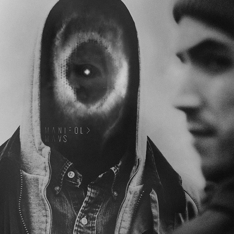
mavs_manifold_750

a while back i came head to head with the work of one of my design heroes, eike k?nig. i’d been asked to redesign the logo for the german band booka shade, after many years of eike having been their go-to design guy. it was frankly a terrifying prospect. whilst i was quite sure eike would probably never see the work i did, i would be immediately compared to him by both the band and their large fan base. settling down to create the logo i realized of course that you just do the best thing you can, and make sure that at the very least it’s nothing like the other guy’s work.

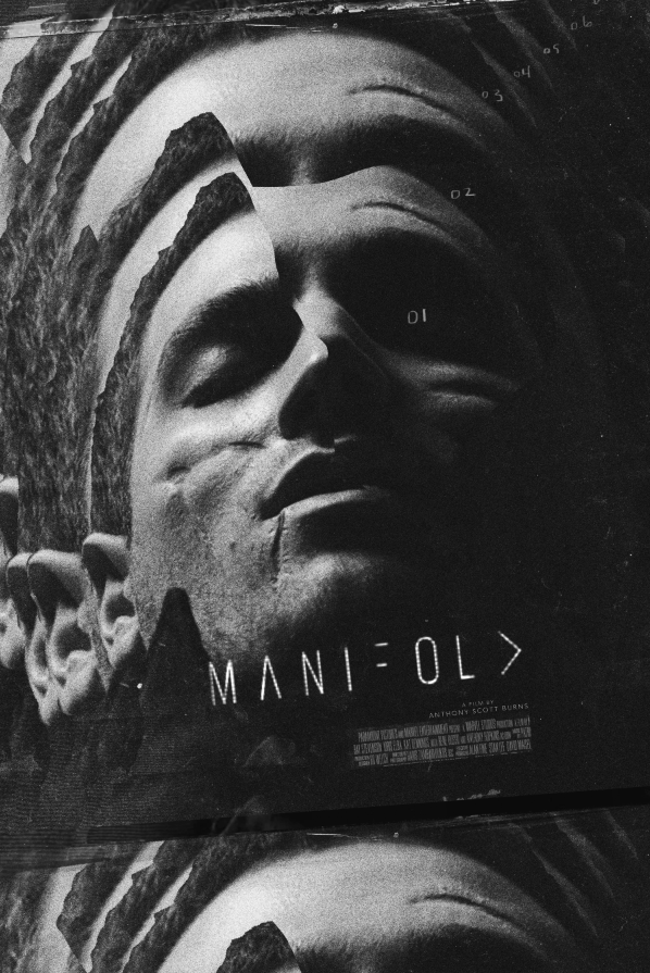
when matthew pusti of makeup and vanity set asked me to do the cover for the soundtrack EP to anthony scott burns‘ forthcoming sci-fi short, manifold, i sighed a similar breath of despair. why? because ash thorp had done the film’s poster and of course once again i would have to be compared to someone of considerable status in the graphics world. suffice to say here’s the poster ash had made –
Screen Shot 2013-09-04 at 11.23.06 AM

turning away from it, going for several walks listening to the soundtrack and spinning the film’s ideas around in my head, i realized of course that ash had the visual concept wrapped up. particularly in terms of subtly explaining what the film was about, but not so much as to spoil the film. every idea i wrote down or got momentarily excited about felt too similar to what he was saying with his treatment.

what he didn’t have however, that of course applied in particular to the job i had to do, were the tracks on the EP that had remained unreleased up until now. these were tracks that had been written for, but not actually used in the film. in particular the track ‘yearling,’ which featured original foley work, vied for my attention every time i put the record on.

mulling over these differences i decided to take a different route, one that i’d been flirting with for a while but never really had the chance to test out – a route i like to call the ‘polish’ route. now i must stress this is a route i still haven’t fully explored, but the work i was to do on manifold?certainly gave me the impetus to do so. it is afterall a firmer step in that direction, and excitingly so.

after watching the film several times i began to feel a tingling, almost aching pain in my face. furthermore i began to think about how much value we put in the face and what it means in terms of not just our identity, but our chances in life. how being beautiful can both be a blessing and a curse, and how in many regards you can either be born with a ticket on a certain kind of ride, or a ticket on an entirely different ride. all of this based on your face and how it develops as an image to others.

i then started thinking about how technology is really quite an organic extension of the human form and mindset, and that it wouldn’t be too long before these things merge imperceptibly. in fact i’d written an essay for the IFP on this subject just a few weeks before, so to say the idea was on my mind a little was an understatement. the sense of menace one feels as we start to worry about the increasing amount that technology governs our lives, is really just a greater understanding of our own constant need for distraction from ourselves.

this is when i started to realize what i had to do for?manifold, and furthermore i knew exactly where i was going to start. skipping through the film to a very particular shot, i cut it out and began work. i had to make an image that encapsulated, for me at least, that sense of terror beneath the ever prettier face of technology, and at the same time capture that actual physical ache i felt in my own face after watching the film. as i worked i began to realize that i was also edging closer to this aforementioned ‘polish’ route.

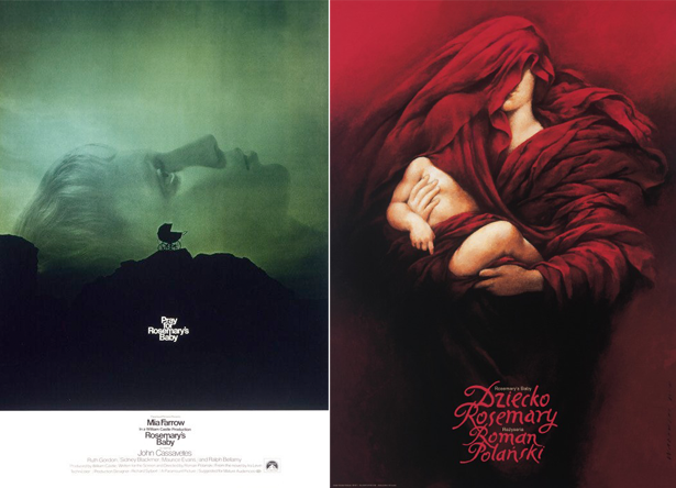
now, by ‘polish’ route i of course mean making a film poster that uses little or none of the imagery from the film and instead offers a more emotional, impressionistic interpretation of its narrative. the eastern-european film posters that have been created in support of US films (with particular reference to poland), are a powerful lesson in creating an image that, to paraphrase jim steinman, you’ll never know the meaning of, but you’ll know how it feels. much in the same way a piece of music moves you in a fashion you cannot put into words, eastern-european posters often remove all trace of the film’s visual, its recognizable characters and its story, and delve headfirst into making an entirely original image. an image that still conveys the film’s ideas, but often in a darker and less conventional style. consequently it’s this approach that has come to feel so incredibly liberating to designers working in US and UK markets. to quote??on the subject??”there?s something captivating about those things that feel inseparable from a haze of abandon, existing to give hope to the creatively forlorn.”
11

left: philip gips, US. right: wieslaw walkuski, poland.

when i presented the final cover to matthew pusti, he said it was perfect. i know he would have let me take it even further into the horrifying abstract had i wanted to, but then we both agreed that it was as important to keep things familiar this time around. after all it wasn’t our film and we could just as easily go to poland next time.

you can buy the full manifold soundtrack here, and you can watch a trailer for the film here.
_category
blog, grafiks, news, , , , , , , , , , , , , ,

big black delta –
bbdlp1_101211

bbd_lp_reissue_750

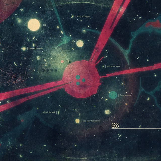
the above cover of the new big black delta album has existed in one form or another for a year or more. aside from the protomen act II logo, this is the longest we’ve had to sit on something and let it mature. it has therefore had to suffer being discarded a few times and consequently being heaved back onto the table for repair. this is largely because we were nervous and didn’t trust that the visual came close to the power of the music. thus we kept searching for a way to express that, and consequently found ourselves staring at this piece again and again, realizing it was the closest we’d ever come.

the idea behind this cover was essentially two-fold –

first up whilst the EP depicted elements passing through space toward something, the LP we felt should be emblematic of the place they were all headed – the core or nucleus sucking everything in. this way we had a story of sorts, both visually and conceptually. conceptually because, as with most EPs, the songs were tested out and then some found their final resting place on the LP.

secondly we wanted something that gave you the sense of being in a minute, inner-space, just as much as the more obvious, vast, outer-space setting the artwork appeared to depict at first glance. we wanted it to feel like the genesis of an idea, or the microscopic core of the beginnings of an erruption, as much as a planetoid or huge cataclysm in space. you see we were into the idea that jonathan bates’ first band, mellowdrone, had had an album cover with a man clutching his head as it exploded, and that subsequently this record was perhaps illustrating the inside of that same head. the nucleus of the eruption, be it psychological or physical, that lead to the head exploding. the assumption being that both images, for us, represented the state the band was in, the lyrics and the overall tone.

whilst big black delta is very much a more personal, solo musical endeavor for jon, mellowdrone saw him very much more in a band environment, in more of a democracy and also dealing with a sense of disenfranchisement. so the angry bear album cover was an external view of the result of a certain psychology, and the BBDLP1 cover?is a depiction therefore, also, of something more personal, from somewhere more unique to just jon.

beyond the hand-drawn elements themselves the cover was also treated with a level of distressing and texture. the reason for this is that the music itself was treated in a similar fashion. jon deliberately kept certain glitches and errors that happened in the processing or compression of each track in order to give it a more freeform and ‘fuck it’ attitude. so in turn we effectively threw the record on the floor at a UFO convention and let everyone stampede across it as they made their way from bob lazar’s talk on alien spaceship reverse engineering over to the preview screenings of the next series of ancient aliens.

so what next? well jon is of course working on new music and we’re already working on new artwork. as jim carroll says in the basketball diaries “come on, reggie, you know this game never ends.”

stay tuned.

_category
blog, grafiks, news, , , , , , , , , ,

makeup and vanity set –
never let go_080711


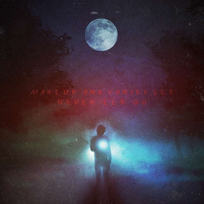
working with makeup and vanity set continues to be a very exciting, fluid and rewarding process. we will never take for granted the fact that we get to work so directly with such an exciting, cinematically driven collective of musicians down there in nashville, tennessee. MAVS and the protomen continue to challenge and inspire, and this project was no different.

that said, when MAVS first approached us for this project we had a lot going on and so he was forced to go elsewhere. however when that didn’t pan out as planned, he offered us another shot at it. by this point we’d had a chance to listen to the record a great deal and lament on the fact that the job was no longer ours. this of course meant that the moment we got given the reins again everything came together very quickly. the work was done in 2-3 days and proved to be a rather cathartic and emotional experience for all involved. both MAVS and i had been through intense personal experiences around this time and listening to the record now whilst looking at the cover, it clearly expresses both of our desires to keep searching for an answer no matter how dark things got.

beyond the obvious emotional understanding, we’d been informed that it was to be a cassette only release and that MAVS was keen to echo a visual from the VHS era of home entertainment. old enough to have lived through a great portion of the VHS and cassette era, we understood how this record would sound when fans heard it and very much where it was coming from in terms of cinematic narrative. the decision to in some way make it photographic and involve some sort of backlit misty scene came very quickly, and was undeniably influenced by our shared love for shows from that era like?twin peaks and the x-files. so it was then a matter of building that out with a combination of photographic elements and a series of photoshop brushes and textures. finally, the typography came about as a result of wanting something elegant and not too clich?, but that would also feel a little like film credits.

it goes without saying but we can’t express just how fantastic the music is on this record. it’s powerfully cinematic and takes you back into a world made mysterious by not just the technologies used to create and record it, but also by the melodies and the concepts behind them.

stream the record here and by all means buy a copy of if you dig it. it’s only $6 on mp3, or $15 if you want the cassette version.

_category
grafiks, news, , , , , , , , , , ,

65daysofstatic.com
& the japanese EP_121810


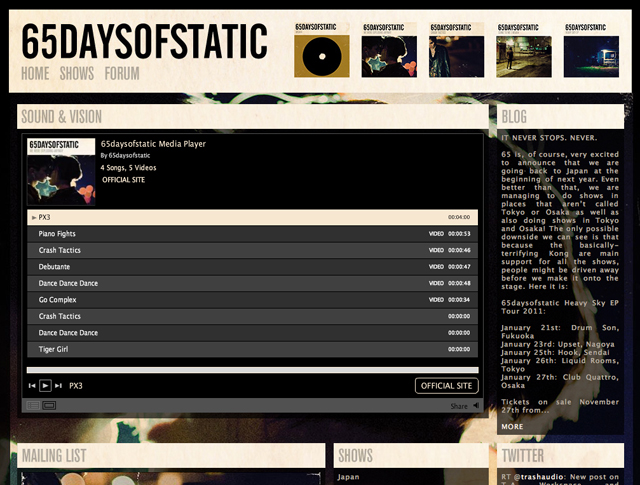
65daysofstatic.com is one of those sites where the work on it is continuous and so we’re never sure when to stop for a second and make a record of our progress. fans of the band will know that major redevelopments began back with the release of their last full length studio album, and that it’s taken on 2-3 guises since then.

based primarily around the original wordpress foundations that the band laid themselves back with the release of one time for all time (their second studio album), the open-ended nature of that fantastic (and free) platform has meant we can keep reskinning, redesigning and evolving the site whilst keeping the core database.

the latest version of the 65 site is more of a hub that incorporates not only their blog, tour dates and forum, but also their twitter, flickr, soundcloud and vimeo feeds. the design is of course based around their new album’s rather?fotografik aesthetic and was intended to allow the band a freedom from making multiple updates across their various outlets, and give fans a one stop shop for all information about the band.

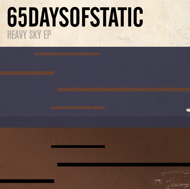
in other news, with the japanese heavy sky EP tour on the horizon and a special edition of the EP in the works, we got talking to the band about a possible variation on the established cover design. after some deliberation we agreed that a design that felt more in sync with the japanese release of their single?weak4 would be appropriate. keen to explore that release’s more geometric artwork styling, we set about developing a design that echoed the original EP photography whilst exploring the implications of the EP’s title further. the resulting cover (above) was inspired in part by a series of early drawings and paintings by the artist thomas newbolt.

_category
blog, code, grafiks, news, , , , , , , , , , ,

65daysofstatic –
heavy sky EP_102610


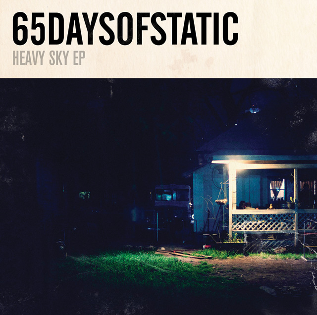
65daysofstatic’s heavy sky EP pretty much has to be heard to be believed. it’s a collection of songs that for one reason or another just didn’t make the cut for we were exploding anyway, their last album. perhaps its most intriguing quality is its slightly erratic nature, in terms of sounds and styles. in and of itself this is nothing new for an EP, however when it arrives after an LP in this fashion, it offers an exciting insight into the band’s thought process when they made that album – sonic directions that for one reason or another they didn’t pursue.

therefore our task this time around was to create a sleeve that echoed the artwork of the album, but that had a more abstracted, less direct narrative. as such we kept the same design template as before, but looked into an entirely different style of photography. one that was more transient, and that focussed more on mood and ambience.

after sifting through 50 odd photographs we’d taken that echoed this sentiment, we put together a sleeve design that had this texas chainsaw massacre / halloween type vibe about the setting. which isn’t to say it was about horror, but looking at it now it certainly has a darker, almost voyeuristic tone to its domestic leanings. a tone that is of course balanced by the record’s title and the warm, evening glow that permeates through each photograph.

you can download a track from the EP for free here:

65daysofstatic.com

_category
blog, grafiks, news, , , , , ,