(v)
(v_i)
(version_industries)

art of the title, aftersun_011123


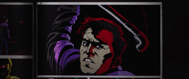
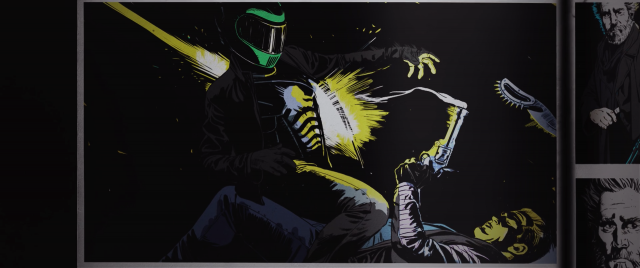
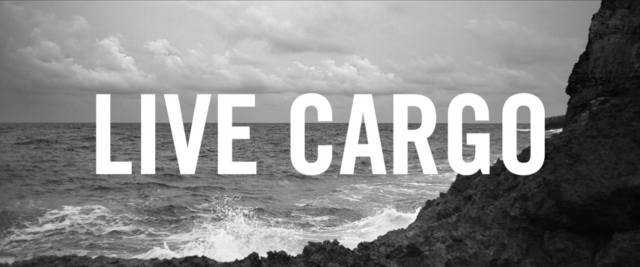
shortly before the cannes film festival last year we were asked to create the title sequence for a film called aftersun. caspar was headed home to england for a bit after having been robbed of his computer and camera in paris, when the email from pastel came in: would we be able to make titles for a film on its way to cannes in just four or five days? caspar picked up a new laptop in london and we asked to see the film. those who have seen the film can imagine what it must have been like to consider whether to work on it or not, even with very little time to do good work. the film is a remarkable thing by any stretch of the imagination, and one that touched caspar particularly for a number of reasons.

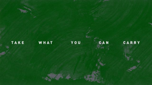
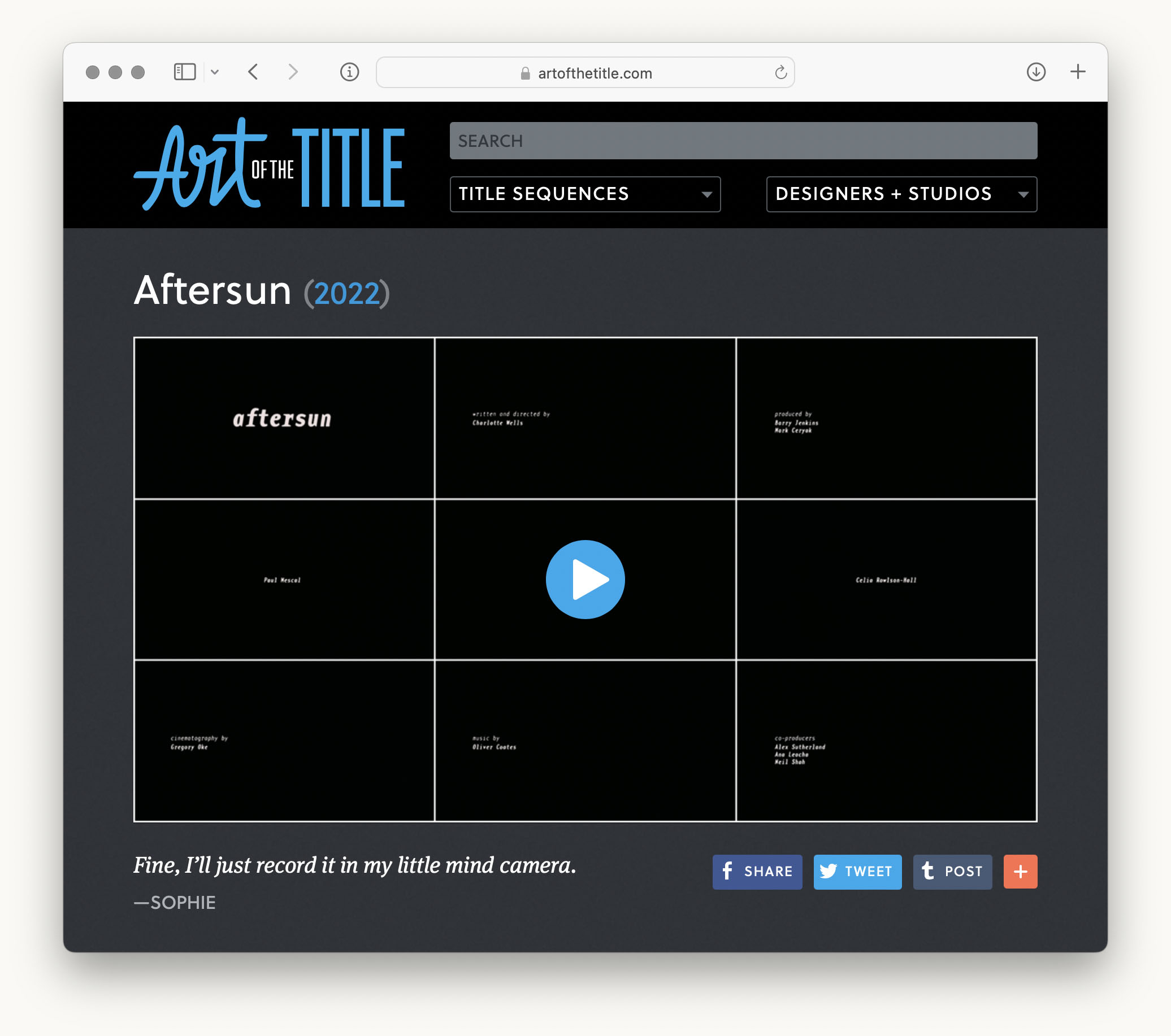
caspar sent the director, charlotte wells, some typeface ideas based on the film’s overall mood and his experiences of growing up in the 90s. charlotte picked the typeface—base mono—that you see here:

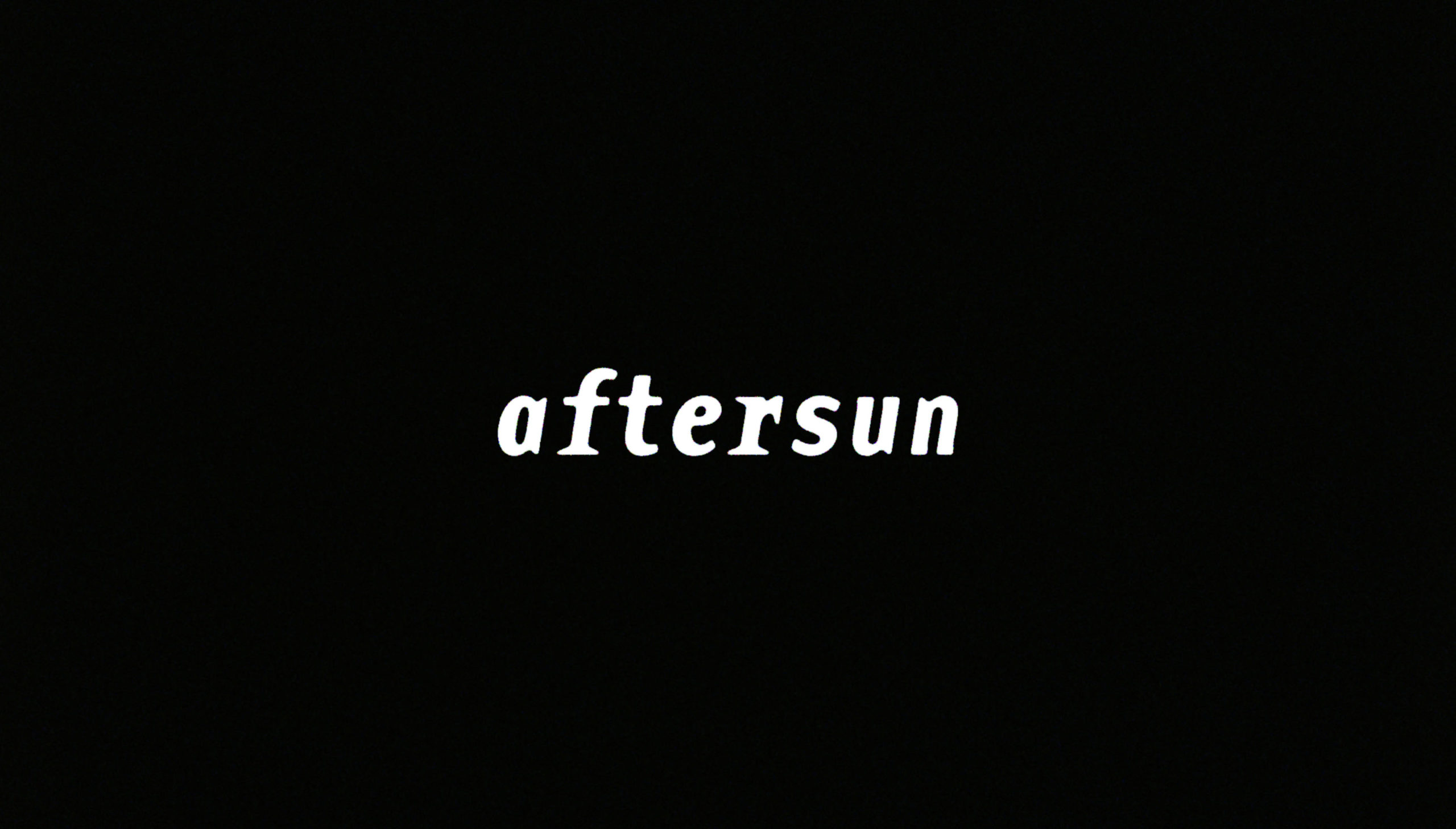
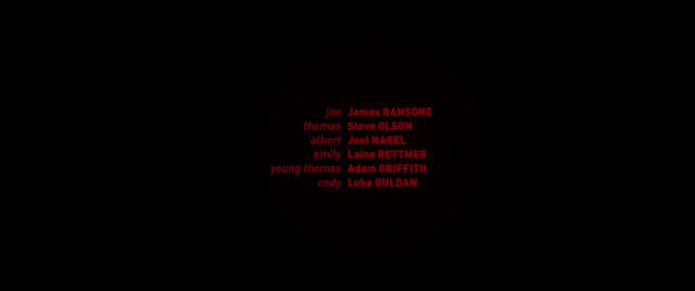
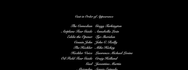
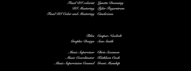
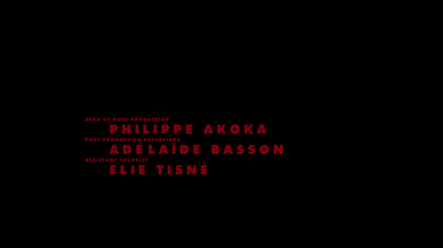
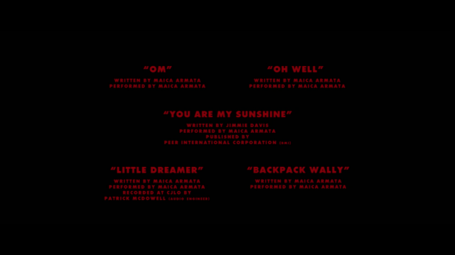
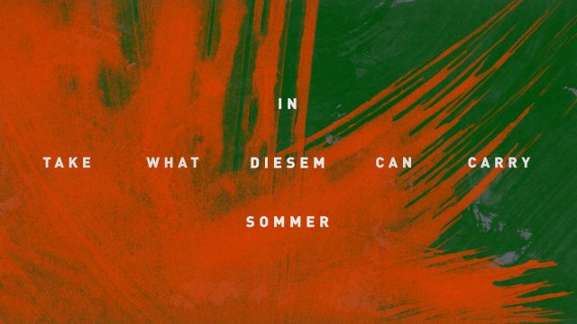
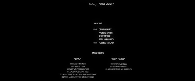
caspar then began work on customizing and animating the typeface in a fashion that charlotte and he felt appropriate to the tone of the film; dissolving the sharp edges of each letter and making them flicker in and out of focus as if light was coming at us from behind each word; all the while treating it as if our eyes could not quite focus on it because it was too bright. meanwhile caspar’s brother josiah got to work on creating the end crawl, and needless to say we made the deadline. caspar then headed to cannes to see the work on the big screen.

art of the title is a remarkable website run by lola landekić, that’s dedicated to celebrating film title sequence design and animation. in fact here’s director david fincher (se7en, fight club, zodiac, the social network) talking to lola on the subject:

“I love the site. It’s really beautiful. I would much rather have anything and everything about the title sequence be on Art of the Title than in USA Today or any publication like that. Your site is the proper context for this conversation.”

we’ve referenced title sequences in the extensive and beautifully presented art of the title archives many times in our work, and to see that yesterday the aftersun titles were posted to art of the title was incredibly moving, not to mention flattering.

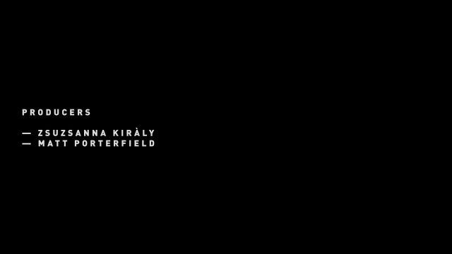
thank you so much to adele romanski, charlotte wells, lola landekić and everyone else at pastel and a24 films. we remain endlessly thankful for these opportunities to work on such beautiful films.

_category
blog, grafiks, news, , , , , , , , , , , , , , , , , ,

film title sequence + motion graphics work_062117

memphis titles

it’s been a while since we updated this blog thing. it occurred to us that we really need to make a record of our gradual move into the world of film title sequences. unfortunately the way this website is constructed means that it’s hard to highlight this kind of work, and so we hope this article gives you an inkling of what we’ve done and hope yet to do in this field.

over the last few years we’ve been asked to do an increasing amount of motion graphics work for films, and whilst the work is often relatively rudimentary in terms of graphic design, the projects have certainly been respectable. in this regard it’s worth noting what kind of films we’ve worked on and observing the more subtle compliment a thing as simple as a typeface choice or type placement can offer a film. which isn’t to say we wouldn’t rather do something more explosive graphically, but more often than not a film doesn’t need that. not at all.

anyway, after a while in this business you realize that you need to just let the work speak for itself, rather than doing a whole lot of talking about your process or whatever. so here are a series of title cards and stills from various film productions, where you can see our motion graphic design work at play.


light up the night
co-directed by matt sundin and caspar newbolt. featuring drawings by john delucca and animation by josiah newbolt.

light up the night titles


entertainment
directed by rick alverson.

entertainment titles


dark night
directed by tim sutton. featuring in-film poster design and ‘google maps sequence’ compositing.

dark night titles
dark night titles
dark night titles
dark night titles
dark night titles
dark night titles
dark night titles
dark night titles


take what you can carry
directed by matthew porterfield.

take what you can carry titles


live cargo
directed by logan sandler.

live cargo titles
live cargo titles
live cargo titles
live cargo titles
live cargo titles
live cargo titles
live cargo titles
live cargo titles
live cargo titles


memphis
directed by tim sutton.

memphis titles
memphis titles
memphis titles
memphis titles
memphis titles
memphis titles
memphis titles
memphis titles


the convention
directed by jessica dimmock.

the convention titles


pavilion
directed by tim sutton.

pavilion titles
pavilion titles
pavilion titles
pavilion titles


muito romântico
directed by distruktur.


stay tuned for more work from us for jonas carpignano’s a ciambra, matthew porterfield’s sollers point and ari gold’s the song of sway lake.

cheers.

_category
grafiks, news, , , , , , , , , , , , , , , , , , , , , , , , , , ,

65daysofstatic –
escape from new york, tech interview_011910

digieffects65doc screenshot


we’ve been featured on the digieffects website as part of a ‘user profile’ series they’re doing. we’ve been included because of our use of their awesome damage plugin in the documentary we made for 65daysofstatic last year. there’s a brief interview and a chance to watch the promo video we made for radio protector again.

_category
grafiks, news, , , , , , ,