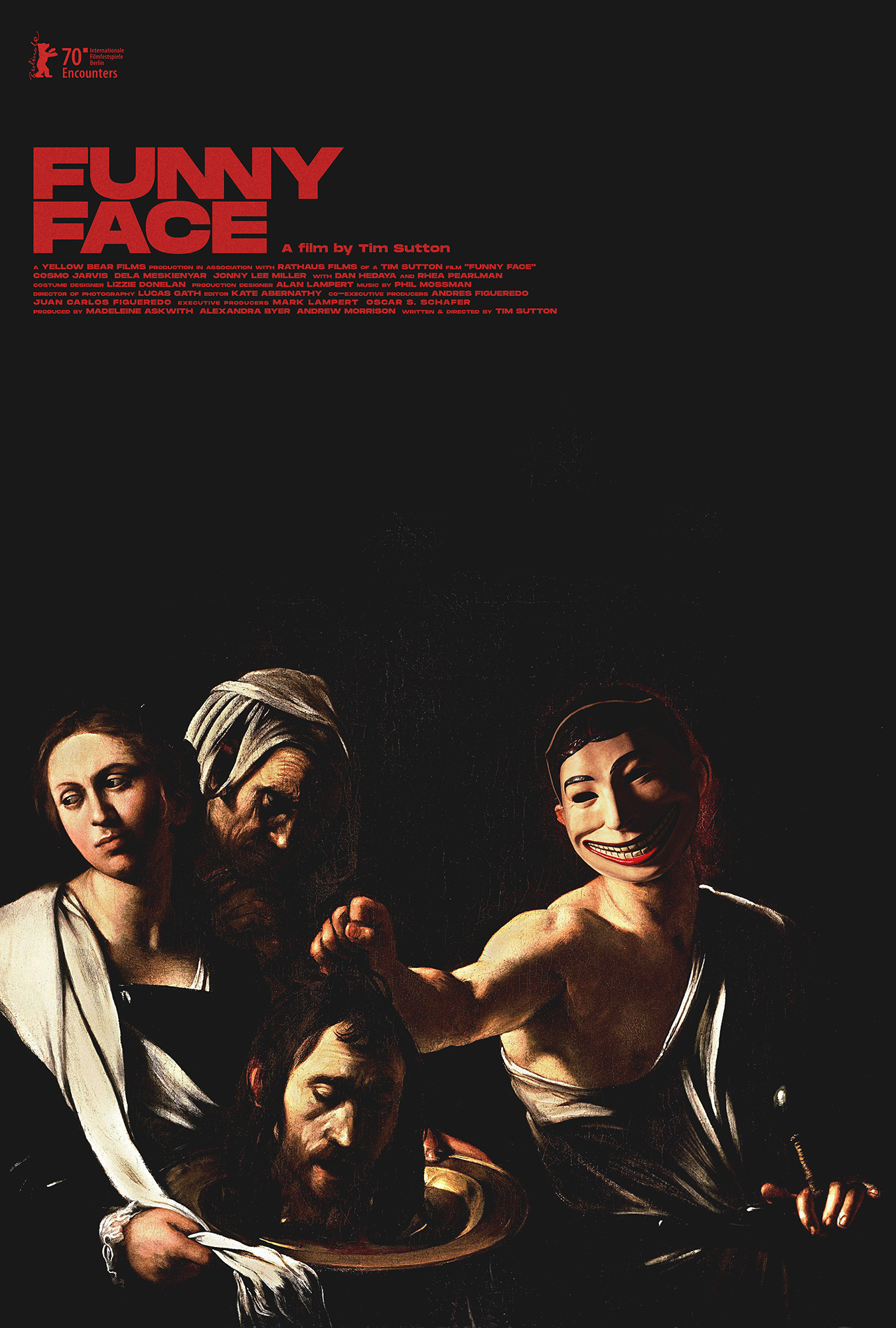
“Caspar Newbolt and (version_industries) traverse an inspired path to give frequent collaborator Tim Sutton’s film Funny Face a printed counterpart. The subject is a revenge-seeking man who serendipitously discovers a plastic mask, donned more as a talisman of confidence than means of anonymity. Was its appearance fate? Has this surreal shield served others before him? Newbolt looks to amplify that potential by delving back through history to discover another artistic work with empowered figures perfectly suited to become this character’s progenitors. His selection of Caravaggio’s Salome with the Head of John the Baptist proves a magnificent partner both thematically and tonally. You want to laugh, but it’s all too sinister to risk the ensuing wrath. For all you know, that face might just find you next… already affixed to another’s head.”
thank you jared and everyone at the film stage for this vote of confidence.
the objectiv section of this website contains a scan of an email that my business partner giles once wrote to his father. his father hated the designs we’d created for our business cards back in 2003 (in retrospect, they were pretty bad) and giles, who often stood by his father’s point of view on our various new business concerns, did me proud in telling his pa to “back off” on this particular occasion. in fact i was so moved at this gesture and felt it such a call to arms to everything we were trying to do together, that i posted it on our new website as an indication of our company’s modus operandi. it’s been there now for 15 years and reading it still moves me. without giles’s understanding and counterpoint to my idealism i wouldn’t still be here doing this today.
we recently made the decision to shift our focus as a company to almost exclusively producing design and artwork for films. we felt that the considerable paycut would be worth it for the job satisfaction — or karma if you like — that came with creating artwork that extended, supported and promoted other artwork. films were after all my first great passion.
in the last year it’s my belief that we’ve really hit our stride, particularly with regards to the posters we’ve been producing. in doing so we’ve noticed various design fashions come and go and have strived where possible to avoid producing work that looks or feels like anyone else’s. this is easier said than done, but in certain cases i do think we’ve succeeded.
we’ve noticed in this process that there’s often a great divide between the quality of posters made for festivals and those made for a film’s theatrical release. it seems that the reasons for this are twofold:
sales, marketing and distribution types like to play it safe and rely upon the success of old marketing visual concepts in order to ensure their clients’ future success. there is of course no great logic to their point of view here, when what made the previous concepts successful was that they were once new. however they’d argue that it’s not always about talking about what’s new or different about a film so much as convincing audiences that they might enjoy this film as much as this or that great film from the past.
it’s common knowledge in the design community that the posters we are asked to make for film festivals are, more often than not, the posters that the filmmakers themselves would be framing and putting on their walls at home. this is because these posters were made fresh off the back of the film’s completion and in such close collaboration with the filmmakers that they became an expression of the film’s very DNA. these posters are often unique, experimental and highlight explicitly what sets one film apart from others.
this year alargenumberof ‘best film posters of 2018’ lists have appeared and it’s saddened us greatly to see, in certain cases, the inclusion of a lot of particularly basic, derivative and often downright tiresome designs. designs that in our opinion do nothing to make us want to see the film, let alone credit poster-making as an art form. these works make a sham of the profession as they further train the general public to rely upon such substandard methods of communication. it is then of course no great fault of those humans making these lists when this is what they have to choose from.
the decision to select posters from an exclusively theatrical pool works very well from the point of view of the platform publishing the list — you know, the playlists, indiewires, rotten tomatoes and little white lies of this world — because when these filmmakers are given a shout out of this kind they’re likely to repost this list for their audiences, and theatrical films often have much bigger audiences. these are also films that the general public have already seen or can hope to see soon, and so members of the public are also likely to repost these lists as they likely contain one or two of their favourite films.
jean-luc godard once said that “the best way to criticize a film is to make a film.” so allow us, if you will, to make a list in order to criticize some of these other lists. be they festival, theatrical or even unused byproducts of an otherwise doomed creative process, these are the posters from 2018 that we feel really count:
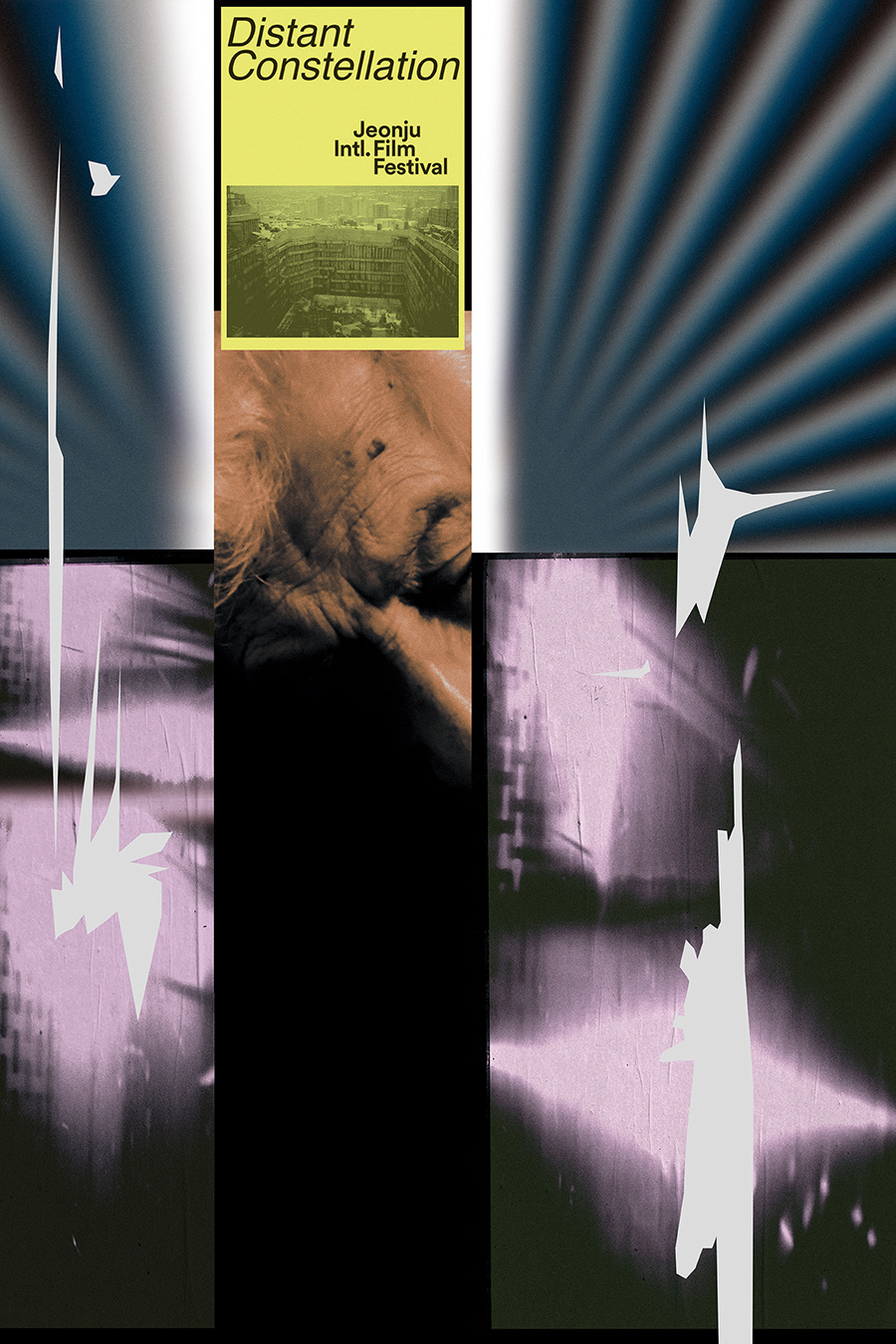
distant constellation i was once hired to create a poster for this film and failed, so it is with the utmost respect and admiration that i post this poster. it was created by shin-woo park for the jeonju film festival which takes special pride in commissioning its own set of posters for the films that it programs each year. shin-woo manages in ways i could not to touch on some of the complex ontological thoughts one has whilst watching this truly unique film.
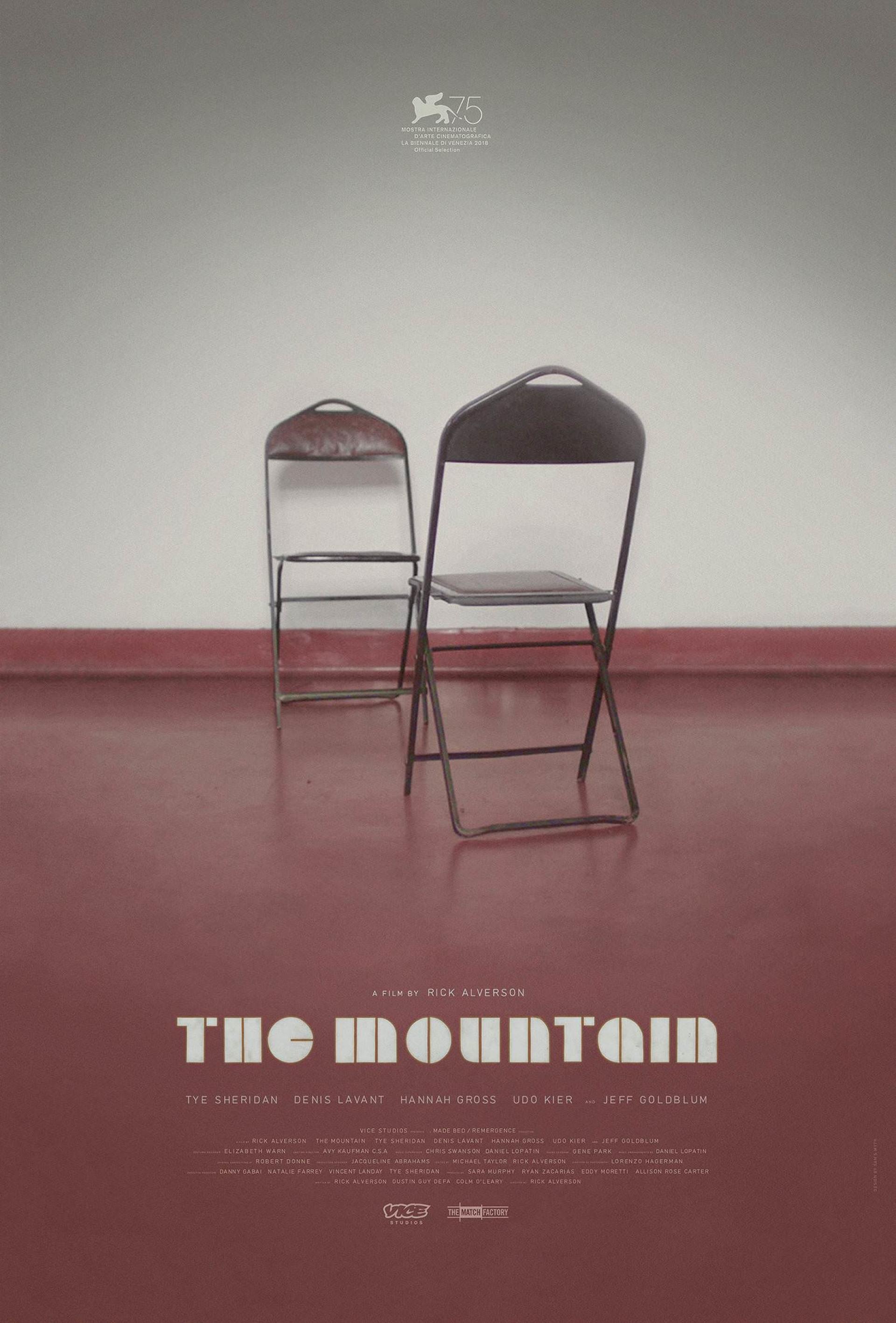
the mountain sam smyth did good here. the suggestive quality of this photograph combined with the film’s name and the typographic treatment of it, give this poster a cold but curious mystique. i’ve never seen the film, i know little about it and yet i’m delightfully curious to see it simply because of the level of nuanced restraint in this design. furthermore i imagine that the poster will mean even more to me after seeing it than it did before.
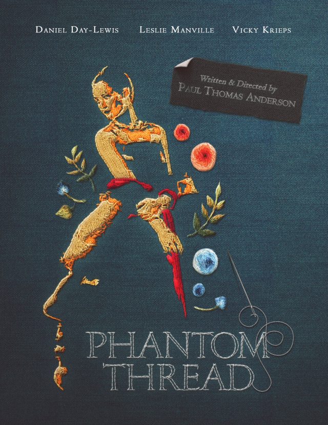
phantom thread i have seen this film and enjoy this poster by brian vee not just because of its inventive delivery of the film’s narrative concepts, but also because making a poster with your own bare hands will always grant it a unique quality; a quality that computer software alone never will. adobe products tend to homogenize design aesthetics the world over, and the more we all learn to keep them at arm’s length, the better and more original our work will be.
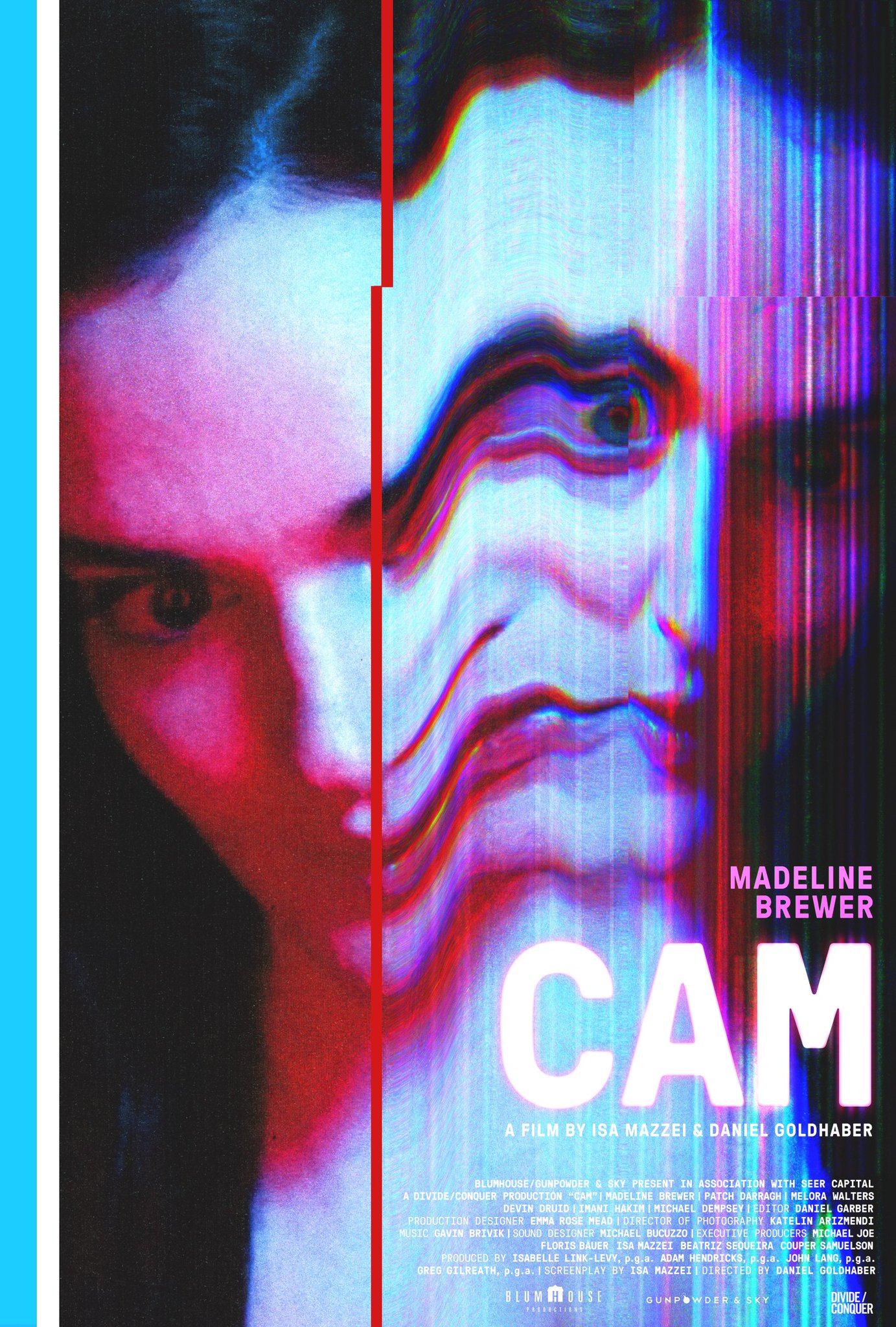
cam the fact that this poster was used for both the festival and theatrical releases of this film is testament not just to the design, but to the quality of the sales and distribution folks behind the project. i am biased as i work regularly with the poster’s creator, charlotte gosch, and so got to see it at several stages of its production, but that’s the limit of my influence on its genesis. it’s a striking, stand-out and brutal piece of work for a film i have not seen, but very much want to now.
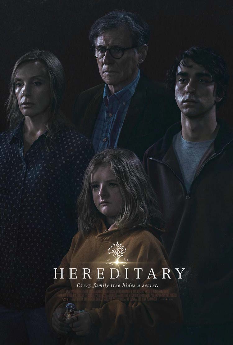
hereditary the lighting alone in this poster is unlike that in any film poster i’ve seen before. it’s reminiscent of the work of gregory crewdson. the predominance of shadows hint at the horrific quality of the film — which i have seen — whilst the glinting light emphasizes the facial structures of each of the characters. this second part is of particular importance given this film is about a family, one of whom is all the more striking in appearance than any of the others. the family’s arrangement in the frame echoes the small family tree motif which is further echoed in the film’s name and tagline. speculation as to the film’s nature and narrative fill the mind even before a screening, and afterwards you’re reminded of just how unique the film looked compared to other films (as much as you’re reminded of its dark, dark heart.)
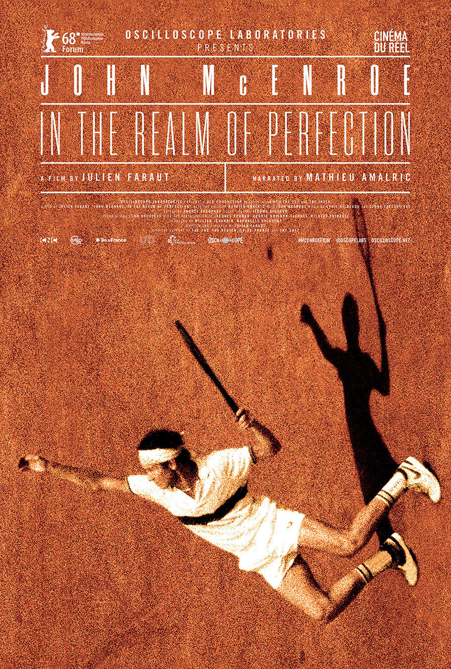
john mcenroe — in the realm of perfection french design team checkmorris created this poster. the relatively conventional ‘tennis court-esque’ typesetting is offset by the delightfully effective rotation and cropping of the photo of mcenroe. i have not seen the film so i can’t comment on how much john’s plummeting fall from the top of the frame is an echo of the film’s narrative, but it does make me wonder.
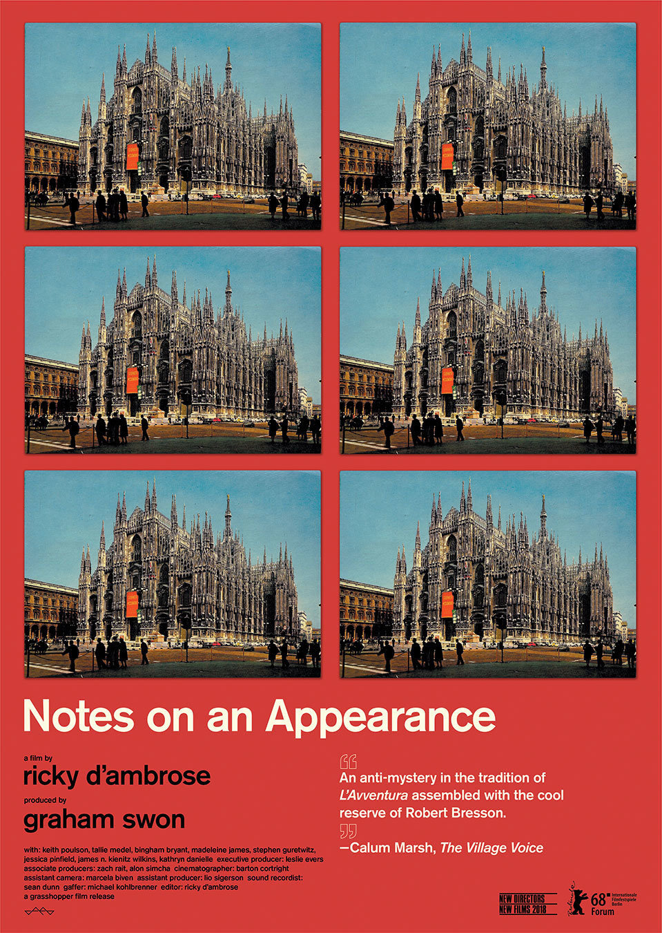
notes on an appearance this poster is exceptionally interesting on a number of levels. first up the ‘spot the difference’ nature of its repeated imagery really grabs your attention. the moment i saw it i was left wondering what i was supposed to be looking for, which in turn made me keen to see the film. secondly, the poster was made by the film’s director ricky d’ambrose. this fact inherently makes me trust the work more; it’s a piece of direct communication from the film’s heart. whilst it’s not unusual for a director to design their own film poster, it is certainly not common for that poster to be quite this good.
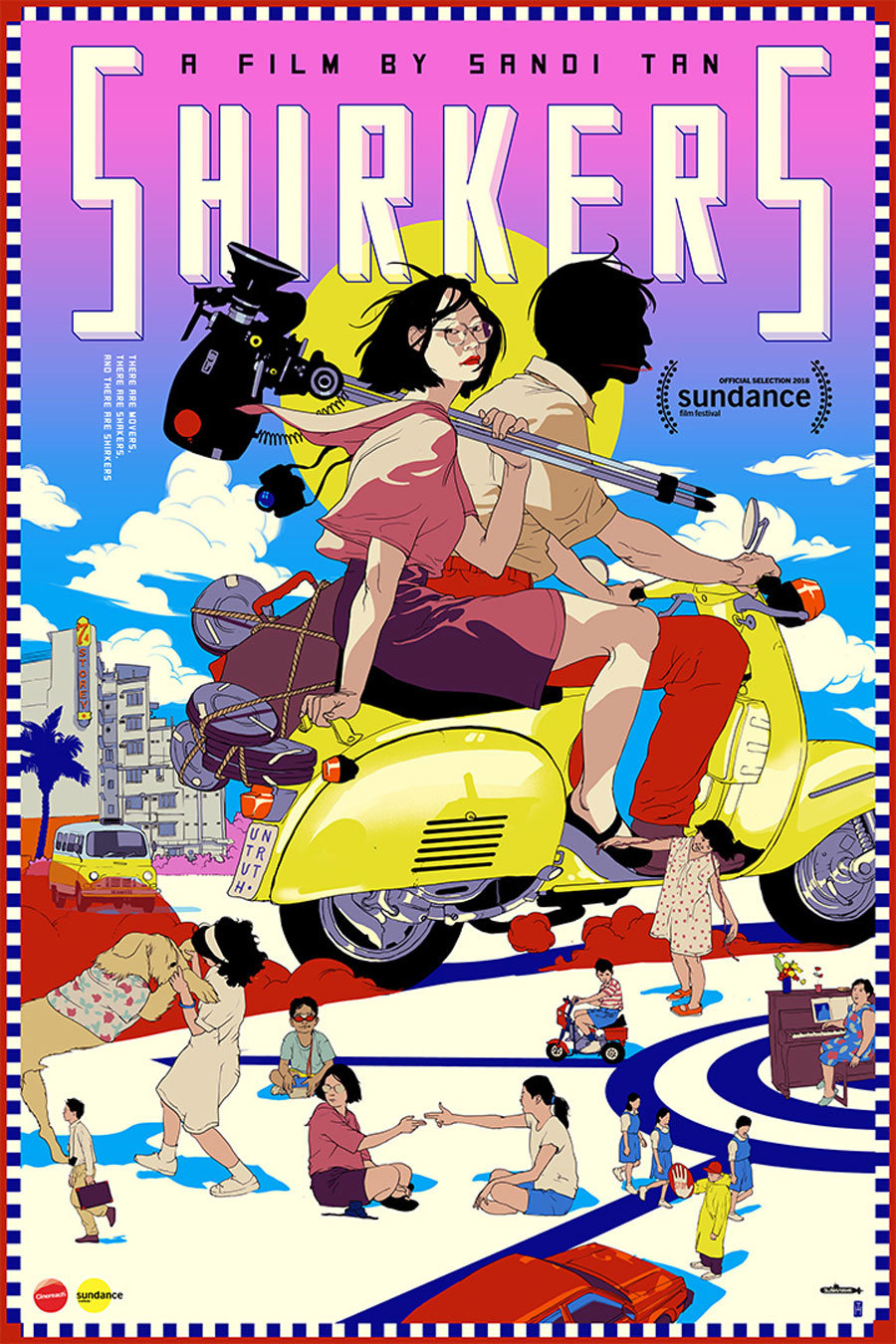
shirkers this poster by tomer hanuka is remarkably pleasing to look at. it feels unique in the realm of film poster design, particularly theatrical film poster design. i know very little about the film but something tells me its not an animation. this in turn makes me appreciate it all the more as this kind of ambiguity is usually a ‘no go’ with sales and distribution figureheads. i cannot say the poster gives me any great clues as to what the film is about, but certain aspects — like the ‘untruth’ license plate and the silhouetted motorcycle driver — make me very curious. in fact i’m sure that once you’ve seen the film the poster will become all the more valuable as a result of these mysterious little details.
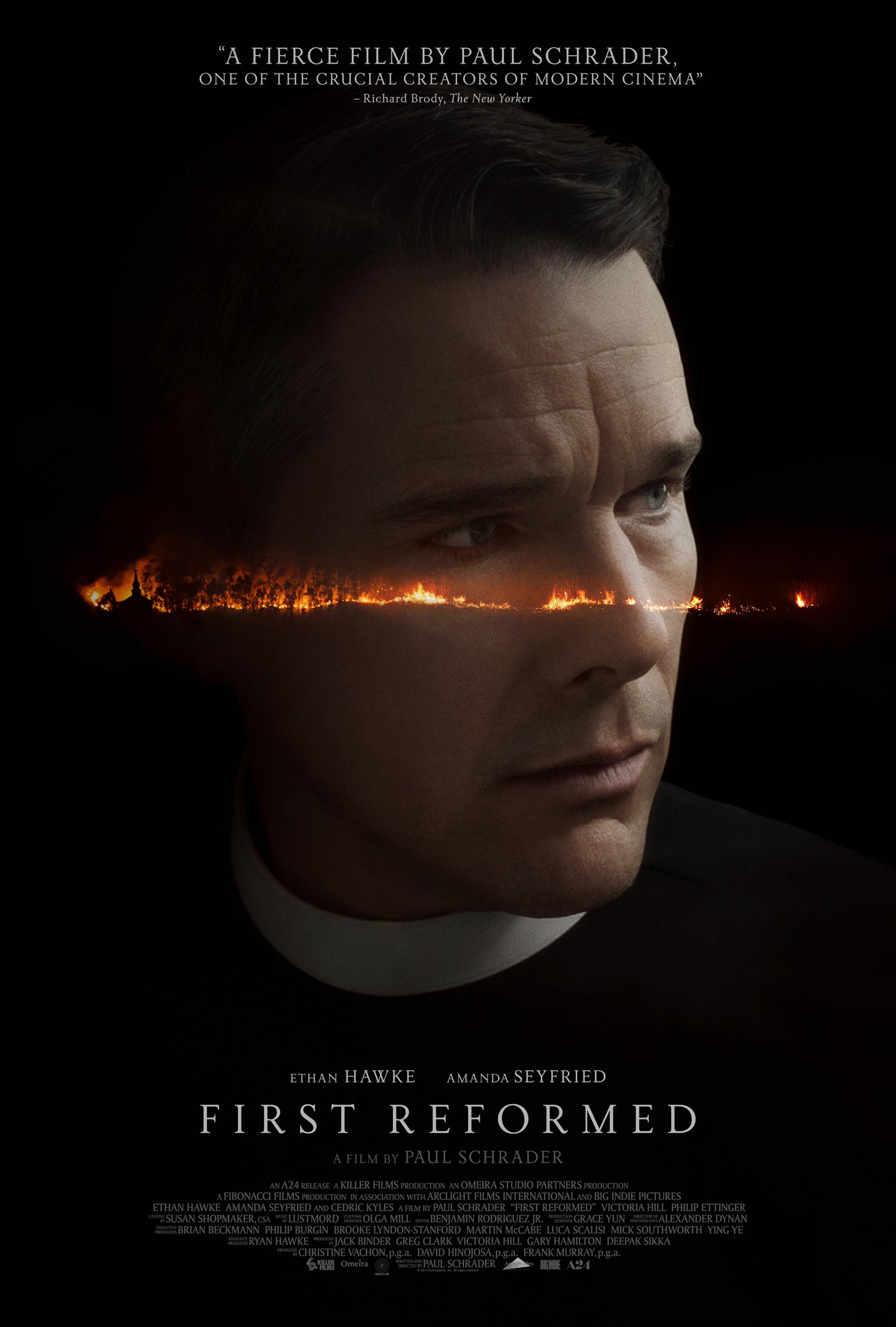
first reformed i suppose it’s no secret that this poster is a rip-off of the great italian poster for andrei tarkovsky’s film, stalker. that said my rule has always been that if you find yourself under the heavy influence of a previous work, then you simply must evolve it if you wish to preserve your integrity. in this case i think the conversion of the tarkovsky factory / war-scape into this more delicate fiery hellscape is not just welcome, but considerably more psychologically impactful. i have seen this film and what you see here in this poster is more of a feeling about the film’s narrative and its protagonist’s psychological condition than is necessarily depicted in the film. this in turn makes this work a respectful evolution of its predecessor.
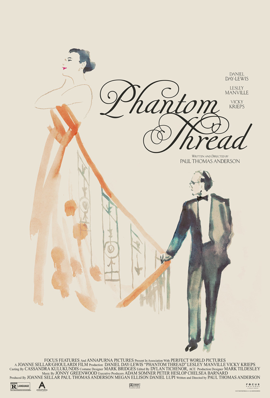
phantom thread this is, i believe, an unused poster from the alphaville design archives. that said i think it’s the best poster for phantom thread out there. it not only harnesses what alphaville are good at, but it makes a beautiful commentary on the film’s narrative. every time i think about posters for this film, this is the first one that comes to mind. simple, elegant and clever. i imagine it would be particularly beautiful printed on a nice, large piece of old cartridge paper.
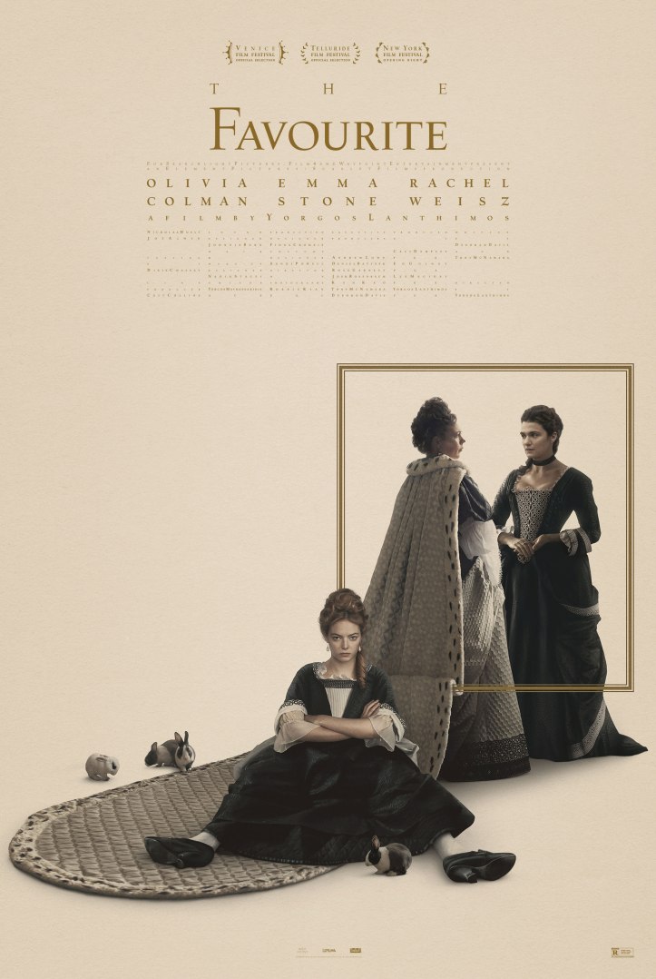
the favourite i’ve yet to see this film, but i remain a huge fan of yorgos lanthimos’ work and that of his poster designer, vasilis marmatakis. they, together, feel to me like one of the most vital forces in modern cinema. that said i’ve found most of the posters for this, his latest film, rather lackluster … until now. this poster below is lovely. everything from the typesetting that suggests ‘being separated out or split up or a-typical’, through to the small graphic picture frame that similarly splits the characters up, is great. on top of that you have a flat graphical element (the small frame) actually affecting a photographic element (olivia colman’s dress) to great optical effect. i’m sure this poster looks fantastic in the printed flesh, which is something i don’t necessarily feel with a lot of posters. these days whether film posters are actually going to be printed and how good they might look as a result, can often be a lowly afterthought.
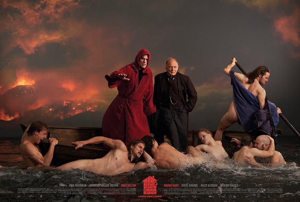
the house that jack built this is one of my favourite films of the year. this poster is, believe it or not, a shot from the film. having grown up — as the son of two painters — regularly looking at the paintings of géricault and caravaggio, i find the fact that this is a film still particularly stimulating. lars von trier’s films are often a cause for concern with some people and this poster reminds those that have seen it of the more philosophical and logical side of the film. much like with his previous nymphomaniac films, it’s this psychologically investigative narrative through-line that grants lars the ability to reach deeper into the dark heart of humanity without losing touch with his audiences. this is particularly important in today’s increasingly divided, politically-correct world.
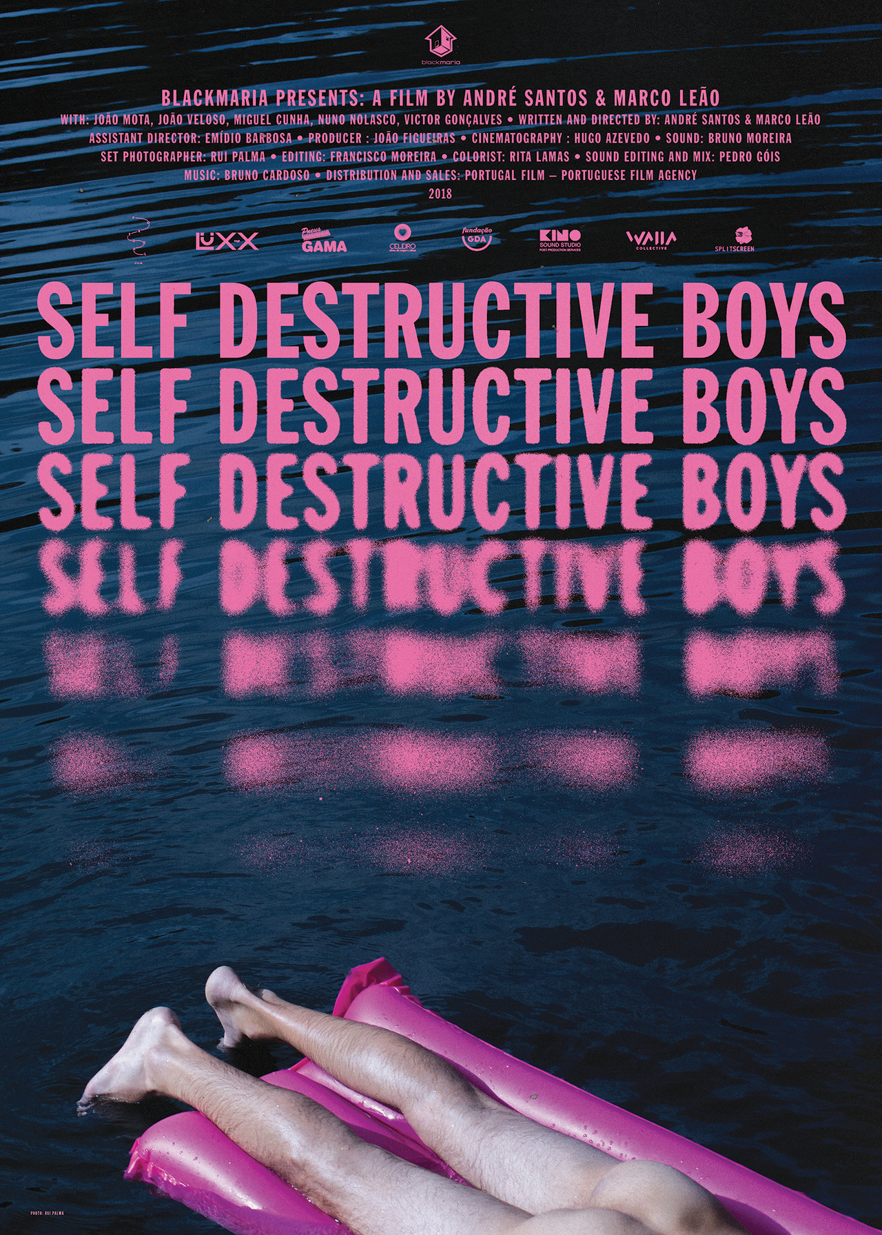
self destructive boys braulio amado is an excellent graphic designer. he doesn’t usually make film posters, but he seems to take to any new subject like a fish to water. i know nothing about this short film but the poster is both funny and mysterious. the day it came out i found myself sending it to other design friends, whilst at the same time i wrote to braulio himself to ask how he did that ever so beautiful blurring / disintegration of the text. the best work makes you want to be better at what you do.
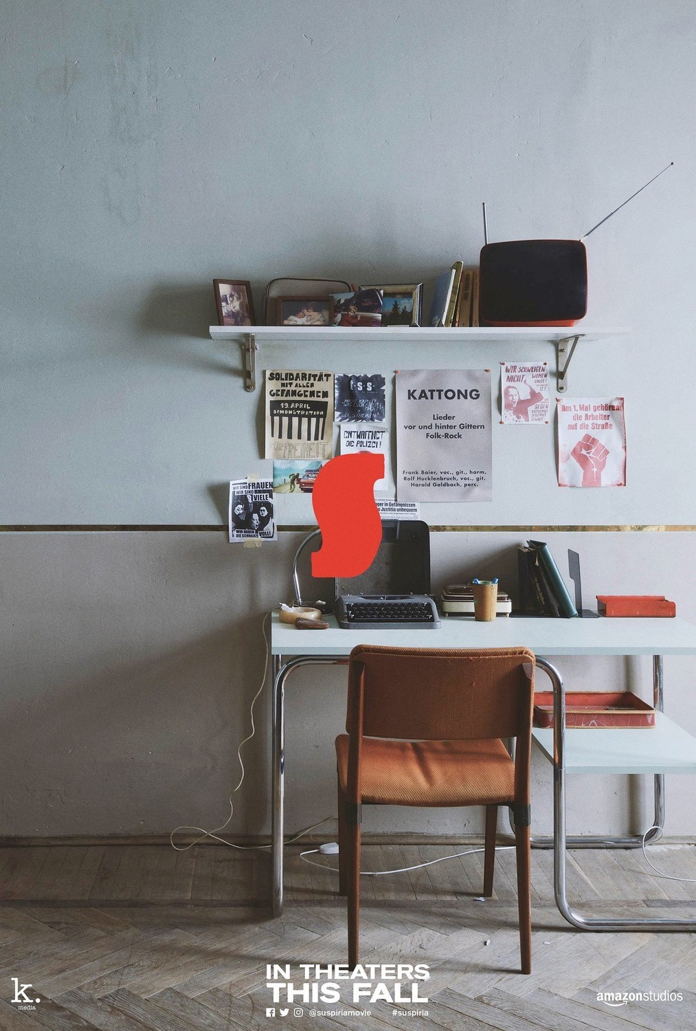
suspiria there have been a wealth of promotional items produced for luca guadagnino’s suspiria remake. as a filmmaker i very much appreciate his work, however i’ve never seen him produce a good poster for his films until now. the poster below is part of a second or third wave of promotional materials for the film that caught me quite off guard. legendary title designer dan perri’s now famed suspira ‘S’, when coupled with these very simple, softly lit, full-frame images from the set of the film, carries more magic than it ever did before. i’ve yet to see the film but i’m certainly all the more curious because of the elegant and minimal constraint of these designs combined with all the lovely details in each photograph.
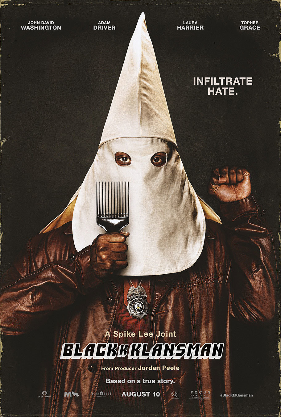
blackkklansman kenny gravillis triumphant poster for spike lee’s latest joint has been a great pleasure to see on the walls of new york city during this particularly dark political time. the work needs no real analysis of course, but to me it represents what they call ‘design for social change’ and in every way is good in my book. whether you see the film or not, hopefully the image sets your mind on fire, whether that be about the past, the present or the days to come.
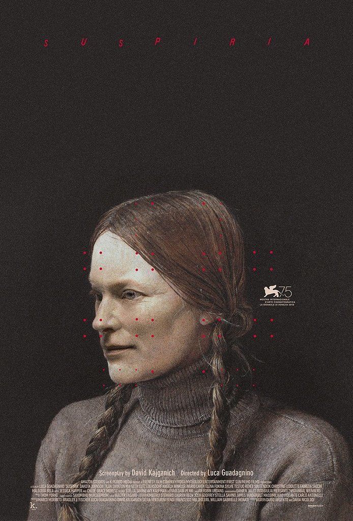
suspiria last but not least i wanted to draw attention to this particularly beautiful, unused poster by my contemporary, midnight marauder. i remember the day he posted it on instagram and my jaw dropped a little. i then looked at it a little closer and my jaw dropped some more. just look at those confoundingly brilliant little red dots, let alone that utterly mysterious face. is it someone from the film? is it some strange amalgamation of dakota johnson and tilda swinton? i had not seen the film yet so i didn’t know, but good lord this image haunted me. as a friend once pointed out, the artworks that often most impress us are the ones we cannot deconstruct. the simple fact that i have no idea who this person is yet feel she is perfectly situated in the world of this film is a remarkable feat.
for the purposes of this article i did some research and discovered that the picture is actually of one helga testorf, who used to secretly model for her neighbour the artist andrew wyeth. in many ways i’m now sad to know this, as the mystery in that face was so perfectly aligned with this film i’d yet to see. this in turn is of course what makes the poster so unique to me. the free association of an entirely unrelated image to a film in this way is often what makes midnight marauder’s posters so strong.