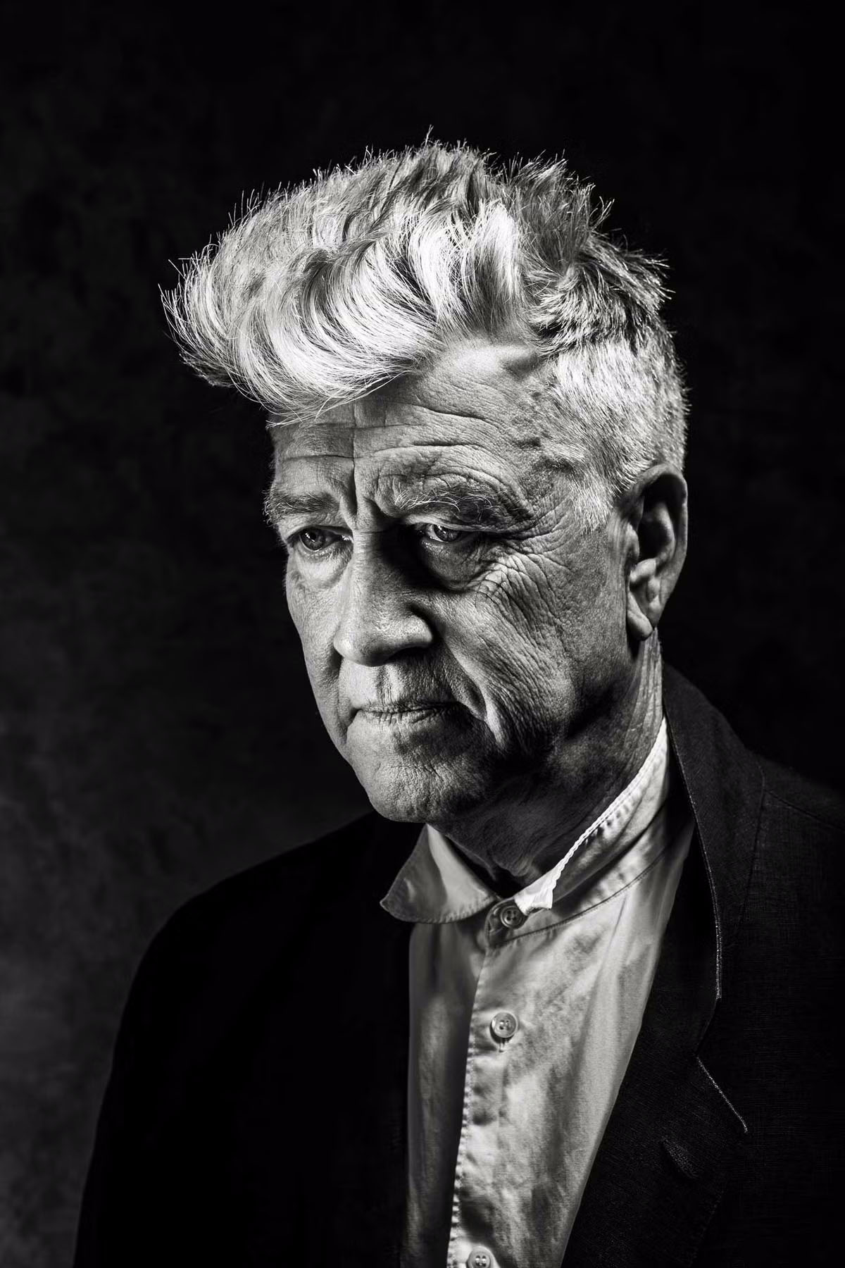
the news of david lynch’s death came to me today through a text message from a friend. i didn’t believe it was true—after all it couldn’t actually be true—so i searched the internet to satisfy my doubts. at first there really was no mention of it, and i smiled. then, slowly, like a polaroid developing, obituary after obituary began to appear as i refreshed and refreshed. immediately, my face now wet with tears, i sent messages to those with whom i’ve shared a great delight in his work. immediately and sweetly each one of them responded.
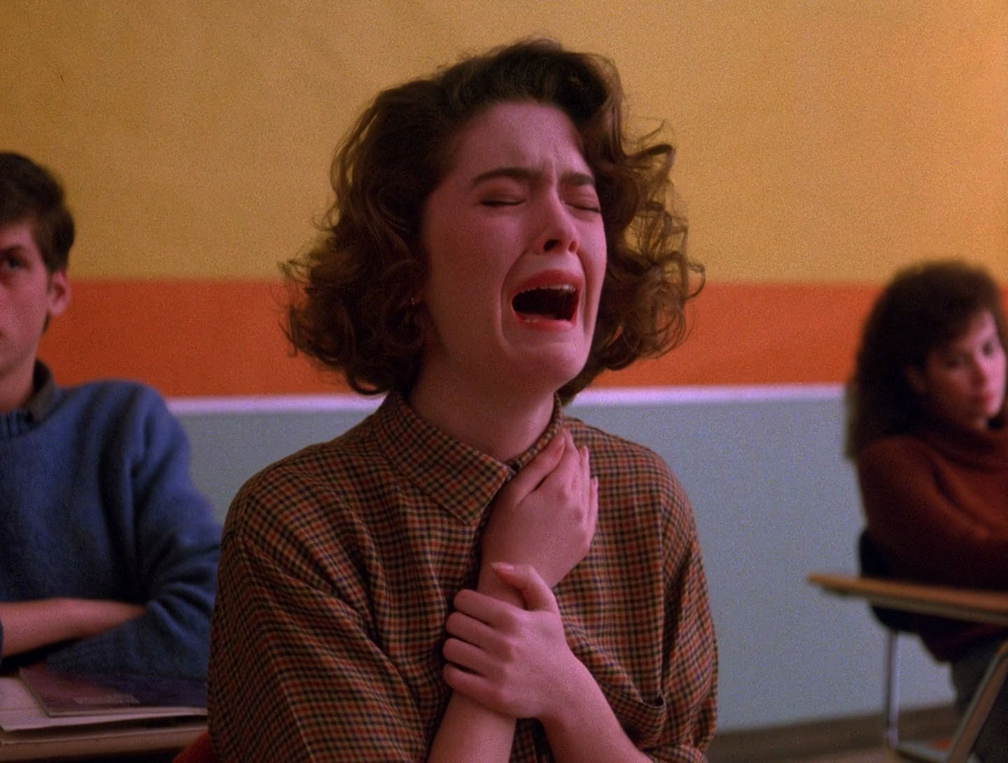
i have just arrived back in new york for a brief trip. new york is a city i used to call home in a country i was fundamentally drawn to as a teenager. i was pulled here by the allure of artists like david lynch and trent reznor, who were making work (and at that time, together) that felt so unsafe that it excited my young mind. i am sitting at the kitchen table of my friend’s brooklyn apartment working on some film titles. i was sitting here when the news of lynch’s passing came in just hours ago. i was so consumed with tears in that moment that this scene from twin peaks started playing out in my mind. it’s a scene i’ve often thought of when crying, as in some ways it’s always helped me feel okay about crying as much as i do. the scene is from the pilot episode of the TV show. it depicts donna hayward, james hurley and audrey horne—sitting in their high school class room during a roll call—finding out that their classmate laura palmer is dead.
in the scene a policeman enters the class room and asks for a kid called bobby briggs. the cop then whispers words we can’t hear into the teacher’s ear whilst, simultaneously, an unidentified female student runs past the class room outside screaming in tears. then, as the teacher turns to the class and fearfully glances at laura’s empty desk chair, donna and james share a profound sense of what’s happened to their friend. donna then sighs, says “laura” out loud and starts to cry, and—after the teacher elliptically says “there’ll be an announcement from the principle”—james uncontrollably snaps the pencil he’s holding as his right hand becomes a fist.
the crying isn’t the whole story here though. there are other reasons this scene returns to me so frequently. first of all: every beat of it exhibits a thing prevalent in lynch’s work; a thing that’s been so important to my work; a thing that has consequently lead me to the work of robert bresson, jean-luc godard and andrei tarkovsky. the scene delivers profoundly accessible feelings with barely a word of dialogue spoken. angelo badalamenti’s famous score is also left that the door, only to be replaced in small part by lynch’s trademark ambient soundscaping. sure, the policeman’s unintelligible whisperings to the teacher, the inarticulate knife-slash of the student screaming past outside and donna exhaling “laura” would lead those with eyes closed in a certain direction. however it’s the sequence of images used here that are invaluable to us the audience, as we find our own deeper way to relate to the action: there’s the look on everyone’s faces as the policeman enters the room and then whispers to the teacher. there’s the look on donna and james’ faces as the girl runs past outside and as the teacher glances in the direction of laura’s empty chair. then, finally, there’s the sense of loss expressed by the shot of laura’s empty chair itself, and donna and james’ consequent reactions to that. i have spent much of my life figuring out how to communicate the ineffable effectively with only one or two images, and so i’ve kept returning to this scene, and countless others in lynch’s work, in reassurance of the possibility.
second of all: there’s that eagerness david lynch possessed to let go of the handlebars and order each scene or act in his films such that they connect with those around them more because of a feeling than any clear rationale. he once said, “i don’t know why people expect art to make sense when they accept the fact that life doesn’t make sense,” in response to which the film critic (and champion of jean-luc godard’s work) richard brody excellently quipped: “that’s why.” both men are of course right in some sense, but for me it’s lynch’s view that feels closer to life as i experience it. at my most heartbroken a few years back, a friend whispered to me on the phone: “i know it doesn’t make sense. don’t try to make sense of it. it’s never going to make sense.” it helped me profoundly to hear that, and again i found comfort in thinking of laura palmer’s empty chair in the class room, and the unidentified girl running by outside screaming in tears.
it’s not lost on me that i’m here trying to express with words a feeling that one cannot express with words; moreover a feeling that words are often superfluous in visual artwork. to that end i’ll stop now. in fact all discussion of the unique power of images aside, the following quote from the film critic matt mahler is perhaps a more adept description of why i’m writing any of these words in the first place:
“I understand how strange it might be for a stranger’s passing to have this much of an effect on someone, but that’s just it — when you love an artist’s work, they aren’t a stranger. Their memories become your memories, their best thoughts and days motivate yours. Their sadness is yours, and they share with you the shreds of beauty they’ve discovered.”
i’ve shared a love of david lynch’s work with some of my closest friends, and even my family. earlier today in sharing with him the news, i told my brother that i had been crying. he said, “yeah, of course. it feels like a door has closed.”
again i cried.
and again, as my brother made clear, another image without words sufficed.
caspar wrote this piece upon request for the independent, full-service, film, photography and animation production company, ecstatic static. the essay now resides in their website’s resources section alongside an extraordinary array of other materials. this text represents to date everything he’s come to learn about making film posters within the world of independent cinema. he hopes it’s of use to some of you out there.
Filmmakers: in the 10 years or so that I’ve been making posters for films I’ve come to understand two important things. The first is that whilst I wasn’t very good at it when I started, many filmmakers were nevertheless happy to pay for my bad work and use it to represent their films. The second is that there really is a very comprehensive ideology to making the proverbial “good film poster,” and that if you adhere to it even loosely you’ll have on your hands not just a poster that talks seductively about your film, but also a beautiful piece of print work in its own right. Please don’t misunderstand: there is no precise formula for making a good poster, just as there’s no formula for writing a good song. My father the painter and drawing teacher, Thomas Newbolt, teaches his students not to draw better but to see better, so that whatever their natural technique they can draw better with it. In this same fashion my aim here is to introduce you to ideas that perhaps will improve how you see your film through the eyes of the mise-en-scène on paper that is the film poster.
Despite what you might assume filmmakers are often not particularly visual people, and likewise I can tell you that graphic designers are often not particularly poetic. In fact it concerns me a little when someone asks me to “design” a poster because aside from some text-based information, the best film posters have very little conventional graphic design thinking to them at all. In fact it’s in thinking more like a painter that I believe film postermakers are more successful. Similarly it concerns me when a filmmaker knows how to, let’s say, “gather scene information” with their camera, but yet is unable to make a beautiful film. Today’s technology enables anyone to film someone walking down a corridor, opening a door with a key, going through the door it and closing it. Yet not everyone will have the eyes for framing, movement, lighting, tone, performance, sound or editing to make anything about witnessing this event observant, meaningful or remarkable in its point of view. In the same way, many people have a copy of Adobe Photoshop and consequently many film posters feel similarly limited by what that software can do.
The filmmaker Robert Bresson when speaking on the subject of film editing stated that “an image must be transformed by contact with other images as is a colour by contact with other colours. A blue is not the same blue beside a green, a yellow, a red. No art without transformation.” Thus I’m aware that for filmmakers it is in part this transforming of an image through the cut that a deeper poetry in this medium can be developed. The good film poster also exists in that cut between any two pieces of footage. It is a single image often created using complimentary elements from the print world vernacular. Each element pieced together to articulate a visual counterpoint to the film rather than rely upon any actual still image in the film. If filmmakers cannot be open to their film being articulated in this way and / or if graphic designers don’t have the poetic sensibility to depict it, then the collaboration can lead to some bad work.
I say this because to make a good film poster one should aim to achieve the following:
Reduce a film — which can be some 172,800 still images more or less — to one single image that speaks to the whole. Therefore one must often aim to be even more poetic than the film itself was able to be.
Make that one single image work on paper — often in portrait format, when films are largely shot in landscape format — and in a fashion that speaks to people walking quickly by, across the street, and often with other things on their mind. I stress the word “paper” here because things that look good on screen do not always look good on paper. Furthermore things that do look good on paper and therefore make for the most beautiful posters, are often the simplest and flattest things. Those can be lines, shapes, drawn or painted marks, cut out or torn pieces and typefaces that make you as aware of the paper itself as possible. When filmmakers get excited about shooting on film, so postermakers should be excited about printing on paper. As the script is to the film, so the composition on screen is to the printed poster. A success in this understanding and practice leads to something the Germans have a word for: plakativ. The word translates as “striking, bold, pithy” and yet, stems from their word for “poster,” plakat. Thus the implication of the word is that poster-like work is something we should strive for.
Understand that the poster exists within a context. The poster is for a wall on the street or in a house or in a cinema. It’s not just for digital usage such as social media. Let’s not be confused: you’re not making digital banner ads for a website — which is all a poster is if it’s never printed on paper — you’re making an object that someone should not just want on their wall for the duration of the film’s release like some advertising billboard. You’re making something that people may want on their wall, at home, very large, perhaps even framed, for the rest of their lives. Think about that. Think about the poster sitting next to a painting, and a window, and a vase of flowers, and in the morning light — as a part of a complete interior experience, and so on. The moment you start to really think about context in this way you’ll start noticing, commissioning and / or and making better posters.
Now, let’s say that you’ve made a film and you’ve just gotten into a festival. Or better yet, you’ve sold your film and now its on its way to cinemas nationally or internationally. Either way you’ve got some “successful” marketing and distribution people breathing down your neck about needing a poster. They’ve told you how they know how to make a poster that will get people to see your film, and how their in-house designers — under close guidance — will make just such a poster for you. Perhaps you’ve even signed a contract with them that gives them final say in how the poster looks, and now somehow the early drafts of what you’re seeing are just nothing like you’d hoped or imagined a poster for your first film would be. You then find yourself sitting there with a week to go before the poster has to be done, and you and your film might well be misunderstood and neglected.
The above paragraph is deliberately emotionally manipulative but it is also based on truth. This is often exactly what happens and whilst some filmmakers don’t even notice it happening, here are some things to consider when you’re ready to have a film poster made:
FIND A GOOD POSTERMAKER You probably have a good idea already which film posters you like and maybe even who made those posters. However sometimes it’s not a professional poster maker you’re after. It may well be someone who has never made one before who will give you the freshest and most powerful poster to herald your film. Hell it may even be you, the filmmaker, who should make the poster. Either way try to find someone who isn’t all about style and technique, who has the breadth of imagination and skill to create something that speaks as directly as possible to the film. The actor and director Brady Corbet once said he preferred — when considering to act in a film — to talk to the filmmaker directly than to read any script; he knew it was the filmmaker’s attitude that would convince him the project was worthwhile rather than any skill at writing. I say this because if you just want some recognisable artist or designer to slather your poster in their clever signature style, then you’re just selling their work and not talking about your film. This would be akin to paying a critic for a good review. What you’re really looking for is someone who deeply understands your film and can articulate that understanding on paper.
HAVE AN IDEA Much like a film, every poster should have an idea or reason behind the execution of its visual approach. There are no exceptions. A poster with an idea behind it is a clear reaction to an action. This is to understand that humans by their very existence are a series of reactions to actions, and thus will immediately notice the nature of origin stories like their own.To sense a poster is behaving visually strangely for a reason is to sense an interpretation, in the hands of the postermaker, a reaction to an action by the filmmaker. This creates a tension, a curiosity, questions without answers, and ultimately engenders the desire to see the film. It is better if the poster is trying to be original, otherwise you will get your film confused with other films. This, despite what your marketing people might tell you, is not a good thing.
MAKE YOUR OWN RULES Just as film doesn’t necessarily need a plot or a three-act structure, so there are no general rules for film poster design and therefore no particular way a film poster should be made or should look. The only rules are those that the filmmaker and the postermaker devised as a way of best articulating “the idea” mentioned above. This means you should have absolutely anything you want on the poster, be that a photograph, a painting, a drawing, a collage, a smear of your own blood, a blank canvas, a Jackson Pollock drip painting with type, if it be your will.
Speaking of type: this is where graphic design thinking in the strictest sense most often prevails, but we must accept that type is also ultimately a part of the image. Anything on the poster is the image, whether letters are legible or not. As the graphic designer David Carson once said, “don’t mistake legibility for communication … you cannot not communicate.” This means that what you are trying to say with the poster will define the nature of the typographic treatment. In the case of typography this implies that you can make the words on the poster as big or as small or as legible as you like. Whatever feeds the agreed idea and helps articulate it more powerfully and clearly is key. For example: very small type draws you in closer and makes the rest of the image feel very big and grand in contrast. Similarly very large type can trivialise the rest of the image and remove the stature you might otherwise believe it had. Whatever you choose to do, when you do make your own rules, you must stick to them. Part of noticing a good poster is the subconscious awareness that it’s abiding by a series of self-imposed rules and that the tension created by those rules is clear.
BECOME THE FILM No two posters should look the same. Insisting that they do is saying that your film is the same as another film. Referencing other, older film poster styles only may make those who get the reference wish they had the original poster on their wall instead. Despite what your sales, marketing and distribution people might say, the only reason the poster style they’re suggesting you try “worked in the past for this kind of film,” is because once upon a time that style was original, unique to a previous film and had never been tried before either. Just like the film you are making a poster for, the best ideas for film posters come from everywhere but the world of film. Start sourcing images and ideas from your own life, literature, painting, sculpture, street art, magazines, fashion photography, corporate logo design, typographic journals, war propaganda, cave paintings, political pamphlets, household product packaging; literally anywhere but the world of film and its posters. Remember you are not talking about film posters as a culture when you make a film poster, you’re talking about a film. So become the film, embrace what is unique and original about it, and don’t just become another in a long line of film posters dressed in a recognizable uniform of a pre-established school of thought.
One way of thinking about this that might help is to imagine you’re making a poster that would itself hang comfortably on the wall in one of the scenes in the film that you’re making the poster for. Try this as a thought experiment when starting to put together ideas for your poster. Whilst it’s not imperative that this line of thinking be followed — far from it in fact — you will find it yields some interesting results.
GET AWAY FROM THE COMPUTER Where and when possible move your process of postermaking into the physical world. Even if that’s as simple as printing your work out and scanning it back in, it makes a difference. The introduction of any analog element into the design process will give your work a life that is inherently unique to you. People say that one of the reasons vinyl records remain so popular after all this time is the “user experience” they offer; the large reproduction of the artwork, the interaction with a layered physical object, the cleaning of the musical surface, the positioning of the needle, and (if your hand is shaking) the unique sounds that can be made in the process of listening to it. The same thing applies to good postermaking; the less time you spend trapped inside the confines of popular computer graphics software and instead are allowing the shake of your own hands to place elements onto the poster — be that photography, collage, drawing, painting, scanning or whatever — the more mysterious, imperfect and beautiful your work will be. Again, humans like to feel that extra work has been done and that mistakes have been made; reactions to actions.
PROVIDE TWO POSTERS (IF NECESSARY) The filmmaker David Fincher once said that there are two ways to shoot a scene: the right way and the wrong way. Similarly any postermaker worth their salt may make a series of different versions of their poster as they explore how to deliver the agreed concept in the most powerful and beautiful way. It is not however then the postermaker’s responsibility to show anyone those different versions unless they want to. This is where — assuming you’ve chosen the right person for the job — the postermaker’s most important and unique talent comes in; they choose the poster that clearly does the best and most beautiful job, and hand that and only that to the filmmaker. Anyone who believes it’s the director or anyone else’s job to choose from an array of versions created by the postermaker for the sake of their being “options” doesn’t understand or respect the eyes, skillset or experience of the person making the poster. Again if you’ve found the right postermaker and they truly understand your film, then you can trust them to make this decision implicitly. It’s in giving the postermaker agency that you encourage them to produce their very best work.
Celebrated graphic artists Hans Hillmann, Peter Saville and David Carson — to name but a few — all famously produced their best work when they rarely had to answer to anyone. Hans Hillmann worked during a time in Germany when very few people had the means to create film posters, and so he’d be sent the film and simply send a poster back when he had one that he liked. Peter Saville had a similar relationship with Factory Records in England: on at least one occasion New Order only saw the artwork for their latest LP after it had been released into record stores. David Carson’s now infamous, groundbreaking work on Raygun magazine was only possible because he sent the design files directly to the printer, without the editors and writers having a say in how he’d laid out the content.
Having the proverbial good film poster on your hands, what often happens next is that your marketing people tell you your poster has type that’s “too small to read on a phone,” or something to that effect. This can quickly become a dealbreaker to these people no matter the strength of your arguments, and it’s at this moment that you and your postermaker take a deep breath and take 5 minutes to make an additional, ephemeral poster-shaped social-media-banner with huge lettering and hand that over too. You may be surprised at how often this method works. Then you can get back to helping make the object that one day will be framed on your wall and represent your feelings about the cinematic artwork you’ve given years of your life to making. Everyone’s happy.
…
I had an argument recently via email with a Swedish graphic designer who told me he thought film posters were commercial advertisements and nothing more. In not so many words he told me that I was wasting everyone’s time by thinking about film posters as anything remotely artistic. Whilst I hope my own work has gone some way in proving this man wrong, I shall lean on the words of Peter Saville here to brush aside this line of thinking so that we can continue to strive to create increasingly poetic film posters:
“It’s during the current era that in a way the cultural canon has become entirely appropriated for the purposes of commercial practice. And that’s where there’s — in a way — a disconnect. And it then begins to become rather upsetting when you begin to realize that we are now selling out the culture for the purposes of marketing. And that’s the thing which I’ve not wanted to really partake in. And that’s something which I find is — I mean just below the surface — a kind of wave of disillusion across the creative profession. So when you are fighting the marketing men saying look there is a better way of doing this, it kinda felt worthwhile. But when the marketing people sit there and say, ‘how do we seduce? And, you know, how do we position? How… Effectively how do we make our product or service or company look as if it believes in something, when actually it doesn’t?’ That’s the problem.”
I’ve deliberately not included any specific examples or technical instructions in this text, because again I’m simply hoping to urge you to try and change the way you see a film poster, and the way you see your film through the eyes of that poster. That’s the first step towards making a beautiful one of your own. I hope that by keeping my direction elliptical that I have left open that important space between your head and, what filmmaker Andrei Tarkovsky called “the ceiling of the director’s so-called thought.” Tarkovsky was troubled that audiences seemed to prefer knocking their head against this ceiling; they preferred being told what to think or feel about a film. He said, “such knocks … make them feel safe: not only is it ‘exciting’ but the idea is clear and there’s no need to strain the brain or the eye, there’s no need to see anything specific in what is happening. And on that sort of diet the audience starts to degenerate.” So don’t let me degenerate you. In helping you understand that no two posters should be alike, that there are no general rules to a poster’s form and function, and that a film poster must be perhaps even more poetic than a film, I trust you will find a keener eye for film posters, for those who make them and for what your film truly deserves.
Caspar Newbolt Berlin / New York May 3rd — 9th, 2021
the objectiv section of this website contains a scan of an email that my business partner giles once wrote to his father. his father hated the designs we’d created for our business cards back in 2003 (in retrospect, they were pretty bad) and giles, who often stood by his father’s point of view on our various new business concerns, did me proud in telling his pa to “back off” on this particular occasion. in fact i was so moved at this gesture and felt it such a call to arms to everything we were trying to do together, that i posted it on our new website as an indication of our company’s modus operandi. it’s been there now for 15 years and reading it still moves me. without giles’s understanding and counterpoint to my idealism i wouldn’t still be here doing this today.
we recently made the decision to shift our focus as a company to almost exclusively producing design and artwork for films. we felt that the considerable paycut would be worth it for the job satisfaction — or karma if you like — that came with creating artwork that extended, supported and promoted other artwork. films were after all my first great passion.
in the last year it’s my belief that we’ve really hit our stride, particularly with regards to the posters we’ve been producing. in doing so we’ve noticed various design fashions come and go and have strived where possible to avoid producing work that looks or feels like anyone else’s. this is easier said than done, but in certain cases i do think we’ve succeeded.
we’ve noticed in this process that there’s often a great divide between the quality of posters made for festivals and those made for a film’s theatrical release. it seems that the reasons for this are twofold:
sales, marketing and distribution types like to play it safe and rely upon the success of old marketing visual concepts in order to ensure their clients’ future success. there is of course no great logic to their point of view here, when what made the previous concepts successful was that they were once new. however they’d argue that it’s not always about talking about what’s new or different about a film so much as convincing audiences that they might enjoy this film as much as this or that great film from the past.
it’s common knowledge in the design community that the posters we are asked to make for film festivals are, more often than not, the posters that the filmmakers themselves would be framing and putting on their walls at home. this is because these posters were made fresh off the back of the film’s completion and in such close collaboration with the filmmakers that they became an expression of the film’s very DNA. these posters are often unique, experimental and highlight explicitly what sets one film apart from others.
this year alargenumberof ‘best film posters of 2018’ lists have appeared and it’s saddened us greatly to see, in certain cases, the inclusion of a lot of particularly basic, derivative and often downright tiresome designs. designs that in our opinion do nothing to make us want to see the film, let alone credit poster-making as an art form. these works make a sham of the profession as they further train the general public to rely upon such substandard methods of communication. it is then of course no great fault of those humans making these lists when this is what they have to choose from.
the decision to select posters from an exclusively theatrical pool works very well from the point of view of the platform publishing the list — you know, the playlists, indiewires, rotten tomatoes and little white lies of this world — because when these filmmakers are given a shout out of this kind they’re likely to repost this list for their audiences, and theatrical films often have much bigger audiences. these are also films that the general public have already seen or can hope to see soon, and so members of the public are also likely to repost these lists as they likely contain one or two of their favourite films.
jean-luc godard once said that “the best way to criticize a film is to make a film.” so allow us, if you will, to make a list in order to criticize some of these other lists. be they festival, theatrical or even unused byproducts of an otherwise doomed creative process, these are the posters from 2018 that we feel really count:
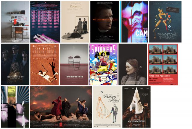
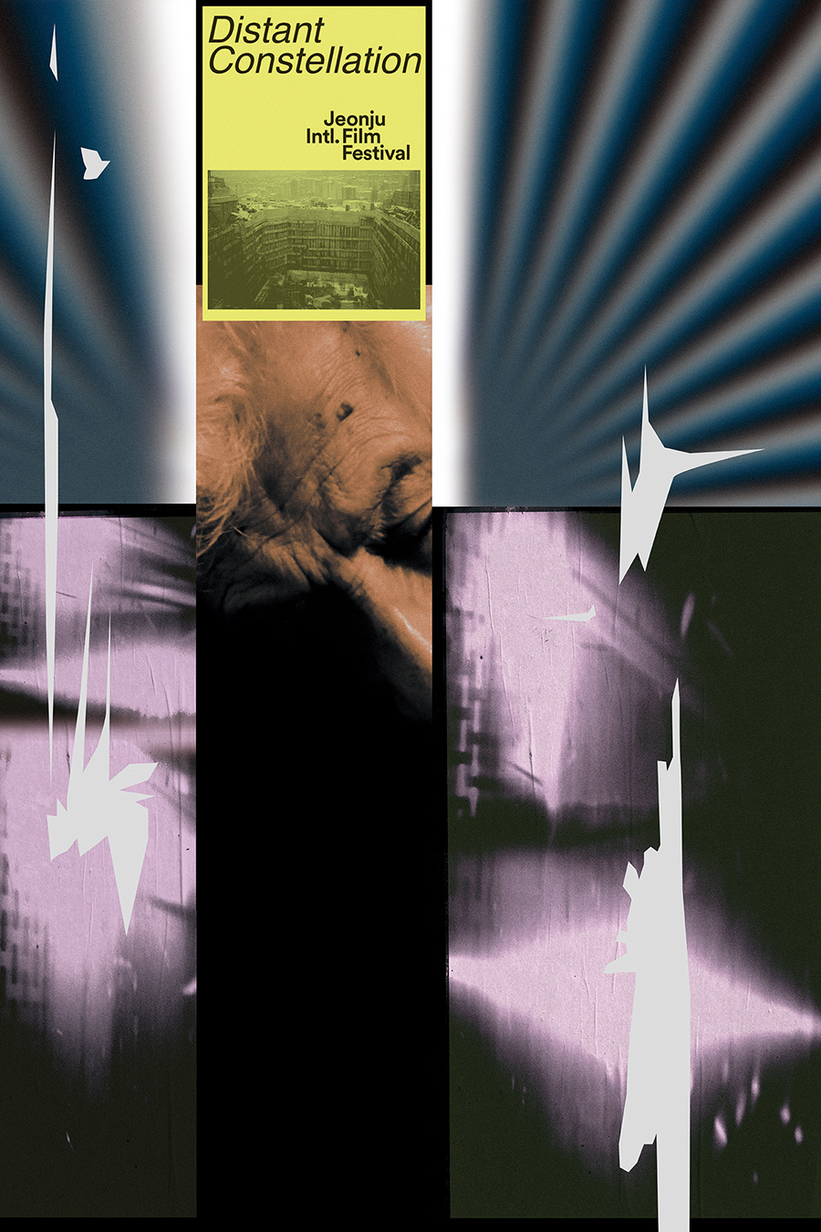
distant constellation i was once hired to create a poster for this film and failed, so it is with the utmost respect and admiration that i post this poster. it was created by shin-woo park for the jeonju film festival which takes special pride in commissioning its own set of posters for the films that it programs each year. shin-woo manages in ways i could not to touch on some of the complex ontological thoughts one has whilst watching this truly unique film.
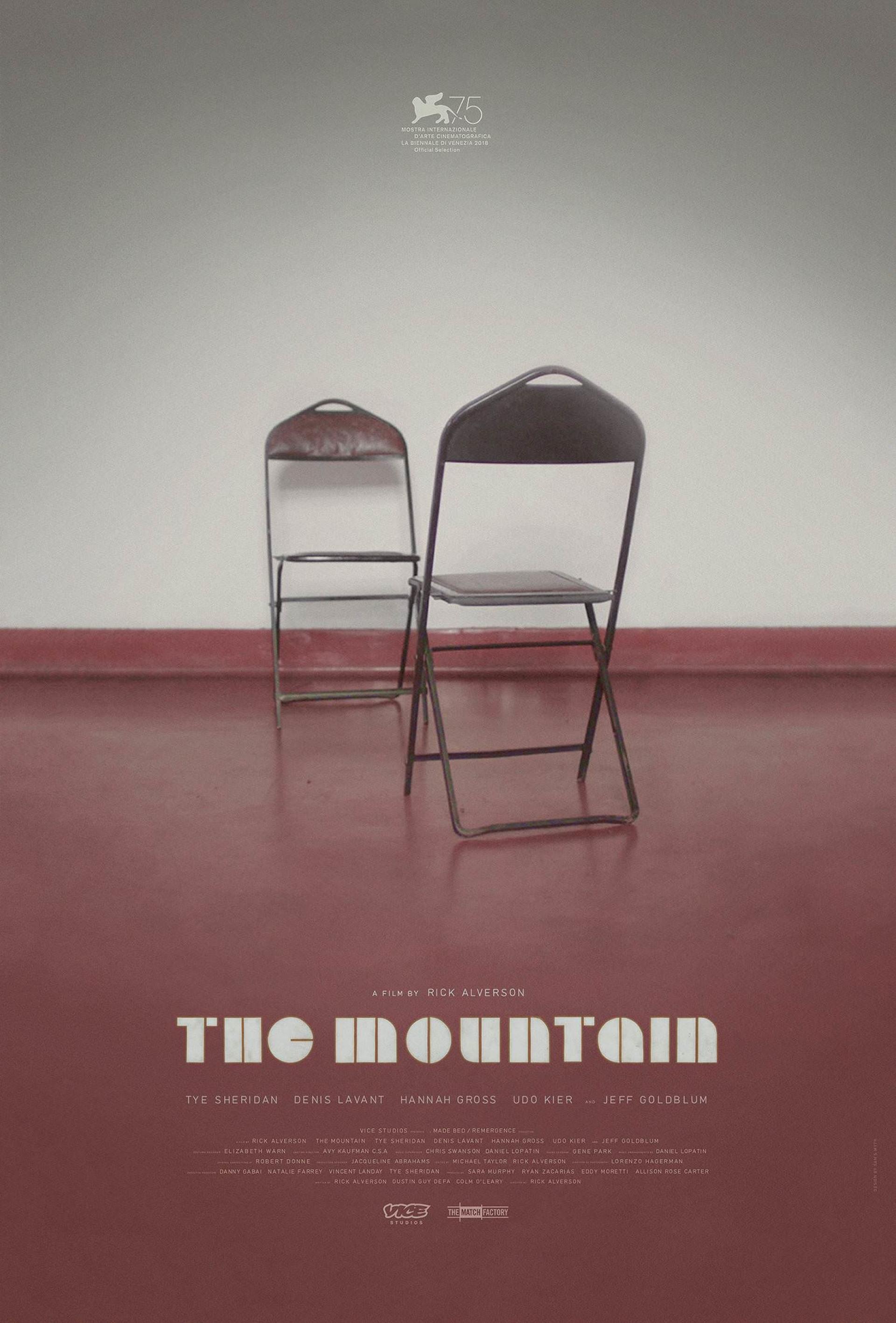
the mountain sam smyth did good here. the suggestive quality of this photograph combined with the film’s name and the typographic treatment of it, give this poster a cold but curious mystique. i’ve never seen the film, i know little about it and yet i’m delightfully curious to see it simply because of the level of nuanced restraint in this design. furthermore i imagine that the poster will mean even more to me after seeing it than it did before.
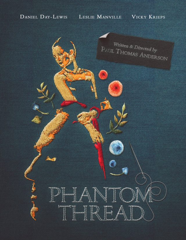
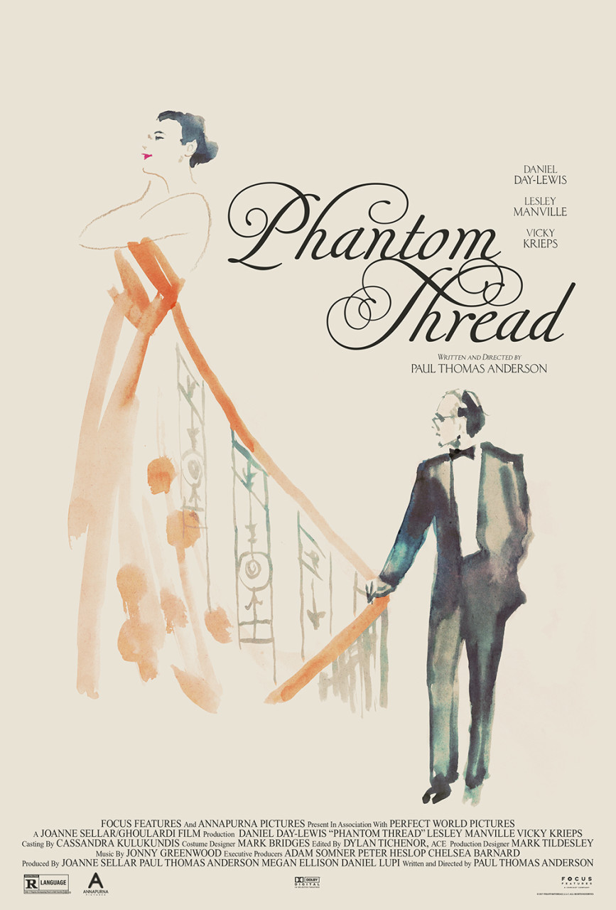
phantom thread i have seen this film and enjoy this poster by brian vee not just because of its inventive delivery of the film’s narrative concepts, but also because making a poster with your own bare hands will always grant it a unique quality; a quality that computer software alone never will. adobe products tend to homogenize design aesthetics the world over, and the more we all learn to keep them at arm’s length, the better and more original our work will be.
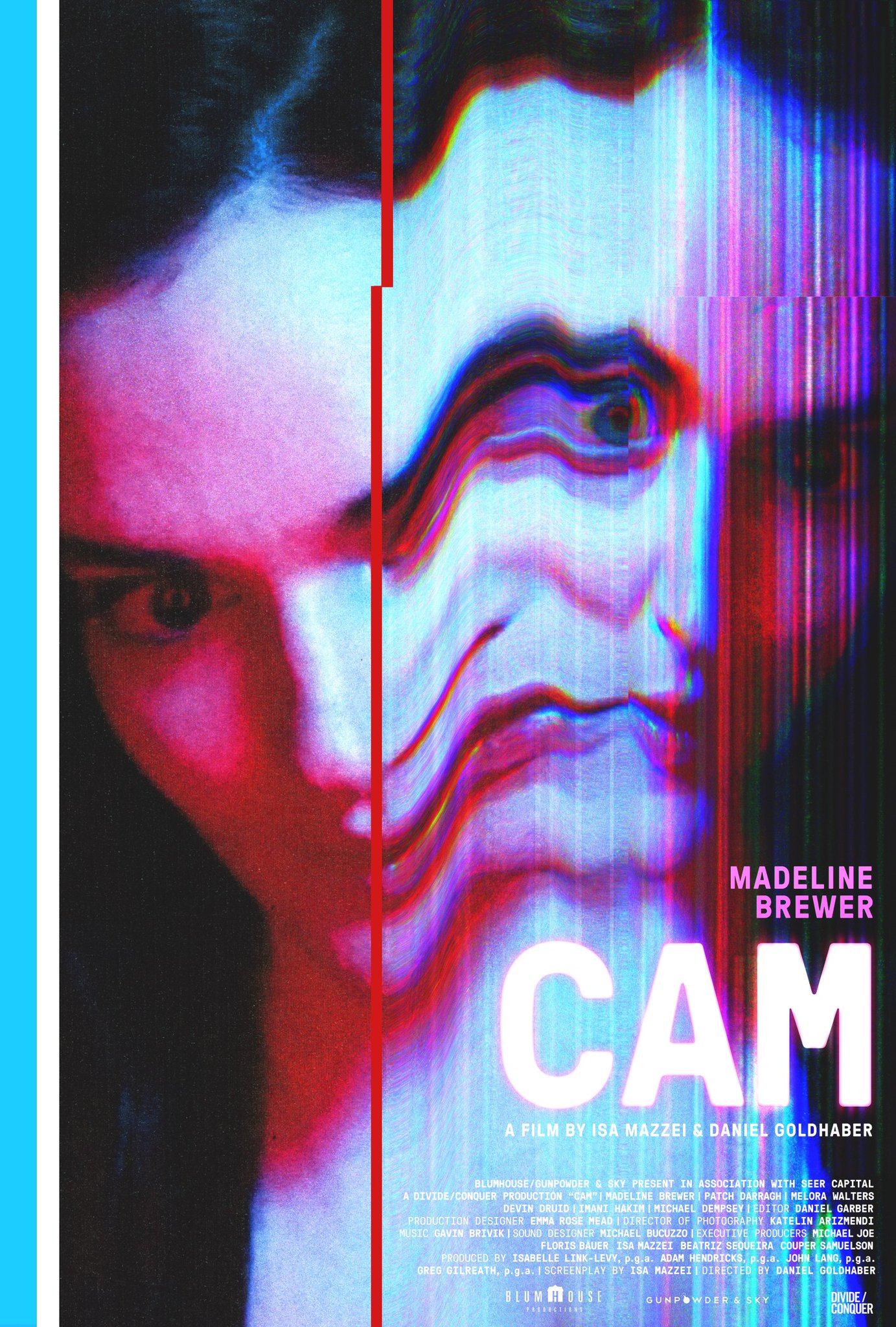
cam the fact that this poster was used for both the festival and theatrical releases of this film is testament not just to the design, but to the quality of the sales and distribution folks behind the project. i am biased as i work regularly with the poster’s creator, charlotte gosch, and so got to see it at several stages of its production, but that’s the limit of my influence on its genesis. it’s a striking, stand-out and brutal piece of work for a film i have not seen, but very much want to now.
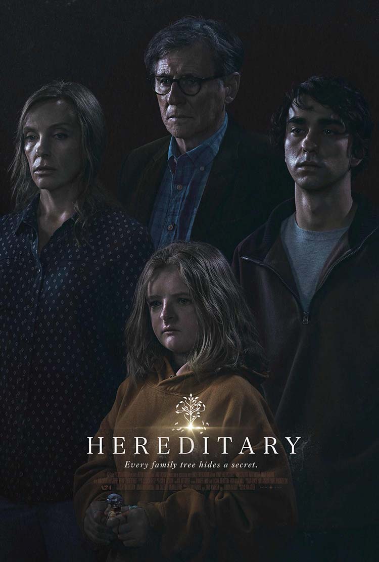
hereditary the lighting alone in this poster is unlike that in any film poster i’ve seen before. it’s reminiscent of the work of gregory crewdson. the predominance of shadows hint at the horrific quality of the film — which i have seen — whilst the glinting light emphasizes the facial structures of each of the characters. this second part is of particular importance given this film is about a family, one of whom is all the more striking in appearance than any of the others. the family’s arrangement in the frame echoes the small family tree motif which is further echoed in the film’s name and tagline. speculation as to the film’s nature and narrative fill the mind even before a screening, and afterwards you’re reminded of just how unique the film looked compared to other films (as much as you’re reminded of its dark, dark heart.)
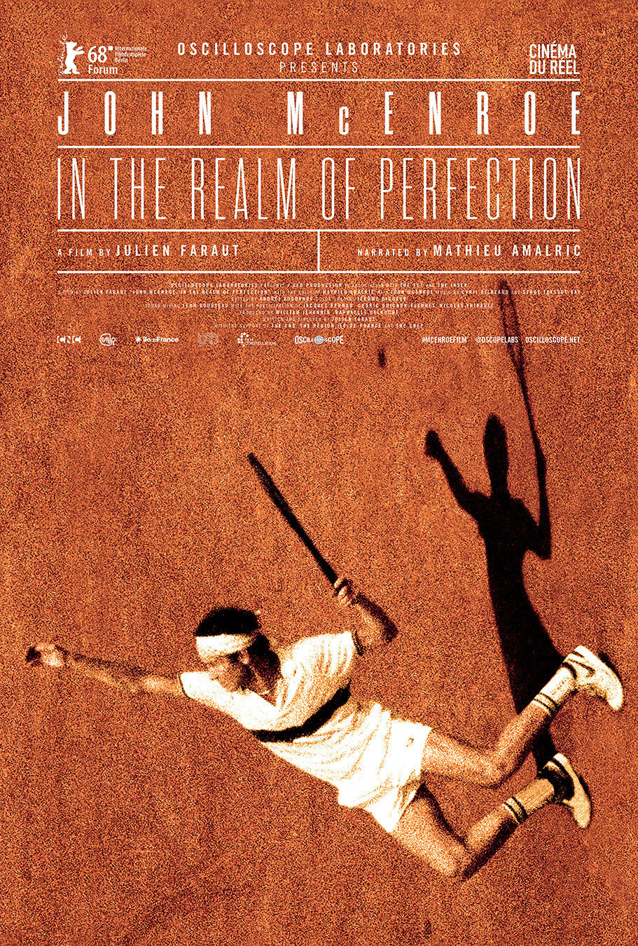
john mcenroe — in the realm of perfection french design team checkmorris created this poster. the relatively conventional ‘tennis court-esque’ typesetting is offset by the delightfully effective rotation and cropping of the photo of mcenroe. i have not seen the film so i can’t comment on how much john’s plummeting fall from the top of the frame is an echo of the film’s narrative, but it does make me wonder.
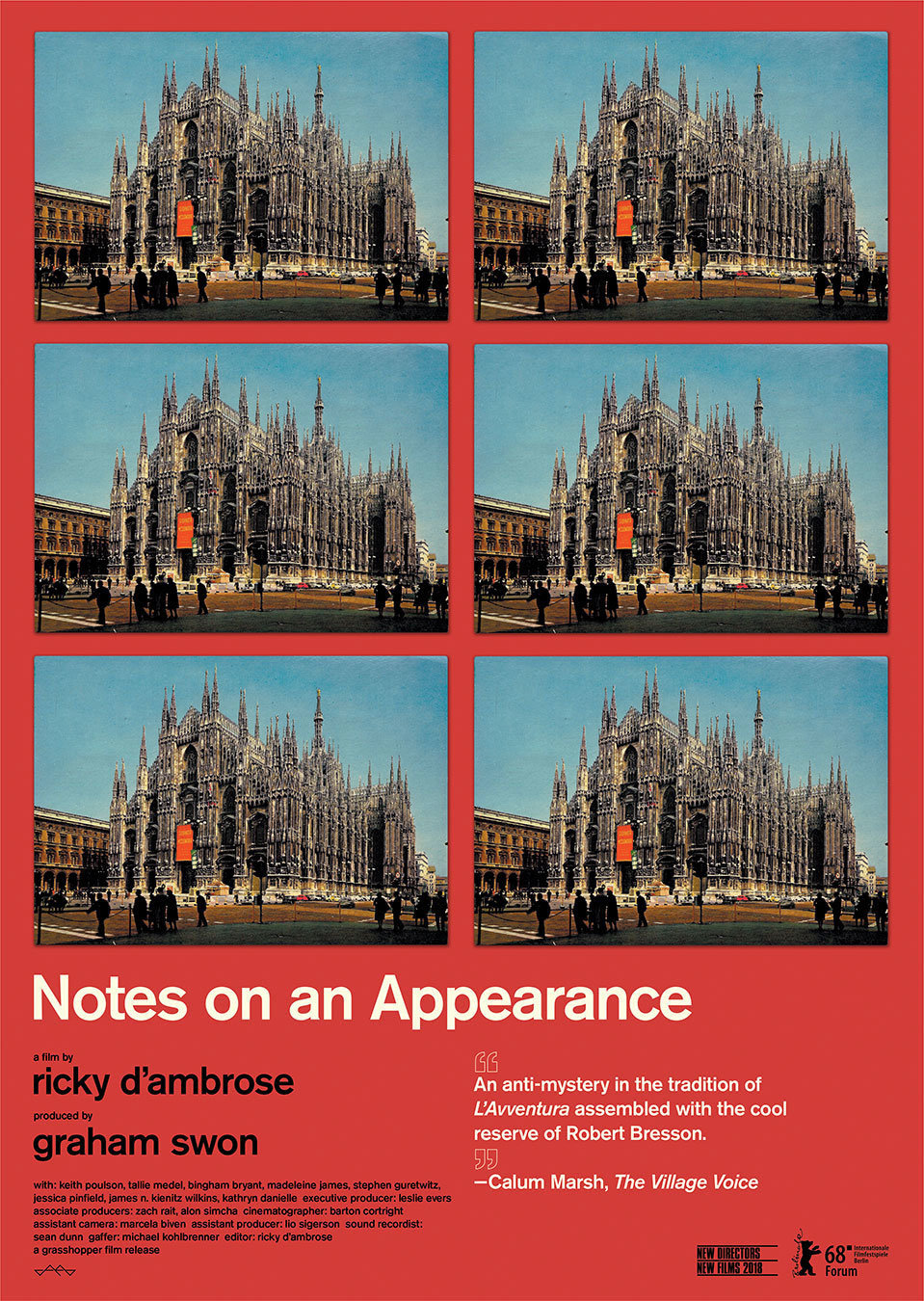
notes on an appearance this poster is exceptionally interesting on a number of levels. first up the ‘spot the difference’ nature of its repeated imagery really grabs your attention. the moment i saw it i was left wondering what i was supposed to be looking for, which in turn made me keen to see the film. secondly, the poster was made by the film’s director ricky d’ambrose. this fact inherently makes me trust the work more; it’s a piece of direct communication from the film’s heart. whilst it’s not unusual for a director to design their own film poster, it is certainly not common for that poster to be quite this good.
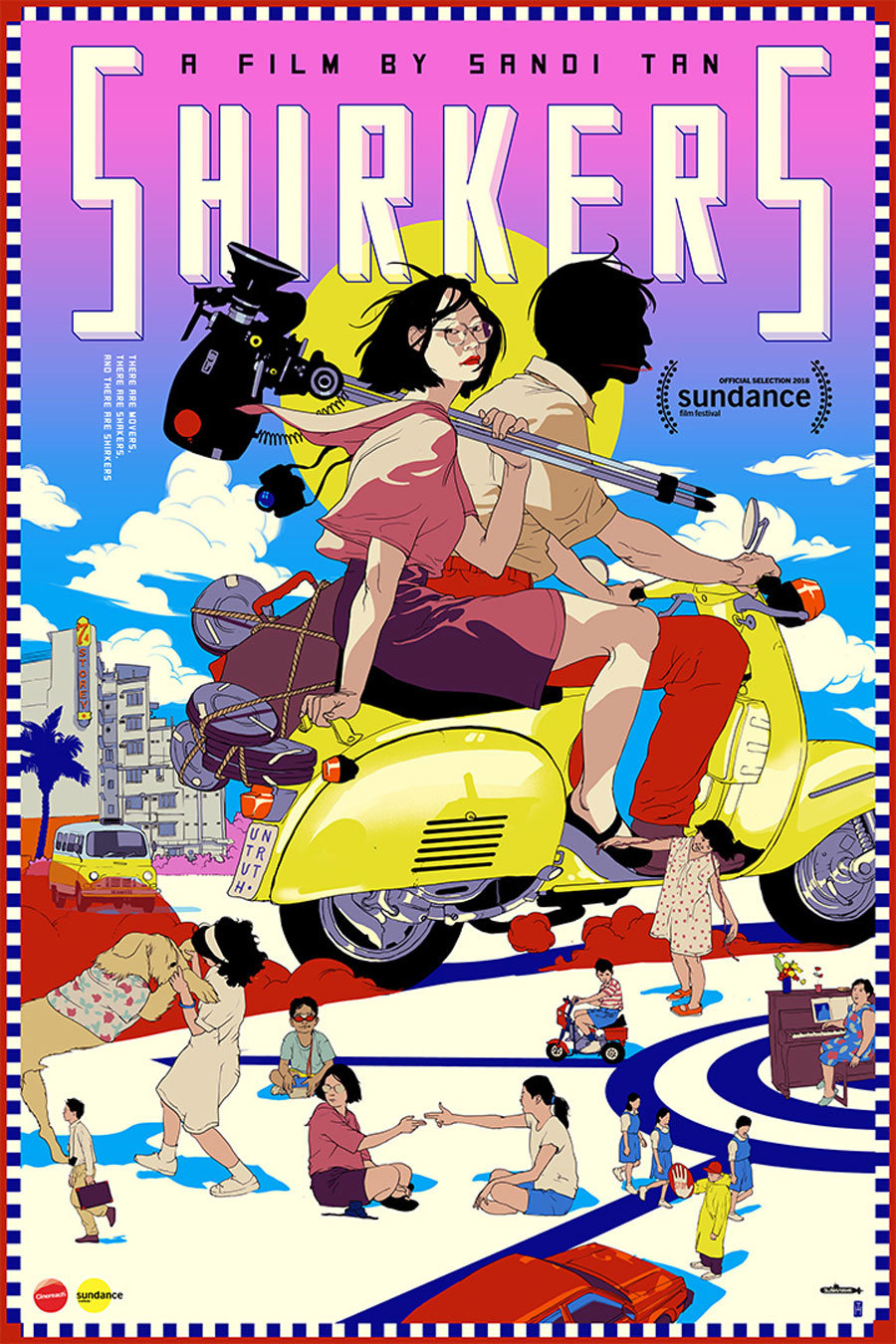
shirkers this poster by tomer hanuka is remarkably pleasing to look at. it feels unique in the realm of film poster design, particularly theatrical film poster design. i know very little about the film but something tells me its not an animation. this in turn makes me appreciate it all the more as this kind of ambiguity is usually a ‘no go’ with sales and distribution figureheads. i cannot say the poster gives me any great clues as to what the film is about, but certain aspects — like the ‘untruth’ license plate and the silhouetted motorcycle driver — make me very curious. in fact i’m sure that once you’ve seen the film the poster will become all the more valuable as a result of these mysterious little details.
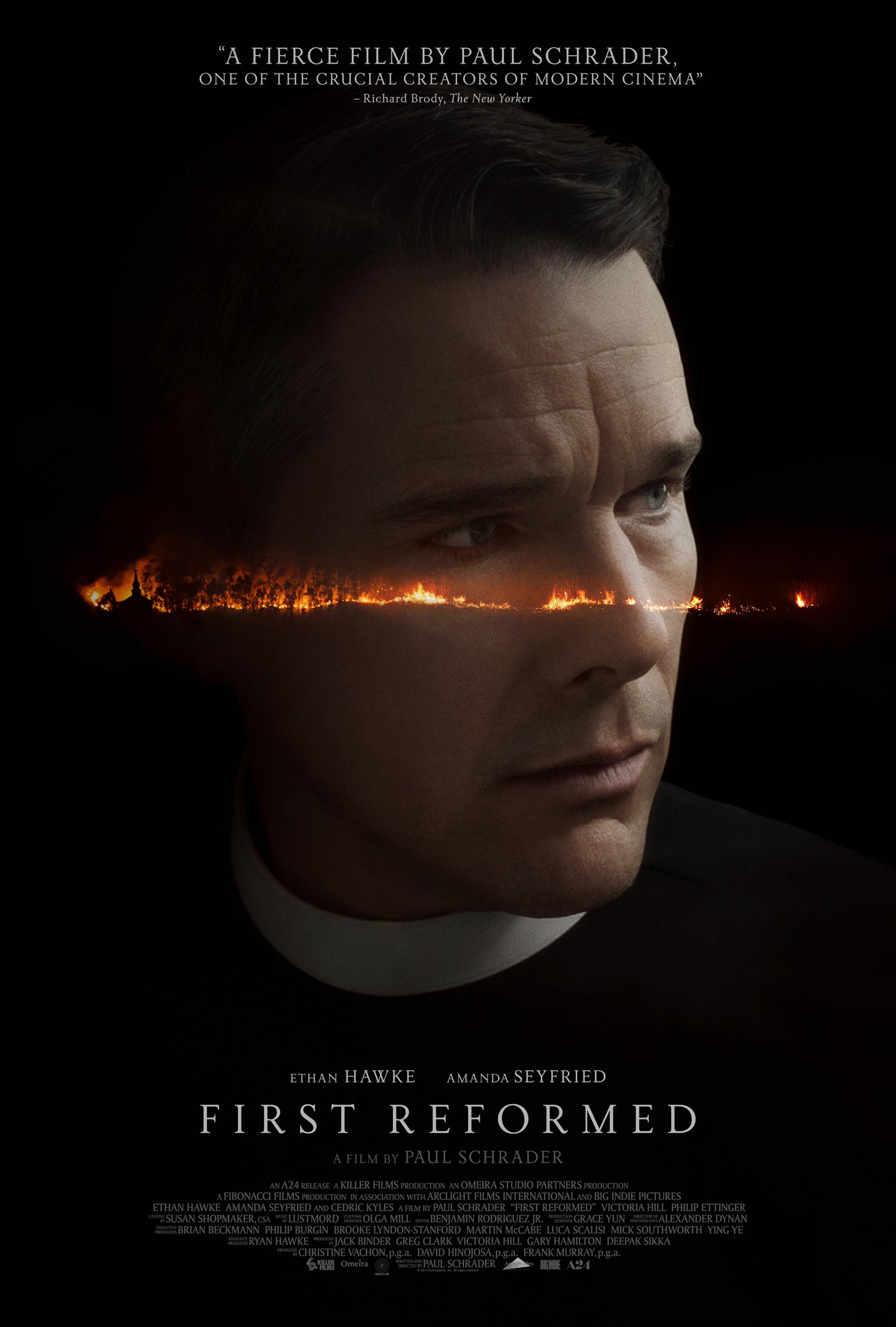
first reformed i suppose it’s no secret that this poster is a rip-off of the great italian poster for andrei tarkovsky’s film, stalker. that said my rule has always been that if you find yourself under the heavy influence of a previous work, then you simply must evolve it if you wish to preserve your integrity. in this case i think the conversion of the tarkovsky factory / war-scape into this more delicate fiery hellscape is not just welcome, but considerably more psychologically impactful. i have seen this film and what you see here in this poster is more of a feeling about the film’s narrative and its protagonist’s psychological condition than is necessarily depicted in the film. this in turn makes this work a respectful evolution of its predecessor.
phantom thread this is, i believe, an unused poster from the alphaville design archives. that said i think it’s the best poster for phantom thread out there. it not only harnesses what alphaville are good at, but it makes a beautiful commentary on the film’s narrative. every time i think about posters for this film, this is the first one that comes to mind. simple, elegant and clever. i imagine it would be particularly beautiful printed on a nice, large piece of old cartridge paper.
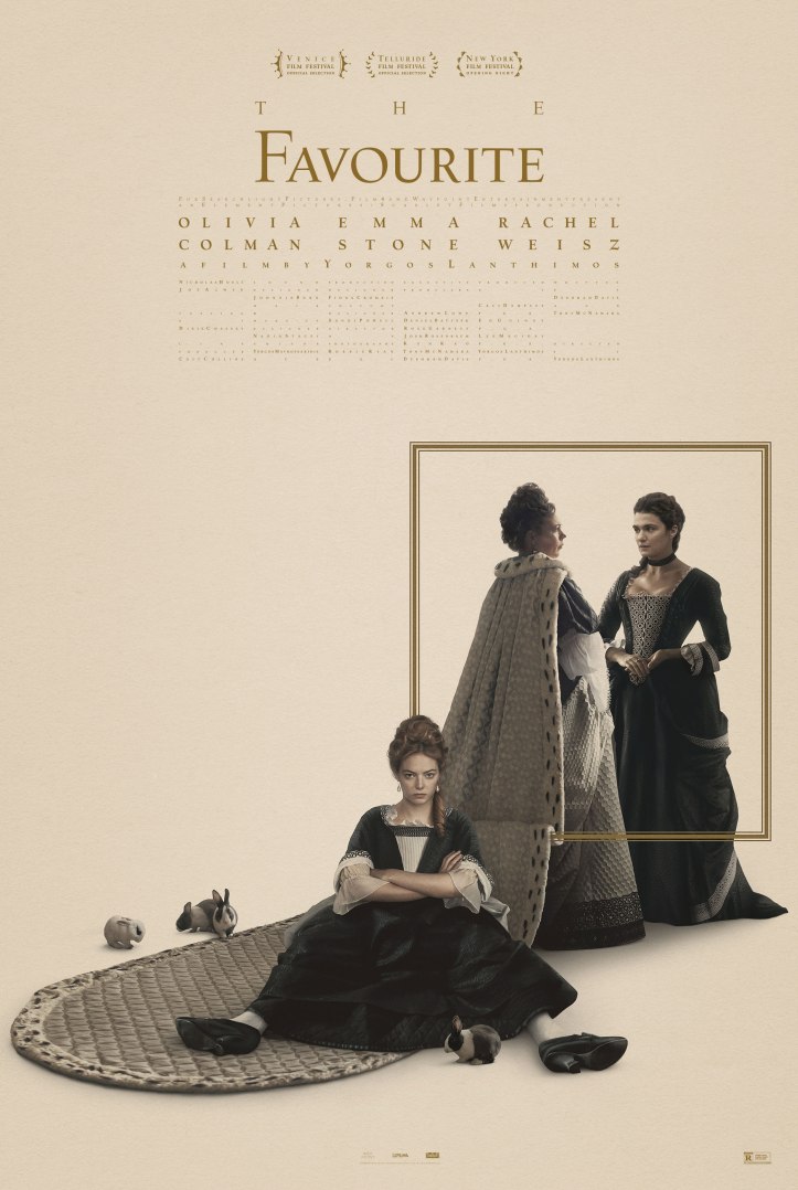
the favourite i’ve yet to see this film, but i remain a huge fan of yorgos lanthimos’ work and that of his poster designer, vasilis marmatakis. they, together, feel to me like one of the most vital forces in modern cinema. that said i’ve found most of the posters for this, his latest film, rather lackluster … until now. this poster below is lovely. everything from the typesetting that suggests ‘being separated out or split up or a-typical’, through to the small graphic picture frame that similarly splits the characters up, is great. on top of that you have a flat graphical element (the small frame) actually affecting a photographic element (olivia colman’s dress) to great optical effect. i’m sure this poster looks fantastic in the printed flesh, which is something i don’t necessarily feel with a lot of posters. these days whether film posters are actually going to be printed and how good they might look as a result, can often be a lowly afterthought.
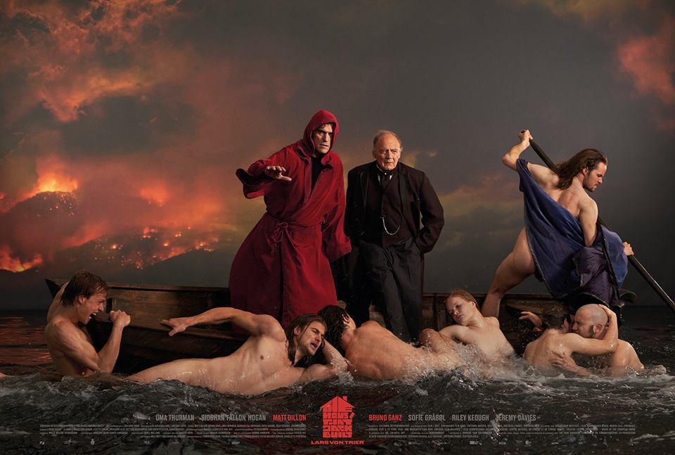
the house that jack built this is one of my favourite films of the year. this poster is, believe it or not, a shot from the film. having grown up — as the son of two painters — regularly looking at the paintings of géricault and caravaggio, i find the fact that this is a film still particularly stimulating. lars von trier’s films are often a cause for concern with some people and this poster reminds those that have seen it of the more philosophical and logical side of the film. much like with his previous nymphomaniac films, it’s this psychologically investigative narrative through-line that grants lars the ability to reach deeper into the dark heart of humanity without losing touch with his audiences. this is particularly important in today’s increasingly divided, politically-correct world.
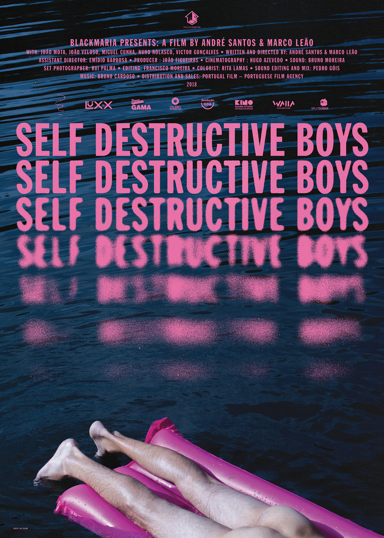
self destructive boys braulio amado is an excellent graphic designer. he doesn’t usually make film posters, but he seems to take to any new subject like a fish to water. i know nothing about this short film but the poster is both funny and mysterious. the day it came out i found myself sending it to other design friends, whilst at the same time i wrote to braulio himself to ask how he did that ever so beautiful blurring / disintegration of the text. the best work makes you want to be better at what you do.
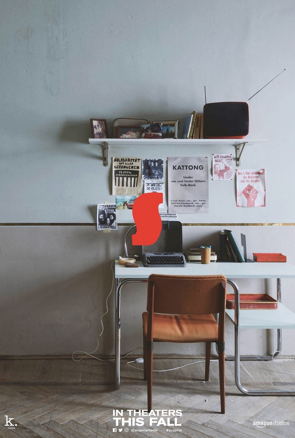
suspiria there have been a wealth of promotional items produced for luca guadagnino’s suspiria remake. as a filmmaker i very much appreciate his work, however i’ve never seen him produce a good poster for his films until now. the poster below is part of a second or third wave of promotional materials for the film that caught me quite off guard. legendary title designer dan perri’s now famed suspira ‘S’, when coupled with these very simple, softly lit, full-frame images from the set of the film, carries more magic than it ever did before. i’ve yet to see the film but i’m certainly all the more curious because of the elegant and minimal constraint of these designs combined with all the lovely details in each photograph.
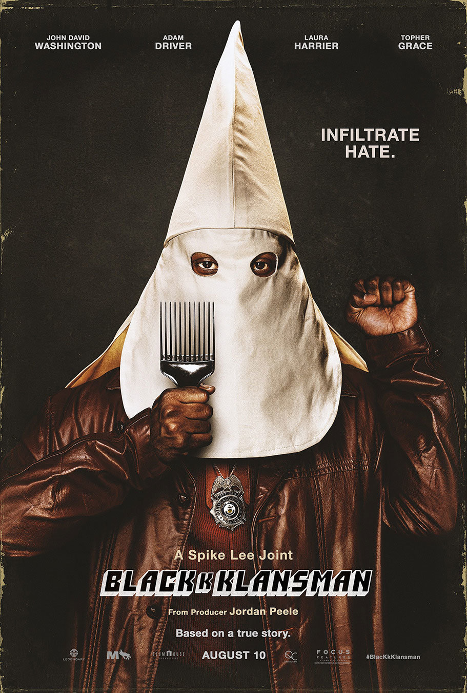
blackkklansman kenny gravillis triumphant poster for spike lee’s latest joint has been a great pleasure to see on the walls of new york city during this particularly dark political time. the work needs no real analysis of course, but to me it represents what they call ‘design for social change’ and in every way is good in my book. whether you see the film or not, hopefully the image sets your mind on fire, whether that be about the past, the present or the days to come.
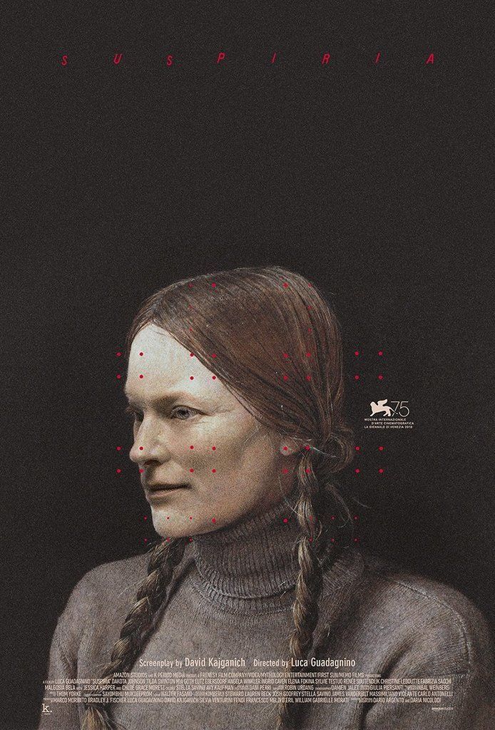
suspiria last but not least i wanted to draw attention to this particularly beautiful, unused poster by my contemporary, midnight marauder. i remember the day he posted it on instagram and my jaw dropped a little. i then looked at it a little closer and my jaw dropped some more. just look at those confoundingly brilliant little red dots, let alone that utterly mysterious face. is it someone from the film? is it some strange amalgamation of dakota johnson and tilda swinton? i had not seen the film yet so i didn’t know, but good lord this image haunted me. as a friend once pointed out, the artworks that often most impress us are the ones we cannot deconstruct. the simple fact that i have no idea who this person is yet feel she is perfectly situated in the world of this film is a remarkable feat.
for the purposes of this article i did some research and discovered that the picture is actually of one helga testorf, who used to secretly model for her neighbour the artist andrew wyeth. in many ways i’m now sad to know this, as the mystery in that face was so perfectly aligned with this film i’d yet to see. this in turn is of course what makes the poster so unique to me. the free association of an entirely unrelated image to a film in this way is often what makes midnight marauder’s posters so strong.