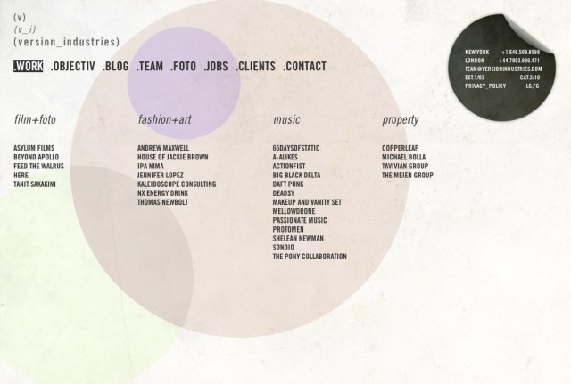
it’s been about 4 years since we changed the way we present ourselves to people. it’s never been a huge deal to us, given we’ve never been hugely attracted to the idea of brands, fixed identities and the overall corporate approach to a company’s ‘personality’. in fact this time around we’ve dropped our previous ‘graphic’ logo, preferring instead to simply type our (v) out and produce a variation on it that echoes the kaomoji anime style emoticons, (v_i)
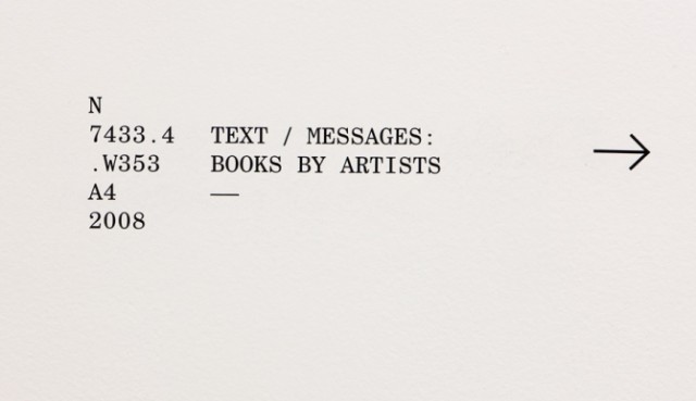
beyond this there are basically three key elements that governed this redesign. the first part was some kind of old library catagorization card that we found a scan of online.
for whatever reason the raw simplicity of it matched our desire to build a site that was stripped right down to the bare essentials. our portfolio was now strong enough to speak for itself, and some basic lettering on a paper surface like this made a lot of sense to us.
the second key part of the redesign came to us when designing our new business cards. our local printhouse cut us a deal for some super heavy stock letterpressed cards, so long as we limited ourselves to using one colour on one side. turning this to our advantage we created a design based on the black spot from treasure island. it tickled us to think that anyone we gave our card to might be considered guilty, or that their time for judgement has come.
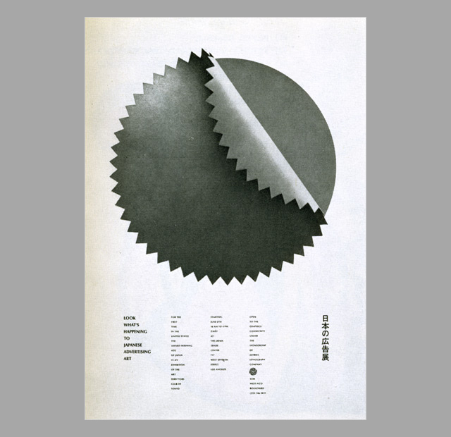
the third part was this beautiful old japanese poster, again found online, that for one reason or another had haunted us. if anyone knows where we can get a copy of this poster, or even a higher resolution image of it, we’d be hugely grateful.
everything else you experience throughout the site are elements of our own creation or recreated from design blogs and experimental code projects around the internet. as stated before, the site is intended to take very much a back-seat to our work so it’s almost an exercise in harmonies rather than a lead melody of any sort.
we hope you find it non-intrusive when looking at our work, but also complimentary to the work.


