stan at posteritati had this to say on the matter:
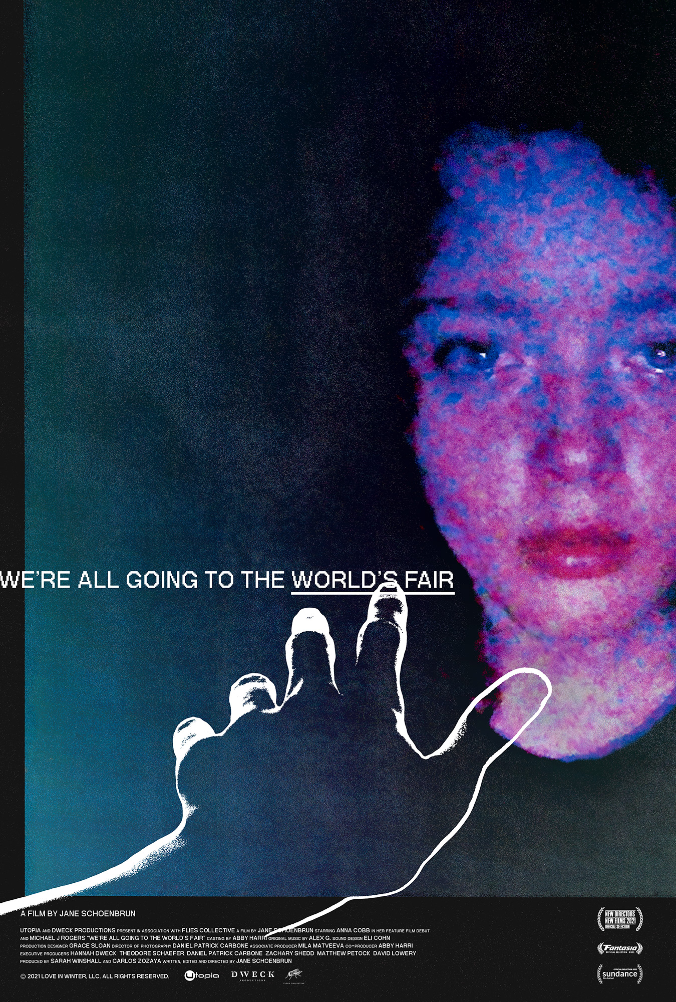
I’m always happy to see a new movie poster by Caspar Newbolt on the TL, it’s sure to be something totally unexpected that eschews current design trends, and these two are no exception. And I love that his inspo for The Act of Coming Out was Waldemar Świerzy’s Polish poster for Blow Up. Read Adrian Curry’s MUBI interview with Caspar. We’re All Going to the World’s Fair released by Utopia.
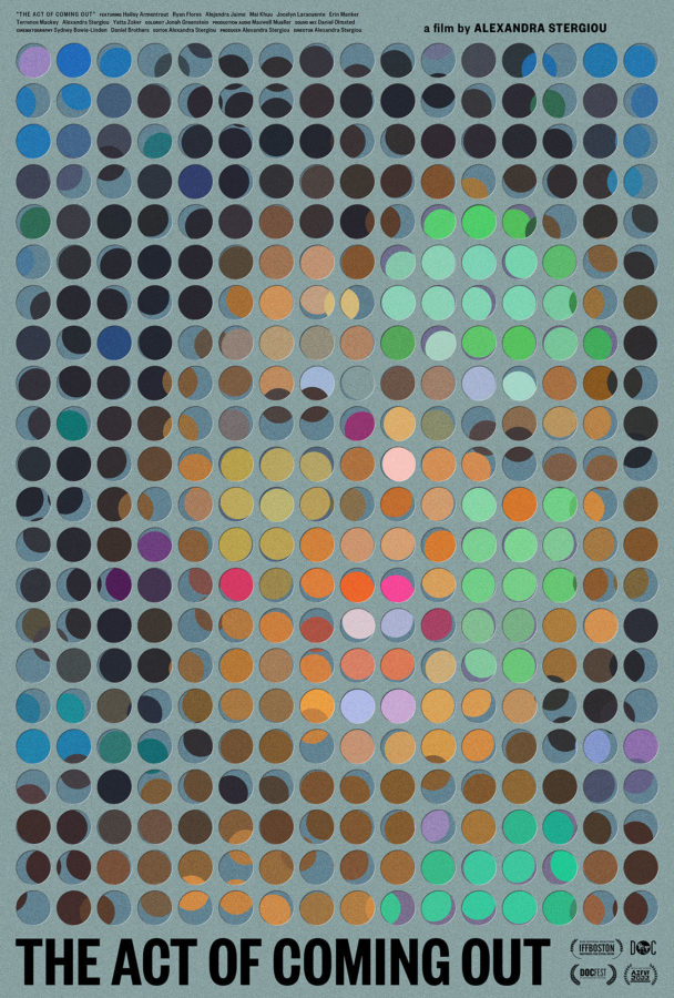
once again we are incredibly thankful for this level of recognition and support. particularly when the act of coming out is a short film and everything else on these lists are feature films, not to mention oscar contenders.
“The posters in my list this year are those that do what any poster worth its salt should do: they stopped me in my tracks. These days those tracks are less and less likely to be along a city street or even inside the lobby of a multiplex and more likely to be on a virtual stroll (or scroll) through a streaming service or social media feed. The received wisdom is that this will result in a dumbing down of poster design, leading to work that is less complex and easier to take in in a one-inch high thumbnail. In other words, more big heads. But the 30 posters below, most of which I likely saw first on a phone screen, give the lie to that doomsday prediction. They are posters that not only work on first glance but reward repeated viewing. In other words, you could hang them on your wall. One footnote: there are a lot of pairs in this year’s collection, partly because I couldn’t fit all my favorites into a top ten, partly because I love graphic coincidences, and partly because two of a kind is sometimes better than one.”
“Another designer I have interviewed recently is Caspar Newbolt of Version Industries who, as I said back in July, has for the past ten years been stealthily creating some of the most adventurous, expressive, and unusual film posters out there. It was this beautiful and unique poster for the short film The Act of Coming Out that prompted me to contact him, but his deceptively lo-fi design for the online horror movie We’re All Going to the World’s Fair is also one of the year’s very best, especially in its motion version in which the design comes eerily to life.”
you can read the rest of the article here. a huge thank you again to adrian curry and to everyone at MUBI for the continued support.
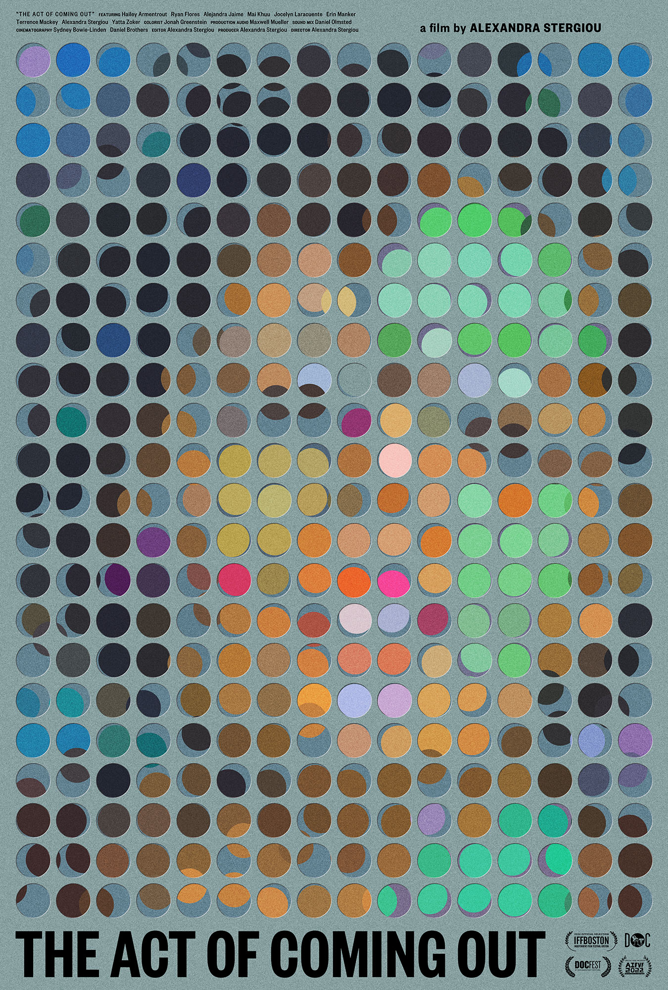
NOTEBOOK: As with A Confucian Confusion, your poster feels as if you should be able to step back from it and a face will start to appear, but only a very vague sense of a face forms. Is there an actual face in there or is it a multitude of faces mashed together?
NEWBOLT: There is an actual face there but much like standing very close to a large painting by Seurat, when you are close to the poster you end up seeing only a cloud of colors and thus having the vaguest sense of a face or a multitude of faces as a result. That said if you squint your eyes, even close up, you’ll see the face much more clearly.
It will perhaps remind people of that famous scene in John Hughes’s Ferris Bueller’s Day Off (1986) where they visit Chicago’s Art Institute and Cameron Frye ends up transfixed in front of Seurat’s painting, A Sunday Afternoon on the Island of La Grande Jatte (1886). The picture was painted exactly 100 years before the Hughes film came out, and this particular scene in the film hit me very hard when I first saw it.
I am the son of two painters and grew up in museums and art galleries around the world. I knew every word of Ferris Bueller’s Day Off by heart by the time I was 14, inspired largely I’m sure by this moment Cameron has with the Seurat. I myself had stared in just such a way at just so many paintings as a kid. I love that in the director’s commentary for the film John Hughes describes Seurat’s pointillistic painting style as being like filmmaking, in that: “You’re very very close to it. You don’t have any idea what you’ve made until you step back from it.” (You can see the scene and hear Hughes’ commentary here.)
It was important to Alexandra and I that, because of the film’s narrative, you could not clearly tell the gender or ethnicity of the person in the poster. The film presents a series of queer and trans actors of various ethnicities exploring what Alexandra describes as “the never ending process of coming out,” and if you look at the LGBTQ flag you can better appreciate the color field we created for the poster. We strove therefore to create an image of a person with a visage comprised of these many shifting colors.
you can read the rest of the interview here. a huge thank you again to adrian curry and to everyone at MUBI for the continued support.
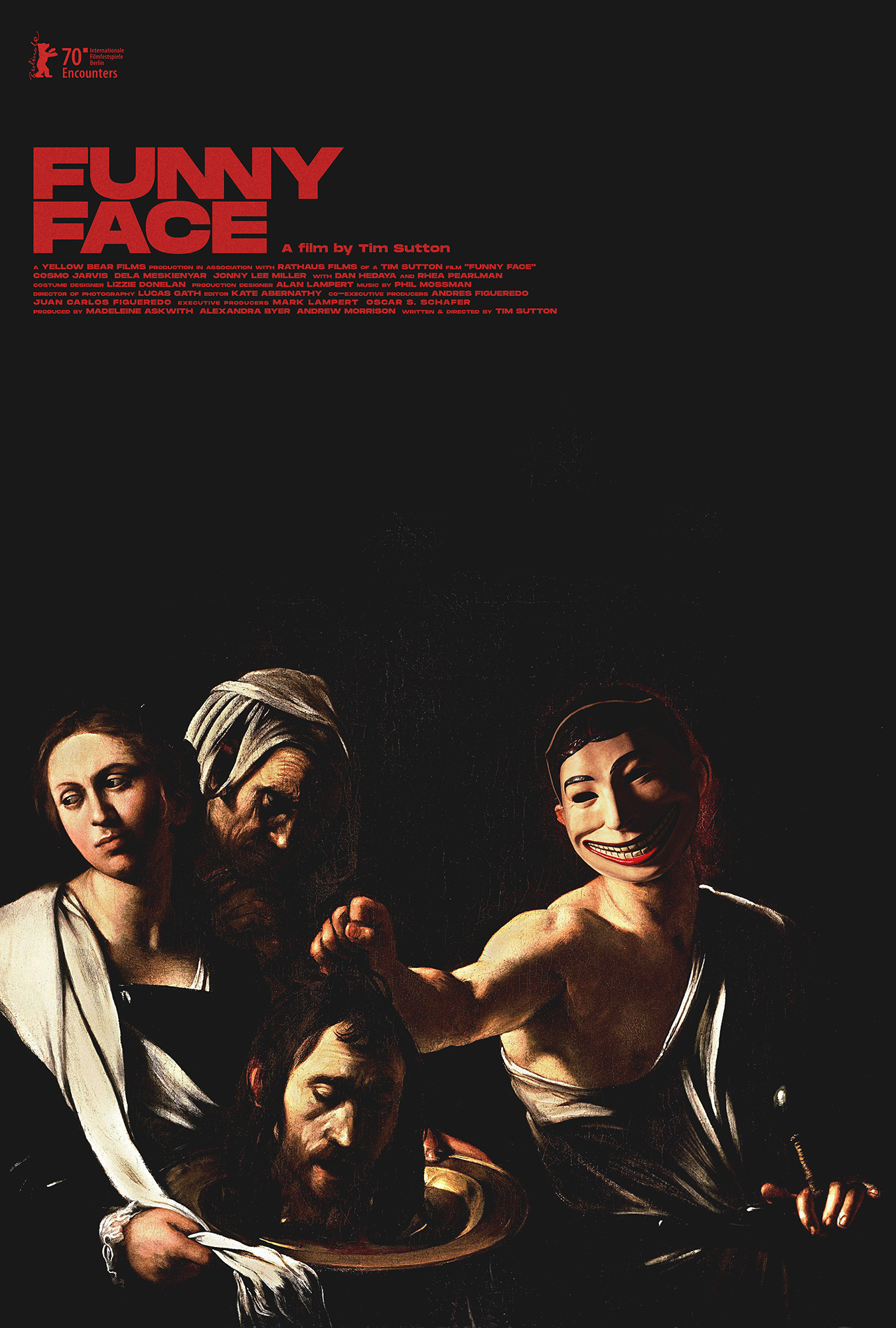
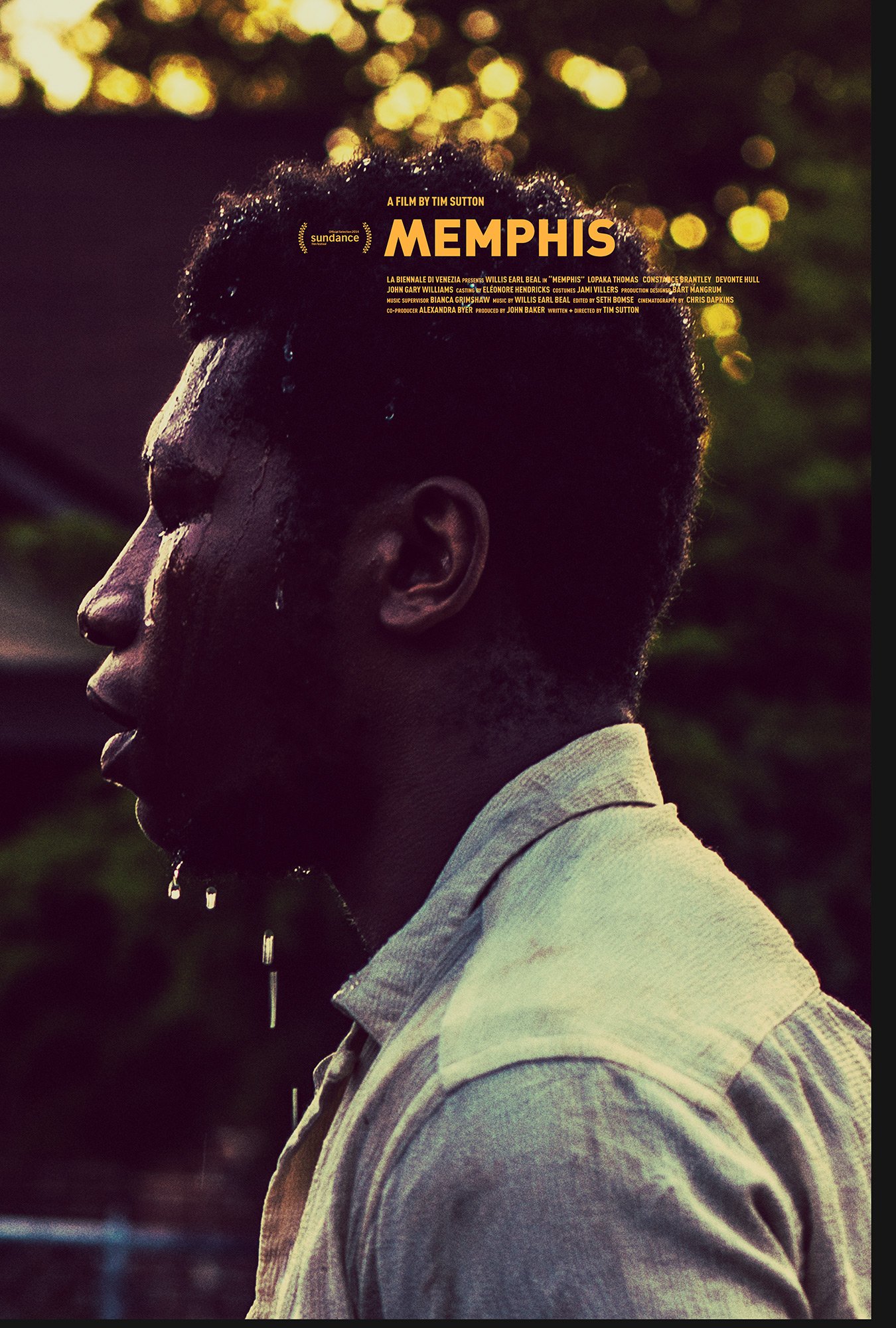
“Caspar Newbolt and (version_industries) traverse an inspired path to give frequent collaborator Tim Sutton’s film Funny Face a printed counterpart. The subject is a revenge-seeking man who serendipitously discovers a plastic mask, donned more as a talisman of confidence than means of anonymity. Was its appearance fate? Has this surreal shield served others before him? Newbolt looks to amplify that potential by delving back through history to discover another artistic work with empowered figures perfectly suited to become this character’s progenitors. His selection of Caravaggio’s Salome with the Head of John the Baptist proves a magnificent partner both thematically and tonally. You want to laugh, but it’s all too sinister to risk the ensuing wrath. For all you know, that face might just find you next… already affixed to another’s head.”
thank you jared and everyone at the film stage for this vote of confidence.
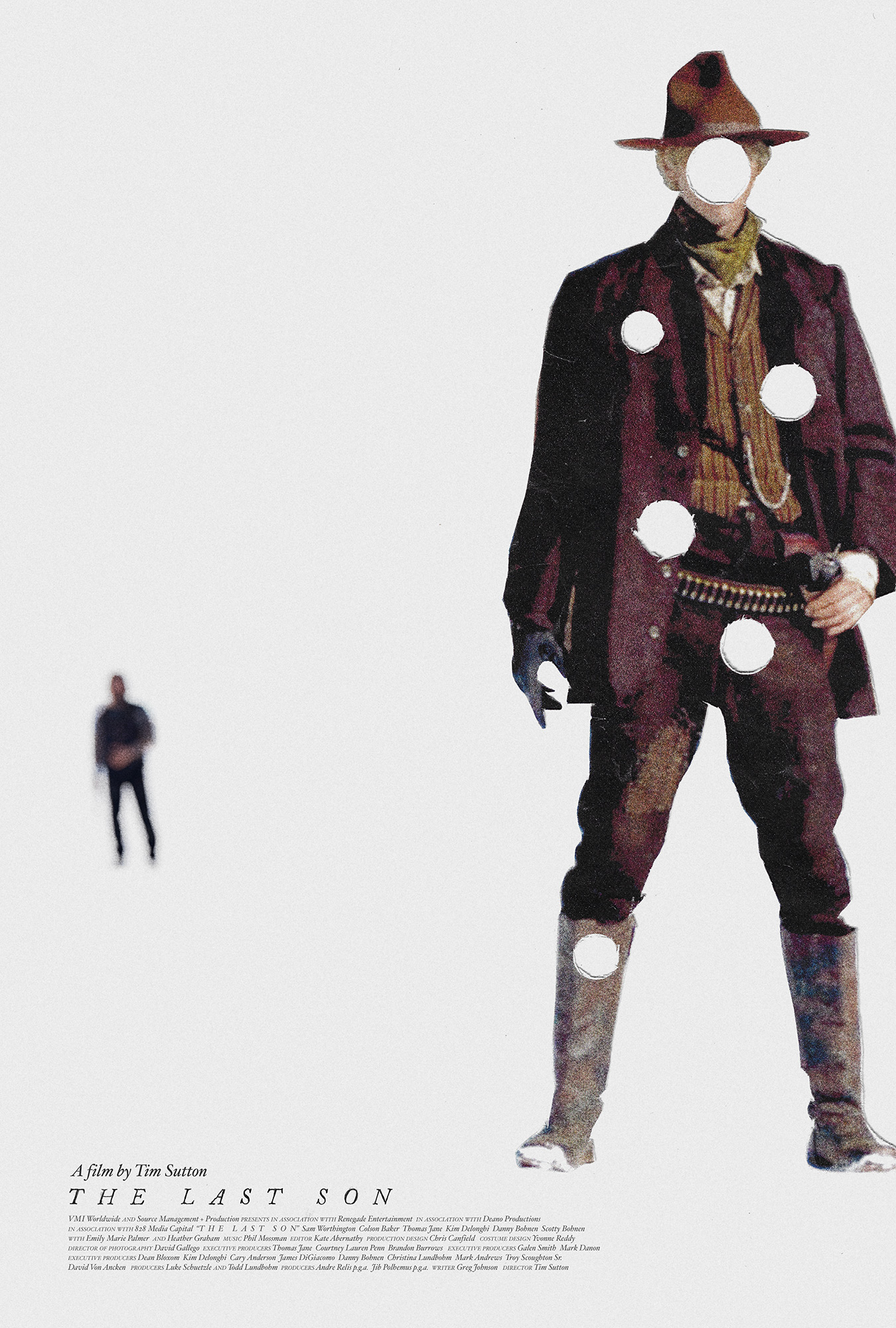
“With a wry nod to its star’s name – Machine Gunned Kelly? – Caspar Newbolt avoids the usual grizzled-faces-and-dusty-vistas approach for Tim Sutton’s modern western, opting for something more abstract. As with many on this list, a more conventional poster was also used, but strong visual identities like this are essential for standing out among streaming services’ endless carousels of content.”
a huge thank you to creative review and to mr. benneworth-gray. you can see the poster in question below.
after 10 years of working to make the best and most original film posters we can for everyone, we wanted to celebrate by opening a print shop at shop.versionindustries.com to provide physical copies of those posters to anyone anywhere.
our mission is simply to make sure those that want these posters can have them and for the cheapest price possible. during the 2020 global pandemic we worked out a way to print posters “on demand” and deliver them worldwide whilst keeping our overheads very low. as you can see, we’re talking around $25 at most for a full-size 27×40 inch US one-sheet or A0 poster on good paper, plus shipping. what small profit margin there may be will hopefully cover the overheads of running an online store of this kind.
we trust that this offers us a way to make sure the films we have worked on can be remembered beyond the festival and theater releases, on the walls of those who really loved them. the funny thing is this is so often not the case; film posters only get printed a handful of times and then they’re just the result of google image searches and that’s that. this goes against the entire point of making posters of course.
thank you in advance for your continued love and support for independent cinema, and for the work that we do to celebrate the films and filmmakers we’re lucky enough to work with.
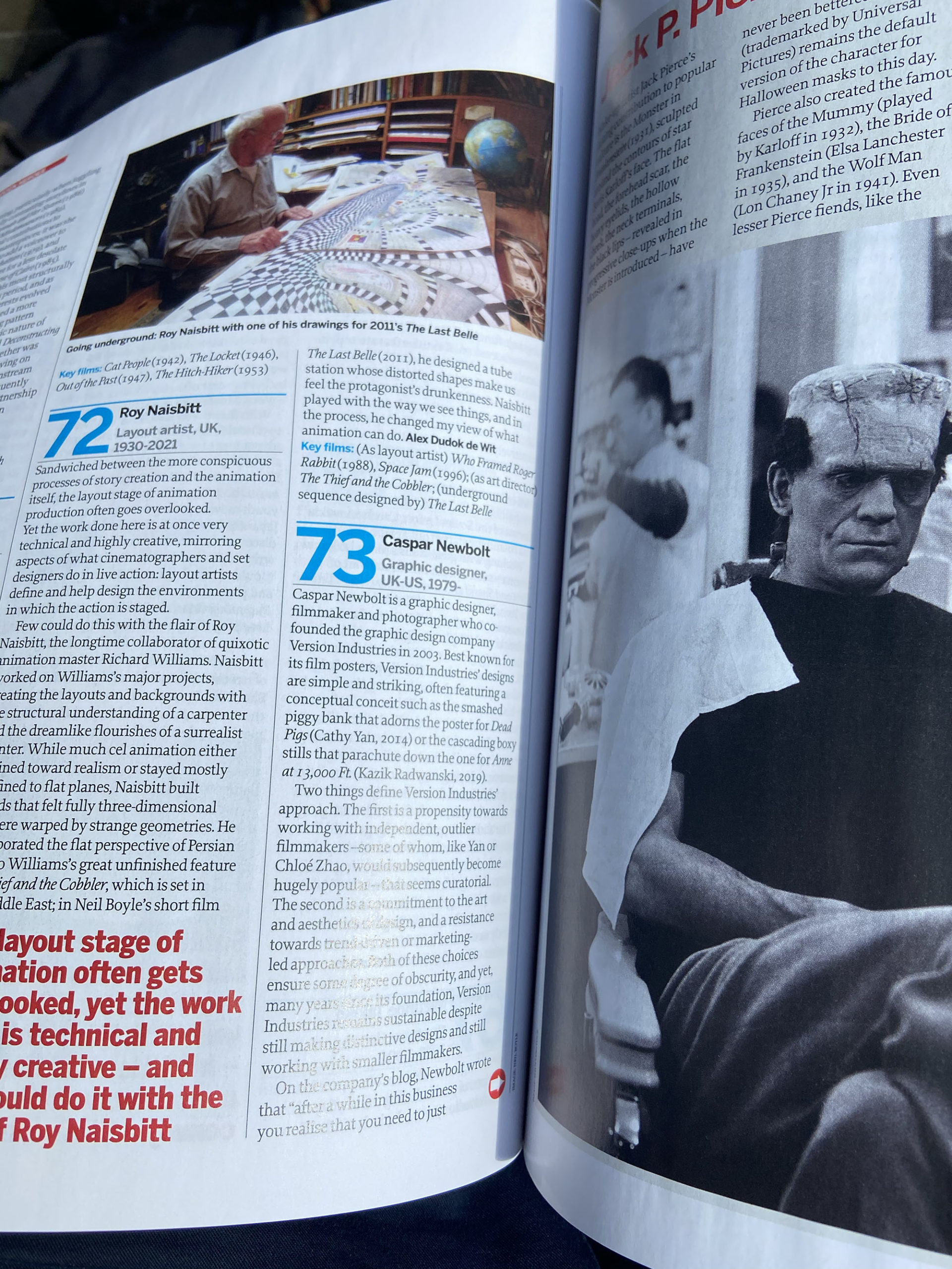
caspar was recently included in sight & sound magazine’s “100 hidden heroes of cinema” list. here’s what they had to say on the subject:
“Caspar Newbolt is a graphic designer, filmmaker and photographer who co-founded the graphic design company Version Industries in 2003. Best known for its film posters, Version Industries’ designs are simple and striking, often featuring a conceptual conceit such as the smashed piggy bank that adorns the poster for Dead Pigs (Cathy Yan, 2014) or the cascading boxy stills that parachute down the one for Anne at 13,000 Ft. (Kazik Radwanski, 2019).
Two things define Version Industries’ approach. The first is a propensity towards working with independent, outlier filmmakers—some of whom, like Yan or Chloé Zhao, would subsequently become hugely popular—that seems curatorial. The second is a commitment to the art and aesthetics of design, and a resistance towards trend-driven or marketing-led approaches. Both of these choices ensure some degree of obscurity, and yet, many years since its foundation, Version Industries remains sustainable despite still making distinctive designs and still working with smaller filmmakers.
On the company’s blog, Newbolt wrote that “after a while in this business you realize that you need to just let the work speak for itself” and his company’s posters continue to quietly do that. Sometimes success isn’t about shouting the loudest, but about finding those who are willing to listen to what you have to say.
Key films: It Follows (2014), Songs My Brothers Taught Me (2015), Anne at 13,000 Ft. (2019), Giraffe (2019)
caspar was recently interviewed for a podcast about the record covers he’s made for bands such as 65daysofstatic, alessandro cortini and big black delta. the interview was conducted by vic tory for his art of the sleeve podcast. you can listen to the interview now on spotify, google podcasts, and other streaming services.