(v)
(v_i)
(version_industries)

kaleidoscope pr_101413

Screen-Shot-2013-10-14-at-4.12.26-PM

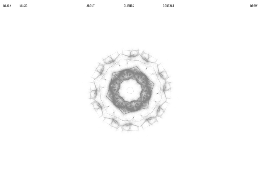
back in 2008 we created a rather simple and elegant flash website for the art and fashion-based PR firm, kaleidoscope consulting. aware now that their site was useless on a range of new platforms but still very much in love with the look and feel of it, they asked us to recreate the site using HTML5 and javascript. in response we proffered that we might add another dimension to the site, and began to scheme this new black + white edition you see before you.?the result is a site that’s fully iphone and ipad compliant, and features not just a kaleidoscope that can be populated with images from your webcam, but also now hand drawn sketches too.

once again we reached out to mr. doob (who’d previously worked with us on the intro to daft punk’s?tronsoundtrack.com) and asked that this time we might integrate elements of his harmony drawing engine into the site. happily he gave us carte blanche and soon we had a new kaleidoscope engine on our hands – one that caters to both the photogenic and sketchy among us.?for this newly ‘harmonized’ white side of the site, our in-house sound designer and composer gavin singleton (aka accelra) created a new piece of music that felt more suited its hand-drawn, softer tone.

lastly we rebuilt the original site’s entire ‘key’ navigated client section around a wordpress backend so that the client could now more easily and swiftly keep this information updated, along with any other site copy.

we trust you’ll enjoy navigating the site as much as we enjoyed the challenge of putting it together.

_category
audio, blog, code, grafiks, news, , , , , , , , , , , ,

record cover + poster exhibition_091213

blog_versionindustriescovers013


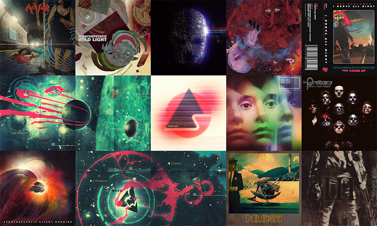
we’ve created an exhibition of our ongoing record cover and poster work over at squarespace. the format of their site and the nature of their templates was immediately conducive to such a concept. immediately following the posting we received a very flattering review over at one of our favourite blogs

“i’m a huge fan of the work of?(version) industries. from their work in?film?to?web?to?video?to?design, they do a grand job every time. they recently launched this?record covers + posters collection?and it’s amazing to see all of their print work at once. i never even realized the big black delta covers were?sewn?together?in that way or that this?makeup and vanity set poster?even existed.”

we hope you enjoy the show.

_category
blog, grafiks, news, , , , , ,

activator_090313

activator album cover

the new york thrash metal band activator are releasing their debut album in two weeks. i’ve known the guitarist jared drace for some time now. his apartment is like a museum version of my formative years. packed full of vintage horror film posters, action figures, comic books, guitars and a vast alphabetized collection of records, i spent the first half hour i was there just staring at the walls. i shared my first boarding-school dormitory with an english metal guitarist who had a redwood washburn N-series N2, with humbucker pickups and a floyd-rose tremolo. this guy had me listening to extreme, van halen,?steve vai and joe satriani. my first record cover was a pencil crayon copy of satriani’s the extremist sleeve. i’ve never told jared this, but i didn’t really have to. suffice to say i lept at the chance of creating the sleeve for his band activator’s debut LP.

almost a year ago i was in london sitting in my brother’s apartment scratching a rat’s nest of unwashed hair on my head, staring at a crude biro drawing of the image you see above. just days before i’d downloaded a mastered version of the record and it was once again upon me to try and make an image that might get people more immediately into the headspace the band were in with these new songs.

the album is a fast-paced and brutal affair with lyrics that delve fiercely into the bleaker side of personal relationships. it opens with the sound of rats screeching as they run through city streets and as a new york resident myself i was immediately transported to a place i’d seen many a rat in my days – waiting for a train as we all have on those sweltering summer nights. closing my eyes and turning up the music, i then tried to think of a way to step over the still fresh vomit of ?’tough love’ clich?s i’d seen on record sleeves of this kind in the past. for one, the failed love stories on this album had such a battering of a soundtrack that i knew i had to find a way of turning the gun on the protagonist somehow. badly sketching out a train platform, i drew in the dead body of a guy, blood streaming from his corpse. next up was of course the question of who killed him and why. if you were to sympathize with the lyrics on this record you’d certainly at least joke that a girl must have killed him. you know, metaphorically speaking … and that’s when it hit me.

i scribbled in the rest of the drawing details, took a photo of the sketch and emailed it immediately to john delucca. if there’s anyone on this planet who can not only whip up an incredible pencil rendering of a scene but also style it to a level that fits my particular idiosyncrasies, it’s john.

3 days later i had a finished pencil drawing in my hands. not one change was necessary – he had nailed it. immediately i set to work on colouring it in, adding textures, type and any other specific little details that i felt would really bring the concept home. i was already smiling – listening to the music as the image slowly came to life, i knew we’d nailed it.

so what was the big idea? well, take a closer look at the image above and you’ll see that the girl hiding around the corner holding the bloody knife is merely coincidental. she’s in fact just a picture of a girl on a poster. she didn’t kill the guy. she’s not really there.

the truth in fact being that something else killed him and the question of what or why that could be is open to the listener’s imagination. one interpretation might be that it’s a more supernatural, as-yet-unseen danger stemming from the bands own obsession with horror films and comic books. another could be that the girl in the poster is?a simply a metaphorical commentary on all the album’s ‘this relationship is killing me’ lyrical content. either way the visual allegory is there and we hope it provokes more than just a passing interest in all activator have to offer. the fact is you won’t find classic thrash this rad with ease, so why not let yourself be seduced.

activator is out on september 17th and you can pre-order it digitally, on CD or on vinyl here.

_category
blog, grafiks, news, , , , , , , , , , , , , , , , , , ,

surachai_090313

surachai embraced cover

i met surachai sutthisasanakul?through alessandro cortini. alessandro would always be laughing about something surachai sent him via email or ichat – usually something grotesque pulled from the murkier depths of the internet. sharing a penchant for the disgusting to the point of having a secret online forum where my friends and i post the most vile things we can find, i knew one day i had to meet this surachai.

the first thing that struck me about surachai’s music was that it didn’t immediately fall into any categorization other than the one he chose to put it in himself. it was spawned from black metal for sure, but really it was a melange of things both experimental and cinematic. moreover it marked a departure from the slightly ridiculous “second wave” of black metal?that i’d read about in the pages of UK rock rag kerrang! during my teenage years.

surachai put out two LPs before he and i had a chance to work together. both of these releases in terms of their accompanying artwork revealed once more a taste for a more refined, original and considered presentation than you’d expect from the genre. surachai himself even quipped that his sound was more ‘plagued’ metal than ‘black’. either way all my friends were impressed with the sounds he was making and whilst it still wasn’t entirely my scene, he had me convinced it was worth some serious attention.

it must have been late last year that surachai told me he wanted me to work on the artwork for his next record. given he’d already employed the likes of?bridget driessen?and?sarah sitkin?to handle such duties on his last two records, it came as a great compliment. he said the record wasn’t anywhere near done yet, and in typical fashion i told him i’m not really much use until i hear something closer to the final music. it’s always the sense that something’s close to done that allows me the chance to fully immerse myself and see what images come.

finally in march of this year i holed myself up in my studio for the weekend, put the record on loop for the umpteenth time and let loose. i remember clearly that i’d wanted to create something close to how it felt to read the end of DM thomas’s novel?the white hotel. this was a book i’d recently finished that had an ending so fiercely out of left-field that i’d found myself in tears on?the train i was riding at the time. the feeling of despair i’d been left with was quite unmanageable and combined with a photograph surachai had shown me a few weeks before of fingernail scratch marks on the wall of a concentration camp gas chamber, i felt compelled to make him something that would tear the world down. something that at the very least was as harrowing and sad.

however, as i’ve learnt over the years if you go into these things trying to force a thing like that or even start with a visual idea so incongruent from what you were actually hearing in the music and lyrics of the songs, it’s not going to work. i hold the belief that the artwork for a record must in some prevalent capacity be a visual response to the sound. it can speak to outside influences without question – doubtless you and the band will have discussed the many ideas that went into making the songs – but hopefully you’ve not been hired to simply imitate another artist or illustrate someone else’s description. hopefully your job here is to interpret what you hear visually, and in so doing create something that gives people a unique and unconscious taste of what they’re about to receive.

the lyrics to?embraced?of course painted a dark, bleak and hopeless image, but one of a resoundingly science-fiction nature. in fact once i started to really listen to them in the context of the music, all the imagery and ideas i’d had up to that point about how the record should look and feel just fell away. i was all of a sudden very clear on what i wanted to make and soon i was looking at a dark field of stars with some kind of nightmare seeping slowly and bloodily out of its shadows, ruptured amniotic sacs and all.

surachai embraced outside sleeve

not wanting to make the visuals too alien and dissociative for people, the album’s inside spread was a way for me to humanize the overall story i was trying to tell. i wanted to show some kind of ‘down to earth’ response to the horrors out there in space – some kind of worship perhaps. it was then that i remembered i’d taken photographs of my friend lena marquise performing a macabre burlesque piece in the early hours of the morning at a club i used to work at. flipping through them again it wasn’t long before i was adapting them to this new world i’d created.

surachai embraced inside sleeve

surachai didn’t hesitate for a moment when i sent him the final layouts. in fact i think it was just minutes after emailing him that i got a message from him on ichat saying, ‘i fucking LOVE you.’ still i can’t say i wasn’t terrified as to what he’d think. interpreting someone else’s music with a picture takes a lot of trust, and you just have to hope they really understand what they’re asking when they hire you for the job. in this case i think it’s fair to say we made a good match and i’m still incredibly honoured to this day to have been responsible for producing the artwork for such a fantastic record.

you can listen to and buy embraced here.

_category
blog, grafiks, , , , , , , , , , ,

protomen 10 year anniversary_042513

protomen 10 year poster

our dear friends?the protomen are 10 years old this year – the same age as us in fact. above is the poster we created for their anniversary show in nashville this weekend. hidden in it are various artifacts dating back to when they recorded their first song, due vendetta. hard copies are of course available at the show, and likely afterwards too.

here’s to another 10 years as magnificent as the last.

cheers,

_category
grafiks, news, , , , , , , , , ,

not fade away (part 2)_012913

not fade away website

our website for david chase’s rock ‘n’ roll, coming-of-age feature?not fade away, is now live. as hinted at in our previous post?the site represents our first public foray into hollywood studio design work.?paramount pictures came to us upon the recommendation of jon reiss, and requested that we create an award-winning website for them for a forthcoming feature film. they then provided us with some examples of the kinds of websites they felt were truly successful on a number of levels – their choices were excellent and we were excited by their expectations. in fact it was in every way one of the more exciting moments in our now-10 year life as a company, as we’d dreamed about such an opportunity since the moment we saw hi-res! flaunting their talents in a similar fashion 10 years earlier.

as is our usual way, we conceived of three differing, strong and complex approaches that we felt would capture at the very least the tonal nature of the film, as best we could determine from their words about the film alone. they were excited by our suggestions and not long after this we were given a chance to see the film at press screening in new york.

of all our ideas, paramount wanted to move forward with our suggestion of a a series of location-aware, fully soundtracked, living photographs that would be tailored to each of the site’s sections. to achieve this we first pitched the relatively new technique of creating PNG animations as a more compatible and controllable form of GIF animation ? in essence, canvas-based video. it was a technique that we’d first noticed being used by jon skinner on the website for?sublime text, and later, the apple website, and one that we knew we could adapt in order to bring the site comfortably to the iphone and ipad.

on top of this, because we could not use music from the film, we had approval on the creation of supporting soundscapes, custom radio recordings and also a full musical score in support of each animation. our trick, of course, being that each soundscape would be different depending on where you were looking at the site within the USA, and the weather outside at that time. each radio news report would be native to your location, should you have been alive in the 60s, and all the songs you heard on the radio would be imitations tracks of bands?from the so-called british invasion of the US. in essence, we were striving to conjure up a disarmingly fragile series of moments in an otherwise rather raucous film, and these looping visual tangents would allow us to illustrate the various tonal elements of the film without having to seriously spoil any of it.

not fade away website, filmmaker page

after making notes during the screening of the scenes we felt would be most suited to this idea, we were sent a quicktime reel of the scenes to produce compositions from.

we then started in earnest to create the soundscapes, radio recordings and music. gavin singleton, who runs our studio in london, headed up the audio production. he created a series of soundscape beds for each scene, and also cut up and mixed the other elements together as they were passed over to him. zach barocas, who manages our studio here in new york and who’s had previous work as a voiceover artist, recorded hundreds of custom, historical radio news and weather reports. adam shaw and pete newton, two trusted commercial composers from england, set about recording a series of rock ‘n’ roll songs in differing styles. giles and i then set about vetting the various elements, offering feedback where possible, in order to harmonize the audio with the visuals we were developing.?it was perhaps the most exciting, unified team effort we’d invested our time in to date – a real showcase of all our various talents.

towards the end of production we found out it was in fact possible to use the music from the film, as long as we used only 30 second clips of it. this meant we had to replace our custom sound work with a player featuring short loops much like itunes does in its track previews.

the site is an unusual and beautiful site in many respects, and we are proud of it.?we hope you enjoy the experience we’ve created. if you’re interested in taking a look at the site with the original sound engine still present (including locale-based news reports, custom rock songs and louder soundscapes), you can do so by clicking here. we’re calling it our director’s cut. we’re thankful to have been commissioned to build such an engine even if it was never used, and one day hope to be able to re-develop it for another project in some capacity.

_category
audio, blog, code, grafiks, news, , , , , , , , , , , , , ,

i drove all night_012313

i drove all night outside cover

the above layout is a part of the latest in our ongoing collaborations with the protomen – it’s the inlay of the cassette single for their cover of roy orbison’s i drove all night. it’s been public knowledge for a while that the band have been working on a covers LP, and this marks the first release from that project. never a band to back down from going all the way in terms of developing a narrative around their releases, this covers record is going to be a very unique thing indeed. striving to be both the greatest covers record you’ve ever heard, it may also turn out to be the greatest soundtrack to a film you’ve never seen. either way we are yet again being pushed by the protomen to pull out the stops on creating the most immersive artwork experience we can in support of it.

the i drove all night cassette single, whilst just a teaser of what’s to come, provided a good warm-up to working on the larger release. you see for?the protomen?the process of selecting songs to cover?is a little more in depth than with most bands we’ve worked with.?i drove all night?was chosen not just because it’s a tough old jam that harks back sweatily to another time, but also because lyrically it echoes very strongly elements of the protomen’s own story. expanding upon this, what you see when you open the cassette up and turn over the inlay is this –

i drove all night inside spread

calling once again on the mighty talents of john delucca, we went back and forth on various different angles and layouts until we had in essence captured what we felt told the story best. once john had drawn in all the details we were after, he brushed in the colour and we took over with various aspects of post-production and layout work. all of this in order to bring it in line with the band’s reference-fueled vision for the overall package.

the cherry on top was of course including the name and logo for the film for which this covers album would be the soundtrack. aptly named?the cover up, we wanted with just a logo to give fans a little taste of what’s to come – what the story of the covers LP might be about and what sort of tone it might have.

i drove all night cassette

only 1000 copies were printed of the cassette ?- you can grab a copy of it here whilst stocks last.

_category
blog, grafiks, news, , , , , , , ,

your days are numbered_120312


about this time a year ago i was back in england with my brother wandering around london buying gifts and the like. at some point somewhere between the various shops we’d been to, i ended up with a tabloid sized newspaper in my bag with an drawing of iron man on the front, bleeding from his eyes. just above his head in a circle read the words, your days are numbered.

sitting down to grab a bite somewhere in soho i pulled out the paper and spread it across the table in front of us. immediately i was taken aback by the design of the layouts on every page. it’s long been a great sadness of mine that so few seem to have learned from magazines like the ray gun and the face, that one should endeavour to design layouts in response to their content, rather than the other way around. of course to find that this?free publication was being braver than the majority of expensive mags weighing down the racks in shops worldwide, should of course have come as absolutely no surprise. free fanzines and their brethren have been developing their punk aesthetic this way for decades now, and this new beauty in front of me was clearly no different.

in their own words, your days are numbered?is an independent graphic fiction magazine documenting the world around creators, comics and pop-culture. a world that whilst i have a huge respect and appreciation for, am absolutely ready to admit i’m not involved in as much as i would like, or perhaps should be. this ostentatiously designed thing lying spread-eagle over my burger and fries however, was about to pull me in deeper into that world that i ever thought i’d go.

arriving back in new york i found the issue in my bags and immediately pinned it to my bedroom wall. if anything it was simply going to remind that there’s still hope. however, over the next few days i kept looking at it and eventually pulled it down from the wall, opened it up and flipped to the masthead. i was going to write to these guys. they had to know how brilliant i thought they were, and as is my curse, i was absolutely going to offer to work for them, at whatever cost. it’s one thing to think something’s great, another thing to encourage them to continue – but if you really believe that what they’re doing is great, you have to work to take them to another level in whatever capacity you can.

firing off an email into the void, it was quite a while before i got a response. eventually i got a very nice email from their editor steve turner who immediately pointed out the humour in the fact that i was an english guy in new york writing to an american in london, and pretty soon we were talking about all of that and more. they immediately asked if i was interested in doing a layout or two for the next issue. not just that, they were asking if i wanted to layout an interview with alex garland?about the script he’d just written for the new judge dredd feature film. as a fan of dredd from when i was kid, and a big critic of alex garland’s work, it was perhaps more than i could have ever hoped for. certainly as my first shot at designing a magazine layout of any sort.

they were very clear about the fact that i could absolutely do whatever i wanted, and simply sent me text and images to work with. i couldn’t really ask for more.

then another serendipitous thing happened. a parcel had arrived in our studio during the spring containing a big brick of a comic book with the title king city. i had no idea who had sent it and during some time off in los angeles this summer to edit a short film i’ve been working on, i started to read it. it was captivating to say the least. the artwork, whilst not typically my style, married so beautifully with the playful dialogue, characters and science fiction concepts, that i was a quick convert. in fact i had to take care to not read it too fast, as comic books in my experience are too easily ripped through and thrown in a pile never to be visited again, and i’d not enjoyed one this much in a while.

after emailing around, curious as to where the book had materialized from, i soon discovered an old friend and comic book enthusiast had simply thought i might enjoy it, so had fired it off at me from his amazon account.

well of course then i get an email from steve at YDAN saying that they had another layout they were interested in me doing, an interview with the creator of?king citybrandon graham. once again i’d been blessed with that sacred thing in design – a great love and understanding of the content i was being asked to lay out. furthermore after being put in touch with brandon so that i could get some of his artwork from him, he offered to do a custom drawing just for the interview. i was over the moon. i set to work immediately, once again on two double page spreads and whilst this was definitely a tougher layout this time, am happy with the results.

afterall you can only do so much before the words have to take precedent, but i felt the balance between what was readable and how much character i got to put into the layouts in order to make it a memorable and exciting reading experience, was good.

the brandon graham issue is now on the shelves and i’m told doing better than any issue they’ve had before, in their admittedly short life thus far. you can find it in london at rough trade, brick lane coffee, eggs milk butter and gosh comics. i’m told it’s gonna be winging it’s way into various comic book stores in new york in the not too distant future too. so you know, if you have the means, it is?free afterall. whether you’re a comic book fan or not, steve and his team are doing the most fucking fantastic job of covering all sorts of relevant content.?most importantly of all however, they are trying to make every issue powerfully different, entertaining just to flip through and fully immersive once you get reading.

sitting back and looking at the various issues laying now on my desk and talking about the whole situation with steve, and some other friends, i am beginning to see the incredible potential of what these guys are trying to do here. more so than i perhaps did at first. it’s been too long since i’ve been excited by any publications of this kind (excluding of course the mighty little white lies), and i feel like?your days are numbered could comfortably be a part of any new vanguard movement striving to show people what a little free will, free press and design fundamentalism can achieve. i am very happy to be a part of this team and am excited to see where they steer this ship to next. i’ve been asking to be involved in magazines of one form or another for a long time, and in many ways i think i may well have found the most perfect spot to exorcise all the demons i have haunting my thoughts about the printed publication world.

_category
blog, grafiks, news, , , , , , , , , , , , , , , ,

beyond the black rainbow_101312


the feeling you get watching panos cosmatos’ science-fiction film?beyond the black rainbow?is akin to what alex delarge must have felt when subjected to the ludovico technique in anthony burgess’ ferocious novel,?a clockwork orange. even if just to cleanse your palette you should subject yourself to its wiles at the nearest opportunity. it is of course not an easy watch. it will test your patience. however it will also leave an indelible mark on your brain. it’s coercive, narcotic audio-visual dictum will remind you that off the side and not so far away, there are those slaving away on the unforgiving, relentless and duty-bound task of making things that change the way you look at the world. things that take great pleasure in revisiting and cherishing the smallest details about the cultural carcasses we leave in our wake.

after seeing the film?here in new york, i found myself back in that familiar late night haze of coffee, loud music, sore back and twitching eyes, carving out the pieces you see above and below. whether you’re a fan of the results or not, we hope you are so moved at least to see the film and perhaps understand why we were so compelled to publicly display our affection for it.

you can watch a trailer for the film here.

_category
blog, grafiks, , , , , ,

not fade away (part 1)_101012


we’re stoked to announce that we recently started working with paramount pictures.?the first fruit to bear is a website for the debut feature film from?david chase, creator of the sopranos. pictured is the teaser trailer site we were asked to create whilst we work on a larger website for the film. details are of course secret for now, but we’re excited about how its looking + where things are going. stay tuned for further updates in december, around the time the film is released!

you can view the teaser site here.

_category
code, grafiks, news, , , , , ,