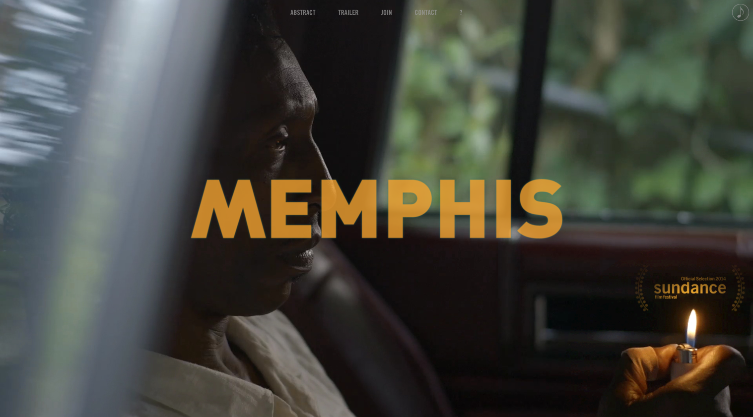
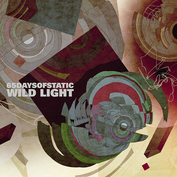
thanks for calling_093014
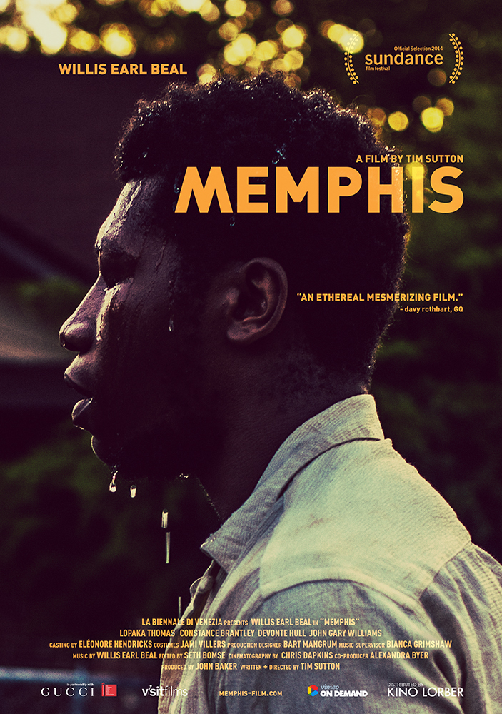
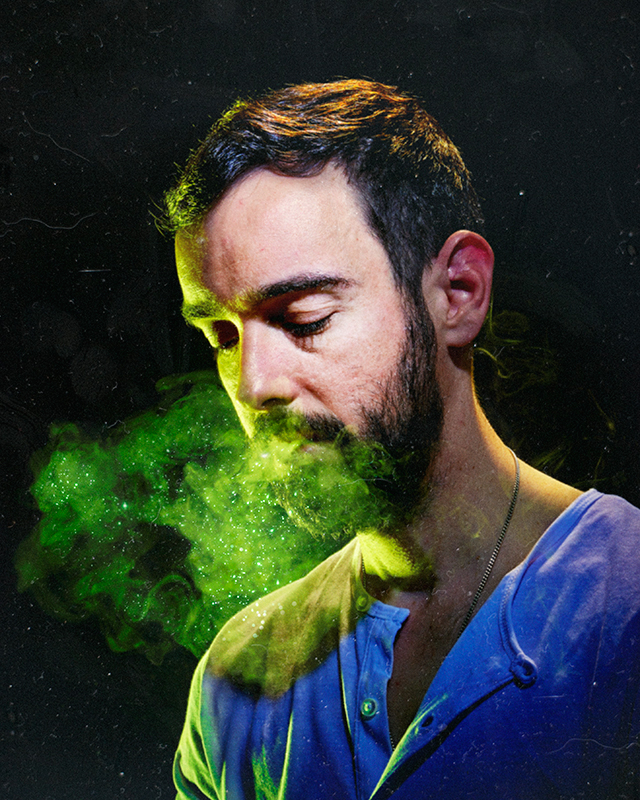
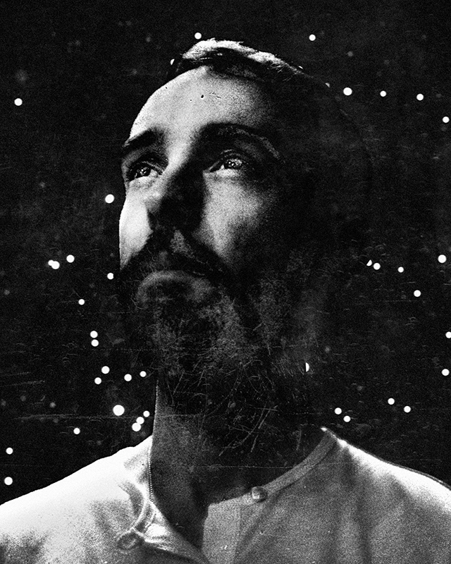
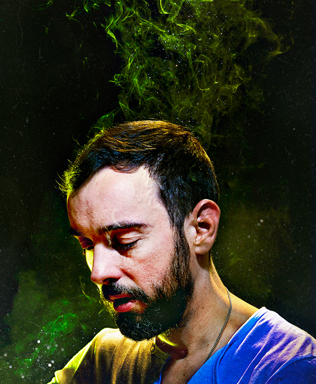
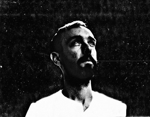
the video above is for ‘thanks for calling,’ the new single by our friend and long-standing collaborator, alessandro cortini. a man of many side projects, we have been fortunate to be most closely involved with sonoio, arguably his most lyrical outlet to date. it’s no secret that the dialogue between us is a constant thing, but it was around the time memphis was being shot that our discussions regarding a video for the song really started to bear fruit. the treatment matt sundin and i put together was a personal one that we felt tied strongly to the lyrical themes of the record and also harked back to the european filmmakers that had featured so heavily in all of our upbringings, for one reason or another.
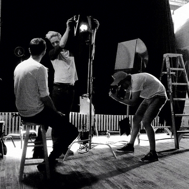
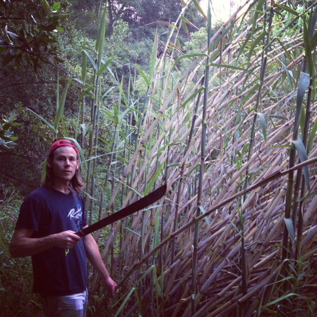
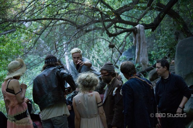
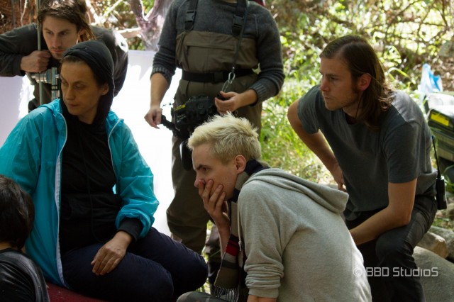
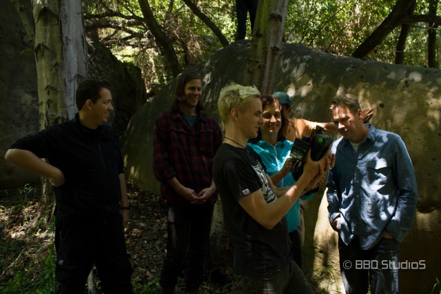
that summer we found ourselves on the ground in los angeles. our producer, friend and hero katharine o’brien had already introduced us to the fantastic director of photography, monika lenczewska, and we were scouting locations, machetes in hand, in the creeks of the santa monica mountains. monika’s enthusiasm and humour as we hacked through the undergrowth planning each shot breathed new life into the project, to say the least.
soon enough emails were flying back and forth with various crew members and our crazed psycho-drama was beginning to look like a reality.
casting, always the rogue element in any film, certainly took us to the brink. we’d crawl out of building sets deep in the forest and find ourselves sitting in a coffee shop or in front of a computer picking gunk from beneath our fingernails, looking at actors and actresses. the trick of course with this film was that we had to find someone willing to play not just the swanky LA party goer, but also the sunbaked, blood-soaked, creek fiend.
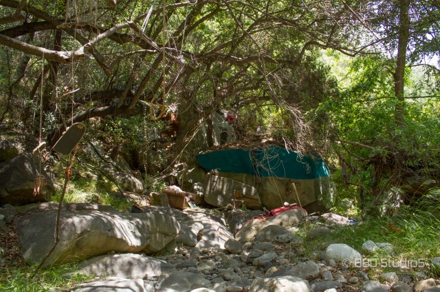
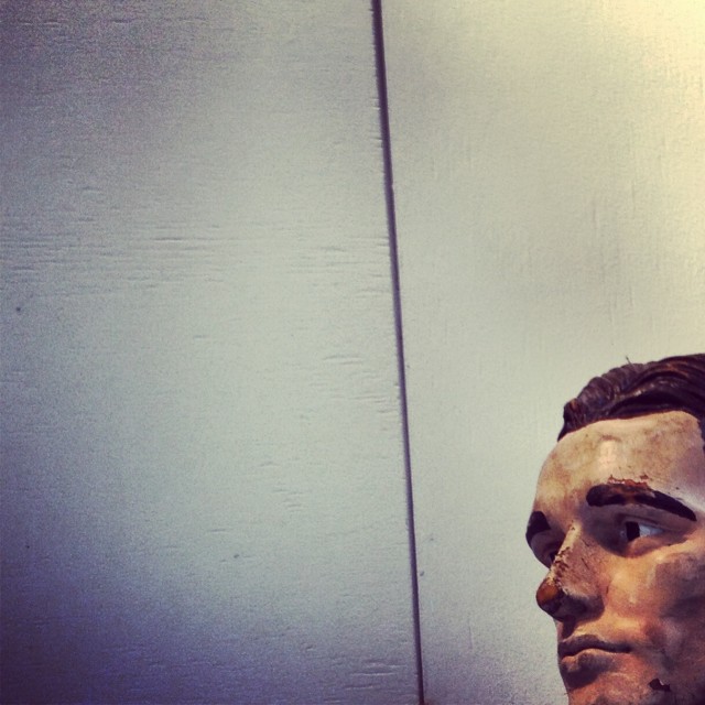
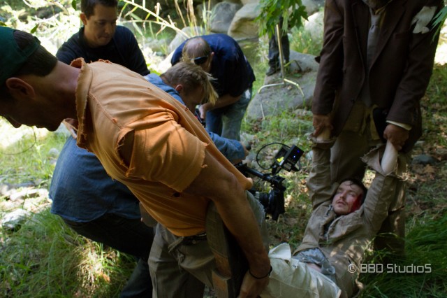
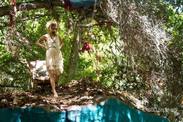
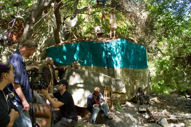
with an entire nation of poison oak cleared away, half the garbage in the surrounding 2 mile radius dragged into one spot and a crew of 20-30 people making a home somewhere long a trail through the forest, we hit the first day and watched marshall allman awake from his fall; delirious, smashed and looking for little more than a sip of water.
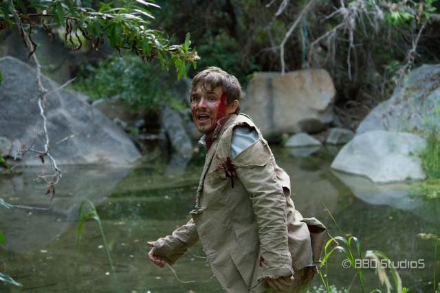
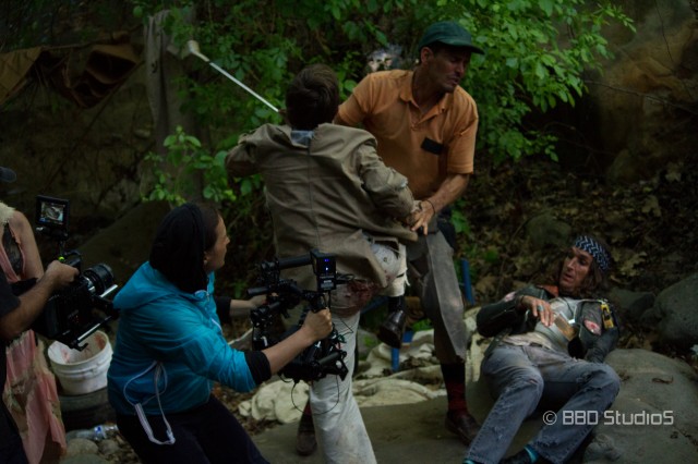
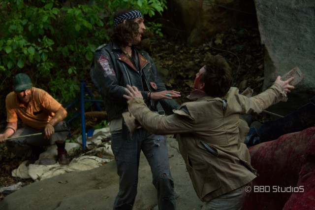
naturally things got out of control and as marshall was dragged away by some curious ‘locals,’ we got into our fair share of technical scraps too. as he pretended to piece together the reasons for why his world had been turned upside down, we?hauled machinery around rocks, through undergrowth and in and out of ponds.
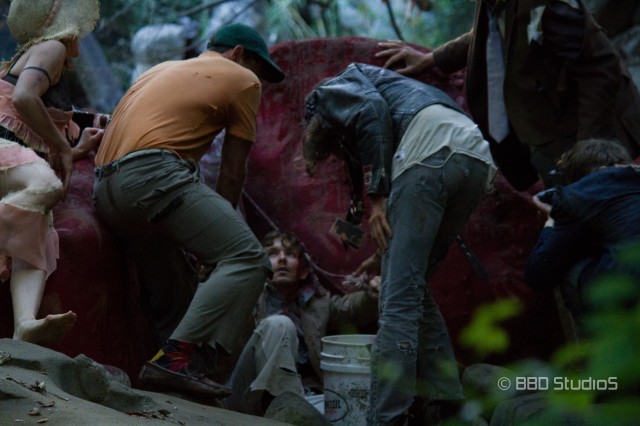
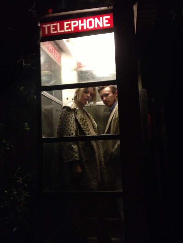
as the day went on we threw everything we had at marshall to try to keep him down. including a spectre of his wife, played by a rather radical looking daveigh chase. pretty soon he was telling us exactly how he planned to kill everyone in sight.
technically speaking one of the highlights of the shoot was hugh bell bringing a prototype of his incredible MOVI rig to the set. when the ground is basically all big rocks, this thing kept the shots looking and feeling like we were floating like a feather across the landscape. naturally it also allowed us a few evil dead style movements through the forest, which was cool. having hugh on set meant he could take apart the rig in a split-second to make any necessary adjustments as we moved forward and tried new shots — an advantage we never took for granted.
all the while we just tried to keep track of things.
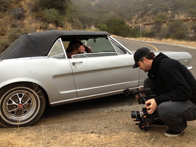
the next day and night we were in a convoy of cars racing around corners on one-way roads throughout the forest canyons. first we did a few runs with monika and hugh sitting in the back seat of the mustang, then, with an enormous camera strapped to the back of another truck like the outboard motor on a boat, we set them off by themselves. we then coaxed marshall and daveigh deeper and deeper into a screaming match via a walkie-talkie hidden in their car, as we swept back and forth across dark canyon roads — our lights out, unaware what might come from the mist at us with each new bend.
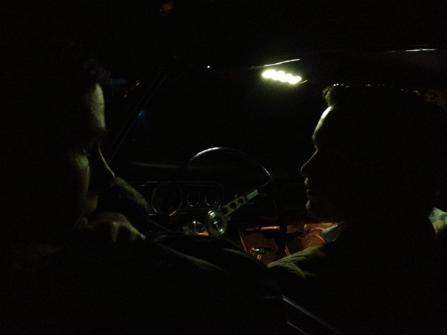
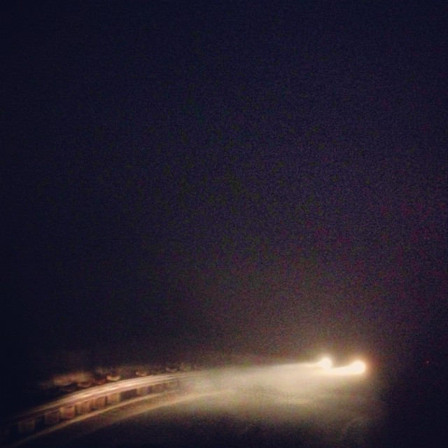
it was a two and a half day shoot that ended by the side of the road early on a saturday morning. all of us, exhausted but content, stared down into a fog filled canyon stretching out toward the ocean. as our 1965 mustang’s headlights cast our shadows into the early morning mist, we wondered equally if we’d got every shot we needed and how good bed would no doubt feel when you’d driven yourself into the ground in this way.
editing the film was a tough process, as is always the case. there are many ways to skin a cat as they say, and this one was often screeching as we did it. we ended up with not just 3-4 different edits of the video, but also two entirely different mixes for the song itself. in the end alessandro made the call as to which combination should be the ‘official’ cut. however we also agreed that one of the other cuts made a good accompanying piece in terms of the different interpretations of the narrative. edit-wise it doesn’t vary hugely, but the colour grade, sound design and song mix set it apart in ways that are worth experiencing — the song mix in particular couples well with the new sound design and puts a different emphasis on the percussive elements of the outro.
this ‘director’s cut’ we present for you now:
cheers.