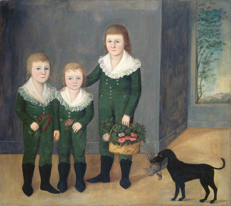
(version_industries) and Caspar Newbolt also go the painted route for Family Portrait (limited, June 28), but from a wholly different angle. Rather than create something from scratch, they have gone back in time to reappropriate an old master painting: Joshua Johnson’s The Westwood Children. That canvas becomes the source of these three sets of eyes, cutout and repositioned for the shift from landscape to portrait as their bodies become lost within the void of a highly textured field of muddied color.
It’s a memorable piece that alludes to the film’s disappearance of a character while trying to take a photo of the group. There’s mystery in that absence of form and horror in the fact that these eyes stare at us unperturbed, as though they know what happened and might in fact be the cause. And there’s a symbolic read of Shakespeare’s quote that “the eyes are a window to our soul” included as well. What more do we need to immortalize ourselves than them?
thank you to jared and the film stage for their continued appreciation and support of out work.
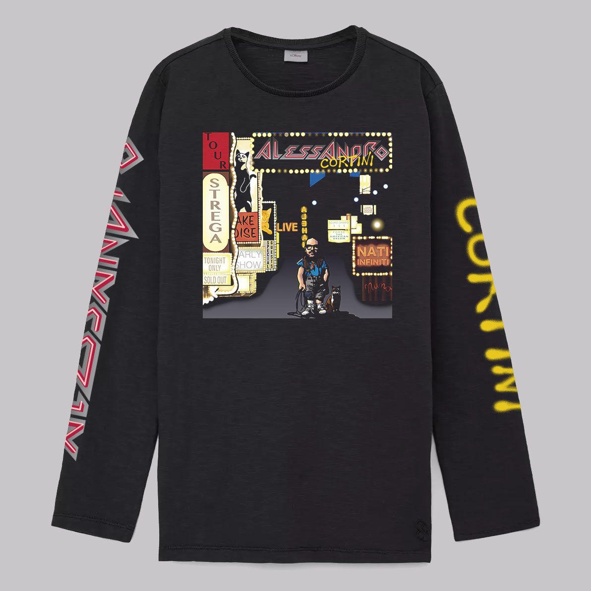
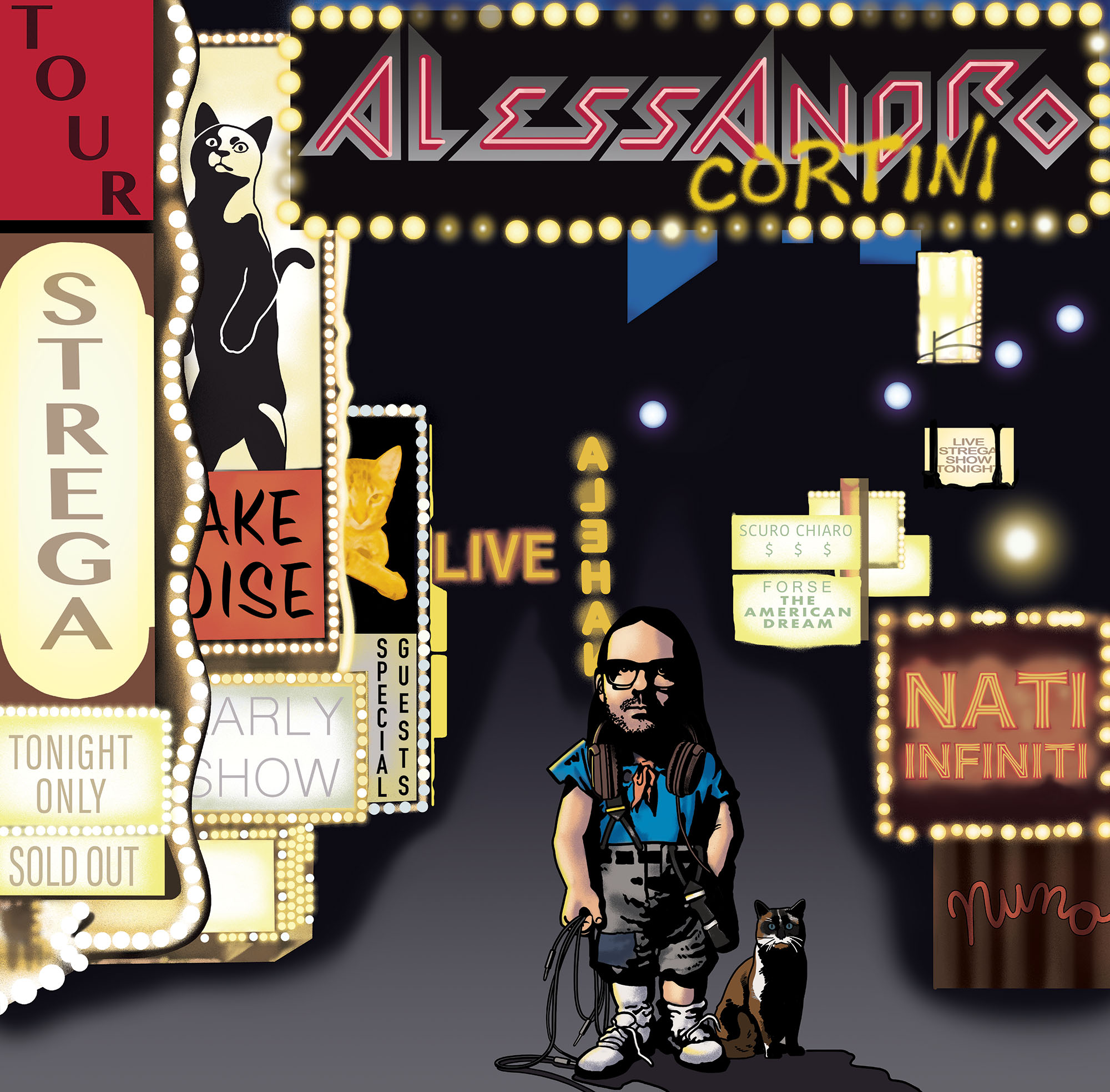
old friend alessandro cortini asked us to make a custom t-shirt for his 2024 “nati infiniti” tour of north america. years ago alessandro and caspar realized they had a shared love of certain bands, one of which was the late 80s american rock band, extreme. to this end alessandro knew who to approach with an idea he had for a new tour t-shirt.
what you see here is a custom version of the artwork for extreme’s most famous album, extreme II: pornograffitti. the brilliant john delucca painted the the entire piece, including the custom typography, from scratch. in doing so, under alessandro’s guidance, john swapped in alessandro’s likeness and various other parts of alessandro’s life and work to replace the original early 90s artwork.
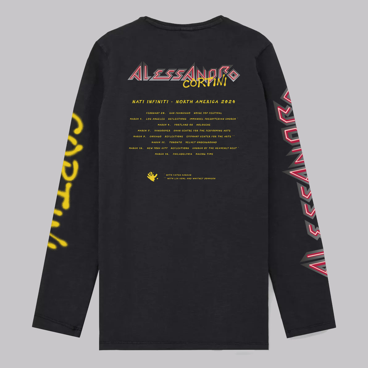
caspar took care of the typographic elements on the back of the shirt and prepared the files for printing. the shirt was printed in a limited edition of 144. you can read comments on the shirt’s concept and design from alessandro’s friends and fans here.
we hope those of you that managed to snag a shirt are enjoying its many facets.
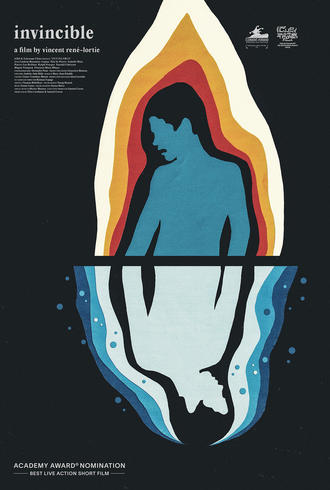
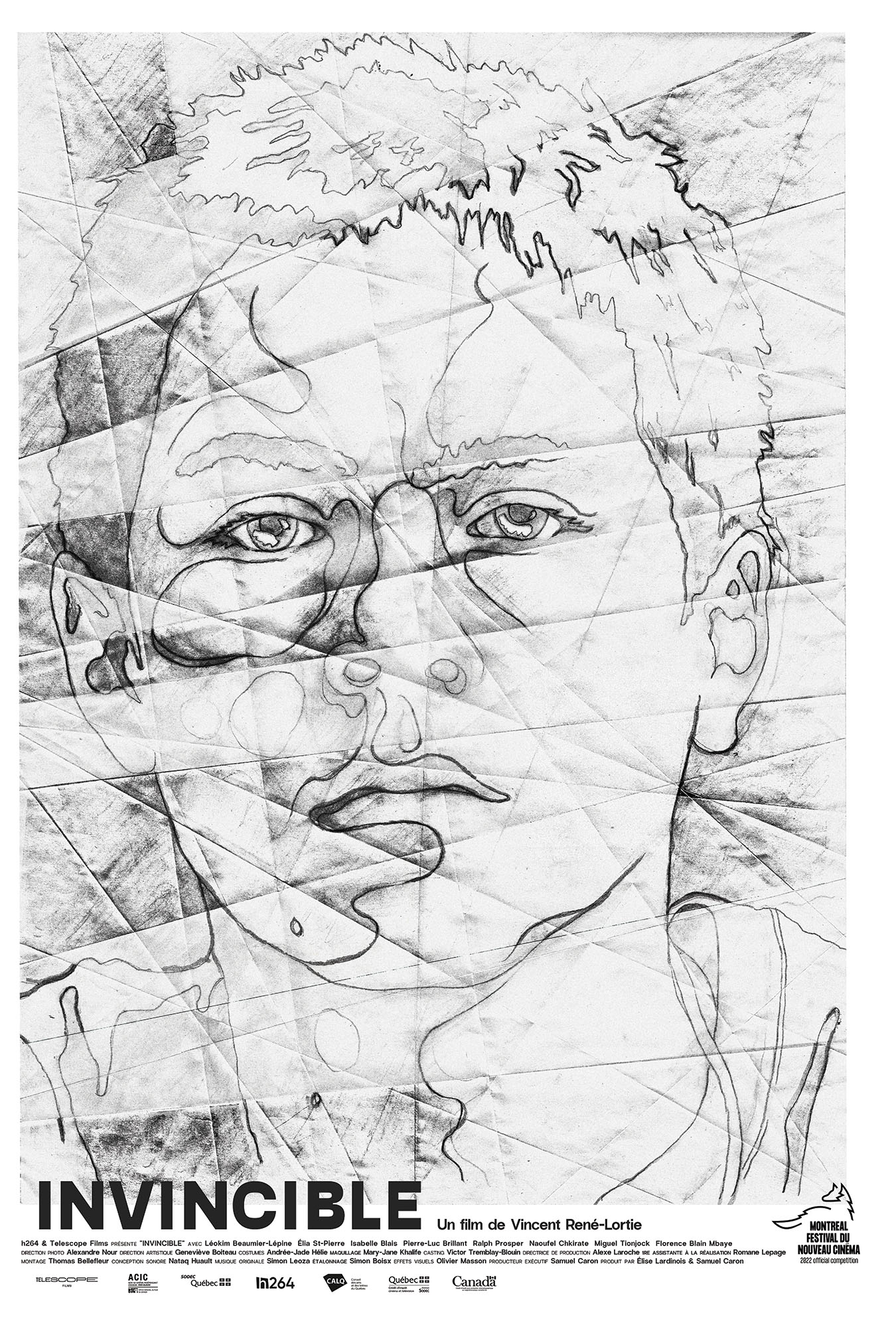
needless to say these are the first posters we’ve made for a film with an oscar nomination. a huge congratulations to vincent, samuel, élise and everyone at h264 distribution.
you can read more about the making of the posters here. the film has since been made a vimeo staff pick, and you can watch it here:
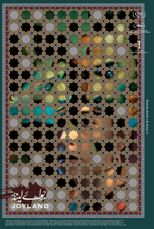
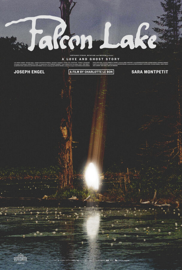
posteritatiand the film stage have kindly included our joyland and falcon lake posters in their best movie posters of 2023 lists. the film stage went as far as to consider our poster for saim sadiq’s joyland their number 1 poster of the year.
here’s what jared mobarek at the film stage had to say about the joyland poster:
There’s so much to talk about with (version_industries) and Caspar Newbolt’s Joyland. The ornately hand-drawn floor tiles (their website always generously explains their process) doubling as a window upon the main characters. The whole’s off-center nature pushing everything into the top-left corner to provide room for text on the outside without sterilizing the composition via more symmetry. The way the three actors feel as though they exist in one scene despite a handful of lotus flowers overlapping their images to prove each has been meticulously layered atop the others. The grain, subdued colors, and blood-smeared title. It’s truly a work of art all its own and a testament to the field’s ability to sell itself as much as the product being sold.
a huge thank you to both institutions for their continued support of our work.
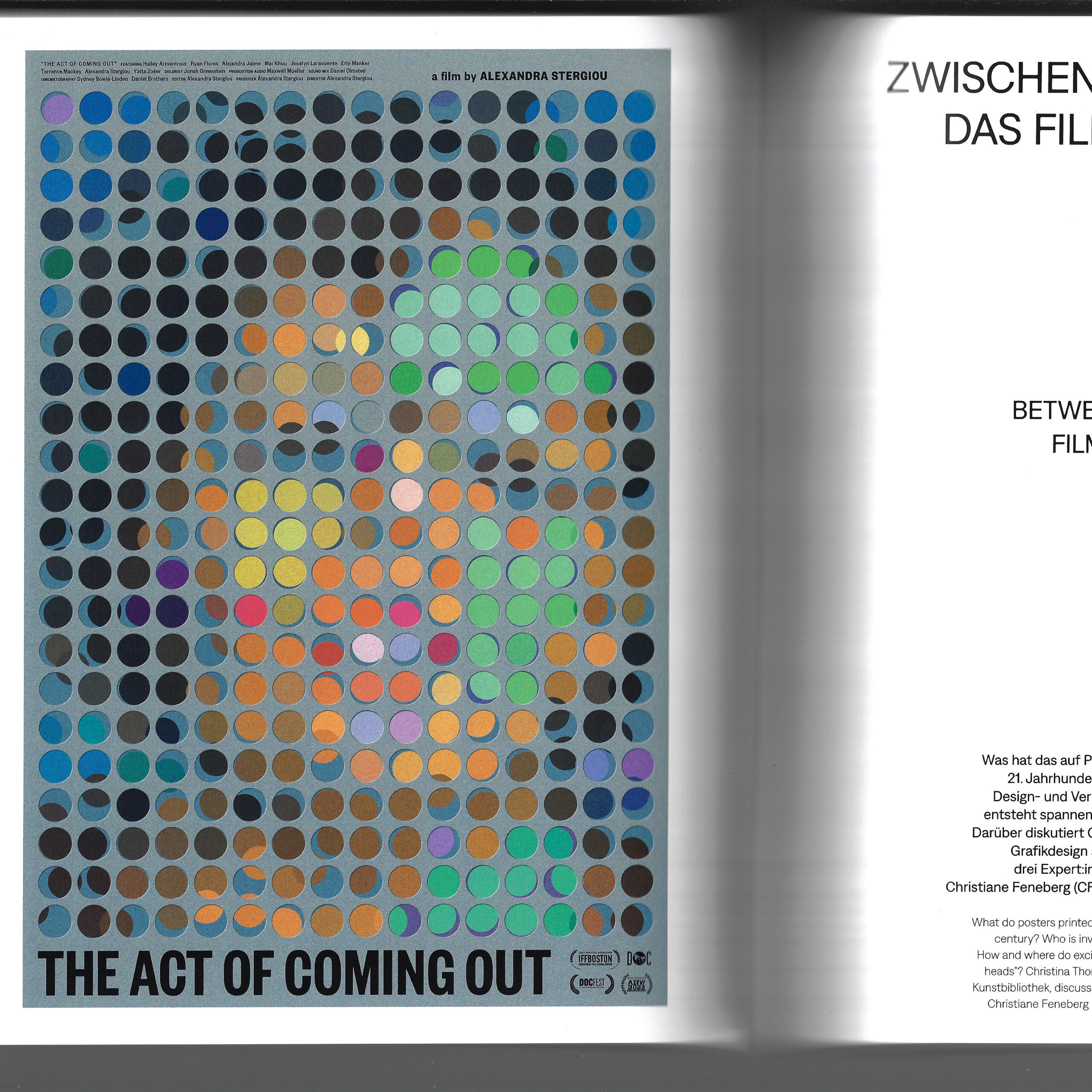
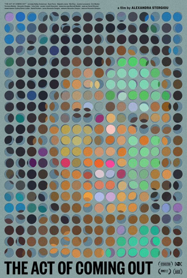
the staatliche museen zu berlin (state museum in berlin) wrote and printed a 280 page catalog for their großes kino exhibition. the catalog was beautifully designed by sandstein verlag and it details every aspect of the exhibition. included within its pages is a full page colour reproduction of the poster we made for alexandra stergiou’s short film the act of coming out, and an interview with german graphic designer christiane feneberg, MUBI germany’s director of distribution lysann windisch, and caspar.
the interview, titled “between paper and pixel: film posters today”, was conducted live on zoom by christina thompson, and then later edited for clarity. here are a few excerpts:
CT: In your professions – as designers and distributor – you are dealing with advertising and communicating films on a daily basis. In this, the film poster is only one aspect of many. How important would you say it is in what you do?
CF: The word “poster” is perhaps a little restrictive. 50 years ago, the printed poster may have been the main piece of publicity for a film, but nowadays, the scope is much broader. Contemporary designers create artwork that gets used for many different purposes, from mega prints to small website banners. So what we do is more like a corporate design for the movie than just a poster. Today, everyone is used to getting information visually – images are what attracts us, what makes us stop and think. That means: designers have the most powerful tools to communicate films. I mainly work with distributors in Germany, both creating fresh artwork and adapting existing designs. Hence, I look at the topic more from the marketing side, less from the art side.
LW: At MUBI, we also never talk about the “poster” but about the “key artwork” for a film. The key art is a central element of a campaign: it defines the look by being customised to each communication channel, whether this is a small digital banner or a large scale out of home promotion. As to the ratio, I’d say at least 50% of our communication output is centred around the film’s artwork. The rest of the campaign is built on moving images such as the trailer.
CN: I agree, but things look different from my perspective. I spend much of my time making physical posters for films. Generally, I am approached by film directors who have a powerful emotional attachment to their work. They are less interested in website advertising or such like. What they want is something beautiful to go on their wall, a poetic image that emotionally captures the piece of cinema they have spent years of their life making. For them, the film poster is like an album cover – you know, in the music industry album covers rarely ever change. I will make a film poster for them, but only the poster, as most of the best images cannot just be reformatted to fit any shaped hole.
CT: So the perfect film poster for you is one that remains unaltered?
CN: In a way, yes. The film poster, in its traditional format, has a great power. It is faster than a trailer, faster than reading a review. It captures the film in a glance, and it grabs your attention, whether someone is scrolling on their phone or walking down the street. If you make this glimpse unique and interesting enough, they’ll stop and wonder: why does it look like that? – and perhaps consider seeing the film.
CT: So is the film poster indeed one of the most restrictive fields of graphic design?
CN: Many of my contemporaries in the field are traumatised and underpaid. They are constantly coerced into making their work worse. They spend endless hours diluting the work with pointless revisions, and are left with pieces they’d never willingly put in their portfolio. As a result, they lose trust in themselves and struggle to get the jobs they want– they have effectively become someone else’s photoshop hands. I have fought hard to reverse this situation: I present several ideas to a client as text and reference image only and after some discussion ask them to choose just one. I then make the poster and what I come up with is effectively what we must work with. This way, I am free to produce what I believe to be the greatest possible poster. As a result, I hold myself to a much higher standard than they would or could, and I can really experiment. Plus: I sidestep the suffering.
CF: Occasionally, I have been tortured, too. Having worked with distributors for many years, I understand their needs well. But sometimes it just doesn’t go smoothly.
CN: I have been fired several times by distributors. For me the quality of the work comes first, and the money second. I’m of course not rich, but I can’t sleep at night if I’ve done bad work. They quickly forget that they couldn’t do it without us and it’s only when that understanding is established and respected, really beautiful things can happen. Then there’s a conversation rather than a bullet point list from them of changes to be made, like bullet holes in the work.
CT: Lysann, how does this look from a marketing point of view?
LW: I am speaking from a luxurious position, as MUBI has a whole creative team inhouse to create campaigns. All designers are employed. I hope that our gifted creative director, Pablo Mantin, is not suffering like Caspar and other designers. As a global platform, we work across territories, building international campaigns for our films – quite unlike the situation dealt with by most distributors in Germany or other countries. Ours is a complex process that needs a lot of listening and understanding, because online design and distribution have different needs and expectations. And some filmmakers also have a strong opinion on how a film should be communicated.
CT: The film poster has a long history of being scalded for tastelessness and bad design. Today, too, you often hear it described as generic, unimaginative, formulaic. How much truth is in that?
CN: I’d say for every beautiful poster (whatever we believe that to be) there are around 50 terrible ones, made globally by people trying to very safely market certain kinds of films, be it comedies, horror or action films. We all know the poster types: movie-star heads, guns, 3D shattered typefaces, a backdrop of explosions etcetera. The companies producing them usually have a lot more money to put up their posters all over the world, while the interesting ones don’t tend to have much reach. So the public get the impression that film posters are generally bad – whereas in fact, it is just power by numbers.
CF: It is all about daring to do things differently. Yet the main enemy of design courage is money: if you produce or buy a film, you have to get your investment back – so you play it safe. The assumption is that if a thing has worked once, it can be used as a formula. In briefings, I often get such references. At the end of the day, however, going to the movies is still a special experience. So I remain hopeful that distributors will dare new paths and change the recipe a bit more often.
LW: Yes. Working internationally, I have learned that, to a certain extent, you have to trust people to understand what you want to communicate. Perhaps German distributors don’t do that enough.
CN: I brought a quote which I think sums up a lot of what we were discussing. The Russian filmmaker Andrei Tarkovsky said in 1984: “Cinema is an unhappy art, because it depends on money. Not only because a film is very expensive, but it is also then marketed like cigarettes. A film is good if it sells well. But if cinema is art, then such an approach is absurd. It would mean that art is only good if it sells well.” With film being such an incredibly expensive art form, it seems understandable that marketing wants to attract everybody – it just cannot afford risks. And that’s where, design-wise, things start to suffer.
CF: Then again, maybe not every not every film poster can be art, or has to be art. It is also simply publicity. People decide for themselves if they want see an arthouse film or a cineplex movie. Is every chain-produced Marvel production a piece of art? Or is it a commercial project? Personally, I consciously chose being a graphic designer, not an independent artist. I believe it is OK that both exists. Big blockbusters don’t have to be ashamed of their commercial artwork, but it’s also very nice and refreshing to have individual, even arty, independent film posters.
CT: To sum up, let’s briefly consider digitalisation. Would you say the printed film poster is dying out?
LW: I wouldn’t say that. We still produce many analogue and haptic things, such as the printed version of our film magazine, the Notebook. This experiments creatively with different designs, adding another layer to campaigns. And for me, thinking about the printed version of a poster is just as important as thinking about a digital version. Nevertheless, we need formats to be adaptable to different communication channels, standardised versions don’t really work.
CN: I regard this hyper-adaptability with some caution. Watching a film on the big screen, you see many more details than you would on your phone, for example. In the same way, a poster tells you so much more than a small display, and it creates different emotions. There’s a value to understanding the different formats and how they work. I am sure that one day, there will be digital screens everywhere. That will also herald animated film posters – which is a whole other dimension. But then I think fondly of vinyl records. Why are they still here? Because people like holding the artwork, they like tactile, haptic things. It’s the same with paper posters.
we’d once again like to thank christina thompson and christina dembny at kunstbibliothek for creating such an extraordinary, in-depth and thought provoking exhibition and catalog. if you have the means, do see the show before it closes march 3rd, 2024. in the meantime you can purchase a copy of the exhibition catalog here.
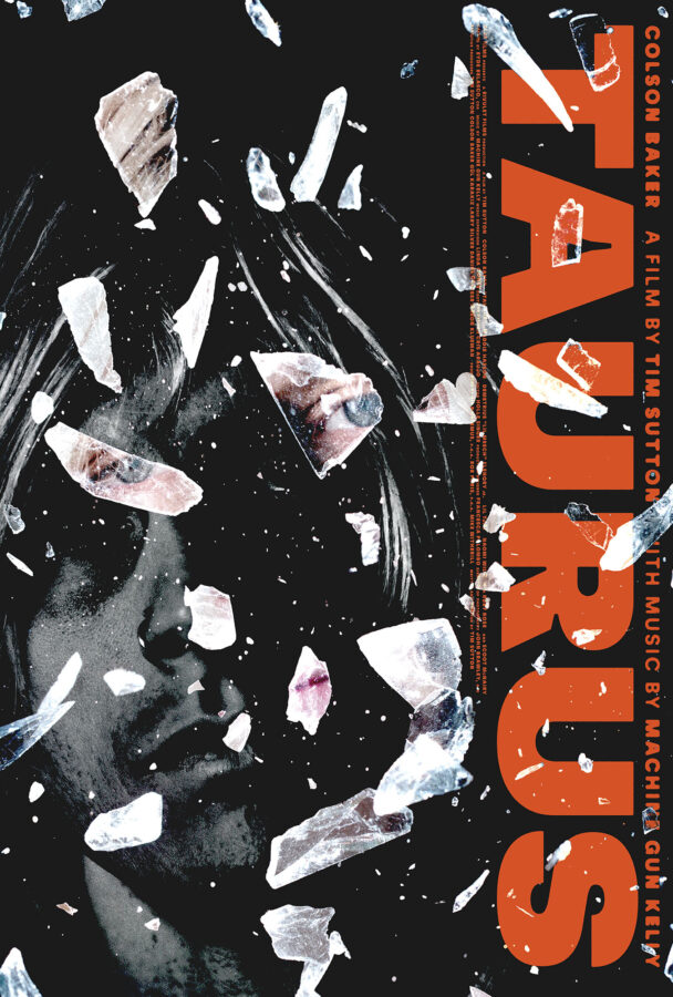
this year marks the 20th anniversary of the founding of version industries. we never imagined we’d last this long. to mark the occasion it feels fitting that the posters we made for tim sutton’s feature film taurus and alexandra stergiou’s short film the act of coming out have just been acquired by the kunstbibliothek (art library) of the staatliche museen zu berlin (state museum in berlin), germany. we will post a link to their digital record of the acquisitions the moment they appear.
there’s a chance also that one or other of the posters will be featured in their forthcoming großes kino: movie posters from twelve decades show. the show opens november 3rd of this year in berlin. here is what they say about it:
Großes Kino – we’re talking about cinema with a capital C, about motion pictures that leave you feeling overwhelmed or in awe. A good movie poster, too, is designed to be remembered: it captures the film’s mood, alludes to storylines, evokes feelings. The drama and narrative of a long film are condensed into a single image. The exhibition “Großes Kino” presents around 100 original movie posters from the 1900s through to the 2020s from the Kunstbibliothek’s collection of graphic design.
The twist is that the selection is not made by the inhouse curatorial team alone, but in collaboration with thirty people connected with the film industry – including actors, directors, cineasts, historians and designers. In the exhibition, an audio guide with the guest curators’ commentaries will inform visitors about the background to their poster selections. Thematic sections provide additional perspectives on the medium of the movie poster, such as its birth at the turn of the 20th century, Berlin as a city of cinema, and current graphic design trends for films. The exhibition will be accompanied by an education and outreach programme as well as a symposium that examines the topic from a critical perspective.
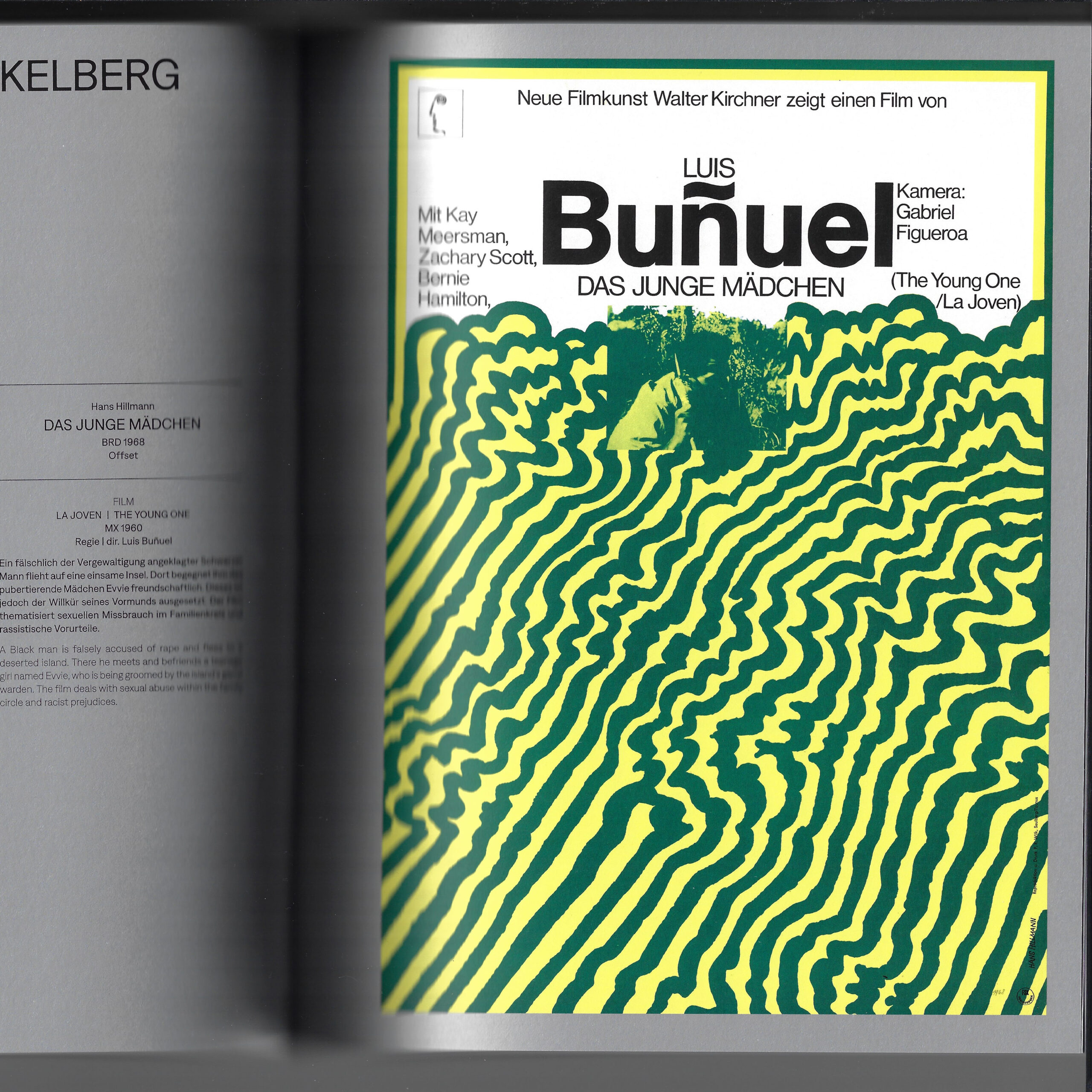
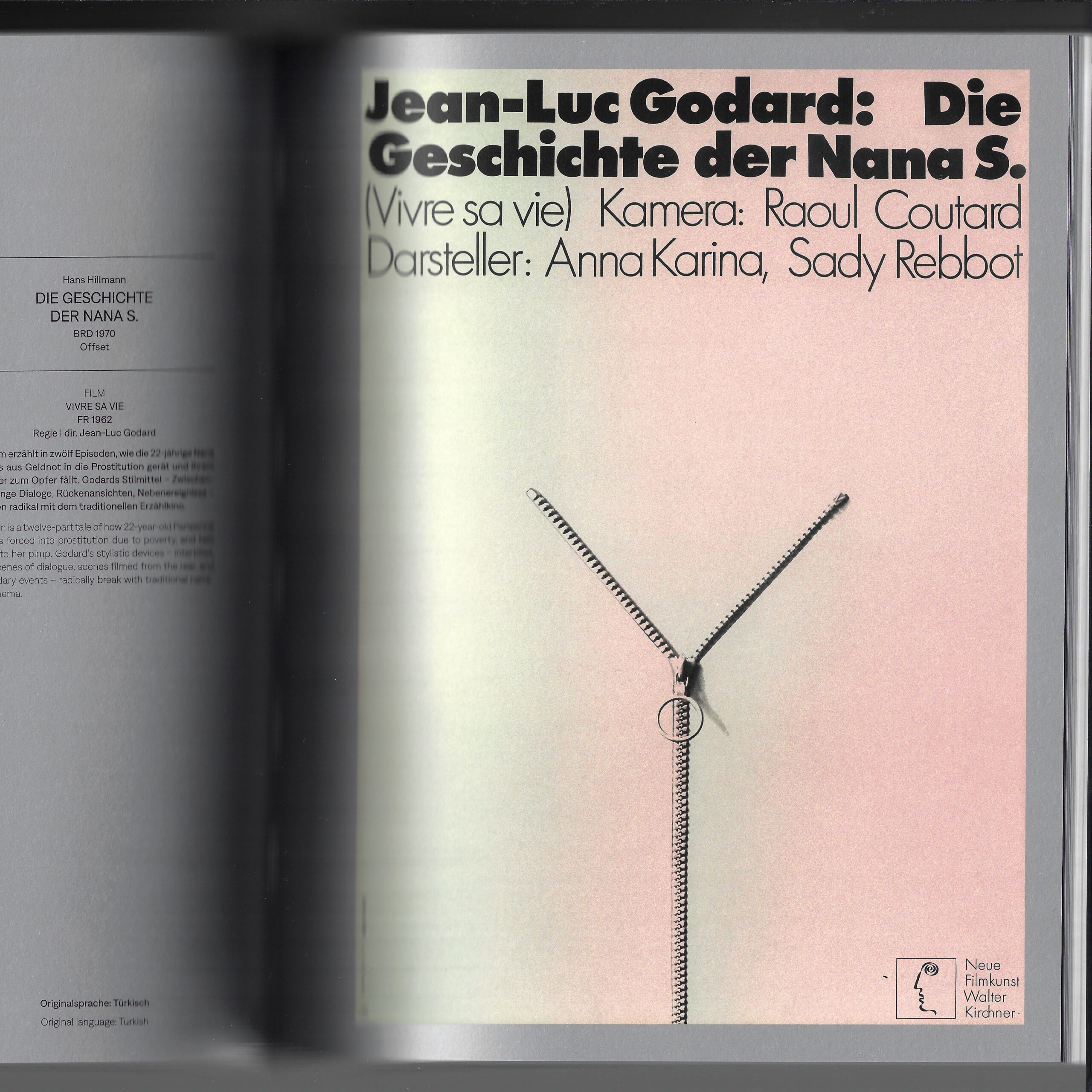
either way a huge thank you to christina thompson and christina dembny at kunstbibliothek for finding and acquiring these posters. we are greatly honoured to have our work in such a museum’s permanent collection; a collection that includes the work of one of our heroes, hans hillmann.
stan at posteritati had this to say on the matter:
I’m always happy to see a new movie poster by Caspar Newbolt on the TL, it’s sure to be something totally unexpected that eschews current design trends, and these two are no exception. And I love that his inspo for The Act of Coming Out was Waldemar Świerzy’s Polish poster for Blow Up. Read Adrian Curry’s MUBI interview with Caspar. We’re All Going to the World’s Fair released by Utopia.
once again we are incredibly thankful for this level of recognition and support. particularly when the act of coming out is a short film and everything else on these lists are feature films, not to mention oscar contenders.
after 10 years of working to make the best and most original film posters we can for everyone, we wanted to celebrate by opening a print shop at shop.versionindustries.com to provide physical copies of those posters to anyone anywhere.
our mission is simply to make sure those that want these posters can have them and for the cheapest price possible. during the 2020 global pandemic we worked out a way to print posters “on demand” and deliver them worldwide whilst keeping our overheads very low. as you can see, we’re talking around $25 at most for a full-size 27×40 inch US one-sheet or A0 poster on good paper, plus shipping. what small profit margin there may be will hopefully cover the overheads of running an online store of this kind.
we trust that this offers us a way to make sure the films we have worked on can be remembered beyond the festival and theater releases, on the walls of those who really loved them. the funny thing is this is so often not the case; film posters only get printed a handful of times and then they’re just the result of google image searches and that’s that. this goes against the entire point of making posters of course.
thank you in advance for your continued love and support for independent cinema, and for the work that we do to celebrate the films and filmmakers we’re lucky enough to work with.
caspar wrote this piece upon request for the independent, full-service, film, photography and animation production company, ecstatic static. the essay now resides in their website’s resources section alongside an extraordinary array of other materials. this text represents to date everything he’s come to learn about making film posters within the world of independent cinema. he hopes it’s of use to some of you out there.
Filmmakers: in the 10 years or so that I’ve been making posters for films I’ve come to understand two important things. The first is that whilst I wasn’t very good at it when I started, many filmmakers were nevertheless happy to pay for my bad work and use it to represent their films. The second is that there really is a very comprehensive ideology to making the proverbial “good film poster,” and that if you adhere to it even loosely you’ll have on your hands not just a poster that talks seductively about your film, but also a beautiful piece of print work in its own right. Please don’t misunderstand: there is no precise formula for making a good poster, just as there’s no formula for writing a good song. My father the painter and drawing teacher, Thomas Newbolt, teaches his students not to draw better but to see better, so that whatever their natural technique they can draw better with it. In this same fashion my aim here is to introduce you to ideas that perhaps will improve how you see your film through the eyes of the mise-en-scène on paper that is the film poster.
Despite what you might assume filmmakers are often not particularly visual people, and likewise I can tell you that graphic designers are often not particularly poetic. In fact it concerns me a little when someone asks me to “design” a poster because aside from some text-based information, the best film posters have very little conventional graphic design thinking to them at all. In fact it’s in thinking more like a painter that I believe film postermakers are more successful. Similarly it concerns me when a filmmaker knows how to, let’s say, “gather scene information” with their camera, but yet is unable to make a beautiful film. Today’s technology enables anyone to film someone walking down a corridor, opening a door with a key, going through the door it and closing it. Yet not everyone will have the eyes for framing, movement, lighting, tone, performance, sound or editing to make anything about witnessing this event observant, meaningful or remarkable in its point of view. In the same way, many people have a copy of Adobe Photoshop and consequently many film posters feel similarly limited by what that software can do.
The filmmaker Robert Bresson when speaking on the subject of film editing stated that “an image must be transformed by contact with other images as is a colour by contact with other colours. A blue is not the same blue beside a green, a yellow, a red. No art without transformation.” Thus I’m aware that for filmmakers it is in part this transforming of an image through the cut that a deeper poetry in this medium can be developed. The good film poster also exists in that cut between any two pieces of footage. It is a single image often created using complimentary elements from the print world vernacular. Each element pieced together to articulate a visual counterpoint to the film rather than rely upon any actual still image in the film. If filmmakers cannot be open to their film being articulated in this way and / or if graphic designers don’t have the poetic sensibility to depict it, then the collaboration can lead to some bad work.
I say this because to make a good film poster one should aim to achieve the following:
Reduce a film — which can be some 172,800 still images more or less — to one single image that speaks to the whole. Therefore one must often aim to be even more poetic than the film itself was able to be.
Make that one single image work on paper — often in portrait format, when films are largely shot in landscape format — and in a fashion that speaks to people walking quickly by, across the street, and often with other things on their mind. I stress the word “paper” here because things that look good on screen do not always look good on paper. Furthermore things that do look good on paper and therefore make for the most beautiful posters, are often the simplest and flattest things. Those can be lines, shapes, drawn or painted marks, cut out or torn pieces and typefaces that make you as aware of the paper itself as possible. When filmmakers get excited about shooting on film, so postermakers should be excited about printing on paper. As the script is to the film, so the composition on screen is to the printed poster. A success in this understanding and practice leads to something the Germans have a word for: plakativ. The word translates as “striking, bold, pithy” and yet, stems from their word for “poster,” plakat. Thus the implication of the word is that poster-like work is something we should strive for.
Understand that the poster exists within a context. The poster is for a wall on the street or in a house or in a cinema. It’s not just for digital usage such as social media. Let’s not be confused: you’re not making digital banner ads for a website — which is all a poster is if it’s never printed on paper — you’re making an object that someone should not just want on their wall for the duration of the film’s release like some advertising billboard. You’re making something that people may want on their wall, at home, very large, perhaps even framed, for the rest of their lives. Think about that. Think about the poster sitting next to a painting, and a window, and a vase of flowers, and in the morning light — as a part of a complete interior experience, and so on. The moment you start to really think about context in this way you’ll start noticing, commissioning and / or and making better posters.
Now, let’s say that you’ve made a film and you’ve just gotten into a festival. Or better yet, you’ve sold your film and now its on its way to cinemas nationally or internationally. Either way you’ve got some “successful” marketing and distribution people breathing down your neck about needing a poster. They’ve told you how they know how to make a poster that will get people to see your film, and how their in-house designers — under close guidance — will make just such a poster for you. Perhaps you’ve even signed a contract with them that gives them final say in how the poster looks, and now somehow the early drafts of what you’re seeing are just nothing like you’d hoped or imagined a poster for your first film would be. You then find yourself sitting there with a week to go before the poster has to be done, and you and your film might well be misunderstood and neglected.
The above paragraph is deliberately emotionally manipulative but it is also based on truth. This is often exactly what happens and whilst some filmmakers don’t even notice it happening, here are some things to consider when you’re ready to have a film poster made:
FIND A GOOD POSTERMAKER You probably have a good idea already which film posters you like and maybe even who made those posters. However sometimes it’s not a professional poster maker you’re after. It may well be someone who has never made one before who will give you the freshest and most powerful poster to herald your film. Hell it may even be you, the filmmaker, who should make the poster. Either way try to find someone who isn’t all about style and technique, who has the breadth of imagination and skill to create something that speaks as directly as possible to the film. The actor and director Brady Corbet once said he preferred — when considering to act in a film — to talk to the filmmaker directly than to read any script; he knew it was the filmmaker’s attitude that would convince him the project was worthwhile rather than any skill at writing. I say this because if you just want some recognisable artist or designer to slather your poster in their clever signature style, then you’re just selling their work and not talking about your film. This would be akin to paying a critic for a good review. What you’re really looking for is someone who deeply understands your film and can articulate that understanding on paper.
HAVE AN IDEA Much like a film, every poster should have an idea or reason behind the execution of its visual approach. There are no exceptions. A poster with an idea behind it is a clear reaction to an action. This is to understand that humans by their very existence are a series of reactions to actions, and thus will immediately notice the nature of origin stories like their own.To sense a poster is behaving visually strangely for a reason is to sense an interpretation, in the hands of the postermaker, a reaction to an action by the filmmaker. This creates a tension, a curiosity, questions without answers, and ultimately engenders the desire to see the film. It is better if the poster is trying to be original, otherwise you will get your film confused with other films. This, despite what your marketing people might tell you, is not a good thing.
MAKE YOUR OWN RULES Just as film doesn’t necessarily need a plot or a three-act structure, so there are no general rules for film poster design and therefore no particular way a film poster should be made or should look. The only rules are those that the filmmaker and the postermaker devised as a way of best articulating “the idea” mentioned above. This means you should have absolutely anything you want on the poster, be that a photograph, a painting, a drawing, a collage, a smear of your own blood, a blank canvas, a Jackson Pollock drip painting with type, if it be your will.
Speaking of type: this is where graphic design thinking in the strictest sense most often prevails, but we must accept that type is also ultimately a part of the image. Anything on the poster is the image, whether letters are legible or not. As the graphic designer David Carson once said, “don’t mistake legibility for communication … you cannot not communicate.” This means that what you are trying to say with the poster will define the nature of the typographic treatment. In the case of typography this implies that you can make the words on the poster as big or as small or as legible as you like. Whatever feeds the agreed idea and helps articulate it more powerfully and clearly is key. For example: very small type draws you in closer and makes the rest of the image feel very big and grand in contrast. Similarly very large type can trivialise the rest of the image and remove the stature you might otherwise believe it had. Whatever you choose to do, when you do make your own rules, you must stick to them. Part of noticing a good poster is the subconscious awareness that it’s abiding by a series of self-imposed rules and that the tension created by those rules is clear.
BECOME THE FILM No two posters should look the same. Insisting that they do is saying that your film is the same as another film. Referencing other, older film poster styles only may make those who get the reference wish they had the original poster on their wall instead. Despite what your sales, marketing and distribution people might say, the only reason the poster style they’re suggesting you try “worked in the past for this kind of film,” is because once upon a time that style was original, unique to a previous film and had never been tried before either. Just like the film you are making a poster for, the best ideas for film posters come from everywhere but the world of film. Start sourcing images and ideas from your own life, literature, painting, sculpture, street art, magazines, fashion photography, corporate logo design, typographic journals, war propaganda, cave paintings, political pamphlets, household product packaging; literally anywhere but the world of film and its posters. Remember you are not talking about film posters as a culture when you make a film poster, you’re talking about a film. So become the film, embrace what is unique and original about it, and don’t just become another in a long line of film posters dressed in a recognizable uniform of a pre-established school of thought.
One way of thinking about this that might help is to imagine you’re making a poster that would itself hang comfortably on the wall in one of the scenes in the film that you’re making the poster for. Try this as a thought experiment when starting to put together ideas for your poster. Whilst it’s not imperative that this line of thinking be followed — far from it in fact — you will find it yields some interesting results.
GET AWAY FROM THE COMPUTER Where and when possible move your process of postermaking into the physical world. Even if that’s as simple as printing your work out and scanning it back in, it makes a difference. The introduction of any analog element into the design process will give your work a life that is inherently unique to you. People say that one of the reasons vinyl records remain so popular after all this time is the “user experience” they offer; the large reproduction of the artwork, the interaction with a layered physical object, the cleaning of the musical surface, the positioning of the needle, and (if your hand is shaking) the unique sounds that can be made in the process of listening to it. The same thing applies to good postermaking; the less time you spend trapped inside the confines of popular computer graphics software and instead are allowing the shake of your own hands to place elements onto the poster — be that photography, collage, drawing, painting, scanning or whatever — the more mysterious, imperfect and beautiful your work will be. Again, humans like to feel that extra work has been done and that mistakes have been made; reactions to actions.
PROVIDE TWO POSTERS (IF NECESSARY) The filmmaker David Fincher once said that there are two ways to shoot a scene: the right way and the wrong way. Similarly any postermaker worth their salt may make a series of different versions of their poster as they explore how to deliver the agreed concept in the most powerful and beautiful way. It is not however then the postermaker’s responsibility to show anyone those different versions unless they want to. This is where — assuming you’ve chosen the right person for the job — the postermaker’s most important and unique talent comes in; they choose the poster that clearly does the best and most beautiful job, and hand that and only that to the filmmaker. Anyone who believes it’s the director or anyone else’s job to choose from an array of versions created by the postermaker for the sake of their being “options” doesn’t understand or respect the eyes, skillset or experience of the person making the poster. Again if you’ve found the right postermaker and they truly understand your film, then you can trust them to make this decision implicitly. It’s in giving the postermaker agency that you encourage them to produce their very best work.
Celebrated graphic artists Hans Hillmann, Peter Saville and David Carson — to name but a few — all famously produced their best work when they rarely had to answer to anyone. Hans Hillmann worked during a time in Germany when very few people had the means to create film posters, and so he’d be sent the film and simply send a poster back when he had one that he liked. Peter Saville had a similar relationship with Factory Records in England: on at least one occasion New Order only saw the artwork for their latest LP after it had been released into record stores. David Carson’s now infamous, groundbreaking work on Raygun magazine was only possible because he sent the design files directly to the printer, without the editors and writers having a say in how he’d laid out the content.
Having the proverbial good film poster on your hands, what often happens next is that your marketing people tell you your poster has type that’s “too small to read on a phone,” or something to that effect. This can quickly become a dealbreaker to these people no matter the strength of your arguments, and it’s at this moment that you and your postermaker take a deep breath and take 5 minutes to make an additional, ephemeral poster-shaped social-media-banner with huge lettering and hand that over too. You may be surprised at how often this method works. Then you can get back to helping make the object that one day will be framed on your wall and represent your feelings about the cinematic artwork you’ve given years of your life to making. Everyone’s happy.
…
I had an argument recently via email with a Swedish graphic designer who told me he thought film posters were commercial advertisements and nothing more. In not so many words he told me that I was wasting everyone’s time by thinking about film posters as anything remotely artistic. Whilst I hope my own work has gone some way in proving this man wrong, I shall lean on the words of Peter Saville here to brush aside this line of thinking so that we can continue to strive to create increasingly poetic film posters:
“It’s during the current era that in a way the cultural canon has become entirely appropriated for the purposes of commercial practice. And that’s where there’s — in a way — a disconnect. And it then begins to become rather upsetting when you begin to realize that we are now selling out the culture for the purposes of marketing. And that’s the thing which I’ve not wanted to really partake in. And that’s something which I find is — I mean just below the surface — a kind of wave of disillusion across the creative profession. So when you are fighting the marketing men saying look there is a better way of doing this, it kinda felt worthwhile. But when the marketing people sit there and say, ‘how do we seduce? And, you know, how do we position? How… Effectively how do we make our product or service or company look as if it believes in something, when actually it doesn’t?’ That’s the problem.”
I’ve deliberately not included any specific examples or technical instructions in this text, because again I’m simply hoping to urge you to try and change the way you see a film poster, and the way you see your film through the eyes of that poster. That’s the first step towards making a beautiful one of your own. I hope that by keeping my direction elliptical that I have left open that important space between your head and, what filmmaker Andrei Tarkovsky called “the ceiling of the director’s so-called thought.” Tarkovsky was troubled that audiences seemed to prefer knocking their head against this ceiling; they preferred being told what to think or feel about a film. He said, “such knocks … make them feel safe: not only is it ‘exciting’ but the idea is clear and there’s no need to strain the brain or the eye, there’s no need to see anything specific in what is happening. And on that sort of diet the audience starts to degenerate.” So don’t let me degenerate you. In helping you understand that no two posters should be alike, that there are no general rules to a poster’s form and function, and that a film poster must be perhaps even more poetic than a film, I trust you will find a keener eye for film posters, for those who make them and for what your film truly deserves.
Caspar Newbolt Berlin / New York May 3rd — 9th, 2021