on making film posters_062621
caspar wrote this piece upon request for the independent, full-service, film, photography and animation production company, ecstatic static. the essay now resides in their website’s resources section alongside an extraordinary array of other materials. this text represents to date everything he’s come to learn about making film posters within the world of independent cinema. he hopes it’s of use to some of you out there.
Filmmakers: in the 10 years or so that I’ve been making posters for films I’ve come to understand two important things. The first is that whilst I wasn’t very good at it when I started, many filmmakers were nevertheless happy to pay for my bad work and use it to represent their films. The second is that there really is a very comprehensive ideology to making the proverbial “good film poster,” and that if you adhere to it even loosely you’ll have on your hands not just a poster that talks seductively about your film, but also a beautiful piece of print work in its own right. Please don’t misunderstand: there is no precise formula for making a good poster, just as there’s no formula for writing a good song. My father the painter and drawing teacher, Thomas Newbolt, teaches his students not to draw better but to see better, so that whatever their natural technique they can draw better with it. In this same fashion my aim here is to introduce you to ideas that perhaps will improve how you see your film through the eyes of the mise-en-scène on paper that is the film poster.
Despite what you might assume filmmakers are often not particularly visual people, and likewise I can tell you that graphic designers are often not particularly poetic. In fact it concerns me a little when someone asks me to “design” a poster because aside from some text-based information, the best film posters have very little conventional graphic design thinking to them at all. In fact it’s in thinking more like a painter that I believe film postermakers are more successful. Similarly it concerns me when a filmmaker knows how to, let’s say, “gather scene information” with their camera, but yet is unable to make a beautiful film. Today’s technology enables anyone to film someone walking down a corridor, opening a door with a key, going through the door it and closing it. Yet not everyone will have the eyes for framing, movement, lighting, tone, performance, sound or editing to make anything about witnessing this event observant, meaningful or remarkable in its point of view. In the same way, many people have a copy of Adobe Photoshop and consequently many film posters feel similarly limited by what that software can do.
The filmmaker Robert Bresson when speaking on the subject of film editing stated that “an image must be transformed by contact with other images as is a colour by contact with other colours. A blue is not the same blue beside a green, a yellow, a red. No art without transformation.” Thus I’m aware that for filmmakers it is in part this transforming of an image through the cut that a deeper poetry in this medium can be developed. The good film poster also exists in that cut between any two pieces of footage. It is a single image often created using complimentary elements from the print world vernacular. Each element pieced together to articulate a visual counterpoint to the film rather than rely upon any actual still image in the film. If filmmakers cannot be open to their film being articulated in this way and / or if graphic designers don’t have the poetic sensibility to depict it, then the collaboration can lead to some bad work.
I say this because to make a good film poster one should aim to achieve the following:
- Reduce a film — which can be some 172,800 still images more or less — to one single image that speaks to the whole. Therefore one must often aim to be even more poetic than the film itself was able to be.
- Make that one single image work on paper — often in portrait format, when films are largely shot in landscape format — and in a fashion that speaks to people walking quickly by, across the street, and often with other things on their mind.
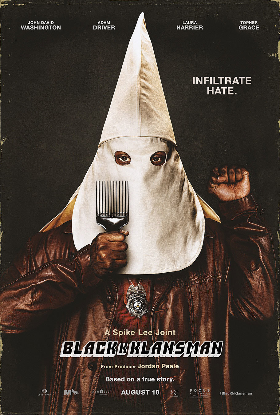
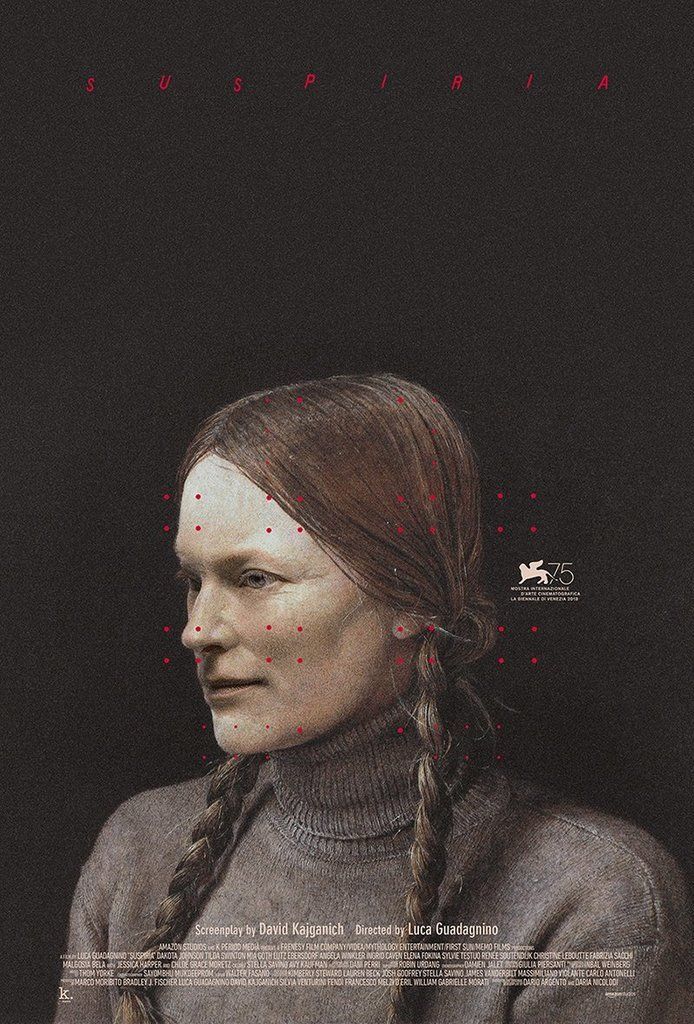
I stress the word “paper” here because things that look good on screen do not always look good on paper. Furthermore things that do look good on paper and therefore make for the most beautiful posters, are often the simplest and flattest things. Those can be lines, shapes, drawn or painted marks, cut out or torn pieces and typefaces that make you as aware of the paper itself as possible. When filmmakers get excited about shooting on film, so postermakers should be excited about printing on paper. As the script is to the film, so the composition on screen is to the printed poster. A success in this understanding and practice leads to something the Germans have a word for: plakativ. The word translates as “striking, bold, pithy” and yet, stems from their word for “poster,” plakat. Thus the implication of the word is that poster-like work is something we should strive for. - Understand that the poster exists within a context. The poster is for a wall on the street or in a house or in a cinema. It’s not just for digital usage such as social media. Let’s not be confused: you’re not making digital banner ads for a website — which is all a poster is if it’s never printed on paper — you’re making an object that someone should not just want on their wall for the duration of the film’s release like some advertising billboard. You’re making something that people may want on their wall, at home, very large, perhaps even framed, for the rest of their lives. Think about that. Think about the poster sitting next to a painting, and a window, and a vase of flowers, and in the morning light — as a part of a complete interior experience, and so on. The moment you start to really think about context in this way you’ll start noticing, commissioning and / or and making better posters.
Now, let’s say that you’ve made a film and you’ve just gotten into a festival. Or better yet, you’ve sold your film and now its on its way to cinemas nationally or internationally. Either way you’ve got some “successful” marketing and distribution people breathing down your neck about needing a poster. They’ve told you how they know how to make a poster that will get people to see your film, and how their in-house designers — under close guidance — will make just such a poster for you. Perhaps you’ve even signed a contract with them that gives them final say in how the poster looks, and now somehow the early drafts of what you’re seeing are just nothing like you’d hoped or imagined a poster for your first film would be. You then find yourself sitting there with a week to go before the poster has to be done, and you and your film might well be misunderstood and neglected.
The above paragraph is deliberately emotionally manipulative but it is also based on truth. This is often exactly what happens and whilst some filmmakers don’t even notice it happening, here are some things to consider when you’re ready to have a film poster made:
FIND A GOOD POSTERMAKER
You probably have a good idea already which film posters you like and maybe even who made those posters. However sometimes it’s not a professional poster maker you’re after. It may well be someone who has never made one before who will give you the freshest and most powerful poster to herald your film. Hell it may even be you, the filmmaker, who should make the poster. Either way try to find someone who isn’t all about style and technique, who has the breadth of imagination and skill to create something that speaks as directly as possible to the film. The actor and director Brady Corbet once said he preferred — when considering to act in a film — to talk to the filmmaker directly than to read any script; he knew it was the filmmaker’s attitude that would convince him the project was worthwhile rather than any skill at writing. I say this because if you just want some recognisable artist or designer to slather your poster in their clever signature style, then you’re just selling their work and not talking about your film. This would be akin to paying a critic for a good review. What you’re really looking for is someone who deeply understands your film and can articulate that understanding on paper.
HAVE AN IDEA
Much like a film, every poster should have an idea or reason behind the execution of its visual approach. There are no exceptions. A poster with an idea behind it is a clear reaction to an action. This is to understand that humans by their very existence are a series of reactions to actions, and thus will immediately notice the nature of origin stories like their own.To sense a poster is behaving visually strangely for a reason is to sense an interpretation, in the hands of the postermaker, a reaction to an action by the filmmaker. This creates a tension, a curiosity, questions without answers, and ultimately engenders the desire to see the film. It is better if the poster is trying to be original, otherwise you will get your film confused with other films. This, despite what your marketing people might tell you, is not a good thing.
MAKE YOUR OWN RULES
Just as film doesn’t necessarily need a plot or a three-act structure, so there are no general rules for film poster design and therefore no particular way a film poster should be made or should look. The only rules are those that the filmmaker and the postermaker devised as a way of best articulating “the idea” mentioned above. This means you should have absolutely anything you want on the poster, be that a photograph, a painting, a drawing, a collage, a smear of your own blood, a blank canvas, a Jackson Pollock drip painting with type, if it be your will.
Speaking of type: this is where graphic design thinking in the strictest sense most often prevails, but we must accept that type is also ultimately a part of the image. Anything on the poster is the image, whether letters are legible or not. As the graphic designer David Carson once said, “don’t mistake legibility for communication … you cannot not communicate.” This means that what you are trying to say with the poster will define the nature of the typographic treatment. In the case of typography this implies that you can make the words on the poster as big or as small or as legible as you like. Whatever feeds the agreed idea and helps articulate it more powerfully and clearly is key. For example: very small type draws you in closer and makes the rest of the image feel very big and grand in contrast. Similarly very large type can trivialise the rest of the image and remove the stature you might otherwise believe it had. Whatever you choose to do, when you do make your own rules, you must stick to them. Part of noticing a good poster is the subconscious awareness that it’s abiding by a series of self-imposed rules and that the tension created by those rules is clear.
BECOME THE FILM
No two posters should look the same. Insisting that they do is saying that your film is the same as another film. Referencing other, older film poster styles only may make those who get the reference wish they had the original poster on their wall instead. Despite what your sales, marketing and distribution people might say, the only reason the poster style they’re suggesting you try “worked in the past for this kind of film,” is because once upon a time that style was original, unique to a previous film and had never been tried before either. Just like the film you are making a poster for, the best ideas for film posters come from everywhere but the world of film. Start sourcing images and ideas from your own life, literature, painting, sculpture, street art, magazines, fashion photography, corporate logo design, typographic journals, war propaganda, cave paintings, political pamphlets, household product packaging; literally anywhere but the world of film and its posters. Remember you are not talking about film posters as a culture when you make a film poster, you’re talking about a film. So become the film, embrace what is unique and original about it, and don’t just become another in a long line of film posters dressed in a recognizable uniform of a pre-established school of thought.
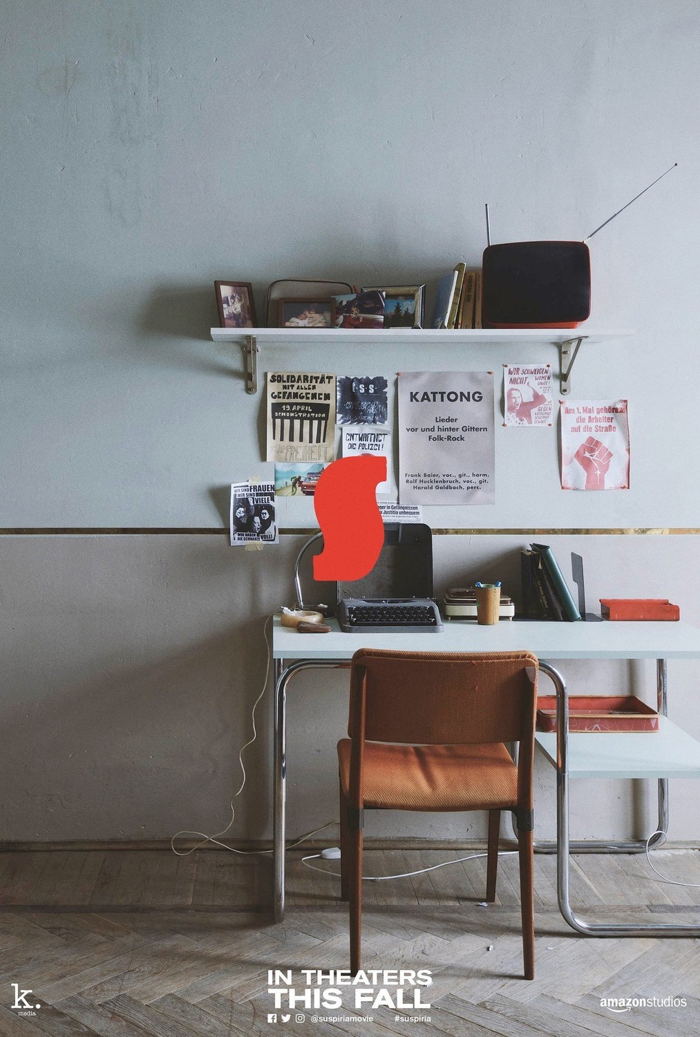
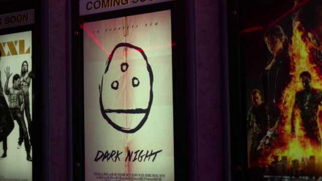
One way of thinking about this that might help is to imagine you’re making a poster that would itself hang comfortably on the wall in one of the scenes in the film that you’re making the poster for. Try this as a thought experiment when starting to put together ideas for your poster. Whilst it’s not imperative that this line of thinking be followed — far from it in fact — you will find it yields some interesting results.
GET AWAY FROM THE COMPUTER
Where and when possible move your process of postermaking into the physical world. Even if that’s as simple as printing your work out and scanning it back in, it makes a difference. The introduction of any analog element into the design process will give your work a life that is inherently unique to you. People say that one of the reasons vinyl records remain so popular after all this time is the “user experience” they offer; the large reproduction of the artwork, the interaction with a layered physical object, the cleaning of the musical surface, the positioning of the needle, and (if your hand is shaking) the unique sounds that can be made in the process of listening to it. The same thing applies to good postermaking; the less time you spend trapped inside the confines of popular computer graphics software and instead are allowing the shake of your own hands to place elements onto the poster — be that photography, collage, drawing, painting, scanning or whatever — the more mysterious, imperfect and beautiful your work will be. Again, humans like to feel that extra work has been done and that mistakes have been made; reactions to actions.
PROVIDE TWO POSTERS (IF NECESSARY)
The filmmaker David Fincher once said that there are two ways to shoot a scene: the right way and the wrong way. Similarly any postermaker worth their salt may make a series of different versions of their poster as they explore how to deliver the agreed concept in the most powerful and beautiful way. It is not however then the postermaker’s responsibility to show anyone those different versions unless they want to. This is where — assuming you’ve chosen the right person for the job — the postermaker’s most important and unique talent comes in; they choose the poster that clearly does the best and most beautiful job, and hand that and only that to the filmmaker. Anyone who believes it’s the director or anyone else’s job to choose from an array of versions created by the postermaker for the sake of their being “options” doesn’t understand or respect the eyes, skillset or experience of the person making the poster. Again if you’ve found the right postermaker and they truly understand your film, then you can trust them to make this decision implicitly. It’s in giving the postermaker agency that you encourage them to produce their very best work.
Celebrated graphic artists Hans Hillmann, Peter Saville and David Carson — to name but a few — all famously produced their best work when they rarely had to answer to anyone. Hans Hillmann worked during a time in Germany when very few people had the means to create film posters, and so he’d be sent the film and simply send a poster back when he had one that he liked. Peter Saville had a similar relationship with Factory Records in England: on at least one occasion New Order only saw the artwork for their latest LP after it had been released into record stores. David Carson’s now infamous, groundbreaking work on Raygun magazine was only possible because he sent the design files directly to the printer, without the editors and writers having a say in how he’d laid out the content.
Having the proverbial good film poster on your hands, what often happens next is that your marketing people tell you your poster has type that’s “too small to read on a phone,” or something to that effect. This can quickly become a dealbreaker to these people no matter the strength of your arguments, and it’s at this moment that you and your postermaker take a deep breath and take 5 minutes to make an additional, ephemeral poster-shaped social-media-banner with huge lettering and hand that over too. You may be surprised at how often this method works. Then you can get back to helping make the object that one day will be framed on your wall and represent your feelings about the cinematic artwork you’ve given years of your life to making. Everyone’s happy.
…
I had an argument recently via email with a Swedish graphic designer who told me he thought film posters were commercial advertisements and nothing more. In not so many words he told me that I was wasting everyone’s time by thinking about film posters as anything remotely artistic. Whilst I hope my own work has gone some way in proving this man wrong, I shall lean on the words of Peter Saville here to brush aside this line of thinking so that we can continue to strive to create increasingly poetic film posters:
“It’s during the current era that in a way the cultural canon has become entirely appropriated for the purposes of commercial practice. And that’s where there’s — in a way — a disconnect. And it then begins to become rather upsetting when you begin to realize that we are now selling out the culture for the purposes of marketing. And that’s the thing which I’ve not wanted to really partake in. And that’s something which I find is — I mean just below the surface — a kind of wave of disillusion across the creative profession. So when you are fighting the marketing men saying look there is a better way of doing this, it kinda felt worthwhile. But when the marketing people sit there and say, ‘how do we seduce? And, you know, how do we position? How… Effectively how do we make our product or service or company look as if it believes in something, when actually it doesn’t?’ That’s the problem.”
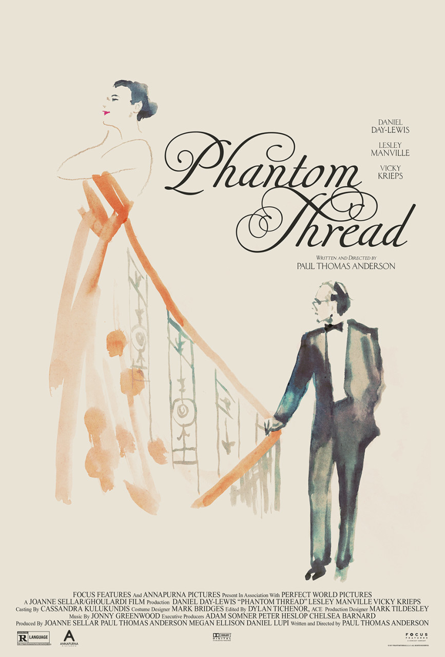
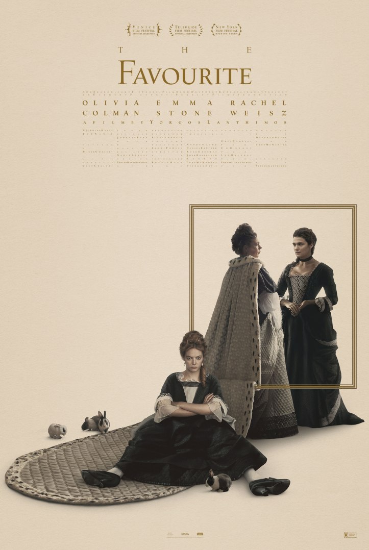
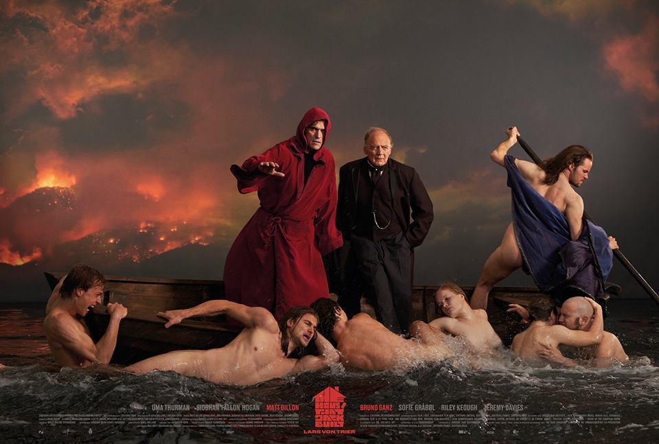
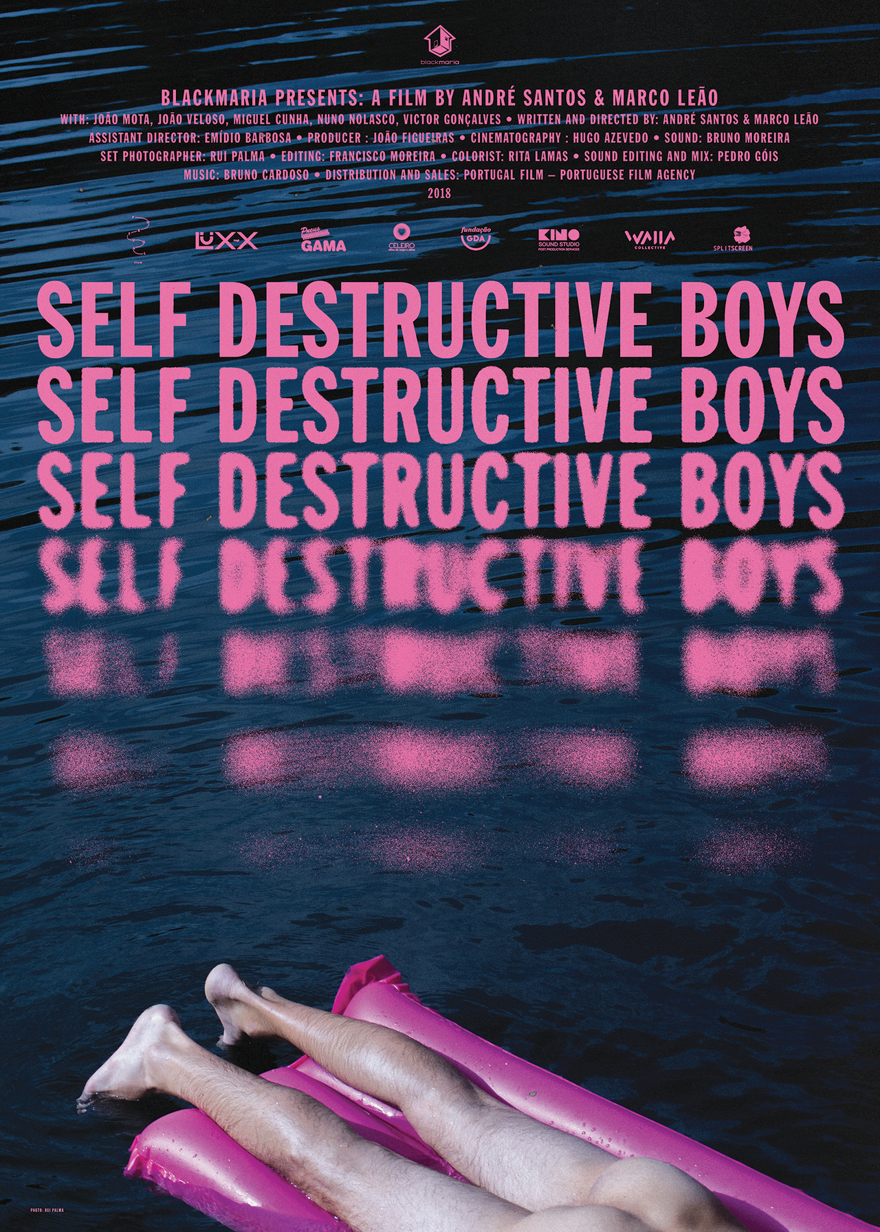
I’ve deliberately not included any specific examples or technical instructions in this text, because again I’m simply hoping to urge you to try and change the way you see a film poster, and the way you see your film through the eyes of that poster. That’s the first step towards making a beautiful one of your own. I hope that by keeping my direction elliptical that I have left open that important space between your head and, what filmmaker Andrei Tarkovsky called “the ceiling of the director’s so-called thought.” Tarkovsky was troubled that audiences seemed to prefer knocking their head against this ceiling; they preferred being told what to think or feel about a film. He said, “such knocks … make them feel safe: not only is it ‘exciting’ but the idea is clear and there’s no need to strain the brain or the eye, there’s no need to see anything specific in what is happening. And on that sort of diet the audience starts to degenerate.” So don’t let me degenerate you. In helping you understand that no two posters should be alike, that there are no general rules to a poster’s form and function, and that a film poster must be perhaps even more poetic than a film, I trust you will find a keener eye for film posters, for those who make them and for what your film truly deserves.
Caspar Newbolt
Berlin / New York
May 3rd — 9th, 2021
