großes kino show in berlin to include echo poster_102323
the art library of the staatliche museen zu berlin (state museum in berlin) have just informed us that their forthcoming großes kino (the big screen) show will now also include the poster we made for mareike wegener’s film, echo. we are delighted.
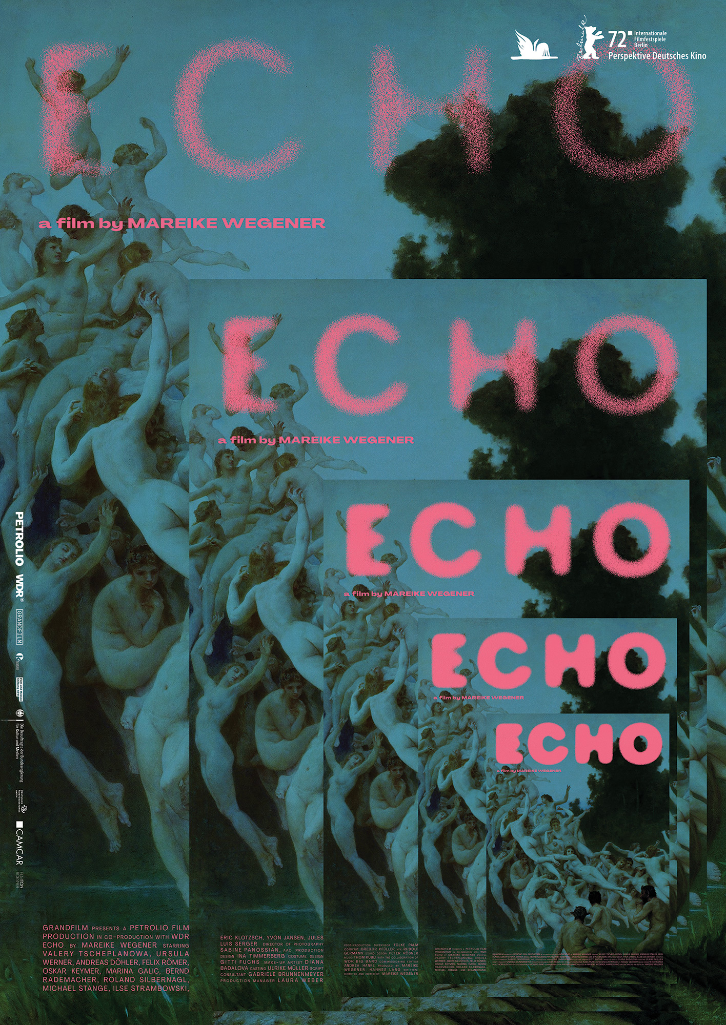

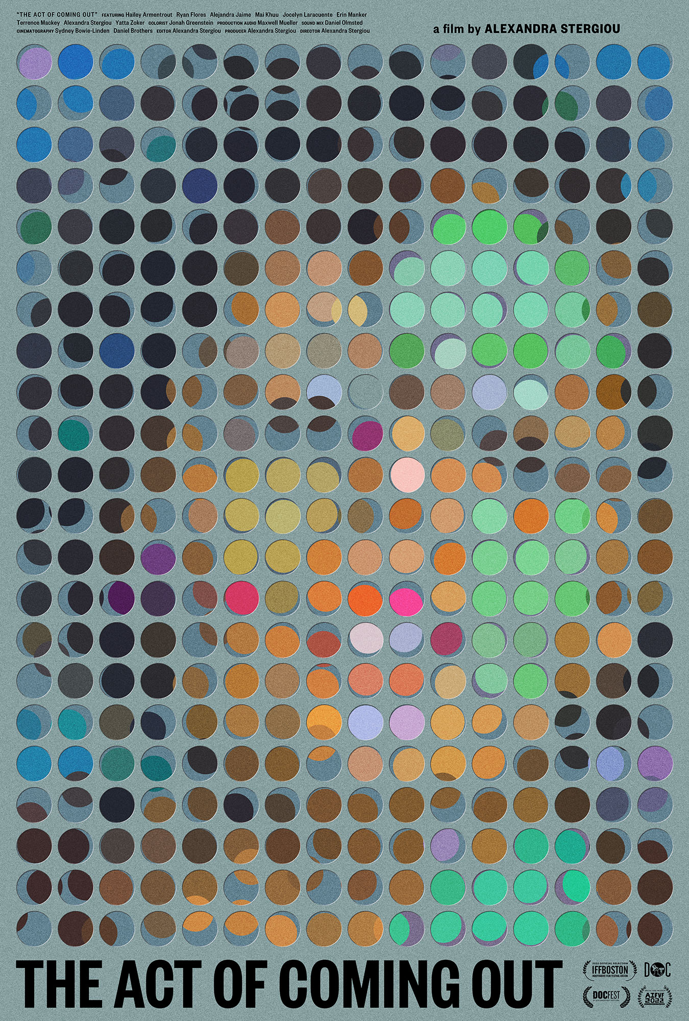
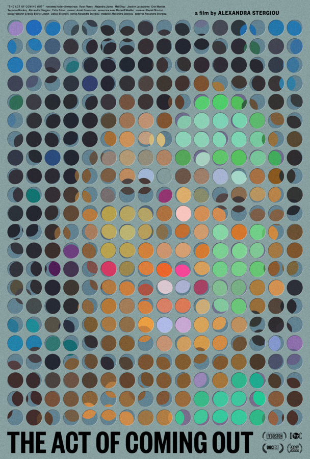
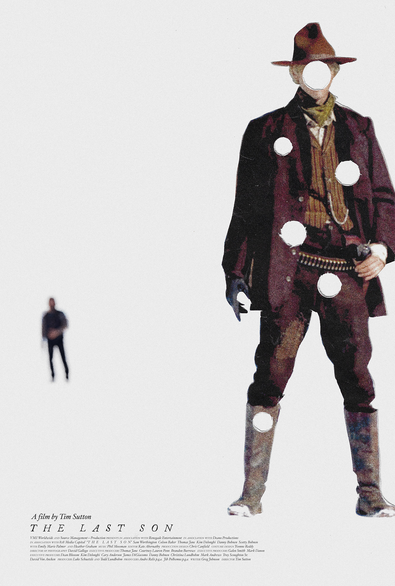
the echo poster will join the act of coming out poster alongside 298 other posters dating back to the year 1900 in a celebration of 120 years of film poster making.
here are some further details, translated into english, about the show:
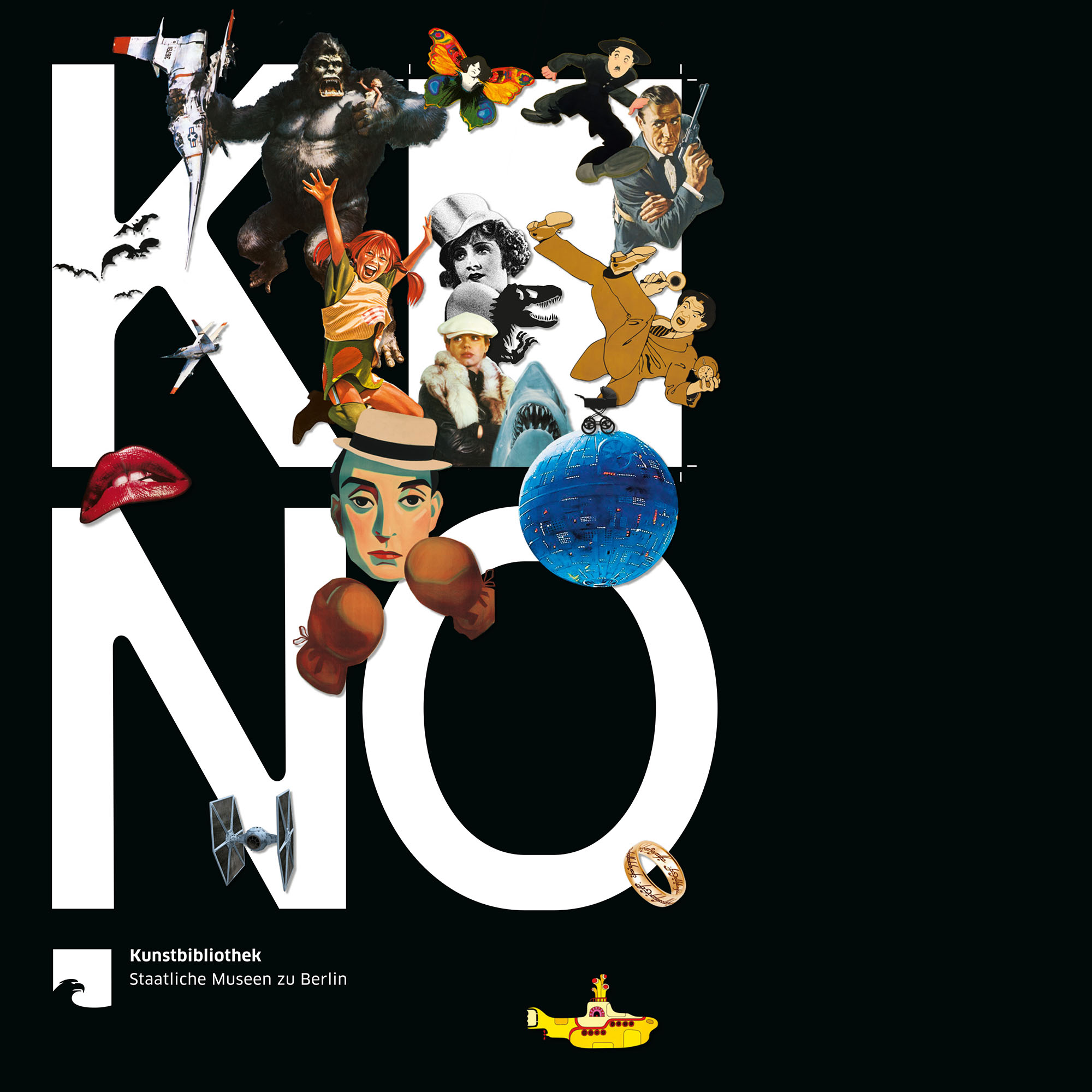
THE BIG SCREEN — FILM POSTERS OF ALL TIME
Film posters are both advertising and art: they condense a film’s plot into a single concise image and spark curiosity. They translate cinema – and all the emotions it evokes – into graphic design. The exhibition presents 300 original posters from twelve decades – classics, cult films, and arthouse cinema.
PROS AND CELEBS: 26 posters were chosen by film industry experts – hear their voices in the exhibition.
OPENING CREDITS: Graphics meet moving images.
PAULA POPCORN: Follow our mascot to family stations and listen, play, and draw!
CURIOUS? For details about our catalogue, symposium, and events programme, go to smb.museum/kb
An exhibition of the Kunstbibliothek, Staatliche Museen zu Berlin
3.11.2023 – 3.3.2024
Tue–Sun 10am–6pm
Tickets 10 € / 5 €, ‹ 18 frei / free smb.museum/ticketsKulturforum Matthäikirchplatz
10785 Berlin
Tel. +49 30 266 42 4242 service@smb.museum
the show will run through until march of 2024, which means it will be open during the 2024 berlinale. a huge thank you again to christina thompson and christina dembny at kunstbibliothek for finding and acquiring these posters.

see you at the show.