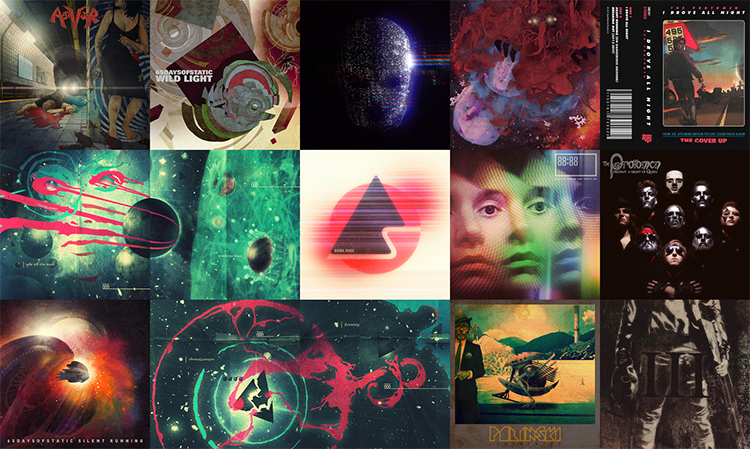
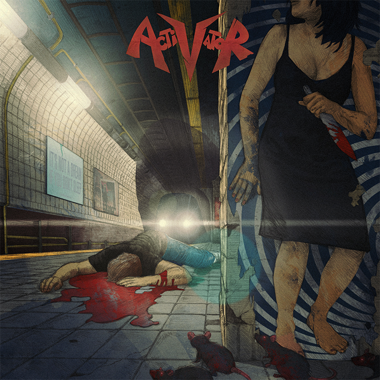
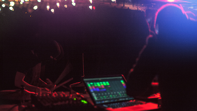
a while back i came head to head with the work of one of my design heroes, eike k?nig. i’d been asked to redesign the logo for the german band booka shade, after many years of eike having been their go-to design guy. it was frankly a terrifying prospect. whilst i was quite sure eike would probably never see the work i did, i would be immediately compared to him by both the band and their large fan base. settling down to create the logo i realized of course that you just do the best thing you can, and make sure that at the very least it’s nothing like the other guy’s work.
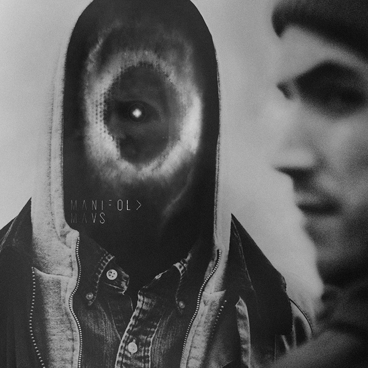
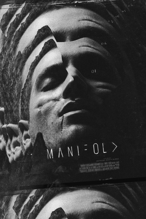
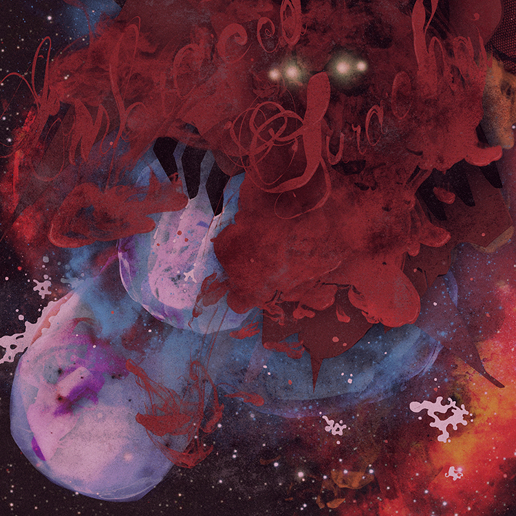
when matthew pusti of makeup and vanity set asked me to do the cover for the soundtrack EP to anthony scott burns‘ forthcoming sci-fi short, manifold, i sighed a similar breath of despair. why? because ash thorp had done the film’s poster and of course once again i would have to be compared to someone of considerable status in the graphics world. suffice to say here’s the poster ash had made –
turning away from it, going for several walks listening to the soundtrack and spinning the film’s ideas around in my head, i realized of course that ash had the visual concept wrapped up. particularly in terms of subtly explaining what the film was about, but not so much as to spoil the film. every idea i wrote down or got momentarily excited about felt too similar to what he was saying with his treatment.
what he didn’t have however, that of course applied in particular to the job i had to do, were the tracks on the EP that had remained unreleased up until now. these were tracks that had been written for, but not actually used in the film. in particular the track ‘yearling,’ which featured original foley work, vied for my attention every time i put the record on.
mulling over these differences i decided to take a different route, one that i’d been flirting with for a while but never really had the chance to test out – a route i like to call the ‘polish’ route. now i must stress this is a route i still haven’t fully explored, but the work i was to do on manifold?certainly gave me the impetus to do so. it is afterall a firmer step in that direction, and excitingly so.
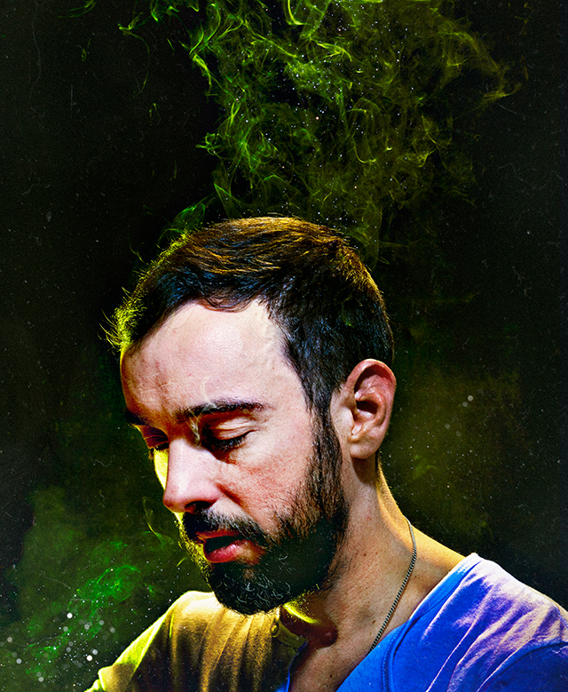
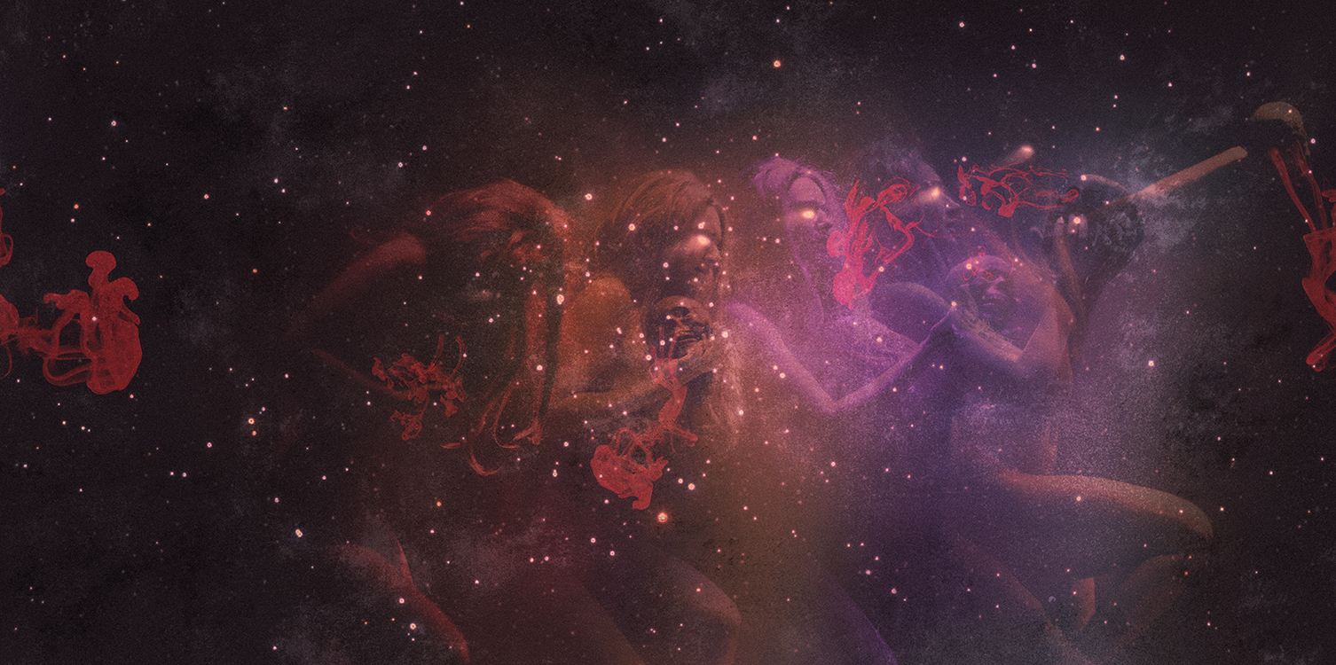
after watching the film several times i began to feel a tingling, almost aching pain in my face. furthermore i began to think about how much value we put in the face and what it means in terms of not just our identity, but our chances in life. how being beautiful can both be a blessing and a curse, and how in many regards you can either be born with a ticket on a certain kind of ride, or a ticket on an entirely different ride. all of this based on your face and how it develops as an image to others.
i then started thinking about how technology is really quite an organic extension of the human form and mindset, and that it wouldn’t be too long before these things merge imperceptibly. in fact i’d written an essay for the IFP on this subject just a few weeks before, so to say the idea was on my mind a little was an understatement. the sense of menace one feels as we start to worry about the increasing amount that technology governs our lives, is really just a greater understanding of our own constant need for distraction from ourselves.
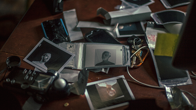
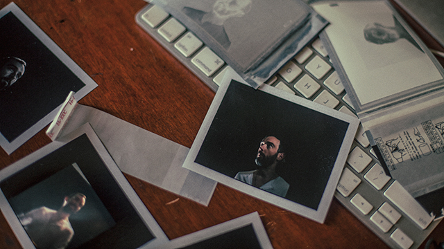
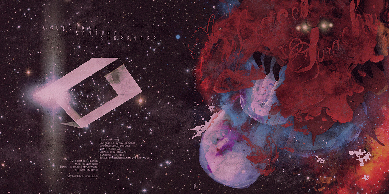
this is when i started to realize what i had to do for?manifold, and furthermore i knew exactly where i was going to start. skipping through the film to a very particular shot, i cut it out and began work. i had to make an image that encapsulated, for me at least, that sense of terror beneath the ever prettier face of technology, and at the same time capture that actual physical ache i felt in my own face after watching the film. as i worked i began to realize that i was also edging closer to this aforementioned ‘polish’ route.
now, by ‘polish’ route i of course mean making a film poster that uses little or none of the imagery from the film and instead offers a more emotional, impressionistic interpretation of its narrative. the eastern-european film posters that have been created in support of US films (with particular reference to poland), are a powerful lesson in creating an image that, to paraphrase jim steinman, you’ll never know the meaning of, but you’ll know how it feels. much in the same way a piece of music moves you in a fashion you cannot put into words, eastern-european posters often remove all trace of the film’s visual, its recognizable characters and its story, and delve headfirst into making an entirely original image. an image that still conveys the film’s ideas, but often in a darker and less conventional style. consequently it’s this approach that has come to feel so incredibly liberating to designers working in US and UK markets. to quote?brandon schaefer?on the subject?–?”there?s something captivating about those things that feel inseparable from a haze of abandon, existing to give hope to the creatively forlorn.”
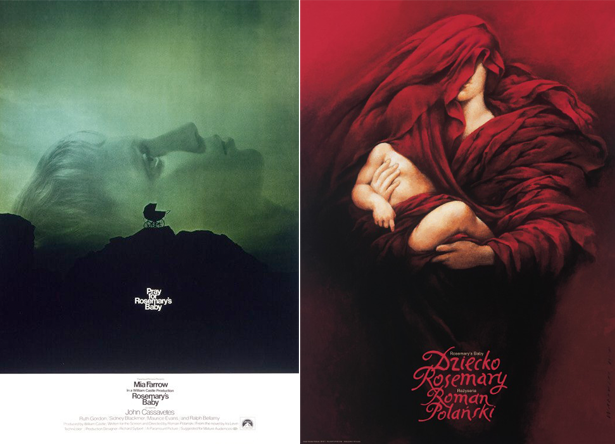
left: philip gips, US. right: wieslaw walkuski, poland.
when i presented the final cover to matthew pusti, he said it was perfect. i know he would have let me take it even further into the horrifying abstract had i wanted to, but then we both agreed that it was as important to keep things familiar this time around. after all it wasn’t our film and we could just as easily go to poland next time.
you can buy the full manifold soundtrack here, and you can watch a trailer for the film here.