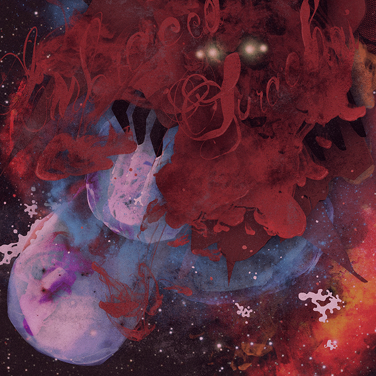
surachai_090313
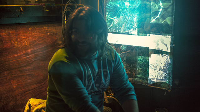
i met surachai sutthisasanakul?through alessandro cortini. alessandro would always be laughing about something surachai sent him via email or ichat – usually something grotesque pulled from the murkier depths of the internet. sharing a penchant for the disgusting to the point of having a secret online forum where my friends and i post the most vile things we can find, i knew one day i had to meet this surachai.
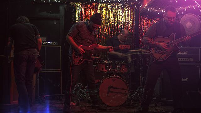
the first thing that struck me about surachai’s music was that it didn’t immediately fall into any categorization other than the one he chose to put it in himself. it was spawned from black metal for sure, but really it was a melange of things both experimental and cinematic. moreover it marked a departure from the slightly ridiculous “second wave” of black metal?that i’d read about in the pages of UK rock rag kerrang! during my teenage years.
surachai put out two LPs before he and i had a chance to work together. both of these releases in terms of their accompanying artwork revealed once more a taste for a more refined, original and considered presentation than you’d expect from the genre. surachai himself even quipped that his sound was more ‘plagued’ metal than ‘black’. either way all my friends were impressed with the sounds he was making and whilst it still wasn’t entirely my scene, he had me convinced it was worth some serious attention.
it must have been late last year that surachai told me he wanted me to work on the artwork for his next record. given he’d already employed the likes of?bridget driessen?and?sarah sitkin?to handle such duties on his last two records, it came as a great compliment. he said the record wasn’t anywhere near done yet, and in typical fashion i told him i’m not really much use until i hear something closer to the final music. it’s always the sense that something’s close to done that allows me the chance to fully immerse myself and see what images come.
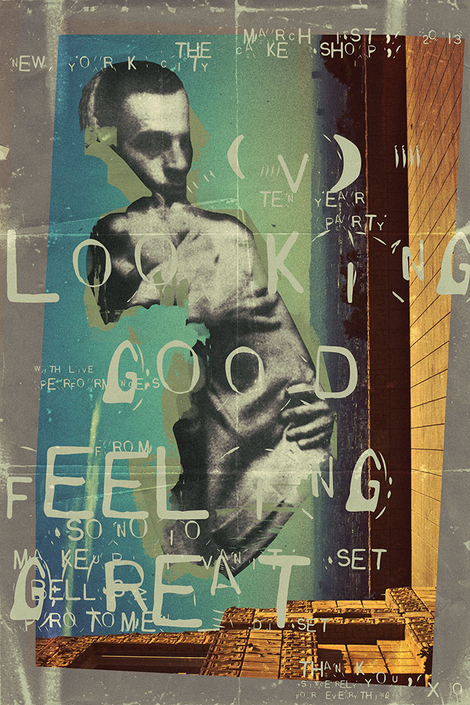
finally in march of this year i holed myself up in my studio for the weekend, put the record on loop for the umpteenth time and let loose. i remember clearly that i’d wanted to create something close to how it felt to read the end of DM thomas’s novel?the white hotel. this was a book i’d recently finished that had an ending so fiercely out of left-field that i’d found myself in tears on?the train i was riding at the time. the feeling of despair i’d been left with was quite unmanageable and combined with a photograph surachai had shown me a few weeks before of fingernail scratch marks on the wall of a concentration camp gas chamber, i felt compelled to make him something that would tear the world down. something that at the very least was as harrowing and sad.
however, as i’ve learnt over the years if you go into these things trying to force a thing like that or even start with a visual idea so incongruent from what you were actually hearing in the music and lyrics of the songs, it’s not going to work. i hold the belief that the artwork for a record must in some prevalent capacity be a visual response to the sound. it can speak to outside influences without question – doubtless you and the band will have discussed the many ideas that went into making the songs – but hopefully you’ve not been hired to simply imitate another artist or illustrate someone else’s description. hopefully your job here is to interpret what you hear visually, and in so doing create something that gives people a unique and unconscious taste of what they’re about to receive.
the lyrics to?embraced?of course painted a dark, bleak and hopeless image, but one of a resoundingly science-fiction nature. in fact once i started to really listen to them in the context of the music, all the imagery and ideas i’d had up to that point about how the record should look and feel just fell away. i was all of a sudden very clear on what i wanted to make and soon i was looking at a dark field of stars with some kind of nightmare seeping slowly and bloodily out of its shadows, ruptured amniotic sacs and all.
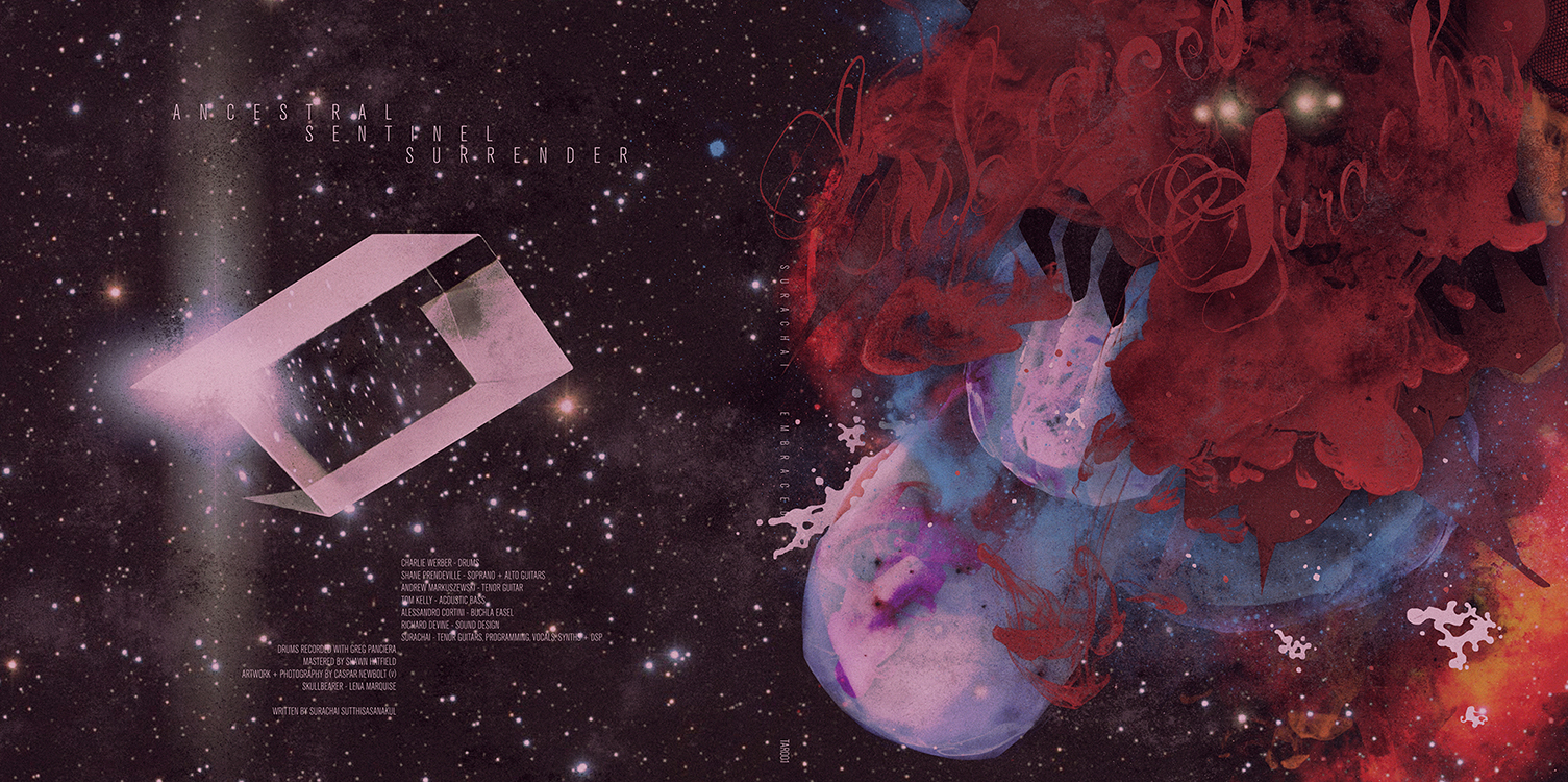
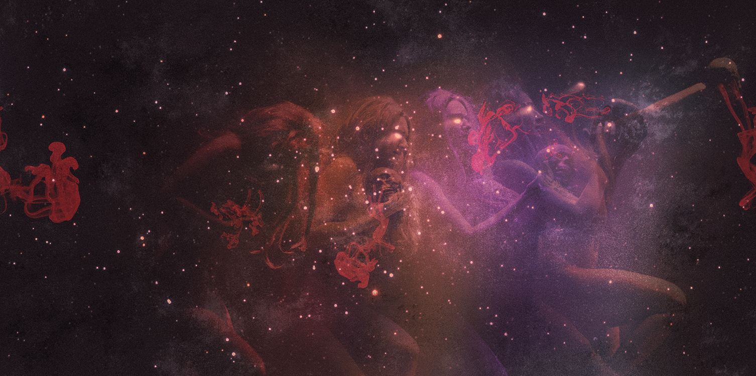
not wanting to make the visuals too alien and dissociative for people, the album’s inside spread was a way for me to humanize the overall story i was trying to tell. i wanted to show some kind of ‘down to earth’ response to the horrors out there in space – some kind of worship perhaps. it was then that i remembered i’d taken photographs of my friend lena marquise performing a macabre burlesque piece in the early hours of the morning at a club i used to work at. flipping through them again it wasn’t long before i was adapting them to this new world i’d created.
surachai didn’t hesitate for a moment when i sent him the final layouts. in fact i think it was just minutes after emailing him that i got a message from him on ichat saying, ‘i fucking LOVE you.’ still i can’t say i wasn’t terrified as to what he’d think. interpreting someone else’s music with a picture takes a lot of trust, and you just have to hope they really understand what they’re asking when they hire you for the job. in this case i think it’s fair to say we made a good match and i’m still incredibly honoured to this day to have been responsible for producing the artwork for such a fantastic record.
you can listen to and buy embraced here.