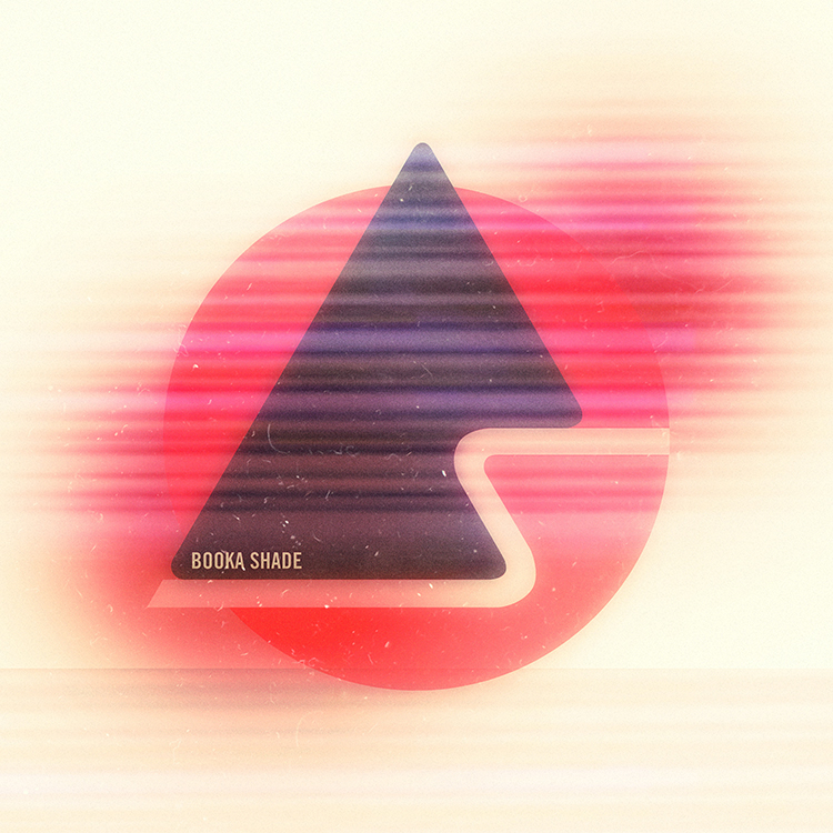
booka shade_081412

based on our work with big black delta, the fine folk at nerve management asked us to work on an aesthetic revamp for the german, minimal-house duo booka shade. we knew of the band in part because of their music, but also because HORT had handled their look up to this point. for the record HORT are one of the few design houses out there who’s work we look at on a regular basis for inspiration. therefore, as you can imagine, the prospect of taking on this mantle was both terribly exciting and very daunting.
that said, it turns out booka shade themselves were fans of the sleeve design + logo work we’d done for big black delta, and were keen for us to reproduce that very textured approach in a fashion more suited to their sound. we were given demos from their new record and spoke to the band about the sorts of aesthetic ideas they had in mind. the end result was a push by us to simplify their previous geometric logo type even further. we wanted to add an elegance, softness and wear to it, in order to create a more established and timeless feel. a feel that perhaps spoke as much of their origins as to where they were going next.
the first piece of work we produced for them you can see above. it’s the single cover for their forthcoming release?honey slave, and focusses mainly on the new logo we created for the band. the single will be out on DIM MAK records, and we’re more than a little excited to hold a 12″ vinyl copy of it in our hands.
you can hear samples from the honey slave single here.