(v)
(v_i)
(version_industries)

giles vs. huffington post_052814

Screen-Shot-2014-05-28-at-10.58.06-AM

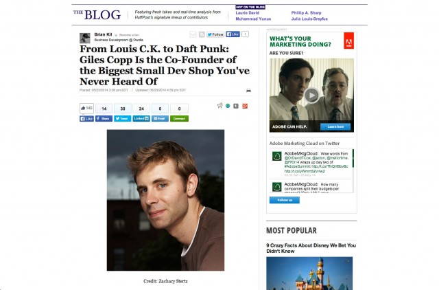
giles was interviewed for huffington post a couple of weeks ago. the piece, which sits in their small business section, is important to us as it expresses concisely how far we’ve come as a company and where we stand ideologically to this day. it’s not often you get an exact thing you can point at whenever people ask you where you’re at, but now we have one. a huge thanks to brian kil for granting us this opportunity to be this outspoken, and on such a high platform.

_category
blog, code, grafiks, news, ,

kaleidoscope pr_101413

Screen-Shot-2013-10-14-at-4.12.26-PM

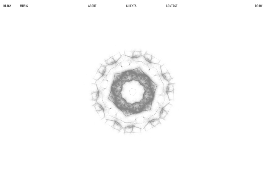
back in 2008 we created a rather simple and elegant flash website for the art and fashion-based PR firm, kaleidoscope consulting. aware now that their site was useless on a range of new platforms but still very much in love with the look and feel of it, they asked us to recreate the site using HTML5 and javascript. in response we proffered that we might add another dimension to the site, and began to scheme this new black + white edition you see before you.?the result is a site that’s fully iphone and ipad compliant, and features not just a kaleidoscope that can be populated with images from your webcam, but also now hand drawn sketches too.

once again we reached out to mr. doob (who’d previously worked with us on the intro to daft punk’s?tronsoundtrack.com) and asked that this time we might integrate elements of his harmony drawing engine into the site. happily he gave us carte blanche and soon we had a new kaleidoscope engine on our hands – one that caters to both the photogenic and sketchy among us.?for this newly ‘harmonized’ white side of the site, our in-house sound designer and composer gavin singleton (aka accelra) created a new piece of music that felt more suited its hand-drawn, softer tone.

lastly we rebuilt the original site’s entire ‘key’ navigated client section around a wordpress backend so that the client could now more easily and swiftly keep this information updated, along with any other site copy.

we trust you’ll enjoy navigating the site as much as we enjoyed the challenge of putting it together.

_category
audio, blog, code, grafiks, news, , , , , , , , , , , ,

not fade away (part 2)_012913

not fade away website

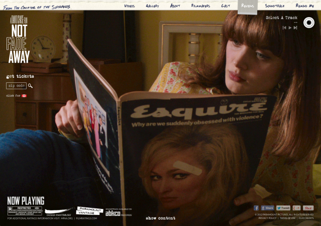
our website for david chase’s rock ‘n’ roll, coming-of-age feature?not fade away, is now live. as hinted at in our previous post?the site represents our first public foray into hollywood studio design work.?paramount pictures came to us upon the recommendation of jon reiss, and requested that we create an award-winning website for them for a forthcoming feature film. they then provided us with some examples of the kinds of websites they felt were truly successful on a number of levels – their choices were excellent and we were excited by their expectations. in fact it was in every way one of the more exciting moments in our now-10 year life as a company, as we’d dreamed about such an opportunity since the moment we saw hi-res! flaunting their talents in a similar fashion 10 years earlier.

as is our usual way, we conceived of three differing, strong and complex approaches that we felt would capture at the very least the tonal nature of the film, as best we could determine from their words about the film alone. they were excited by our suggestions and not long after this we were given a chance to see the film at press screening in new york.

of all our ideas, paramount wanted to move forward with our suggestion of a a series of location-aware, fully soundtracked, living photographs that would be tailored to each of the site’s sections. to achieve this we first pitched the relatively new technique of creating PNG animations as a more compatible and controllable form of GIF animation ? in essence, canvas-based video. it was a technique that we’d first noticed being used by jon skinner on the website for?sublime text, and later, the apple website, and one that we knew we could adapt in order to bring the site comfortably to the iphone and ipad.

on top of this, because we could not use music from the film, we had approval on the creation of supporting soundscapes, custom radio recordings and also a full musical score in support of each animation. our trick, of course, being that each soundscape would be different depending on where you were looking at the site within the USA, and the weather outside at that time. each radio news report would be native to your location, should you have been alive in the 60s, and all the songs you heard on the radio would be imitations tracks of bands?from the so-called british invasion of the US. in essence, we were striving to conjure up a disarmingly fragile series of moments in an otherwise rather raucous film, and these looping visual tangents would allow us to illustrate the various tonal elements of the film without having to seriously spoil any of it.
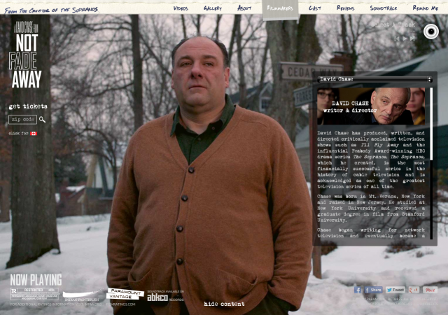
not fade away website, filmmaker page

after making notes during the screening of the scenes we felt would be most suited to this idea, we were sent a quicktime reel of the scenes to produce compositions from.

we then started in earnest to create the soundscapes, radio recordings and music. gavin singleton, who runs our studio in london, headed up the audio production. he created a series of soundscape beds for each scene, and also cut up and mixed the other elements together as they were passed over to him. zach barocas, who manages our studio here in new york and who’s had previous work as a voiceover artist, recorded hundreds of custom, historical radio news and weather reports. adam shaw and pete newton, two trusted commercial composers from england, set about recording a series of rock ‘n’ roll songs in differing styles. giles and i then set about vetting the various elements, offering feedback where possible, in order to harmonize the audio with the visuals we were developing.?it was perhaps the most exciting, unified team effort we’d invested our time in to date – a real showcase of all our various talents.

towards the end of production we found out it was in fact possible to use the music from the film, as long as we used only 30 second clips of it. this meant we had to replace our custom sound work with a player featuring short loops much like itunes does in its track previews.

the site is an unusual and beautiful site in many respects, and we are proud of it.?we hope you enjoy the experience we’ve created. if you’re interested in taking a look at the site with the original sound engine still present (including locale-based news reports, custom rock songs and louder soundscapes), you can do so by clicking here. we’re calling it our director’s cut. we’re thankful to have been commissioned to build such an engine even if it was never used, and one day hope to be able to re-develop it for another project in some capacity.
_category
audio, blog, code, grafiks, news, , , , , , , , , , , , , ,

not fade away (part 1)_101012


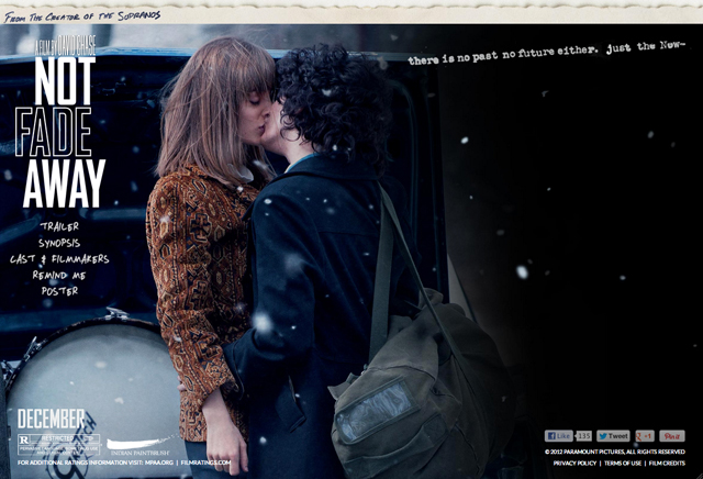
we’re stoked to announce that we recently started working with paramount pictures.?the first fruit to bear is a website for the debut feature film from?david chase, creator of the sopranos. pictured is the teaser trailer site we were asked to create whilst we work on a larger website for the film. details are of course secret for now, but we’re excited about how its looking + where things are going. stay tuned for further updates in december, around the time the film is released!

you can view the teaser site here.

_category
code, grafiks, news, , , , , ,

pavilion_101711


the website for the feature film PAVILION went live today, and along with it my second blog article for the IFP in which i discuss the process that went into making the site. we were also fortunate enough to be asked to handle the film’s posters and the credit sequences. the article discusses this and explains why our treatment on all fronts aimed to reflect the very minimal, atmospheric nature of the film.

here’s an excerpt –

my co-worker zach referred me once to a film (portrait of jason, 1967) where a man is sitting there smoking a cigarette for pretty much the entire film. that?s it. talking about this on the way to get lunch one day we agreed that in a film like that, where that?s all that happens, the small things turn into huge events. zach then stopped, scratched his head and thought for a moment, whispering to the air in front of him, ?what was it that happened in that one??. i stopped too, waited, and then finally he said ?ah yes, he ran out of gas on his lighter. huge deal!? we both laughed and then stepped inside?jimmy?s, our regular lunch joint.

so to reiterate,?pavilion?really is one of those exact films. it?s almost fair to say that if you blink or cough, you could miss the entire ?reveal? at the end of it. there are tiny fragmented shards of dialogue that tell you what?s happening whilst all the while you?re watching the most detached, beautiful and mesmerizing footage of kids feeling out the moments in those long, long, useless days of our youth. in fact what i said when i came back from the bathroom after tim had screened his movie for us was ?congratulations?. congratulations for capturing that feeling of the abstract, aimless ennui of what it was to be young, with almost no sense of responsibility at all.

you can read the rest of the article here.

_category
blog, code, grafiks, news, , , , , , ,

the gregory brothers_061311

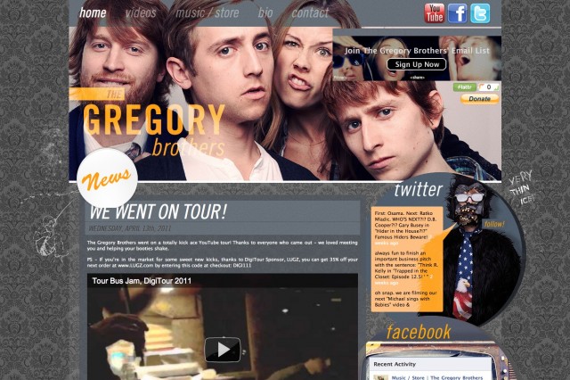
once again we could not be more grateful to topspin. they have put us in touch with an eclectic range of radical artists with whom we’ve had the most exciting and rewarding relationships. the gregory brothers, better known as the auto-tune the news guys, are no exception. a month or so ago they walked into our studio and told us they needed a new website. they then hit the road and we sent them our ideas as they criss-crossed the country on the youtube tour. the trick was to combine their already burgeoning aesthetic with a number of new levels of functionality. their old site had been pretty much built entirely by them using dreamweaver and they were understandably into something that would be a little easier to update. needless to say, but the process was a breeze and often funny too.

as the project went on we of course became more and more familiar with their work. aside from the classic auto-tune videos that we’ve all seen, it was very apparent that they were a talented 4 piece band in their own right. not only are they capable of making a hilarious youtube videos but they’ve got an album’s worth of solid, self-proclaimed?folk ‘n’ roll jams. hit up the music store on the new site to check some of them out. they just got back from playing bonnaroo festival and i’m sure will be announcing more tour dates soon. seriously, go. they’re fantastic people and their show is seriously unique.


gregorybrothers.com

_category
blog, code, grafiks, news, , , , , , , ,

tron soundtrack –
javascript site of the month in .net magazine_032911


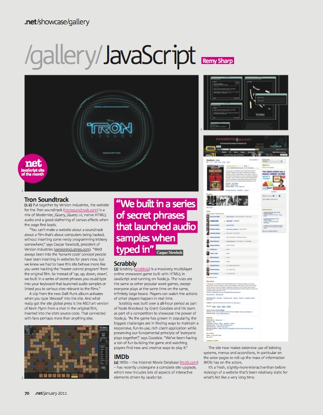
we’ve just had it confirmed that the site we did for daft punk’s TRON: legacy score, tronsoundtrack.com, was javascript site of the month in the january issue of .net magazine. click here to read the full PDF including a short interview with us about the making of the site. huge thanks again to remy sharp, mr doob, topspin and disney for the hook-up!

_category
blog, code, news, , , , , , , , , , , ,

65daysofstatic.com
& the japanese EP_121810


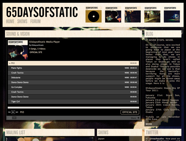
65daysofstatic.com is one of those sites where the work on it is continuous and so we’re never sure when to stop for a second and make a record of our progress. fans of the band will know that major redevelopments began back with the release of their last full length studio album, and that it’s taken on 2-3 guises since then.

based primarily around the original wordpress foundations that the band laid themselves back with the release of one time for all time (their second studio album), the open-ended nature of that fantastic (and free) platform has meant we can keep reskinning, redesigning and evolving the site whilst keeping the core database.

the latest version of the 65 site is more of a hub that incorporates not only their blog, tour dates and forum, but also their twitter, flickr, soundcloud and vimeo feeds. the design is of course based around their new album’s rather?fotografik aesthetic and was intended to allow the band a freedom from making multiple updates across their various outlets, and give fans a one stop shop for all information about the band.

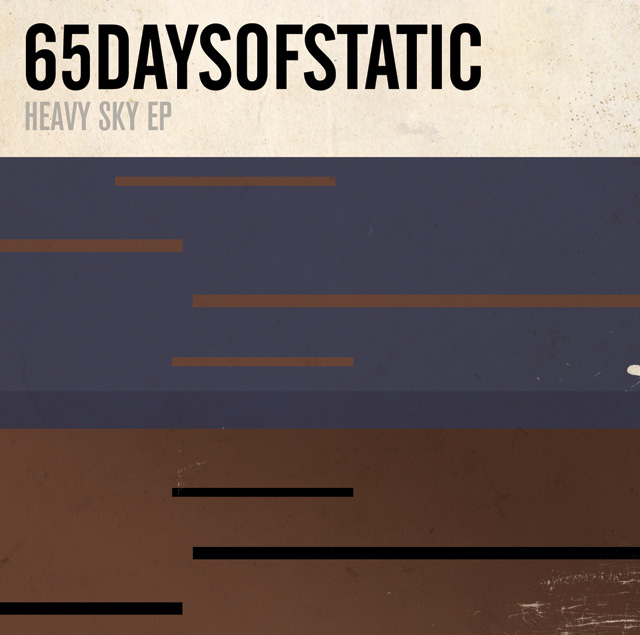
in other news, with the japanese heavy sky EP tour on the horizon and a special edition of the EP in the works, we got talking to the band about a possible variation on the established cover design. after some deliberation we agreed that a design that felt more in sync with the japanese release of their single?weak4 would be appropriate. keen to explore that release’s more geometric artwork styling, we set about developing a design that echoed the original EP photography whilst exploring the implications of the EP’s title further. the resulting cover (above) was inspired in part by a series of early drawings and paintings by the artist thomas newbolt.

_category
blog, code, grafiks, news, , , , , , , , , , ,

TRON_090910


well, where to even start? it was 20 years ago when my friends and i first saw the original TRON film. my parents rented it on VHS for my birthday party back home in england. the TV sat at one end of the table and about 8 kids sat around the other end, which was otherwise covered in food, streamers and wrapping paper.

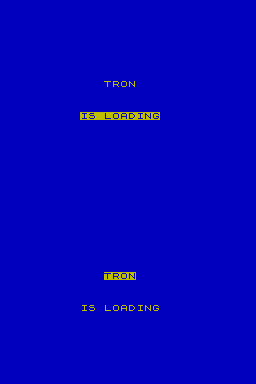
we all adored it, but more importantly a seed had been sewn and over the years i found myself playing TRON games on all manner of gaming systems. the first time was on my best friend’s ZX spectrum 48k+ back in the late 80s (seen above) and the latest, years later, when we stumbled across an original TRON arcade machine living out the end of its days at barcade in brooklyn.

now as for daft punk … it was about 4 years ago that we finally sat down to watch the interstellar 5555 animated film in its entirety. i was taken-a-back at the quite brilliant and moving concept behind it. consequently i swiftly purchased their second film electroma, and it was even better. ordinary house DJs these guys were not. requiring further validation for my new found obsession i called my friends the protomen (with whom i shared a great love of concept-based music) and consulted them on the matter. pretty soon my entire line of thinking on what daft punk was about had done a massive U-turn. then, as if waiting for my undivided attention, it was announced that they were going to score the new TRON film.

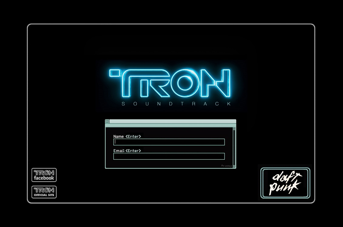
tronsoundtrack.com

so there it is. a small testament to years of love for that great old movie, and to the incredible potential of the new one and its soundtrack.

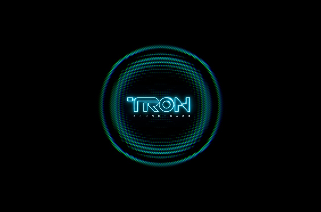
all the site does right now, formerly speaking, is register your interest in the forthcoming soundtrack release. however in order to satisfy the fans out there of the original film, daft punk or both, we packed it with as many tricks and secrets as we could.  we also made it work on ipads and ipods as well as it would on any desktop. this involved giving a suitable nod to the generation of internet users that would have grown up with the original film. i.e. we threw ASCII art imagery in the source code, built out all the site animations using .gifs, and included another element … but since no one has worked that out yet we’re not about to spoil the fun here.

the look and feel is of course taken from both the dusty desktop computer in the second TRON LEGACY trailer and the sites some of you will have seen when playing the flynn lives ARG. that is of course with the exception of the boom / ripple animation, which was adapted from a piece of code that mr. doob (of arcade fire video / harmony fame) wrote. all we did beyond that was build it all out using HTML5 and javascript rather than video or flash. we did this so that you can move the windows on the site with your fingertip on a touchscreen, as well as with a mouse. a touch that again we felt true to the world of TRON.

what’s to come after this? well even we don’t know right now. such is the mystery of these things. in the meantime we wish to extend our thanks of course to topspin and disney for helping us be a part of all this, and hope that we’ve done enough for now to satisfy even the most rabid fans out there.

end of line.

_category
blog, code, grafiks, news, , , , , , , , , ,

love & glamour_090910


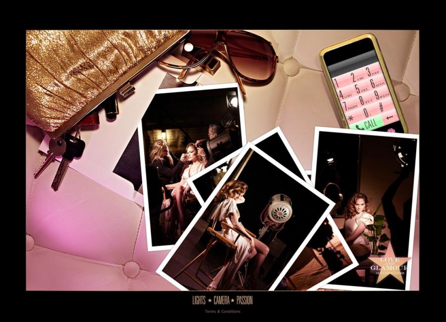
it seems like forever ago that we were first asked to work on this. watching the campaign go live now, it’s fair to say we still can’t believe we’re responsible for it. it’s easily the most elegant, refined, high-end and sophisticated website we’ve ever put together. a long time ago we did an interview where the journalist theorized that we just needed that one project to prove what we were really capable of. never in a million years did we think jennifer lopez of all people would be giving us that chance.

in short, the concept speaks for itself and since the campaign is still running, we won’t ruin its carefully crafted mystique by going into too much detail here. however to really get a feel for it we suggest you read the campaign blog post here and play around with the small, interactive scenes we built. completing each one brings you ?a step closer to the prize whilst simultaneously giving you a flavour for the overarching old hollywood, classic film noir aesthetic of love & glamour.

above all we’d like to thank all those at selectNY for being so fantastic at what they do. it’s not often you can get great ideas made. all those times you see something original, excellent and thought provoking in the mainstream media, someone will have fought very hard to make it happen. much harder than you think. selectNY believed in us and worked hard to make this happen, providing us with idealogical support and some truly excellent photography along the way.

loveandglamour.com

_category
audio, blog, code, grafiks, news, , , , , , , , , ,