activator_090313
the new york thrash metal band activator are releasing their debut album in two weeks. i’ve known the guitarist jared drace for some time now. his apartment is like a museum version of my formative years. packed full of vintage horror film posters, action figures, comic books, guitars and a vast alphabetized collection of records, i spent the first half hour i was there just staring at the walls. i shared my first boarding-school dormitory with an english metal guitarist who had a redwood washburn N-series N2, with humbucker pickups and a floyd-rose tremolo. this guy had me listening to extreme, van halen,?steve vai and joe satriani. my first record cover was a pencil crayon copy of satriani’s the extremist sleeve. i’ve never told jared this, but i didn’t really have to. suffice to say i lept at the chance of creating the sleeve for his band activator’s debut LP.
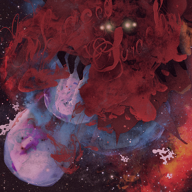
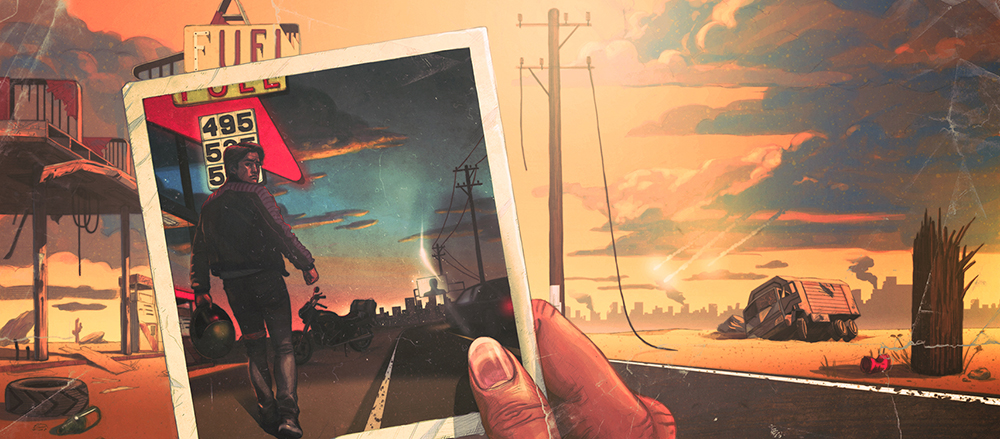
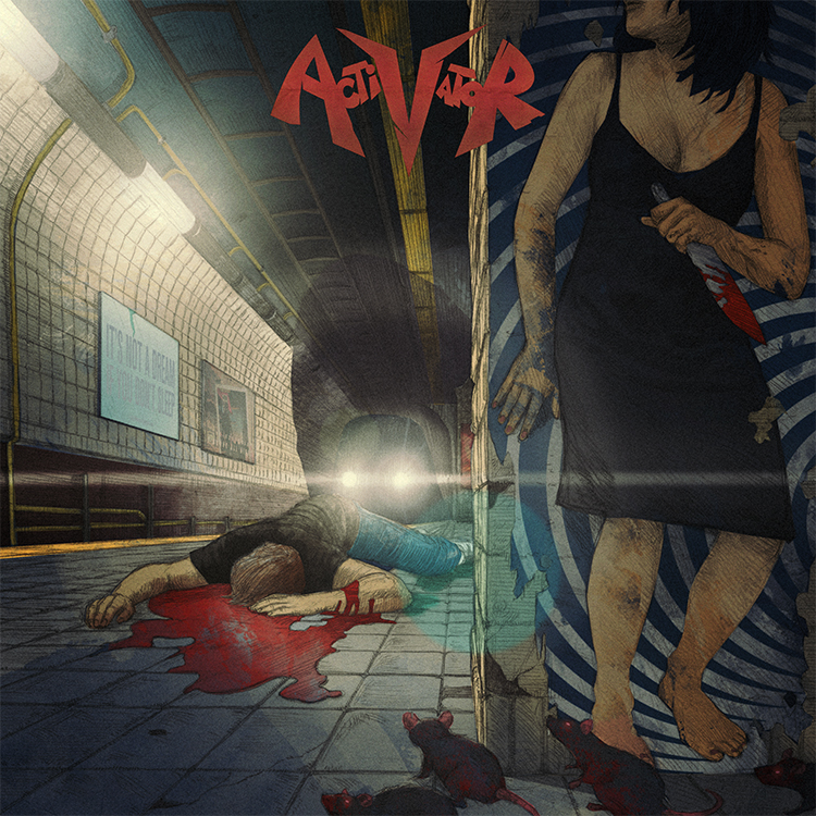
almost a year ago i was in london sitting in my brother’s apartment scratching a rat’s nest of unwashed hair on my head, staring at a crude biro drawing of the image you see above. just days before i’d downloaded a mastered version of the record and it was once again upon me to try and make an image that might get people more immediately into the headspace the band were in with these new songs.
the album is a fast-paced and brutal affair with lyrics that delve fiercely into the bleaker side of personal relationships. it opens with the sound of rats screeching as they run through city streets and as a new york resident myself i was immediately transported to a place i’d seen many a rat in my days – waiting for a train as we all have on those sweltering summer nights. closing my eyes and turning up the music, i then tried to think of a way to step over the still fresh vomit of ?’tough love’ clich?s i’d seen on record sleeves of this kind in the past. for one, the failed love stories on this album had such a battering of a soundtrack that i knew i had to find a way of turning the gun on the protagonist somehow. badly sketching out a train platform, i drew in the dead body of a guy, blood streaming from his corpse. next up was of course the question of who killed him and why. if you were to sympathize with the lyrics on this record you’d certainly at least joke that a girl must have killed him. you know, metaphorically speaking … and that’s when it hit me.
i scribbled in the rest of the drawing details, took a photo of the sketch and emailed it immediately to john delucca. if there’s anyone on this planet who can not only whip up an incredible pencil rendering of a scene but also style it to a level that fits my particular idiosyncrasies, it’s john.
3 days later i had a finished pencil drawing in my hands. not one change was necessary – he had nailed it. immediately i set to work on colouring it in, adding textures, type and any other specific little details that i felt would really bring the concept home. i was already smiling – listening to the music as the image slowly came to life, i knew we’d nailed it.
so what was the big idea? well, take a closer look at the image above and you’ll see that the girl hiding around the corner holding the bloody knife is merely coincidental. she’s in fact just a picture of a girl on a poster. she didn’t kill the guy. she’s not really there.
the truth in fact being that something else killed him and the question of what or why that could be is open to the listener’s imagination. one interpretation might be that it’s a more supernatural, as-yet-unseen danger stemming from the bands own obsession with horror films and comic books. another could be that the girl in the poster is?a simply a metaphorical commentary on all the album’s ‘this relationship is killing me’ lyrical content. either way the visual allegory is there and we hope it provokes more than just a passing interest in all activator have to offer. the fact is you won’t find classic thrash this rad with ease, so why not let yourself be seduced.
activator is out on september 17th and you can pre-order it digitally, on CD or on vinyl here.