sonoio red_060211
a couple months back alessandro cortini pushed the button on the sequel to his experimental synth project sonoio. he’d finished a rough version of the album and was keen to get some ideas for the artwork rolling. the first record’s aesthetic had been based around the colour blue, and we’d known for a while that this record was likely to be coloured, and called, red. in fact there was already a version of the album cover from the original design sessions that had been cast in red and he’d been using for his demo mp3s. however once we’d heard the record and fallen under its spell (it is even better than the original), we knew a new cover was needed. something that felt more involved, continued the abstract character based narrative of the first cover and took it into a new realm of introspection, if you will.
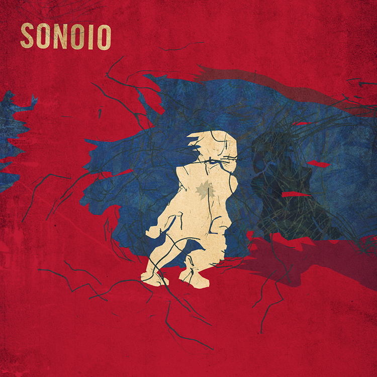
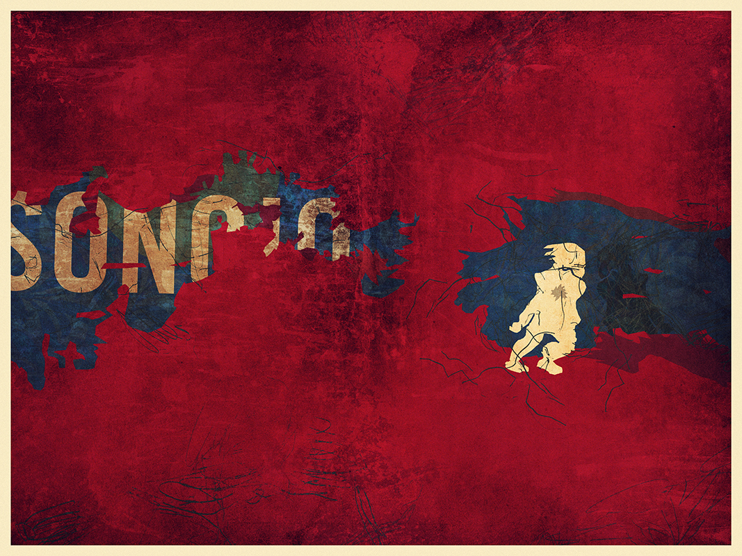
we’d also already developed the blue cover in a number of directions for the remix album that came soon after it, and so realized there was space there to keep telling the story in a fashion we felt true to the new material. it took a while to stumble across something that still felt immediately connected to the first cover, whilst offering a fresh angle on things. the resulting piece is of course deliberately open to interpretation, but features our white and black characters again, now in different circumstances and states of repair. we also started to pad out the design with more intricate textures and new colours, as the new album felt like a development and growth musically in such a way that the artwork had to follow suit.
then there’s this music video for enough, as seen at the top of this post.
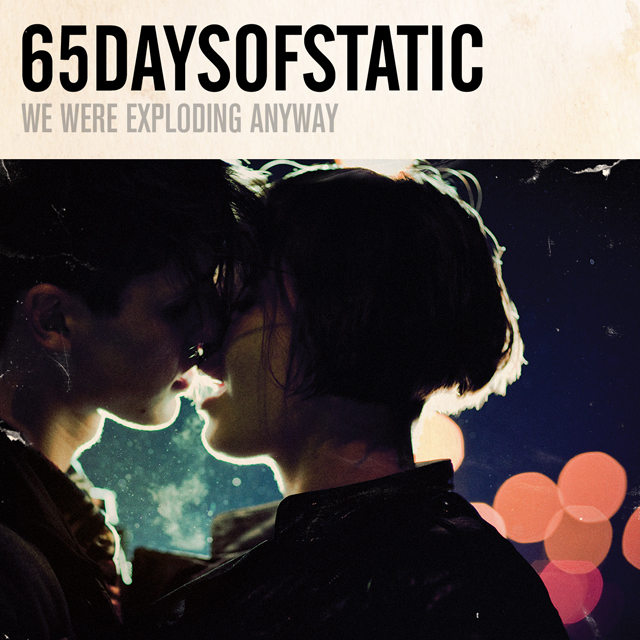
for a long time my close friend and collaborator, the director / photographer?matt sundin, and i have been talking about making videos, and eventually films, together. in fact it was this desire that made the 65daysofstatic we were exploding anyway album cover turn out the way it did. so the moment alessandro proposed a video, i gave him a call and said ‘this is our chance’.
alessandro was considering making 2-3 of the new songs into videos and wanted our ideas for each. ultimately he felt that the ‘live performance’ pitch that we included was the one that felt truest to where he was with this project right now. so matt called his crew together and asked that i start to write down a list of ideas for shots for the video. so i took an evening, put the song on repeat and worked on shot ideas that i felt would embellish the music visually and give the production a quality that had some level of character. you know, above and beyond what you usually get with these things.
we then booked a studio in green point, brooklyn and alessandro flew out from LA. the next day we hit the ground running.
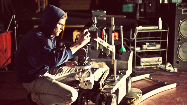
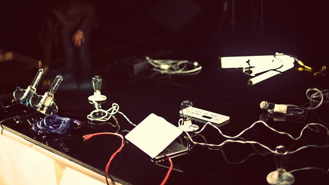
matt and his gaffer / assistant craig ward had pulled together some fantastic elements, including a wild array of lighting options and a carpenter to build a small but unusually surfaced stage for alessandro to perform on. we then painted everything else in the room black and setup our dolly / tracking rig. so far everything was going well, heck there were even 2 cats wandering around the studio which proved more than enough to keep alessandro entertained between takes.
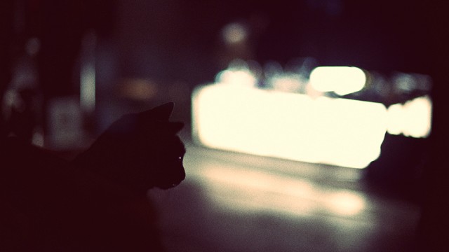
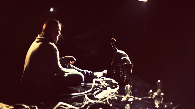
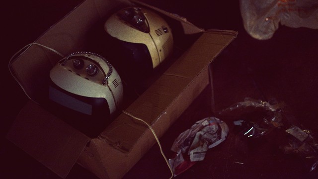
the only sad moment was when the two vintage television sets that alessandro had used for his live performances in LA arrived via post all cracked and broken inside their box. we tried our best to make them work, but it wasn’t happening.
pushing on we proceeded to do take after take of alessandro performing the song from every angle we could, taking care to include shots with him not on the stage too for some fun and games later in the editing room. it was a pretty intense process but the footage was clearly looking solid from the outset. plus the more the song got played over the studio speakers the more everyone involved started to dance a bit too, and dancing never hurt anyone.
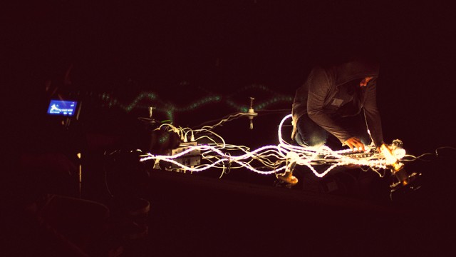

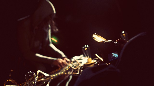
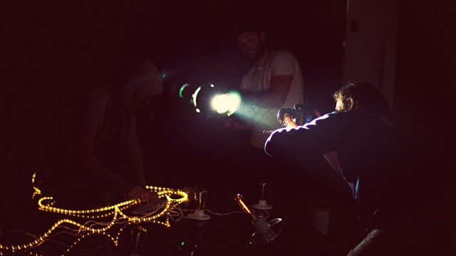
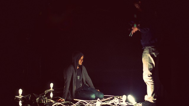
the shoot ended pretty late into the night and the studio owner offered to keep our stage setup for some cabaret / performance art style shoot he had going on later, involving strippers and wild animals. i could have mis-remembered that though. we then headed back to matt’s apartment for the wrap-party and alessandro headed back to LA the next day.
a week or two later the intense process of editing began. matt went through the footage and started pulling together the best stuff from the vast array of material we had. soon after that he was putting together a great rough cut of things and sent this to me so that i could cut together the teaser clip that went live a couple weeks ago. he then did another cut and passed it over to me again. we agreed that what there was already felt good and exciting, but tended to get a little tiring after a while, as it all had a very similar tone. so we consciously divided the song up into 4-5 parts and attempted to address each section with a different mindset, in terms of editing. i was then left to re-imagine the intro to the video and the electronic breakdown after the verses and choruses – the part with all the ‘oh oh ohs’. sending this back to matt lead us to more talks, further edits and the delivery of the first rough cut to alessandro.
alessandro was very excited by what we gave him and made a series of notes regarding various tonal changes he was after and what he felt, due to the nature of where his head was at with the song, needed adjusting in terms of shots used for certain lyrics. in this way several cuts were sent back and forth between new york and los angeles and then just last sunday we got a thumbs up from alessandro. matt then sat down and worked his magic on the footage, grading it to give it the warm, grainy, contrasty feel you see in the final cut. it was that final lick of varnish that properly started to give us the shivers. the thing was done, we were flat out of time and there was nothing we could do but send it off.
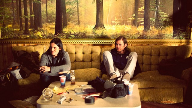
none of us could be happier with the response to the video. you just never know if you’re going insane in that editing suite. many days in the dark with breaks at strange hours for food or beer, and then back into the darkness. hearing the song a thousand times over to the point where it’s just noises and everything in your head is tied to its ebb and flow. it gets a bit bewildering. so much so that at one point we did an edit of the video laced with eerie footage of cats that we’d shot at matt’s girlfriend’s apartment nearby. inspired as we were by the cats that had been on set throughout the shoot, and often leapt onto the stage right into the shot. of course the ‘cat cut’ really didn’t work but we felt we had to try everything just to be sure, haha. ?so yeah, thanks and thanks again.
the sonoio project is going from strength to strength at this point and we’re very fortunate and grateful to be a part of it.
