(v)
(v_i)
(version_industries)

your days are numbered_120312


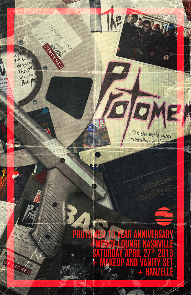
about this time a year ago i was back in england with my brother wandering around london buying gifts and the like. at some point somewhere between the various shops we’d been to, i ended up with a tabloid sized newspaper in my bag with an drawing of iron man on the front, bleeding from his eyes. just above his head in a circle read the words, your days are numbered.

sitting down to grab a bite somewhere in soho i pulled out the paper and spread it across the table in front of us. immediately i was taken aback by the design of the layouts on every page. it’s long been a great sadness of mine that so few seem to have learned from magazines like the ray gun and the face, that one should endeavour to design layouts in response to their content, rather than the other way around. of course to find that this?free publication was being braver than the majority of expensive mags weighing down the racks in shops worldwide, should of course have come as absolutely no surprise. free fanzines and their brethren have been developing their punk aesthetic this way for decades now, and this new beauty in front of me was clearly no different.

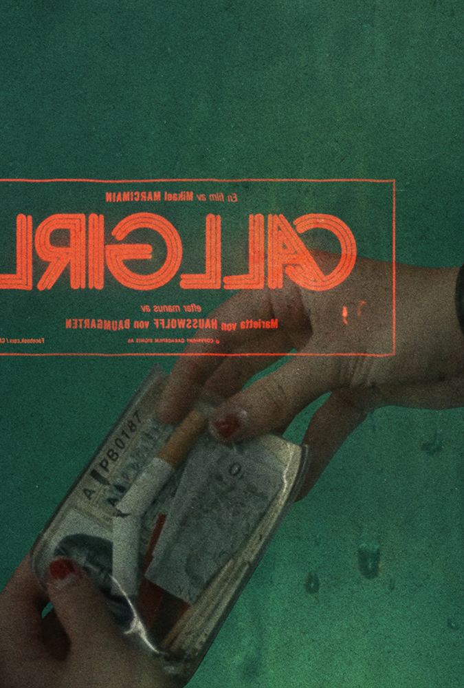
in their own words, your days are numbered?is an independent graphic fiction magazine documenting the world around creators, comics and pop-culture. a world that whilst i have a huge respect and appreciation for, am absolutely ready to admit i’m not involved in as much as i would like, or perhaps should be. this ostentatiously designed thing lying spread-eagle over my burger and fries however, was about to pull me in deeper into that world that i ever thought i’d go.

arriving back in new york i found the issue in my bags and immediately pinned it to my bedroom wall. if anything it was simply going to remind that there’s still hope. however, over the next few days i kept looking at it and eventually pulled it down from the wall, opened it up and flipped to the masthead. i was going to write to these guys. they had to know how brilliant i thought they were, and as is my curse, i was absolutely going to offer to work for them, at whatever cost. it’s one thing to think something’s great, another thing to encourage them to continue – but if you really believe that what they’re doing is great, you have to work to take them to another level in whatever capacity you can.

firing off an email into the void, it was quite a while before i got a response. eventually i got a very nice email from their editor steve turner who immediately pointed out the humour in the fact that i was an english guy in new york writing to an american in london, and pretty soon we were talking about all of that and more. they immediately asked if i was interested in doing a layout or two for the next issue. not just that, they were asking if i wanted to layout an interview with alex garland?about the script he’d just written for the new judge dredd feature film. as a fan of dredd from when i was kid, and a big critic of alex garland’s work, it was perhaps more than i could have ever hoped for. certainly as my first shot at designing a magazine layout of any sort.

they were very clear about the fact that i could absolutely do whatever i wanted, and simply sent me text and images to work with. i couldn’t really ask for more.

then another serendipitous thing happened. a parcel had arrived in our studio during the spring containing a big brick of a comic book with the title king city. i had no idea who had sent it and during some time off in los angeles this summer to edit a short film i’ve been working on, i started to read it. it was captivating to say the least. the artwork, whilst not typically my style, married so beautifully with the playful dialogue, characters and science fiction concepts, that i was a quick convert. in fact i had to take care to not read it too fast, as comic books in my experience are too easily ripped through and thrown in a pile never to be visited again, and i’d not enjoyed one this much in a while.

after emailing around, curious as to where the book had materialized from, i soon discovered an old friend and comic book enthusiast had simply thought i might enjoy it, so had fired it off at me from his amazon account.

well of course then i get an email from steve at YDAN saying that they had another layout they were interested in me doing, an interview with the creator of?king citybrandon graham. once again i’d been blessed with that sacred thing in design – a great love and understanding of the content i was being asked to lay out. furthermore after being put in touch with brandon so that i could get some of his artwork from him, he offered to do a custom drawing just for the interview. i was over the moon. i set to work immediately, once again on two double page spreads and whilst this was definitely a tougher layout this time, am happy with the results.

afterall you can only do so much before the words have to take precedent, but i felt the balance between what was readable and how much character i got to put into the layouts in order to make it a memorable and exciting reading experience, was good.

the brandon graham issue is now on the shelves and i’m told doing better than any issue they’ve had before, in their admittedly short life thus far. you can find it in london at rough trade, brick lane coffee, eggs milk butter and gosh comics. i’m told it’s gonna be winging it’s way into various comic book stores in new york in the not too distant future too. so you know, if you have the means, it is?free afterall. whether you’re a comic book fan or not, steve and his team are doing the most fucking fantastic job of covering all sorts of relevant content.?most importantly of all however, they are trying to make every issue powerfully different, entertaining just to flip through and fully immersive once you get reading.

sitting back and looking at the various issues laying now on my desk and talking about the whole situation with steve, and some other friends, i am beginning to see the incredible potential of what these guys are trying to do here. more so than i perhaps did at first. it’s been too long since i’ve been excited by any publications of this kind (excluding of course the mighty little white lies), and i feel like?your days are numbered could comfortably be a part of any new vanguard movement striving to show people what a little free will, free press and design fundamentalism can achieve. i am very happy to be a part of this team and am excited to see where they steer this ship to next. i’ve been asking to be involved in magazines of one form or another for a long time, and in many ways i think i may well have found the most perfect spot to exorcise all the demons i have haunting my thoughts about the printed publication world.

_category
blog, grafiks, news, , , , , , , , , , , , , , , ,

aesthetically speaking_042812


my latest IFP article is a call to arms to designers and those employing them, to raise the standard in terms of what is aesthetically acceptable. it’s very easy to dismiss the need for a good looking visual design, when money is short and the immediate gains are negligible. the article strives to point out however that the long-term affects of these decisions can be quite damaging, both psychologically and sociologically. here’s an excerpt from the piece –

“to reiterate once and for all, it?s our responsibility as human beings to remember there?s a lot of people on the planet who have no control over the look of the world around them and who are ruled by those who want to ?make a buck?. those of us that must suffer living beneath billboards towering above, promising soulless dreams, the garishly coloured junk food wrappers sitting in the gutter, the television commercials selling drugs for pains that don?t exist, the dying buildings built with cheap materials slumping under the weight of their own short lives, the angry faces and the lack of respect for anything. these people aren?t idiots. they know better than anyone that the look of the world around them massively affects their subconscious state of mind. they know it when they walk out of their rotting front door, glance at the grey sky, the paint peeling from the walls of their neighbour?s house across the street, scrape the ice from their car?s windshield with the splintering lid of a margarine tub, curse as the car won?t start and their foot goes through the rusted bottom of it as they lash out in anger. they know it when some of them later get drunk and walk around smashing windows, keying car doors, spray-painting church walls, and beating people up ? all scenes I?ve witnessed in my years growing up in england in the suburbs of cambridge, 3 years at university in manchester and later living in bedford-stuyvesant in new york city. It?s a level of rage that I can support and forgive when places like that?are?your reality. try getting mugged at 8:30am on your way to work, as i was in 2008, and being told by the cops that there?s no point in reporting it.

some of these people?hate?the world around them. they know what the end-game is better than the thoughtless assholes who make the products, create the ads for them and leave those ads gathering mould on some rusted old bus-stop sign, 23 stops out of town in some relentless nightmare of a burnt out suburb. the sorts of places that otherwise only filmmakers dare frequent in order to make their gritty melodramas. we have got to remember that every small gesture toward making things simply functional, that disregards how much ?greyer? you are making the user?s day, is a very valid negative point.”

you can read the rest of the article here.

_category
blog, grafiks, ,

sonoio red_060211


a couple months back alessandro cortini pushed the button on the sequel to his experimental synth project sonoio. he’d finished a rough version of the album and was keen to get some ideas for the artwork rolling. the first record’s aesthetic had been based around the colour blue, and we’d known for a while that this record was likely to be coloured, and called, red. in fact there was already a version of the album cover from the original design sessions that had been cast in red and he’d been using for his demo mp3s. however once we’d heard the record and fallen under its spell (it is even better than the original), we knew a new cover was needed. something that felt more involved, continued the abstract character based narrative of the first cover and took it into a new realm of introspection, if you will.

we’d also already developed the blue cover in a number of directions for the remix album that came soon after it, and so realized there was space there to keep telling the story in a fashion we felt true to the new material. it took a while to stumble across something that still felt immediately connected to the first cover, whilst offering a fresh angle on things. the resulting piece is of course deliberately open to interpretation, but features our white and black characters again, now in different circumstances and states of repair. we also started to pad out the design with more intricate textures and new colours, as the new album felt like a development and growth musically in such a way that the artwork had to follow suit.

then there’s this music video for enough, as seen at the top of this post.

for a long time my close friend and collaborator, the director / photographer?matt sundin, and i have been talking about making videos, and eventually films, together. in fact it was this desire that made the 65daysofstatic we were exploding anyway album cover turn out the way it did. so the moment alessandro proposed a video, i gave him a call and said ‘this is our chance’.

alessandro was considering making 2-3 of the new songs into videos and wanted our ideas for each. ultimately he felt that the ‘live performance’ pitch that we included was the one that felt truest to where he was with this project right now. so matt called his crew together and asked that i start to write down a list of ideas for shots for the video. so i took an evening, put the song on repeat and worked on shot ideas that i felt would embellish the music visually and give the production a quality that had some level of character. you know, above and beyond what you usually get with these things.

we then booked a studio in green point, brooklyn and alessandro flew out from LA. the next day we hit the ground running.

matt and his gaffer / assistant craig ward had pulled together some fantastic elements, including a wild array of lighting options and a carpenter to build a small but unusually surfaced stage for alessandro to perform on. we then painted everything else in the room black and setup our dolly / tracking rig. so far everything was going well, heck there were even 2 cats wandering around the studio which proved more than enough to keep alessandro entertained between takes.

the only sad moment was when the two vintage television sets that alessandro had used for his live performances in LA arrived via post all cracked and broken inside their box. we tried our best to make them work, but it wasn’t happening.

pushing on we proceeded to do take after take of alessandro performing the song from every angle we could, taking care to include shots with him not on the stage too for some fun and games later in the editing room. it was a pretty intense process but the footage was clearly looking solid from the outset. plus the more the song got played over the studio speakers the more everyone involved started to dance a bit too, and dancing never hurt anyone.

the shoot ended pretty late into the night and the studio owner offered to keep our stage setup for some cabaret / performance art style shoot he had going on later, involving strippers and wild animals. i could have mis-remembered that though. we then headed back to matt’s apartment for the wrap-party and alessandro headed back to LA the next day.

a week or two later the intense process of editing began. matt went through the footage and started pulling together the best stuff from the vast array of material we had. soon after that he was putting together a great rough cut of things and sent this to me so that i could cut together the teaser clip that went live a couple weeks ago. he then did another cut and passed it over to me again. we agreed that what there was already felt good and exciting, but tended to get a little tiring after a while, as it all had a very similar tone. so we consciously divided the song up into 4-5 parts and attempted to address each section with a different mindset, in terms of editing. i was then left to re-imagine the intro to the video and the electronic breakdown after the verses and choruses – the part with all the ‘oh oh ohs’. sending this back to matt lead us to more talks, further edits and the delivery of the first rough cut to alessandro.

alessandro was very excited by what we gave him and made a series of notes regarding various tonal changes he was after and what he felt, due to the nature of where his head was at with the song, needed adjusting in terms of shots used for certain lyrics. in this way several cuts were sent back and forth between new york and los angeles and then just last sunday we got a thumbs up from alessandro. matt then sat down and worked his magic on the footage, grading it to give it the warm, grainy, contrasty feel you see in the final cut. it was that final lick of varnish that properly started to give us the shivers. the thing was done, we were flat out of time and there was nothing we could do but send it off.

none of us could be happier with the response to the video. you just never know if you’re going insane in that editing suite. many days in the dark with breaks at strange hours for food or beer, and then back into the darkness. hearing the song a thousand times over to the point where it’s just noises and everything in your head is tied to its ebb and flow. it gets a bit bewildering. so much so that at one point we did an edit of the video laced with eerie footage of cats that we’d shot at matt’s girlfriend’s apartment nearby. inspired as we were by the cats that had been on set throughout the shoot, and often leapt onto the stage right into the shot. of course the ‘cat cut’ really didn’t work but we felt we had to try everything just to be sure, haha. ?so yeah, thanks and thanks again.

the sonoio project is going from strength to strength at this point and we’re very fortunate and grateful to be a part of it.

_category
blog, grafiks, news, video, , , , , , , , , , , , , , , , ,

war widow_051111


if you’ve ever heard their cover of cheap trick’s song he’s a whore, you’ll know that both big black delta and war widow are bands to keep an eye on. both new, both from LA and both with singers called jon. now whilst we’ve been working with big black delta for some time now, war widow are pretty new to us. both bands share the same record label – coming home records – who have handled not just releases from a large amount of nine inch nails alumni, but of course also the magnificent mellowdrone. it was through coming home records that we got wind of some of the new tracks by war widow. the label’s boss erik andrews posted a couple of tracks on soundcloud one morning and i joined the others on twitter who follow the label’s feed, and gave them a listen over a hot cup of coffee.

tear it up (above) is the track that immediately grabbed me. the first thing that struck me was the dirgey feel of it. then when the dark + seedy lyrics filled my ears i started getting a range of very particular images dancing around in my brain. so i immediately looked to see if any artwork had been announced for this release. sure enough they had a record cover on their website. it was of a cat snarling. rich colours. very vibrant. it was tough, but it didn’t seem to mesh with the music i was hearing. so i quickly fired off an email to erik and asked if the artwork had been printed yet. he said it hadn’t. i then started ripping through various photographs i had lying around on hard drives and bookmarked on various sites, trying to find things that seemed to fit the music. i then put together a few designs using the bands logo and some of these images, and fired it off as quick as i could to erik. he amazingly passed them right onto the band and just moments later i got news that they were into trying a new cover and wanted to know what else we had up our sleeves.

i then emailed two people. first my friend?matt sundin, who took the photographs for the 65daysofstatic album cover,?we were exploding anyway. i briefed him quickly on the sorta images i was after and asked him if he had anything lying around. i then reached out across oceans into distant lands i’d never set foot in and contacted a ukrainian photographer who’s flickr account i’d been obsessed with for some time now. i felt his photos were utterly perfect for this and had in fact used some of them in the initial comps i sent to the band. this guy’s name is alex alekseenko, and you can see more of his work here.

knowing both would need some time i then told the band i’d need a day or so to pull things together and if they could hold off the printing presses for a moment, it’d be worth their while. they were cool with this.

the next morning i was elated to find an email from alex in my inbox. turns out he was 100% down with us using one of his photos for a record cover, particularly for a rock band. he himself was a collector of many records and was very excited at the prospect of having some of his work used in such a fashion. similarly matt also got back to me with a few shots of his own that he felt stepped into the murky conceptual arena i was after with this.

the images then started to speak for themselves. certain images coupled very well with others and those that didn’t lead me to ask if they could delve deeper – send me anything. i wanted them to send me the stuff they might even be scared to send through, because of the content of them. needless to say but we were all excited and definitely beginning to get that feeling again. that feeling that made you remember why you do this damn thing for a living.

pretty soon it was done. round 2 was off to the band and we were checking our emails regularly for anything back from them.

the band got back to us after a few days. they’d made a decision. they wanted the image you see above for the cover, and the image you see below for the backcover. we then started about ‘finishing up’ the design, which of course involved making it feel like you’d find the record in the damp corner of someone’s basement in the middle of nowhere.

if you’re into hearing the record, needless to say we highly recommend it. it will be out on 12 inch vinyl and was produced by none other than jonathan bates of big black delta. you can grab another song from the record from the band’s site here, or from the label’s site here.

we hope you enjoy it and that the artwork in some way helps you get deeper into the music.

_category
blog, grafiks, news, , , , , , , , , , , ,

acknowledgement_053109

david carson website link

david carson has posted a link to our recent article about design and advertising on his own website. we feel vindicated (to say the least) to have received this kind of acknowledgement of our point of view.

_category
blog, grafiks, news, , ,

commercialism and design_030108

peter saville

it’s hard not to feel?underwhelmed with the state of the design industry today. one avenue i personally had always relied upon was designing artwork for bands. however now the music industry can barely afford to pay for the great designs they need to present their artist’s work, we are all having to find work elsewhere to make ends meet. this, along with other elements, is adding to the larger realization that now more and more of the market is being eaten up by corporations forcing designers to use their art to sell incompatible, emotionless products.

if you have a moment, i highly recommend registering to the (albeit commercially founded) ‘i love design’ site and watching this short interview with peter saville. i have been feeling a great weight on my conscience recently and after watching this i felt it all lift a little as one man defined the issue so succinctly. i hope many can take a lesson from this and things will change. thanks, peter.

http://www.ilovedesign.com/us/exclusives/interviews/peter-saville-design

_category
blog, , , , ,