homage 1_042226
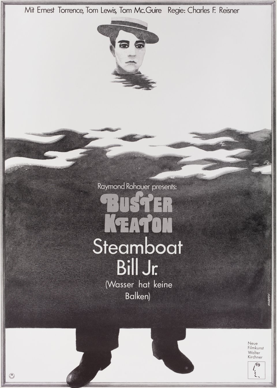
poster by hans hillmann (1973)
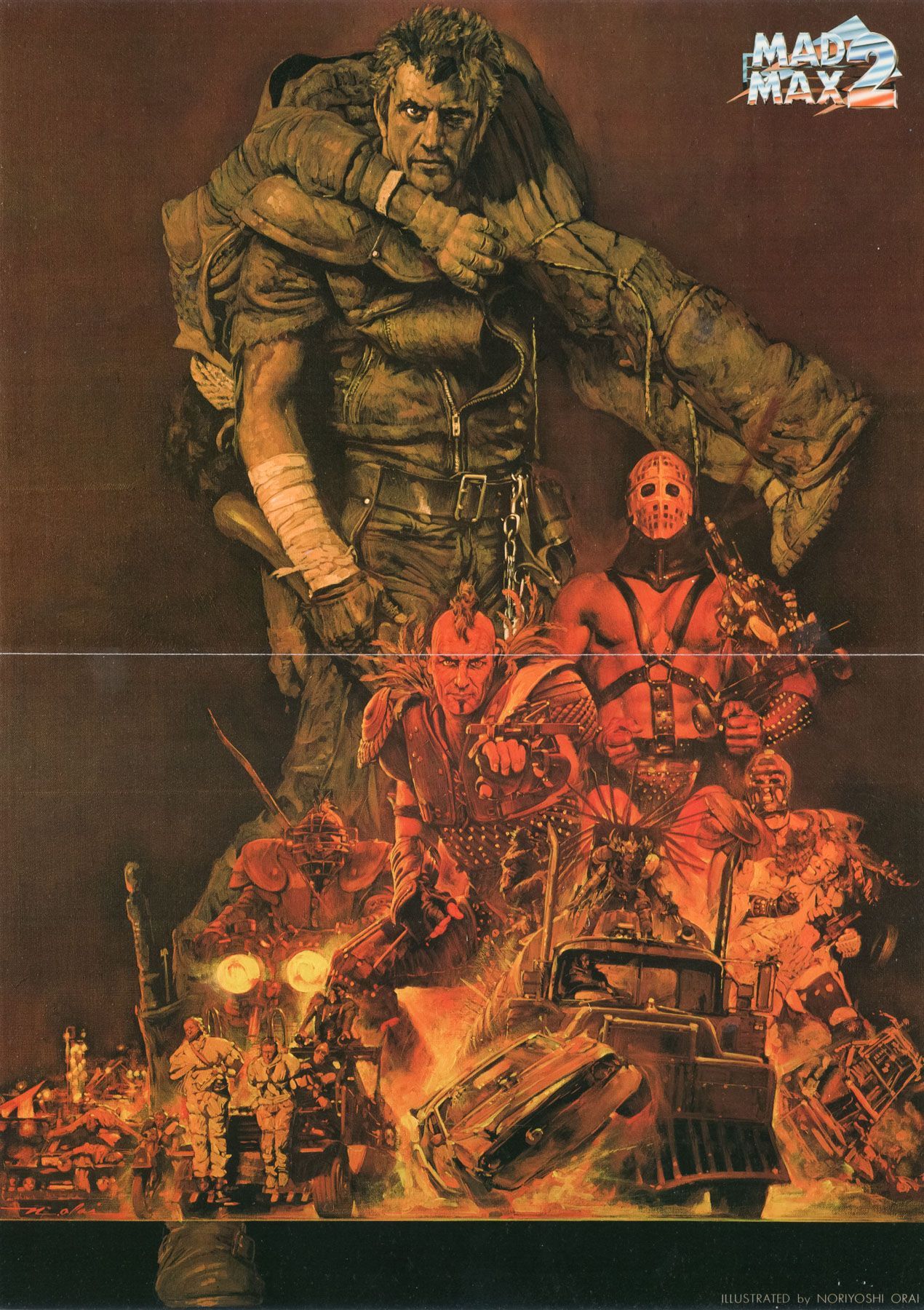
poster by noriyoshi ohrai (1982)


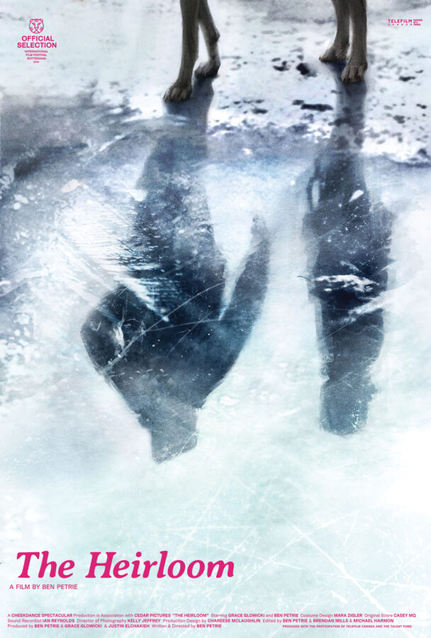
the film stage have very kindly included our april and the heirloom posters in their best movie posters of 2025 list. whilst ben petrie’s the heirloom poster was placed in their honourable mentions category, they went as far as to consider our poster for dea kulumbegashvili’s april their 4th best poster of the year.
here’s what jared mobarek at the film stage had to say about the april poster:
The initial inscrutability of Caspar Newbolt’s (version_industries) design for April is a huge part of its appeal—abstractions ask the viewer to look beyond its formal success and find a path towards its visual interpretation of systemic violence. We aren’t witnessing an illegal abortion via characters and action so much as a representation of the procedure’s power within a repressive state. This serenely calm and cloudy sky destroyed by hastily covered blood portrays a tacit agreement. It shields the evidence of its horror while allowing the patriarchy to keep pretending everything is fine.
a huge thank you again to jared and the film stage for the continued support of our work.
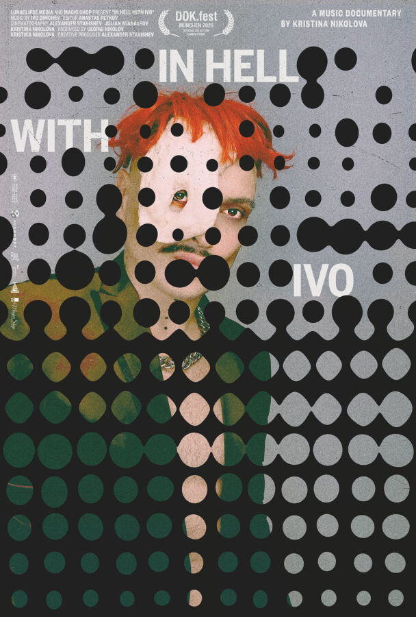

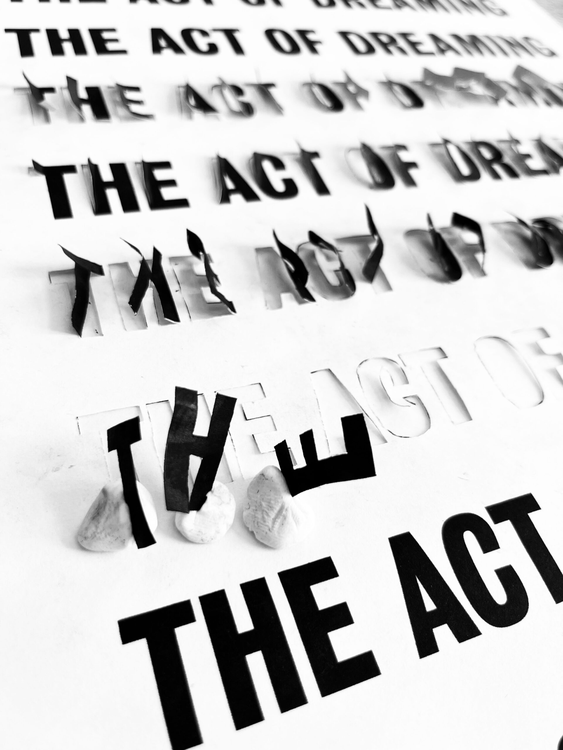
MUBI and seek and speak have kindly included our in hell with ivo and the act of dreaming posters in their end of year lists. MUBI placed kristina nikolova’s in hell with ivo poster in their best poster of the year 2025 runners up category and postermaker brandon schaefer included john maggio and neha shastry‘s the act of dreaming poster in his notable film posters of 2025 list.
a huge thank you again to adrian curry and bradon schaefer for the continued support of our work.
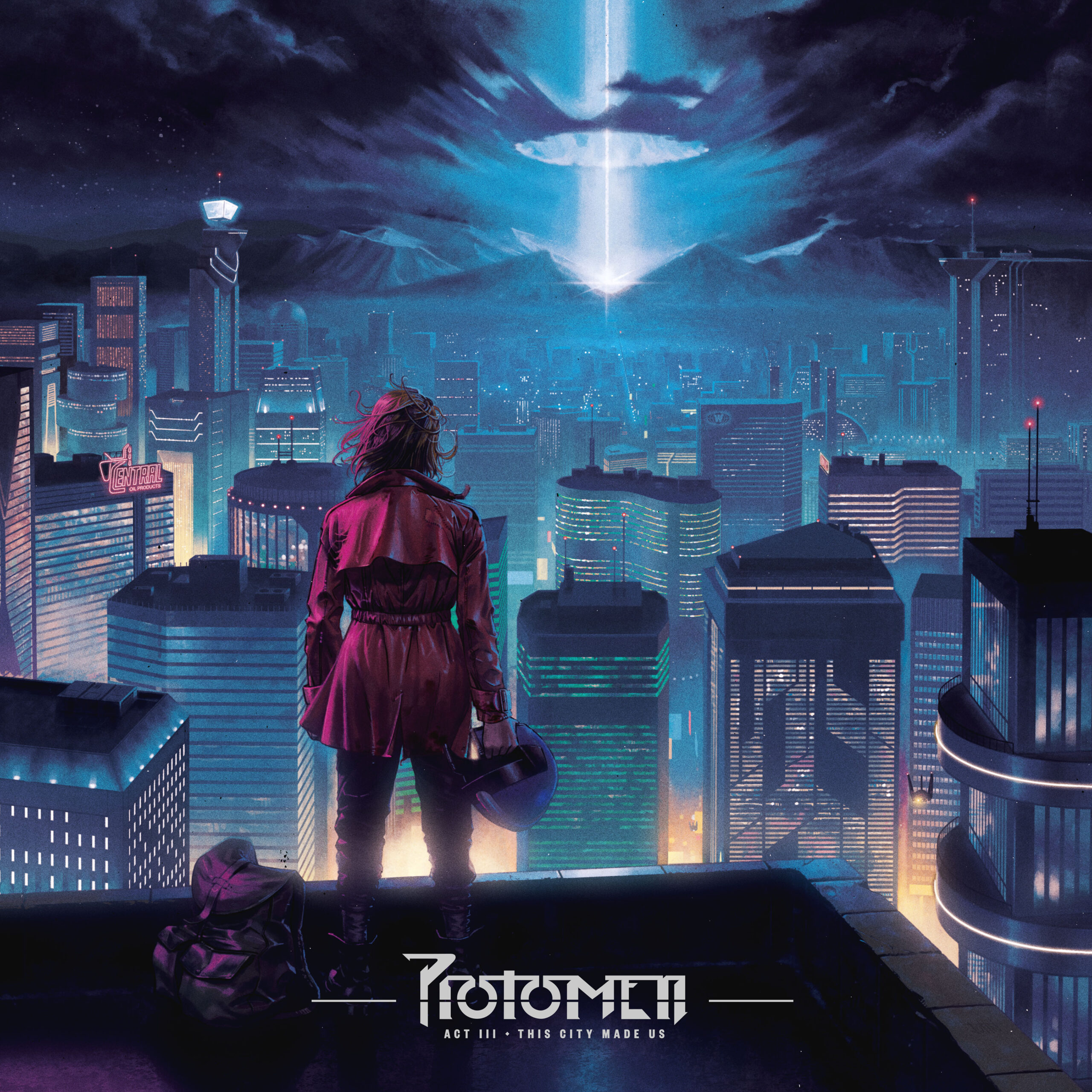
in a rather touching turn of events the protomen’s 3rd and final album was announced by bandcamp last week as their most pre-ordered album of 2025. whilst completely unexpected, this felt like a just reward for the unique way in which we and the band handled the album’s artwork and preorder process.

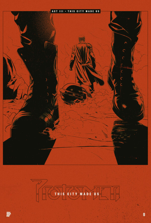
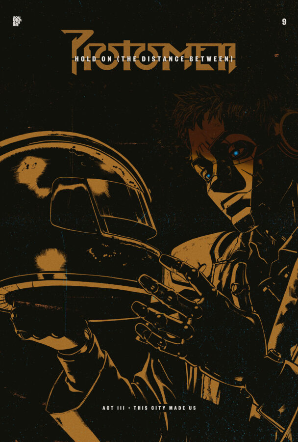
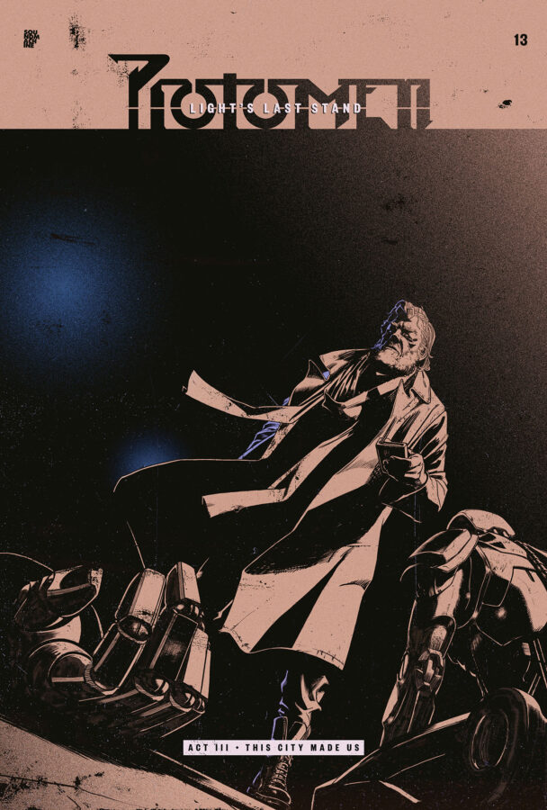
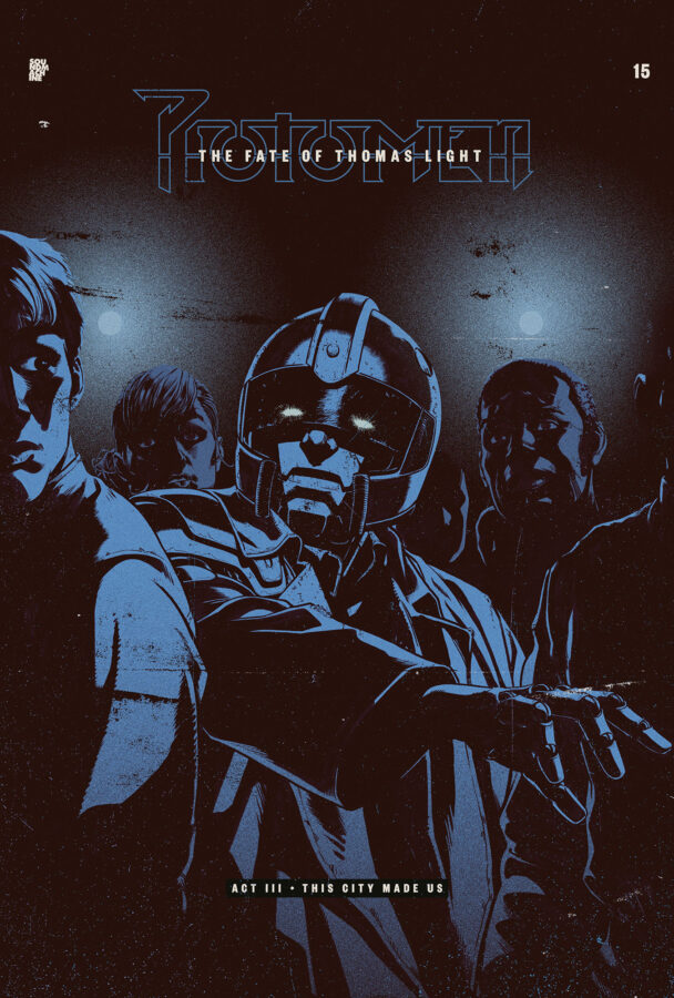
thanks to bandcamp’s setup the protomen were able to reveal the album’s cover artwork, start the preorder and then release a song from the album each week like a TV episode. any fans who preordered or signed up to the band’s mailing list were notified of each episode’s release each week. each week they were then sent the song’s “single artwork”, which was created in the form of a film poster / comic book cover. inspired by the covers of the AKIRA manga by katsuhiro otomo seen below, john delucca did a drawing each week, and caspar took care of its colouring, typography, texturing and layout.
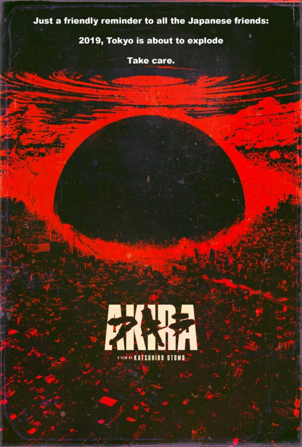
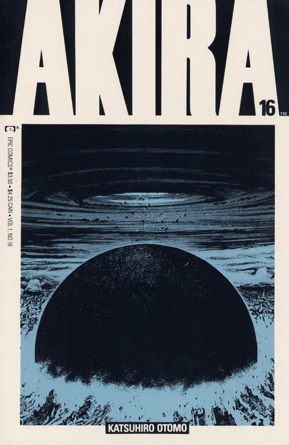
all of this perfectly suited the long-form narrative nature of the protomen’s music. every song on a protomen record is part of a larger story told chronologically and cinematically. therefore to miss a song or to listen to the songs in the wrong order, is akin to missing the beginning of a movie or reading the last chapter of a book first. this all might sound insane, but the protomen formed in the late 90s to tell one story as a rock ‘n’ roll opera, and to deliver that story in just three acts. the band released the first act in 2005, and here 20 years later is the last. if you’re new to the band we suggest, of course, that you start at the beginning.
below are four of the posters we made each week with the release of each new song.
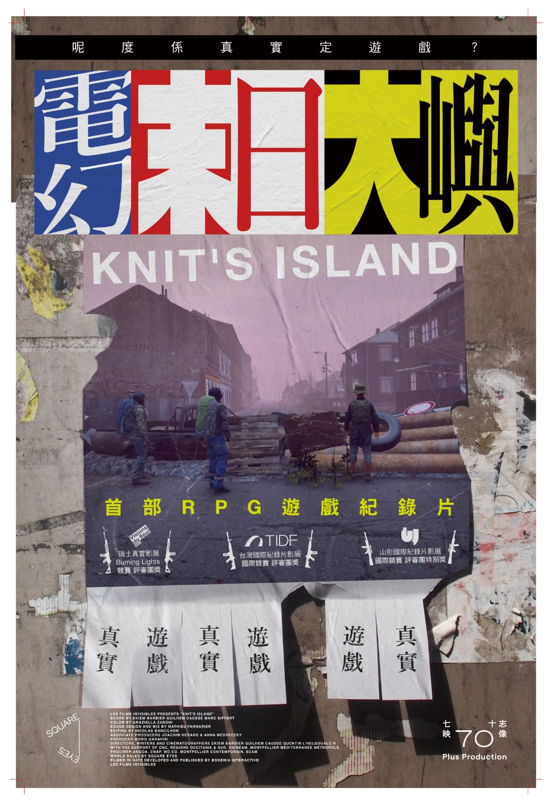
this beautiful poster by lau yan hin was made for the hong kong release of knit’s island (renamed electric doomsday in cantonese). knit’s island is an excellent french documentary that we also made a poster for back in 2023. i am posting lau’s poster here for posterity’s sake, because it is both an homage to our original work and i believe an improvement upon our work.
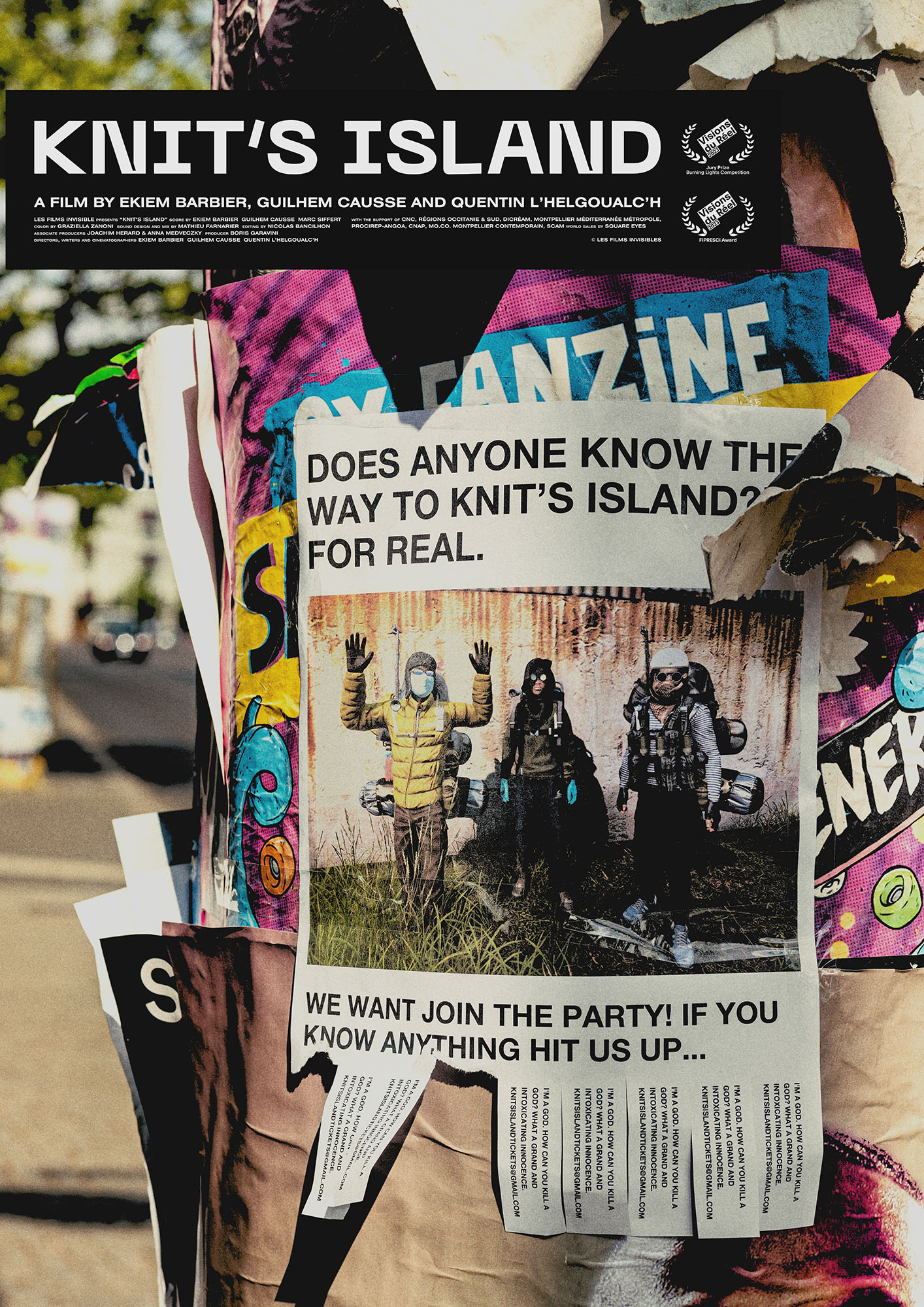
the idea behind our original poster was to make real “missing cat” flyers for knit’s island and plaster them around the city of berlin. our intention was not just to promote the film, but also to return later to photograph each flyer after people had ripped-off and kept the contact details from the bottom of it.
the reasoning for this is as follows: this film was made during the COVID lockdown. it’s effectively a series of interviews conducted by three french filmmakers with individuals and groups of human beings all over the world, as they play an expansive, online, multiplayer game called dayZ. the catch is that these people were interviewed from inside the game. the filmmakers themselves—also playing the game and using screen capture software to record their work—are seen chasing after players, often during deadly combat scenarios, in an attempt to draw them into a conversation. for the duration of the film we see only the in-game graphics, as each human—wearing an avatar of their own creation—describes how they’re spending more time playing the game than in reality, thanks in no small way to the pandemic. you can hear mini-fridges being opened, beers being drunk and babies crying in the background of their audio feeds. some of those interviewed had even gone as far as starting their own religions, repurposing in-game churches and all. suffice to say watching the film offers an uneasy, surreal and in some sense enlightening experience, wherein we the audience certainly begin to question the nature of our own reality.
this is where the “missing cat” flyers come in. since our poster had to exist in reality and not in the game, we knew we had to flip the film’s entire concept around, and pretend that people from the game—our french filmmakers—had come out of the game in order to post a flyer in real life. furthermore this flyer had to show a picture of the filmmakers as they looked in the game, and it had to ask people in “reality” where knit’s island was. knit’s island being not just the name of the film, but a mysterious location whose name the filmmaker’s made up to capture the new reality the film provokes in our minds when viewing.
incredibly our idea worked. various people ripped off and took the contact details home. we then took photographs of those “used” flyers and made them into a series of posters. the best of which you can see below.
all that said, there are always posters we’ve done that i start to feel over time could have been better, and actually long to go back and change one day. this is certainly one of those posters, not because of the concept or the photography, but more because i feel the title treatment and layout was never quite what i wanted it to be.
either way knit’s island is a particularly unusual and fantastic film and it was truly an honour to make a poster for it. i hope the folks in hong kong enjoyed watching the film also, and i want to extent a huge thank again you to lau yan hin for delivering such an inspiring response to our original work.
caspar

our poster for kristina nikolova’s music documentary, in hell with ivo, was selected as MUBI’s movie poster of the day today. a massive thank you once again to adrian curry for his continued interest in and support of our work.
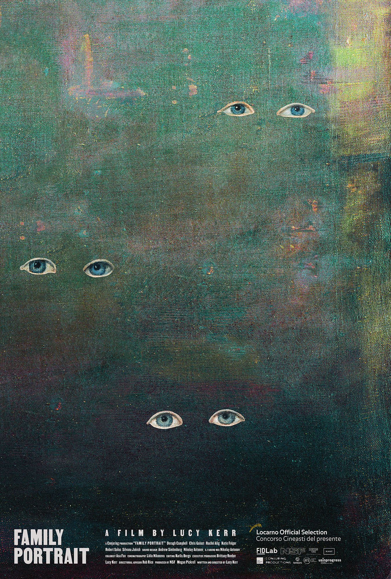
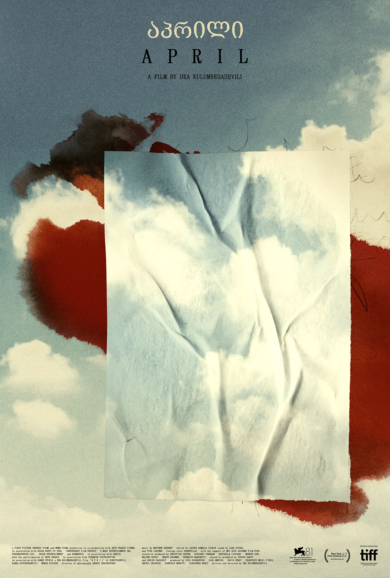
the film stage and MUBI have kindly included our family portrait and april posters in their best movie posters of 2024 lists. whilst MUBI placed dea kulumbegashvili’s april poster in their 2024 runners up, the film stage went as far as to consider our poster for lucy kerr’s family portrait their 7th best poster of the year.
here’s what jared mobarek at the film stage had to say about the family portrait poster:
Much like the film’s commentary on absence versus presence, Caspar Newbolt’s poster for Family Portrait hinges upon the dynamic shared by those two states. Whether the hunt for a mother to take the Christmas card photo she enlisted them to take or pointed words read by the daughter searching for her so she can fly back home (“Where did my mother go when she would leave her empty gaze fixed on me?”), there arrives a shift from opposition to coexistence––we still have presence through absence and can be absent despite our presence. Thus Newbolt cuts the eyes out of Joshua Johnson’s The Westwood Children and places them upon a textured wash of color that thematically erases the bodies while simultaneously promising they’ll exit the fog next. It’s an illusion. Just like the photo. Because a finished product was never the goal; the portrait was simply an excuse to physically reunite one more time… just in case next year proves too late.
a huge thank you again to jared, adrian curry and both of their institutions for the continued support of our work.
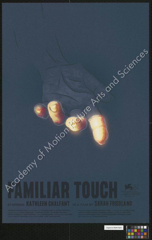
our poster for sarah friedland’s award winning debut feature film, familiar touch, has been acquired by the margaret herrick library of the academy of motion picture arts and sciences. two copies of the poster now exist in their collection in los angeles, california. you can view their digital record of the acquisition here.
this is the second of our posters that has been acquired by the academy. we’re incredibly grateful to gordon spates and everyone else at the margaret herrick library for their interest in and support of our work.