(v)
(v_i)
(version_industries)

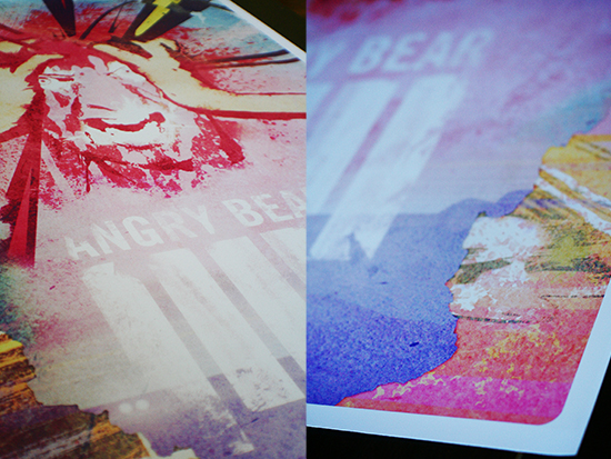
SXSW sonos smash party poster_031110


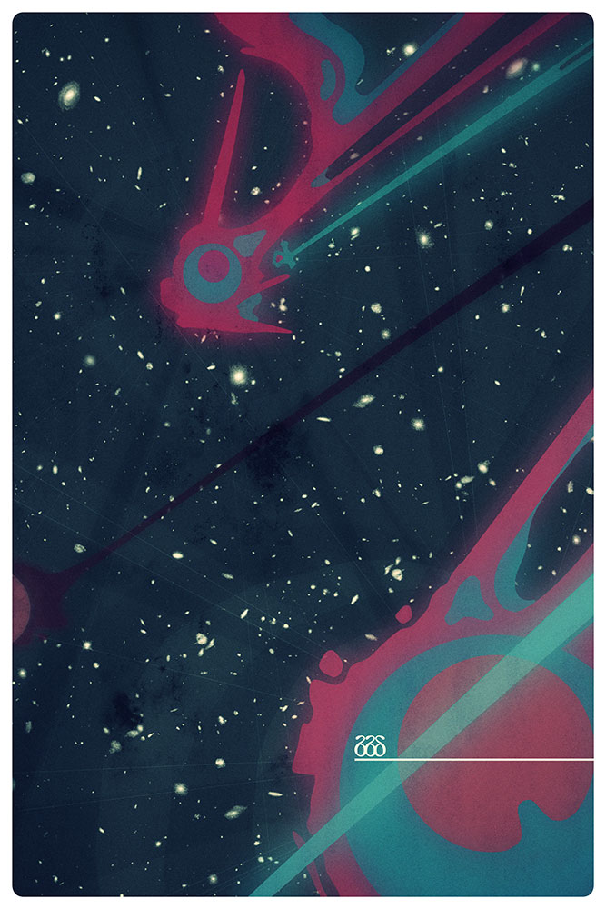
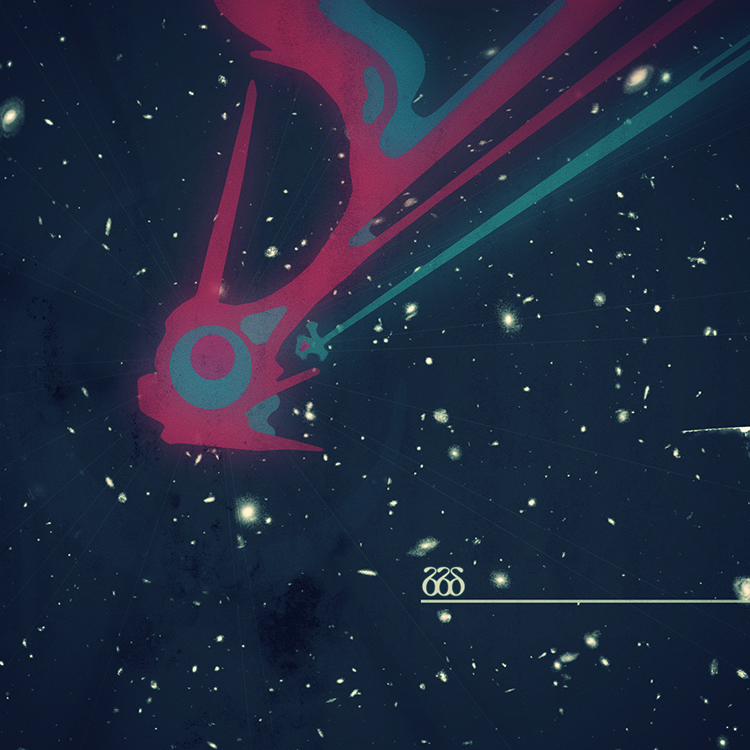
here’s the poster we just designed for the sonos smash up party in SXSW down in austin, TX next week. a big thank you to greenshoelace.com for the commission. we’re actually looking forward to finally getting down to the festival ourselves this year, rather than just being nominated for stuff from afar. of course we’re mostly there this time around because of our good friends the protomen playing not one but four shows throughout the music week. with that many performances it’d be impossible not to at least see one show, right? seriously though, be sure to say hi if you do come to one of their shows, as we’ll most likely be filming or photographing them in some capacity.

_category
blog, grafiks, news, , , , , , , , , ,

HERE website praise_121009

the_film

ioncinema.com, a webzine / blog website dedicated to american independent film, world cinema, documentary film and the world film festival scene, has just posted this article in praise of the HERE website. this is the site we built in collaboration with filmmaker braden king, to promote and provide information on his forthcoming feature film of the same name.

it’s also worth mentioning that the site was built using the ever more relevant ‘website-in-a-can’ setup offered for FREE over at wordpress.org. more than just a powerful piece of blogging software, it’s an extremely affordable, plug-in based solution for almost all your basic website needs these days. provided you’re happy to undertake the task of a little coding and skinning, you can build a very easy to update and maintain online platform to serve a variety of immediate needs.

worth a look.

_category
blog, news, , , , , , , , , , , , , ,

the protomen –
act 2 release show aftermath_092909

act2_poster

the above, giant, 3′ x 4′ poster was available exclusively at the protomen’s act II release show last weekend in nashville, TN. we created it with the band as a thank you to fans for making the long trek, as they all did, to see the band perform both their albums back to back in thunderous, conceptual glory. version industries representatives, myself included, attended and helped make sure the performance was recorded both in HD video and with digital still photography. below is a taste of the material we gathered –

IMG_6681
IMG_6579
IMG_6330
IMG_6135
IMG_6287
IMG_6398
IMG_6434
IMG_6706
IMG_6582
IMG_6728
IMG_6512
IMG_6633

you can view the rest of the photographs we took here. you can also expect video footage of the show from us in the coming months. in the meantime check out this incredibly flattering review of the new album by nashville resident?yewknee. a perfect come down to an incredible weekend with our friends in the south.

_category
blog, grafiks, news, , , , , , , , , ,

lucky pierre music_062509


lucky pierre music just emerged again for the first time in 5 years. the last time it was around we were just fans of the music they had under their umbrella, this time we had a small hand in heralding their return.

so what’s the story? well, where to even start?

back when everything seemed to matter more, everyone at (v) got into a band called PRICK. we found the band originally because they were on nothing records, like so many other great bands back then. however what made PRICK particularly unique were the unusually crazed vocals and complex lyrical play of their mastermind, kevin mcmahon. a man, we soon discovered, that had a much larger and even more remarkable musical body of work than we could have imagined. with record releases dating back to the late 1970s, it turns out kevin’s musical scope and lyrical imagination was simply vast. in fact so beguiling and intriguing was it, that we flew from london in 2003 to see a rare performance by PRICK in their home town. since then have devoured every rare recording, morsel of news and rumor surrounding kevin’s extremely sparse and mysterious output of work. nothing like being into a cult band that always delivers, huh.

long story short, that was 6 years ago. today version industries are very proud to present the online music store for the entirety if kevin mcmahon’s body of work spanning from the late 70s to the present day, be it PRICK, lucky pierre, (sic) or fear of blue :

store.luckypierremusic.com

customized, reskinned and built with love for a guy who’s work’s kept us company in the studio since the very beginning, we hope you enjoy digging around and taking a good listen to the samples you find. we’ve gone to great lengths to ensure you can get the music in mp3 and FLAC as well as obtain physical copies of the releases. it should be a treat for newcomers and older fans alike.

before you do that though, take a listen to this song:


don’t say maybe, (lucky pierre, late 70s)

and watch this video:

attitude
from poortraits of thinking (released 2010)

both should give you a good idea of what it is we do so love about this man’s work. there really is nothing quite like it in the grand scheme of things. enjoy.

_category
blog, code, grafiks, news, , , , , , , , , , , , ,

30_062209

photobooth

(v) co-founders giles + caspar celebrated their 30th birthdays last week.

_category
blog, , , , , ,

acknowledgement_053109

david carson website link

david carson has posted a link to our recent article about design and advertising on his own website. we feel vindicated (to say the least) to have received this kind of acknowledgement of our point of view.

_category
blog, grafiks, news, , ,

ray gun magazine, the ARG
& advertising at large_050909


i came across this cover the other day (designed by chris ashworth) and like a splash of cold water across the face, was reminded just why i believe that ray gun magazine was far?and?away the best print magazine. this is not a very popular belief mind you, even among its fans. many designers and publishers have noted that its aggressive visual style often made it harder to read,?and?consequently of limited interest. however as one ?joe clark notices, it seems that few of these critics when pushed can deny just how “[ray gun] is strikingly fresh even now,” and frankly, there really aren’t many magazines on the shelves today that that can still be said about. avant garde? THE FACE? sadly, they’re dead too.

the first issue of ray gun i saw, i bought. it had a picture of?trent reznor on the cover. aside from the bar-code there weren’t many words on the cover; the name?and?tagline at the top?and?the word ninechnails at the bottom:

raygun #43

if you’ve heard of the band (or possibly even if not), you’ll notice not just the obligatory backwards n here and there, but also the removal of the letters i + n from ‘inch’.

why? my assumption there?and?then when i bought it was that that’s how you say nine inch nails, if you say it at the pace you would in regular conversation. you know, as a fan, for the umpteenth time.

say it now.

see, you don’t actually pronounce the ‘in’. i’ve never had this confirmed by anyone, but i know it to be true because i know how much the guy who designed that cover would understand a?nine inch nails fan?and?not just a fan of the magazine.

now take another look at the image i opened this article with. of course if you’re a fan of radiohead then you either recognized them from the photograph or swiftly interpreted the typographic code in the magazine title hinted at by the different fonts used.

so, where am i going with all this? well one thing you get to to do a lot of as a designer, whilst sitting at your desk putting together layouts and listening to music, is think. finding this radiohead cover got me thinking about ray gun magazine again and just what it was about it that excited me about it and made it feel so relevant to me even now. so the following is an attempt to explain what i see as an interesting correlation between the mentality behind a production such as ray gun and the nature of advertising and, consequently, big business. why advertising in particular? well if there’s one thing that’s becoming an ever more suffocating and all the more life-threatening to the life of a designer these days, it’s advertising. no really, it’s true. even joy division and new order record designer, peter saville, agrees with me. advertising is arguably the ‘sword of damocles’ hanging over the heads of any designers worth their salt today. so the following are my collected thoughts on the matter, as a designer in 2009 wondering when we’ll ever get back to just making beautiful things for those with truthful and honest intentions.

here goes –

the key thing here that ray gun magazine highlighted?and?the thing i have mourned the loss of since its death, is the concept of communicating directly and?almost subconsciously with your audience. what the creators of?ray gun understood was that if you want to really communicate with people, then you have to think like them. yes i know, you’re thinking ‘well, that’s obvious’. however, i don’t mean ‘think like them’ in the don draper sense of the phrase. you see?ray gun was the only magazine of its kind to completely redesign its entire look and feel with every issue, and every article article in that issue. why? because it wanted to really speak to its readers. it wanted to make the fan of that particular band, musician, film or writer to feel more at home on that page (that they’d just hurriedly skipped to), than on any other page. no, let’s take this one further. ray gun wanted to make them feel even more at home in their own home town, than they’d felt all month waiting for the issue to hit the shelves. such was,?and?still is, one of the key qualities of good art (assuming for a second we can suggest?ray gun presented the reader with art) – be that the art its articles were about or the art that the articles imbued as they bent their own will to the content they were delivering.

you see communicating an idea with words is one thing. but when you realize words are made up of letters?and?that letters are just symbols or images, you realize you’re talking about a series of pictures all lined up. a series of pictures that define with increasing accuracy (as you read a sentence or paragraph) a larger more abstract image in your mind. now take those words and start changing the definition of them. by this i mean change the font, start removing letters or changing the structure of how they’re laid out, whilst all the time keeping it intuitive so that everything you do is based around what the words are saying … just like ray gun did …?and already you’ve started to alter the way you’re communicating with the person reading, especially if they have a predisposed interest in the content.

what you’re doing is making them have an original, thought provoking and even difficult time deciphering the information, but in doing so you’re creating an experience that they will potentially remember more vividly, especially if they are a more visual person. it’s the same as the way you might use a coloured pen to highlight text from a book so that you can later remember that phrase in an exam; just by thinking of the page, the colour?and?the text inside it. likewise the way a dog might learn from something by being scolded, but unlike the migraine inducing repetition of say today’s advertising techniques, this is a personal moment of conflict where you actually care for the struggle.

in a similar fashion to ray gun, i’ve often wondered why i’ve always been drawn towards designing an entirely different website, print piece or video every time i start on a new project. it’s not just about trying to make my portfolio look diverse?and?it’s not just about making our daily routine more interesting or challenging. i think it’s also about a subconscious understanding that in no way is it even logical to re-use a style from one project to the next. no two people are the same, no two companies want to be the same?and?you’d never find anything if everything looked the same.

now you might argue here that yes of course you agree, but that surely every project or client within the confines of their own business must conform to a consistent set of styles?and?values in order to maintain a solid sense of identity, organization?and?reliability.

i would definitely agree with this, but it’s an equation that quickly imbalances and this brings us closer to the core of the problem – big business. big business fundamentally relies on the idea of constant growth, but as we know from our very nature, nothing can keep growing forever. we don’t have it in us mentally or physically. so it shouldn’t surprise us that larger businesses start to build up seemingly impossible overheads through inflating staff salaries, flailing expense accounts and increasing office rents. as if grotesquely obese, they start to focus vainly on their own ‘figure’ over the ‘figures’ of the others that got them this fat. in doing so they realize they must make a certain amount of money to stay alive. an amount that goes beyond the value of what they ever had to offer, even in their heyday. this in turn has them fighting to remain approachable, safe, dependable and reliable. much more so in fact than they ever needed to be before. their advertising budgets then grow as they fight to appear more relevant. unable to rely on their own bloated staff for the necessary fresh ideas, they start mining young minds for that extra ‘juice’, via focus groups and the like. this reliance on investment over their own ability to generate exciting concepts, forces them to take less risks.?consequently they slowly start to shift down gears and end up producing considerably less interesting or worthwhile products.

shitty, right?

sadly it’s hard to see this fate being avoided by anyone, with the way things work now. hell, ray gun certainly died that way. obviously i don’t know for sure, but my guess is that it started to lose readers and eventually died because, as suggested above, convention always wins out?and?anything you can’t define, pigeon-hole and brand loses its way fast in this world.

i bought a much later issue of ray gun the other day (#74)?and?was stunned at how much it had fallen from grace in its final stages. the type was horrid, the photography dull, the layouts unimaginative and the design was pretty much uniform throughout. my guess is that it had to go that way due to publishers worrying about dwindling sales. however in doing so they probably then lost the core fan-base too, who’d learnt to speak ‘fluent ray gun‘?and?could not cope with such unremarkable mediocrity operating under that once great name. i certainly can’t show #74 to friends and illustrate what a paragon of creativity it is, like i can with my beloved #43.

so what’s the solution? how can you prevent this? we can’t all run our own lean & adaptable companies with our heads down, working weekends and somehow managing to scrape by each month. most people just want a job. they don’t want the precarious task of running something themselves?and?never knowing if next month’s pay cheque will amount to anything.

well maybe we can’t prevent it, but keeping our fingers on the pulse may just keep us around a little longer. take the ARG (alternative reality game) for example. it’s a sophisticated?and?quite successful method of promoting a product that’s evolved through the ubiquitous nature of the internet and the desire for a radical change in standard advertising practices. its apparent failing is that it predominantly caters to niche markets, but my gut feeling is that, much like ray gun, it should not be overlooked. it would appear, at least to me, to show signs of a possible way out of this mess.

to wit, ARGs are completely and utterly designed around the mindset of the people choosing to get involved with them. so much so that you can’t summarize the rules of each game, you can’t list the techniques involved in building them and you can’t specify the ‘reward’ or ‘goal’ other than that of simply giving those involved an evolving and expanding reminder of what it is they already love so much …

… and here we are now, having come full circle.

you see it’s this lack of uniformity that is what?ray gun was also about. whilst advertising execs would i’m sure consider ARGs a part of the ‘guerilla marketing’ movement (which i assume is a reference to wars like vietnam where the traditional mindset failed so tragically), what i fear they are missing is that fact that it’s all based purely on intuition. intuition in the sense that it’s more of an art than some business technique. you see you can’t quantify it so therefore you can’t monetize it. the old corporate guard can’t rely on it either, because the bulk of the work must be done by the people who’s work you’re promoting for it to succeed – so your larger companies with a select arsenal of ad directors are in trouble. simply put, it’s?incompatible?with the old system because it’s an?allergic?reaction to that very system. a trapdoor in the floor upon which the entire corporate advertising infrastructure has been built.

for example, it was in fact trent reznor that recently made huge strides through the ruins of the major labels and the burnt-out music industry at large, when he quit his record label?and?constructed his own ways of selling his music centered around giving the fans exactly what they wanted in a fashion that simply only he could have known how. this only possible because not only has he has managed to stay very in tune with his fans interests over the years, but also with the way people choose to consume music in today’s day and age. the end result being that he does not insult people’s intelligence when he sells his music – in fact he makes them feel like they are a part of something very exciting, futuristic and unpredictable.

you see, as far as i can tell, this is the reason why people won’t stand for advertising and will eventually grow sick of heavy marketing campaigns – the kind that always, without fail, hype a product or experience beyond that which its capable of. i simply don’t even watch television any more?and?i know i’m not alone in that gesture. we’re all very tired of being told what to think?and?buy by people who don’t know us, don’t care for us?and?have absolutely no interest in anything more than taking our money. the methods advertisers use these days for undermining your better judgment is enough to upset anyone mentally worth their salt:

so where does this all lead us? will people take heed from these examples and evolve their methods to create a more honest, sincere and attentive market place? well let’s hope so. the fact that there is not a single magazine still on the shelf today that even comes close the design approach ray gun took, isn’t a great sign. however as michael beirut noted about ‘ray gun culture’ in his book looking closer:

“what’s striking about this ambiguous [design] trend is the fact that it has become a coded language for an entire generation. illegible typefaces are the graffiti of cyberspace.”

it certainly reinforces the feeling that we’re on the brink of reaching a new level of understanding here. especially when the internet (arguably the most user-defined place in the world) is now rapidly developing its own vernacular, ARGs have grown like a mould across the carcasses of dated worldwide advertising infrastructures and magazines, like ray gun, seem to sit there in your cupboards saying, “i told you so”.

so i say: pull out your old issues of?ray gun and really get stuck into those ‘hard to read’ articles about those bands you are ashamed to admit you like now. you might just feel like the world of the media isn’t such a condescending and cold place afterall?or, as david carson put it:

“If you think it?s hard to read or too weird, you?re probably not the audience, and that?s fine.”

ultimately if we are to put up with products needing promotion and a competative market place requiring aggressive forms of advertising, then let’s take some responsbility. let’s think about who we are trying to sell to and just what would really make their day more complete. even if that means telling them the truth, flattering their intelligence, respecting their space and giving them a world without adverts plastered over every conceivable surface, be that physical, aural or virtual.

a good (and ironic) analogy here would be this old ‘army recruitment’ television advertisement that i’ve never forgotten. it depicts soldiers abroad during an encounter with natives who are behaving increasingly dangerously with every passing second. the commanding officer then realizes that removing his mirrored sunglasses so that they can see his eyes as he talks to them, might help. this consequently soothes the situation somewhat and a more cordial exchange presents itself.

_category
blog, grafiks, , , , , , , , , , , , , , , , ,

fallen heroes –
the designers republic_012809

designer's republic ad

our first experience of the work of the designers republic was through the stunning record sleeve artwork of pop will eat itself back in the mid-nineties. since then they’ve continued to produce nail-bitingly original work for the likes of warp records, the wipeout video game series & nine inch nails. however equally important is their attitude toward the world of commercial design and the background from which they come. it’s for all these reasons combined that they remain one of the very few design outfits that we here at (v) take seriously at all.

so it’s no great surprise then that we were greatly saddened to hear of their recent demise (though rumour has it they will be rising again!).

please read the following article recently dusted off by the smart fellows at creative review. it’s from 2001 and gives you a very good idea of why these guys should probably be taken more seriously than just about anyone else out there:

the designers republic remembered

_category
blog, , , , ,

browser lore_010309

_category
blog, ,

net neutrality open source documentary_070308

if you have 5 minutes, check this out:


now if that pissed you off as much as it did us, please do what you deem necessary to raise awareness and / or support the cause. here are some links that might help:

save the internet | rock the vote

_category
blog, ,