(v)
(v_i)
(version_industries)

web design handbook_061211


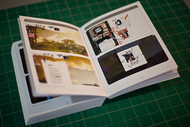
a while back we were asked by loft publications in barcelona, spain, to have some of our work featured in a web design handbook that they were putting together. the book is now out and available from amazon here.

a huge thanks to paz diman and all at loft publications for the invitation. we’re very honoured.

_category
blog, news, , ,

sonoio red_060211


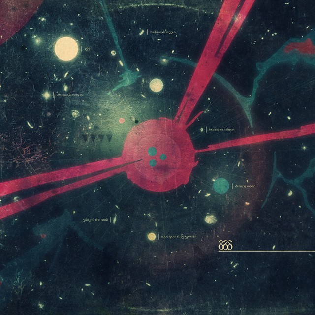
a couple months back alessandro cortini pushed the button on the sequel to his experimental synth project sonoio. he’d finished a rough version of the album and was keen to get some ideas for the artwork rolling. the first record’s aesthetic had been based around the colour blue, and we’d known for a while that this record was likely to be coloured, and called, red. in fact there was already a version of the album cover from the original design sessions that had been cast in red and he’d been using for his demo mp3s. however once we’d heard the record and fallen under its spell (it is even better than the original), we knew a new cover was needed. something that felt more involved, continued the abstract character based narrative of the first cover and took it into a new realm of introspection, if you will.

we’d also already developed the blue cover in a number of directions for the remix album that came soon after it, and so realized there was space there to keep telling the story in a fashion we felt true to the new material. it took a while to stumble across something that still felt immediately connected to the first cover, whilst offering a fresh angle on things. the resulting piece is of course deliberately open to interpretation, but features our white and black characters again, now in different circumstances and states of repair. we also started to pad out the design with more intricate textures and new colours, as the new album felt like a development and growth musically in such a way that the artwork had to follow suit.

then there’s this music video for enough, as seen at the top of this post.

for a long time my close friend and collaborator, the director / photographer?matt sundin, and i have been talking about making videos, and eventually films, together. in fact it was this desire that made the 65daysofstatic we were exploding anyway album cover turn out the way it did. so the moment alessandro proposed a video, i gave him a call and said ‘this is our chance’.

alessandro was considering making 2-3 of the new songs into videos and wanted our ideas for each. ultimately he felt that the ‘live performance’ pitch that we included was the one that felt truest to where he was with this project right now. so matt called his crew together and asked that i start to write down a list of ideas for shots for the video. so i took an evening, put the song on repeat and worked on shot ideas that i felt would embellish the music visually and give the production a quality that had some level of character. you know, above and beyond what you usually get with these things.

we then booked a studio in green point, brooklyn and alessandro flew out from LA. the next day we hit the ground running.

matt and his gaffer / assistant craig ward had pulled together some fantastic elements, including a wild array of lighting options and a carpenter to build a small but unusually surfaced stage for alessandro to perform on. we then painted everything else in the room black and setup our dolly / tracking rig. so far everything was going well, heck there were even 2 cats wandering around the studio which proved more than enough to keep alessandro entertained between takes.

the only sad moment was when the two vintage television sets that alessandro had used for his live performances in LA arrived via post all cracked and broken inside their box. we tried our best to make them work, but it wasn’t happening.

pushing on we proceeded to do take after take of alessandro performing the song from every angle we could, taking care to include shots with him not on the stage too for some fun and games later in the editing room. it was a pretty intense process but the footage was clearly looking solid from the outset. plus the more the song got played over the studio speakers the more everyone involved started to dance a bit too, and dancing never hurt anyone.

the shoot ended pretty late into the night and the studio owner offered to keep our stage setup for some cabaret / performance art style shoot he had going on later, involving strippers and wild animals. i could have mis-remembered that though. we then headed back to matt’s apartment for the wrap-party and alessandro headed back to LA the next day.

a week or two later the intense process of editing began. matt went through the footage and started pulling together the best stuff from the vast array of material we had. soon after that he was putting together a great rough cut of things and sent this to me so that i could cut together the teaser clip that went live a couple weeks ago. he then did another cut and passed it over to me again. we agreed that what there was already felt good and exciting, but tended to get a little tiring after a while, as it all had a very similar tone. so we consciously divided the song up into 4-5 parts and attempted to address each section with a different mindset, in terms of editing. i was then left to re-imagine the intro to the video and the electronic breakdown after the verses and choruses – the part with all the ‘oh oh ohs’. sending this back to matt lead us to more talks, further edits and the delivery of the first rough cut to alessandro.

alessandro was very excited by what we gave him and made a series of notes regarding various tonal changes he was after and what he felt, due to the nature of where his head was at with the song, needed adjusting in terms of shots used for certain lyrics. in this way several cuts were sent back and forth between new york and los angeles and then just last sunday we got a thumbs up from alessandro. matt then sat down and worked his magic on the footage, grading it to give it the warm, grainy, contrasty feel you see in the final cut. it was that final lick of varnish that properly started to give us the shivers. the thing was done, we were flat out of time and there was nothing we could do but send it off.

none of us could be happier with the response to the video. you just never know if you’re going insane in that editing suite. many days in the dark with breaks at strange hours for food or beer, and then back into the darkness. hearing the song a thousand times over to the point where it’s just noises and everything in your head is tied to its ebb and flow. it gets a bit bewildering. so much so that at one point we did an edit of the video laced with eerie footage of cats that we’d shot at matt’s girlfriend’s apartment nearby. inspired as we were by the cats that had been on set throughout the shoot, and often leapt onto the stage right into the shot. of course the ‘cat cut’ really didn’t work but we felt we had to try everything just to be sure, haha. ?so yeah, thanks and thanks again.

the sonoio project is going from strength to strength at this point and we’re very fortunate and grateful to be a part of it.

_category
blog, grafiks, news, video, , , , , , , , , , , , , , , , ,

caspar vs. IFP_052511


thanks to the ladies and gents at topspin, we were asked to do a talk at the IFP independent filmmaker labs last week because of our work on tronsoundtrack.com. on thursday morning i spoke to a room full of documentary film makers hoping to find their way in the online world now that their various projects were nearing completion and needed some kind of apt promotion.

the talk went extremely well, which is surprising given it was literally the first thing of this kind that we’ve ever done aside from giles’s PACA panel discussion back in ’08. we’d like to thank rose vincelli and jonathan reiss for considering us for the task and for making us feel so welcome throughout the process. it’s looking like we’ll be doing more of these talks in future now that we’ve gotten a feel for it. we’ll try and post on twitter or similar when such things are about to occur. you know, should you want to come say hi or whatever.

i’d also very much like to add that i had no idea who jonathan reiss was when i met him over email, in person or when he introduced my talk. i mean i thought his name seemed familiar, but i never would have guessed this was the same jonathan reiss who’s work i have been in awe of for years. you see this is the man who directed the famously ‘banned’ happiness in slavery video for nine inch nails. a video that literally changed the lives of my friends and i when we first saw it in the 90s. few music videos come close to it in terms of sheer power, brutality and brilliance. suffice to say i thanked him not just for myself but for all the people out there who i know would want me to do the same, given half a chance.

you can view the filmmaker labs press release?here.

_category
blog, news, , , , , , ,

sonoio red
teaser video_051611


this is something new we’ve been working on with SONOIO. stay tuned.

_category
grafiks, news, video, , , ,

war widow_051111


if you’ve ever heard their cover of cheap trick’s song he’s a whore, you’ll know that both big black delta and war widow are bands to keep an eye on. both new, both from LA and both with singers called jon. now whilst we’ve been working with big black delta for some time now, war widow are pretty new to us. both bands share the same record label – coming home records – who have handled not just releases from a large amount of nine inch nails alumni, but of course also the magnificent mellowdrone. it was through coming home records that we got wind of some of the new tracks by war widow. the label’s boss erik andrews posted a couple of tracks on soundcloud one morning and i joined the others on twitter who follow the label’s feed, and gave them a listen over a hot cup of coffee.

tear it up (above) is the track that immediately grabbed me. the first thing that struck me was the dirgey feel of it. then when the dark + seedy lyrics filled my ears i started getting a range of very particular images dancing around in my brain. so i immediately looked to see if any artwork had been announced for this release. sure enough they had a record cover on their website. it was of a cat snarling. rich colours. very vibrant. it was tough, but it didn’t seem to mesh with the music i was hearing. so i quickly fired off an email to erik and asked if the artwork had been printed yet. he said it hadn’t. i then started ripping through various photographs i had lying around on hard drives and bookmarked on various sites, trying to find things that seemed to fit the music. i then put together a few designs using the bands logo and some of these images, and fired it off as quick as i could to erik. he amazingly passed them right onto the band and just moments later i got news that they were into trying a new cover and wanted to know what else we had up our sleeves.

i then emailed two people. first my friend?matt sundin, who took the photographs for the 65daysofstatic album cover,?we were exploding anyway. i briefed him quickly on the sorta images i was after and asked him if he had anything lying around. i then reached out across oceans into distant lands i’d never set foot in and contacted a ukrainian photographer who’s flickr account i’d been obsessed with for some time now. i felt his photos were utterly perfect for this and had in fact used some of them in the initial comps i sent to the band. this guy’s name is alex alekseenko, and you can see more of his work here.

knowing both would need some time i then told the band i’d need a day or so to pull things together and if they could hold off the printing presses for a moment, it’d be worth their while. they were cool with this.

the next morning i was elated to find an email from alex in my inbox. turns out he was 100% down with us using one of his photos for a record cover, particularly for a rock band. he himself was a collector of many records and was very excited at the prospect of having some of his work used in such a fashion. similarly matt also got back to me with a few shots of his own that he felt stepped into the murky conceptual arena i was after with this.

the images then started to speak for themselves. certain images coupled very well with others and those that didn’t lead me to ask if they could delve deeper – send me anything. i wanted them to send me the stuff they might even be scared to send through, because of the content of them. needless to say but we were all excited and definitely beginning to get that feeling again. that feeling that made you remember why you do this damn thing for a living.

pretty soon it was done. round 2 was off to the band and we were checking our emails regularly for anything back from them.

the band got back to us after a few days. they’d made a decision. they wanted the image you see above for the cover, and the image you see below for the backcover. we then started about ‘finishing up’ the design, which of course involved making it feel like you’d find the record in the damp corner of someone’s basement in the middle of nowhere.

if you’re into hearing the record, needless to say we highly recommend it. it will be out on 12 inch vinyl and was produced by none other than jonathan bates of big black delta. you can grab another song from the record from the band’s site here, or from the label’s site here.

we hope you enjoy it and that the artwork in some way helps you get deeper into the music.

_category
blog, grafiks, news, , , , , , , , , , , ,

tron soundtrack
javascript site of the month in .net magazine_032911


we’ve just had it confirmed that the site we did for daft punk’s TRON: legacy score, tronsoundtrack.com, was javascript site of the month in the january issue of .net magazine. click here to read the full PDF including a short interview with us about the making of the site. huge thanks again to remy sharp, mr doob, topspin and disney for the hook-up!

_category
blog, code, news, , , , , , , , , , , ,

another (version) of the truth_011811

screenshot

it’s been about 4 years since we changed the way we present ourselves to people. it’s never been a huge deal to us, given we’ve never been hugely attracted to the idea of brands, fixed identities and the overall corporate approach to a company’s ‘personality’. in fact this time around we’ve dropped our previous ‘graphic’ logo, preferring instead to simply type our (v) out and produce a variation on it that echoes the kaomoji anime style emoticons, (v_i)

beyond this there are basically three key elements that governed this redesign. the first part was some kind of old library catagorization card that we found a scan of online.

library card scan

for whatever reason the raw simplicity of it matched our desire to build a site that was stripped right down to the bare essentials. our portfolio was now strong enough to speak for itself, and some basic lettering on a paper surface like this made a lot of sense to us.

the second key part of the redesign came to us when designing our new business cards. our local printhouse cut us a deal for some super heavy stock letterpressed cards, so long as we limited ourselves to using one colour on one side. turning this to our advantage we created a design based on the black spot from treasure island. it tickled us to think that anyone we gave our card to might be considered guilty, or that their time for judgement has come.

the third part was this beautiful old japanese poster, again found online, that for one reason or another had haunted us. if anyone knows where we can get a copy of this poster, or even a higher resolution image of it, we’d be hugely grateful.

everything else you experience throughout the site are elements of our own creation or recreated from design blogs and experimental code projects around the internet. as stated before, the site is intended to take very much a back-seat to our work so it’s almost an exercise in harmonies rather than a lead melody of any sort.

we hope you find it non-intrusive when looking at our work, but also complimentary to the work.

_category
blog, grafiks, , , , , , , , , ,

65daysofstatic.com
& the japanese EP_121810


65daysofstatic.com is one of those sites where the work on it is continuous and so we’re never sure when to stop for a second and make a record of our progress. fans of the band will know that major redevelopments began back with the release of their last full length studio album, and that it’s taken on 2-3 guises since then.

based primarily around the original wordpress foundations that the band laid themselves back with the release of one time for all time (their second studio album), the open-ended nature of that fantastic (and free) platform has meant we can keep reskinning, redesigning and evolving the site whilst keeping the core database.

the latest version of the 65 site is more of a hub that incorporates not only their blog, tour dates and forum, but also their twitter, flickr, soundcloud and vimeo feeds. the design is of course based around their new album’s rather?fotografik aesthetic and was intended to allow the band a freedom from making multiple updates across their various outlets, and give fans a one stop shop for all information about the band.

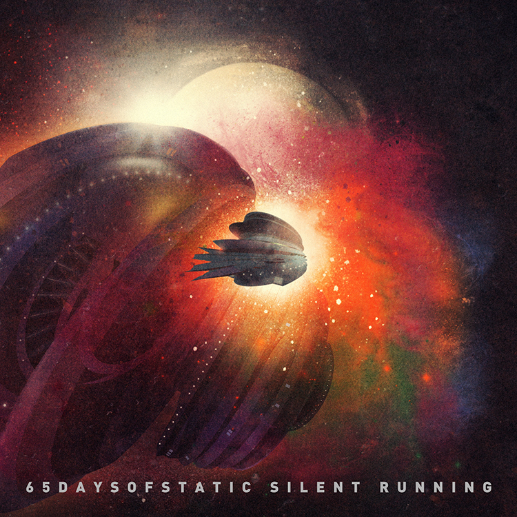
in other news, with the japanese heavy sky EP tour on the horizon and a special edition of the EP in the works, we got talking to the band about a possible variation on the established cover design. after some deliberation we agreed that a design that felt more in sync with the japanese release of their single?weak4 would be appropriate. keen to explore that release’s more geometric artwork styling, we set about developing a design that echoed the original EP photography whilst exploring the implications of the EP’s title further. the resulting cover (above) was inspired in part by a series of early drawings and paintings by the artist thomas newbolt.

_category
blog, code, grafiks, news, , , , , , , , , , ,

love & glamour honours_102710


we just found out that our website for jennifer lopez’s love & glamour fragrance entered at number 14 in the design charts last week, and subsequently rose to number 12 this week.

once again, a huge thanks to all involved in making the site.

_category
blog, news, , , ,

65daysofstatic
heavy sky EP_102610


65daysofstatic’s heavy sky EP pretty much has to be heard to be believed. it’s a collection of songs that for one reason or another just didn’t make the cut for we were exploding anyway, their last album. perhaps its most intriguing quality is its slightly erratic nature, in terms of sounds and styles. in and of itself this is nothing new for an EP, however when it arrives after an LP in this fashion, it offers an exciting insight into the band’s thought process when they made that album – sonic directions that for one reason or another they didn’t pursue.

therefore our task this time around was to create a sleeve that echoed the artwork of the album, but that had a more abstracted, less direct narrative. as such we kept the same design template as before, but looked into an entirely different style of photography. one that was more transient, and that focussed more on mood and ambience.

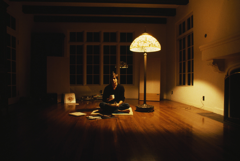
after sifting through 50 odd photographs we’d taken that echoed this sentiment, we put together a sleeve design that had this texas chainsaw massacre / halloween type vibe about the setting. which isn’t to say it was about horror, but looking at it now it certainly has a darker, almost voyeuristic tone to its domestic leanings. a tone that is of course balanced by the record’s title and the warm, evening glow that permeates through each photograph.

you can download a track from the EP for free here:

65daysofstatic.com

_category
blog, grafiks, news, , , , , ,