65daysofstatic.com
& the japanese EP_121810

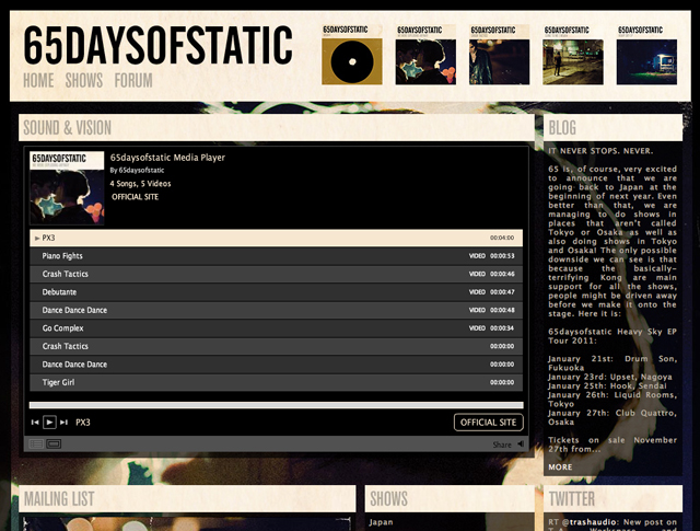
65daysofstatic.com is one of those sites where the work on it is continuous and so we’re never sure when to stop for a second and make a record of our progress. fans of the band will know that major redevelopments began back with the release of their last full length studio album, and that it’s taken on 2-3 guises since then.
based primarily around the original wordpress foundations that the band laid themselves back with the release of one time for all time (their second studio album), the open-ended nature of that fantastic (and free) platform has meant we can keep reskinning, redesigning and evolving the site whilst keeping the core database.
the latest version of the 65 site is more of a hub that incorporates not only their blog, tour dates and forum, but also their twitter, flickr, soundcloud and vimeo feeds. the design is of course based around their new album’s rather?fotografik aesthetic and was intended to allow the band a freedom from making multiple updates across their various outlets, and give fans a one stop shop for all information about the band.

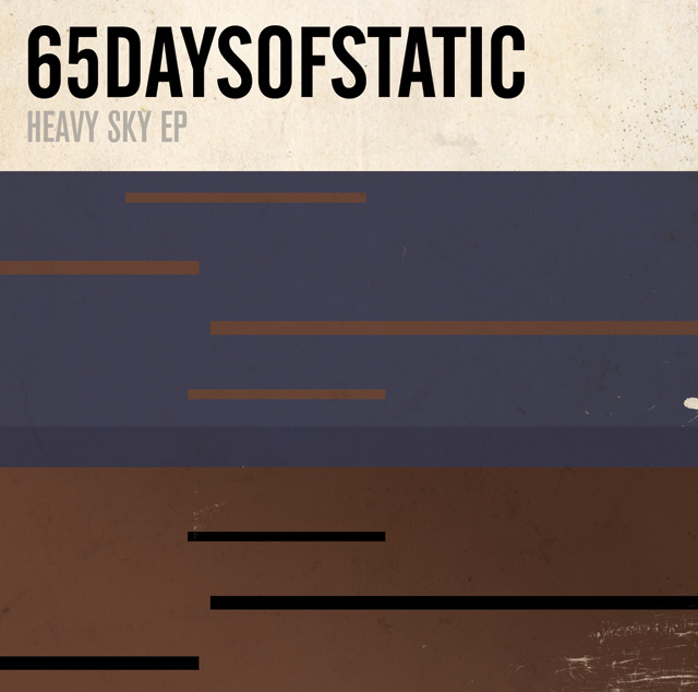
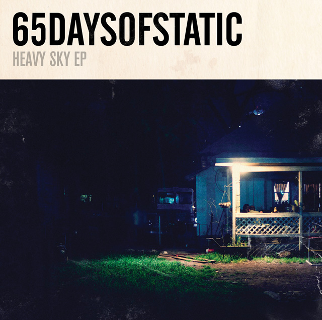
in other news, with the japanese heavy sky EP tour on the horizon and a special edition of the EP in the works, we got talking to the band about a possible variation on the established cover design. after some deliberation we agreed that a design that felt more in sync with the japanese release of their single?weak4 would be appropriate. keen to explore that release’s more geometric artwork styling, we set about developing a design that echoed the original EP photography whilst exploring the implications of the EP’s title further. the resulting cover (above) was inspired in part by a series of early drawings and paintings by the artist thomas newbolt.
