(v)
(v_i)
(version_industries)

the film stage, the best movie posters of 2020_122320


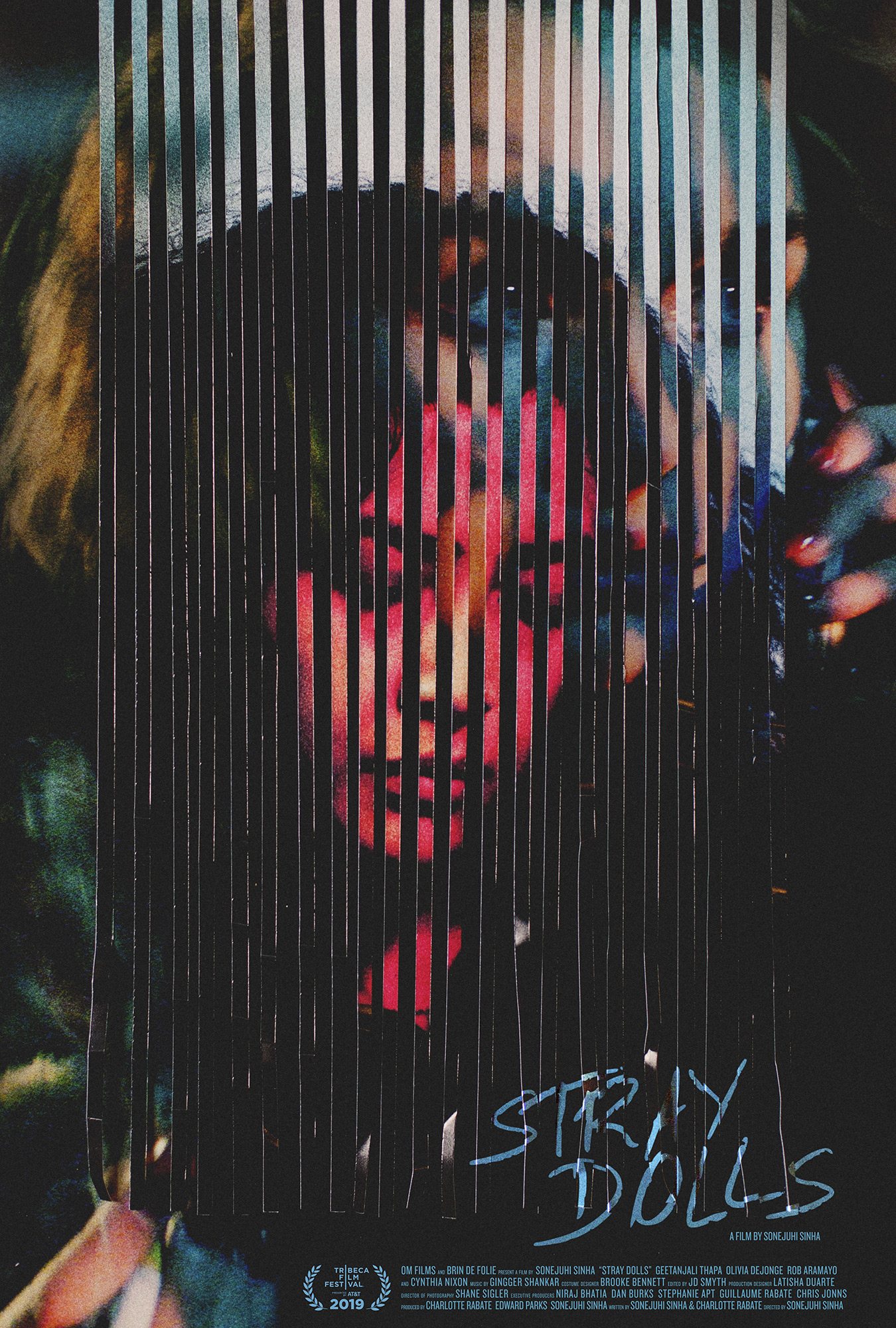
the film stage just selected caspar’s poster for sonejuhi sinha’s feature film, stray dolls, as their 4th best poster of 2020jared mobarek, writing for film stage, had the following to say about the poster:

Caspar Newbolt and (version_industries) take that sense of barrier through line work one step further to create a piece for Stray Dolls like only they can: dark, evocative, and eccentrically off-kilter in an almost discomforting way. Our vision is in constant flux like an optical illusion, shifting back and forth between the woman looking down on the page and the woman on the phone behind it. There’s a sense of before and after … or perhaps lost and found when you bring in the title. The red hue supplies connotations of danger that the cool blues beneath—via depth (the second face) and direction (the text)—contrast less with the promise of safety than the allure of mystery.

thank you jared and everyone at the film stage for this vote of confidence.

_category
blog, grafiks, news, , , , , , , , , , , , , , , ,

indie memphis film festival, best poster design award_102920


the poster caspar made for elegance bratton’s documentary pier kids just won the best poster award at the 2020 indie memphis film festival. a huge thank you to all involved.

_category
grafiks, news, , , , ,

criterion collection, saul bass interview_050820


today marks the 100th anniversay of the birth of saul bass, whom in our book is one of the greatest graphic designers there’s been yet. to celebrate this day criterion collection—amongst other things—interviewed a few living title designers about the impact saul bass has had on their work. caspar was included in the selection and wrote about saul and his wife elaine’s work on the west side story title sequence. here is an excerpt from what caspar had to say:

“Around that time, I attended an exhibition of his work in London and heard a recording of Bass talking about an argument he’d had with Otto Preminger while creating the title sequence for The Man with the Golden Arm. It was from hearing about that particular fight that I started to learn about the nature of good collaboration in graphic design, and also about how much can be said with so little material.”

and here’s another:

“The part of this sequence that means the most to me is where Saul and Elaine wrote their initials into the graffiti on the background wall not once, not twice, but three times. At least one of those times, their initials are written inside a heart. For me, it’s this desire to include personal touches like this that often makes good work exceptional. Their joy and their care for what they did is present from start to finish, to the point where they’ve included a piece of their personal lives within it.

As a graphic designer and filmmaker, I’ve always had the goal to not only make everything I do by hand (even the typography) but to film live-action title sequences when possible. That requires immense trust from the directors and producers.”

a huge thank you to hillary weston, andrew chan and all at criterion.

_category
grafiks, news, , , , , , , ,