call girl_031114
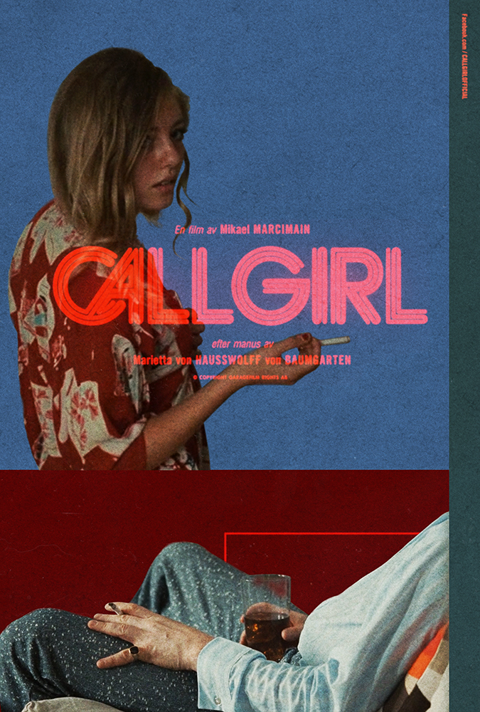
in the last days of 2013 whilst on a longish trip back to england, i sat down with my brother to watch a film called call girl. we didn’t know anything about it – in fact i’d picked it up because i liked the typography used for the film’s logo. it was close to midnight, we filled our whiskey glasses and slung the disc into the playstation. i said one word during the entire viewing. in fact i said that one word twice. the word was ‘fuck.’
call girl came out in 2012. it’s basically unheard of here in the US, and even harder to get a physical copy of. heck it was tough enough to find a pressing of the soundtrack that anyone would ship to england, let alone new york. whether this is to do with the controversy that surrounds the film, or simply because for some reason it failed to pickup a good distribution deal, is unclear.
call girl documents a political catastrophe in the 1970s that is still such a sore matter for those involved in sweden, that the film had to be heavily edited after it’s festival screenings in order for it to make the public domain. without going into the story, i’ll add that it’s one of the most beautifully written, shot, edited, scored, acted and packaged films i’ve seen in a long time. after watching it i immediately picked up a copy for a friend in england, and have since screened my copy for as many friends as i can in new york.
soon after returning from england i began to steal an hour here or there amongst my regular projects, to piece together notes, take screen snapshots and cut together various layouts. a day or so ago a much larger film related project landed – one that would truly require every second i had left in each day – and i had to save the files, export them and put this particular aside to rest.
there’s no real need to go into why the posters turned out the way they did, but they certainly follow my long-running ethos that the artwork supporting a film or record should in every capacity echo the tone, message and overall aesthetic value of that work. i hope you enjoy each of the 10 editions i’ve put together in different ways, and ultimately take the time to see the film (and buy the soundtrack) as soon as you can.
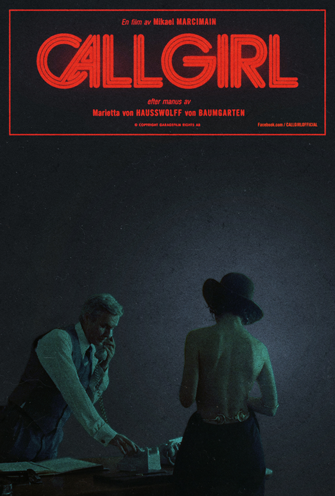
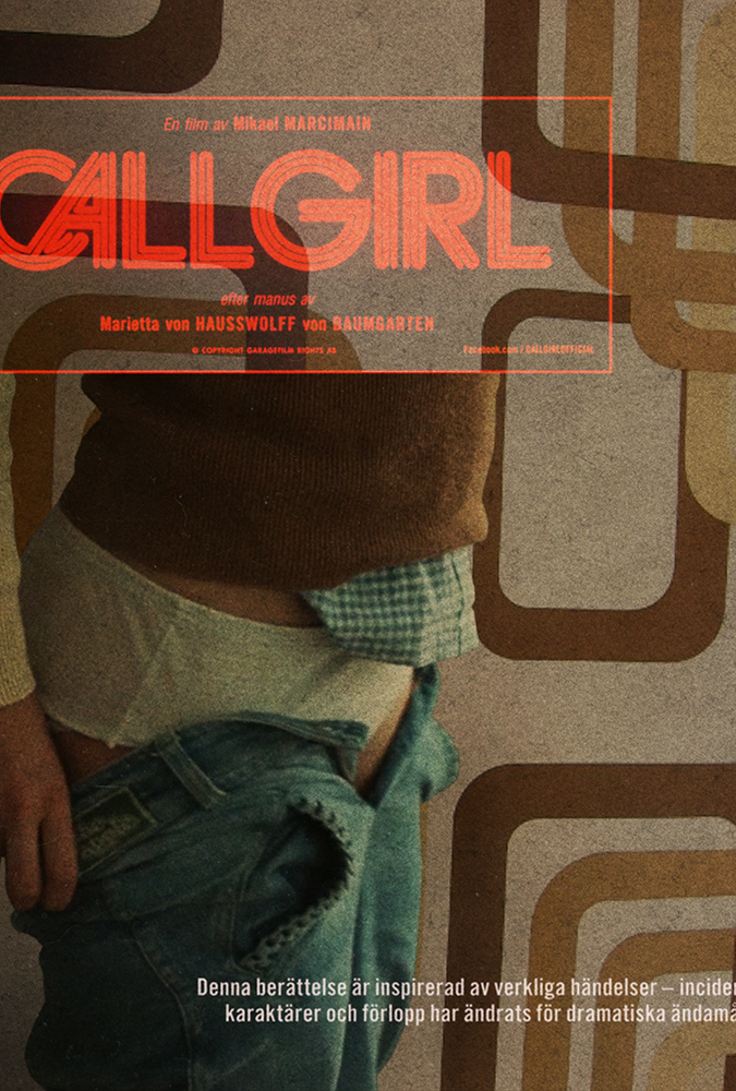
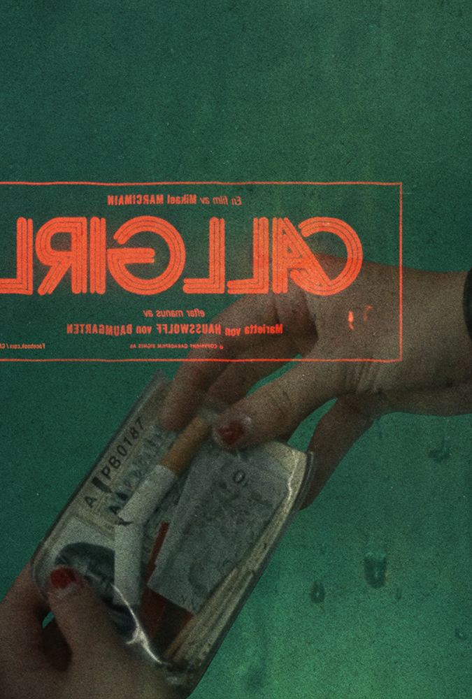
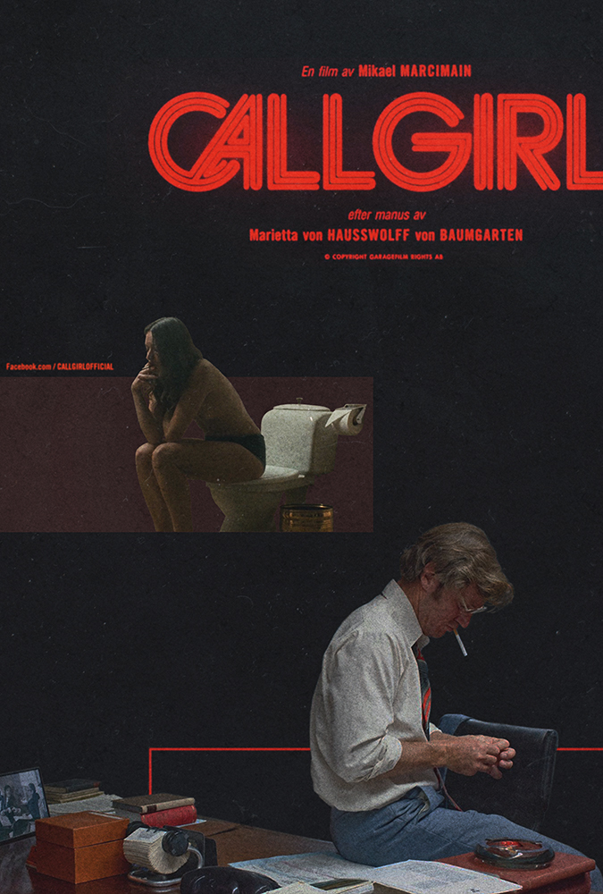
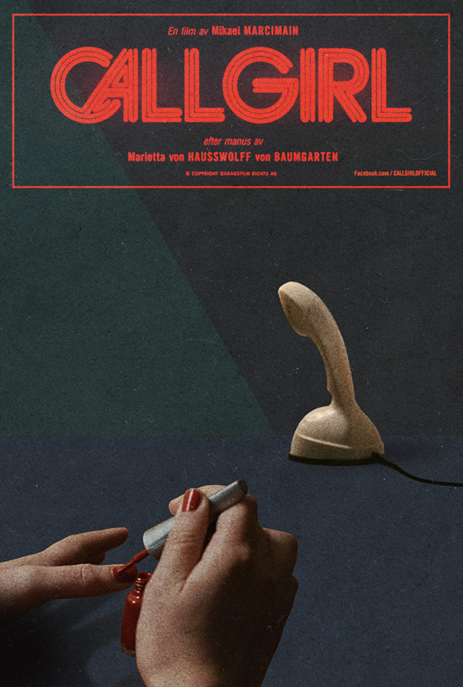
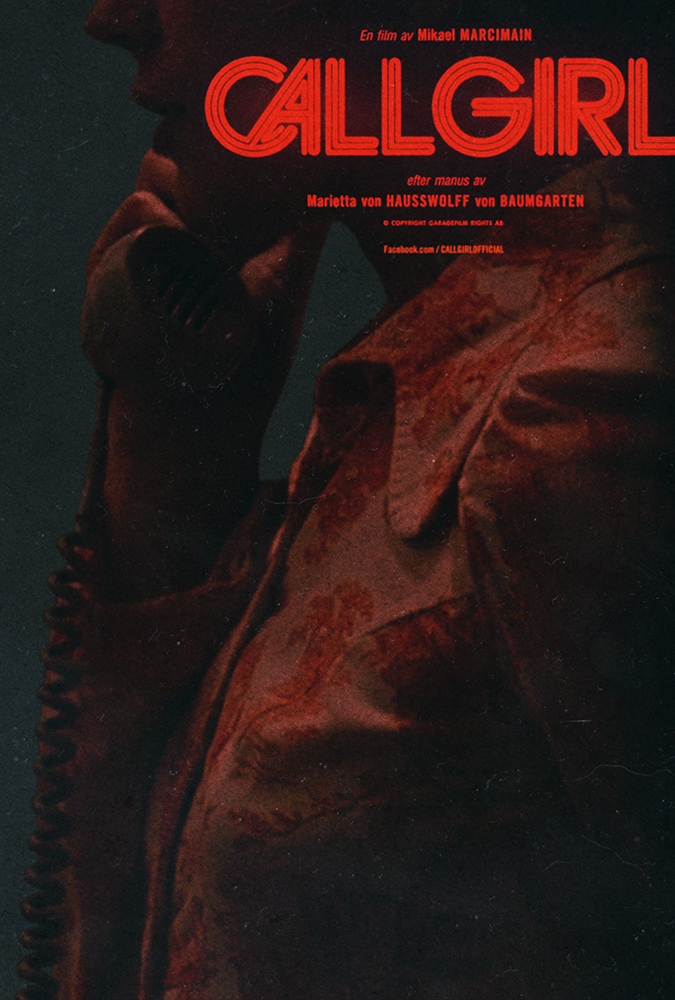
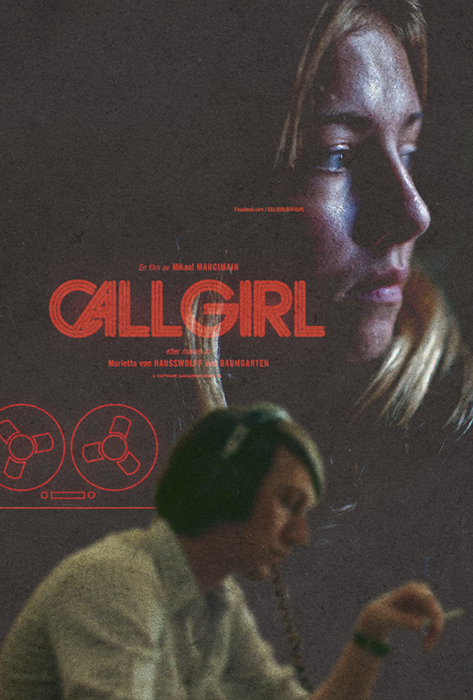
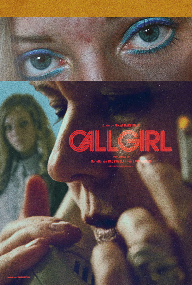
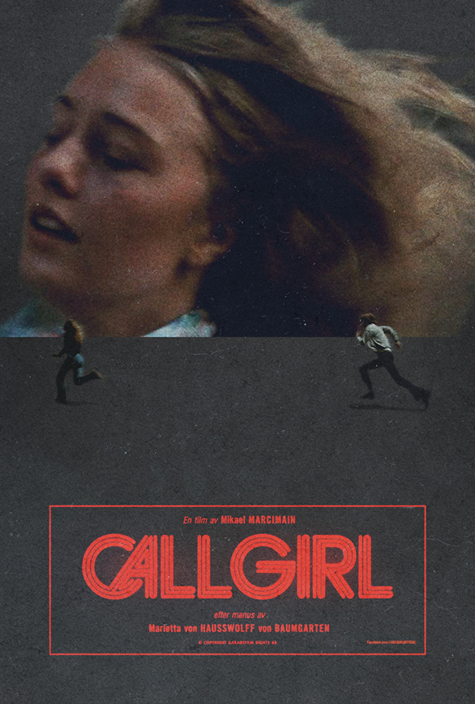
my gratitude to daniel carlsten who’s typographic work on the film drew me to it. my congratulations to mikael marcimain for such masterful directing, to hoyte van hoytema (let the right one in) for a level of cinematography the likes of which i wish every film could be blessed with, and lastly to mattias bärjed for an incendiary soundtrack. one i am still trying to get on vinyl.
for more information about the film click here.
cheers.