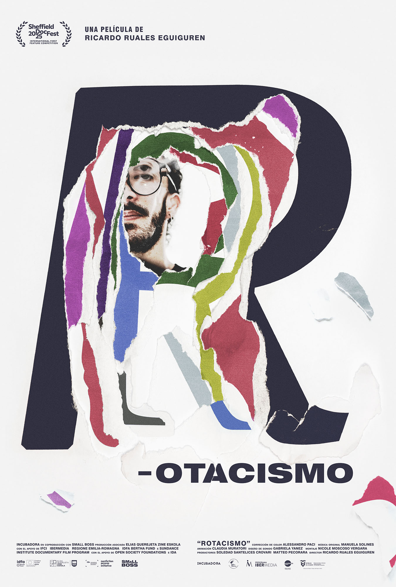
(v)
(v_i)
(version_industries)

Recent Work
_what
poster for the feature documentary, rotacismo.
_how
director ricardo ruales eguiguren reached out after finding our work through a google search. he was finishing work on his debut feature film, an experimental documentary about himself and his family, and wanted a poster for it. the film is called rotacismo, in spanish, and "the broken R" in english. 

ricardo was born with treacher collins syndrome and with it—amongst other things—came an inability for him to pronounce the letter R. this meant he could not at first even pronounce his own name. the film explores how this idea became emblematic for his relationship with his parents. it reveals how that in learning to say his own name, and in pointing the camera at himself and his family, he fought back against their inability to talk about any of this with him.

caspar watched the film and was immediately taken by the layered emotional complexity of the work. in talking to ricardo it was clear that making the film was not just a process of self confrontation and realization, but also a process of finally and successfully communicating the level of his suffering to his inattentive parents.

caspar presented a series of potential directions the poster could take, and ricardo chose the one you see here. the poster was then made in the berlin studio using a various typefaces, a printer, lots of paper, a camera and natural light. the resulting collage is an attempt to talk both about learning to pronounce the letter R and about how this process started a deeper journey into obtaining a clearer picture of himself in the eyes of his parents.

the photograph of ricardo used in the poster was taken by the film's editor nicole moscoso. it was created specifically for the piece by using a beveled mirror.

the film was selected to play at sheffield docfest whilst we were making the poster. you can watch a trailer for it here. if you have the chance do please see this searing, brave and original film. 
_link
imdb.com/title/tt36870646
_tags
_what
poster for the short film, rentboy.
_how
hannah swayze and daniel contaldo of ataria pictures reached out and introduced us to writer / director trey chapman. trey had just finished work on a short film called rent boy, which daniel had also been the cinematographer on.

we dug the movie and talked to trey about his intentions with the work and how he'd like to talk about it in poster form. caspar then sent trey a series of ideas, and trey chose the one you see here.

the film is about a young sex worker who—anxious about not having enough money to persue his career as a concert pianist—violates a client’s privacy, triggering unexpected consequences. 

the poster tries to capture the sexualized surveillance aspect of the film. it's also a nod to certain key lines of dialogue in the film's denouement. caspar made it in berlin using a printer, a sheet of white metal, some water, a sponge, plenty of sunlight and a camera.

the film will have its world premiere at palm springs short fest this month.
_link
imdb.com/title/tt30875240
_tags
_what
typography and title design for the nashville-based band, the protomen.
_how
the protomen wanted to announce that some new things were on their way this year, and approached joey ciccoline and caspar with their vision for a new clip.

caspar and the protomen had been continuing their work to refine the band's new logo and—alongside a fragment of some of the band's new music—this felt like a good time to reveal the work so far.

you can watch the clip here
_link
instagram.com/p/DKF9-ozymeR
_tags