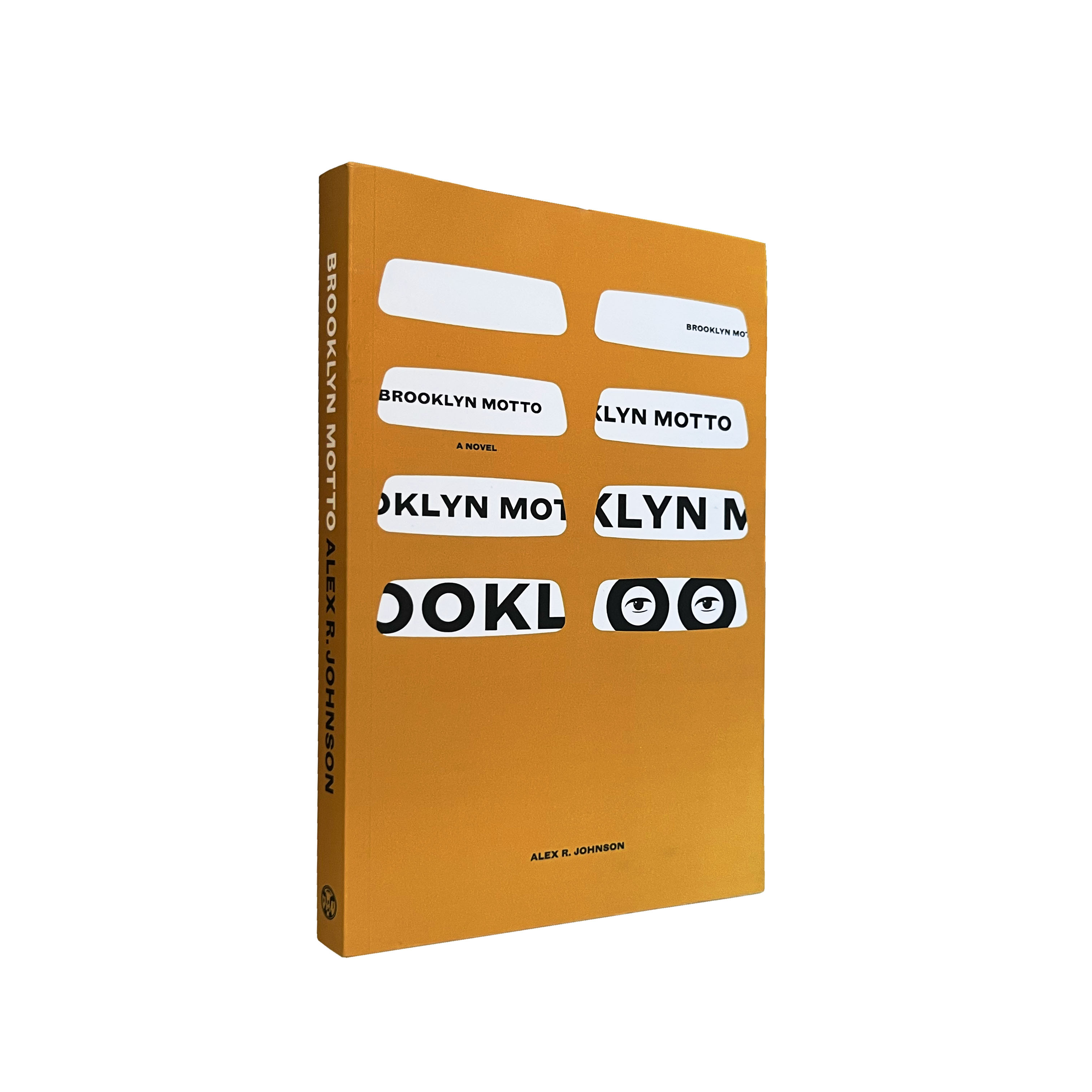
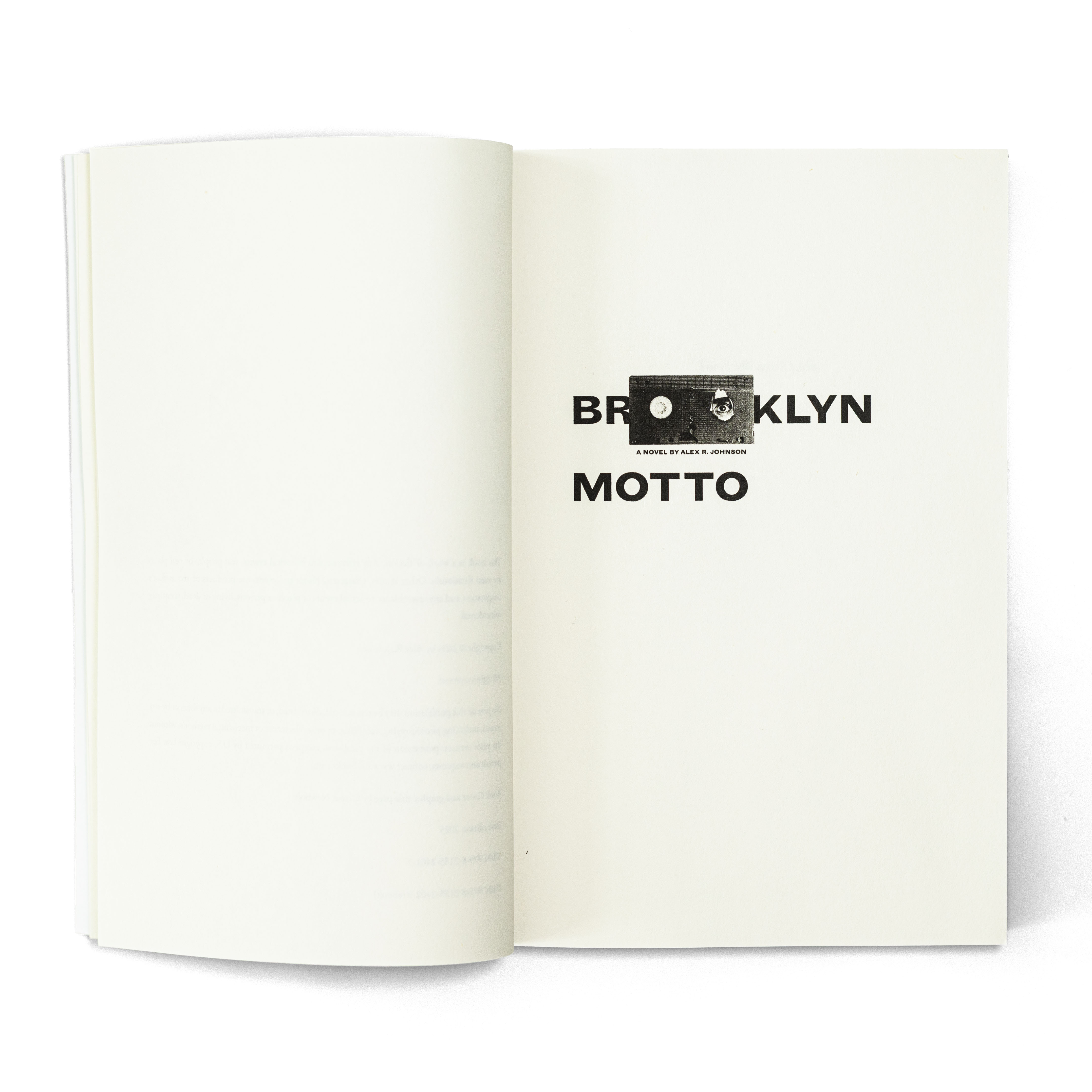
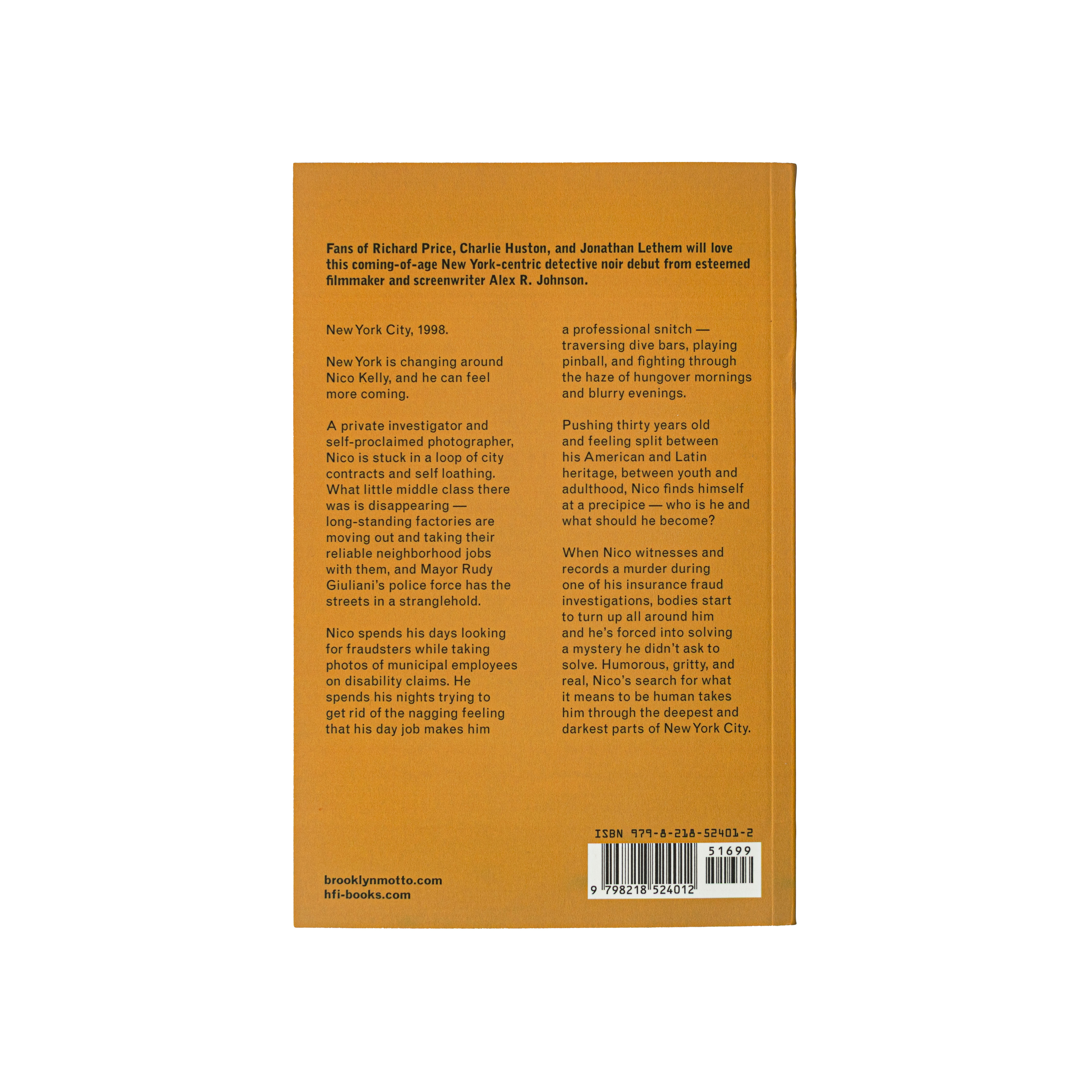
(v)
(v_i)
(version_industries)

book
cover
_what
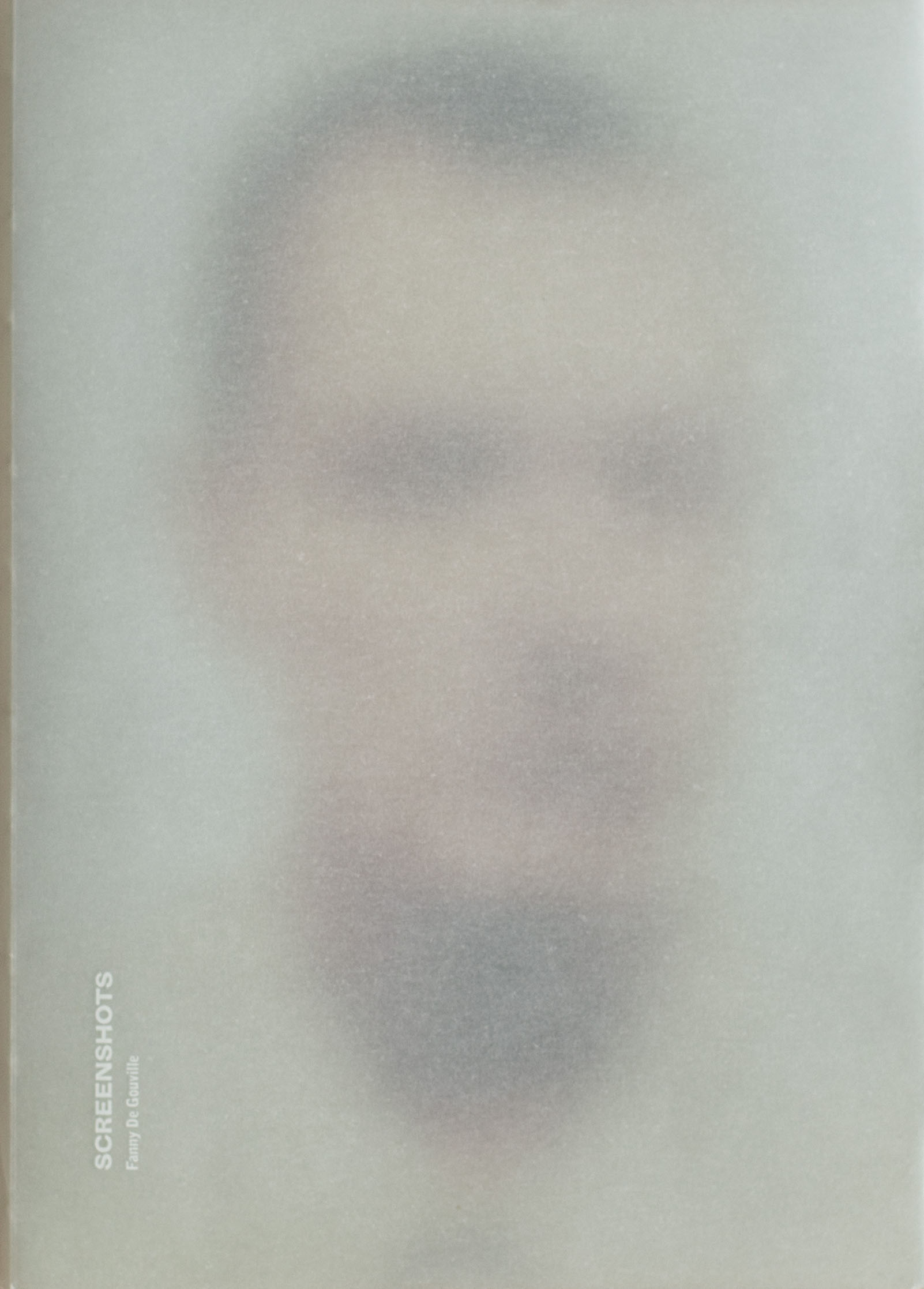
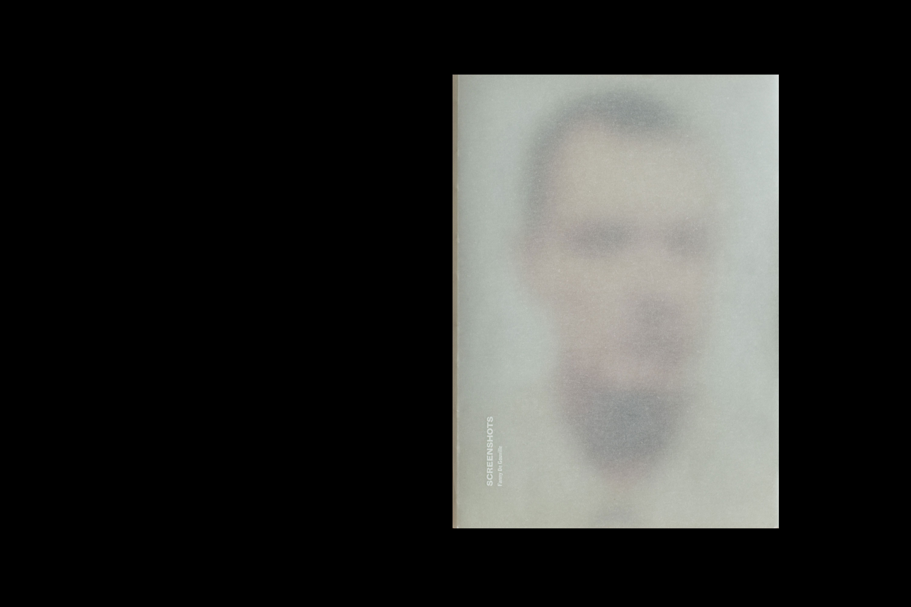
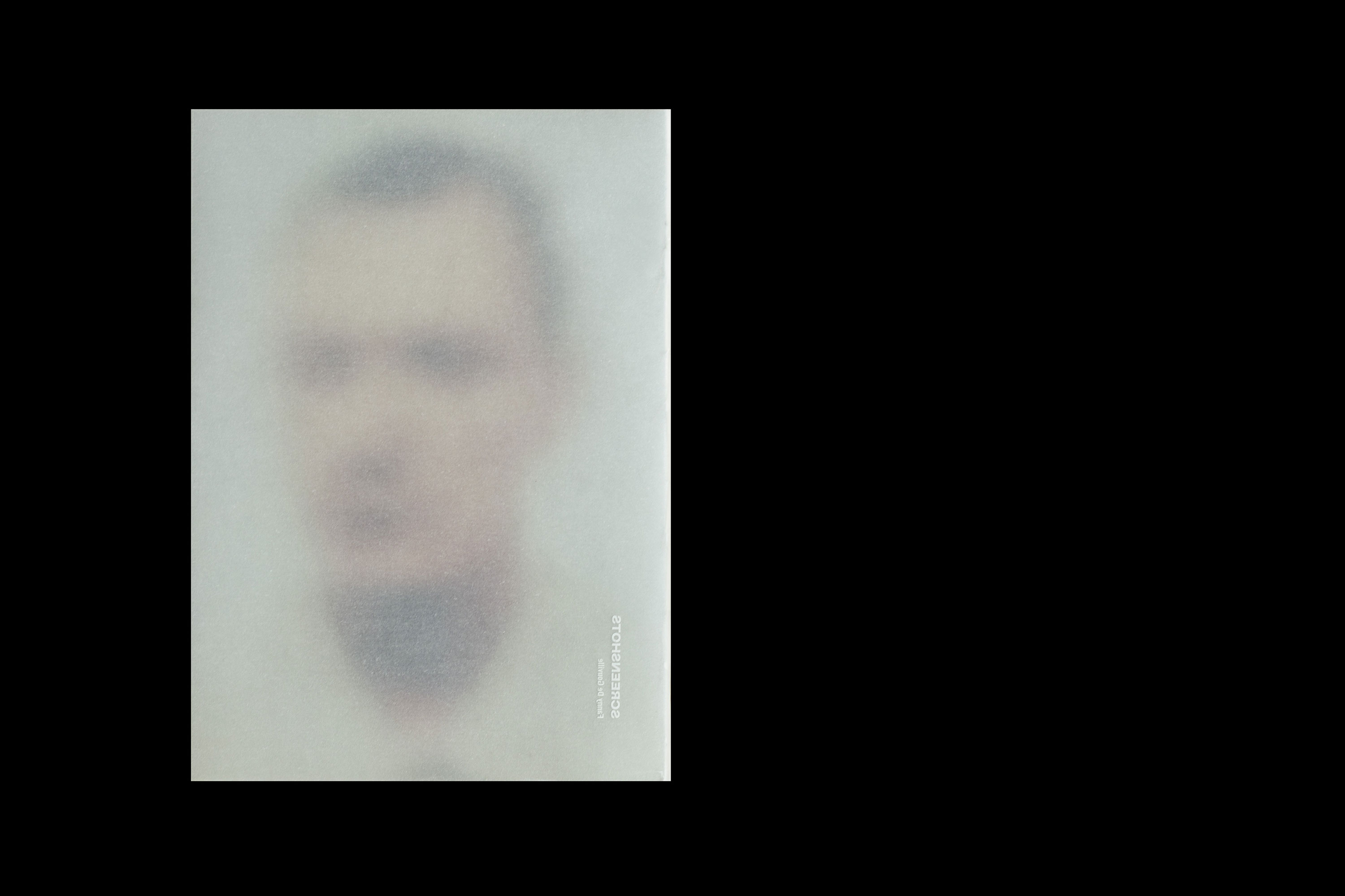
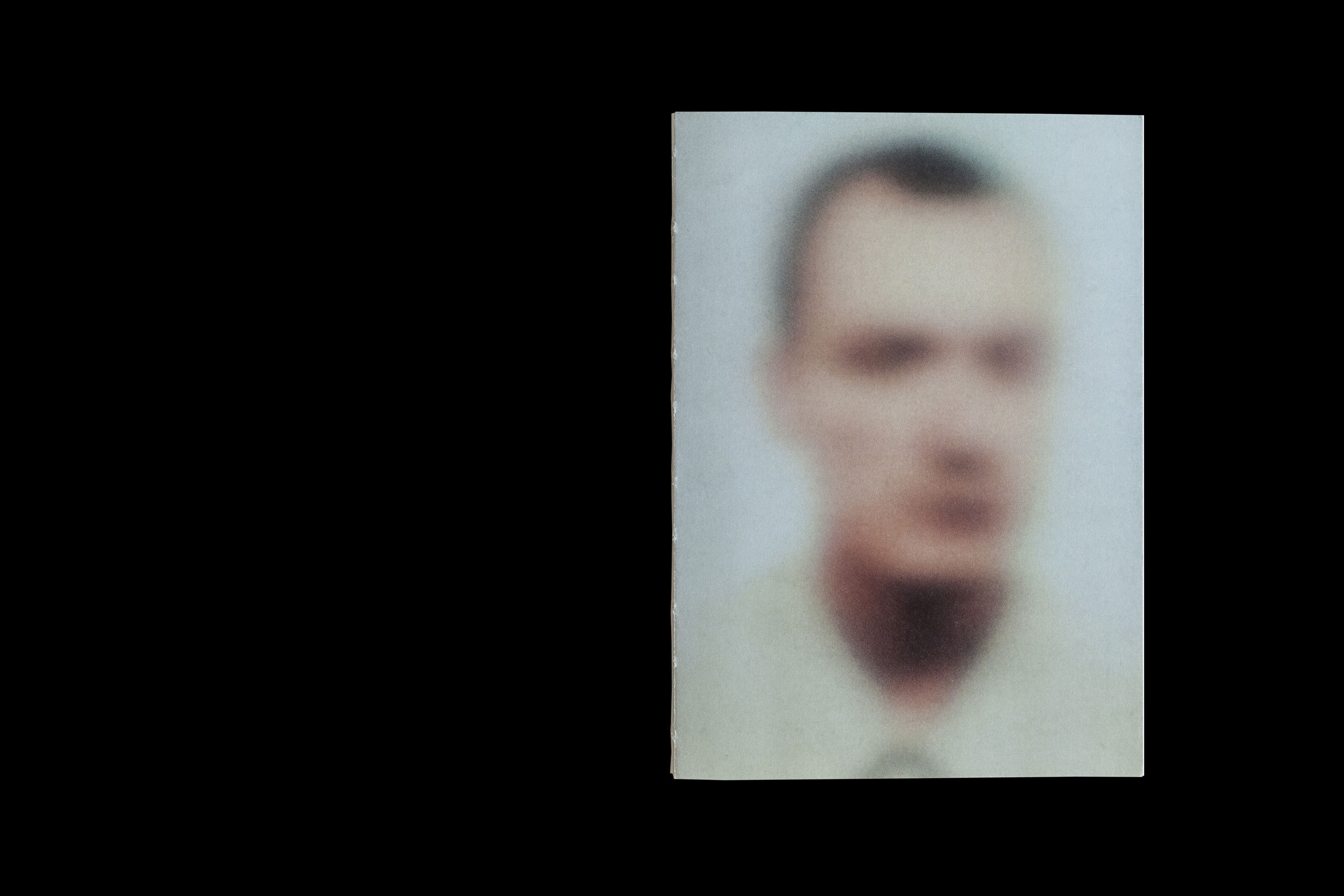
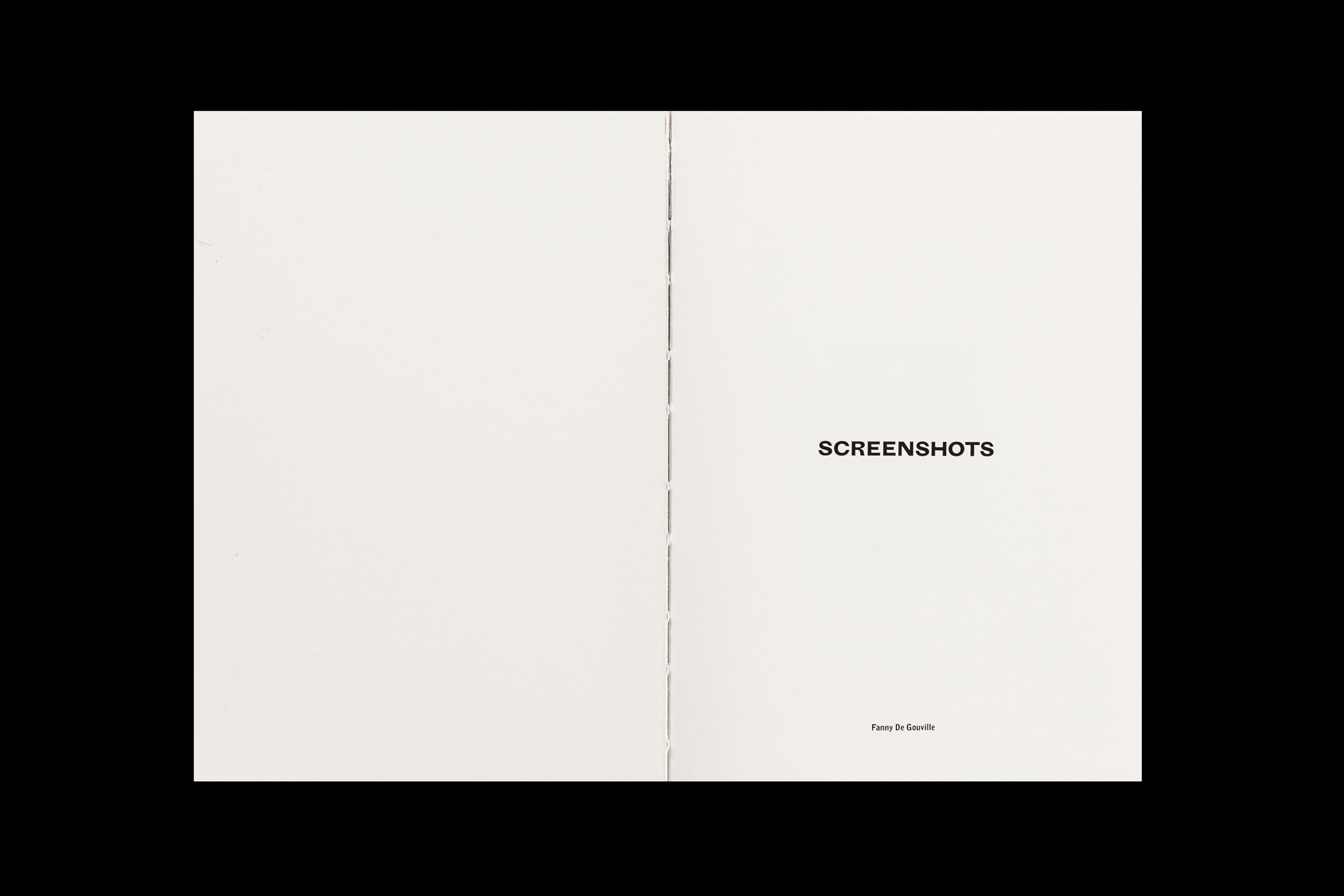
book design for the paris-based photographer, fanny de gouville.
_how
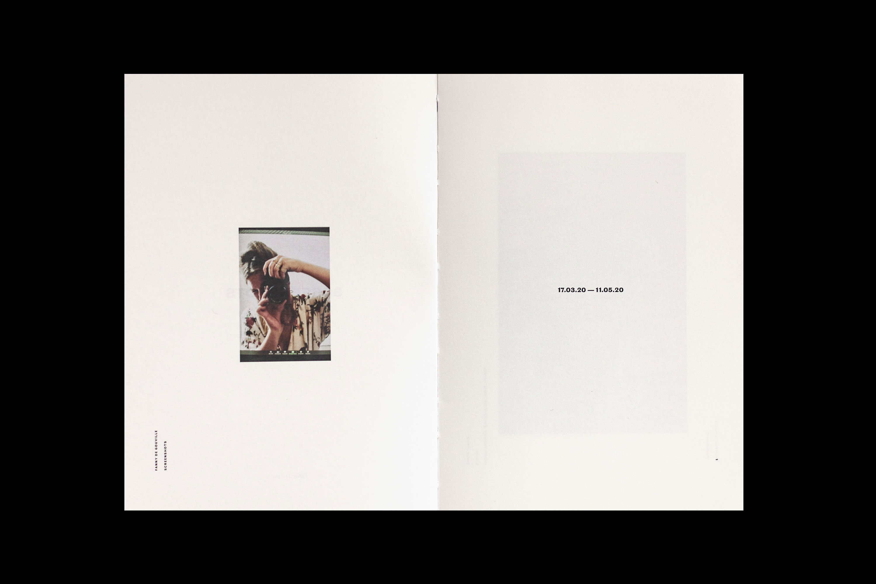
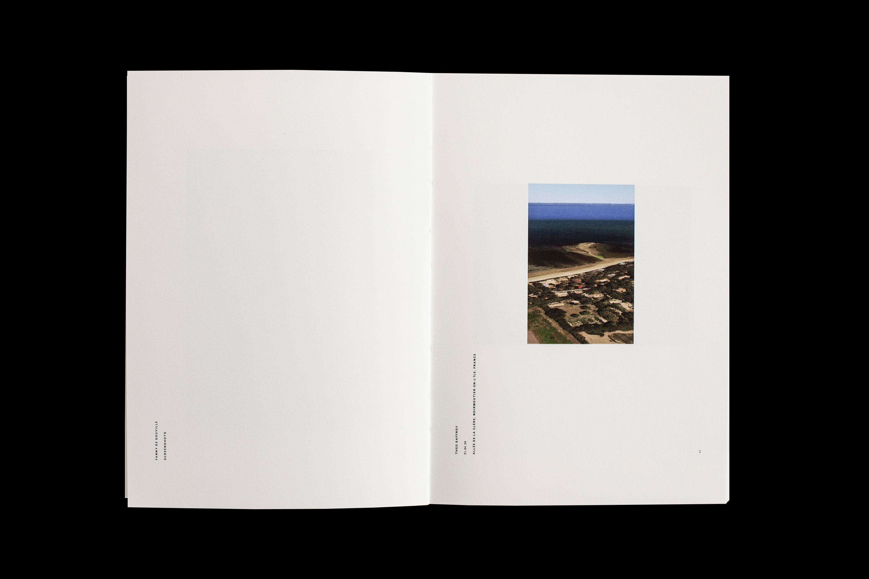
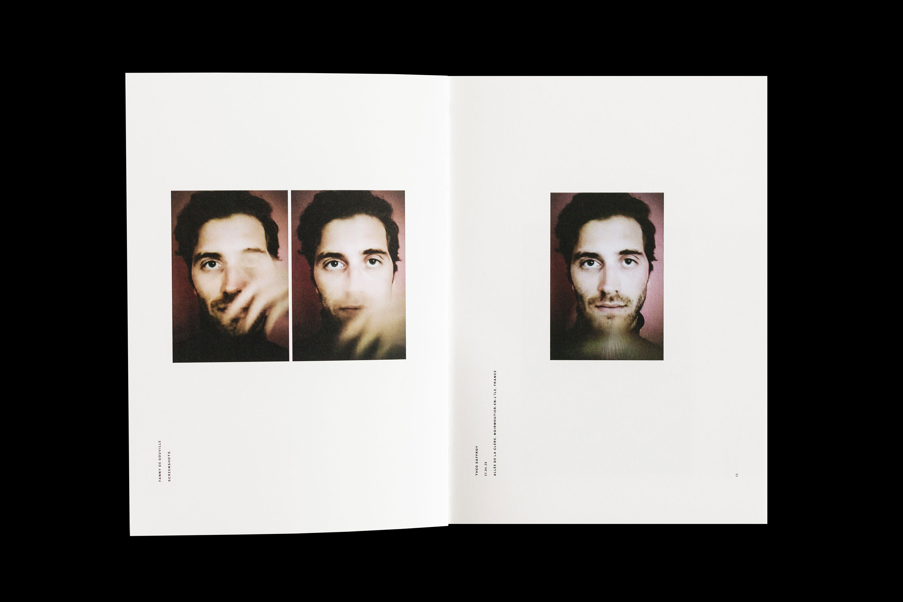
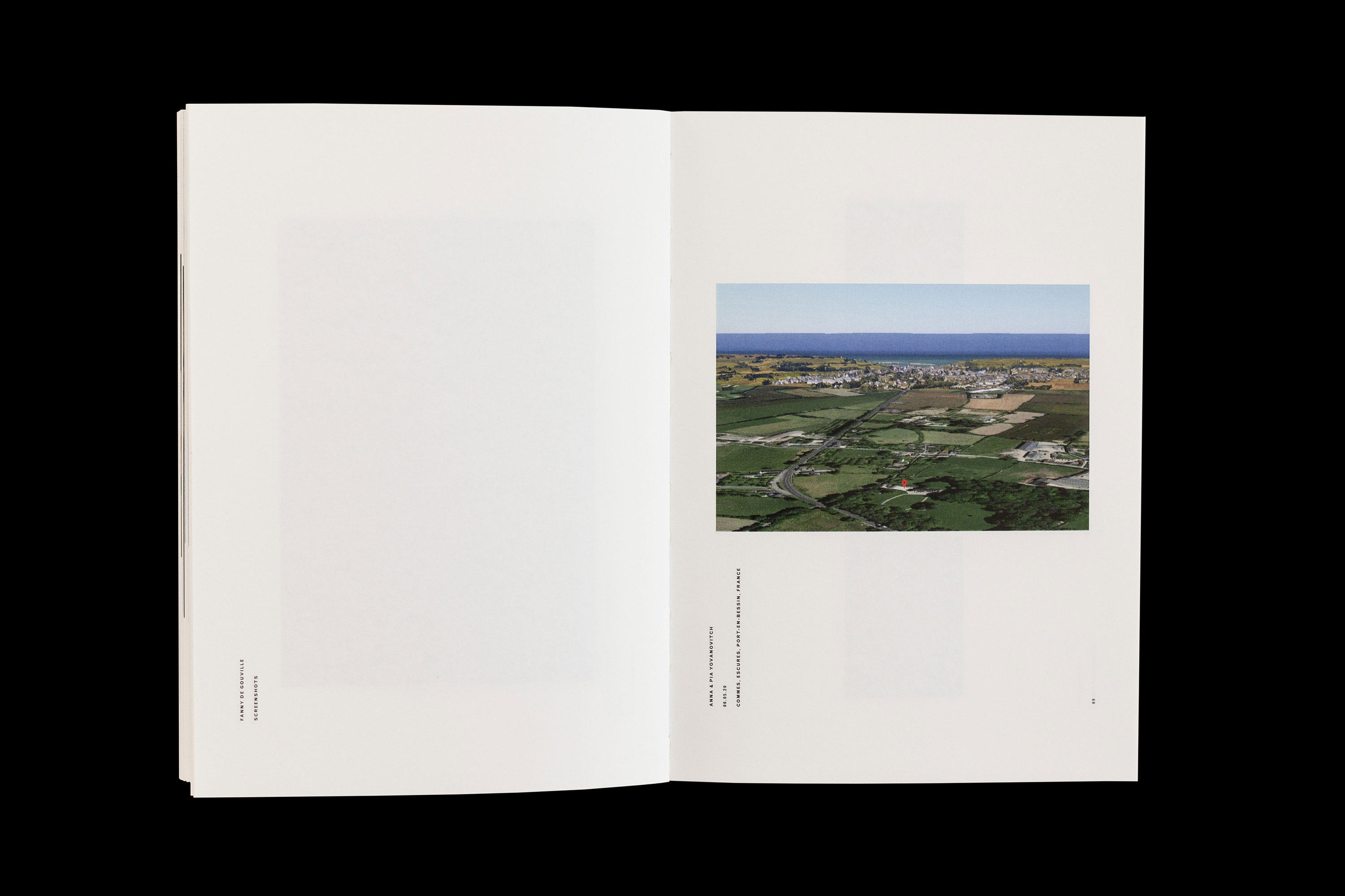
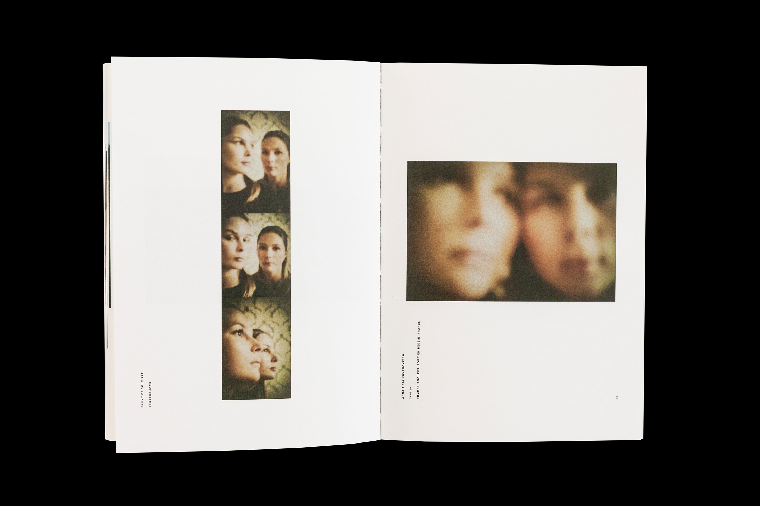
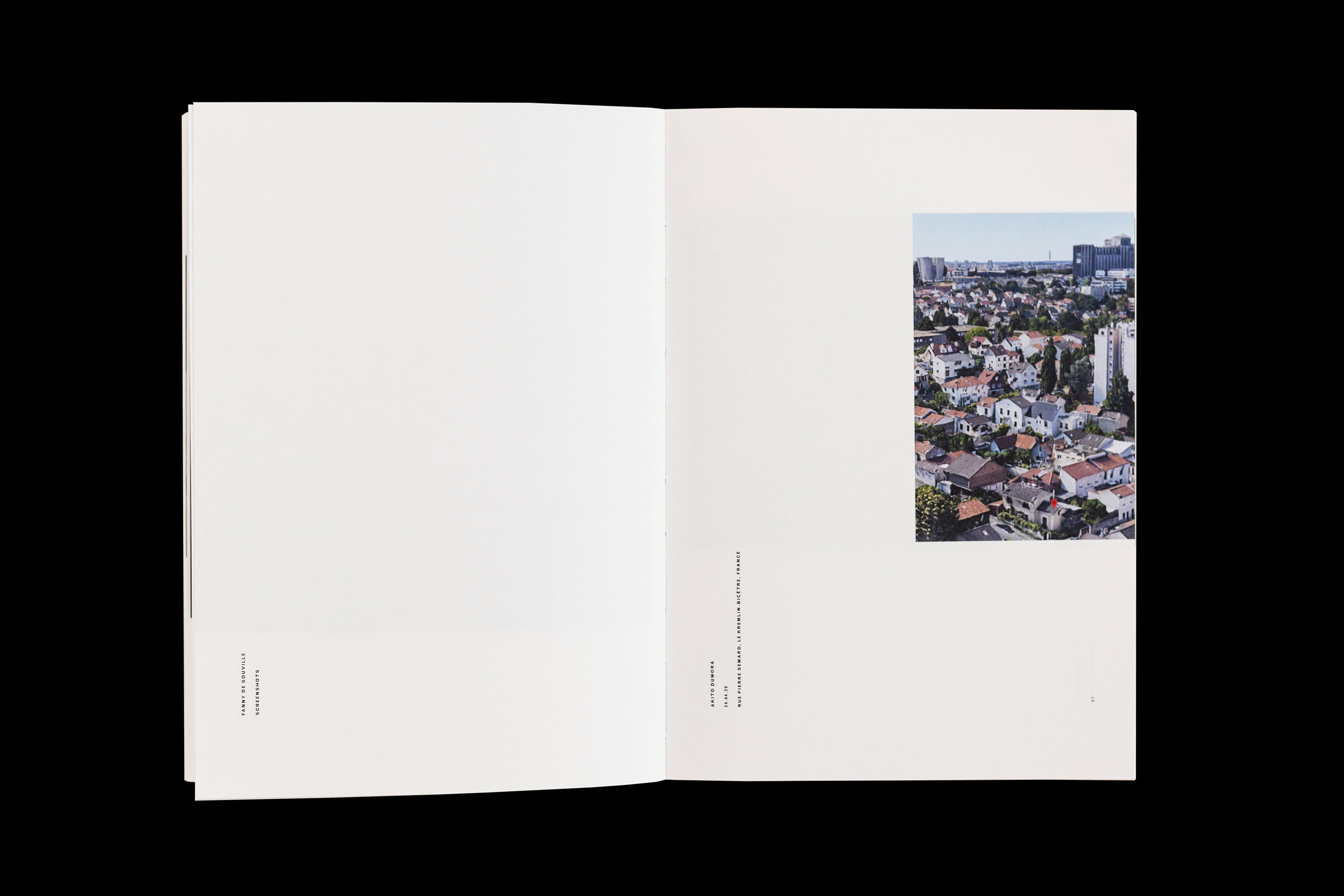
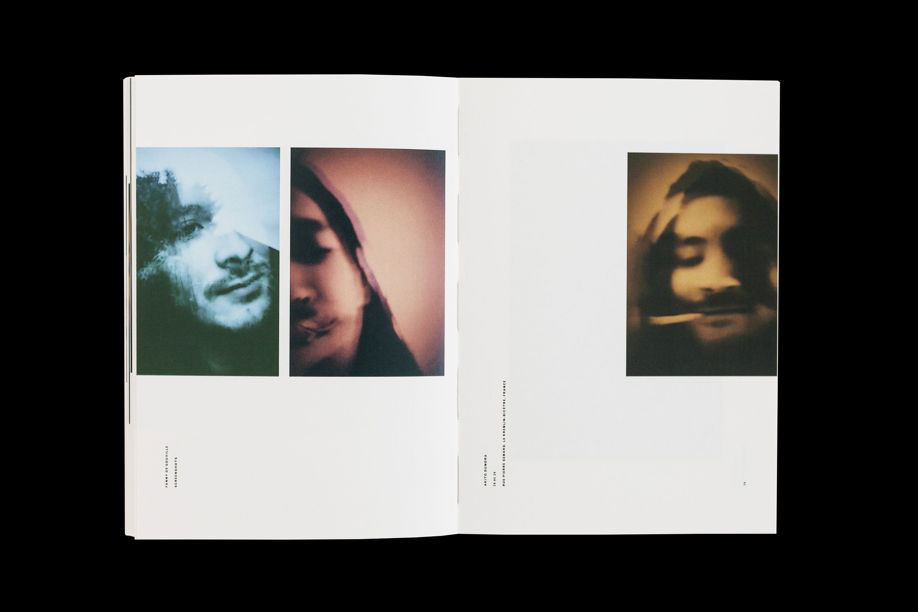
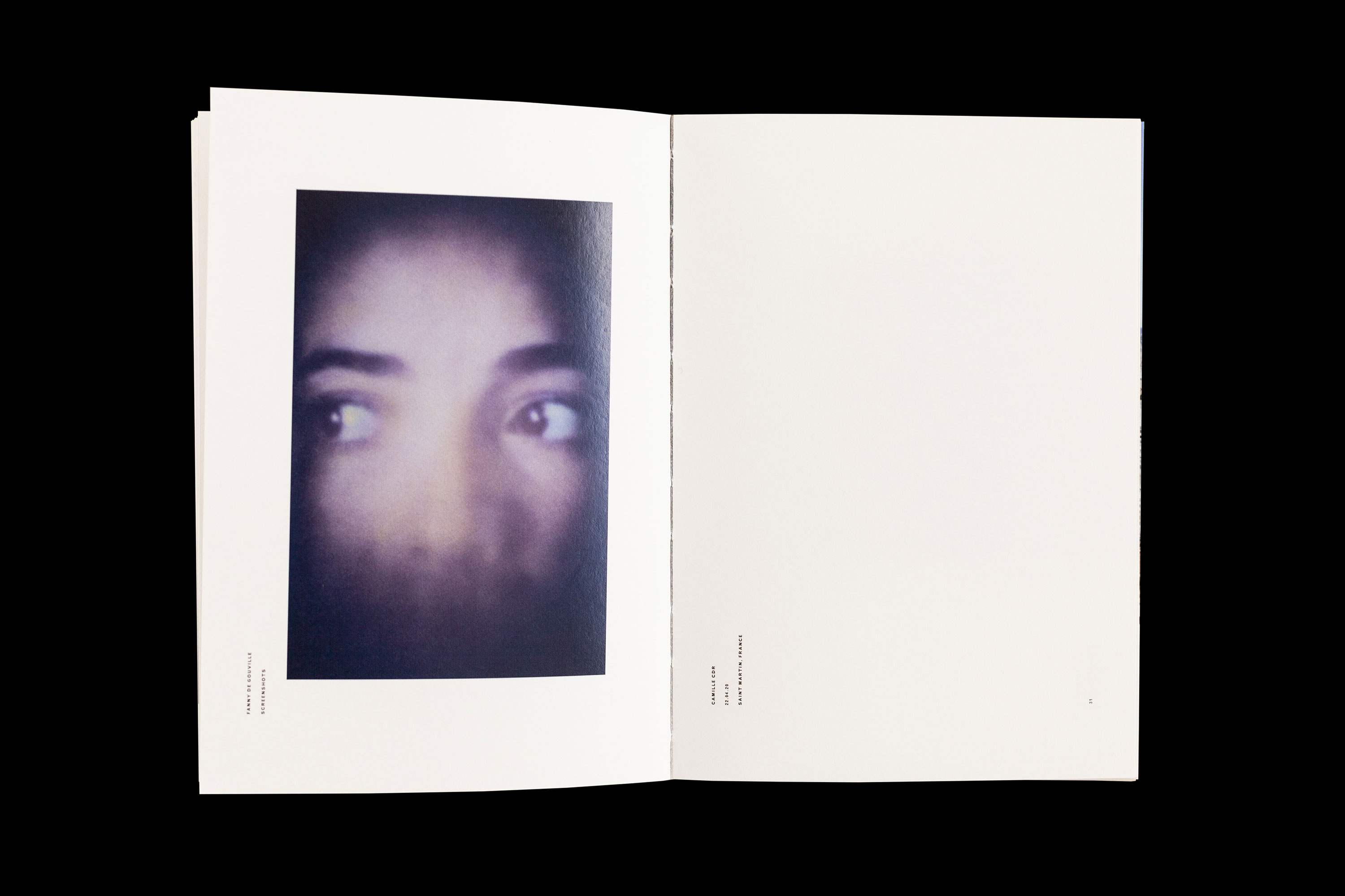
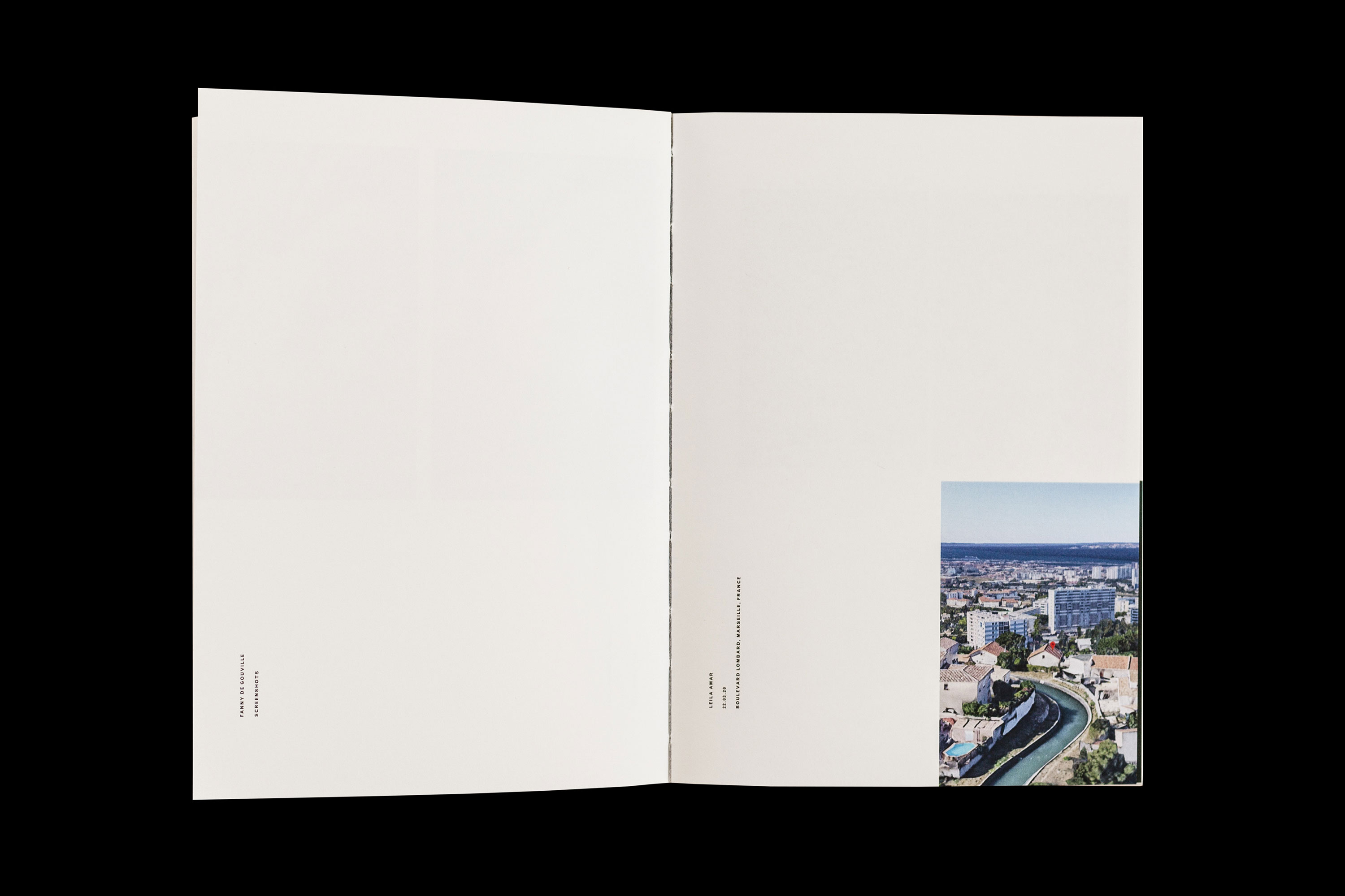
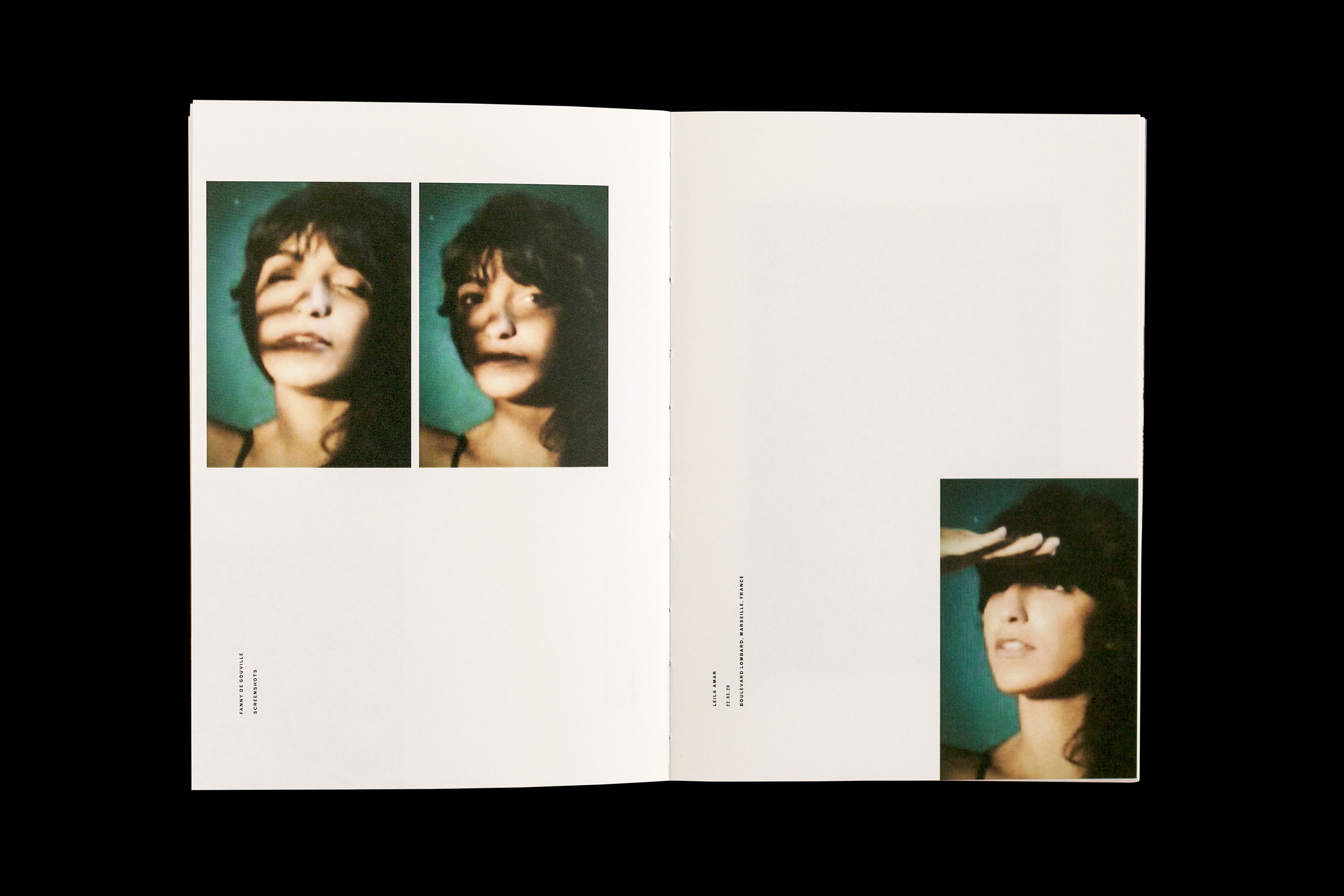
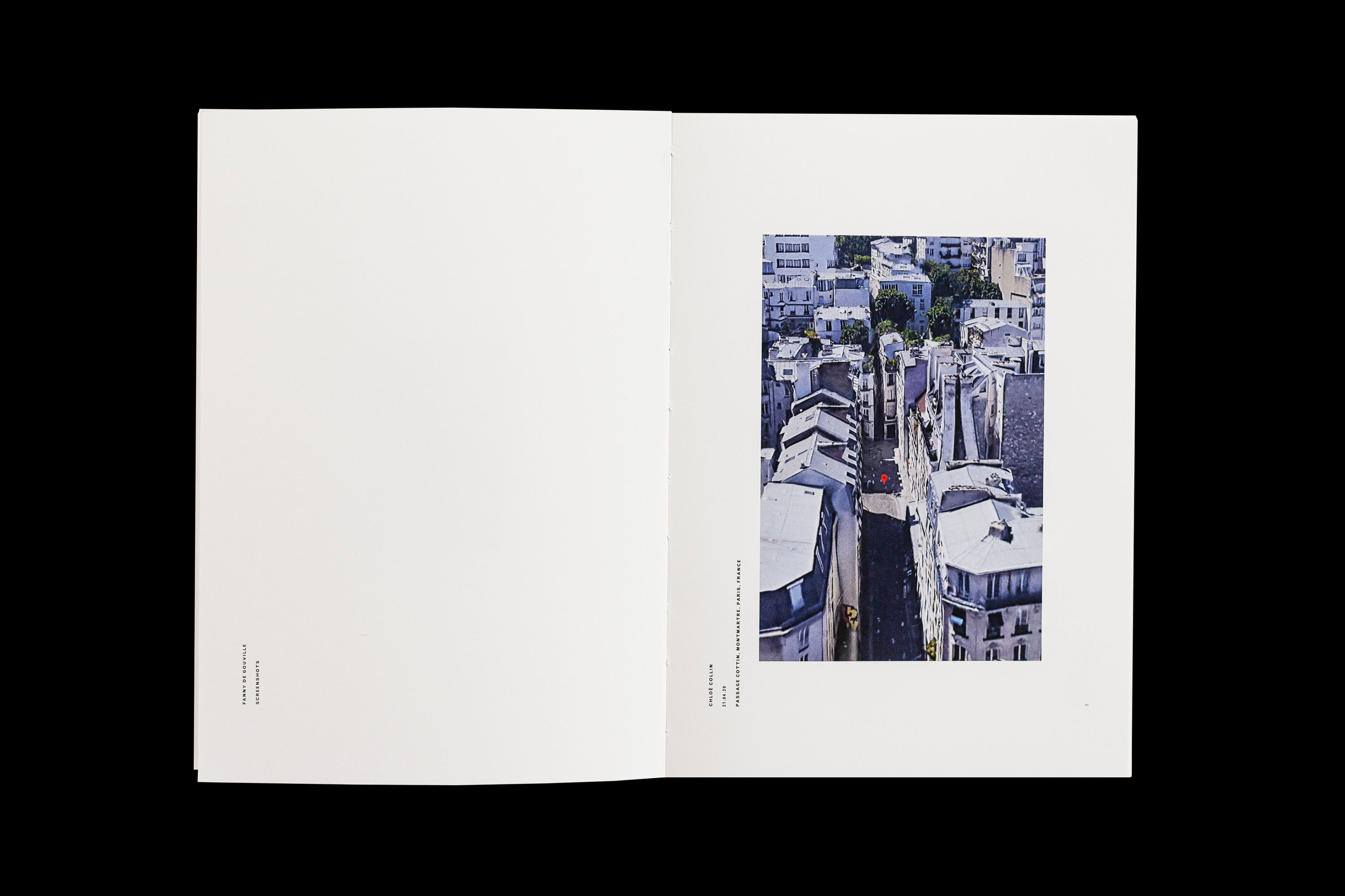
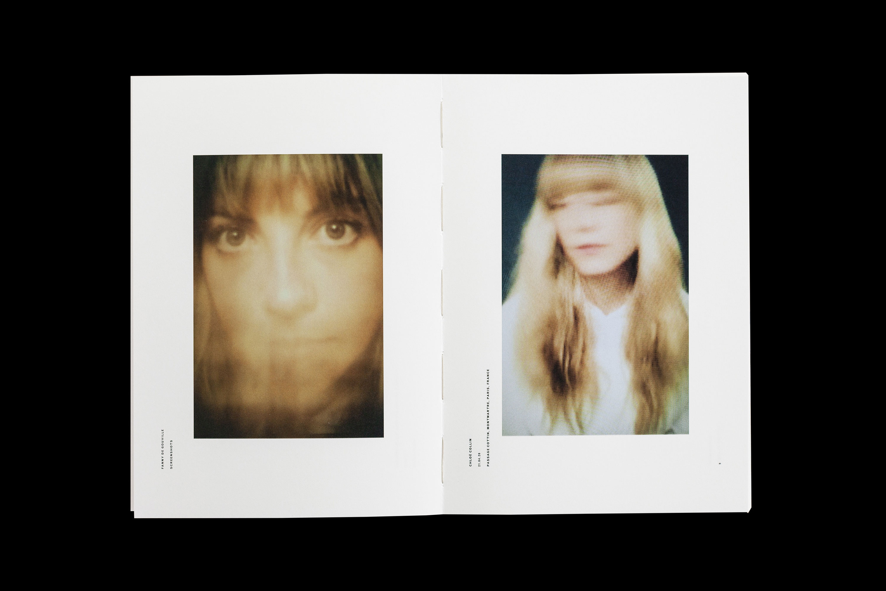
fanny de gouville put out a call during the 2020 coronavirus lockdown for someone to help design a new book of her photographs. these photographs she'd taken were special; they were taken of her friends on her computer screen with her SLR camera as they video chatted with her, each isolated in their homes around the world. we happily responded to her call.

she wanted to call the book "screenshots." it was therefore up to us to find a way to talk about the way these photographs had been taken, during the pandemic, whilst also commemorating them as the beautiful series that they were. one particularly nice feature of the book is that fanny also took screenshots of each of her friend's google maps location, and coupled this with their portraits. we translated this particular idea into a kind of "match cut," to speak cinematically for a moment, so that the map image in each case directly corresponded to the first image of her friend on the following page. this is a feature that can only really be enjoyed with the book physically in your hands, which is of course the point.
_link
fannydegouville.com/books/screenshots
_tags
cover
1
2
3
4
5
6
_what
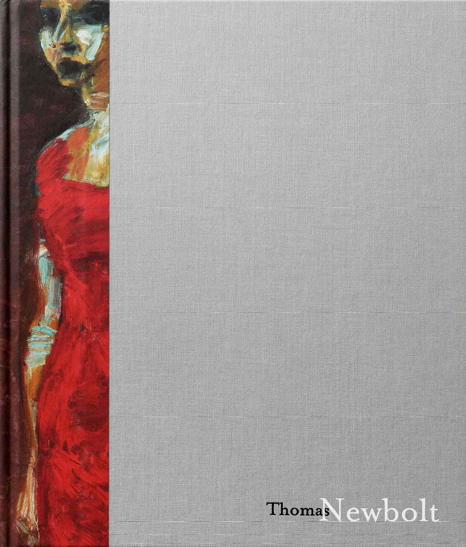
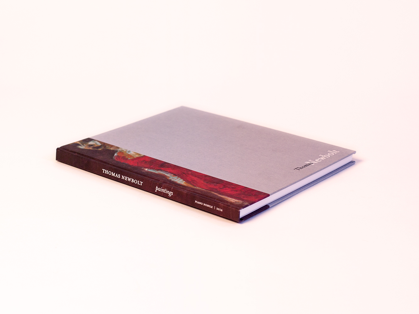
catalog for the cambridge-based fine artist, thomas newbolt
_how
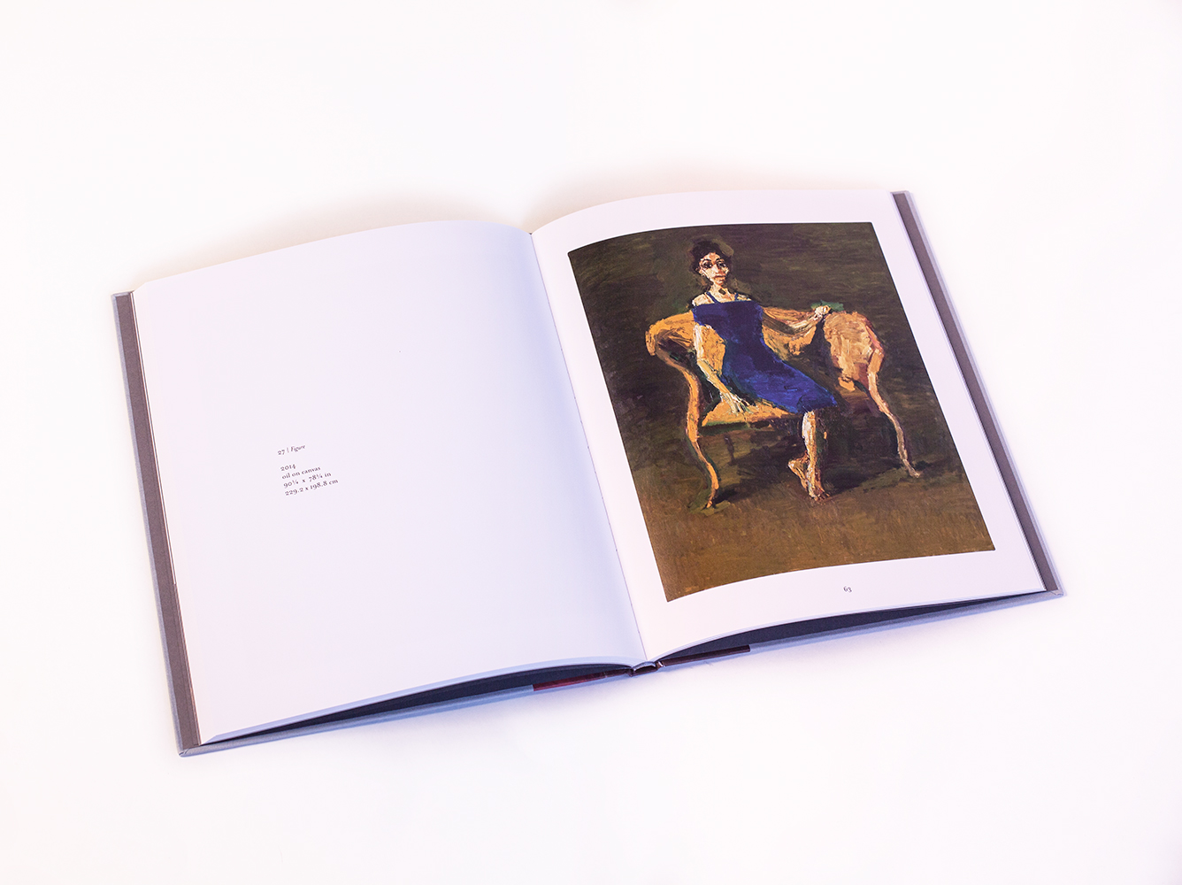
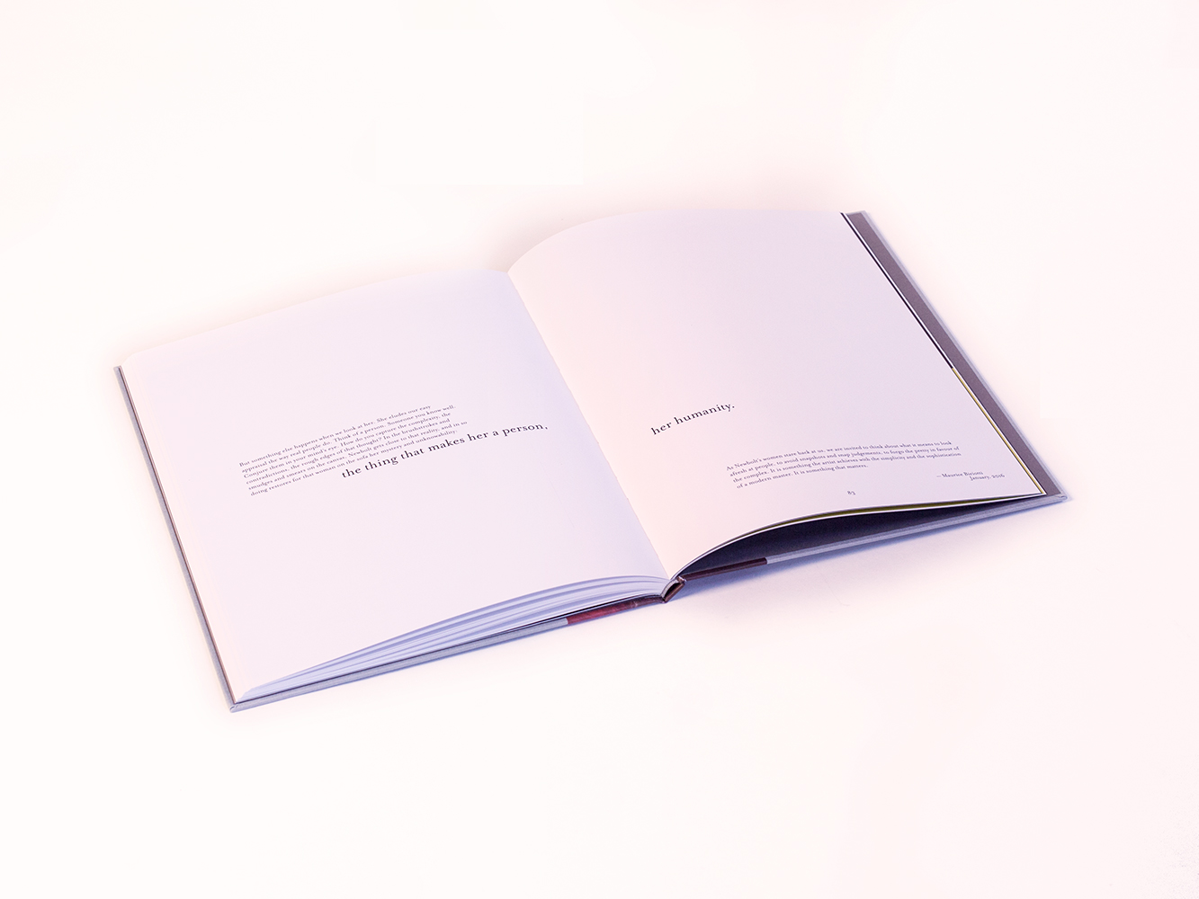
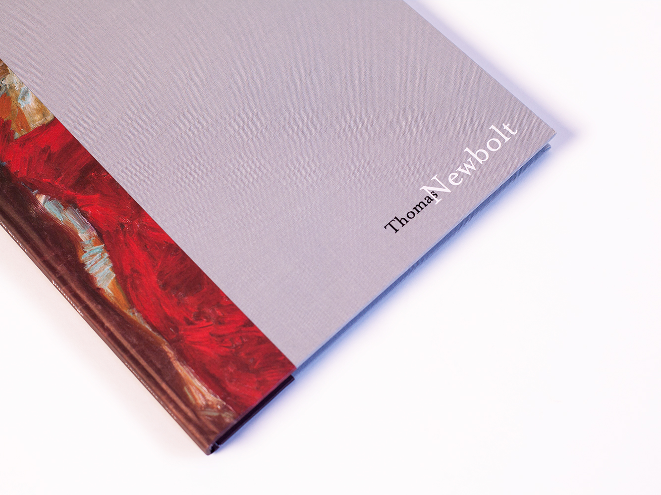
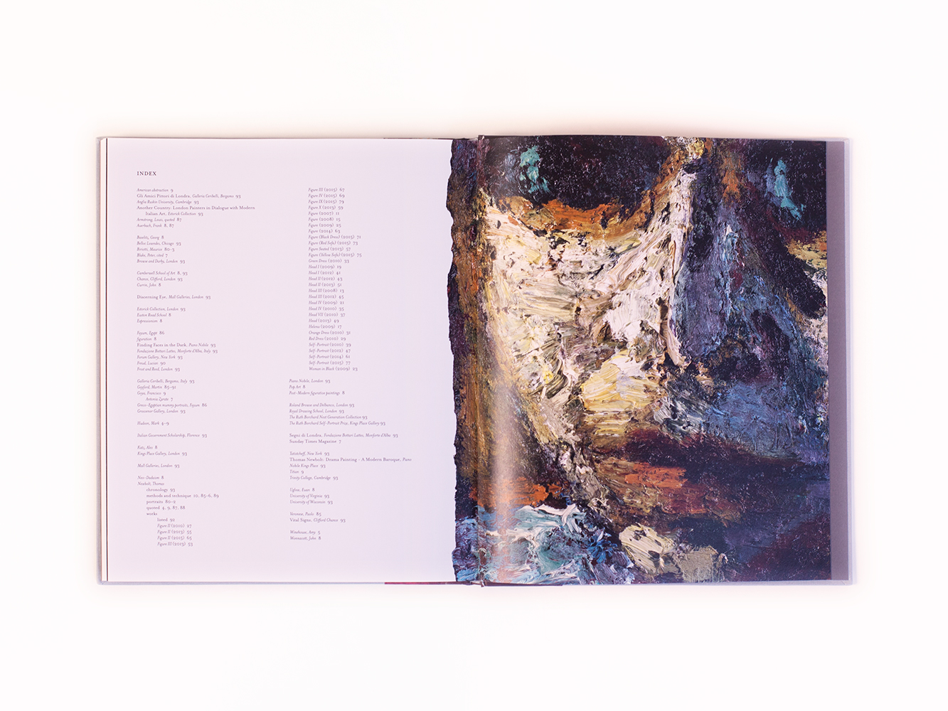
the english painter thomas newbolt commissioned us to design a 100 page catalog of some of his best works to date. his gallery, piano-nobile, had proposed the idea of a catalog for his most recent show and this idea exploded into the book you see here now.

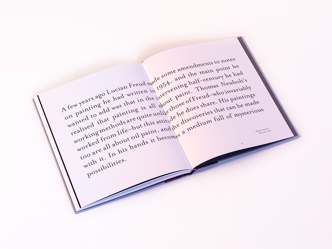
a canvas-bound, rather experimental and intuitive affair, the book attempts to capture the nature of thomas's paintings not just through reproductions of the work, but via the accompanying essays, interviews and free-form designed layouts.
_link
piano-nobile.com/publications/46
_tags
1
2
3
4
5
_what
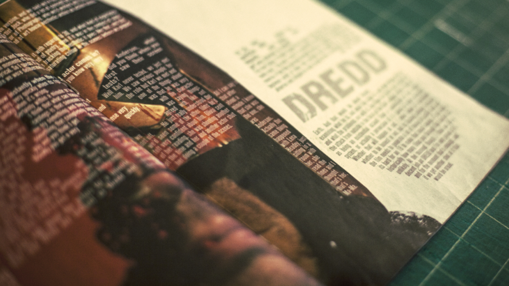
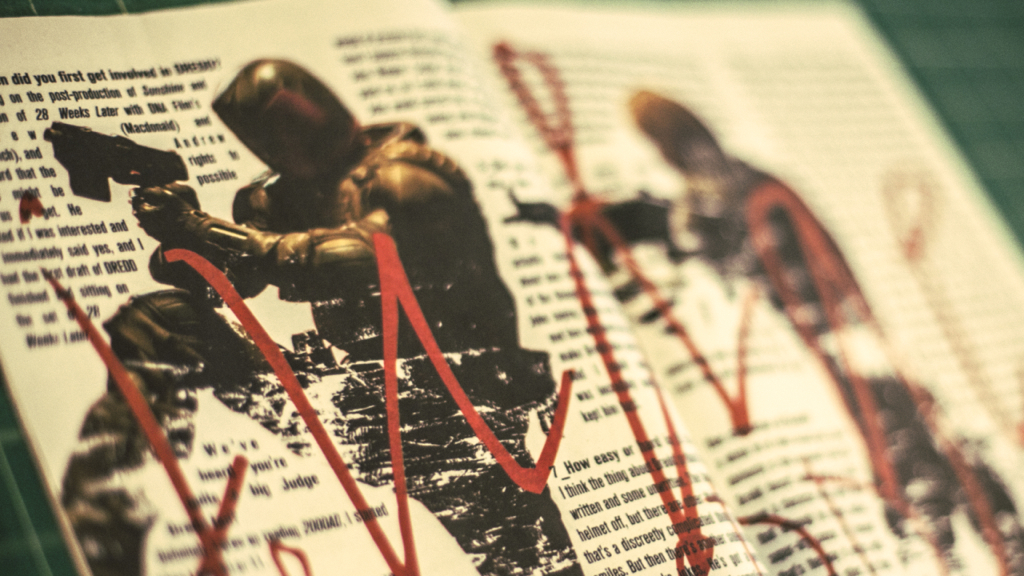
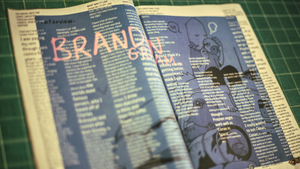
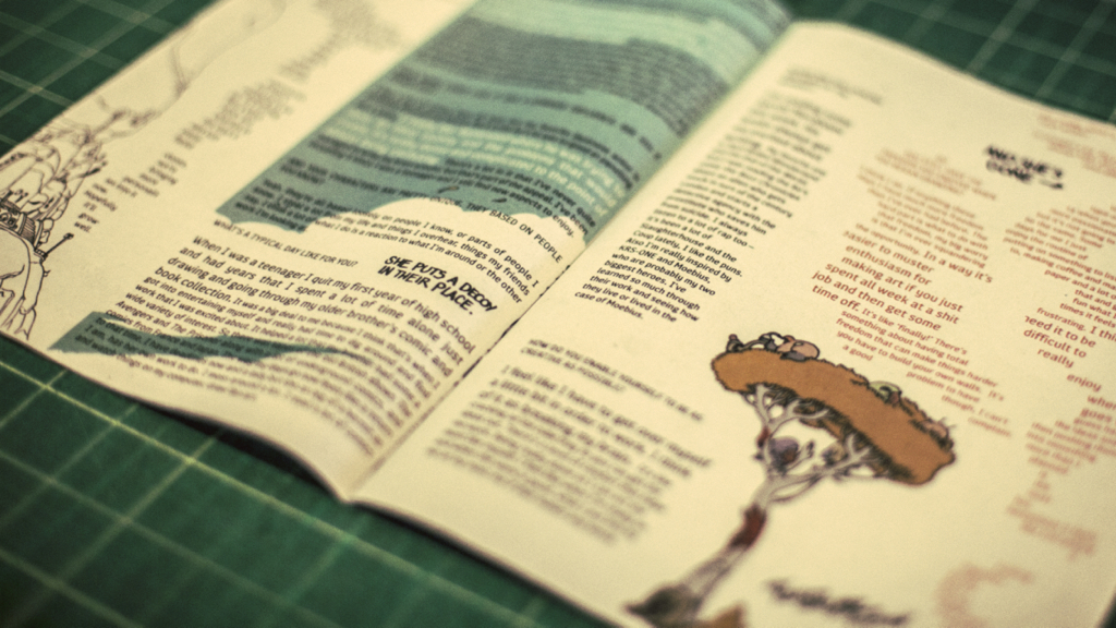
layouts for the london-based, independent graphic fiction magazine, your days are numbered.
_how
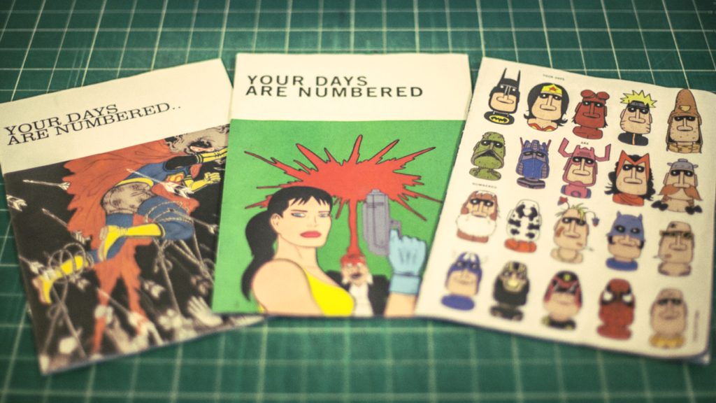
we discovered issue #1 of YDAN on the streets london back in 2011. it was free, the design-work inside was brave, punk and in the context of where magazines have gone in the last 10 years, felt fresh. we were excited and reached out to them immediately to applaud their work. a few months later and we were talking about how we could collaborate. suffice to say that every issue since #3 has included layout work from us in the form of a center-fold design for the magazine's leading interview piece.
_link
yourdaysarenumbered.com
_tags