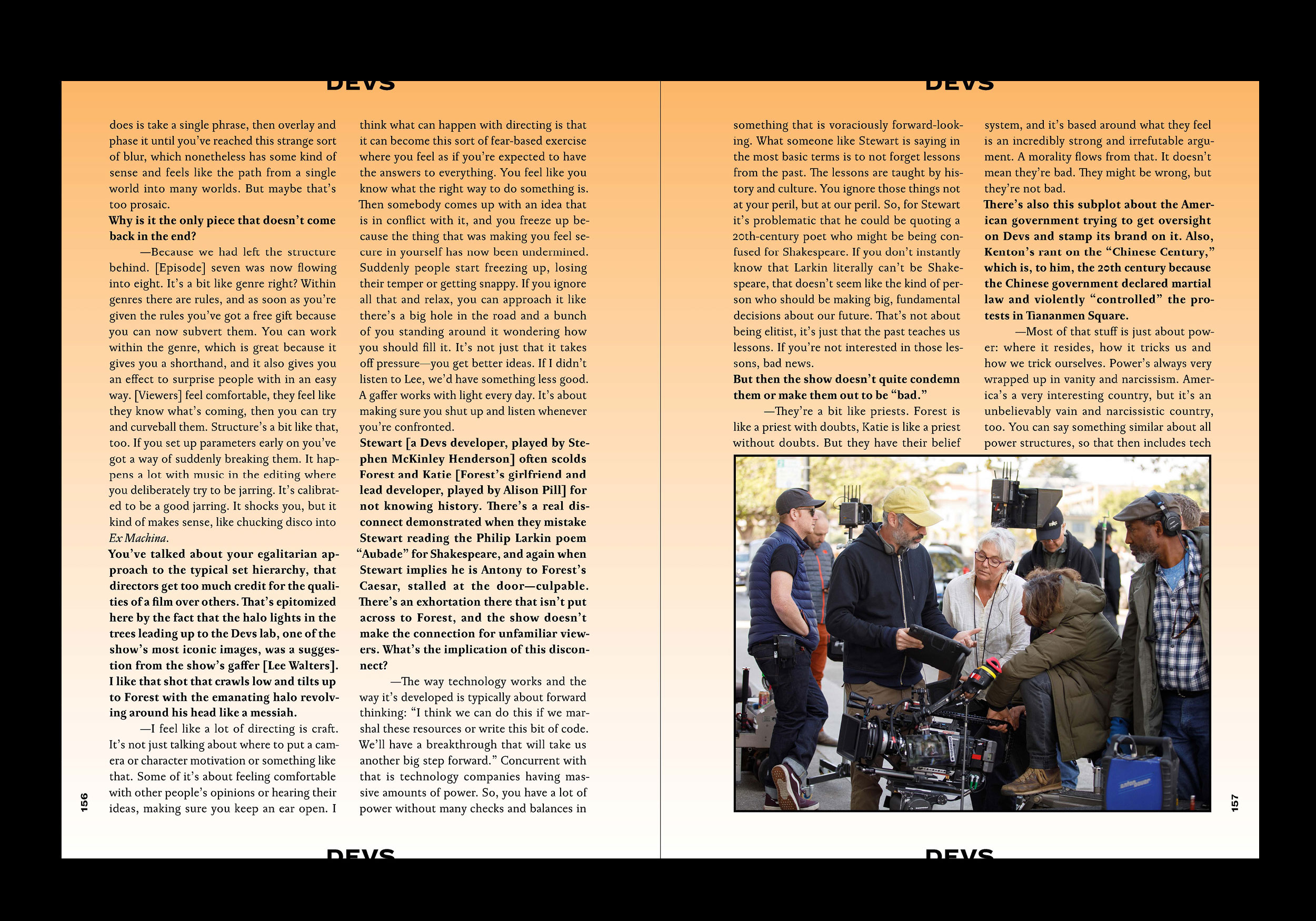
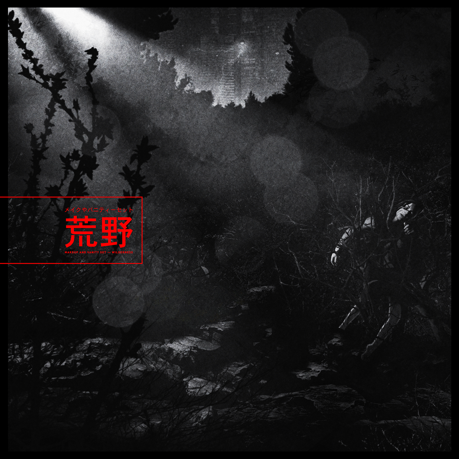
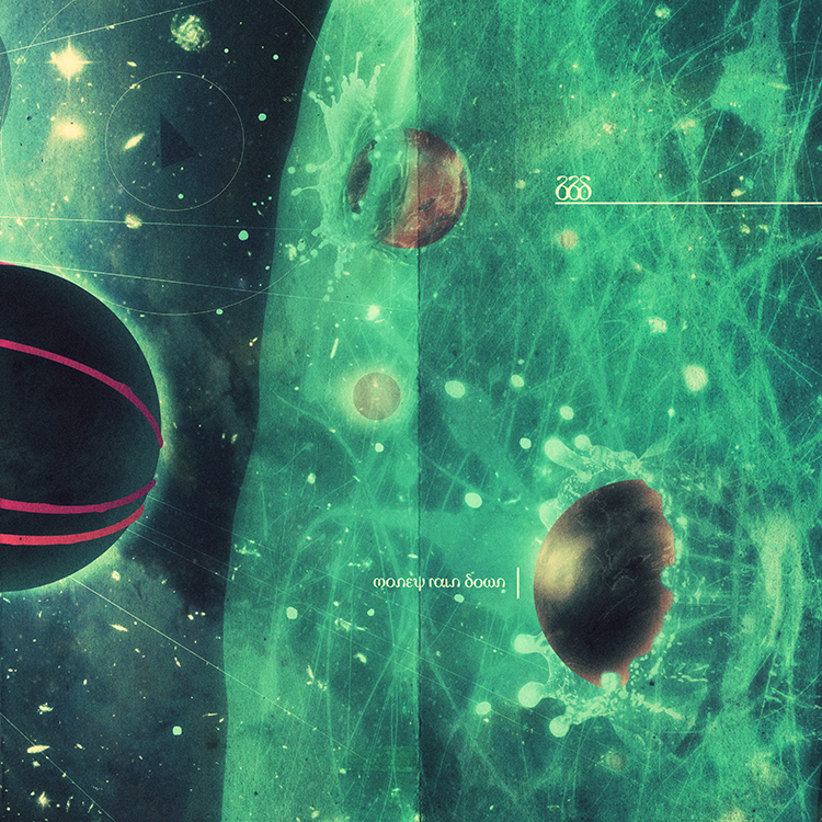
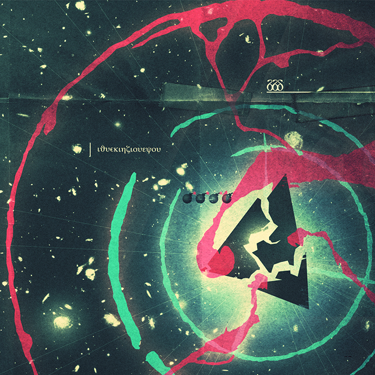
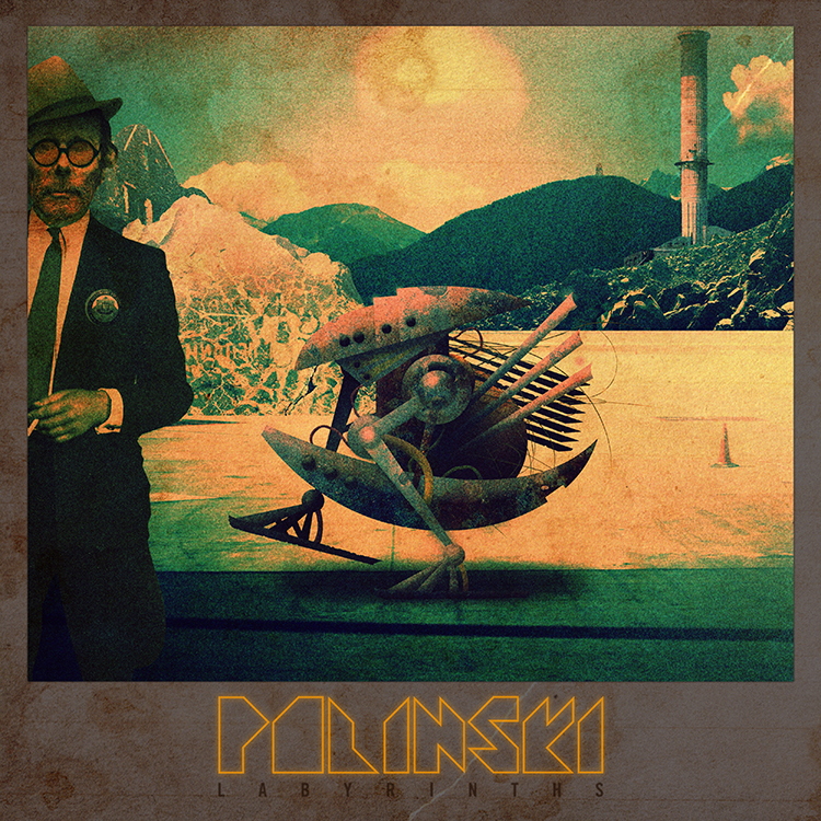
paul wolinski is one quarter of the experimental musical machine that is 65daysofstatic. polinski is his more purely electronic side-project.
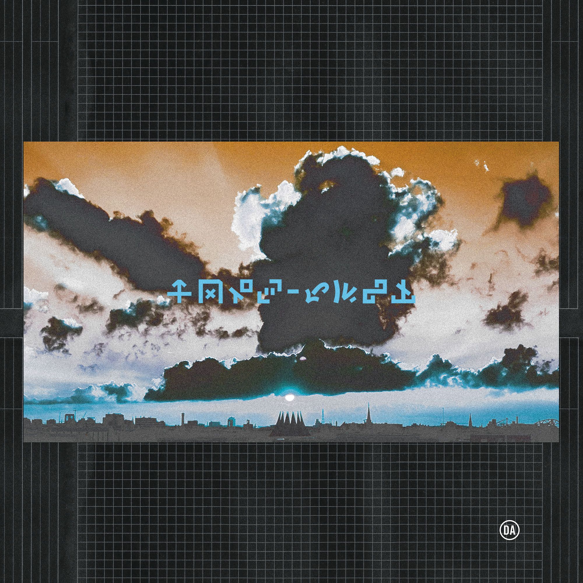
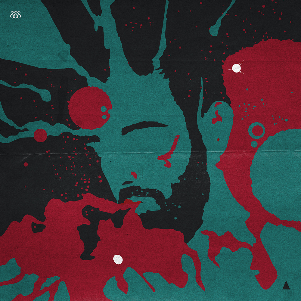
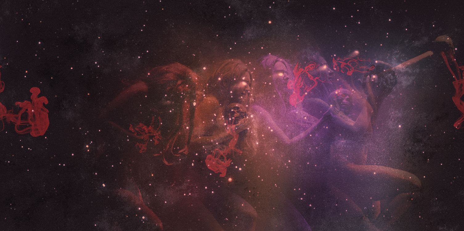
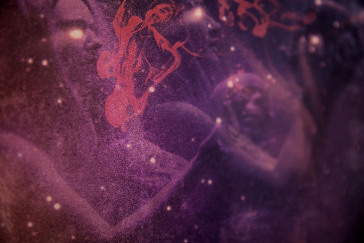
the discussions for how to handle the artwork for the album started years before the record was even a twinkle in his eye. we'd talked at length for years about films, musics, books, games and designs that appeal to us for whatever reason. whether it be the books of jeff noon or the cassette loading games of sinclair ZX spectrum, there was an innate understanding of what this solo project would demand in terms of artwork the moment the demos started to come together.
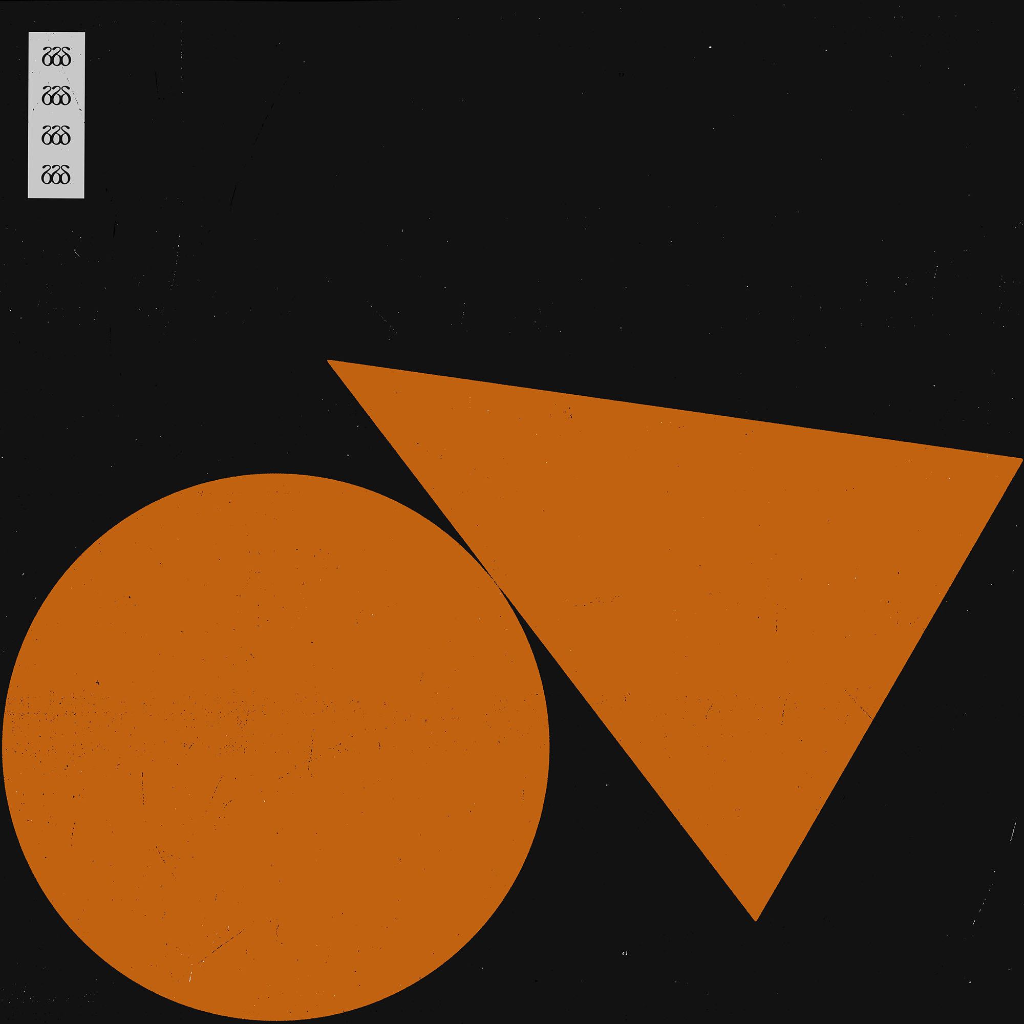
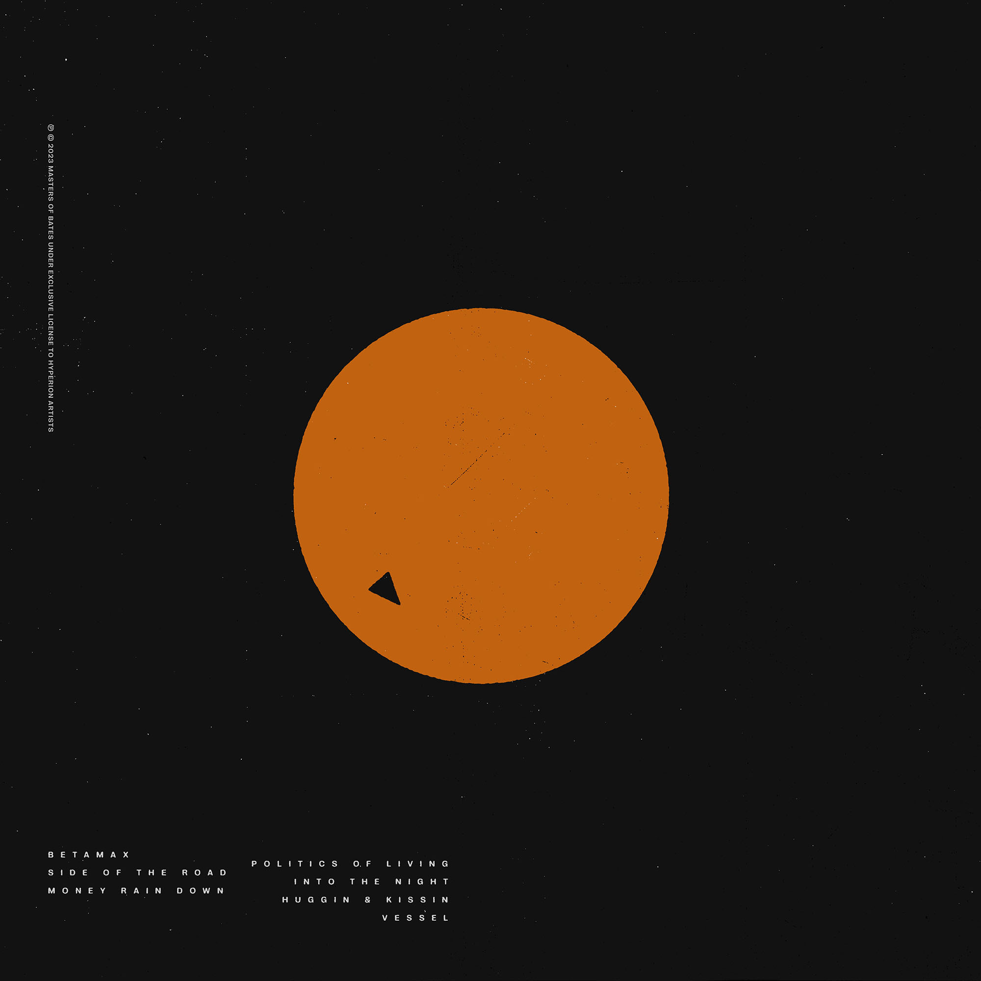
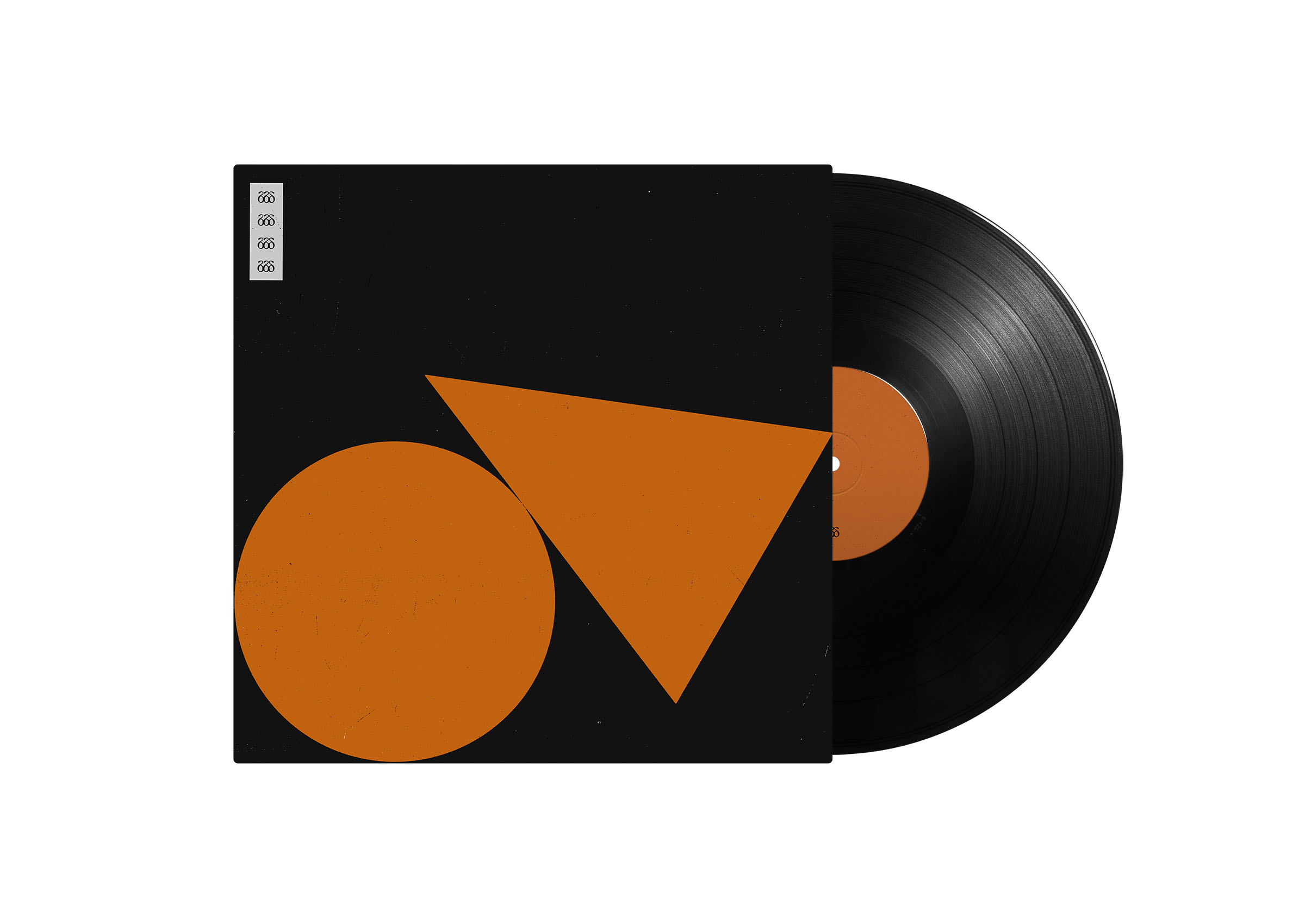
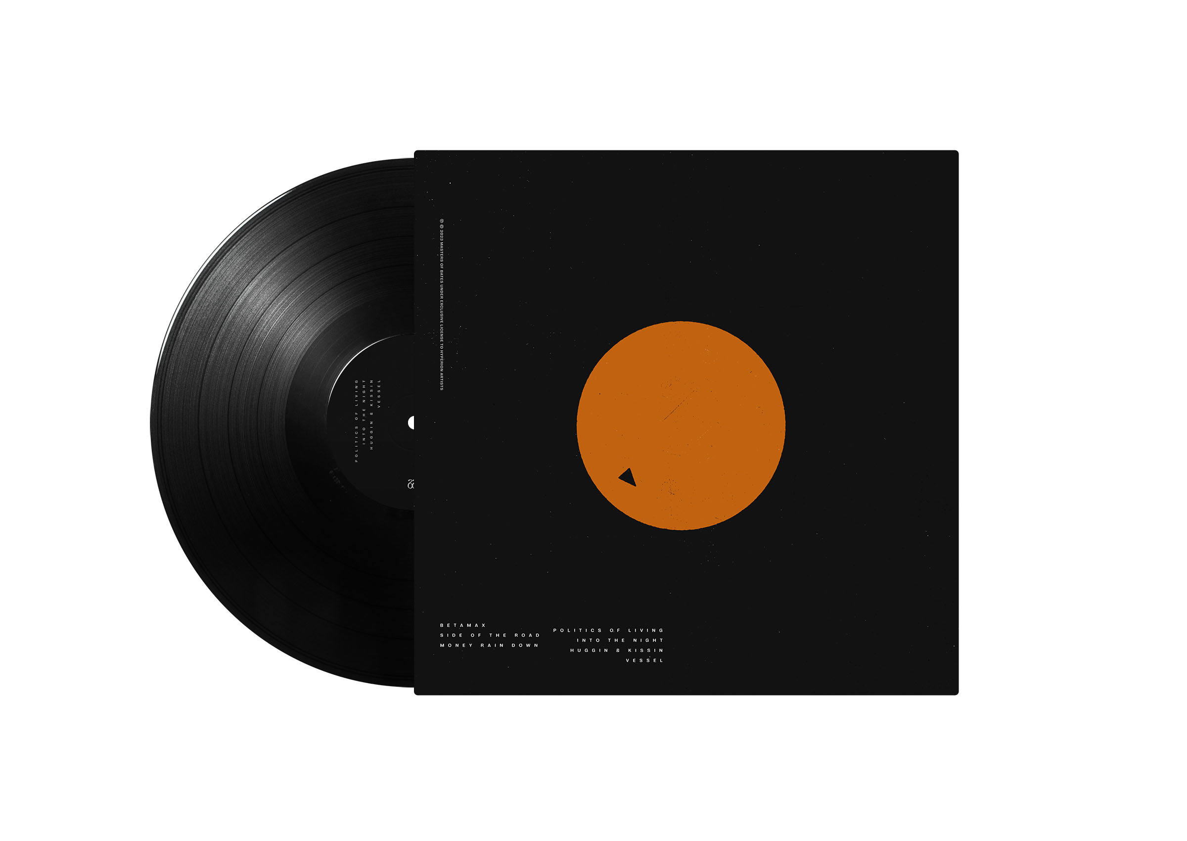
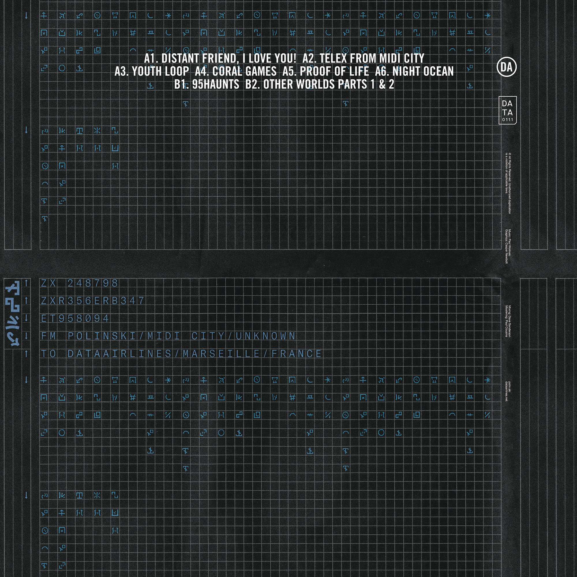
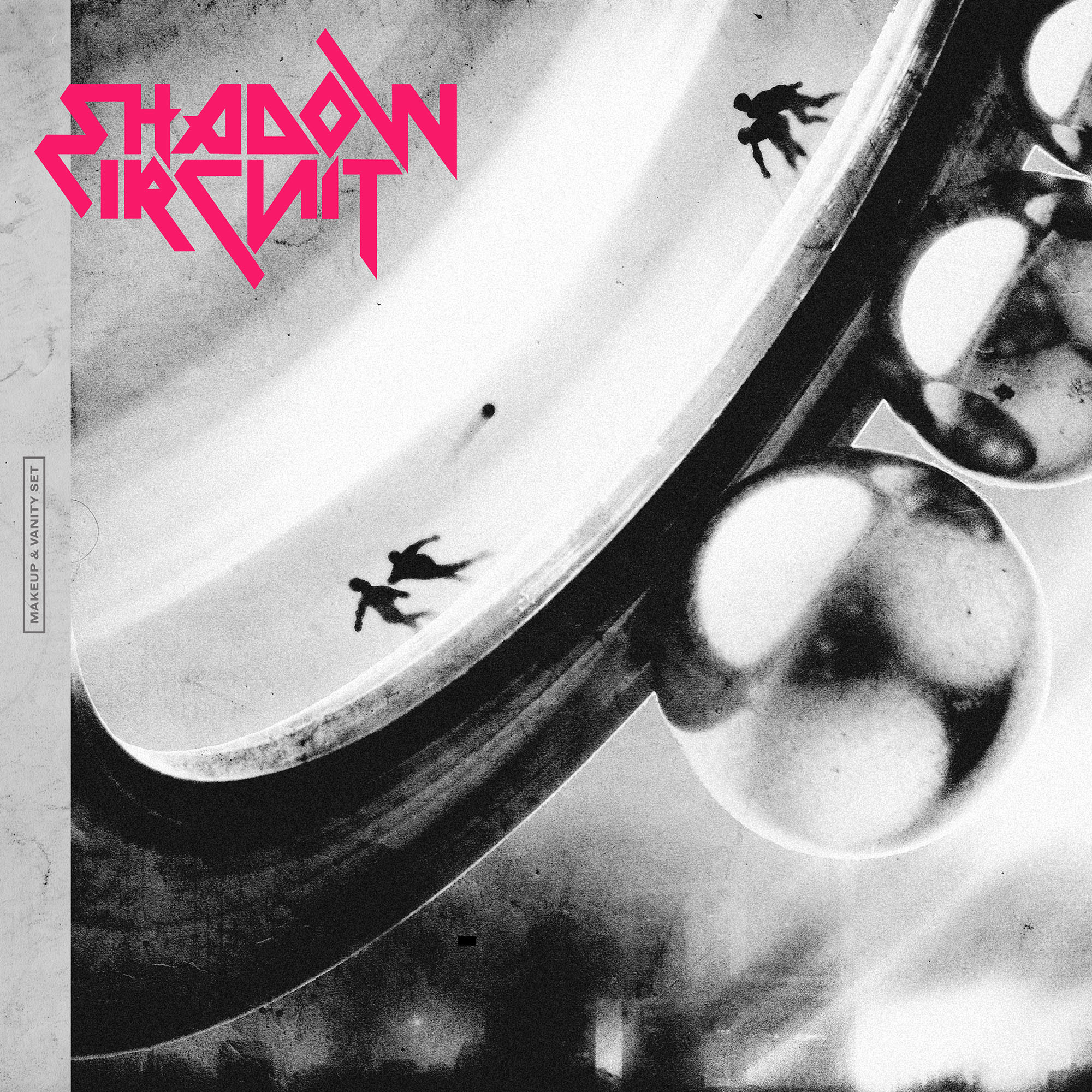
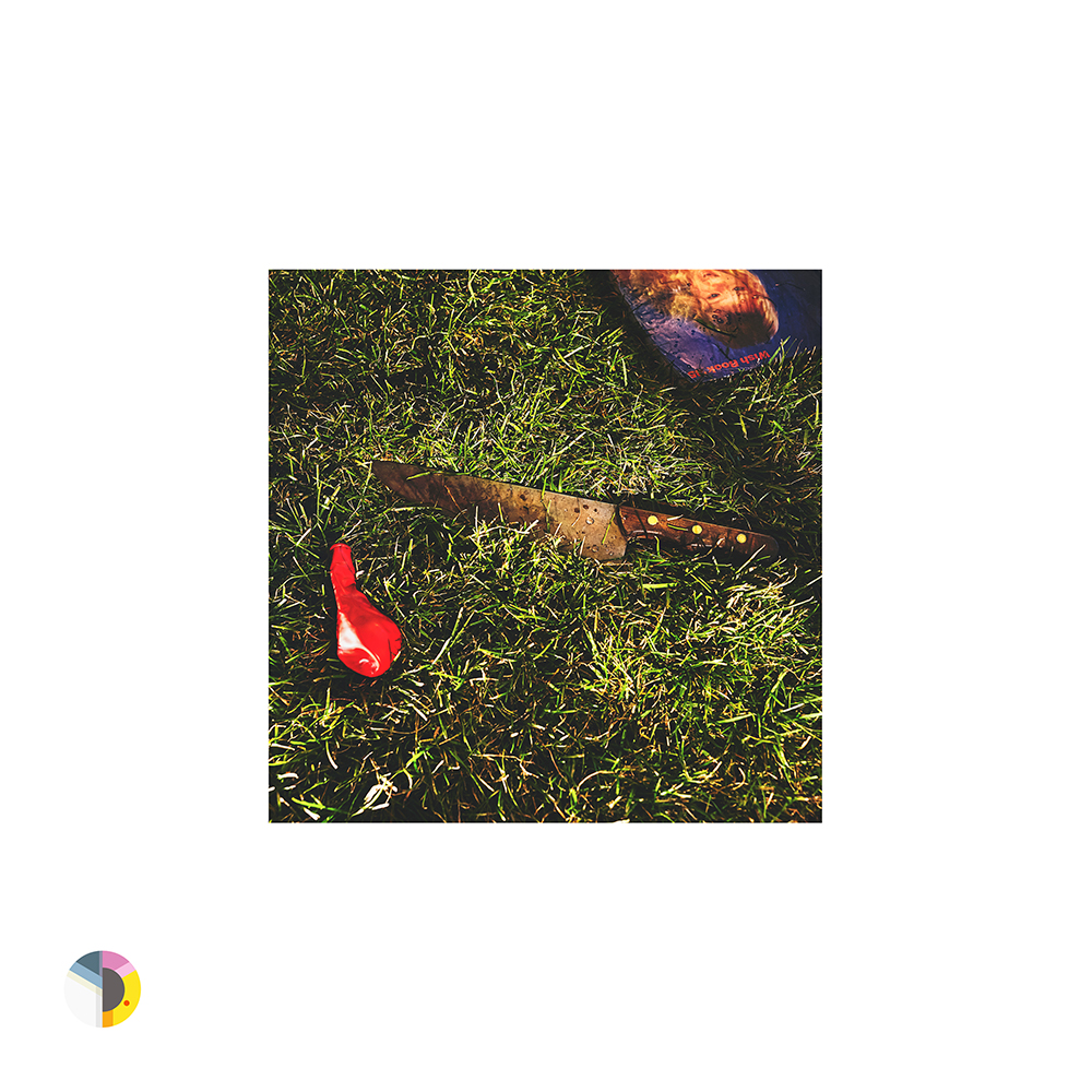
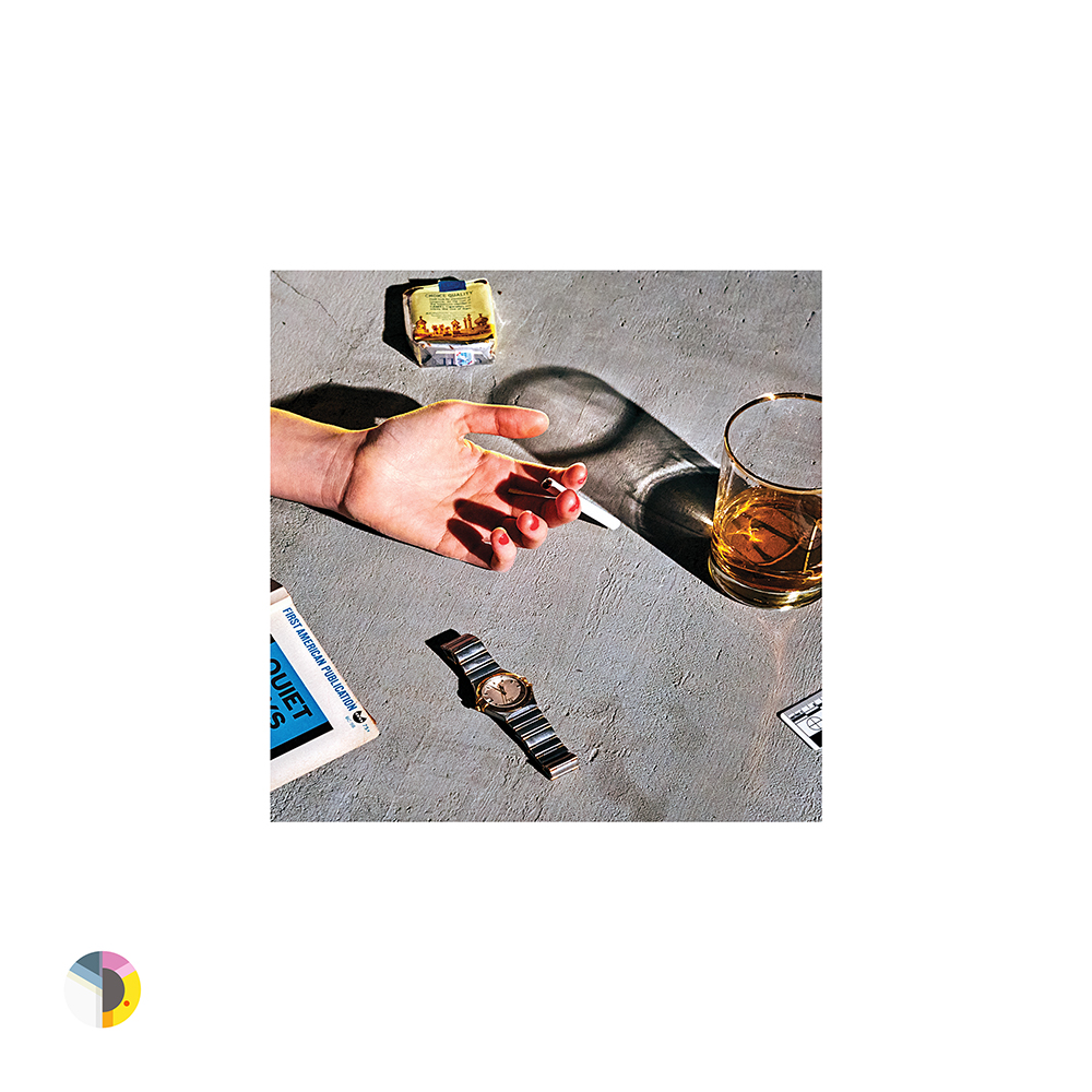
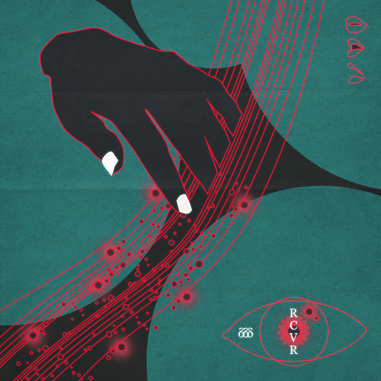
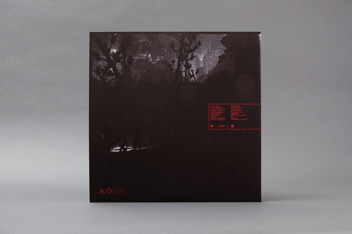
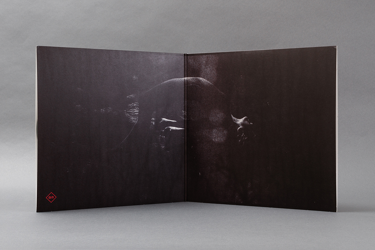
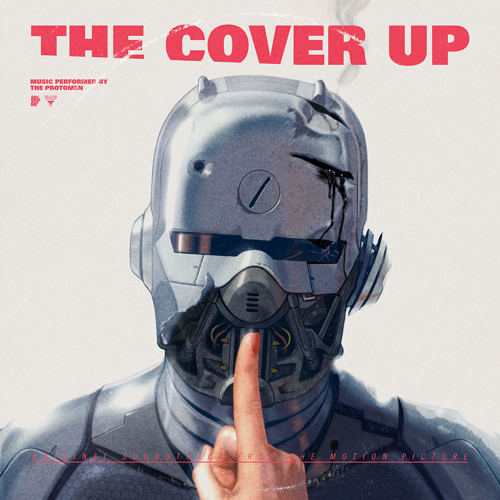
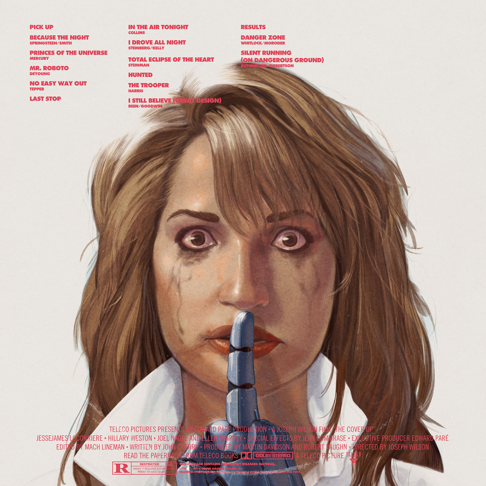
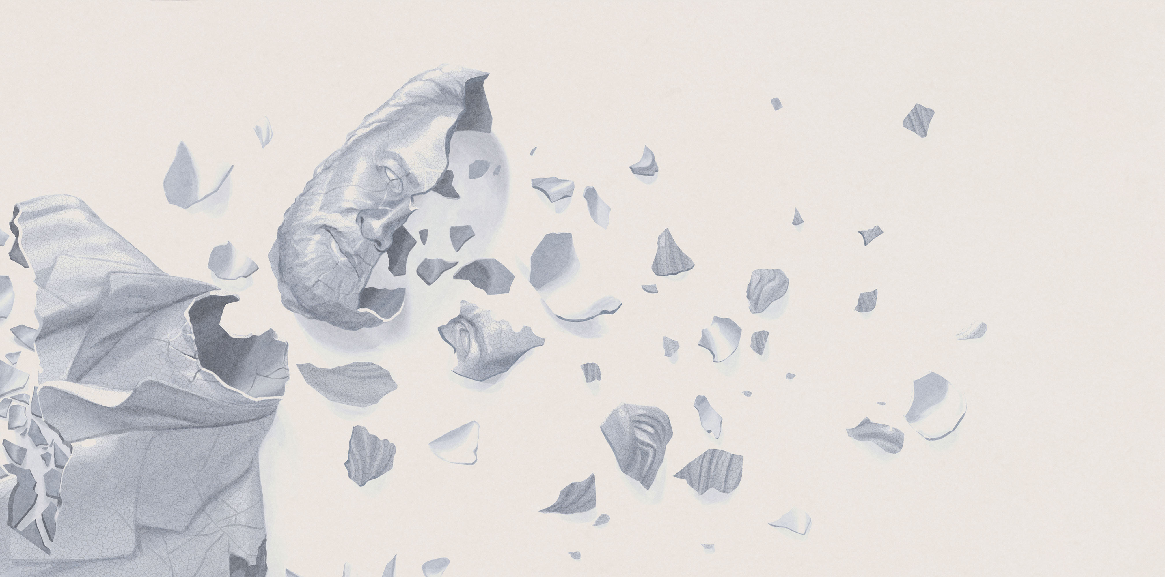
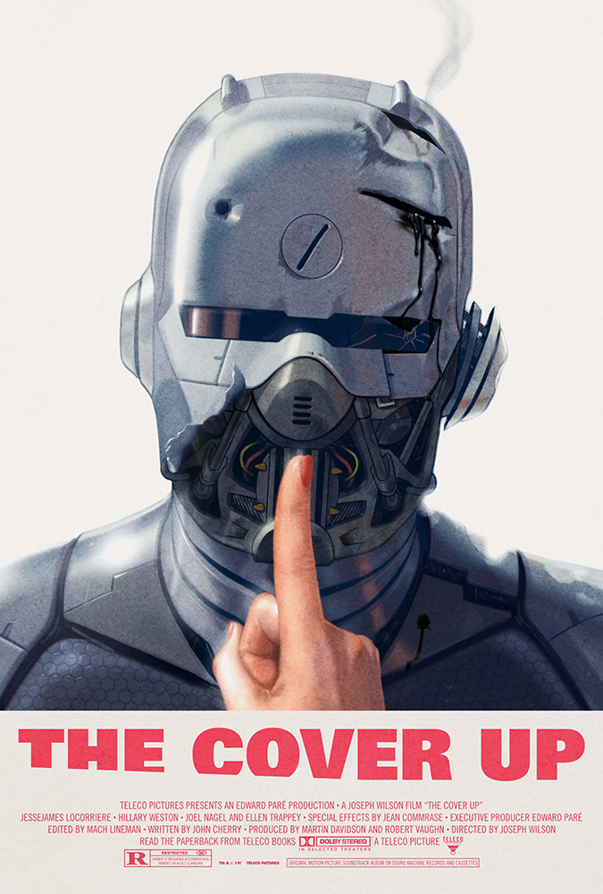
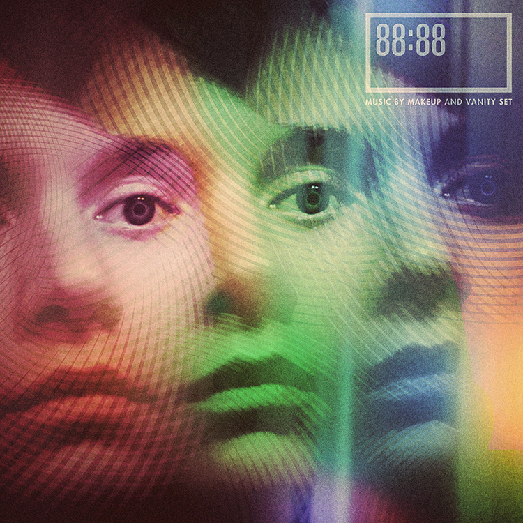
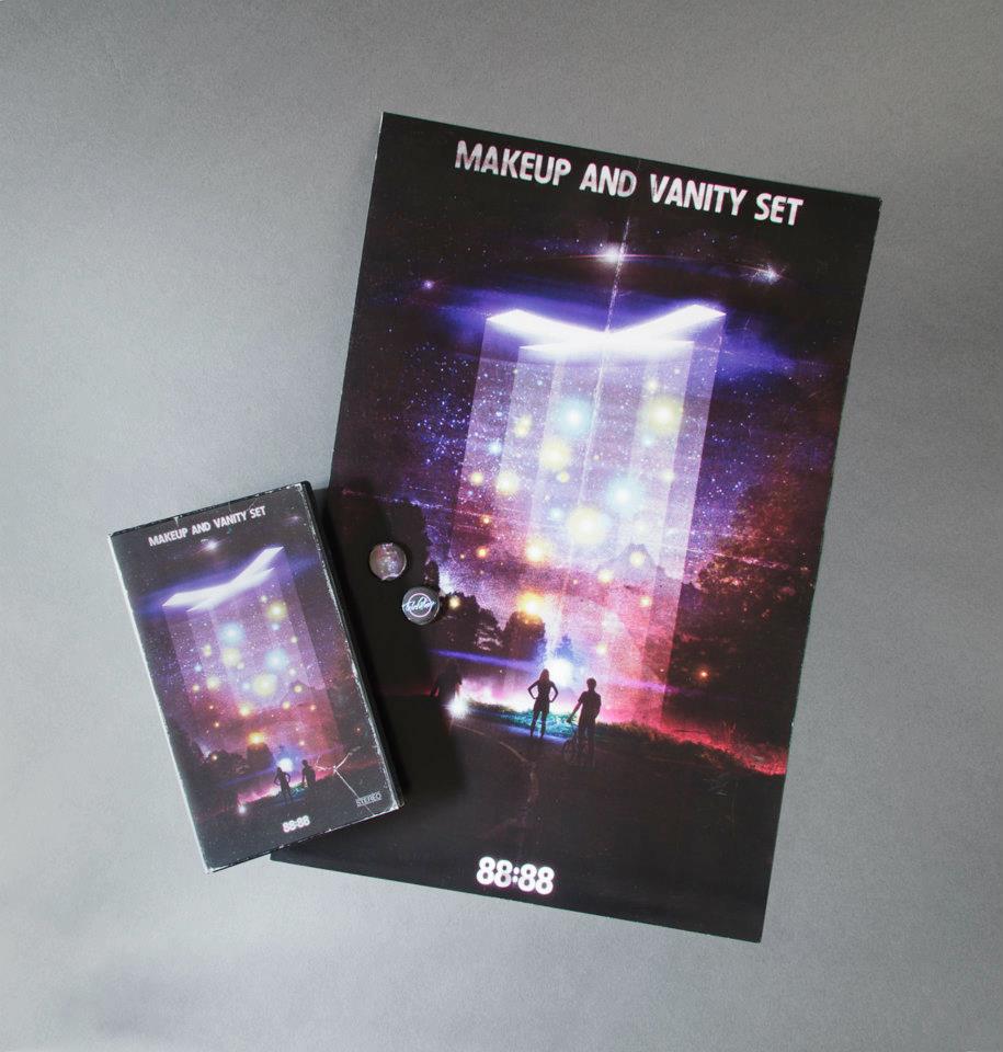
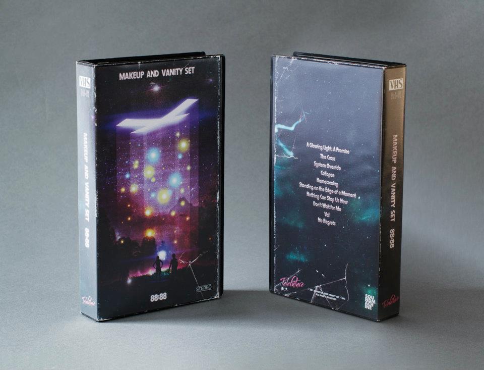
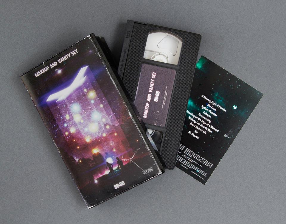
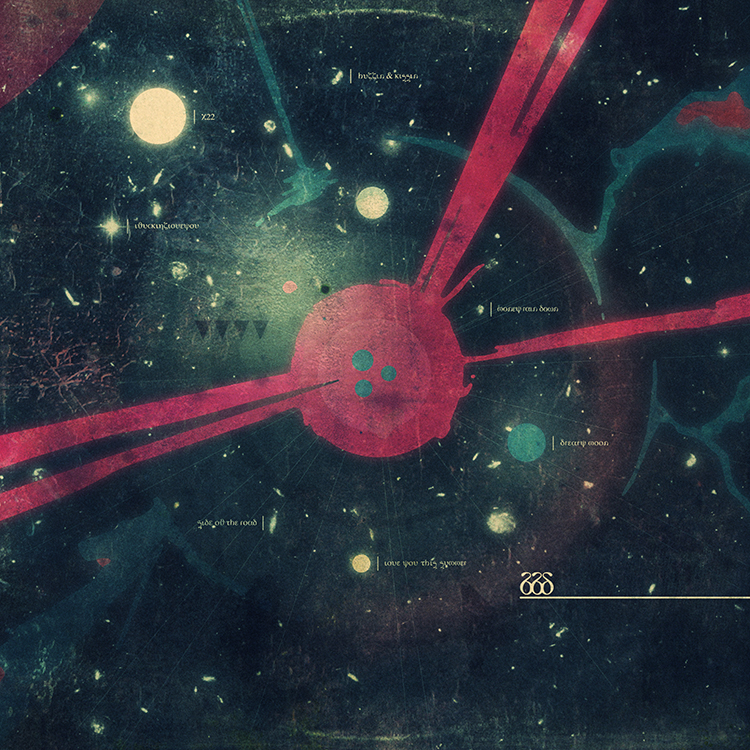
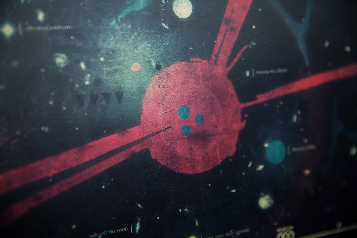
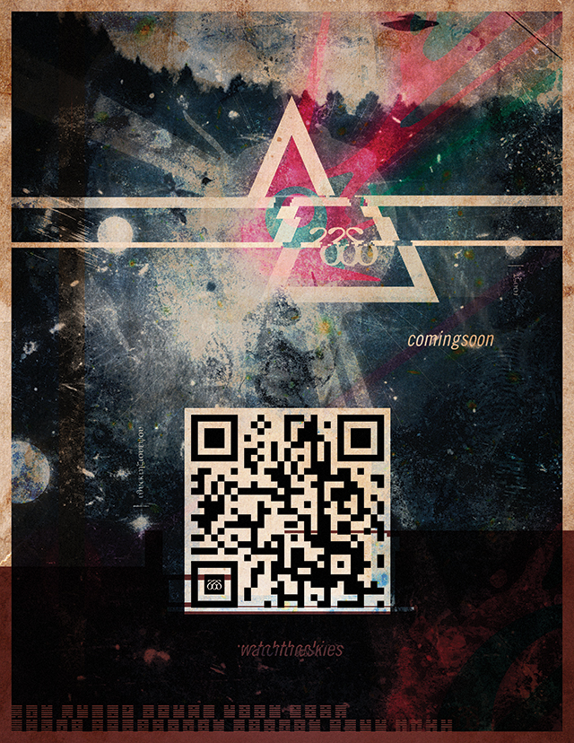
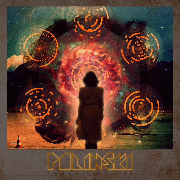
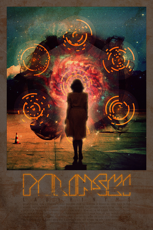
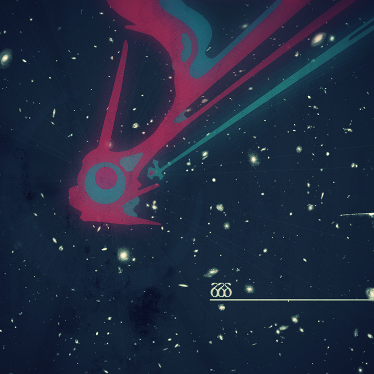
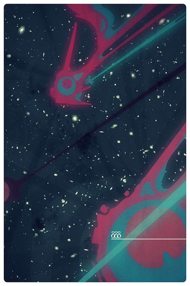
the final artwork started with us coming up with a story that would capture paul's feelings about various things and how he wanted to translated those into a science fiction tale of some kind. the next step was padding that story out with various touchstone visual elements and then translating those into a series of panels that we could use for the album and any singles. the first image we put together turned out to be the album cover as it is now, and this went onto influence paul's approach to making the music. he then sent us more demos that inspired the creation of more panels, and so the back and forth went until we had enough to illustrate the story / world we had created.
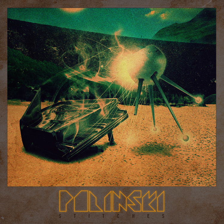
the music video for the album's first single, stitches, was an attempt to bring back the feeling of using the sinclair ZX spectrum computer, whilst detailing some of the album's narrative elements. paul and caspar wrote the video's story, which expanded upon the lyrics jonathan bates from
big black delta was singing on the song.
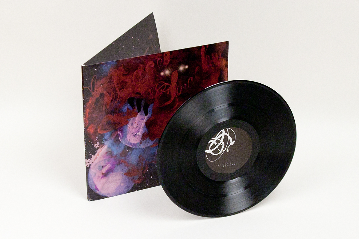
john delucca then beautifully redrew and further illustrated the graphics caspar had made for the vinyl record's packaging in pixel art format, and
josiah newbolt then animated those graphics.